Skip to Content Skip to Search Go to Top Navigation Go to Side Menu


"highlight" Tag


Highlights


Sunday, May 26, 2019

As I open up Designblog, the first thing that caught my eye and took all the attention were the yellow highlights. I almost got annoyed, that my focus wasn’t even on the title. I don’t think my focus is that easy to distract but maybe, who knows. At first I didn’t wanted to choose a focus subject yet, so I decided just to surf around on the blog. Some of the posts I found interesting others not.

But I still couldn’t not escape being aware of the yellow highlights every time I arrived at a new post. The highlights were very different in the way of the use of them. Some of the posts had a lot of highlighted words, some had a small text highlighted and some only had a very few. So I went on surfing on the blog with this in my mind until something strange happened.

I came across a post, where something was different. It didn’t had any highlights at all (except for the ones in the bottom, they all have). I felt somehow confused and relieved. I made it to the end of my journey on the design blog. I hit a wall. Just a clean post about “Doing aerobics before painting?: What can we expect during the Basic year”.

I followed the different yellow highlight to the end and I wanted to do something with the placement of them, the shapes and lengths. That was one of the nice thing with them, they changes and had a nice random flow.


So I decided that I wanted to work with them only. So I screenshot a lot of the different post on the Designblog. So I could have a nice “library” for the highlights. From there I started working on how to visualize it. Because it was such a simple gesture they made, but were quite strong, I wanted to make it as a very clean piece.

So what is a highlight, why do we use it and how do we use it?

Highlights works as you might know to make one specific word or sentence stronger. In some cases you underline your point for example. They are KEYWORDS in your text. The most important words to sum up your text. It is there to show the importance and your valid point in your text.
As Wikipedia also says: Highlight adds translucent color to a paper or text to emphasize particular parts of the text. The highlight can be seen in different displays as colors, fonts, depending the meaning of the context. You can also use the highlight to confuse the reader by putting them places where it is out of context. So in a way, it is a very simple but strong tool.
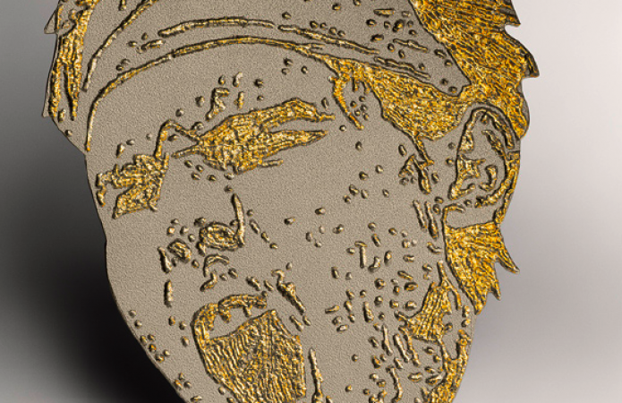
So as I said before I wanted to do a simple visualizing of the highlights. In the blog the highlights are colored yellow, it could also have been blue, green, different fonts etc. But my idea was neither of these. I thought that another way to make something pop out of the context could be levels. Levels in that sense that you don’t adjust anything else that the level or height of the highlights.

Imagine that you read a book, suddenly one of the words is in another level that the others. You would notice that in the same way as a “regular” highlighting as color. I’m not saying it is a more clever way to do it. Especially not in a book (it would be unpractical, so unless that is the case. I wouldn’t recommend it) but for something else than that it has the same effect. So I wanted to make a board, where I took some of the highlights I printed from the blog, and visualized it on that. Where everything is the same color and same font (in this case no fonts at all) where the only different is the level of the surface. I placed my “higher levels” as the highlights from the blog I had screenshotted earlier.


The result is very minimalist, but I think it sums up the thoughts I have been dealing with, while doing this assignment or exploring. The levels of course also works because of the shadows. And I think they work stronger, the more shadow and light they have. It is actually also the only highlight you can feel, unless we make a new highlighting with materials instead. That could be interesting too..

Waterman


Tuesday, March 3, 2015

Waterman

Sportsfigures_240_WatermanBrooch

I have chosen the Waterman Brooch from the series, combining a postcard of a Bruce Weber image with the diamond ring of the commissioner. Bakker bought the image as a postcard from a secondhand store in New Orleans, then embellished it with white gold and diamonds that resemble water droplets flowing from the bucket down the model’s muscular back. The movement and elegance in the original image was heightened by the placement of the gemstones. Bakker eventually created two additional brooches using the same image; one is in the collection of the Stedelijk Museum ’s-Hertogenbosch, the other in a private collection.

Gijs Bakker (1942) is a Dutch jewerly and industrial-designer, educated at the Gerrit Rietveld Academie and the Konstfack Skolan in Stockholm. Over the years, he has taught at various European art academies and worked on numerous commercial collaborations, creating everything from furniture through jewelry to public spaces. In 1985, Bakker began to use easily available and recognizable images of popular figures for his Sports figure series.

Passing by these items in the museum has made me doubtful about if it’s serious or some sort of joke ending up in the kitschy result. I’ve found this contradictional impression interesting enough to deal with it a bit further.

But what is jewellery’s role in our modern and future lives?

In the late 1960s, Gijs Bakker and Emmy Van Leersum, created a furor with their avant-garde jewelry and clothing that fused fashion, design, and art. They were the first to make minimal jewelry out of unorthodox materials, such as aluminum and plexiglas. The pair set of a real revolution in jewelry design. Bakker and Van Leersum’s breakthrough came in 1967 when they presented their vision of a total concept of fashion and jewelry with a spectacular show at the Stedelijk Museum Amsterdam. It was a provocation after which jewelery totally changed,especially on the subject of the concept of beauty and functionality.


MS04foto_matthijs schrofer_lowres


The most famous item of jewelry featured in the show is undoubtedly Bakker’s Stovepipe Necklace (with matching bracelet), now an icon of Dutch design. Bakker was the first designer to create a piece of jewelry of such audacity and on such a scale. It was a provocation.


The-Gijs-and-Emmy-Spectacle-exhibition-at-the-Stedelijk-Museum_dezeen_3


3.1999-K80249(A-C)A


https://vimeo.com/89612291

Afterwards his role in dutch jewelry design became really important in Holland, it changed the view on jewelry.


In 1993 he founded Droog Design, a Dutch collective of designers, products and information, together with design critic and historian Renny Ramakers. Together with Ramakers, Bakker was the selector and art director of all products within Droog. Droog works with independent designers to design and realize products, projects, exhibitions and events. During the Milan Furniture Fair in 1993, the duo presented a selection of sober designs made of industrial materials and found objects. The presentation was titled ‘Droog Design’, because of the simplicity and dry humor of the objects. The Droog collection is curated by Renny Ramakers and consists of around 200 products by more than a hundred designers. New designs are often developed and presented in relation with exhibitions “Saved by Droog” is an element of Droog design that buys up stock and transforms it into something completely new with a distinct voice and purpose. It’s more than sustainable design; it’s a “reflection of the designer’s creativity.

image.php

droog design [x]

In current design projects Bakker investigates the relation between craft and design. Since 2009, he is exploring this theme in his role as creative director for HAN Gallery, formerly known as Yii in Taiwan.His new series ‘Go for Gold’ emphasizes the importance of gold in the competitive world of sports, business and politics. By laser-welding gold on titanium or by laser-cutting gold under titanium, the brooches literally go for gold.


 „I am watching football in the same way as I am watching ballet”


The Sport figures series used copies of images from various newspapers of athletes in track along with contrasting, valuable materials like gold for example – to emphasize and highlight a particular moment. The practice of this clash of substances ends up in a playful tension that comes from having precious gems combined with an everyday object, bringing focus (or questioning) the borderline between „cheap” and „expensive” materials.

Does the use of valuable material makes something a jewelry (as the commissioner ask for it) or does it become a design piece driven by the vision of the maker himself?

Since he was fluently shifting through content, character, and medium it makes it hard to categorize the Sports figure series. Visual references from sports, automotive, and history are imbued with a trademark postmodern stance: sarcastic, ironic, and unsubtly nonconforming.

All of the works demonstrate his unconventional relationship with his discipline, as Bakker once admitted, „I dislike jewelry. I dislike the behavior of jewelry buying ladies. I dislike ladies jewelry. jewelry shops depress me. if jewelry is only decorative, I lose interest. I like jewelry because it is absolutely superfluous. I like jewelry because it is never a prior functional. I like jewelry because like clothes, it is closest to our body and says something about the wearer. a painting is hung on the wall and can be ignored. a piece of jewelry is worn and creates an impression.”


timthumb.php


For the first look the Waterman seemed for me like objects what you find in shops selling useless stuff for tourist, ranging the weirdest combinations of taste and culture.  Yet Bakker’s main approach was driven by the concept over the final product. So instead of the craftmanship’s usual categories, he tried to focus on the driving thought behind the piece, which in this case was the clash of materials, a surprising marriage between the every dayness of the paper cut picture and the stones. For me, this piece is still about the beauty itself (like all jewellery), just inviting a rather unusual form of it, at least within this field. But picking athletes somehow still tells about the beauty, so this piece becomes a celebration of the natural born beauty, combined and emphasized by the diamonds, which becomes a secondary tool for this purpose rather then the main „attraction” or message of the work. Like if it would pass it’s shine to the photo itself.

Yet I think that next to all the importance of conceptual approach, the visual and applied design principle shouldn’t be left behind too much, especially in an originally and historically applied discipline like jewellery. I feel that it’s just not the right tool or way to mediate such a message. Let’s be honest, a jewel is made for wearing, but who would walk around in a piece like Waterman?


Log in
subscribe