Skip to Content Skip to Search Go to Top Navigation Go to Side Menu


"Designing the Surface 2" Project


Centre of attention: elephant or cockerel?


Monday, June 5, 2017

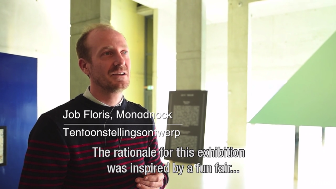
Ten seconds of watching Arttube’s video about the Designing the Surface-exhibition (posted on the website of het Nieuwe Instituut), brings you Chris Kabel, “concept and curator”, saying the following:

SC1_1100

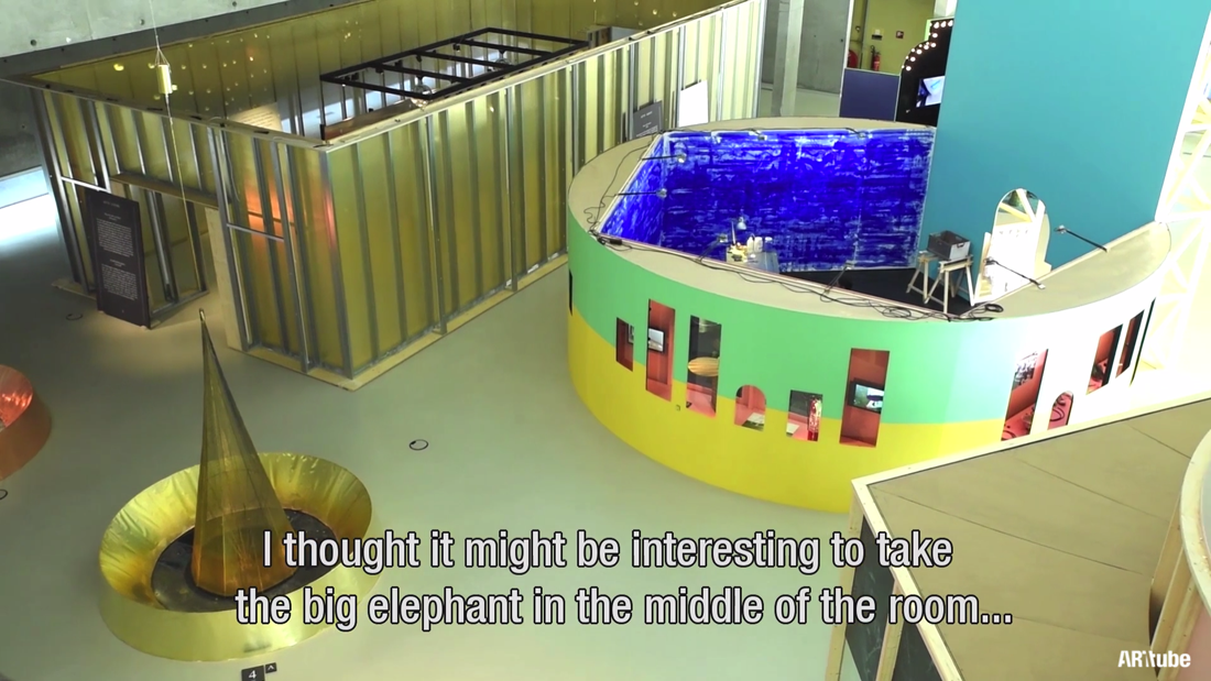
Although just having visited the exhibition, I did not remember seeing a thickset, usually extremely large, nearly hairless, herbivorous mammal (family Elephantidae, the elephant family) that has a snout elongated into a muscular trunk and two incisors in the upper jaw developed especially in the male into long ivory tusks, [x] at all.

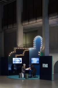
I started doubting if I had seen the same exhibition he was talking about but looking at the video we pretty surely had. But also on the screen (see above) there is no elephant to be seen. Maybe the zoo (or, so called fun fair)

SC2_1100

is too big for the elephant to be found? Impossible. Kabel even mentions giving the elephant centre stage,

SC3_1100

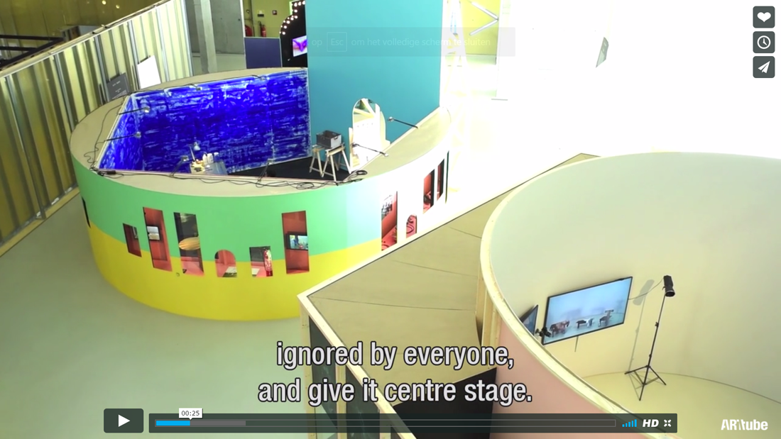
so it must not be too hard to find this “elephant.” What is really meant with the elephant in the room,

an obvious major problem or issue that people avoid discussing or acknowledging [x]

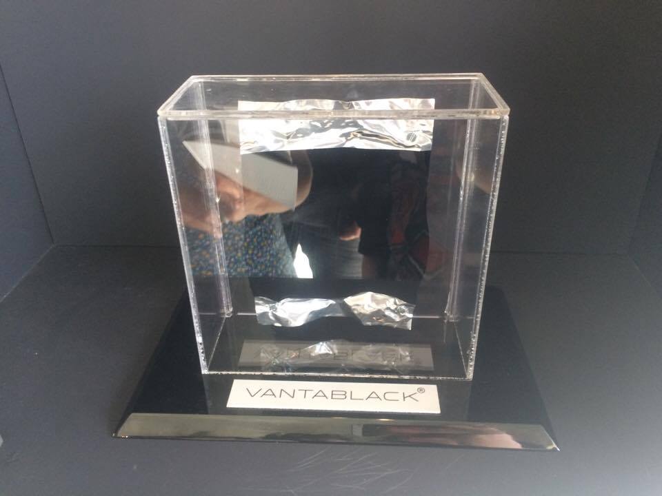
is the surface in design: apperently ‘avoided’ (as quoted above) or ‘ignored’ (Chris Kabel), en therefore in Designing the Surface, put in the centre of the room. Also should be to be found in one of the two other animals in the room: the golden cockerel.

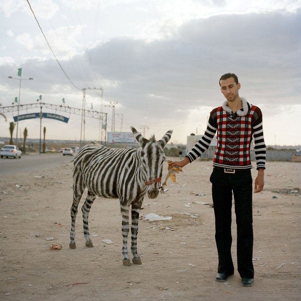
The golden cockerel might be a bit rare – it’s one out of the three animals (an elephant, a zebra and a cockerel) n the zoo –  it is one of the first objects to be seen and written about:

ACT I PATINA: How does the fate of a golden cockerel and his companions intertwine with that of the tormented tale of two fountains, the first crafted from copper and the second one built from brass?

All to be found in a zoo perhaps? Or in the near surroundings of a church?

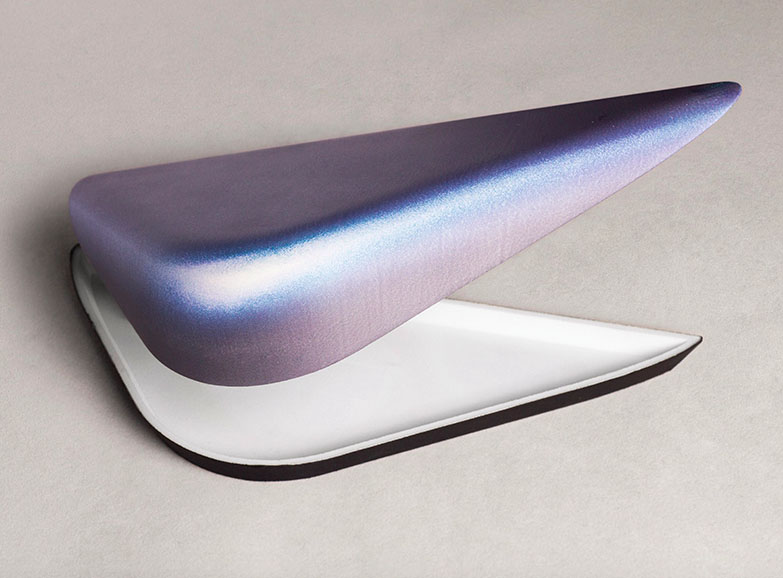
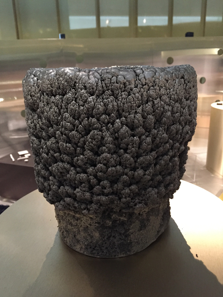
Gold-plated weathercock, lent by Museum de Roode Tooren, is a weathercock like any other apart from the fact that it’s gold-plated, and therefore it doesn’t lose its shine.

SC5_1100

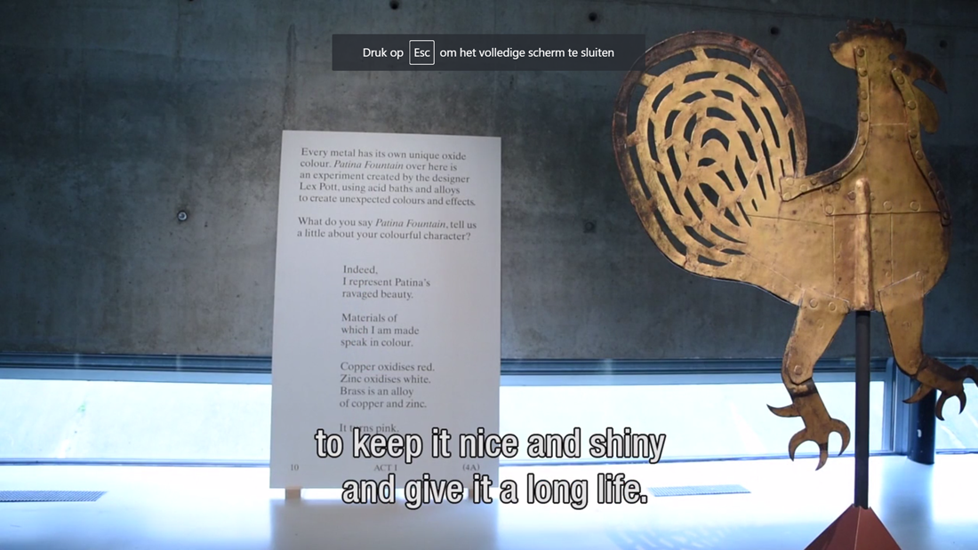
Normally sitting on the church’s tower in Doesburg, shining bright and golden, the weathercock is certainly put in central view. And now put on the ground, looking at it from closer by, we are obviously not looking at the rotting wooden cockerel inside, but at the shiny golden elephant.


Gold-plated weathercock. Museum de Rode toren. exh.cat.no2-patina

How to prick’s one eye


Sunday, June 4, 2017

designingsurfqce

« The Faux Series » by Chris Kabel is a serie of small boxes with a very particular 3d-like texture. Through water-transfer printing, photos have been printed on the small boxes’ surfaces. Shadows and bright spots are emphasizing the shape of these boxes. These prints match the objects and succeed at giving more depth to the visual aspect of the boxes.


I chose « The Faux Series » because I have been very interested by photography lately. The work made me think about several references, the first one is the book « The concept of Non-Photography » by François Laruelle. The author mentions the interesting relationship that is established between the image and the real object. The image is a way of perceiving the object almost like formulating a point of view on that object. Chris Kabel’s work challenges Mr. Laruelle statement: « photography is a process that excludes the object-form » by using the technique of photographic prints directly on an originally neutral object.


Photography in my point of view is putting up a boundary between itself and the real object, as Martha Sandweiss said: « The capacity of photographs to evoke rather than tell, to suggest rather than explain ». Photography is i think the attempt to materialize each human beings’ perception of things. It is as if Chris Kabel decided to glue the perception of an object on that object itself to create a new « alien-object ».


The Chris Kabel « Faux Series » relate to the Act III of the booklet. « Faux » in french means false. Act III is made of little humoristic and theatrical dialogues that mainly personify materials such as wood and marble. This short play also gives a voice to objects, an animal and a product (a dress). It displays the following ideas of looking like and ressemblance. It is also about pointing out the complexity of a visual system that deals with notions like authenticity vs camouflage, imitation vs sincerity and all the changes and transformations happening in between.

Chris Kabel is experimenting how two different medium could cooperate together, in that sense the work of Chris Label is interesting.


Faux Series 2017, 3D printed polyamide, water transfer printed. exh.cat.no36-faux

After Dark Software


Sunday, May 28, 2017

flying tooooo

Probably the most famous screensaver software of the 90’s on windows. Something i instantly remembered seeing on the only computer screen we had standing in the living room, so seeing it again after so long in an exhibition was a nice nostalgic encounter.

Flying Toasters was released in 1996, designed by Jack Eastman and Patrick Beard and developed under Berkeley systems. The name gives it all away, classic toasters with wings fly across your black computer screen along with pieces of toast. In relation to the New Institute Exhibits and Flying Toasters being a screensaver software, in my opinion it leans more towards Act 3, FAUX. loosely related in the sense that the software changes the pixelated screen surface into a temporarily living scenario of an engineer’s imagination, sparked most likely by spending too many hours awake at night programming screensavers in the first place. as simple of a concept it may be, the visual aspects made huge impacts on subcultures within and outside of the programming world.

During the trip to the exhibition where flying toasters was screened among other screensavers, I noticed that not much detail was given about these screensavers. they filled up a dark space wall to wall and gave the impression one was walking through a slice of 90’s time-space. What’s fascinating about these old modulated screensavers, initially designed to prevent phosphor burns in CTR and plasma monitors, is their apparent animation style that provided hours of background distraction. The “designing the Surface” exhibition showed many different surfaces which are manipulated in many forms. The screensaver room felt the most intriguing because the screens weren’t just being displayed, they still served their adapted function in a very subtle manner, simply to distract and entertain. Having flying toaster, pipes 3D, aquatic realm, Geo Bounce, lasers and many other software lined up on big screens gave me a bittersweet feeling of how dead 90’s computing is in the progressive new Century. Yet there will always be an interest in whatever people feel nostalgic relevance for.

Minus #000000


Saturday, May 27, 2017

Vantablack_01

Vertically Aligned NanoTube Arrays – VANTABLACK, is the blackest matter known yet, with its capability to absorb 99.965% of the light projected on it in the visible spectrum. The vertical tubes that compose it trap the light inside instead of bouncing it around, until it dissipates into heat.

Patented by Surrey NanoSystems Limited, it is much easier to produce than its predecessors. A similar matter developed by NASA required 750 ° to be grown, whereas Vantablack needs only 400 °C. Still, it is very difficult to produce and thus quite a valuable material. Which is probably why it was shown in a glass case during the show “Designing the Surface” at the New Institute in Rotterdam.

The catalogue, that was published on the occasion of this project, was structured in acts of a theater piece, grouping designs and materials related to their common specialties or their physical or intellectual interactions. Vantablack was part of the Act VI, titled Slim; “In which the future is superficial”. The reason for that was probably that Vantablack is a human made, fascinating material that seems like it’s out of a science fiction movie or a fairytale; almost too strange to be real. What 21st century humans can achieve may be little in future perspective, but currently it can be quite fascinating. Laboratories are like alchemy labs of medieval sorcerers. Industries can make impossible a reality. Still, it all depends on the funding of course.

Vantablack proved very useful for various industries. Especially for astronomy and space sciences; since it can help the development of far better telescopes that can reach even further into the universe. It can potentially be used for the medical treatment for eyesight problems as well. Since it pushes the boundaries of the relationship between human, matter and light, it revolutionizes anything that has something to do with optics.

No wonder Vantablack is so fascinating for many. British-Indian artist Anish Kapoor licensed the use of its color and is currently the only artist who is allowed to use it. The RGB code for the black as we know it and are able to use freely is #000000. Although, with the further development of Vantablack, a slight change in the percentage of the absorbing power of the material can give it a different RGB code, making Kapoor’s license useless. Even though I am not sure if Kapoor would run out of money before purchasing the license of each step of Vantablack’s development, I certainly hope that this material with so many possibilities would become available to common folk so that I can also let my imagination run free with it.


Vantablack display sample Surrey NonoSystems. exh.cat.no.75

Lustrous Lips and Fingertips


Sunday, May 21, 2017

Warning: Do not scratch the surface.

lips


The nail polish stand is linked to the Lustre section of the exhibition for the visually obvious reasons such as its shininess and sheen, but also for its historic link to car paint (also highly featured in the Lustre section) as an inspiration for the first nail polishes.


tumblr_on9d8801wK1rze8z7o5_1280 Designing the Surface Nail Salon Screens


The exhibition designed to feel like a fun fair, is divided into pavilions. The Nail Salon becoming an attraction for visitors. Drawn to it like magpies, visitors are able to get one nail painted and glittered. Somehow promoting the addition of Lustre to ones body, to have one nail become like a car door, while you watch two screens flash lips dripping with gold and gloops of glossy colour, nails painted and paint peeled from pristinely polished cars. Somewhat hidden is a third screen. I must admit I did not catch it at first. Too distracted by the glitter goodies, to notice the children labouring in mines. Since I did not pay full attention to this third video, I am not sure what they are rummaging in the dirt for? How is it linked to getting your nails painted? To the lips pouting at you from the first screen and to the expensive cars in the second. How are these poor children linked to these items of luxury?


Perhaps they are mining for titanium dioxide or ground mica, which can be found in some glittery nail polishes? Why then was this screen placed out of view from the person sitting getting shiny minerals added to their fingers?


I wonder if the artist Jonathan Auch was offering a critique to lengths we go to to increase our lustre? These videos differ from the artists’ usual street photography style. Black and white photographs of real people in real settings. Rough, gritty, textured faces of everyday faces. Seems odd then, this choice of work for this exhibition. Accentuating the fake-ness of the surfaces we crave to have not only on our cars but also on our very bodies, and who in another part of the world this may affect.


Jonathan Auch for Koehorst in 't Veld, Nailsalon screens Mother/Father/Child 2017. exh.cat.no.24A/24B/24C

Fordite: the post-industrial agate


Friday, May 19, 2017

Skærmbillede 2017-05-27 kl. 19.20.22

Fordite is a material left over from when car manufactures used to paint by hand. It is an incidental leftover material. Fordite comes from layers of paint being sprayed on top of each other on the bed the car chassis would sit on when its was painted.
 

Fordite_Carplant Skærmbillede 2017-05-19 kl. 15.06.23

It can be found mostly in America, especially in Detroit were all the old great car-factories were. The layers were hardened repeatedly in the ovens that the car bodies went into to cure the paint. Eventually the paint would layer up so much that it had to be chipped off. The practice of spray-painting by hand started in the 1920s and stopped in the 1970s when the process was automated. Because of this fordite has gotten a nostalgic appeal, with people also remembering their old cars. Also it means that its finite with people looking around the ruins of old factories to find it. All the layers of different coloured paint end up making a unique looking product, striped, almost psychedelic to look at. Its hardness makes it possible to cut up and polish, making it ideal for things such as jewellery.

The name Fordite is of course made up, nobody is sure where it originates from. Maybe Ford-ite. Its also called other names like motor-agate, Detroit-agate. Agate is a gemstone, where the slow accumulation of sedimentary layers creates beautiful patterns and colours.

In the ‘Designing the Surface‘ exhibition, Fordite is in the second act of the “lustre” section. Part of the”pearly entourage” playing the character of the ‘The Derivative’. Lustre is a type of metallic glaze, that’s originates from the middles east and has been around for almost a thousand years. It is the first enamel if you will, while the car paint might be the last.

unnamed (1) DSC0475

raw fordite v.s cut and polished fordite.[x]

A new material is rare, and what peaked my interest, is that fordite is a new material born out of chance. An accidental waste product. Alas it had to take some time before it was perceived as something much more precious, and beautiful.

I’m fascinated by idea that something like a massive industrial operation, such as the ford factories can leave something as complex and beautiful behind. I hope in the future that our current wasteland of factories might leave small nuggets of beauty like this behind in the rubble.

raw Fordite v.s cut and polished fordite.


Niban-Kan building, Tokyo


Thursday, May 18, 2017

Walking around Shinjunku, Tokyo’s district, one may have noticed the unusual buildings standing out on its east side.
The Ichiban-Kan (“building number one”) and the Niban-Kan (“building number two”) were designed by the architect Minory Takeyama in 1966. They were commissioned by a Korean Toyota salesman, asking him to design both buildings at the same time, and finally completed in 1969. Respectively, one was home of 49 tiny bars distributed through its eight floors, and the other hosted bars, clubs and sauna.

Slides from the 1970s, reproducing the two buildings. Domus Archive


In 1977, the cover of Charles Jenks’ The Language of Post-Modern Architecture features an enigmatic Japanese building. It raises the Niban-kan as an icon of Supergraphics, along with its adjacent brother building the Ichiban-kan.
Niban-Kan’s colored surface has been painted over by now, blending now with Tokyo building’s flat designs.
But what made this building so special, beside its colorful surface ?

ea51f7eab203dca46b02e89a28e9f475

In the 60’s, East-Shinjuku was the land of protest and porn, where one could meet the radical, intellectual, and other underground Japanese subcultures. This area’s hyper activity led to an important street competition, where signs and speakers had to be bigger and louder.
Minory Takeyama was challenged to implant a new architecture in the given context. It had to stand out of this saturation of lights and neons, while blending in with the energy of the district.

big_373446_6621_5street2

Entrance of the Ichiban-kan building


Japanese architecture is typically vertical, where each floor has a common area with entrances to shops and bars. As architecture was being more and more influenced by western design in term of multi-storey models, Takeyama exploited the local past of architecture and brought the verticality back to the front, creating a vertical street through the facade. The late-Modern “High Architecture” aim to reveal the movement directly from the outside, such as what’s going on, and how to get there.
The front shows the circulation, to arouse curiosity. This is completed by signs that bring an informative layer to the surface. At night, neons reflect on the glazed area, which emphasize the gap between the surface and the platform, and reveal part of the building’s activity.

big_373255_2410_5coppia

Left: a view of the Niban-kan interior today. Right: The same space with the original flooring, as seen in a 1970s Japanese publication, Domus Archive


The Niban-kan and the Ichiban-kan are representative of Tokyo’s relation between private and public space. You can go from the street to the seventh floor without encountering a door. By directly opening to the street, those buildings breaks the boundary and transmit a feeling of public space from the street.

big_373446_9514_4street

Entrance of the Ichiban-kan building, with a direct access to the outside


In the exhibition “Designing the surface”, The Niban-Kan was presented as an item from the, ‘agency’ category, through Charles Jenck’s 1977 bookcover.
Agency is an action or intervention producing a particular effect. Minory Takeyama’s colorful and ambitious buildings were possible to realize at that time, far from the actual strict rules of urban planning. This freedom made it possible to bring local tradition in the actual architecture and –promoted by Charles Jenk– become a figure of Post-Modernist Architecture.

Screen Shot 2017-05-18 at 02.43.21

Screen Shot 2017-05-18 at 02.41.21

Ichiban-kan and Niban-kan seen from Google street view 2016

Architecture became almost a banal experience, we are surrounded by buildings that we don’t question much, because the more we see them, we forget them. We take design for granted. But sometimes one stands out and makes you travel.
It’s fascinating how design, by small changes of the interface, can revolutionize the way we experience our environment.


Charles A.Jencks, The language of Post-Modernist Architecture 1977-1987, London. New Institute. exh.cat.no.61-agency

unintentional surface


Thursday, May 18, 2017

Silen-Witness_950

 
These works are created unintentionally over years, silently coming into form. The first work, a tin used to collect small parts of paint where after some years dust has assembled on the surface to grow on the paint and bloom into a totally new object. In the second work it is about the paint dripping down and forming stalactites. Both works that at first had no apparent form/function or where the object is somewhat misused, they had time to grow and form a skin that now attracts full attention. These objects have a certain relation to imitation (faux) where I assume that you would expect a different material at first, something that has a long thinking process behind it, and where technique seems to be funest to create such an ornamental artwork. These works hide perfectly behind being part of a long growing process where they just slowly and unnoticed can find their purpose. Also it is interesting to think about certain materials and their aging form where the possibilities and speculations seem to be endless. I think these objects have an interesting point of view where you have to think about an aging process. You wouldn’t be actually able to make something like this in a short amount of time and where you almost never really will be able to control the way it will grow. This way of designing that is more unintentional, often by accident, requires an eye on detail, tryouts and attention. For me personally these works that sometimes almost appear accidentally by just trying out things and looking closely to the options, combinations and faults, are the things that bring some depth or in some way a soul into the work where I want to approach it as a living form that deserves a place to get recognition.
Silen-Witness2_1100


Silent Witness 1 and 2, private collection C.Pompe. exh.cat.no.19A/19B-lustre

Gaza: A leopard never change its spots but a donkey can change and get stripes


Thursday, May 18, 2017

A cages, a theater, a library and research center – Gaza Zoo, the first one ever in the strip. It opened in January 2006, the same month Hamas, the radical Islamist, came to power

I have chosen to analysis what it is to be Authentic. Authenticity is the undisputed origin and not a copy; genuine. In my opinion, the artist chose to use the donkey as an analogy for the Palestinian people that their “authentic life” is to survive in extremely difficult living conditions. The donkey throughout history has been known to be used for labour by humans and are often overworked. In comparison, animals such as zebras and horses are always seen to be more superior than donkeys. Zebras and horses tend to have more rights and often protected from abuse as though they are on a pedestal. Similarly, the Palestinian people are represented by the donkey who have also been stripped of their true identity as they are not recognised by the Israeli government. Palestinian people have no citizenship rights in the west bank and in Gaza. It is as though Israeli people have superiority and the Palestinian are inferior and are left powerless.

(http://www.bbc.co.uk/newsround/20436092)

faux is made in imitation, it is artificial, it is not genuine. Faux is the opposite to authenticity as it masks itself to look like the real deal, however underneath lies the truth. The chair, similar to the donkey is sat on by man and are used, changed and adapted. Sincere imitation is achieved through genuine feelings. Portraying these feelings of how you see the world and its changes are the keys to make it.

In the picture below, the man seen is Mahmod Berghote standing with one of Marah Zoo’s world famous painted donkeys. The zoo’s two white donkeys caused an international media frenzy after Mahmod and his brother spent three days painting stripes onto them using black hair dye. Unable to find an animal trader to bring a real zebra through the tunnels from Egypt, the Berghote family decided to make a fake pair using white donkeys. The story was reported all over the world as a feel good news piece and often used as an example of the Palestinian people’s resourcefulness during the siege of Gaza.

 The idea that imprisoned people can make a business out of smuggling, locking up, and exhibiting animals is deeply ironic. There are about a dozen Zoo’s in Gaza and their story is intertwined with world politics in a way that would be unimaginable anywhere else.

In 2005, Dr. Saud Shawa, a veterinarian, decided to establish Palestine’s National Zoo. For Shawa, this was about education and showing people how to care for animals. Supported by international donors, he built a spacious compound with big movement, won elections in Gaza. The border was closed and the initiative was halted before it could get started.

As of today, not a single zoo has been profitable. In fact, there is only one person in the Gaza Strip who benefits from the business: Abu Nadal Khalid, an animal trader. He has animals drugged and smuggled through the infamous system of tunnels leading from Egypt into the strip.

gazazoos6

The Swedish/British Anastasia Taylor-Lind (Great Britain, 1981) is a photojournalist connected with the VII Photo Agency, with a special interest in the Middle East. She made this photo of the Marag Zoo Zebra, Gaza 2009.


Untitled photo by Anastasia Taylor-Lind. Exh.cat.no.32-faux

The Flasher


Thursday, May 18, 2017

Reflecting on a reflection with a play within a play

Schermafbeelding 2017-05-18 om 15.15.40

Deer:               Hi, I can’t see you properly.


Albedo:               That’s weird, because we can see you very clearly.


Deer:               Why?


Albedo:               Because we made you like this.


Deer looks confused and wishes to walk away.


Albedo:               Wait! We’ll explain.


Deer:                   I don’t trust you, I am an individual and not made by humans like you. Humans are dangerous and all they do is kill us.


Albedo:               Exactly!


Deer:               I don’t get it…


Albedo:               Hold on a sec.


Deer:               I don’t have all day, I’ve got some cars to catch in accidents tonight.


Albedo:               This is precisely the point. So we made this retro-reflective coating. It is paint mixed with glass beads embedded in a mirroring material.
 

Deer:               This sounds really horrible.


Albedo:               It’s not, haven’t you noticed that less of your family friends got killed since we came up with this?


Deer:               Maybe


IMG_20170510_120814


Albedo:               What we did is, we applied the paint to you antlers such that direct light is captured and internally reflected to brilliant effect.


Deer:               When did you do this exactly?


Albedo:               Not relevant.


Deer:               Okay, it sounds great, but to me it sounds even more dangerous than before I had this spray. Looks really unhappy.


Albedo:               How come?


Deer:               Well, for instance, wolves. They will see me since I am now glowing in the dark.


Albedo:               They can’t see you. The antlers glow only in car headlights so it’s not like wolves are scanning the forest with searchlights for flashy reindeer. Laughs.


Deer:               Hmm, still not convinced.


Albedo:               Hey man not to be rude, but between the moon, their natural night vision, and the snow, pretty sure wolves don’t need head lights to see a reindeer with reflectors on its antlers…


Deer:               True. Butt still.


Albedo:               What’s wrong now?


Deer:               I feel a bit like I am being used. Do I look like the patronus of Harry Potter?


harry patronus stag


Albedo:               No. You are not the only one we will use this paint for.

Anti-paparazzi handbags and clothing would also do great.


Deer:               That goes far beyond me. I am just a deer you know.


Albedo:               It’s slim. You are now somewhere where the future is superficial.

Don’t you think this is super cool?!


Deer:               Why would I think that? looks alarmed.


Albedo:               Because it’s like magic, like Harry Potter. We changed your life, we saved  it. Now there is less car accidents, which is a win- win for deers and for humans (and their cars).


Deer:               Okay man, I get it. I like it. But I do want to say, without humans nature would have done fine by itself.


Albedo:               I think humans are also part of nature.


Deer:               This is an endless discussion. We are done.


Deer walks away nodding and mumbling quietly.


Albedo:               Good luck. Waves.
 

THE END

xR2VSju


 Reflective Spray Albedo 100. exh.cat.no.72/74B-slim

Sleep Mode.


Thursday, May 18, 2017

screensaver

screensaver


Hello there dear reader, do you remember that moment when – around the year 2000 – after a long period of watching your screen and you turn away in order to rest your eyes for a bit, or perhaps you went to the kitchen for a snack or a quick visit to the bathroom, only to find your screen being “saved” when you return. It grabs your attention, you might ask yourself how does it work and
why does my screen need to be saved…? 

So opening a program on your computer works within the operating system (.exe). Example; POWERPNT.EXE or OFFICE.EXE are word processing applications so when you create for example a .doc document (an executable file) it can only be viewed within the office.exe application or an external reading program. This is also the case for the .png, .jpeg etc. extensions. A screensaver is different (.scr); it will appear on top of its computer operating system and does not need another .exe  program to execute its script.
Back to the most common question: “what needs your screen to be saved from”? The first generation of monitors had a phosphor layer on its screen which was sensitive enough to get permanently damaged when the monitor was not triggered. So back in the day when it took more then seven minutes to start up a computer, it was more common to leave the monitor on for the rest of the day. If it was not for the screensaver, your screen would eventually show black spots, permanently. The animation in the screensaver made sure that there was enough movement for the screen to prevent this. Nowadays, it is used to save battery life or to protect your privacy. The reason I brought up this question is because at that time my personal experience was that my computer  was programmed to respond by itself. I did not consider what these screensavers were for, yet It was enjoying enough for me to accept its presence.

In the exhibition “Sleep mode – The art of the screensaver” on the second floor of the institute you will find some historical screensavers placed in the 2017 version of documentation. I experienced it like a gallery in system preferences but brought into the physical world. The room is divided by the screens which are life-size and square. Designing the surface… Is it really designing  a surface? OR rather “protecting the surface”. Their design choices, which were determinant within the computer medium, had to be as minimal as possible, the great thing about these animations is that there subjects were depended on technological limitations. This makes it not possible to categorise them in the “FAUX /PATINA /LUSTRE /TEFLON /AGENCY /SLIM ” line

The exhibition was brought together by Rafaël Rozendaal [x], an internet artist who got fascinated by the designs of the screensaver generation. Animation without a story is how he calls them.

All screensavers are part of the exhibition “Sleep mode – The art of the screensaver” Janiary – August 2017 at “Het Nieuwe Instituut” in Rotterdam. You’re Welcome, peace out.

Windows-screensaver


Sleep mode – The art of the screensaver, The New Institute, Rotterdam

The Blackest Black


Thursday, May 18, 2017

Vantablack

Vantablack is know to be the blackest black made by humans. It is substance made of vertically aligned carbon nano tube arrays, that is also where it got it’s name from: Vertically Aligned NanoTube Arrays. The carbon tubes are grown onto a surface and absorb up to 99,9% of radiation in the visible spectrum, so when light strikes on Vantablack instead of bouncing off, it becomes trapped and is continually deflected among the tubes, eventually becoming absorbed and dissipating into heat.

The material was originally designed for space equipment, its ability to limit stray light makes it ideal for the inside of telescopes. Also a lot of luxury brands try to get their hands on Vantablack to use it in their latest products. Anish Kapoor has exclusively licensed the material for artistic use, which is an extremely cunty move. He says: “it’s effectively like a paint… Imagine a space that’s so dark that as you walk in you lose all sense of where you are, what you are, and especially all sense of time.” Vantablack isn’t a pigment but a material and due to its temperature and physical requirements is not practical for most uses yet.

Vantablack was featured in the last of all acts, act VI Slim (smart) which was about experiments and investigations into futuristic ‘smart’ materials.

What makes me personally intrigued about Vantablack is it’s ability to absorb almost all light which makes you lose your sense of depth completely, you stare into an endless pit of nothing, like looking into a black hole, unfortunately the material was put in a plexiglass box, so instead of looking into the depths of the universe, you are looking at the reflection of your own face. On the positive side by putting it in a box that you can pick up, you can experience how you lose your sense of depth. I’m curious to see how Anish Kapoor will make use of his artistic privilege and hope to get the opportunity to ‘lose all sense’ of where I am and ‘time’.

When I got home and stared writing this text I found out that the material was presented inside a cabin designed by Aliki van der Kruijs, which has a surface that changes it colour depending on the light that falls on it. Just like the Flippo’s I used to collect when I was a kid.

Flippo


Vantablack display sample 2016. Surrey NanoSystems exh.cat.no.75-slim

Semenova’s Moloko


Thursday, May 18, 2017


The Russian artist Ekaterina Semenova work, Care for Milk, deals with the massive industrialization of milk and attempts to reclaim, or analyse the prior use and value of the popular dairy product. Semonva appears to be fascinated with milk, actually the dairies in general, she graduated from Eindhoven Design Academy in 2016 and it is possible that the Dutch admiration for dairy has reached to an extent by which it has begun to influence her work. The piece consists of various ceramic cups, plates and bowls that have been dipped in dairy products, resulting in a sort of faint dairy glaze that created various shades of silky brown. According to Semenova’s website, the effects of the dairy dipping also makes the clay more durable and waterproof, and depending on the amount of fat in the used milk, resulted in varying coloured remains on the ceramics. The dairy products used for the glazing come from dairy waste as the work also focuses on the over production of milk.

https://www.ekaterinasemenova.com/careformilk

Semenova’s work can be connected to the Faux subject from the little white booklet that accompanied the exhibition in which the dairy dipped cups were shown. Faux, meaning made in imitation, taken from the French word for false, suits Semenova’s dipping. Although the dipping of the ceramics is not a false act or trying to imitate anything other than what it actually is, as an object on its own disconnected from its context simply looks like beautiful colouring of ceramics. Thereby the faux subject is rather sweet suiting, as although it is not fake it might look fake. A reaction to the dairy dipped pottery could easily be that the cups are not dipped in dairies and instead in watercolour or some sort of ceramic glazing. Hence my choice of Semenov’s work, as it’s rather amusingly pretty and charming to know that the carefully flawless cups are simply dipped in varying fatty milks that constitute to the attractive brown shades. The idea was rather simple, to dip things into a substance as ordinary as milk, however the result was rather delightful. Although I found the display of the works along with the space itself uninviting. Semenova’s work sort of disappeared in the corner of the room behind the sweat-smudged glass. As discovered on her website, the work should be accompanied with milk and the pouring of milk, and viewing it behind glass made it seem as if it was an exhibit of ancient pottery at an anthropological museum.


Care for Milk 2016 Earthenware dipped in various dairy products, Ekaterina Semenova exh.cat.no3-faux

CAN THIS BE FAUX?


Thursday, May 18, 2017

mosselschotel-1IMG_20170518_134749


Mussel dish with marbled decoration, Delft 1846 : Openluchtmuseum. exh.cat.no.30-faux


Log in
subscribe