1
December 2016, I’m at the school library. Our society is individualistic, so we take ourselves too seriously. The graphic design in here reflects that; everything should be minimalistic, aesthetic and decent all the time. There is no space for an ugly colour scheme or a freakishly curly title anymore. It’s pleasant to look at for sure, I think, but it doesn’t fascinate me. I mean, what stories do those smooth columns tell?
Today, the sky is grey and my energy is gone. Art makes me sigh because I’m so moody and I long for my bed. Unfortunately, I can’t go home and sleep, because I received a long list of books, of which I should choose one to research its design.
With a crotchety gaze, I witness a mountain of books slowly emerging on top of the reading table. I see the diligent hands of my classmates searching for a nice design, while I hear “ooh!” and “ah!”, but in my mind, I only hear “boo”. I conclude that I truly hate graphic design and try to find an acceptable book.
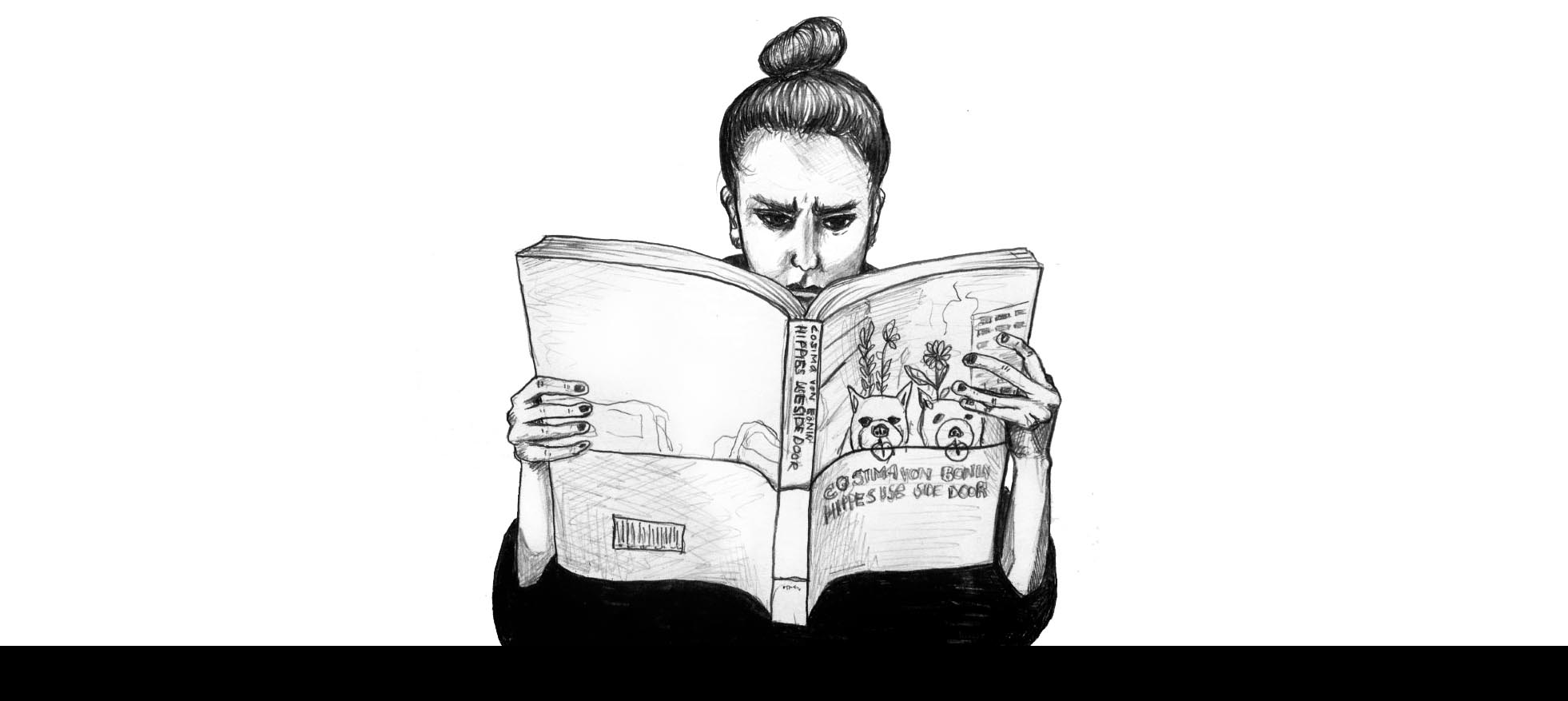
After a couple of sighs and an attempt to sleep on the ground, I find something that satisfies me; a book with self-mockery. It’s called Cosima von Bonin hippies use side door. The moment its colourful cover smiles at me from the pile of bitter looking books, I admit I don’t really hate graphic design after all. Apparently, there are still books in this library that are a little less tight.
2
January 2017, I’m in my room. Choosing a book was easy, but researching it is not. Somewhere in the back of my mind there is the fading knowledge that this assignment is important, because it’s very useful to learn about graphic design. But the rest of my mind is stuffed with other things, so I’m very much distracted.
At a certain point, my thoughts drift away to my website. I type the address in my browser and then watch it with a frown, concluding that I should make my own design, instead of using a template. With confidence, I open Photoshop, to make a visual plan of what my website should look like. But my confidence doesn’t last long. Those damned fonts! None of them seems to work! And then the background… White looks so bald, but all my alternatives look distracting. I just want my website to look cool and exciting, but that turns out to be much more complicated than I thought.
I ask Google desperately what to do, and although I find answers that make sense, it doesn’t help me get much further. Then, I realize there’s a better way to learn; I should analyse existing designs. Hey, wait… Wasn’t that the assignment for the book? I try to clear my mind of distracting thoughts and finally place the book in front of myself. Let’s see what I can learn.
3
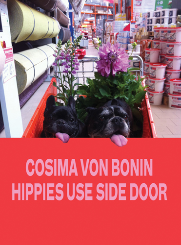
The book asks for attention by the way a big colourful photo is printed on its cover. I see a stuffed shopping cart in a lumberyard, in which two little black dogs cheerfully look at the camera lens, with their pink tongues hanging from their mouths. The image stops where the wrapper begins, except for the dogs’ tongues; they’re printed on the bright orange wrapper as well. This little graphic wink breaks the ice; it gives the book an approachable feeling. Besides that, the awfully bright colours and the simple font make the book look modern and careless.
I start to leaf through the book. The paper is thick and matte, so the pages make a pleasant, crackling sound, as they slip along my thumb. I see big photos printed in colour, big white spaces and small amounts of text. Once in a while, I get a glance of something odd, repeated through the book but always looking the same; it’s a photo on a different paper size, that looks a bit alien amongst the other pages. The frivolous artworks that are being presented and the royal use of unprinted paper make the book look even more careless. Still, the book is attractive, because of the large amount of images in comparison to the text.
From the text, I conclude the book is a catalogue, showing the latest exposition of Cosima von Bonin’s work. The book itself is designed by Yvonne Quirmbach, a graphic designer from Berlin.
4
One of the things Google told me when I was looking for the secrets of graphic design, was how a graphic design is comparable to an outfit. Just like fashion, graphic design is a language that is being used to tell a clear message. Like google said, you wear a bathing suit to the beach and a suit to a job interview, not the other way around. But there’s more to clothing choices than that; if you want to show off at the beach, you might put on your fancy sunglasses and if your job requires that you’re humoristic, you might wear your Simpsons-socks at the interview. It’s the same with books; within the lines of the function of a book, the designer has the freedom to tell a lot more.
And that’s clearly visible in the book I chose. Quirmbach’s design adds to the carelessness that can also be found in Von Bonin’s works, so the design and the content are at the same level.
5
Now, I discovered something important; I was wrong about graphic design. It does tell a story. So, if I translate that to my own attempt to make a web design; the design shouldn’t look cool and exciting, instead it should tell the viewer that my work is cool and exciting. But… Wait, is that what I want it to tell? And if I do, how am I going to translate that into a lay-out?
The design struggles clearly haven’t decreased, but fortunately, I gained some respect for graphic designers. Next time I enter the library, I’ll do it with a humble bow, instead of a moody face.
Akademie X : lessons in art + life /Rietveld library catalogue no : 700.8 mor 1
