Skip to Content Skip to Search Go to Top Navigation Go to Side Menu


"research" Category


emojis


Sunday, May 13, 2018

So what it basically iS?

.                                    Symbols, that help to describe/show things/emotions.

Did it all start from the primitive period, when people drew animals on the walls of the caves, using images and signs in order to describe?

2017-01-092_1300


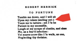
Or from the first ‘:)’ in the poem from 17th century?


emojis


Anyways, it became popular in the 90s when in SMS people started using emoticons. Emoticons are punctuation marks, letters, and numbers used to create pictorial icons that generally display an emotion or sentiment.
Actually, it officially started in 1982, when in Carnegie Mellon University the joke in online message board went wrong and made a huge misunderstanding. Dr. Scott E. Fahlman came with a proposal to use emoticons in order to define jokes and non-jokes.  : – )

Kao(face)moji(character)s are Japanese emoticons ¯\_(?)_/¯ .

e(picture)moji(character)
the first emoji was made by Shigetaka Kurita in 1999 for the first Japanese mobile internet platform i-mode.
(the 176 original emojis are now part of the permanent New York MOMA collection)

In 2011 Apple (of course) made them famous by adding them in iOS 5, but only for the Japanese version.                                  (2 years later Android joined 🙂
After noticing the growing popularity of emojis around the world they added them to every keyboard.
Now every user can switch from English or German to emojis’ keyboard.

With the help of Unicode Consortium    (- a non-profit group that maintain text standards across computers) (and Google’s petition to get emojis recognized  )             emojis are (almost) everywhere.                                                                                                                                                                                                    O-:

in 2010 Unicode accepted 625 new emojis proposed by Apple.

in 2013 the US Congress Library added the ‘Moby Dick’ written in emojis languages

in 2014 the gender and skin-color issues raised

in 2018 157 emojis were added.


You can propose your emoji and explain why it is necessary to add it                                                                                                 http://unicode.org/emoji/selection.html

2 times a week the Unicode meets up to discuss wether the pasta should be on a plate or in the bowl

wether it is important to add a sugar cube to emojis’ list

wether the girl’s haircut should be till shoulders or longer

You can go to https://emojipedia.org/                if you are not sure in the meaning of the emoji and do not want the misunderstanding to happen

You can go to                                                             if you want to analyze the emojis you are using

http://emojinalysis.tumblr.com/                                                                            (sometimes they can tell more than your daily horoscope from Cosmopolitan)


http://emojitracker.com/                       if you want to know what is in trend on Twitter


We are now way more reachable for any person in the world

We are now able to understand people without words


                           are emojis the new Esperanto?

                                                                                                                                                                How are they effecting us socially?

In Japan, where the emoji was born, there are declining birth rates due to people loosing interest in romantic relationships.

 Hikikimori – a group of young men who dont leave the house and only communicate through technology.

                             We are loosing the power to communicate face to face.

However, Match.com released data proving that the more emojis a singleton uses on their dating site seems to result in more dates, therefore more sex.

      Our phones have become priority.               In general, if someones phone pings they stop their real life conversation for their phone.

Emojis are  proven to help dyslexic people – they help us to sense emotions in bland messages.

                                                                                                             what is the future of emojis and our language?

€200.000 in one room or €4.000 under my butt


Monday, February 19, 2018

To continue my research (read also my intro), I decided to learn more about other neighbourships in which clay furniture was involved.

There exists a set (clay classic, plain clay, and clay specials) of clay furniture and different elements of it have been exhibited in different museums of the world (you can read about another series by Maarten Baas that really comes in contrast to clay furniture in Maud’s research).

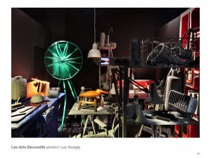
Maarten Baas Paris

In Musée des Arts Décoratifs four rooms were stuffed with different objects designed by the artist. Clay furniture was also there. All these objects put together create an interior and can hardly be perceived separately. They create an atmosphere of a storage room or a flea market. Put so close together so that each object can hardly breathe they lose their individuality and become parts of one slightly absurd impression which he called “curiosity cabin“.

maarten baas clay furniture

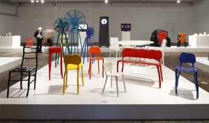
Another stop of the clay furniture’s adventure was the Stedelijk Museum of  ‘s-Hertogenbosch. There they were exhibited with other kinds of furniture designed by Marteen Baas placed on a thick white pedestal. Such placement made it look like a warehouse or furniture salon.

Comparing the three exhibitions (Stedelijk Base, Musée des Arts Décoratifs and the Stedelijk Museum in ‘s-Hertogenbosch) I started to pay more attention to the space as one of the important factors of impression we get of these objects.

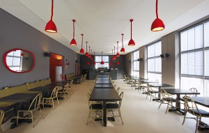
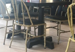
To explore how else the clay furniture of Marten Baas interacts with different spaces and objects we went on a journey to Groninger Museum in Groningen where this furniture really became a part of the space. There you can find a restaurant designed by the designer and furnished with his clay chairs. As soon as you enter the museum you can see rows of black tables surrounded by green clay chairs with black pillows.

                                                                                                                                             MendiniRestaurant

If you look up you can see red clay lamps lighting the space. If you look at the wall behind you there is an oval mirror with a red clay frame. For people with little children there’s also a red children’s chair standing in the corner.

Being a part of a functioning restaurant the designer furniture faces the most challenging neighbourship – people. Putting design objects into public use creates certain difficulties. You have to follow two opposite tasks at the same time: to protect the piece but still make it usable in everyday life.

And here are some of my observations:
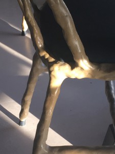
1) Black tips on chair’s legs

clay furniture detailed

After a closer look, I noticed that unlike the chairs in the museums the chairs at the restaurant have these black caps preventing the actual material of the chair from touching the floor. Even though it doesn’t catch your attention, at first sight, it slightly changes the general look of the chair.

2) Pillows instead of clay seats

cafe1

Instead of clay seats of the classic clay chairs, the chairs at the restaurant have black leather pillows filled with some soft material. This modification probably aims to make it more comfortable to sit or to match the green coloured chairs with the black tables but it still changes the object.

3)Regular tables

cafe2

One more thing that really influenced the overall picture was the fact that clay furniture (such as chairs and lamps) was placed in the restaurant with tables and benches of a different style. Maybe it was done to emphasize the clay chairs, lamps and mirrors in the space. However, in my humble opinion, this leaves the impression of the undone design, like it is halfway from being a restaurant designed by Maarten Baas and not a restaurant where apart from regular restaurant looking furniture there are also twenty 4.000€ chairs in one room. I think that if the set of the furniture would have been complete and all the tables and benches would have been made of clay it would have given a whole different impression of the space and the objects themselves.


Roots and Branches


Thursday, May 4, 2017

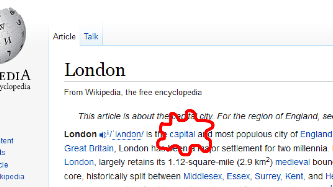
Go on Wikipedia and start a research for something, it can be the most common thing or notion you think about. Then, start clicking on the first link you see, in the sentence that defines what you are searching for. Again and again. If you arrive on a webpage where you have been before, just click on the next link, so not the first but the second one and see where you will end up. Here is my example :

London

london_1100

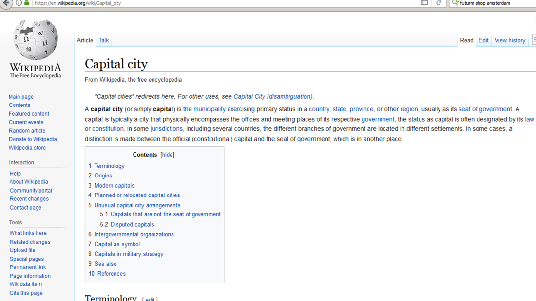
> capital city

capital_1100

> municipality
> urban area
> human settlement
> geography
> science
> knowledge
> awareness
> perception
> sensory nervous system
> nervous system
> eumatazoa
> clade
> organism
> biology
> natural science
> natural phenomena
> phenomenon
> experience
> philosophy

SQLtree1

So, this brings us to a crucial point. It shows how important arborescence (which means in French from the trunk to the branches) is in a research process. By starting from a very specific subject, you can end up on something you don’t expect to see, something really independent from your first research. By a system of hierarchy, websites choose for you what you should see, in order to make your research larger and more relevant. The concepts presented through the pages are of course connected, because terms are presented to define the notion you are looking for. That is by the way essential for every website : to give a hierarchy. But how? On what logic?

If you follow the previous example on Wikipedia, you can try how many times you want, you will normally end up on the Wikipedia page related to philosophy.

By placing some hyperlinks, you can give an orientation on an internet reasearch. In that sense, links are super efficient tools. Just have a look to what is offered on an everyday internet journey.

But more widely, from the easiest thing, you can always go to something larger in terms of meaning : groups of living species, geographical regions, etc. By defining something, you need an element with a bigger concept to categorize it. Then, is philosophy the final notion, the highest point to reach?

It is basically more than just a simple category in which we can put everything like a cellar where you come to take an old box once a year to remember your sweet childhood.


A dopamine delivery service

By spending time by scrolling down, letting my eyes wandering a bit on the DesignBlog, and repeating the same process previously experienced, I found that article by Olya Troitskaya about a concept that defines pretty well this process. It is called “cyberflânerie”. Have a look at it here.

flâneur (word which comes from the french verb flâner) is according to Baudelaire, quoted by Olya Troitskaya, “a person who walks the city in order to experience it”.

By experiencing a part of the internet content in a certain order, you expect something to get, a crucial information, or just an everyday surprise, your dopamine doses maybe. At least some satisfaction.

Play at this (not)serious game, make this fantastic tool a hijacked object, follow the lines, think about this endless journey, how you move through this digital space in terms of pictures and map, with a starting point and an unreachable end.

Analyzing Modern Religious Writing


Tuesday, April 25, 2017


Time Spend Analyzing After Meeting A Modern Cult (The Introduction).

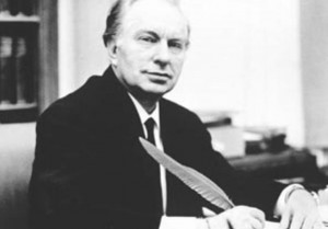
Recently, I have been looking at language while diving into modern religious or cult-ish writing techniques and aesthetics. This is mainly the language used by Scientology and the way its founder L. Ron Hubbard confuses the reader, which then, makes it possible for Hubbard to arrive at simpler conclusions. I have looked at the writings of William S. Burroughs in his book The Job, where he argues for the seemingly nonsense idea of language as a virus.

The following is a result of these readings made with the agenda of publicizing these techniques for us to advantage of.


I: Using “Mental Fogginess” To Simplify Conclusions

In the first chapter of the very first scientology book, Dianetics: the original thesis (1948), L. Ron Hubbard concludes after a small, compact and confusing rant on topics such as heuristic science, workability contrasting idealism, semantic difficulties, psychosomatic ills, the unknowable/the knowable, spiritualism, deism, telepathy, clairvoyance, the human soul, field of thoughts, dynamic principle of existence, that the first cornerstone of what for the reader seems to be everything, is for the human to SURVIVE!. This is just after the section entitled important notes, placed on page four, where the church informs the reader that:


“Trying to read past a misunderstood word results in mental “fogginess” and difficulty in comprehending the passages which follow. If you find yourself experiencing this, return to the last portion you understood easily, locate the misunderstood word and get it defined, using a good dictionary or the Glossary at the end of the book.”


The problem is not that these difficult concepts such as telepathy, dynamic principle of existence, etc. are hard to grasp. The problem is that Hubbard is using them as a sort of “mental fogginess”, so when he finally concludes that the essence of all this is to SURVIVE!, the reader might not have understood what was meant above but the essence of it (to survive) we all surely understood, and we then do not need to use a good dictionary to understand this.

Hubbard also tells us in the text that we do not need to concern ourselves with the basic questions to our existence. He says that by dividing everything in the field of thoughts into two categories, the unknowable and the knowable, we then do not need to concern ourselves with such indefinites as spiritualism, deism or the human soul. This is of course addressed towards those who search for meaning. Hubbard constantly plays with concepts that an ordinary person will be confused by, and what the ordinary person will easily understand and in these easily understandable parts, he then gently pads our backs to ease our worries.

L.RonHubbard


II: An authoritarian language.

As William S. Burroughs writes about his invented professor, Professor Wilson Smith, he does it in a very scientific and authoritarian way. He uses this authoritarian language as a tool to create confusion and chaos, so his own radical and confusing statements have a chance of being seemingly logical. He writes:


“The word has not been recognized as a virus because it has achieved a state of stable symbiosis with the host, though this symbiotic relationship is now breaking down, for reasons I will suggest later. I quote from Mechanisms of Virus Infection, edited by Mr. Wilson Smith: “Viruses are obligatory cellular parasites and are thus wholly dependent upon the integrity of the cellular systems, they parasitize for their survival in an active state. It is something of a paradox that many viruses ultimately destroy the cells in which they are living.”


After Burroughs has claimed that The word has not been recognized as a virus he then quickly makes a shift to Professor Wilson Smith, making it seem like it is exactly this that Wilson Smith argues for, although Wilson Smith is not. But when Burroughs then quickly again reassures the reader that the spoken word as we know it came after the written word due to a virus infection, which also is a highly speculative statement, Borough is then again putting this idea of the word as a virus into our minds, and it is only made possible by the use of an authoritarian language.

We see that Burroughs is using language like it is an actor in a hidden camera show. Like a scene where an actor is dressed up as a police officer on a train station, ordering passengers to get out of the train, only to be left on the station, tricked by what they thought was the law. This is just as I have done by manipulation all of Burroughs’ statements for my own agenda.


III: Take Advantage. 

But what I in generally would like to propose is this: Let everyone take advantage of these techniques to create a more chaotic environment, were illogical facts can sprout in the chaos of all other illogical facts. But to make this environment to perfection, there are other techniques we need to acquire. Luckily every technique can be learned for this purpose since much of it already has been produced for us to observe.


fcec6bfd258dc344b5b5b553975743bd

Mads B Sørensen: Text from the essay collection “Language and Technique”

Stone, Space, Me; Pretending to be Solid


Sunday, October 30, 2016

How to enter a stone? by knocking? stroking? breaking it with a hammer? or by curving a door in order to step inside?
Thinking and imagining about how it must be like to dwell inside a stone and take part in the universal creation, I find my search. Focusing on the human ability to relate, think and imagine spaces in objects, I create a link between the interior of stones and human memory and imagination.


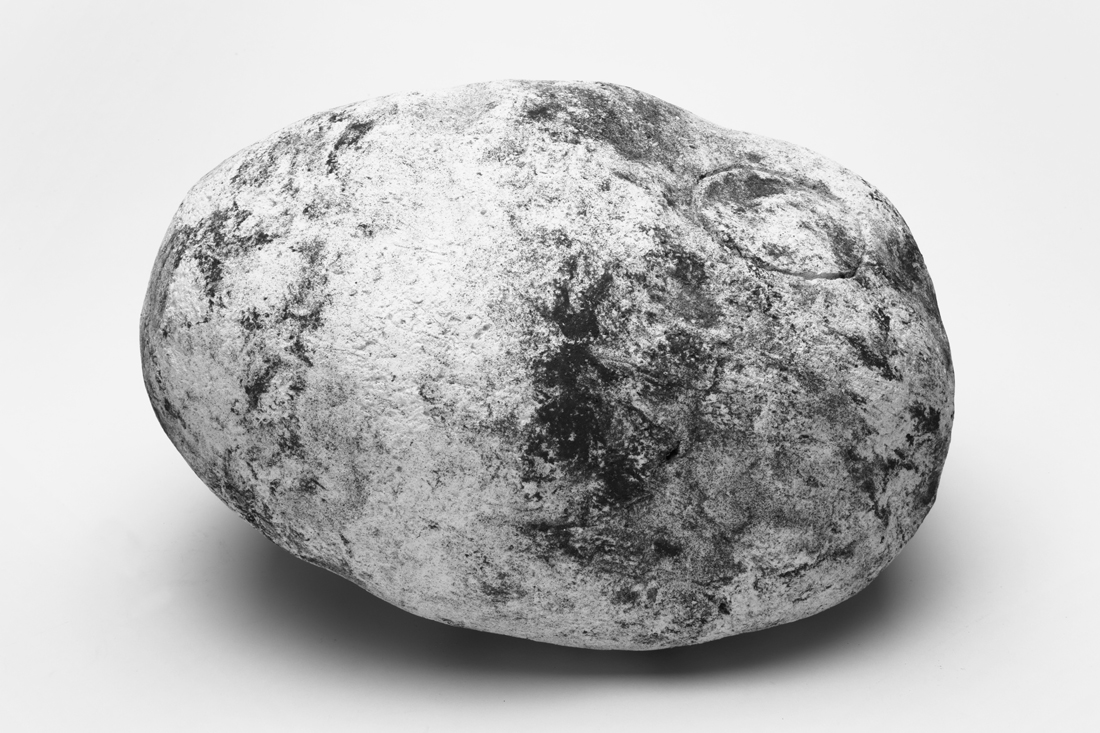
6_Naama_IMG_1100

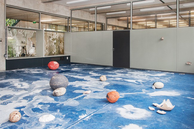
Pretending to be Solid, Naama Aharony, Gerrit Rietveld Graduation show, 2016.

( solid as stone they say…)

Along with personal notes and thoughts of dwelling a stone, I collect, trace and place cultural narratives, legends and philosophical thoughts contemplating the meaning found in stones. Through those I look to change the perception of stones being solid, suggesting to look at it as constant movement. The mind then becomes the traveler, moving through environments, places and spaces the stone I hold may offer. Those spaces are changing, coincidental, circumstantial.

This writing can be seen as a collection of short texts where the shared ground is memory, imagination and the stone. It will not necessarily talk about actual caves, walls, floors or corridors that might exist in the interior of stones, but will be researching the potential content of the stone, the meaning and narratives this stone might bring. And although while reading you might drift away from time to time, one will always go back to the ground, and the stone.


650-_MG_8700
For my graduation project, I was focusing on the relationship between man and the stone. I wanted to work on the way people approach and perceive stones. To open up the understating of A Stone to discussion and new ways of seeing. To create tension between what people usually think of a stone and the sensible perception I am offering them.

<wall-stone_950 Overvieuw_650 IMG_6344_650

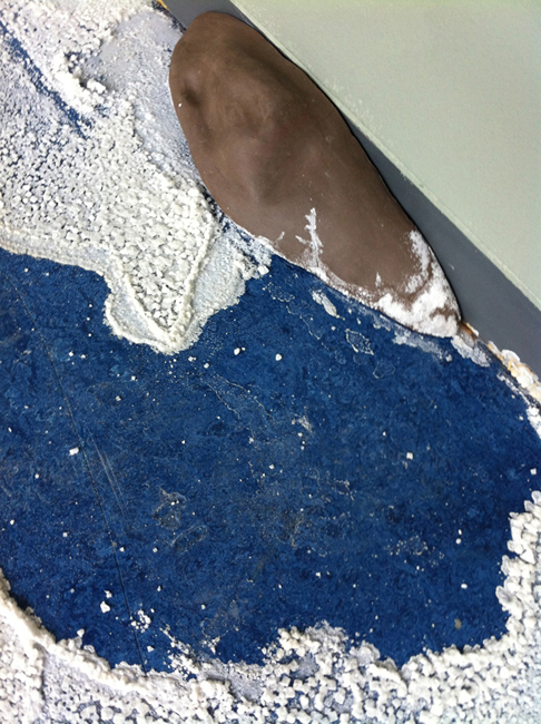
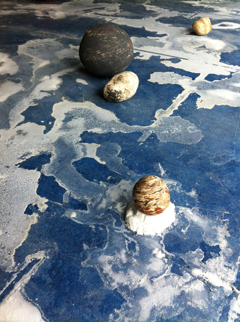
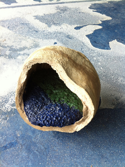
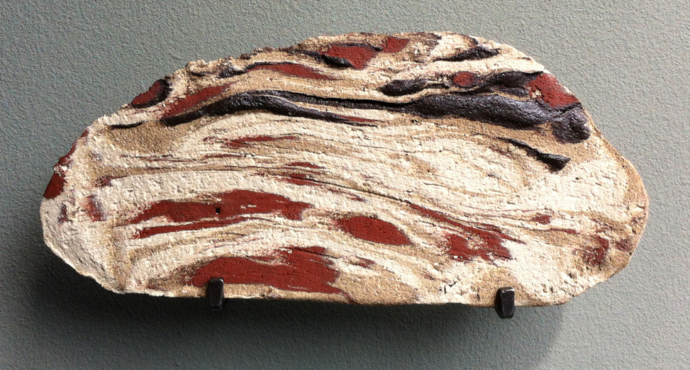
Writing the thesis and researching on different layers the stone offers, pushed me to create my own, man-made stones. Using ceramics, a study of oxide glazing and experimenting with different firing programs, enabled me to create a divergent collection of stones. Where each of the made stones carries different qualities, tells a chapter, a layer and where all together they create a story.

IMG_6343_1100

The installation ‘Pretending to be Solid’ consisted of the stone collection I have made, creating a constructed landscape inside the room. The spectators were invited to walk through the room, in-between the placed stones. Through the walk, I looked to evoke a personal contact between the spectator and the made stones. Which was for me, a place for memory and imagination.


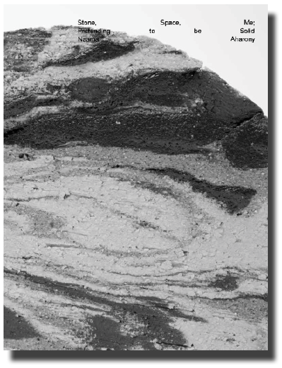
cover_image_shade download this thesis by Naama Aharony
all rights to this thesis are property of the author © 2016


I & O


Sunday, May 17, 2015

q1

q2

q3

q4

q5

q6

pic1

pic2

pic3

pic6

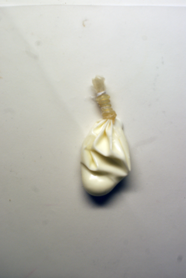
Through the stages of chewing gum.


Saturday, May 16, 2015


                                              oO.oO

                                       .oO.oO.oO.oO.oO

                                    .oO.oO.oO.oO.oO.oO

                                       .oO.oO.oO.oO.oO

                                             .oO.oO


.oO  STAGE 1 : Culinary World
[audio:https://designblog.rietveldacademie.nl/wp-content/uploads/2015/05/STAGE-1.mp3|titles=stage 1]

.oO  STAGE 2 : Roel Oostrom
[audio:https://designblog.rietveldacademie.nl/wp-content/uploads/2015/05/STAGE-2.mp3|titles=stage 2]

.oO  STAGE 3 : First Sketch 
[audio:https://designblog.rietveldacademie.nl/wp-content/uploads/2015/05/STAGE-3.mp3|titles=stage 3]

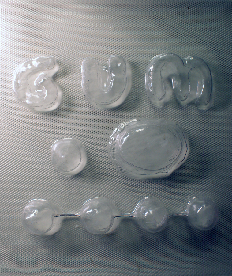
.oO  STAGE 4 : GUM!
[audio:https://designblog.rietveldacademie.nl/wp-content/uploads/2015/05/STAGE-4.mp3|titles=stage 4]

.oO  STAGE 5 : Maizena Experiments
[audio:https://designblog.rietveldacademie.nl/wp-content/uploads/2015/05/STAGE-5.mp3|titles=stage 5]

.oO  STAGE 6 : Chewing
[audio:https://designblog.rietveldacademie.nl/wp-content/uploads/2015/05/STAGE-6.mp3|titles=stage 6]

.oO  STAGE 7 : Hunting For Material
[audio:https://designblog.rietveldacademie.nl/wp-content/uploads/2015/05/STAGE-7.mp3|titles=stage 7]

.oO  STAGE 8 : Perfect Wrapping
[audio:https://designblog.rietveldacademie.nl/wp-content/uploads/2015/05/STAGE-8.mp3|titles=stage 8]

.oO  STAGE 9 : Experience Of Chewing
[audio:https://designblog.rietveldacademie.nl/wp-content/uploads/2015/05/STAGE-9.mp3|titles=stage 9]


.oO THE GUM                                              .oO THE DIP 

SONY DSC    SONY DSC

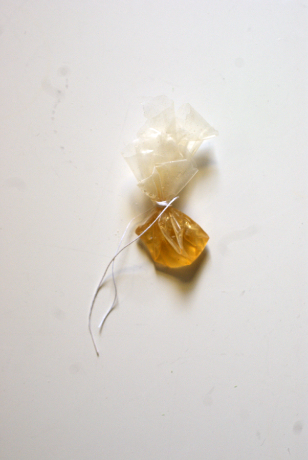
.oO THE PACKAGE

SONY DSC


Red Carpet Culture


Tuesday, November 25, 2014

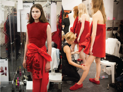
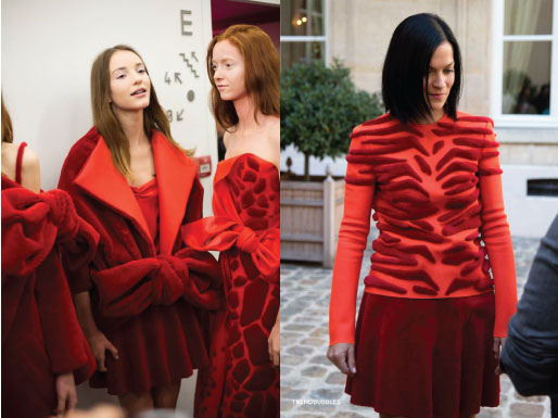
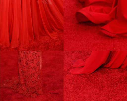
According to Oxford Dictionary, red carpet is ‘A long, narrow red carpet laid on the ground for a distinguished visitor to walk along when arriving.’ This dictionary also proposes one idiom related to the red carpet – red carpet treatment. This idiom is used ‘in reference to privileged treatment of a distinguished visitor.’ Viktor&Rolf’s Autumn/Winter 2014 collection meet that definition au pied de la lettre. This Amsterdam based duo literally made the dresses from the red carpet.


web_1


Viktor&Rolf took part in The Future of Fashion is Now exhibition at Museum Boijmans Van Beuningen in Rotterdam with two of their collections; Autumn/Winter 2013 aka Zen Garden collection [x] and Autumn/Winter 2014 aka collection executed entirely in red carpet. Although the Zen Garden one was broadly exhibited, the second collection made a bigger impression on me. Two white figurines with two dresses and two pair of shoes, all made from red carpet – that was it, quite decent display but perfectly contrasting to all glamorous world of red carpet. There was something magical about the material. Or maybe is it just something in human nature that we are subconsciously attracted by red carpet?


web_2


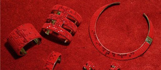
The designers found in a carpet manufacturer Desso a great partner for this collection. This Dutch company produced carpet without the usual rubber backing and also carpet with animal skin motifs, according to their words ‘shaved and laboriously hand-appliquéd carpet, which takes up to 300 hours per look to complete.’ The clothes were wrapped around body and a little bit resembled bath towels from afar. Dresses were accompanied by jewels and shoes made in the same style.


rc_9


Collection was initially presented in Paris, obviously on the red carpet, followed by a rhythmic clapping song [Video]. This presentation is worth watching. Viktor&Rolf themselves describe this collection as ‘a meditation on a current obsession.’ Are we actually a society obsessed by a red carpet? Are we a red carpet culture?

I have never realised that such thing as a red carpet can have a rich history. It was first mentioned in the play called Agamemnon, written by Aeschylus in 458 BC. In this play, the main character returns home from Troy and is greeted by his wife who offers him a red path to walk upon. However, Agamemnon, knowing that only gods walk on such luxury refuses and says: ‘I am a mortal, a man; I cannot trample upon these tinted splendors without fear thrown in my path.’

People are no more afraid of walking on the red carpet. First of all, there were popes and heads of states. Red carpet marked the route they were taking on ceremonials and special occasions. Red carpet is now mainly associated and broadly used by celebrities and all VIPs glamour world. For those who are interested, exhausting and detailed history of red carpet is here. Bearing in mind Agamemnon’s story and the fact that red carpet is only for gods, I realised that maybe the basis is still the same but we changed our faith.

We can also consider the red carpet as the first marketing tool in the history of fashion. In the early decades of the 20th century there were the celebrities (actors and actresses, singers, dancers as well as members of noble families) who carried fashion impulses. Nowadays designers like to dress celebrities for red carpet events because their photos literally see the whole world. In this context we can understand Viktor&Rolf’s collection as a revolt against this trend.

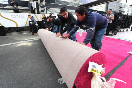
Nowadays, the actual event may seem overshadowed by the red carpet. Just look at this video of Oscar preparation – workers rolling out the red carpet and a huge amount of photographers and media in place to depict that very moment.


rc_3


It might be as well really stressful moment for celebrities in terms of perfectionism. All the world is watching every detail, manicure, hair, make-up, dresses, jewellery, manner of walking, everything. In the event of Emmy’s 2014, E magazine also prepared so called ‘clutch cam’ and ‘mani cam’ so the viewer could see every detail even closer. Walking the red carpet can actually be a nightmare. Celebrities might not eat for days or even weeks before the event. You can look at how many results you find when searching on google for ‘how to be red carpet ready’: tips on diets, workouts, pills and many many more.

We developed some kind of camouflage pattern for being invisible in the nature. Can we also be invisible on the red carpet? Viktor&Rolf dresses can represent one way of reaching invisibility but I searched for more examples where celebrities tried to disappear.


rc_10


I think that Viktor&Rolf caught really well this current obsession. Suzy Menkes, Vogue fashion journalist, expressed it in a good way: ‘two brilliant minds catching a sociological thread.’ [x] I can only agree with her words. Red carpet represents a new value of our lives. If we think about the idiom ‘red carpet treatment’ I have one suggestion for future. Maybe we will have real red carpet treatments. Covering our body with red carpet for certain amount of time will cure illness and give back lost self-confidence.


1-2-3-:^)


Saturday, April 5, 2014

ppp1


Jumping around through these images in Designblog,

back to essay this title ‘1-2-3 Jewel’ caught my eyes.

An essay about jewelry? Cool, lets check out.

Not only its pretty graphic design and pinky pinky makes you happy, the content is really good.

For me hand made jewelry is unique, you can feel so much more than mass manufactured accessories.

And it’s always a great gift option for special occasions.

It’s so nice to read about the graduates, after spending so much time in Rietveld and staying in the Jewelry department.

What is their understandings or maybe personal relationships and reflection on jewelry.

To see how they find their own way through different approaches, experiments and observations,

finally to see where they are standing now.


ppp2


Are you an artist or a craftsman?

Are you making wearable jewelry or object for contemplation?

Does it matter? Does it not matter?

Sometimes I pass their department several times a day when I have to go to workshops,

then I start to guess how many people are working there on their table now:

Glue, hammer, burn, bang bang.

Pretty in color and form. Another jewelry is born.


ffff


Wendingen as Layout and Form


Wednesday, April 2, 2014

[X]

One of the most immediate impressions one has of a Wendingen publication is of the format. It is ironically a very stout and conventional square shape, while not being a standard Din format. This is obviously a considered format, one which was chosen so as to fulfill a specific requirement. Similarly, once the publication is opened, the considerations of lay-outing the page as well as the type, is as immediate. The shortening of the printed area of the page reverts the visual shape of the page back to a more common rectangular format. The lay-outing of the type too is interesting as it plays along a similar functionality. With colour fields being constructed from smaller sets of shapes aligned together. This back and forth in format and form is something that may be interesting to play with on a digital platform such as a a basic webpage, where format differs from screen to screen, and browser to browser. Although this is fairly standardized, there is some variation. The lay-outing of individual elements in HTML then allows for a chance to reformat the page as desired by the user. While this is in no means a finished or particularly useful webpage, a more playful and relevant investigation into these issues is at least a potentially good starting point.

ON DESIGN EDUCATION


Thursday, February 6, 2014


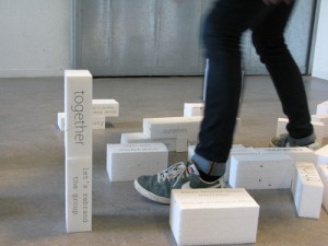
The bricks manifesto is a collaborative version
of ‘this is (not) a manifesto’ to bring people together
to discuss their education vision during DDW 2012.9

tumblr_inline_ms8phbzUvw1qz4rgp


UnBornLab
Presented at the graduation show of the Design Academy Eindhoven during Dutch Design Week 2013, UnBornLab is a masters project, initiated by Eugenie de Lariviere, looking at design education from a design student’s perspective.

It was important for me to understand education from my own perspective; as a student and a designer.
Mixing both a field research on a local level, and an academic research on a more ‘global level (that is the European level)I felt the need to always bring the theoretical part into practice, by organizing workshops, discussions, lectures, interviews (etc), in order to grasp an understanding of the big notion that is education.

One way to do so was to analyze how the system functions. I was able to get an overview of it by breaking it down into four ‘elements’, which together, represent the main ‘pillars’ forming our schools. These four elements being; community, structure, content and environment, the interactions they have together shapes the different academic institutions we know of.

(For example: Structure = Content implies that if structure makes content, it induces a top-down approach of knowledge, raising the question of knowledge accreditation, knowledge hierarchy, as well as of formal vs. informal knowledge. Whereas Content = Structure implies that if knowledge forms structure it leads to a more bottom up approach of producing and sharing knowledge for example; crowd source and open source systems. The same goes with structure = community vs. community = structure and so on.)

To communicate the concept clearly, I visualized these methods of the ‘four elements’ by quickly sketching them into volumes. It was once again a means of bringing the theory into practice by giving shape to the research. Making it physical also enabled me to reach people who did not feel strongly about the subject.

COMMUNITY-CONTENT_redu CONTENT-COMMUNITY_redu

Community = Content  vs.  Content = Community


Following on the idea of ‘rethinking’ education from a student’s perspective, I chose to look further on recent shifts in the relationship between ‘content’ and ‘community’, focusing on students as the bearer of contemporary knowledge.

With the faster availability of information the world is transforming at a greater pace and students are often proven to be quicker to adapt to these changes, may they be social, economical, political (etc). The content they bring in the school, as an addition to the curriculum, comes to show more applicability regarding the world they evolve in. In this process, schools go from being knowledge distributors to becoming intermediate spaces where a dynamic cross-pollination of knowledge happens.

The UnBornLab functions as an experiment to document students’ working processes as the basis for renewing design curricula.
The first step of the project was a blog to bring student’s current research (in this case their thesis topics) outside of schools.

DAE-BLOG

DAE Masters Blog


Believing in the importance of students’ self-taught expertise as a school’s temporary knowledge, the idea evolved in the motivation to create a dynamic archive of this knowledge by building a self-generating library of past researches.

Through a series of short video-interviews students present their work, focusing on the research rather than the outcome. Considering students as temporary ‘experts’ of their subjects, the videos can be seen as short introductions on given design topics. One topic leading to another UnBornLab intends to be the start of a dynamic knowledge database of ‘UnBorn’ designers.

UnBornLab_siteS_screenshot


A shallow look into Intentional Stance


Sunday, December 8, 2013

Intentional Stance presents works by ten young artists who conclude their two-year working period at De Ateliers.
Intentional Stance,
published by Stichting Ateliers 63

‘De Ateliers, established 1963, is an independent postgraduate artists’ institute led by artists. New talent from the Netherlands and abroad is given the opportunity to work in a spacious studio, with the support of a grant and the critical feedback of prominent artists and critics who make studio visits weekly. A working period lasts two years.’

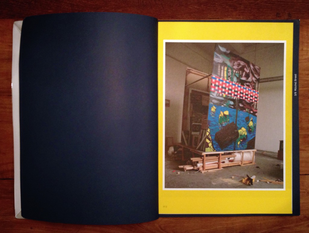
‘Intentional Stance’ presents works by ten young artists [Eric Bell & Kristoffer Frick, Fritz Bornstück, Mitchel Breed, François Lancien Guilberteau, Fiona Mackay, Saskia Noor van Imhoff, Emma van der Put, Laurens Stok and Amanda Wasielewski] who conclude their two-year working period at this internationally acclaimed postgraduate artists’ institute (De Ateliers 63) at the summer 2012 exhibited between 23.05. – 03.06.2012 in the exhibition curated by Bojan Šarcevic.

The publication is very much like an exhibition. The cover itself lists the names of the artists featured inside, the name of the publication, dates of the actual exhibition, the above mentioned institution and its location. All this would come across as rather informative, in my opinion, if the cover wasn’t done in only one color. Nearly the whole publication is printed on a dark blue heavy-weight paper.

When you open the book, a leaflet falls out.On the inside the publication is explained much like I just did here. There is also a floor map of the exhibition that took place in 23.05. – 03.06.2012 and short descriptions of each participating artist.

Each artist is given a spread to ‘exhibit’ his or her work. Each spread is the same dark blue as the cover with nothing printed on it except for the number and name of the artist. Instead of print on the pages themselves, each spread comes with a two-sided print the size of a poster showing the artist’s work. Needless to say these prints are another work by the artists.

The publication has a sturdy binding which, after a brief research, might be called the over sewn binding. The size of the book is roughly 34.9 cm by 27.3 cm, with these measurements it falls in between formats Quarto and Folio. It gets close to the paper size B4, as well.

What attracts me is that the publication was done in collaboration with the artists. It creates a tight relation between the content and the publication. It is not only a publication but also a piece of art. What I find interesting are the posters in between, one gets closer to the work when it is possible to hold and even replace in another context. The design creates a space of its own.

Other aspects that attracted me with this publication were the dark blue color, the size and the heavy-weight paper. All of which are personal weak spots of mine when browsing books.

The book was designed by Merel van den Berg and the artists. As far as I got with my research about van den Berg, it seems she has worked with combining posters and publications. Based on this, rather direct parallels can be drawn.

Little do I know about designing books, but to me it seems that this publication is a typical art book and, I would say, trendy with its simplicity and very careful, ‘designy’ look.

The publication is accompanied by a website, which is more or less just another version of it.


Who made the publication?

Entries: Dominic van den Boogerd in collaboration with the artists, Marlene Dumas and Simeon Cieslinski
Photography: the artists
Design: Merel van den Berg, the artists
Print: Drukkerij Raaddraaier
Website: Joel Galvez
Website photography: Gert Jan van Rooij, the artists


Rietveld library catalog no: 705.9 ate 5

Ecosophical Roadmap


Friday, August 30, 2013

intro

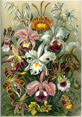
Haeckel_Orchidae

“The drawings in Kunstformen Der Natur express Haeckel’s fascination and devotion to the study of nature. Haeckel himself described his fascination for the world he was investigating, mostly referring to his main discovery, the Radiolarius [x], a single cell organism discovered in the depth of the ocean.
“It’s hard to believe that these creatures are single cells, some are like grids, broken nets or stems, others like tiny balls, helmets or bells when others appear to us like tender houses, windmills, fantastic towers.”

These words reflect on how much the artistic impulse of Haeckel seemed to have taken over his wish to be perfectly accurate and neutral as a scientist. His drawings are projections of real observations but they are as much projections of the inner interpretation of the artist’s vision of reality. Kunstformen der Natur was a way for him to unite these two projections in a single work. He by doing so “began to see not only the outer forms but also the inner content, the nature and the history of things”. He’s been trying to see nature as a “single unfolded work of art” by trying to understand the sequences allowing the Radiolarius to be present in such a multitude of forms. By doing so he achieved an astonishing body of work that can be seen as a suspended moment in time, a witness of this wish to leave space enough for observations and fantasy in a single picture. Following Goethe’s attempt to present nature in its diversity and trying to find unity in it at the same time, Ernst Haeckel created hybrid specimens that reflected on his subjective way to create the marvelous and the poetic in order to try to decode the genesis and the evolutionary systems of nature. That lead him to coin the word “ecology” itself.”

Excerpt from “The Curious, the Marvelous and the Particular”
(thesis by Rudy Guedj can be downloaded as pdf at the end of the article)


roadmap

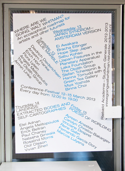
By exploring the potentialities of ecological worldviews, old and new, through theory and art, WHERE ARE WE GOING, WALT WHITMAN? seeked, to accelerate, accumulate, animate and activate our poetical and political understanding of the world. (Introduction of the Studium Generale 2012-2013 “Where are we going, Walt Whitman? An ecosophical roadmap for artists and other futurists”)

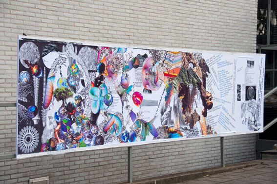
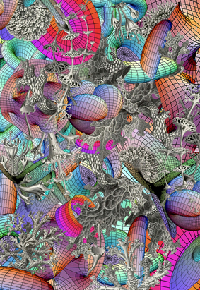
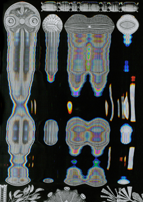
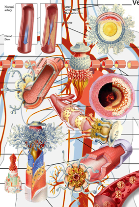
The visual campaign for the Studium Generale — designed in collaboration with Sophie Rogg, Olya Troitskaya and Martin Huger –all graduates from the Graphic Design department in 2013— revealed itself progressively. It was trying to both map knowledge acquired during the past lectures, and project on a fictional level thanks to a visual pollution which was growing exponentially on all the mediums we used.

billboard1

The first layer of the campaign, the map, was created before the Conference-Festival as a simple topology arranging references into a single spacial representation. Day after day, the basic map, as all the different supports we used to communicate with, was taken over by a visual infection.

DSC_0030

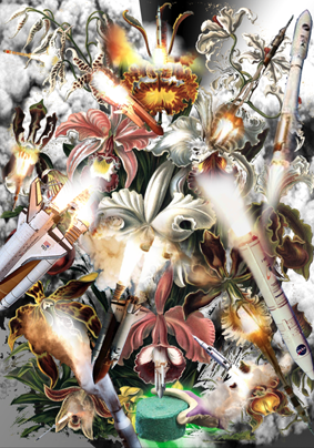
The creation of each of the collages has been realized as a reaction to the existing publication Kunstformen der Natur (Ernst Haeckel, 1899-1904). These bold interventions on top of the existing drawings shaped a fictional journey throughout the campaign and provided endless interpretations of the very broad topic of ecology today.

Collage_Orchidae calabi-yau-2 poster_3 Haeckel_Kunstformen_Page_065_2
< illustrations Rudy Guedj, Sophie Rogg, Olya Troitskaya and Martin Huger >

“A welcome pendant to the overload of terms and theory is the online Ecosophical Roadmap: an ongoing encyclopedic exercise accumulating (visual) footage that inspired the speakers. (Ecosophical Roadmap) I dare say this experiment is the only contribution to the Studium Generale that practices what it preaches: it actually embodies our way of interacting with the material world, mediated through technology and immaterial digits.”
From : Metropolis M (online reviews)

DSC_0110 DSC_0127
< Studium Generale poster, physical translation Roadmap >

The online roadmap was a way for us to respond to the immediate and ephemeral format of the lecture by gathering notes and other references mentioned during the discussions. It functions today as a remaining archive, an attempt to visualize the many connections that were progressively built up and to emphasize on the important role that plays serendipity in our daily use of technological medias.

text by Rudy Guedj [graduate student department of Graphic Design]

thesis


Pdf-icon Download my thesis: ”The Curious, the Marvelous and the Particular“


Brooch : Absence, Function & Contemporary Jewellery Practice


Thursday, August 29, 2013


he-jing-brooch-2013-7


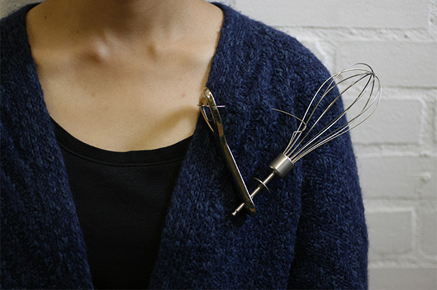
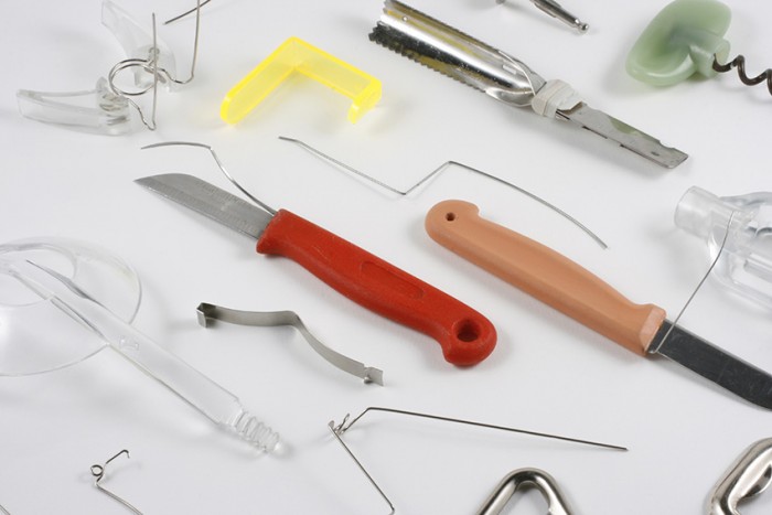
My graduation work called ‘Brooch’ stems from my study in structure of brooches and daily objects. I am interested in the relationship of forms and functions in mass productions; how the form appeared because of function but not only aesthetic. I was wondering how they work and how people use or misuse them. During the research I questioned what jewelry can be and its characters, and compared jewelry with other ready-mades [x].
My practice has combined these daily objects with jewelry, focussing on the tensions between “sense and nonsense, “usefulness and uselessness”. I was observing every details of the objects, and in the mean time, I was observing my reactions to them. I saw my works as results but not answers of this process, which included remaking, testing, running, repeating and failing.
I take jewelry as a way of asking questions instead of giving answers, I hope people wear my works and question them, maybe even misuse them, or be questioned by others.


brooch8
Brooch by Jing He /photography DAN/NAD


My practice on jewelry is focused on the relationship of the human body and daily objects. I questioned what jewelry can be and its characters, observing and experiencing the function of objects, and comparing them with jewelry. The central interests in this are tensions between ‘sense and nonsense’, ‘usefulness and uselessness’. What I did was to focus first on the structure of mass produced products; how the form appeared because of the function and not he aesthetic. Then I explored how jewelry, as part of people’s daily life, resides at the edge of usefulness and uselessness/function and aesthetic, analyzing the special character and dilemma of jewelry makers. Finally I related my findings to the practice of the contemporary jewelry field.


post_card_2clean


In Chapter 1, I mainly referred to the philosophy of Laozi and Martin Heidegger: the absence and function of objects, the different structures and usages between jewelry with other practical objects.
From Heidegger’s essay ‘The Thing'[x], I found the handle of his example of the jug interesting. In my opinion, the character of the jug’s handle has similarities with jewelry. In addition, I described and questioned my own jewelry practice, and how I discovered “absence”.
In Chapter 2, I studied similarities and differences of the jug handle and jewelry. In the contemporary jewelry field, I provided examples, referred to Jacques Derrida’s idea of supplement, and questioning the meaning of jewelry.
Jewelry is not only about the creation process but also the viewing experience, thus in Chapter 3, I compared paintings from ancient China and Italy, and discovered a new way of viewing image and jewelry. I proposed the idea that jewelry is seen out of the corner of once’s eyes.
In the end, I refocused on the absence of objects, and added how people misuses daily objects, and a few pieces of art. I believe that jewelry making can originate in the idea of combining different absence parts from objects.

text by Jing He [graduate student department of Jewelery] he-jing.com


Pdf-icon Download my thesis: ”Absence, Function and Contemporary Jewellery Practice“
 

Woman of the Shreds


Thursday, August 8, 2013

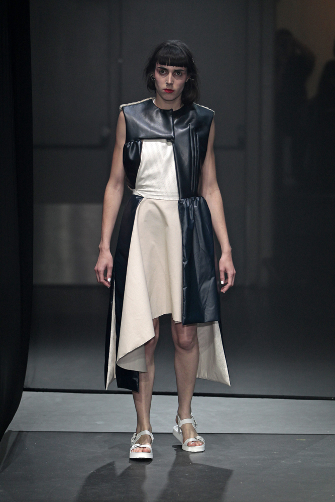
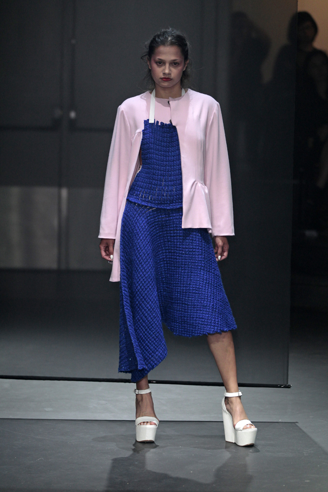
My thesis “Aufarbeitung” [reprocessing] is based on a historical research on the influence of economical and political crises on fashion and clothing production from a German perspective, says Verena Michels (fashion graduate 2013). My investigation aimed at finding answers on “how can I be a pro-active designer in the current crises and turn shortcomings into innovation? This theoretical research was the starting point for my garment collection.

© PETER STIGTER  FILENAME IS DESIGNERNAME RIETVELD 2013 GRADUATES © PETERS STIGTER RIETVELD ACADEMIE 2013 EINDEXAMEN © PETER STIGTER  FILENAME IS DESIGNERNAME RIETVELD 2013 GRADUATES

photo's Peter Stigter


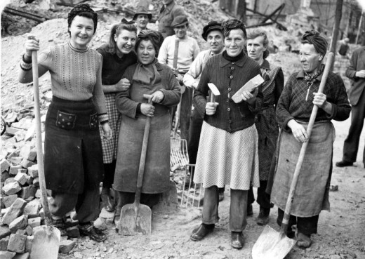
trummerfrauen The icon of my collection is the so called “Truemmerfrau” (woman of the shreds): former housewives who were empowered and emancipated through physical labour in post-war Germany during the years of restoration. It was a period of hardship and material-, clothes-, and food shortcomings that encouraged black market and innovation through necessity.
When comparing that situation to our current crisis, I find a paradox: the European financial crisis is characterised not by a shortcoming but by an overload of materials, clothes and food, and what we lack are values, work ethics and a definition of what defines quality in times of mass production and over-consumption.
I decided to look for the answer by researching “material”. After experimenting with dust, lint and fabric leftovers, I chose wool as my main material. It is a highly relevant material for me because of its rawness, because it comes directly from nature (sheep, alpaca, goat), protects our body, keeps us warm, and doesn’t need to be washed. I decided to use wool in a non-conventional way, and put it in a context other than knitting.

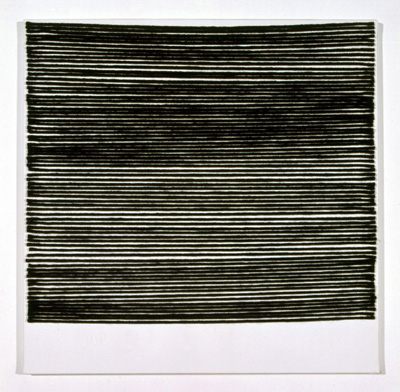
COVER Rosemarie Trockel wool painting
Rosemarie Trockel wool on canvas, Dark Threat 2 2010, Syz Collection

Inspired by the wool paintings of German artist Rosemarie Trockel who transferred wool from the female household to established art galleries, I developed a new textile. This material is flat, structured, and requires only the exact amount of yarn without waste. It can be produced at home with a household sewing machine. The simplicity of the technique allows me to share it with friends and to collaborate. This can be a relevant starting point for making production communal and local again. I see it as a contemporary translation of the post-war DIY culture and hope my idea inspires others.

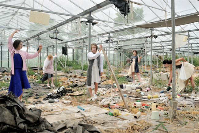
Screen shot 2013-08-08 at 12.13.23 PM

photo by Lutz Bauman

My collection book is an archive of visual research, notes and ideas, documentation of material and form research. It includes two chapters of my thesis and a photo series of the end results. The photo shoot took place at KOBOR, the wool store of Koos Koopman who buys yarns from bankrupt companies or factories that produced too much, and sells it at a fair price.

text by Verena Michels [graduate student department of Fashion] : more verenamichels.tumblr.com


Pdf-icon
Download her collection book ”Treummerfrau“, [woman of the shreds]

Pdf-icon Download the thesis: ”Aufarbeitung“, [recollection]
 

Orthogonal Allegory – the reality of architectural plan drawing


Friday, July 26, 2013

In this essay not only does the plan delineate (describes) the basic ‘syntax’ of a building, but it also creates a reality on its own; through allography the plan creates an allegory. This thesis won the 2013 Rietveld Thesis award


The floorplan takes a peculiar position in architectural creation. As a notational device, it translates the conception of a built space to a graphical code. The form of an orthogonal projection of a building abolishes the illusion of space, it excludes exactly the elements that are elementary to architectural expression, “light and shade, walls and space.” Le Corbusier, Towards a New Architecture.
Scan 2
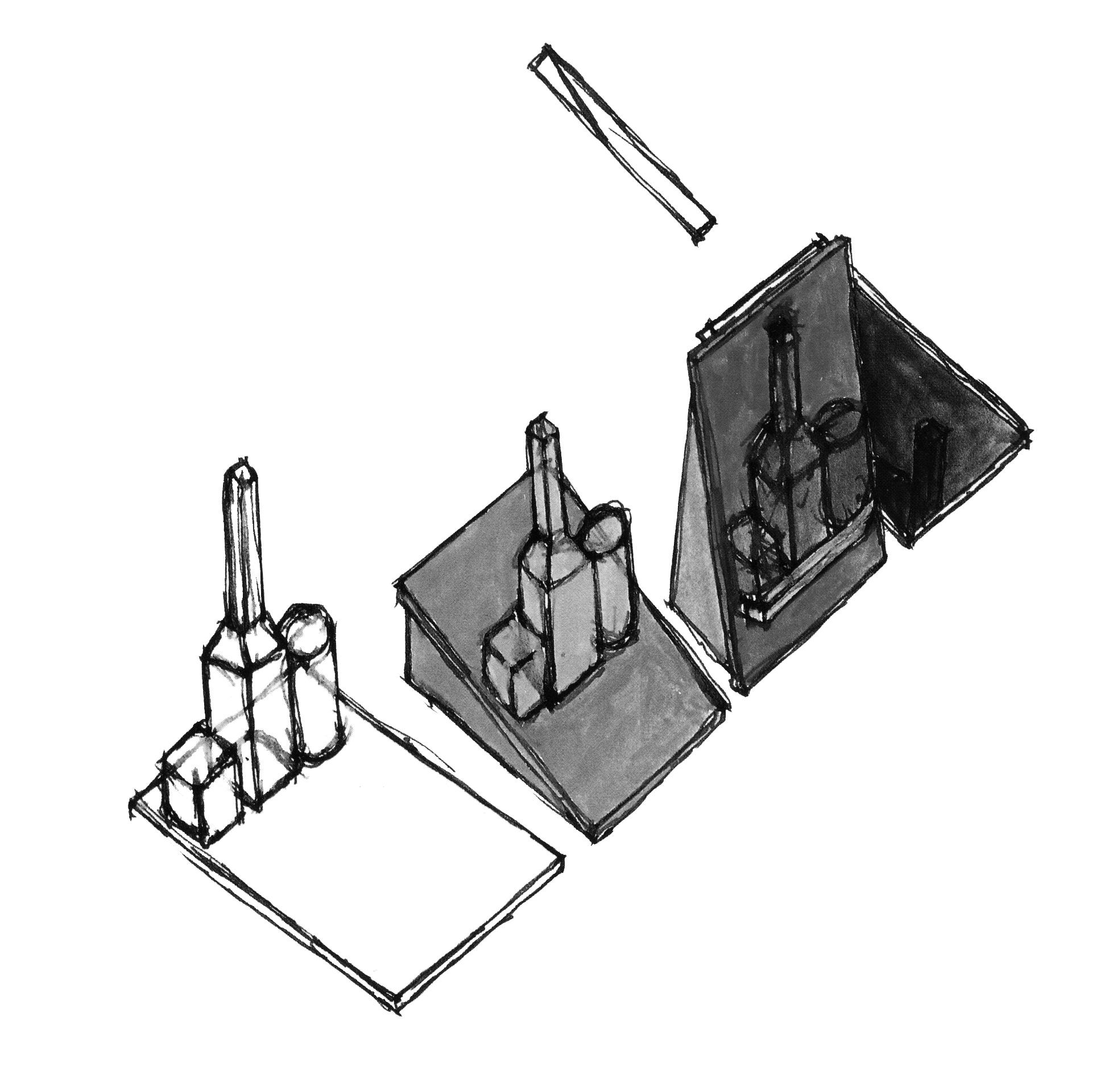
John Hejduk Still Life Museum / Museum for still lifes, could it be possible for the architect to take the natura morta of a painting and by a single transformation build it into a still life?

First and foremost architectural plans are a tool for instruction and documentation of a building process, but the graphic compression of a spatial idea creates a reality on its own. The plan equally takes part in other disciplines, painting, literature (think of Alain Robbe Grillets Jealousy), as it does in architecture.

chamberworks III-H
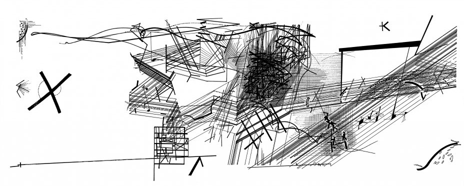
Daniel Libeskind, Drawing from the series Chamberworks, 1983, Chamberworks, carries in its title the notational character of the drawings, the form of their conception of space.


The planar form of representation is able to develop architectural problems independent from the construction process. It writes a text, different from that of the building, though in an indexical relation they contain each other. The factual information given by the plan creates a metaphor of the building through decisions made in its form of graphical notation, the format of drawing enables architecture to incorporate and appropriate parts of other disciplines, literature, philosophy, painting. The foundations of casual literacy are different from those of architectural, spatial literacy. In John Hejduk’s Architecs wheel the history of literature stands of the same level of elemental necessity, as that of construction materials, forms of depiction and building elements. Still, a plan is bound to an indexical relation towards reality, but it narrates a different story about the building it depicts, just as the story of the building differs from that of the plan. In its abstraction, the plan creates a Sinnbild (symbol), ideograph, allegory of the building.

DP109642
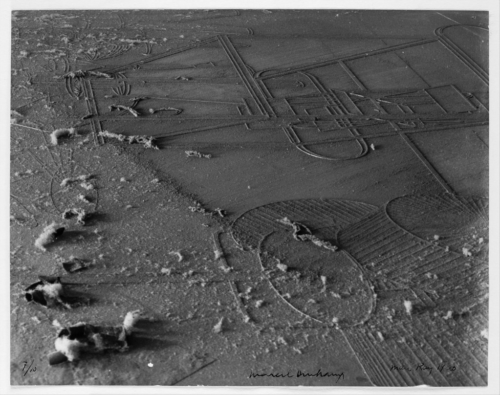
Man Ray, Dust breeding, 1920, Duchamps 'Large Glass' metaphorically turns it into a huge landscape, a pictorial setting.


The text formed from a logic of graphical signifiers, line, plane colour, typography, delineates what a building is about it a two-fold way: Syntactical, as the composition of spaces, and theoretical, as the Weltanschauung (philosophy of life), a complex synthesis of philosophical, religious, social beliefs. In that sense, the architects wheel is an archetypical plan, containing Hejduks complete vocabulary, a model for his architecture, for the narrative of basic shape, rather than a concrete building. Every plan evokes the world in which that building exists, the possibility of a space, just like every lie creates the world in which it is true. The plan formulates principles of grammar, methods of thinking and working, it integrates tectonic space and form and human experiences and conditions that comprise our existence and thus it is essentially philosophic.

dubai_masterplan2
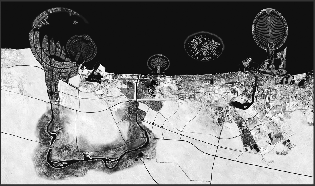
Dubai Masterplan, “It was the precision of my memory which enabled me to demystify the imaginary quality of the dream: surreal and real became interchangeable metaphors.” Raimund Abraham, the architects dream, 1983

text by Anton Stuckardt [graduate student department of Graphic Design]


from the jury rapport: In ‘Orthogonal Allegories, the reality of architectural plan drawing’ Anton Stuckardt has tackled the difficult subject of how the three-dimensional form is two-dimensionally represented. Still Anton manages to make the subject understandable in a very intelligent way and the thesis shows that he is a sharp thinker. The jury also found it to Anton’s advantage that he took his own interest in architecture, and connected this to the field of graphic design. Overall the thesis was compact, powerful and well written with good illustrations.


Pdf-icon Download this thesis:

Orthogonal Alegory – the reality of architectural plan drawing.


Over de kunstenaar die een detective wilde zijn


Friday, July 12, 2013

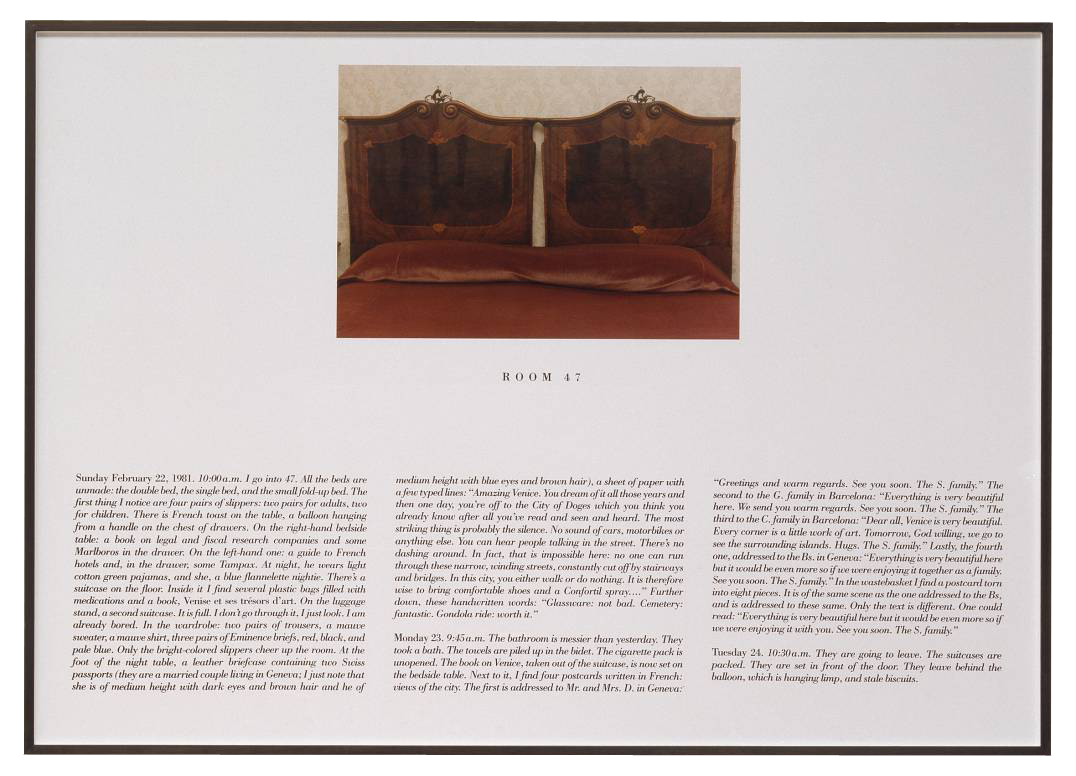
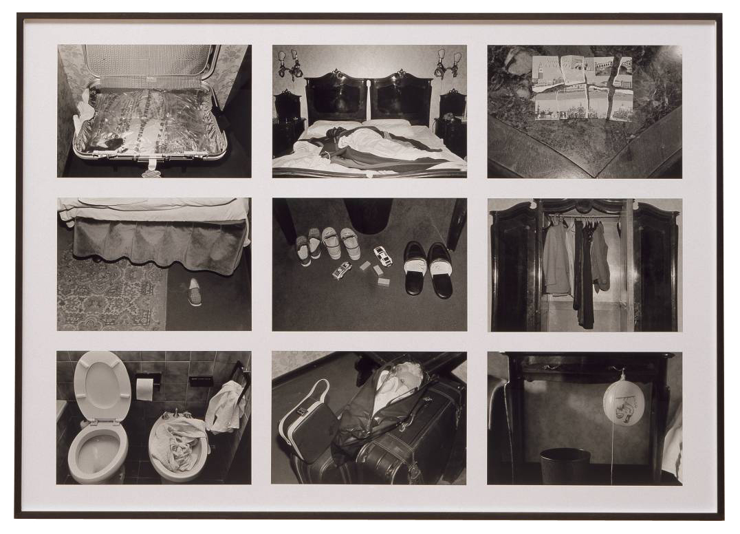
The Hotel, Room 47 1981 by Sophie Calle born 1953

In L’Hotel (1981) neemt de Franse kunstenares Sophie Calle tijdelijk een baan aan als kamermeisje in een Venetiaans hotel. Ze krijgt 12 kamers toegewezen, die ze gedurende enkele weken zorgvuldig moet schoonmaken. Tijdens haar werkzaamheden documenteert ze de voorwerpen die de gasten in hun verblijf achterlaten. Ze fotografeert de bedden, die soms niet eens beslapen zijn. Ze opent de koffers, bevoelt de zijden stropdassen. Ze leest brieven, die niet aan haar gericht zijn, en maakt aantekeningen van wat ze in de badkamers aantreft. Ze documenteert alles wat de gasten in hun kamers achterlaten. Als een ware detective onderzoekt ze hun levens.
De foto’s en teksten die Calle maakte tijdens haar werkzaamheden als kamermeisje, publiceert ze later in de serie L’Hotel. Met dit werk maakt ze het publiek deelgenoot van haar voyeurisme: ze biedt de toeschouwer een intiem kijkje in het leven van de hotelgasten.

The Hotel, Room 47 1981 by Sophie Calle born 1953

both images : Sophie Calle, The Hotel, Room 47 1981, © DACS, 2004

De kunstenaars die in deze scriptie behandeld worden gedragen zich net als Calle als een detective. In hun werk nemen zij het leven onder de loep: ze verzamelen informatie, onderzoeken deze zorgvuldig en komen vervolgens tot verrassende ontdekkingen. Aan de hand van het werk van onder andere Douglas Huebler, Hans-Peter Feldmann, Arjan de Nooy en Hans Aarsman, wordt in deze scriptie ingegaan op de overeenkomsten en verschillen tussen de werkwijze van de kunstenaar en die van de detective.

text by Rosan Dekker [graduate student deartement of Graphic Design]: www.rosandekker.com


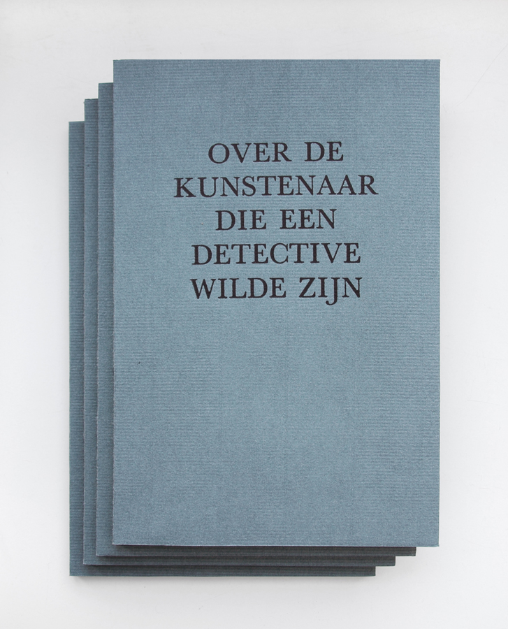
From the jury rapport : The jury found the carefully designed thesis of Rosan Dekker, which looks like a poetry booklet from the early twentieth century, very charming. Scriptie - boeken - Rosan Dekker - Detective_small But the jury was also impressed by the content of the thesis. In her thesis Rosan investigates what we can learn from the artist in the role of detective. Rosan shows in a well-written narrative that the artist should be a detective that asks the wrong questions and takes up the false leads to get the best results. The jury has found that Rosan's is the only thesis that shows good art criticism in that she is not afraid to take in a position and defend it. [thesis nominated for 2013 Rietveld theses prize]


Pdf-icon Download this thesis: Over de kunstenaar die een detective wilde zijn [dutch language]


Log in
subscribe