To continue my research (read also my intro), I decided to learn more about other neighbourships in which clay furniture was involved.
There exists a set (clay classic, plain clay, and clay specials) of clay furniture and different elements of it have been exhibited in different museums of the world (you can read about another series by Maarten Baas that really comes in contrast to clay furniture in Maud’s research).
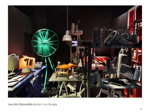
In Musée des Arts Décoratifs four rooms were stuffed with different objects designed by the artist. Clay furniture was also there. All these objects put together create an interior and can hardly be perceived separately. They create an atmosphere of a storage room or a flea market. Put so close together so that each object can hardly breathe they lose their individuality and become parts of one slightly absurd impression which he called “curiosity cabin“.
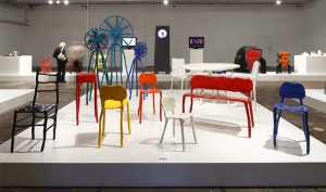
Another stop of the clay furniture’s adventure was the Stedelijk Museum of ‘s-Hertogenbosch. There they were exhibited with other kinds of furniture designed by Marteen Baas placed on a thick white pedestal. Such placement made it look like a warehouse or furniture salon.
Comparing the three exhibitions (Stedelijk Base, Musée des Arts Décoratifs and the Stedelijk Museum in ‘s-Hertogenbosch) I started to pay more attention to the space as one of the important factors of impression we get of these objects.
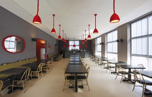
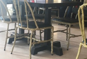
To explore how else the clay furniture of Marten Baas interacts with different spaces and objects we went on a journey to Groninger Museum in Groningen where this furniture really became a part of the space. There you can find a restaurant designed by the designer and furnished with his clay chairs. As soon as you enter the museum you can see rows of black tables surrounded by green clay chairs with black pillows.
If you look up you can see red clay lamps lighting the space. If you look at the wall behind you there is an oval mirror with a red clay frame. For people with little children there’s also a red children’s chair standing in the corner.
Being a part of a functioning restaurant the designer furniture faces the most challenging neighbourship – people. Putting design objects into public use creates certain difficulties. You have to follow two opposite tasks at the same time: to protect the piece but still make it usable in everyday life.
And here are some of my observations:
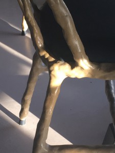
1) Black tips on chair’s legs
After a closer look, I noticed that unlike the chairs in the museums the chairs at the restaurant have these black caps preventing the actual material of the chair from touching the floor. Even though it doesn’t catch your attention, at first sight, it slightly changes the general look of the chair.
2) Pillows instead of clay seats
Instead of clay seats of the classic clay chairs, the chairs at the restaurant have black leather pillows filled with some soft material. This modification probably aims to make it more comfortable to sit or to match the green coloured chairs with the black tables but it still changes the object.
3)Regular tables
One more thing that really influenced the overall picture was the fact that clay furniture (such as chairs and lamps) was placed in the restaurant with tables and benches of a different style. Maybe it was done to emphasize the clay chairs, lamps and mirrors in the space. However, in my humble opinion, this leaves the impression of the undone design, like it is halfway from being a restaurant designed by Maarten Baas and not a restaurant where apart from regular restaurant looking furniture there are also twenty 4.000€ chairs in one room. I think that if the set of the furniture would have been complete and all the tables and benches would have been made of clay it would have given a whole different impression of the space and the objects themselves.
