Skip to Content Skip to Search Go to Top Navigation Go to Side Menu


Archive for April, 2013


What does it mean?


Sunday, April 28, 2013

If you start a research without the desire to find anything does the result have any meaning? I think the purpose of this last research was to assemble all the pieces. Find a sense to this sometimes automatic, sometimes random, book hunting. When you are finally looking for the meaning behind your actions, I deeply think you actually limit yourself. Think about looking for the ultimate solution to all your trouble is probably one of the most stressing action. This time I walk around this books with actually no desire to find anything. Your eyes go around with this emotionless sensation toward the object you are looking at. Of course this is an assignment so I tried to respect the rules. Look for the words my other research led me too. I knew before entering this will be pointless.


Them let the meaning behind and let’s act past forward. The art section is now open to me. The first choice I ever did during this assignment is them accessible. And there is actually nothing that I can find today, which match more word in my head. This a book about Jacques-Henri Lartigues. This is a name I for long hear, but I could not related any image to it. And if during the past assignment the purpose was to describe our research, as a results it is here in the content that the sense appear. Why this book sounded interesting to me in the first place is quiet easy to understand. The name remind me of something. The tittle is french as well and probably could be link to some nostalgia i felt them. But if all the element are quiet random and actually boring the content offer an ultimate and unexpected resolution to the research.


Jacques-Henri Lartigues, have been an amateur photograph during all his life. From the age of 8 when his father offer the young boy, his first camera. The desire of taking image never left Lartigue. It is though only as a painter that he was well know during most of his life. The picture stayed a passion. An habits practice and repeat as an amateur. The meaning was kept by himself only.


The black and white image reveal a pure and simple beauty. Because at any moment this poet had no idea of the work he was making. It is as a “Flaneur” that he keep wonder around taking image after image out of the reality. There is nothing else to say from here, my choice might not been issue from the word it should have been, but the results couldn’t be more relevant.

But why to my eyes this is the case is not to explain. I discover trough a random research across words and envy, something I’m really glad to have in my hands. A piece of a life I never knew of. A unique expression of poetry as my eyes can read it.

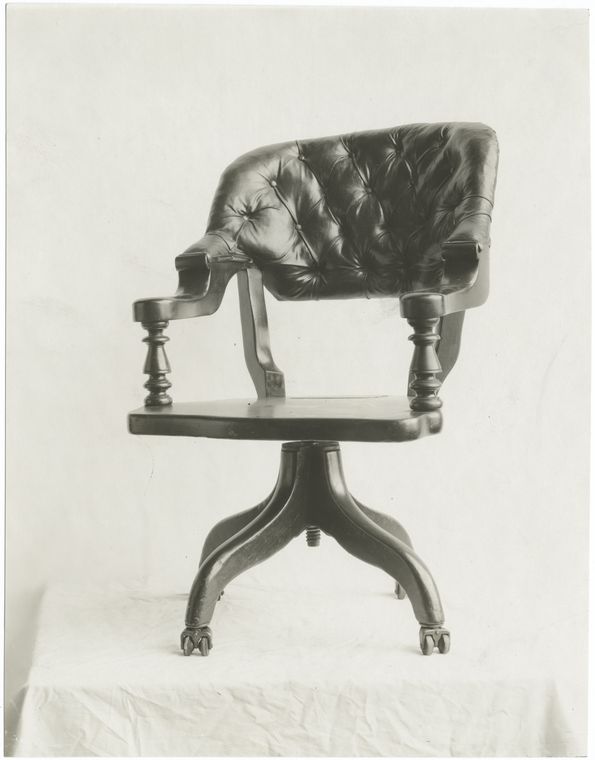
Rietveld Library cat.nr: 761* lar 2

Purple Rain


Friday, April 26, 2013

Purple Rain

I had to look for another book based on the keywords of 40 years of Chinese rock’n’roll. First I tried all my chosen tags. But nothing came out of it, so I just typed in Rock and then I got the title The art of Rock. I found the book easily. But the first thing I noticed when I actually saw the book was the weight of it.
The colour purple remind me the most of royalty and Prince. Maybe the two things go together. Prince has something royal in his way of performing. On the book cover the colour white turns into deep deep purple. The hair exists out of flames. If you look long enough you can read: the art of rock posters from Presley to punk. I saw the cover maybe 15 times but never saw the text into the fire hair flames. That’s some nice graphic art work! My first thought was that the man on the cover is still smiling with his head over his shoulder, but his hair is fire? Also he looked pretty pleased with himself. Most people whose hair is on fire don’t smile that cool. So is it sacrifice for being cool or is he just being stupid?

Tina Turner also smiling over her shoulder but with some more sexiness and joy. Wearing clothes that you normally don’t wear to the supermarket.

But then Jimmy Hendrix his hair turned into snakes.

There are some similar connections between these 3 pictures. But there are also other images on the back of the cover. I have to mention the rolling stones with the two falling dices poster. Because I have to mention them.

Rietveld Library cat.nr: 754.1

Rush into poetry


Wednesday, April 24, 2013

No time to wonder around

Only number this time

Tapping them down

Moving backward

I arrived to a section of graphic design. A few are matching the right number. Two are too small for contain all the letters. Two 75 where I was looking for some 758.3. They are small and easy to grab.

Seven hundres fifty eight point three

Seven

Five

Eight

Three

Two books in my hand

One efficient research

Go.

I barely open them. They are for sure about poetry. Which kind I don’t know. But apparently they are in Dutch, but that something to fins out later. I have two book instead of one.

Now it could be simple. Red or black. Stick to the cover and avoid a contact to the content. Except I already encounter the book in the library. As I was taking them my eyes went inside, turn the pages. My look inside change the way I see them now so why not dig a bit more into them now.

Transparent paper

Poem in construction

White page

Simple drawings

The visual take over the text. I’m confronted to a lovely sensation in my hand. But even through the graphic construction of the lines I don’t manage to read this text. It stays mute. Impossibility to relate to the language, the text loose his meaning. Beauty stay cold and lines unclear.

A world of lines

Symbole of black and white

Visual poetry of square

There is some words

Some birds

Animal by themselves

One dog fucked by a men

Juni 1991

Gerrit Rietveld Academy

The rest is up to you. A new journey is now open across the book. I meet see you along in between a deserted landscape and the sunset over my head as I swim in this ocean of poetry. See you later.

Rietveld Library cat.nr: 758.3 wee 1a

Materialization of thoughts


Wednesday, April 24, 2013

According to one of the tags I decided that I am allowed to search for a book only on the top shelves which made it a little bit easier for me. I could give to my search a better structure and can check every book from that area.
I set up rules for myself that the second tag has to be a part of a title of the book and it has to be written on a cover or it has to have any semantic similarity. My second tag is ‘living book’. I was thinking about something contemporary or something new but happening at the current moment. Or it also could be something which has any quality of living or alive object. A part of the title of the book I picked is ‘themes and movement’. I thought about living moving books and also the subject of the book is quite new for me. I have never been into this topic before. It did not attract me before. Recently I come across this subject all the time. I’ve never divide art according to these categories before for myself. I found this topic quite interesting at the moment. This book caught my eye and it was a coincidence.
My third rule was ‘relay or trust coincidence’. I opened the book some where in a middle and I discovered a picture of a naked lady sitting in the dust surrounded by rubbish. I did not have any doubts about my choice.
My search took about 10 min. Was it accidental or do we always cross over things which we are really into or do those thing find us?

Rietveld Library cat.nr: 708.4 rec

“The space for nude feet and the space for a stone”


Tuesday, April 23, 2013

A boring childish future?
A futuristic boring childhood?
A childish futuristic boredom?
the book “7th Biennale Internationale de La Tapisserie somehow came closest to fulfilling these not easy criteria. Or maybe not. It mostly fits the childish criteria, the cover has a knitted foot on it, very naive and silly. but still quite pretty or intriguing. boring I would say as well, because i find nitting really really boring. Im sure it can be used as a good medium and bring out exiting results, and it sure does in the book, so delicate and structaral a material, photographed in black and white, but however, the procces of knitting is to me quite boring. so kntting is definitley not gonna be my future. A picture that captures me is a picture of th ework by a polish artist named Hanna Jung. the work is called “Two spaces –

The space for the nude and the space for a stone”. In a room you have a delicate fur like cloud of fuzzyness as a gigantic bed overflowing the room on the floor, and above a lamp like shape of the same fuzzyness. almost touching eachother, but not quite. he work comes out so fragile but still so space consuming and i want to touch it. but its not even possible to find a picture on the internet. And im sure, because im really good at internetting. Its really as shame with work like this i think, that they only are documened in a dusty black and white book hidden between to much bigger books in the design section of knitting and fabric where you would never imagine to be drawn in to a magical white cloud of dominating light fur.

Rietveld Library cat.nr:779.2

These black hairs in my ass will soon be in Yours.


Tuesday, April 23, 2013

It’s a screaming gorilla. And it could be me.
Many times when the subject is discussed I really do feel like I’m another type of animal than the others around me. We speak different languages although it all sounds like English. I’m made fun of, I’m put in a gorilla suit.
The gorilla girl.
When I first came to Rietveld and discovered the lack of knowledge and interest I was stunned. The situation baffled me for a second before I realized how freaking much work there is to be done here.
The sleeves of my gorilla suit are rolled up and I’m ready to go to work. I’m a hardheaded one. Because I do it for You. I do it for Your grandma, Your sister, Your dad and the entire payroll of society.
And of course, for myself. The fucking gorilla suit is making me sweat. And sometimes I must admit that it brings out sides in me that are not the most flattering. Chest pounding is very powerful and expressive, but not always convincing. And to make people scared of the gorilla won’t help my cause.
Feminism. It’s a field of Science. Not my personal gorilla opinions. First lesson taught, right there.

Rietveld Library cat.nr: 708.4

The Spatial Brain


Tuesday, April 23, 2013

Entering my three tags in the search engine of the library didn’t lead to any results. At least, I hoped of course to find a book that was at the intersection of all three keywords leading to a publication that delt with designers of Asian witchcraft and mapping their whereabouts.

Fortunately I did find books with every specific tag; one on contemporary Asian architects; one on the map as art; and one on devils, demons, death and damnation. The latter of course sounded very inviting and it is indeed filled with the most fascinating gothic graphics of infernal punishment, public witch executions, demons riding to the Sabbath and Lucifer reigning over the souls of sinners.

On a lighter note, Asian architecture with the Zen-like attitude on dealing with space and the use of water -for tranquility and balance instead of drowning alleged witches- has a certain appeal as well.

But my eye can’t stop getting pulled to the last book of my pile, called “The Map As Art”. Cheating a little bit? Yes. This book is not from the Design department. But it sounds like it’s interestingly bordering on the edge of science, art and design. Cartography assembles scientific data in a technical way and models our reality as to effectively communicate spatial information. But then maps take on a life of their own. They may be worn out, damaged, have decades-old coffee or wine stains on them reminding of holidays or trips effectively pushed to the corners of the memory to make room for new ones. They may be folded so many times that crucial information is deleted, or have scribbles and writings on them that may be even more cryptic than the maps themselves can appear to be on first sight. These alterations seem to be lifted to a higher level in this book, making maps almost into fantastical designers of political landscapes, neighbourhoods and private spaces.

Rietveld Library cat.nr: 708.5 har 1

Inside the egg


Tuesday, April 23, 2013

I was searching for gold.

1988, the year before I was born.

I was searching for something that I could take a look at, pick up and say

“Yes, here is it. I’ve found it.”

Something to put on a shelf, inside of glass, something to be fragile and beautiful.
Or maybe heavy and beautiful at the same time. Like rococo is heavy. Or baroque.
Heavy beauty, when something is meant to be admired.
Money and gold. This thing with power.

When I was 8 years old my mother and my grandmother took me to see the exhibition of the famous Russian Fabergé eggs.
This exhibition got stuck in my memory somehow.

I remember the big rooms.
I remember the whiteness of the walls.
I remember the small glass cages where the most delicate, fragile things were put.
I remember my grandmother, my mother and me getting lost in the whiteness and all the beauty.
Like small animals in a bigger picture, circling around.

Then there were the eggs.
They were made of gold, silver, glass and something that almost seemed like air.
They were magical and impossible to touch.

Maybe it is also about this fascination with the exotic.
Beautiful creations, very far away from my reality.
This idea of something up there in the sky, out of reach.

Lately I have developed this fascination with Japan.
I don’t know what started it, maybe it was my friend who is obsessed with Japan.
Maybe it was just to have a fantasy about something.
I think about their delicate manners. I think about their delicate objects.
I see their patterns in design and art and I don’t understand them but I like it.
I look at Hentai porn, anime and all these crazy comic live shows and I am fascinated.

It is this idea of something, of a country, a people.
I construct it in my head.

I feel somehow that it is the same distance from me to Japan as from the jewelry eggs of Fabergé to me through those glass boxes where they were kept.

Rietveld Library cat.nr:

The Dark Side Of The Chair


Tuesday, April 23, 2013

It is funny and scary in the same time to which result I was leaded this time of researching by using the tags chair, history and portrait. The book is dark on the back and the front and shows an image of a chair, the unclear shape of a phantom which covering the shine of its own ghost, heavy and stiff but the best thing is the book is German. Another German book about the history of chairs and again the title of the book is making me to laugh again. “z.B. Stühle: Ein Streifzug durch die Kulturgeschichte des Sitzens” is for me as well absurd and funny as my first choice in the library “A Chair makes history”. This time the book introduces itself as a guide through the cultural history of SITTING, which I think is the most funniest and beautiful way to find a title to describe the history of a design object, which function is mostly to relax the human bag and ass.
As well as last time the image shows no longer a simple picture of a chair, it is almost again a portrait of a chair which you can find on the front cover of the book, but this time tis image becomes for me to something strange. While the last book I took had a really bright and sort of funny, colorful, cover, which was perfectly hanging together with the title, the book “z.B. Stühle” has a really dark and heavy appearance. Without the title and the text it could be misunderstood as a book about satanic rituals with chairs or dark spiritual experiences with chairs but not as a leader through the history of sitting. The title in relation to the book cover design is for me a big paradox. The title “z.B. stühle” which means “for example chairs” sounds really easy, like “let’s talk about something, for example chairs or trees” which is really well supported by the text below. It sounds cool and relaxed, while the book cover is dark and heavy and doesn’t represents coolness at all to me, rather an image of violent and brutal history, which might be also presented in the book, for example chairs as torturing instruments. All in all the most interesting point is that the tags which I used for the research are leading back to a book which is almost as well absurd in its appearance as the first book I’d choose about the history of chairs. It seems to be not easy to write or create a good or well-chosen title for a book about chairs without letting it sounding absurd.

Rietveld Library cat.nr:774.9

Ruler book


Monday, April 22, 2013

Distinction

Stand-out

Taste

Those were my tree tags from the previous book I choose when we had to write about subjectivity.As you may have read in my previous blog post subjectivity is all about your own individual personal interests and characteristics. When I had to choose a book at random and not by its content the thing that mattered for me and that made me chose that book was that the book was different and therefore it stood-out from the rest and of course your own personal taste is always an important factor.

This time we had to do the same thing, pick a book out of the design section at the library but with a different approach. We didn’t have to choose a book based on subjective criteria but we had to choose a book using the tags that we made for the previous book, so basically the things that defined our subjective criteria now became our objective criteria. So now when I entered the library and went to the design section my goal was to find a book that was distinct as in different from the others, it had to stand out and of course my own personal taste had to be involved, cause basically I have to like the book in order for it to stand out or then I would like it because it stood-out (so it is still a little subjective).


So there I was standing in front of the book shelves looking for book covers that were different then the rest, looking for a book with some kind of new fond that is not used often or for colored stuff that would grab my eye (cause allot of the books have common fond and colors). And then I saw a popping yellow plastic side cover with stencil printed letters, so I picked it up and then I saw something that I have never seen before. The cover was a ruler, it also had this cut-out letters and shapes like the ones old rulers used to have for you to “write’’ or more like fill in the letters. At that point I knew that that was the book I was going to choose this time, the popping yellow made it stand-out and the cover was certainly different. It’s a really nice book.

Rietveld Library cat.nr: 772.9

Book of Spells


Monday, April 22, 2013

The book I chose is of a faded sort of blue, and has the title “Bamboo” on its hardcover back. This back is graphically shaped as a piece of actual bamboo using shading and divisions. Like how you would see real-live bamboo in real-live nature.
The contrast with the blue, which of course in actuality it isn’t, drew my eyes to the book’s back I guess. Also probably since I was feeling very restless that specific afternoon and was more with my head in the sky than in the neatly organized library smelling of old paper and glue. On top of that it appeared old, and somewhat mysterious. And reminded me of when I was a kid and would always hope to find a forgotten book in the corner of the library that would have a map of a hidden treasure tucked away in it. I remember drawing those maps myself and hiding them in old books in my parents’ bookcase. Then I’d make myself forget, so I could stumble upon a forgotten map and could go on a treasure hunt. In my parents’ backgarden mostly. Or sometimes in the attic, where more secret passages could be created.

The typography of the letters “Bamboo” and in fact the word itself also reminded me of a book featured in a film I once watched when I was young. Probably around the same age as I was when trying to forget my hidden maps. It was about an apprentice-witch who lived in a big house in the English countryside and had to take in three children from London at the onset of WOII. The children found out about her secret practices and blackmailed her into giving them a magic gift. This gift was a traveling spell, to be used by turning a bewitched bed knob back on the bed in a specific way and speaking out loud the destination you would want it to take you. Eventually the witch and the kids used it to get to an island not to be found on any known maps; the isle of Naboombu. There, they would get the remaining words needed for the ultimate spell of the witch’s correspondent course in witchcraft, that of “Substitutiary Locomotion”.

Rietveld Library cat.nr: 772.5 aus 1

A boring future?


Thursday, April 11, 2013

This book came to my mind, first of all because it was small, and i already had a really heavy bag with me.
Further more, it kind of looked like an old schoolbook, all yellow and nothing fancy about it. The title is “basic typography”. It was probably trying its best to be very fancy at its time, who knows.
the text on it reminded me of the schoolbooks where you would have to follow the lines with your pencil in order to learn how to write the letters. a b c d e f g, and so on and so forth.
There was something quite calming about this childish first impression, and the faded yellow cover. Besides that, it also has strips of tape, preventing it from falling apart, which doesn’t help me thinking it could once have been very dear to someone, and made me feel kind of sorry for it. I don’t like the font much or the general design of the book but still it is appealing to me some how because its just seems so uselessly boring. the content of the book is served on a plate for the ready to eat, nothing hidden in there, and I am saying this without even opening it. Type fonts. its just the feeling I have. The subject is very geeky in my opinion, and indeed also the title “basic typography” But that is deliberately why i choose it. I would like to study graphic design myself which is also why i picked it. Will I ever find a subject like this interesting? Well maybe in a year or two, but now, it seems like a very distant and flat subject to me. Perhaps not typography in general, but definitely in this case. It just happened to appeal to the doubtful side of me that is about to choose a direction were covers can be so planned out and yet so horribly boring and non exiting.

Rietveld Library cat.nr:7.57.3

Touchable sound


Thursday, April 11, 2013

Are you dying to get your hands on a book? How you can choose the only one from thousands titles on the bookshop shelves? To search books by authors you’ve enjoyed in the past? Isn’t it boring? Look for a “Keyword”. Does it really work like that? Imagine that you are in the restaurant ordering a dish you’ve never tasted. What’s then? You can explore the ingredients, take a look at the picture. But still you can’t smell it or  touch it. With the book – it’s not the same, actually. Real book has it’s own aroma, touching feeling and the sound. That makes it almost a dish you can try before you order and pay.

Narrow down your stack. If you would rather have book 1 over book 2, put book 2 back. Keep doing this. If you would rather have book 3 then book 1, put book 1 back, etc. Try to feel the quality of paper, the smell of typography, touch it as you choosing a fruit or music instrument. Fall in love with it’s cover, play on it, feel it’s life. Deep sound from book’s cover will make you want to take this book to your hands again and again and again. And it will not be quietly collecting dust in your house.

Touchable Sound [audio:https://designblog.rietveldacademie.nl/wp-content/uploads/2013/04/MZ000006.mp3|titles=MZ000006]

Rietveld Library cat.nr: 775.2 vri 1

A Book Makes History?


Thursday, April 11, 2013

When I search for a book in a library or in a book store the design as well as the title of the book has to be eye catching, recognizable for me and outstanding in its own appearance between hundreds or even thousands of books, especially if I’m not searching for something specific and have to walk through an overwhelming sea of letters and information’s.
Therefore the title, the subject or the design of the book doesn’t have to be beautiful or about something I’m interested in, it could be anything from an absurd, paradox, nonsense title/subject to an extremely kitschy, not aesthetically attracted cover design. The most important thing for me is to not only recognize it in ways of attraction rather as well in ways of questioning the whole appearance, the first impression of it.
The first book that got my attention was the German book “Ein Stuhl macht Geschichte” from Werner Möller and Otkar Mácel, a book about different design chairs of an exhibition in the Bauhaus Dessau in 1992. It was not the subject which interested me; it was the title which first made me laugh. Normally I would connect the sentence “A chair makes history” not with a chair, something that makes history for me are people or certain happenings in the past history which are responsible for certain effects on our society or changing points in our systems of thinking or culture as well as political behaviors.  Of course I can see that the design of some of the chairs could have had a certain influence on a new way of living, a new lifestyle but I still see the title connected to a persona or a personification, a group of people or a movement which changed something more life essential than a chair (which mostly just changed something in the “history” for a smaller group of people). To be honest I think it was just absurd and funny for me to use such a personifying sentence for some object like a chair, which you basically use to relax your ass.
The Cover in that context to this thought was even more interesting, you can see on the front as well as on the back page black and white images of different Bauhaus chairs which have for me the appearance of old portraits of important figures of the human history, covered by a big black and white image of a Mies van der Rohe chair. For me that was definitely an interesting way of the personifications of chairs in context to the title as something historically important, almost holy, like the birth of Jesus Christ. I’m looking right now at the book and I’m still impressed by just the visual effect of it. I think it is the first time that I’m actually more interested in the cover as in the subject of the literature.

Rietveld Library cat.nr: 774.4-cat-20

Moral panic? No worries, there is a whole encyclopedia to help a filthy girl out!


Thursday, April 11, 2013

I had to swallow a bit of vomit in my mouth when I saw the cover with the title “Girl culture”. Raw quiche for breakfast was a good choice. And then the stupid pictures of: girls hogging a mirror to smack make-up in their faces. A little (girl)child in a fluffy room with bubbles and pink fluff and beauty queens.
How fucking stupid is that? Puke factor is high.
Girls do other shit than that, I thought. And then I felt a little bit better when I discovered a tiny picture of three girls in a locker room dressed in football gear.
Better, but not well enough. Because I flip the cover to get to the List of Entries. Scrolling down for my favorite two topics. As the girl I am surely they should be listed here, yes?
Baby phat
Backstreet Boys

Breast enhancement
Covering over
Dirty Dancing
Easy-Bake Oven
Fairy Tales
Fat Girl
Felicity
Filmmaking
Feminism? Nope.
And then I puke all over it. Damn it. All that raw quiche, took me a lot of time and love to make, wasted.

I scroll down.
Gilmore Girls
Hello Kitty
Innocence
JAP (Jewish American Princess)
Ken
Little women
Lopez, Jennifer
Madonna
Magazines
Moral panic
My little pony
Masturbation? Nada. “We rather put Moral panic in there”. Truly saddening. The way we’re obstructed, sub consciously, by images and mould by the power of words. Girl culture. With no equality nor sexuality. Ignorant and poor point of view.
Beware of shit like this coming your way. Because this was, as the title said, only VOLUME 2, there’s probably a VOLUME 1 out there too.

Rietveld Library cat.nr: 905.2

Amulet


Thursday, April 11, 2013

When I saw this book first time some one was checking it and considering to take it, which immediately attracted my attention. It happens to me some times. I asked that person If I could see it as well. When I opened first page I saw a fungus. It’s a glue got rotten. The book is broken, so you can see the glue between first page and the cover. The cover of the book looks quite boring and dirty. I made my mind. I fall in love with rotten glue. It is a palette from dark brown to yellow and beige with little crumbles and cracks. The same on the back side. I don’t know what happened there but I don’t see that often a pure life inside of books.

Pictures in the book are quite kitsch. Many of them I would say are very bad and cheesy. You are not really able to see a tittle of the book when you hold it first time. The tittle is Amulet. It is about jewelries. Jewelries are presented on the different parts of a human body inside  of geometric shapes. All the picture are taken on a way to make you think about vaginas and penises. The book has been taken from the library 7 times from 1993 to 2002. I guess it has not been opened that often. Probably it is a reason why the new life got born. It made me think about books in the third row on the top shelf at my parents house. Some of them will be never opened again. I am wondering what could happen there.

Rietveld Library cat.nr:777.6 cat 179


CHINESE BOOK


Thursday, April 11, 2013

The title got me immediately.
40 years of Chinese rock’n’roll is the title of the book. The typical stereotype of Asian people is that they are quiet, down to earth and hard workers.
What I experienced with Asian people is that they aren’t indeed that outgoing as for example people from the United States.
So I expected some Rock’n’Roll pictures that will change my thoughts about the stereotype of Asian people.
The print on the cover shows Chinese men sitting behind baskets with something I guess like potatoes.
Is there a price card in the basket?
Because there are a lot of cards coming out of the baskets.
But they are all red.
There is also a light yellow in the cover that reminds me of Tuscany.
I’m always searching for those pastel colors because it reminds me of the Mediterranean happiness.
The happiness of being always welcome to have dinner with the whole family. Also getting a lot of food because there is plenty enough. Eating good food instead of designed restaurant food with always a piece of parsley.
Being surrounded by a lot of people and sunlight that will lighten up your whole world.
The inside of the book shows a lot of different pictures.
Paintings made of the same fragments but showing 1 image.
Like a picture, all the pixels will become 1 image.
The structured chaos is something that surprises me in the book.
I know that you shouldn’t talk bullshit so this is everything I wanted to say about the book.
But I will give you a Chinese poem to read:

Thoughts afar in moonlight
by Zhang Jiu Ling

A bright moon rising over the sea,
Shores apart, watching the same
Is someone dear to me.
I loath this endless night;
And could not sleep but think of thee.
In this full moon light,
Who cares for candlelight?
Stepping out I don my gown,
And feel dew on the ground.
I wish to offer you moonlight in a handful,
But, to my real shame, ’tis impossible.
Retiring to my bed, it seems, I might find happier days in dreams

Rietveld Library cat.nr: 16845


Log in
subscribe