Skip to Content Skip to Search Go to Top Navigation Go to Side Menu


Archive for January, 2015


Complexity is Free


Monday, January 12, 2015

«Innovation can’t be found in the drawing of an object but in the use that is made of technology, materials, techniques. Technology has no interest for its image, but it is interesting for the service it offers. Its image must disappear, melt into the object. Technology is at the service of the result : price, lightness, comfort…» Patrick Jouin


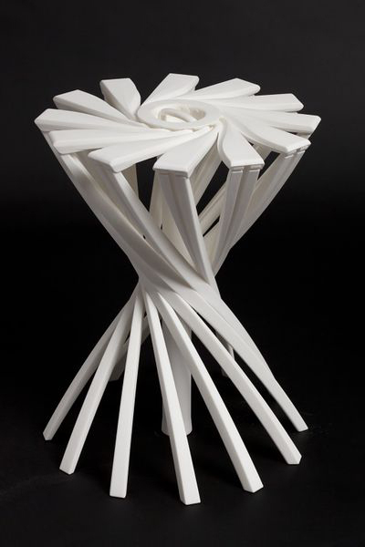
OneShot.MGX_01

OneShot.MGX by Patrick Jouin

OneShot.MGX is a 3D-printed stool designed by the french designer Partick Jouin in 2004.This stool was manufactured using the 3D printing technique. Born in the mid 1980s, 3D printing, more formally known as additive manufacturing, was used at this time for visual prototyping. But some companies soon realized that the technology had the potential to do more than just producing prototypes. In 2003, .MGX by Materialise was founded and they invited world-class designers to experiment with this new technique and come up with novel products that were only possible with this new technology. Patrick Jouin was one of them and created on this occasion two chairs, a table and this stool.

I consider this item as one of the the most relevant among the Stedelijk’s design collection. Innovative, surprising, light, handy, delicate, subtile… it satisfies all the expectations that we have from a stool. You can take it anywhere easily, store it in a cupboard, in a car, in a bag. This object is in harmony with Patrick Jouin’s philosophy if we believe his words : «The objects we draw today are more discrete. They are more «affectuous». Discrete friends. They don’t tell less, they simply do it more slowly. It’s like homeopathy. They diffuse rather than they speak.»  I discovered Patrick at the same time as his product during the exhibition and I think he has a clear mind about what is going on in design nowadays. He created his own agency in 1998 after some years at Philippe Strack’s agency. His style is often qualified as discrete.

Patrick Jouin is really interested in experimenting new technologies. In an interview about rapid prototyping, P.J. said «The distance in between the creation, the drawing, and the final object was very short. It was like a sketch which is coming alive and taking shape in 3D. I know that every time in the history of design, when there is a new technology, there is always a new aesthetic.»

Patrick Jouin talking about 3D Printing

«Industrial production requires a radical conversion : we must start from the function of the object and possibilities of the machine. The limited performance of the craft production allowed sometimes the realization of original or richly decorated forms. Production by the machine, in series, needs a simplification of manufacturing’s forms and processes.» Willem Sandberg wrote these words around 1970 in a catalogue about the german designer Wilhelm Wagenfeld. Should we consider this way of thinking as still relevant nowadays ? New technologies such as 3D printing make these ideas a bit old-fashioned. I am not saying that this aesthetic is over, but 3D printing doesn’t undergo the same rules as the more industrial technique. Patrick Jouin said : «There are so many aspects, undiscovered yet, it is a new way to think how an object can be made.»

In his book Fabricated : The New World of 3D Printing, Cornell University researcher Hod Lipson describes ten of the underlying principles fundamental to 3D printing. The first principle he notes is that «manufacturing complexity is free». Unlike traditional manufacturing processes, where extra complexity requires a more expensive mold with more parts, there is no penalty with 3D printing when an object is made more complex. On the contrary, in some cases there may even be a benefit. With 3D printing, designers and artists can explore new kinds of highly complex and intricate forms that would have been impossible to realize with traditional techniques, and these come at no extra cost. It is a proverbial candy store of new formal possibilities, resulting in a new design language that is baroque and often eclectic.

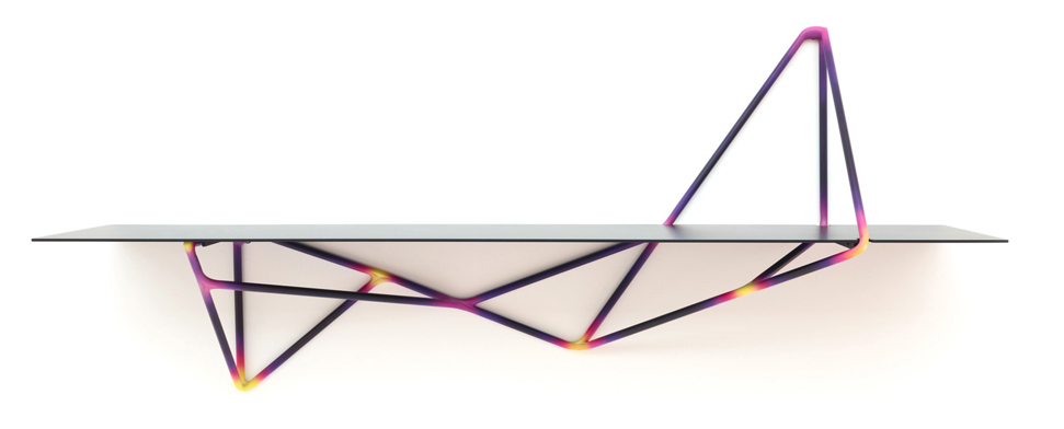
Kram/Weisshaar, Multithread

Multithread #06 Console Shelf[x]

«Just because you can, doesn’t mean you have to». It is true that there is a risk of overuse, a risk that it becomes too much. What should designers do now that complexity is not a problem anymore. Designers are still in the early stages of the search for aesthetic in 3D printing. Many of the experiment we see today may appear outdated in ten years, but they are playing an important role in paving the way. With an increasing number of designers, artists, and makers gaining access to 3D printing, a mature formal language will develop over time, uniting and exploiting the full potential of the technology’s aesthetic powers.

«…people often proclaims grand ideas, things that are just after all, the qualities expected about an object. What an object owes us.» Patrick Jouin

Many studios and companies are working on developing this technique. In Amsterdam, we have the 3D Print Canal House, the first 3D-printed house. It also acts as an exhibition and interactive research center for 3D-printed architecture and related areas, such as material recycling, policy making, and smart electricity grids. The 3D Print Canal House has been printed on-site with the KamerMaker, a shipping container that has been converted into a giant 3D printer.

An aspect of 3D printing that I find particularly interesting is the way you share a product. The designer creates a file that could basically be printed anywhere by any 3D printer (if the printer is able to do so), but then a question appears, how is he going to sell it ? In a shop as a finished object or on internet/in a shop as a file still ?

What will make him choose a certain option ? If you decide to sell for example your 3D printed vases in a shop, you will propose to the public a definite object, with definite colors, materials and price. These choices will be of course part of your research and of course as a designer you know better than anyone the nice colors, but you don’t give to the buyer many possibilities. Eventually you could print ten times the same vase with each time different materials and/or colors, but then you take the risk that some of them might not be successful. You might have eventually planned everything with a marketing analyze or something else, but I am sure that 3D printing could be exploited in a much better way. In this way, the 3D print is not highlighted.

Imagine that you sell the product on your website. The vase that you created has a definite shape, but no colors for the moment, it is still a neutral file, just a shape. Then you put it online and decide the price of it. You could also suggests some colors or materials, without saying that one is better than another. The customer will be free now to  print the vase as he wants. There is no risk of overproduction in this case and there is also an attractive aspect for the customer. He might feel involved in the project and enjoy the fact of being part of the creative process. I talked about the price previously and I think this aspect is also interesting to discuss. How would you fix a price ? If the customer want to print it at home, you would sell a file only, so the customer will print and pay the material by himself. What is the value of it ? Is it in terms of technical innovation or complexity ? Or in terms of originality ? 3D printing could also lead to personal (home) creations and lead to the disappearance of designers. Of course, there will always be designers, but they could be at stake. For sure, this solution is possible only if a great number a person would have 3D printer at home, and it is still not the case, but it may happen soon. We can already see this kind of website where you have the possibility to create your own product.

I am also wondering about reproduction, re-appropriation and protection. How can you protect a product from reproduction or re-appropriation ? How could you recognize an original from the copie ? You could not.

The last possibility that I find personally the most interesting nowadays is to have your own 3D design/print shop. Imagine that you have your design studio that is at the same time a production place. You keep into the studio a selection of the products, accompanied by suggestions of colors and materials. Customers would come into the shop and ask for the vase 3D printed in red and blue plastic with maybe some adjustements. The nice thing is that you have then a real contact with the buyer, you can advice them, keep them informed and help them. You can imagine many things with 3D printing. It could provide a solution to over-production and consumption.

For example, companies could provide 3D files that allows you to print the piece of your machine that is broken instead of ordering it and get it from the other side of the world. You would just have to print it. For sure, the materials that you use to print will not come alone, but I think it could help. There are many other subjects to discuss, so if you are interested in 3D printing, you should have a look at this conference  about the environmental impact of 3D printing that was given on December 13th 2013.

A lot of people are active in 3D printing research. This is the case of Dr. Behrokh Khoshnevis of the University of Southern California which has been developing since 1998 a layered manufacturing process called Contour Crafting, in which cement or concrete is pumped through a nozzle connected to a computer-controlled crane or gantry. This draws the contours of the largescale structure to be built layer by layer.


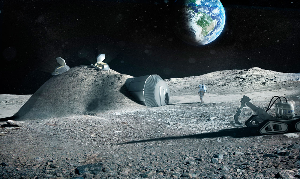
Foster+Partners, Lunar Base

3D printing with Lunar soil by Foster + Partners[x]

Enrico Dini also, a passionate Italian inventor, has teamed up with the European Space Agency and the architects Foster+Partners to test the feasibility of a 3D-printed permanent moon bases built out of moondust. Contour Crafting is also aiming for the moon in a partnership the NASA. Give the significant challenges of scaling up 3D printing machinery to encompass an entire building, many concluded that, for the time being, the most pragmatic approach is to fabricate constructions in sections and then to stack these sections on-site.

Finally, if you are interested, I link you to some studios who realized some really nice project with 3D printing technique. I hope you enjoyed this article.

3D printing is definitely the technology of tomorrow.
MODEL SCULPTURE & DRAGONS


Sunday, January 11, 2015

A model is initially an object whose purpose is either to represent the real world or to be translated into the real world, in short the model can be a copy of reality or reality a copy of the model. The main difference is in terms of scale. Usually the model is a miniature of reality. But what more can it be? When we look at a toy car and a car, what do we see? Is the toy car just a replica of the car in a tiny scale? It is hard to analyze such a thing but I think that there is a huge difference triggered by (but not exclusively) the change of scale. When the toy car is made, it has no longer the same purpose as the car does. A child playing with it might as well imagine it just as real as the car and drive it around with his fingers, or see it in a whole new world, making it fly away, fist-fight and dance Rock n’ Roll. The new scale for things sometimes creates a new meaning for them above representation, a new reality even if they are seemingly the same object in different sizes.

model

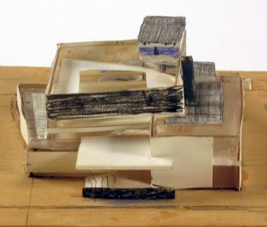
sketch model of van Gogh Museum, Amsterdam by Gerrit Rietveld [object: SM]

In 1963-1964, the furniture designer and architect Gerrit Rietveld (1888-1964) designs the Amsterdam Van Gogh Museum. In 1964 the architect dies before the project is finished. The building is completed by his partners  J. Van Dillen and J. Van Tricht, and the construction was concluded in 1973. The model exposed in the design collection of the Stedelijk was produced by Gerrit Rietveld in those first two years. It is a sketchy model made of wood, paper, cardboard and glass. The final building is close but does not respect this concept, with a unified color of brick and very little white (from front).
I present this piece for multiple reasons. First, because in my personal taste, I prefer this version from the finished one. Rich in contrast between black and white rectangles overlapping each other, the building has the balanced complexity of the Rietveld style although the shapes which compose it stay simple and limited (only colors: white, black and blue) which gives sobriety to the building. When we look at the final museum’s front view, the unity in brick color makes the building lose its striking composition at first sight, for the overlapping rectangles melt into each other. The second reason why I chose this model is because of the way it was made, without any connection to the building itself. I see in between the other models of the museum [x], well built, detailed and clean; something of a stain. On a dirty piece of wood on which we can see quick pencil sketches for the display, an irregular, clumsy, and worn little building is erected. The colors are simply indicated by a rapid and un-precise use of color pencils ( blue and black). The materials used are cheap, and if we try we might not even find one horizontal or vertical line. And yet it is beautiful, marrying complexity and simplicity in form and color, with a rich diversity of cheap materials. Its cheapness gives it a poetic and rough authentic aspect, we see that it was handmade.

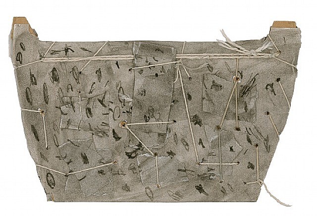
collage-model


James Castle

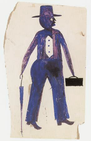
This may remind us of James Castle’s sown cardboard sculptures, which are made of scrap which gives them strength, or Bill Traylor’s choice (and no choice) of using cheap surfaces like cardboard for his paintings.

Bill Traylor blue man with suitcase                                                               James Castle


The model is in addition to this, very close to the final version. That sketchy but precise model shows the talent of Gerrit Rietveld as an architect, like the lines of a great draftsman. Its clumsiness along with the use of paper, lightly put together and slight curved, gives a feeling of fragility and tenderness which contrasts with the strongly built shapes of Rietveld’s buildings or the roughness of the materials.
I love this model because –to me– it is not a model anymore but a sculpture that contrasts with what we usually see, giving a new idea of his work and of what a model can be, even though it was not intended to become a piece of art. A model can be seen in ways that exceed its limits as a technical object.

A perfect embodiment of this idea is seen in the Tim Burton film Beetlejuice. The movie takes place in a small town and specifically in a house on top of a hill overlooking the town. In the opening scene (link here and here for the end with spider) a fake areal shot of the town is taken on a model of the town one of the main characters has built. We are tricked into believing that we are flying over a forest to finally overlook the whole town, then fly over and across it all the way to the house on top of the hill. Although it is possible to see that the scene is really shot on a model, the illusion is strong, and we are astonished to see a real spider (this time) which seems to be the size of a hippo, climb over the roof and be picked up by a real (gigantic) hand. What this illusion does is it gives life to the model, it gives it a new reality, and this is proved later on in the movie when we discover that the model has an “inhabitant”. When the protagonists are changed to the scale of the model, (in this scene) they come to its graveyard to dig up the main antagonist, Beetlejuice. In this case, the change of scale from real world to model is more than representation, the real world and the model are entangled, mingled into each other, whilst the two are different, the real world and the new world of the model. The model can open a whole new world for our imagination to create, a transcendental realm full of fire, wonder, and dragons.

Paul Schuitema: a pioneer of photomontage in the field of food industry


Sunday, January 11, 2015

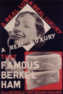
                                                                                               Berkel Ham from Berkel LTD. Rotterdam (1928) By Paul Schuitema. 

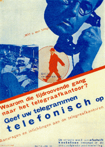
In the Stedelijk’s permanent design collection, I chose one of Paul Schuitema’s posters. Paul Schuitema (1897-1973) is a Dutch graphic designer who also designed furniture, practiced photography and typography. He constructed his advertisements on the principles of De Stijl (more mathematical, abstract and simplified, when compared to previous styles) and Constructivism (as art had to contain social means). El Lissitzky’s ideas, as well as Rodchenko’s (his way of using new angles in photography – such as from high above or down below the subject) influenced him in the design of his industrial advertisements. Those same influences can be found in the works of his colleague, Piet Zwart. Repetition, geometrical forms and the use of primary colors are used in a similar way in both their posters. Paul Schuitema lived during the time of industrialization and of mass production after World War one. These periods can be felt in his poster and the subject chosen.

Schuitema

He started to use Photomontage in 1926 and was one of the pioneers of this technique in the field of industrial design. This poster is an advertising print for food processing industries. It was situated amongst others of his in the Stedelijk’s Design collection. It was explained how photography, not yet considered as an autonomous art, was used for another medium’s finality. Photography was newly used in the 1930’s in order to bring further other types of art.

This is what first appealed to me when I encountered this poster. It felt relevant to our times and to how projects are now executed. More and more of final projects aren’t only constructed of one medium. For example photography is rarely a finality in itself, but a way to get to an other specific result. This new technique of photomontage is relevant to our time in that way. In projects and art works, the medium used is now rarely thought as a finality in itself.

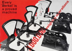
This new technique and his influences can be noticed in other posters of his:schuitema_lg

Primary colors, the use of photography, repetition and new angles as from high above or from down below are used in this second poster as well. Here is another example of his colleague’s, Piet Zwart’s, work, which is closely related to his:

pion6

After paying attention to Paul Schuitema’s poster (the first example used) – It’s design qualities and it’s historical position in the development of arts – I looked at it in it’s original function. This poster was designed in 1928 as an advertisement for the Berkel Ham industry. This subject, presented in the poster, actually takes over its technique and style. It appealed to me more when I tried to look at it in its original context.

Food nowadays is still advertised everywhere, however the energy coming out of them feels different. Therefore, I started to question the accuracy of this poster, for us today, on that matter. Food and its industry is a constant subject today – where it comes from, what is in it, how we eat it, how to eat in a balanced way, the products used for its production… The worry of how we feed ourselves could be considered as one of society’s current obsession. Seen from this point of view, this poster underlines the change of perception we have of food, from the 1930’s to nowadays.

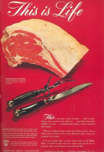
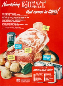
The typography, the choice of photography, and the way the whole poster is disposed, gives me a feeling of playfulness and simplicity. A feeling of innocence almost emerges out of it. As I looked through other food advertisements, of different syles, the gap seemed even more clear:


Vintage-Meat-Ads-03-634x920       50cannedmeat

These posters were used as advertisements in the 1940’s and 50’s. Sentences as :  « This is not just a piece of meat … this is something a man wants to come home to … something that helps children to grow … something that makes women proud of their meals », were used. If these posters were contemporary, they could almost only be received in a satiric way.

Based on the same principles of photomontage, the Dutch group of graphic designers « Wild Plakken » (1977) created posters with a specific social and political goal. They chose clients according to their ideological means. Their belief that a designer had to use his graphic designs in order to mix life to art related to Paul Schuitema and his influences of De Stijl and Constructivism. They illegally pasted posters in Amsterdam, fulfilling this idea of spreading their ideals. Women rights and racism are some examples of subjects they would portray in their posters.

CRI_7259


Some of the same principles of Paul Schuitema can be refound in the esthetic of this poster. In the same way as in the Berkel’s ham industry poster, a different feeling appeals to me. This example of  the Wild Plakken’s poster doesn’t recall innocence, but still gives me a feelling that such an image on such subjects, today, is not as easily disposed for everyone in the city. It is interesting to see how, through time and the development of one technique – such as photomontage – these posters still give a feeling that a gap has been created. Paul Schuitema’s poster and this one example, still give me the impression that this type of expression is less accessible to everyone nowadays.

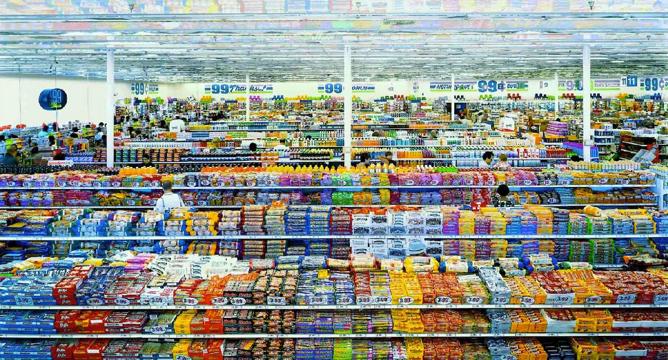
On the subject of the portrayal of food through images : Andreas Gursky’s photo « 99 cent » (1999) states a point of vue which completely contradicts with the posters above. Without giving us a direct position to take towards this subject, Andreas Gursky still pushes a feeling of being overwhelmed and crushed under the overtake of food industry. The feeling is completely contradictory to the one Paul Schuitema’s poster gives us. Both art pieces are thoughtfully structured but opposing themselves in their function.

Andreas-Gursky-4

They are however hard to compare as one is an advertisement and the other, a photography piece. I used Andreas Gursky’s photography as an example of what continuously changed our minds on the food industry. It is pieces of art as this one that put us aware and more distant from the advertisements we see. The opposition of those two examples, in the way they apply photomontage, can maybe explain the gap that I feel in the feeling those images give. As one (Paul Schuitema’s poster) shows a one sided image on how to perceive a subject, the other (« 99 cent »)  faces you to a situation, without giving a straight opinion but implying it through the image.

Art pieces (with « 99 cent » as an example), the overflow of news and a number of new scientific researches, give us a constant possibility to mistrust what is shown to us in advertisements. It is why Paul Schuitema’s poster struck me more than his others. His image underlines such a great gap of how society approached food industry at the time to now. His poster isn’t accurate for today’s society, which is what pushes its relevance in the Design Collection. It is relevant in its design – to how art works are proceeded today  – , and relevant in its subject – as it is one of today’s main concerns.


Who is Gherpe? About Superarchitecture and corruption by conventions


Saturday, January 10, 2015

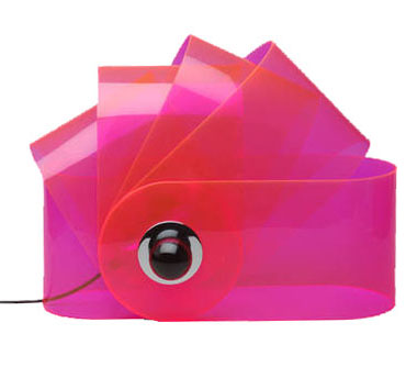
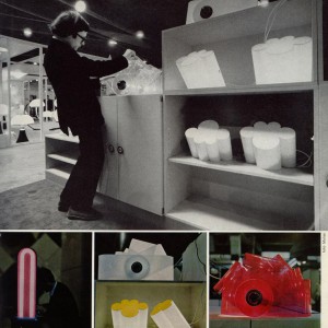
Gherpe – a lamp designed by Superstudio
Gherpe
 (via:http://www.nova68.com/gherpelamp.html)

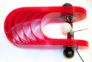
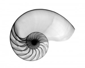
I think the Gherpe lamp is a relevant design because of several reasons. First of all, the lamp itself is made of materials that are still considered modern, even though it was designed more then forty years ago. That alone already shows how we still hang on to, or maybe are condemned to these materials nowadays. Next to that is the design, which references to the mathematics that appear in Nautilus shells. Then again the way this shape is interpreted is more like a cartoon of it, leaving the classical Nautilus image behind. This way of designing, letting interests and research – the designer was into marine biology – influence the work is something I think many designers work like, or would like to work like. Last reason why I think this is a relevant piece is because I think the whole of Superstudio, their designs and mainly their architecture is, because of their new views and extensive researches, relevant. They were part of a critical wave, commenting on Florence and it’s ancient heritage, on the years of full trust in technology and on architects before them. They wanted designers to be responsible for their creations when they design to make a better world. Their criticality on how design and architecture influences the life of other people and self-reflectiveness is what made them different from many before them. This idealism in theories, but with playfulness towards the designing process itself is to my opinion something important to keep relevant in art and design.

gherpe_01


(via:http://photografieundmehr.com/pics/2012-11/gherpe_01.jpg)

Nautilus-OS

Nautilus shell

(via: http://www.hungrywalrus.com/wp-content/uploads/2011/08/Nautilus-POS.jpg)

To test it’s relevance I’ m trying to get to know what Gherpe is, what it is not and what it could be, what it means to Superstudio and what it means to me.

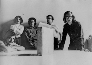
At a time where popular culture is stealing all the science and logic that Modernism employed to make this world better, with youngsters starting to call themselves Mod.’s, Pop Art commenting on this Modernist reality and society by reproducing imagery from that popular culture, Gherpe is born. It’s designed by Cristiano Toraldo di Francia, and adopted by Superstudio, the Italian architecture group where Toraldo is the most important member of, together with Adolfo Natalini, who is a Pop Art painter when they found the group in 1966.


big_374062_2176_giulia_superstudio3

Alessandro Magris, Cristiano Toraldo di Francia, Piero Frassinelli, Roberto Magris, Adolfo Natalini
(via:http://www.domusweb.it/content/dam/domusweb/en/from-the-archive/2012/02/11/superstudio-projects-and-thoughts/big_374062_2176_giulia_superstudio3.jpg)


Where Modernism, in its affirmation of the human power to improve their environment the aid of practical experimentation and science, goes for logic, Gherpe pretty much mocks Modernism, by taking it’s science and it’s new materials to make something that is not in any way useful other than it’s aesthetical purpose. Gherpe is not practical, and it’s not helpful. But Gherpe’s cartoon like ambiguity looks fun, you want to have it, it looks smart even though it isn’t, and that’s exactly in line with popular culture of that day. Gherpes connection with nature is meaningless, but very important for it’s attractiveness. You could say it’s a beauty trick. The interest of Superstudio in nature combined with construction is to be traced back to one of their guides in the Academy of Architecture in Florence, which most members of Superstudio were attending. His name was Leonardo Savioli. As Adolfo Natalini says about Savioli: “Even when the drawings looked like traces of insects or explosions, galaxies, spiderwebs or wounds, they were always able to resemble parts of constructions or something constructable”.


Savioli_plateXVIII

Plate XVIII, a drawing by Savioli

(via:www.etsavega.net/dibex/Savioli_citta-e.htm)


The fact that Gherpe’s reference to nature doesn’t have any symbolism or engagement in it, already shows what things it really has to do with, things like freedom. Gherpe is free from the morals that come with modernism: Superstudio didn’t think architecture could change the world for the better. Gherpe is the joyous realization that the burden of creating something that will add to create paradise on earth is not possible.

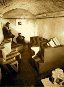
Gherpe was in the Superarchitettura show. This was a show combining two groups. The Superstudio and Archizoom, both from Florence and mainly from the same architecture school. The show took place right after a flood had swallowed a chunk of Florence’s renaissance beauty, at a time where others mourned renaissance architectures birthplace the Superstudio show was a psychedelic experience work that purposely lacked engagement and put consumerism on a pedestal. Their ideal: morals were irrelevant to architecture, and so you should not aim to change the world with it either. So there is a different approach: “Superarchittettura accepts the logic of production and consumption, it utilizes it in an attempt at demystification” and  “Superarchitecture is the architecture of superproduction, of superconsumption, of superinduction of superconsumption, of the supermarket, of the superman, of the super gasoline”.

gherpe-archivio2

Toraldo and Gherpe, and Passiflora
(via:http://www.centrostudipoltronova.it/wp/wp-content/uploads/2014/07/gherpe-archivio2.jpg)

Seeing Gherpe from the eye of the Superarchitecture that it is, means not that Gherpe was meant for a world better than ours, but for the world as it was in 1967, where consumption and production were exploding. You could say, Gherpe is super itself. A lamp fitting for all these phenomena that felt relevant for the younger generation at this time. Instead of denying these phenomena, or wanting to change them, Superstudio designed something that fit in. It might even accelerate superconsumption, be meant for that purpose. In this perspective Gherpe is in a way a neo-futuristic piece, a monument for the speed and mass of its time. You could also see Gherpe as an, perhaps slightly melancholic, attempt at creating something, something touchable and real out of all the superlatives that together form the ungraspable frightening dystopia that was (and is) everyday life. And maybe that this is the reason we enjoy it, because Gherpe is then our comfort, a sign that from superproduction and superconsumption something appreciable can materialize.

superarchitettura-3

Image of Superarchittettura show
(via:http://www.stylepark.com/en/news/a-landscape-of-mountains-and-valleys-the-design-parade-03-in-hyeres/283330)

Gherpe shows Superstudio’s double nature: it’s serious, socially critical but can also be ironic.  When Superstudio presents an utopian, or dystopian design we can never accept it at face value. When they design a utopia, they explore every possibility into the extreme, and so exploration of the architecture itself is it’s aim. Instead of presenting the possible solutions it tells the stories of the decisions of mankind, the ones it made and might make. A very serious and melancholic subject, reflecting their serious opinions (Adolfo Natalini: “the race of consumerism is definitely wrong”) but enabling playful and smart experimentations.

As Gherpe is an early Superstudio piece, Gherpe is also an early exploration which, as we can see in the Stedelijk, ended in a lamp. As Superstudio kept exploring their ideas became more and more critical of architecture and design, which made their projects end up way less often in actual designs and realizable architecture. Instead they expressed their ideas in movies, models and collages.

According to Superstudio architecture was corrupted to such an extent that even the avant-garde architect was guilty of suppressing human development, since he made use of existing conventions in architecture. An interesting idea, which suggests human development can come from no other place than out of the blue. Where one can ask the question what human development actually is, but let’s get back to Superstudio. They saw reason as the only quality that’s uncorrupted by these conventions. This makes it’s easy to see why they step farther away from architecture and design, as they are easily seen as complete and valid evidence of manifestos or ideas, rather than generally questioning and alienating. That doesn’t mean Superstudio didn’t make anything at all anymore, as you might expect.

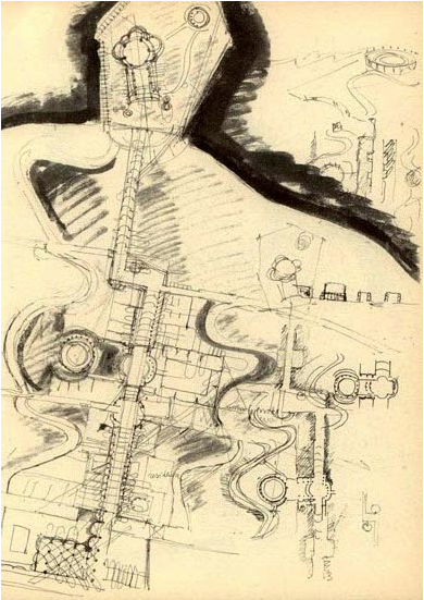
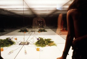
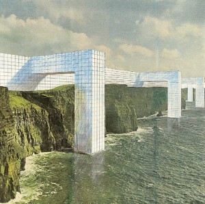
Instead they found ways to visualize what architecture could be, without designing from conventions. Something that wasn’t really architecture. For the exhibition “ Italy: The New Domestic Landscape”  in the MOMA Superstudio made an 8 x 8 black square on the floor, and made it repeat itself in an endless grid by placing mirrors at the walls. They put a box with wires on each corner, making the plugs recur regularly in this “landscape” [x]. It wasn’t the first time they worked with this black grid [x], but it was the first time architecture and design was so completely dismissed that it was actually left out at all. Even though this seems like the ultimate conclusion, there’s more to the ever expanding black grid. In the Continuous Monument, a glass grid-like structure that spans all over the world, visualized in absurd collages [x] where it embraces Manhattan or faces the Taj Mahal, the irony, social critic and dystopia remains: a homogenous unrealizable blank space, but also a space where we can project our own ideas on of what it really is. Our ideas, full of conventions and corruption.

521d003de8e44effd40000a8_environments-and-counter-environments-italy-the-new-domestic-landscape-moma-1972-exhibition_5-528x362

Grid in the Moma: View of Supersurface: An Alternate Model of Life on Earth, by Superstudio, in Italy: The New Domestic Landscape, MoMA, 1972. Photo: Copyright Cristiano Toraldo di Francia.

(via: http://www.archdaily.com/421040/environments-and-counter-environments-italy-the-new-domestic-landscape-moma-1972-exhibition/)

As you understand now, Gherpe too is a piece of corruption. A mash up of conventions and brainwashing, which will, as you look at it, only corrupt and brainwash you more. Which is very true in the sense that, the more you know, the more you are stuck in the things that already are. Whether that really suppresses the development of humanity is questionable. I personally am less negative about the influences of the past and the conventions we get taught. But the fact that Superstudio deals so productively with their frustrations over a system is something everyone, defenitely every art student, can be inspired by.

Over thinking and commenting on how design works is something I find fundamentally important, as I think this self reflection is what can bring us to new insights. Insights that can be reflected on again later, a continuous process I’d say would be human development rather than corruption. But, if you are reading this, and you do happen to find yourself having been corrupted by looking at Gherpe and reading about it, then at least we can be sure about it’s relevance for the (design) world today.


2701091233096716superstudio_monument_1_kl

The Continuous Monument, one of the many collages.

(via: http://www.spaceinvading.com/bookmarklet/Images/2701091233096716superstudio_monument_1_kl.jpg)


Log in
subscribe