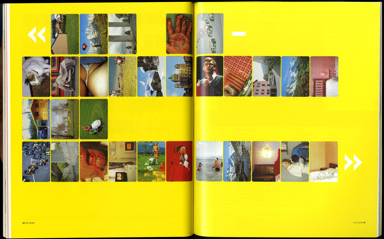
To share and receive, to express an idea or a feeling; that is what communication is to me. It can be transferred in various ways; through verbal and nonverbal communication. In the Arts, communication can be interpreted in a different way. On this essay the main focus is image and communication. How images are understood as means of communication? As a starting point, the ‘visual essay’ of Beat Müller and Wendelin Hess called ‘The Impossibility of Neutrality” gives a view on the perception of communication. The impact globalization has in culture and economy, questioning how “neutral” a design could be? This ‘visual essay’ consists of images from various sources; from the Swiss Alps, from sports, the pope on tour to hooligans in Basel. From the founder of the Microsoft software Bill Gates to luxurious chalets, contrasting with pornography, war and violence. A visual combination arranged in a certain way, each image elaborating harmonious with one another forming a pictorial alphabet and text.
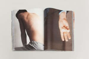
A similar approach as Müller and Hess has the London based artist and designer Paul Elliman with the “Untitled” (September magazine) 2013. The publication consists of an enormous private collection by the artists himself, of found images, reaching around 500 pages, a compilation of different sources from the world of fashion and photography to pornography. Paul Elliman modified every image by adjusting and cropping; by “zooming” into details. as a focus on the human body, emphasizing in such a way, physical gestures, such as the human hands for instance. A publication of powerful figures creating a variety of shapes and patterns. Without any further explanation of a written text; only the act of hands; a distinctively particular way of communication, in contrast of vivid colours. A synthesis of dynamic images capturing semi-nude and nude areas of the ergogenic parts, such as the chest and limbs of the human body. Gestures can be powerful, they are a form of information; a message that has been made by the sender towards the receiver.
Paul Elliman – “Untitled” 2013
Another project called by Elliman is called “The Alphabet” ’92 [x] in collaboration with 26 students of the London University. New ways and possibilities of opening up a communication were created. The result was an interactive piece or work that denies any stereotypes of the spoken language by making a new kind of alphabet by using objects and the human body to create letters. Image is the main element of it, structured by the human body. A unity of photographs decoding the language by giving it literal form and/or subjective expression. Shot inside a photo booth, students were deliberated to be themselves and interpret each letter of the alphabet by using only themselves. By using only a few “ingredients” for instance; movement and the human body. The result is exciting and highly creative; could be a proposal which suggests to be open and think different regarding the process of ; reading and understanding.
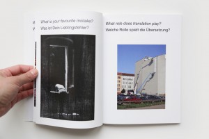
As mentioned above the artist Paul Elliman and his projects “Untitled” 2013 and the “Alphabet” 1992, suggested a new way of communication which I would like to follow up to with an interesting example that can be found in the book of Hans Ulrich Obrist and Hans-Peter Feldmann called “Interview” 2009. They use a cryptic way of communicating, consisting of questions that have been posed by Obrist, to which Feldmann gives an image as the answer. A game between words and visual language, projecting social issues in combination with humor. The reader is allowed to make his own “translation” on every image as the possibilities of an answer are endless.
Hans Ulrich Obrist and Hans-Peter Feldmann – “Interview” 2009
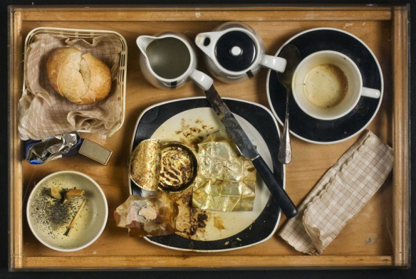
Moving on to one of the founders of the New Realism movement [x], Daniel Spoerri and his book “Coincidence as a Master” 2003. The Romanian-born, Swiss artist and writer have been collecting actual items such as; plates and cutlery for years. Creating himself the term “Tableau Piège” (snare-pictures) around 1960, which stands for; “objects, which are found in randomly orderly or disorderly situations, are mounted on whatever they are found on (table, box, drawer, etc.) in the exact constellation they are found in(…). By declaring the result to be a tableau, the horizontal becomes vertical”. What can be seen in this publication is a synthesis of found objects which each one has a story to tell. Taken from a “bird’s eye” point of view, of tables, frozen in time, captured in a certain moment. Remains of meals fixed on the table, an attempt of reviving a particular event. His own approach of expressing a story through fixed scenery of objects; a momentary need.
Daniel Spoerri – “Coincidence as a Master” 2003
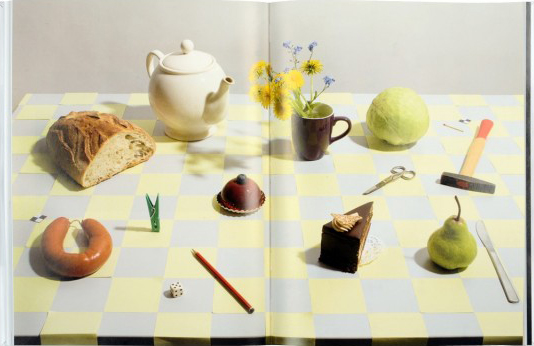
A similar approach as Daniel Spoerri has Uta Eisenreich as seen in her “A Not B” 2010 book designed by Julia Born. A mixture of colourful and playful photos, consisting still life images of objects like matches, balls, fruits and scissors. Rearranged in such an order which creates an optical illusion and language, where you might also come across with “spot-the-difference” mind game; experimenting between the thin line of common and uncommon sense. Eisenreich was inspired by scientific experiments, nursery rhyme poems and the “non-verbal IQ tests” for children,. The work contains of a variety of domestic objects directly connected with our everyday lifestyle. Questioning the possibility of placing in order items that has no function together although create a serene atmosphere. An exploration of structures between objects and space; “A Not B” takes us along into a playground of constructions of forms, the power of symbolism and youthful tendencies.
Uta Eisenreich – “A Not B” 2010
Objects surrounds us, usually designed to fulfill every human need. Although, from another perspective objects can be used for another purpose. Through them we can create a whole new reality, new experiences which opens up possibilities. It is all about perception, how we see the world around us, how do you see it? Eventually, everything is changing and new things are born. For instance, the collaboration between the “creative agency Forsman & Bodenfors, stylist Evelina Bratell and photographer Carl Kleiner” publishing the “Homemade is Best” 2010 cookbook for Ikea. It consists of one hundred and forty pages of ingredients placed in such order of creating geometrical patterns. A wide range of baking recipes motivating the reader to take action. Suggesting an alternative approach of reading a recipe; by looking the images of the ingredients, guides you to the recipe instead of reading a text of each step that has to be made. As a result focusing only on the ingredients that are needed. While you turn the page you can as well see the result of each recipe.
“Language is not dependent on writing” – Ferdinand de Saussure
In conclusion as the examples of the artists mentioned above, communication can be understood without the use of words; the power of the image can be stronger. In depth, photographs can express an emotion and interact with its audience. Words can be unnecessary; the use of the body or an object can create another medium of communication.
