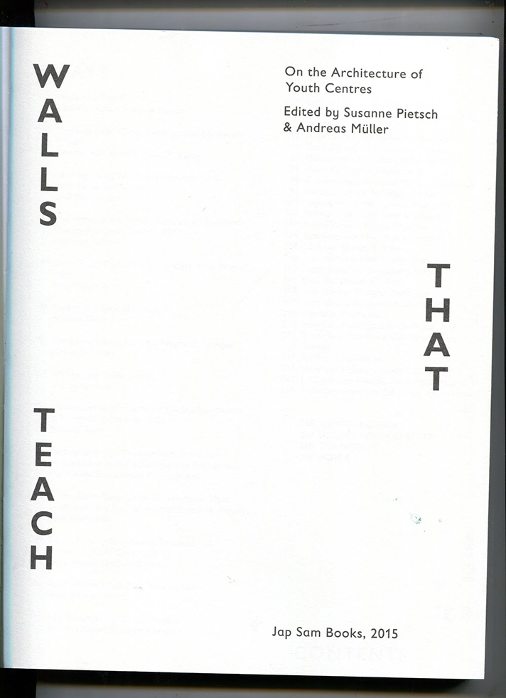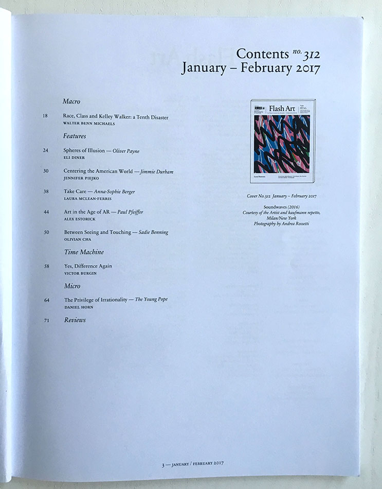
1:
The designer of this catalog is unstated and unfindable and probably dead.
But that’s no good, so lets start again.
2:
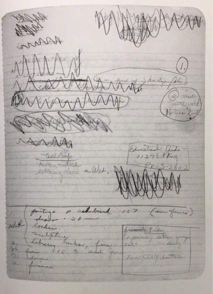
During this assignment we were asked to chose a recent edition in the library based purely on its design, in order to research it for the coming weeks and write a publication on it.
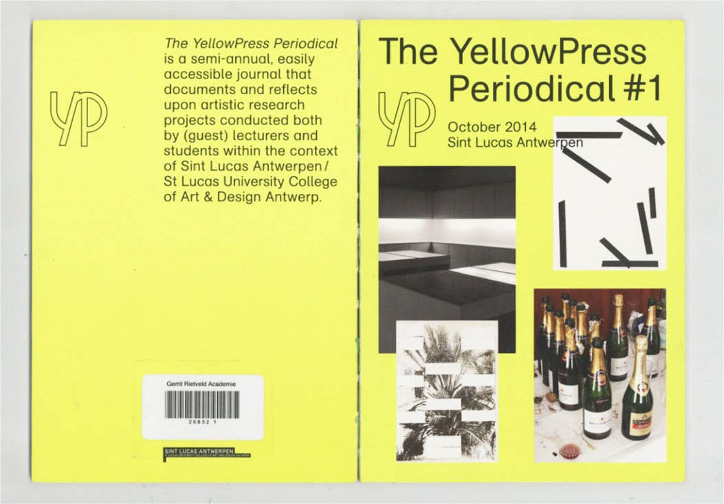
Narrowing down my choices to 2 books Henk advised me one was a classic (he owned 4 copies) and the other he knew nothing about. Which was which he wouldn’t tell, so I followed my instinct. I settled on “Skulpturer och tecknigar 17 Sept.- 30 Okt”: a catalogue of Claes Oldenburg’s work from Moderna Museet in 1966.
Safe to say Henk doesn’t have a copy at home.
3:
Emailing Moderna Museet led to nothing fruitful.
4:
The librarian at the Rietveld Library said he would help me research.
He told me:
“Many designers in the 60s weren’t credited at the time because being a designer was so applied. who cares about them? Its all about the artist”
“Claes’ partner was actually dutch… but that doesn’t help you. Fuck.”
“I bought a Claes Oldenburg book last week.”
He said some things about the Moderna Museet but, again, “It’s no use to you. I don’t know”
He wished me luck.
5:
The librarian at Rijksmuseum told me:
“What is your question? I don’t understand your question?”
6:
Last February I went to a seminar by Nasan Tur.
Sat among the group was a woman (about 50) who was neither introduced nor introduced herself. For the sake of the narrative, she will be called Cecille. Cecille was conflicted about many things and had earlier that day talked herself into great confusion about the significance of a plastic Marylin Monroe compared to that of a plastic Buddha. At some point it all spilled out: an architect for 27 years, fed up of not being able to practice creativity within her job; taking a year out; putting everything on hold; trying to start again.
In trying to solve this issue Tur referenced Oldenburg as an example of an artist using interior design and architectural ideas in an artistic form: suggesting Cecille might learn from this. It was insufficient, she said: “There is no space for art when you build a house”.
Then Tur, exhausted by this statement: “Of course there is, make tiny doors”, Cecille: “Then people will keep banging their heads and they will get sick. We cannot live among sculptures”.
They were talking in riddles. She said “Kitsch is the repression of death”, and he: “Kitsch is the sweetness of the soul”. Cecille here being the front of this catalog, and Tur the back.
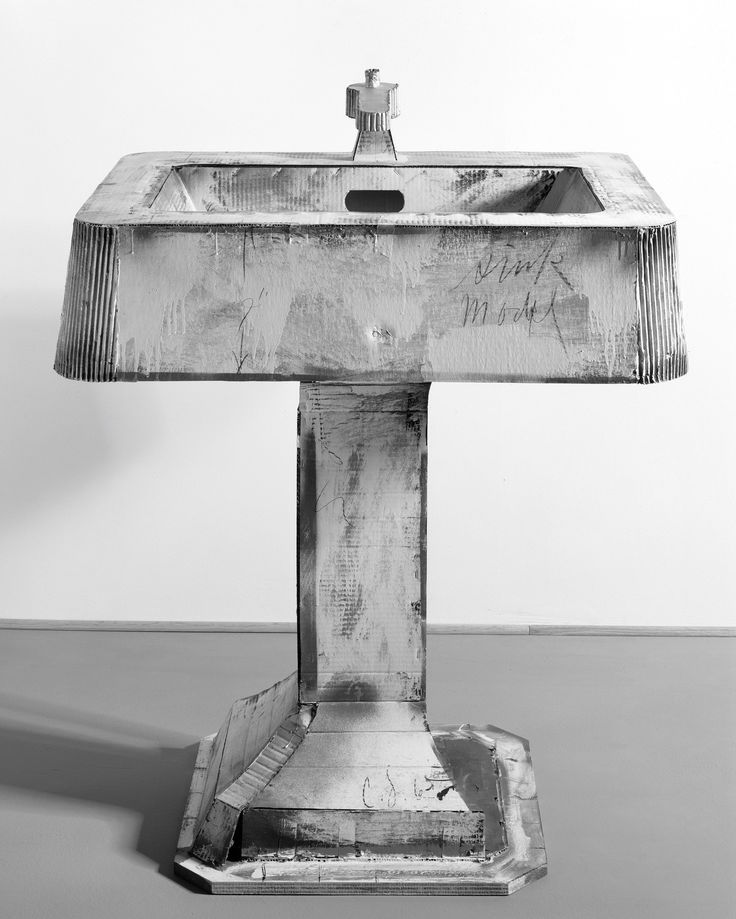

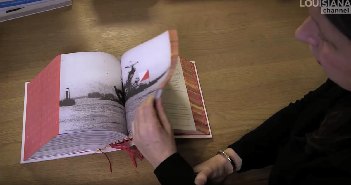
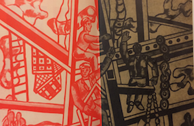
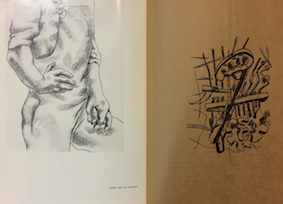
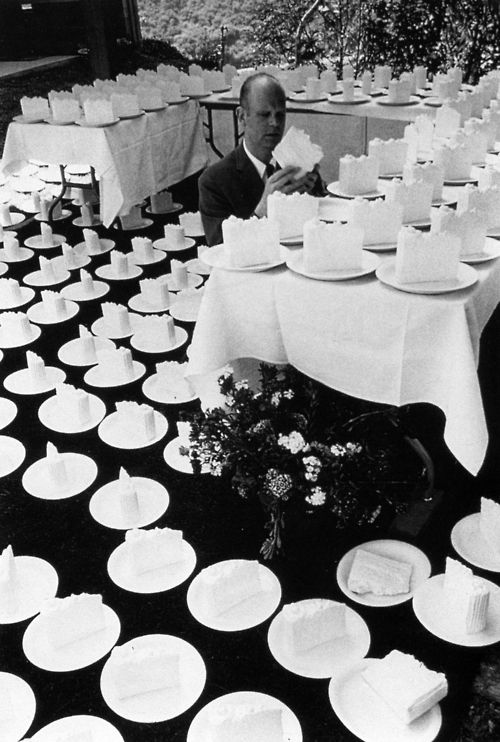
Imagine above your two images: on the left a large black and white photograph of a sink and on the right a deflated, dilapidated version sown out of what looks like bouncy castle material: but here I promise not to dwell too much on content but what this content gives to the form, for there are 20 other pages like this in the book.
Here the designer has chosen not to separate the book by sculpture, photograph, sketch but by more obvious subject. For example:“sink, sink.”
“house, house.”
“ironing board, ironing board.”
“light switch, light switch.”
and beneath this one we may see a statement such as “my room is filled with cigarettes the size of cannons”
It becomes almost farce: such poetic expressions beneath large representative works of art.
The layout provokes:
“how typical of ‘art’ to be so obscure, to lay things next to each other and leave the audience to draw parallels.”
One gets the feeling you can assign meaning to almost anything, a little like this publication so far- so now to look at something slightly more grounded.
7:
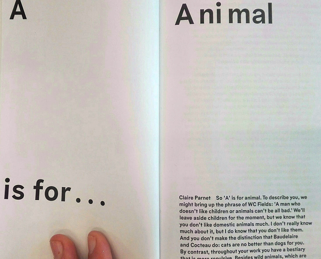
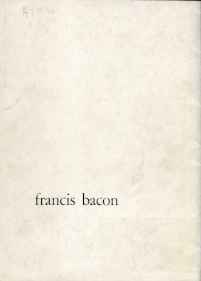
“Skulpturer och tecknigar 17 Sept.- 30 Okt”
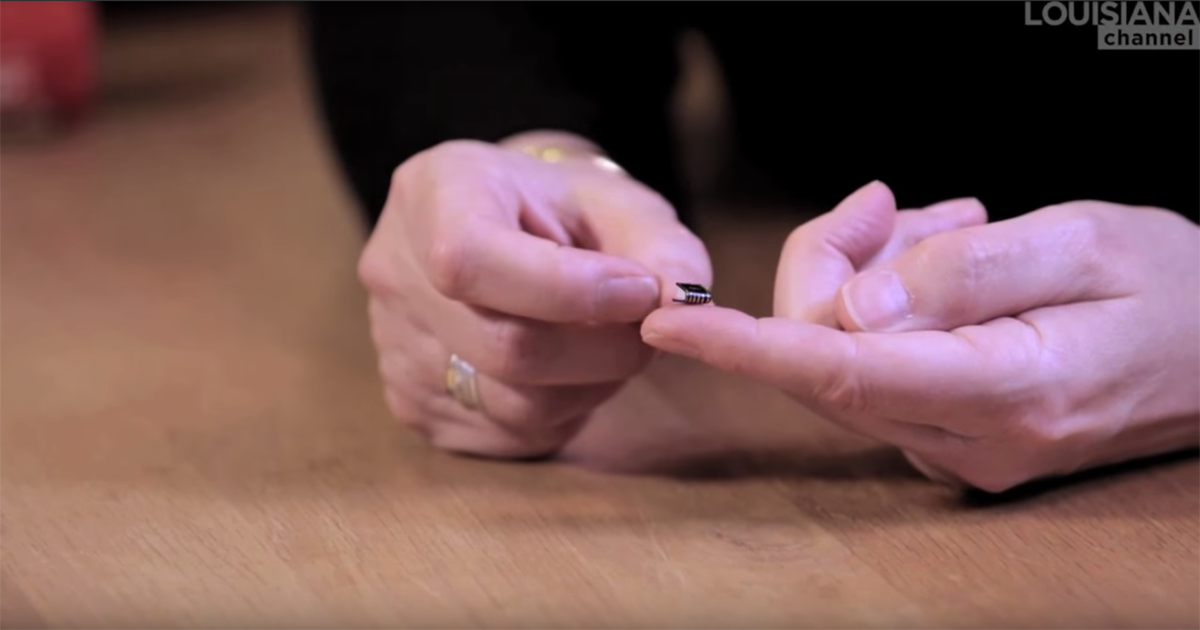
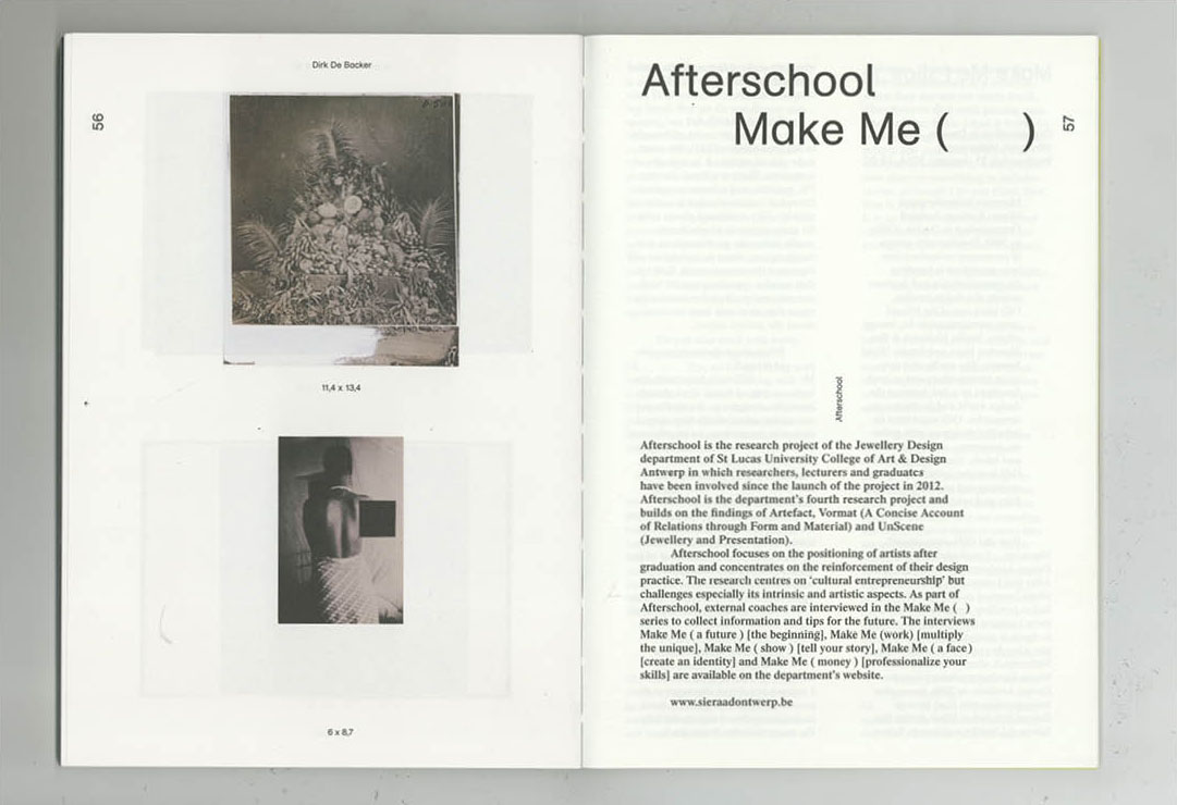
In fact why I chose the catalog- apart from vague memories it evoked- was because of its simple design: the paper is thin and dimly laminate; the font is understated and normal; the arrangement of the text is practical: it sits more or less where you expect it to. The catalog is thin, glue blinded and flops slightly when you open it. Small black borders outline some images but most are left just as they are. These images are often black and white and the coloured ones are stuck in. Initially I thought this was a design decision to emphasize certain works but I found out it was just to make the printing cheaper.
Pulling various other Oldenburg books and catalogues from the library might, I thought, give me some much needed context.
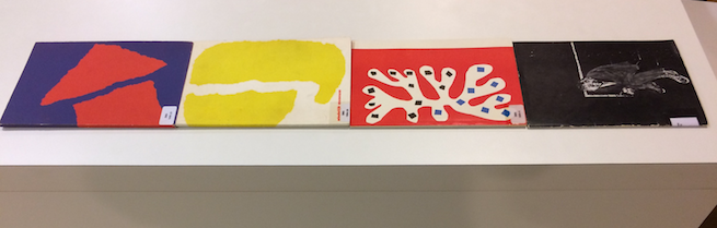
“Claes Oldenburg: Large-scale projects, 1977-1980”above Barbara Rose’s 1969 study of Oldenburg, catalogue Museum Boymans van Beuningen Rotterdam 1983, below.
Comparing a catalogue from Museum Boymans-van Beuningen, Rotterdam 1983, Barbara Rose’s 1969 study of Oldenburg and a book from 1980 called “Claes Oldenburg: Large-scale projects, 1977-1980” to mine, I found them all to be remarkably similar, even down to the thin black borders on some images. Two of the books were published in New York so I checked to see if they had the same designer. They did not. However on reading Rose’s acknowledgements I noticed she directly thanked both Claes and his wife for all of their help and even “good meals” they shared during the time of her research.
Perhaps Oldenburg gave some hint as to the style he expected with his work, after all the candor of the design suits Oldenburg’s work so well: which is also presented nonchalantly despite its surreal actuality.
8:
The designer of “Skulpturer och Tecknigar 17 Sept.- 30 Okt. 1966” remains unstated and unfindable and probably dead.
In trying to research it seems I have confused myself and various librarians. The best I can do is to conjure up some lose image of a designer, in a dimly lit office in 1960’s Stockholm; disregarded because their career choice was too “applied”. It is purely assumption- but somehow a nice one- to imagine Oldenburg influenced the design in some way.
Anyway, I think I will send a copy to “Cecille” in the hope that she might make smaller doors.