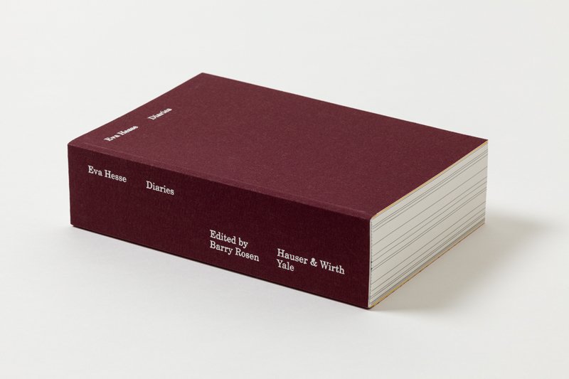
A thick, soft bound minimal book. Deep wine red cover, blank, apart from the title- “Eva Hesse, Diaries”. From a side view, multiple black lines appear – opening the book up at one of such, the viewer discovers fully blacked out pages. Clearly a separation of some kind, and this is where the curiosity started – one of the reasons why I picked up this book to research on it.
To some extent reminiscent of a elderly and minimalist bible caused by colour and size, opening this book immediately provokes a certain curiosity; especially the confrontation with cutting through content and context sharply through a simple, basic idea – to separate each diary with coloured pages enforces the reader or viewer to get a rough insight to the actual content of Hesse’s Diaries already.
The 20 second intimacy that occurs to a person when looking at a book for the first time has always fascinated me somehow – the endless possibilities of reactions one might digest, from a deep attraction to complete indifference, and how the slightest change in design, especially typography can make the most significant change.
According, “Eva Hesse Diaries” reveals a very appealing approach typography wise.
Every new page usually starts with the date of the entry, which truly summons the feeling of physically opening up and reading through her original diaries.
Another attention catching factor supporting the previous are the visual irregularities in which layout and state pages are left, some being nearly blank and some completely filled, but always seemingly decisive.
As an example, turning the page to find one single sentence only may leave a vibrant impression on the viewer. For further underlining of importance, paragraphing has been used with a similar effect.
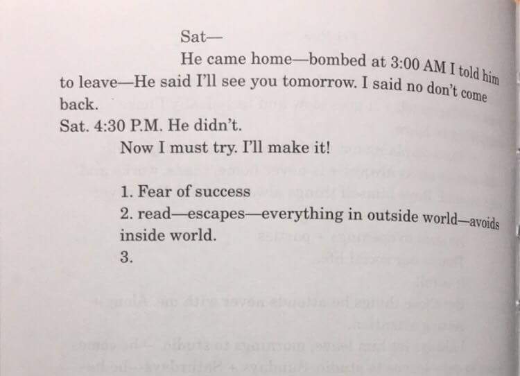
In the optic chaos one might expect reading a diary, this design makes us stumble upon aesthetically pleasing organization due to provision of the books typographic grid in which the manuscript pages had been divided into eight columns.
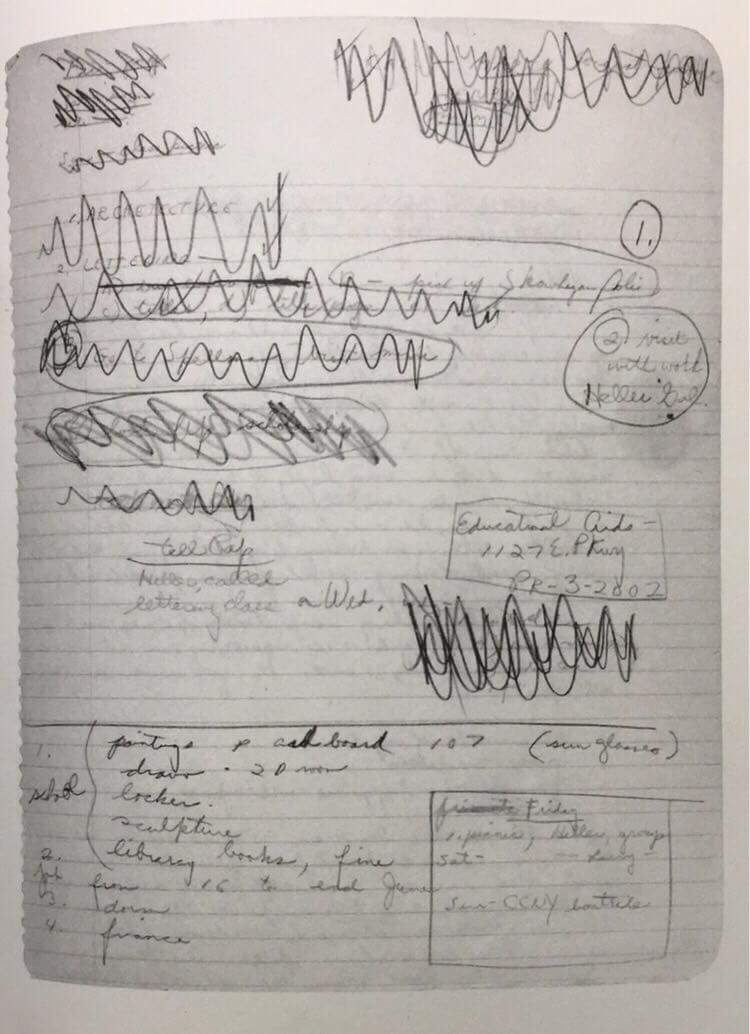
For stronger visual insurance of clarity the font size is standardized whereas uppercase, underlining and crossing outs are retained. As an extra insight content wise, some of the original materials of her diaries such as notes and loose pages have been added.
The design of this newly gathered selection of Eva Hesse’s diaries was awarded the bronze medal in “best book designs from all over the world 2017” and selected one of the “most beautiful Swiss books 2017” and was planned and mainly made by Johannes Breyer during his internship at the design company “NORM” in Zurich, led by Dmitri Bruni and Manuel Krebs.
To get an insight into Breyer’s approach in and understanding of design, we might want to look a bit closer at his persona itself.
He is a half German, half Chilean graphic designer currently based in Berlin who studied in Zurich whilst being occupied at NORM before he graduated from the Gerrit Rietveld Academie.
Nowadays he focuses mainly on printed matter such as books, and type design.
His interest in graphic design roots in a passion he found himself captured in during his youth where he claimed to have been an excessive gamer. Gaming led to him and his online friends stumbling upon web design which stuck to him as a field of interest so such an extent he decided to pursue this newly found passion – which leads us up until now.
Momentarily he runs a Swiss type design practice with the designer Fabian Harb called “DINAMO”, which produces typefaces and exclusive alphabets.
http://www.abcdinamo.com/about
Breyer is interested in creating and deducing the best system for each project and each product. From his perspective, it is better to hold personal preferences back, otherwise the content may be too easily forced into a form without relation to content or cause.
One of his beliefs include the fact that he thinks of passion and general curiosity as a more vital factor to success and progress rather than following an institutional education, although he’d rather work within a tight set of rules during the process of a project, claiming such set of rules to provide the necessary freedom to not run in circles with the same questions over and over again.
Overall, this design accurately depicts a visual insight into the artists personal life in an aesthetically pleasing format that certainly deserves the attention it has gotten. To achieve the effect of a reader entering the mind of a complete stranger could be described as a phenomena, considering the fact that in a social surrounding people interact on a mostly superficial basis – depending on the individually desired extent of social interactions. Exposing the raw content that makes up our persona, sharing every single vital thought, including angst and paranoia, socially unacceptable thoughts and processes in mind is something most people fear – but it also awakens a greater curiosity. To gather personal content together and deal with such sensible material in an appropriate manner could be considered an honorable task, anyhow this book is certainly worth giving it a look at.
Eva Hesse Diaries, designer: Johannes Breyer, Rietveld Library Cat. no: hes 9