I love books. Looking at books, or preferably full bookshelves, has always made me happy. It is not that I loved books because of the way they looked, but rather because of the knowledge that they represent. I’ve always seen books as a medium for information, as a source of knowledge, and because of that, I thought that the content was the most important part of a book.
When I started to make a book myself, I focused on the content, seeing the design as something ‘to worry about later’ or even, something ‘not to think about too much at all’. However, at the same time as making my own book, I did a research on a book designed by Irma Boom. Boom is a Dutch ‘bookmaker’, as she calls herself, who challenges the traditional formats of books. She doesn’t treat books as simple PdFs prints, but rather as architectonic objects. The shape, weight, and size become important aspects of the design because these aspects influence the experience of reading the book just like the content does.
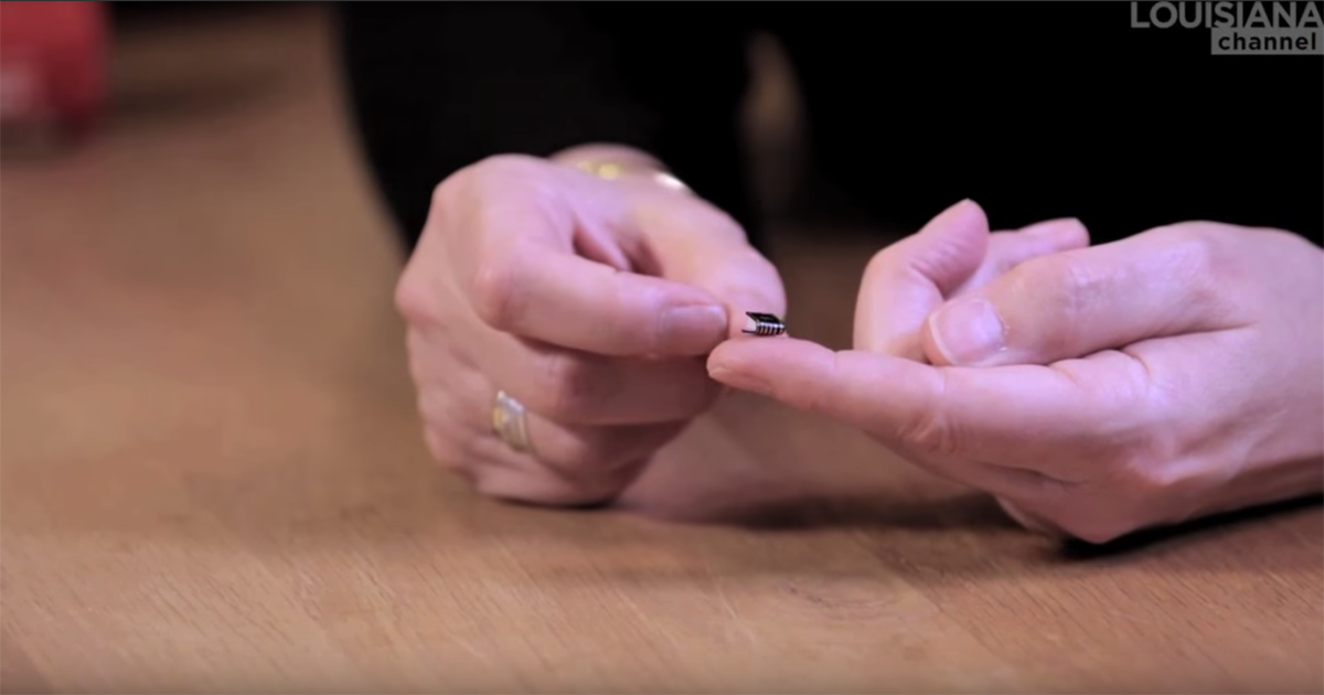
To illustrate this, Boom has prove she could as much make a book that is 170 x 225 x 113mm height and weighs 3.5kg, than a book smaller than the tip of your pinkie. The experience of handling these two ‘objects’ are completely different. While the first one is hard to hold because of the weight, the other one is hard to hold because there’s only a small surface to hold on to. The experience of these two books would have been the same if they both had been read on a computer.
Boom handling her smallest and biggest book.
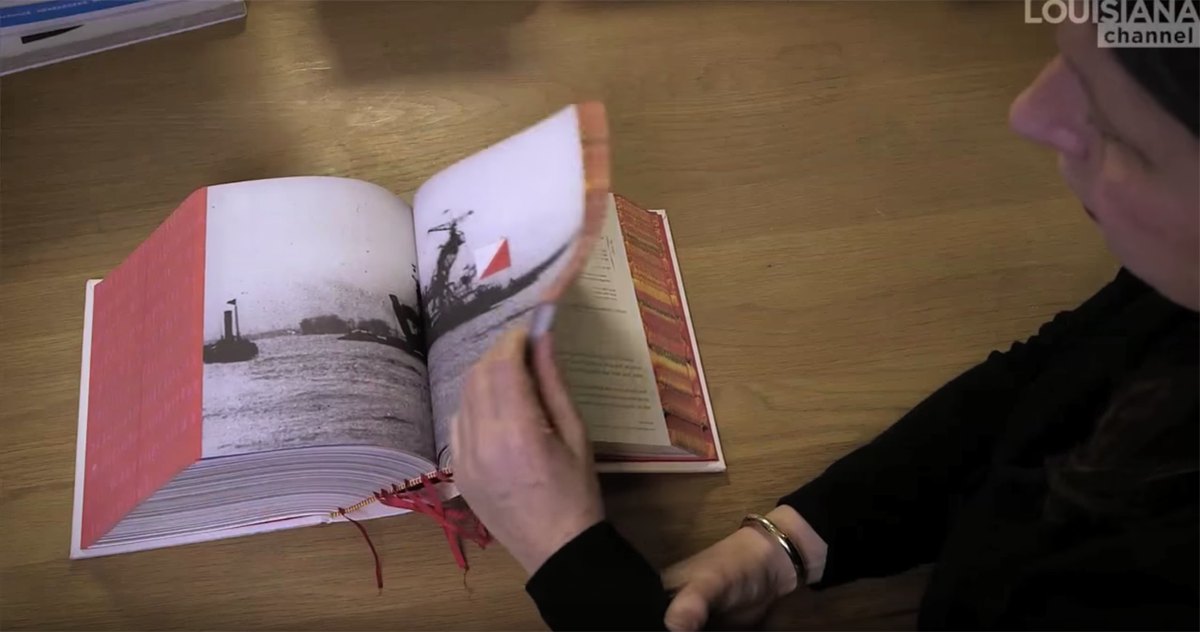
Another book made by Boom is Misfits. Misfits has an outstanding shape too, which spoke to me immediately. The book is bound in the simplest way, but it is an unusual way for a book so thick. It is bound by one thread that holds more than 300 pages together. Like Boom says herself, the book is essentially ‘just a pile of paper, stapled, folded and that is it’.
The middle of the book, where the thread binds the book and the pages come together, is also used as the center of the content. The works that are showing in the book come here together and are ordered in a catalogue. This is also useful when flipping through the book, because this is the place where the book will open naturally. Here, the way of binding influences the structure.
I like that the book is unusual, as well in the shape of the book as in the structure. This makes the book interesting to look through. The book is simple in the mechanism that is used to bind the pages, but it isn’t so straightforward in the mechanism to organize the pages. At the same time, the simple solutions that are used in the book connect the book to the work of Hella Jongerius, the artist whose designs are shown in the book. She tries to find easy solutions in her designs as well.
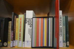
Another book designed by Boom in which the physical shape fits the content is Elements. Elements is a book, or rather a collection of books, that accompanied the exhibition ‘Elements in Architecture’ at the 2014 Venice Biennale. It is a sort of frame that beholds 15 smaller books, each representing another fundamental part of architecture, such as floor, wall, ceiling, balcony, elevator and ramp. The fact that the book is a collection of different parts, different elements, strengthens the content of the book.
The complete collection of Elements standing in a full shelf with other books designed by Irma Boom.
Elements and Misfits both are books with an unusual physical shape. These books got my attention because of their shape, not their content. For me, they where more ‘objects’ than ‘books’. Books are of course always objects, but when does a reader become aware that it is an object? When does a book become more than content, fitted in pages?
Boom’s books are often seen as works of art. I think that one of the reasons for this is their object-quality. They are interesting to look at as object and don’t necessarily need their content to be interesting. This makes them almost like autonomous works of art.
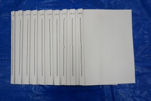
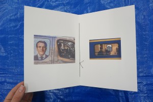
In my own project too, I’m trying to make the design of the book interesting and fitting for the content. I let myself be inspired by Boom’s book designs and made, like Boom did with Elements, a collection of smaller books. These books are bound in the same way as Misfits is bound. In the middle of the book I placed the most important pictures, like Boom used the center for a summary. This way I hope that when someone opens the book, the most important page is immediately visible.
Researching the way Boom uses the physical elements of a book to enhance the content made me aware that a book could be more than just printed out pages, bound together. I realized that books are objects too. I have my own copy of Misfits now, which is not standing in my bookshelf, but proudly on top of it. I haven’t read a page of it yet, but I’m in love with the book already.
Misfit, designer: Irma Boom, Rietveld Library Cat. no: jonger 2
