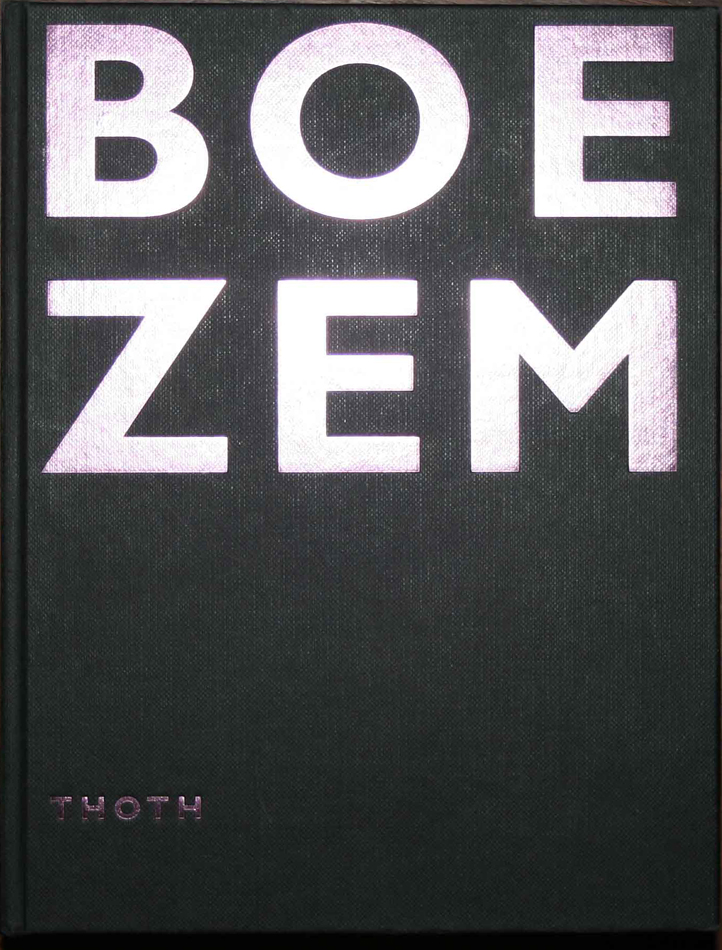
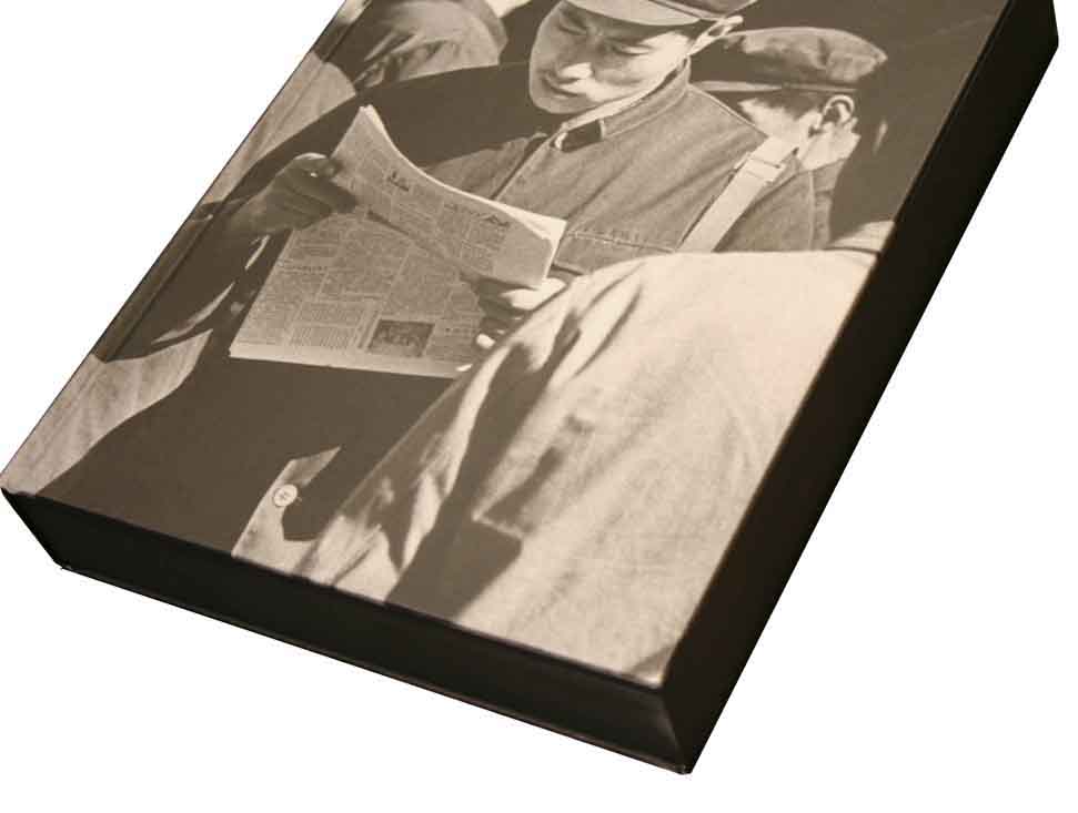
The book was staring at me. With its big shiny, purple letters saying BOEZEM, the Dutch word for bosom, and its firm, solid appearance, almost like a brick. What could this book be about? Anyway, this title, the bookmaker must definitely have been aware of the confronting and maybe also provocative impact it has on its audience. Me, in this case. I found it daring. I found it also daring that there was no picture, no nothing on the cover, except for those letters. I felt like touching the book.
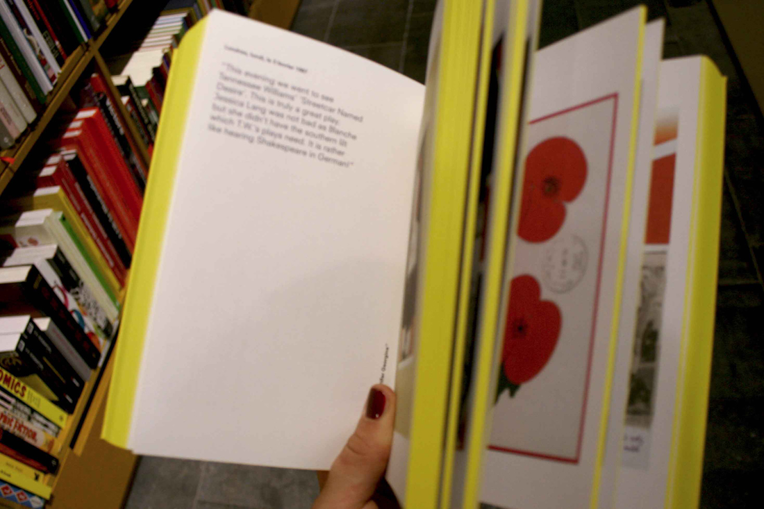
I lifted it from the shelves and it surprised me once again. Whereas I had considered the book as quite minimalistic and probably consisting of just the two colours black and purple, it actually had this very subtle grey pattern on the side, looking a bit like stars in the galaxy. When opening the book it had more surprises for me. So much information! Totally not the white, sterile pages that I had expected, with maybe equally sterile pictures and once in a while a minimalistic amount of text. There were drawings, there was text, dark green as well, and both black and white pictures and full-page colour prints…
“I want to make books with a high amount of density and content.”
Says Irma Boom, the designer of BOEZEM. You can say that in that sense, this one is a very typical book of hers. Just during a first sec google-investigation, I found out that she is probably the most famous Dutch book designer of the moment and that she has made over 250 books. It made me wonder; if I had known this designer Irma Boom, would I have known that the design of BOEZEM was hers? In other words: if a person makes this many books, is his or her ‘handwriting’ visible in every single one of the books? Is it even inevitable? And maybe even more important: would a clearly visible signature of the designer rather thwart or support a proper presentation of what the book is about?
It made me wonder about what it specifically is in that makes people like her books so much. I knew that I had already experienced it in kind of an intuitive way, when getting drawn to her design for BOEZEM. And the way I responded to this book must be an experience a lot of people have when seeing one of her books. Otherwise, she would not have been praised so much as a book designer. But what are the more concrete causes for this?
In order to find out more, first I decided to get more informed about her books; about what kind of projects she has done and about the books` appearances. I started searching on the internet for interviews and articles and I also went to the bookshop Nijhof & Lee that has two bookshelves dedicated to Irma Boom`s designs. To get more of an overview, to hold the books, and experience them as the objects they are. Some of her projects that were the most striking to me, seemed to be also the most famous.
For example, there is the SHV Thinkbook (not in the book shop) which is a jubilee book for SHV, a family owned company with interests mainly in the energy-industry and it is a collaboration between Boom and the art historian Johan Pijnappel. It weighs a little less than 4 kilograms, has 2136 pages and is made up of poems, quotes, letters, advertising, interviews, reports, speeches, memos and photographs from the company`s archive. The book has no page numbers, because it is not meant to be read from beginning to end, but as a ‘voyage’; you have to discover things by coincidence. The touch of Irma Boom becomes maybe the most expressed in all the little details: the poem on the side, the text on the cover that only becomes visible after the book is being used, the fact that there are a lot of pictures in it of family members with their dogs…
Another example is N°5 Culture Chanel, a book printed with no ink, because all the text and all the images are embossed. Just like the perfume, you see it, but it`s not there. This book as well has some interesting detail. The book for instance has a height of 5 centimeters, referring to the name of the perfume, and it is fully white and goes in a black box, referring to the relation between Chanel and black and white.
Furthermore, there is Colour Based on Nature, which consists of colour diagrams that are derived from 80 natural locations designated as UNESCO World Heritage sites. The book pages have to be torn open in order to let more diagrams appear. Another notorious example is Sheila Hicks: Weaving as a metaphor. One of the many beautiful details are the rough edges that refer to Hick`s tapestry.
Just some examples, but they already show how varied the projects are that Boom has done. Every book is a totally different object, having an original style adapted to the subject and interesting new details, and with a totally different format.
“Perhaps every book I make is kind of a failure that I constantly want to improve by the next book.”
But still this does not necessarily exclude that there are some resemblances throughout Boom’s designs, because there definitely are. They differ from returning details – little obsessions maybe – to approach of book design, but one thing is clear: they are indispensable for a Boom-design.
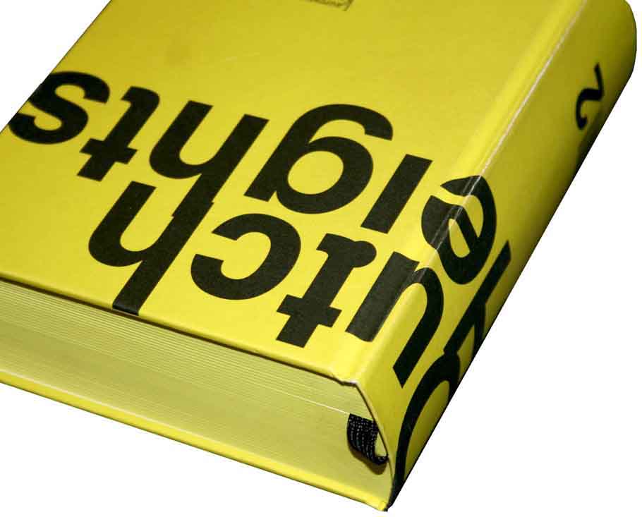
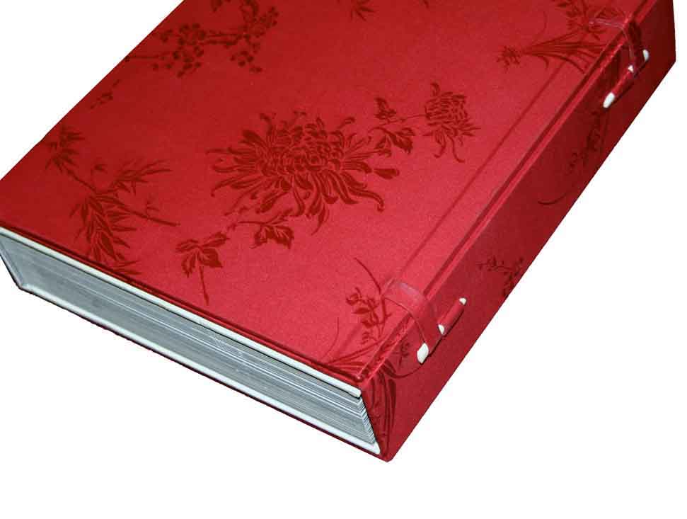
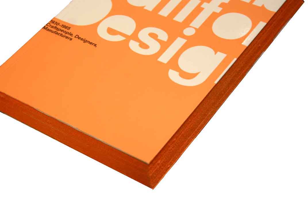
What the books are known for in the first place, is their object-like quality; they are almost like pieces of architecture. This I experienced when seeing BOEZEM and having the association of a brick. Boom sees the book as a container of a lot of information, an ongoing thing, with a permanent quality (of spreading information), in contrast to the internet. And this of course should be manifested in and attained by the design of the book. This is also why the book’s edges are almost always incorporated into the overall design: to make it one whole. Besides, a lot of the books ask for interaction and this way a relation is stimulated between the viewer and the content.
Next to that, attention to detail is what is most essential for a Boom-book. Through those exceptional details, Boom is really able to make –mostly symbolic– links between design and content. Otherwise there is these recurrent little features Boom seems to be fan of, such as embossing, reversed chronological order, and every publishers` worst nightmare: the white cover.
But actually most of all, her books scream uncommonness, everything in it is opposite of what you would expect.
So, the designs certainly have things in common and are in that way sort of connected, very much also approach-wise. You can call this Irma Boom’s signature, but I think it would go too far to define her signature by an obviously present personal ‘imprint’.
But let’s get back to the other questions I raised in the beginning of the article. As a book designer, is it actually desirable to have your signature visible in your designs? And if not, is it even avoidable?
“Making a book you should do with your heart, intuitively”
If this is Boom’s belief, how can her own ideas and preferences of aesthetics not prevail? But still, by saying that she wants to make the book for someone and not just a book, you might actually conclude that Irma Boom tries to keep out anything that refers to herself, as a book designer and as a person, so the book can be fully centred around its subject. You could translate this statement of her as the aim for objectivity. But just have a quick look at her books, and you are assured that her books are far from objective. Her taste, her humour, and her willingness to experiment always become apparent.
And the fusion of Boom with a subject, it seems to work. The adding of a little subjectivity, so to speak, seems to lift the subject. It seems to give it a structure, a context, a voice maybe… This effect is also enhanced by the fact that she is often the editor of a book as well. Maybe this kind of ‘subjectivity’ that Boom incorporates in her designs is part of what makes her so successful. So, in case of Irma Boom, she is sort of depending on her signature and thus it is very desirable for her and her audience.
From a different viewpoint, if someone, a publisher, a company, or an artist asks her if she wants to make a book for them, wouldn’t they want, the ‘handwriting’ of Boom, to shine through in the design a little bit? She is so renowned that it is such an honour if she makes a book for you. Let it be visible, they would probably think. Besides, it obviously sells better when people know that she is the designer, or it could mean something very good for one`s career… look at Sheila Hicks. The many awards winning book that Boom made for her, instantly gave her a huge career boost. Of course, you can also question why customers buy one of Boom’s books in the first place. Is it because they are actually drawn to the book itself? Or is it because they are drawn to the fact that the famous Irma Boom has done the design? Looking at it in this way, does Boom’s signature perhaps stand in the way of properly presenting the subject? Anyway, fact is that the people she makes books for are almost always very content with the outcome. And who knows better if the subject is well presented, than the subject itself?
Simple as it is, that is what Boom does: she evokes excitement. At the time, her own wild ideas excited herself, and through realising them she shares with us that feeling. Going for the realization of these wild ideas, it also takes some courage, and I think this is also something a lot of people respond to. Boom is not afraid. She is not afraid to personally connect herself to the subject, she is not afraid to not know at forehand what the exact outcome will be, she is not afraid to take her time (it took her five years to finish the SHV book), and she is definitely not afraid to do the uncommon. But most of all, she is not afraid to disappoint her clients or to not do what they want. The risk-taking in combination with her ingenuity and eye for beauty are always the recipe for a special result. Most people love this specialness, but of course a risk-taker has a lot of enemies as well. In the beginning it took Boom probably a lot more courage to not listen to them than nowadays, since she is a very respected and many awards-winning book designer.
It all started with that very intuitive attraction to a book that turned out to be made by one of the world`s most famous book designers. Now it ends with me feeling like having at least partly unraveled the magic behind it. But even if I might have unravelled the magic a little bit, the spell that Irma Boom`s books put on me, is definitely not broken.
Rietveld library catalog no : 05547
