Skip to Content Skip to Search Go to Top Navigation Go to Side Menu


"intuition" Tag


chasing after something unclear


Sunday, May 6, 2018

good

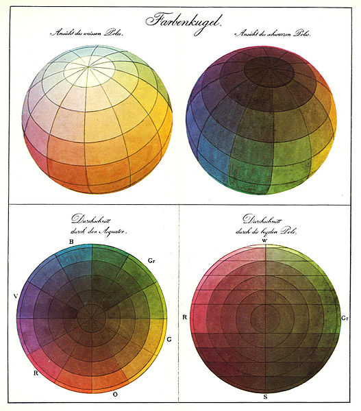
At first I thought of two spheres, one based on pigment, and one based on light. The spheres would hold all colours, but on the outside, the pigment-based sphere would be black and the light-based sphere would be white. It was kind of an immediate response to the three-dimensional colours system shapes I saw during our presentation on already existing colour systems. A lot of artists and taxonomists from this presentation had decided on a certain shape either two or three dimensional, which would hold all, or at least all (for them) relevant colours. These two spheres I had in mind were maybe an ode to the two things I believe decide colour; the pigment an object contains from itself, and the light that makes it possible to receive the colour by the eye. The pigment-sphere is black, with a white center (all other colours exist somewhere in between the white and the black), because this creates a bigger arera of black in opposition to white, just like the more pigment something contains, the darker the colour gets. The same goes for the white sphere, as more light will eventually create white, and no light at all will create complete darkness (black).

But far before I started working with this idea, even before I completely thought it through, I started to doubt. Because, if light and pigment completely depend on each other, than what reason is there to “pin down” colours, in a system? Of course I could create a scale model, animated version or a couple of drawings of these spheres to show what the colours inside are like and how they work, but what would be the use of that if anyone seeing it in a different room, with different light would receive it completely different?

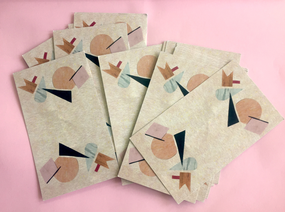
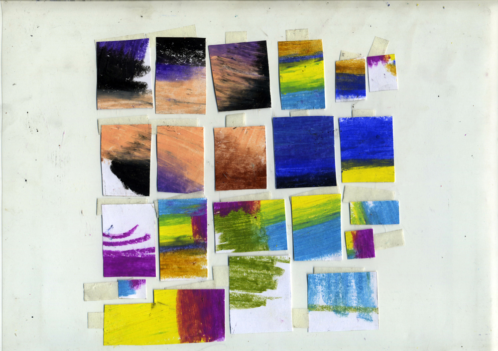
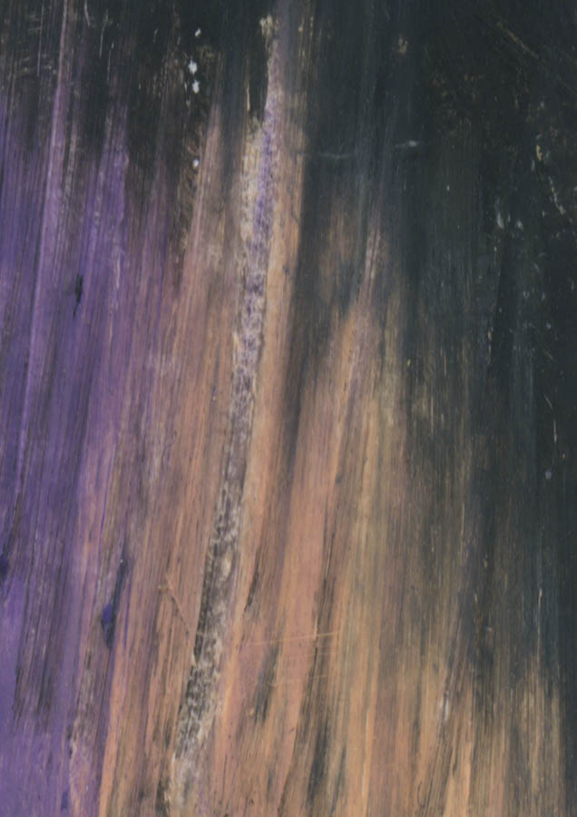
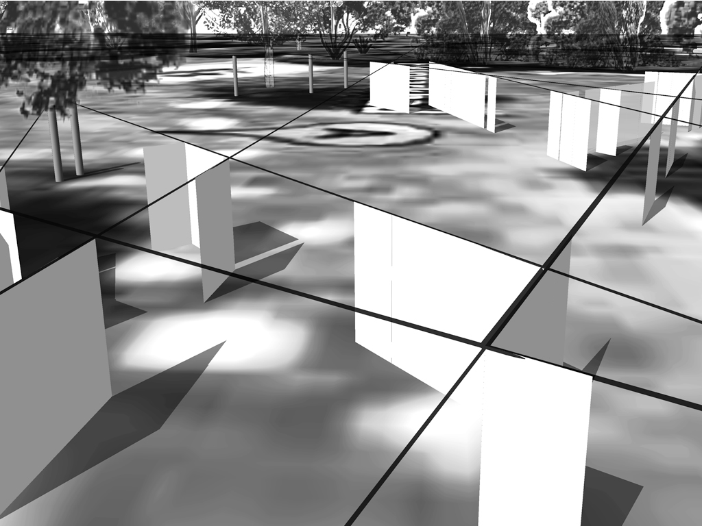
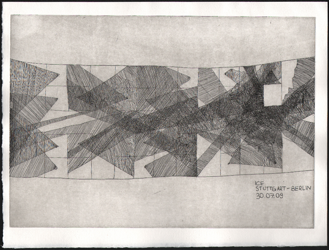
I wasn’t sure how to continue now, as the word “system” felt like I had to make something clear, or at least something that can make sense and be repeated in multiple situations, which I thought wasn’t really possible with something and changeble as colour. It took me a while to realize that I should just start working with colour, and not worry too much about it making perfect sense. But as soon as I realized, I got sick and didn’t do much more than lay in bed. This, in combination with the feeling that colours mostly depend on how our eyes perceive them, made me want to approach the assignment in an unconcious way. A couple of nights I slept with a different colour light in my room. Afterwards I tried to capture what my dream was that night, and if there was any noticeable difference from the night before. Though I remembered the dreams well, it was surprisingly difficult to pin them down. I wanted to show the general feeling of the dream, and no specific details or story lines. I wanted to capture them in a simple way, in which the sense and atmosphere of the dream is immediately there and clear to anyone.

I noticed that sleeping a shorter amount of time had a different influence on the dream than sleeping the entire night. If i only slept an hour or two with the coloured light on, I could clearly remember the first random associations mix up with the usual memories and thoughts I have when I’m awake. To put it differently: I felt myself fall asleep, and I felt myself sleep, and then I felt myself dream and then I felt how an alarm clock woke me up and brought me back to the logical world. Within those few hours, there was not enough time to form coherent, “full” dreams. I dreamed in feelings and associations, not about stories or places or people. I think the lights had some effect, in the short term.


yellow light  Yellow light, 8 hours, no clear difference from my usual dreams, except that everything was darker, This corresponds to an old dream I have each time the morning sun shines into my eyes: That my eyes don’t work and there is a black spot in the middle of my eyesight.

geel 5


green light 
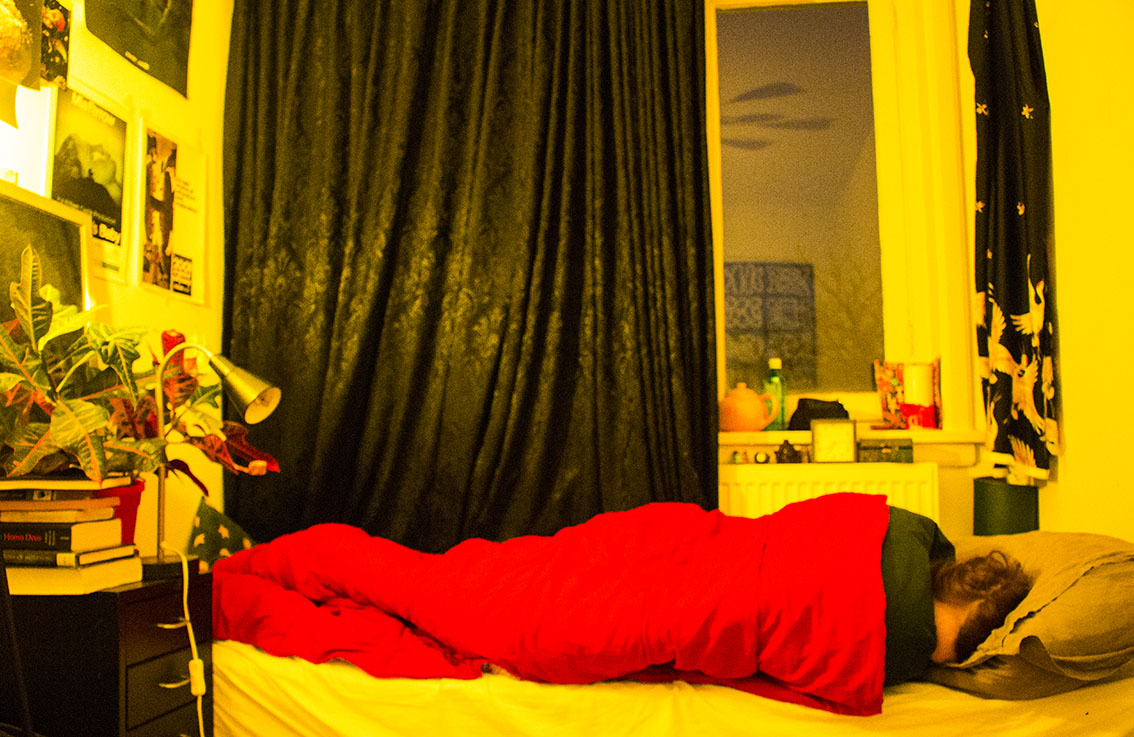
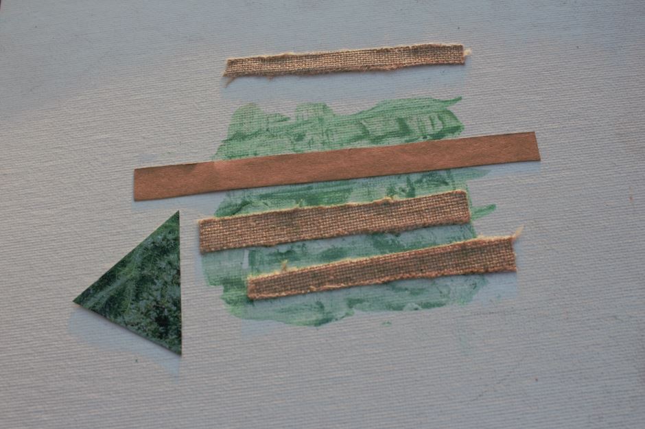
Green light, three hours. Some images I had with this one were of dark wood furniture and music instruments.

groen


light blue light Light blue light, 1 hour (maybe shorter). This one had very clear images, as I was still half-awake. I woke up pretty soon too, so that I remembered them very well.
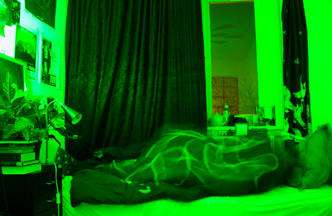
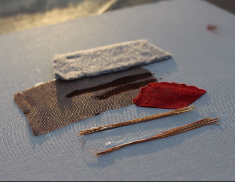
lichtblauw


red light Red light, 8 hours.

rood 2


purple light 
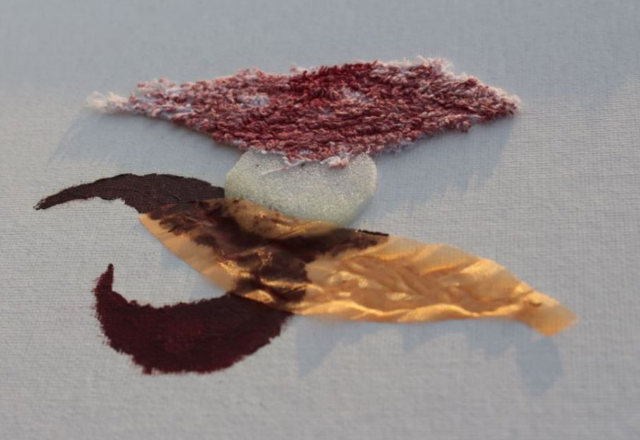
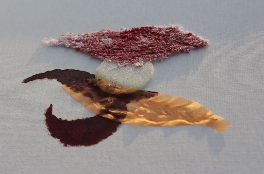
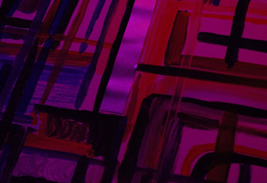
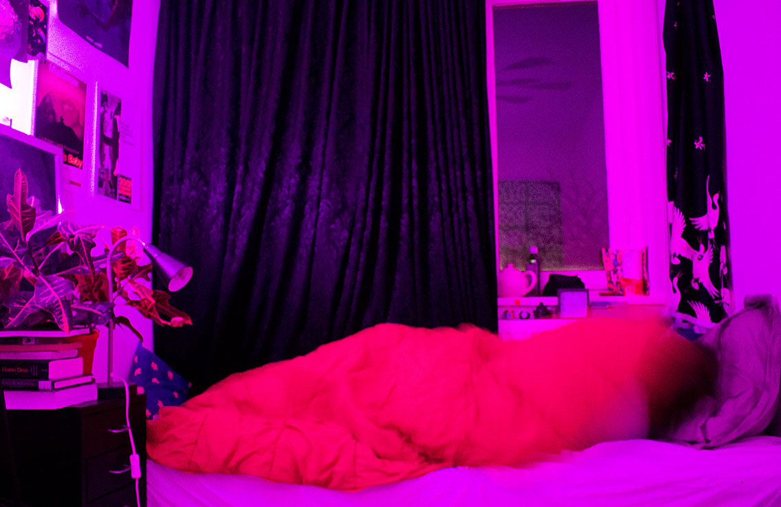
Pink/purple light. 2 hours. I dreamed about textures and places, no clear story lines involved.

roze


dark blue light Dark blue. I don’t remember how long I slept. I dreamed about people crossing a busy highway in the dark, so there were a lot of orange headlights.

blauw


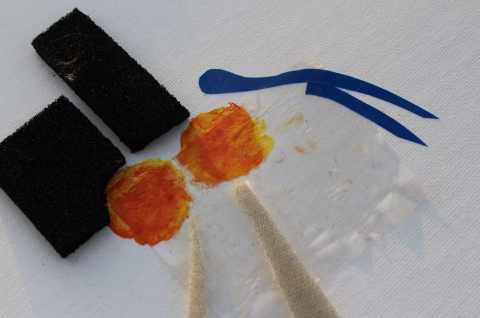
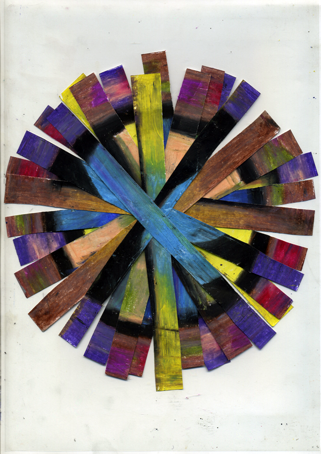
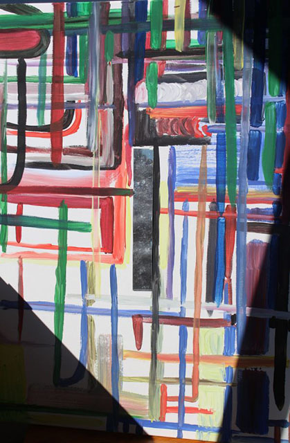
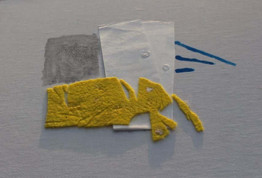
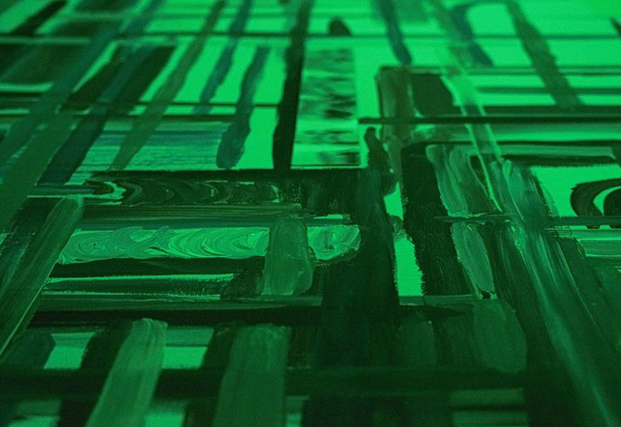
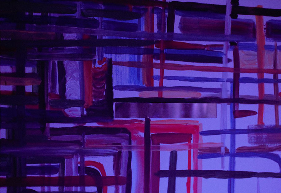
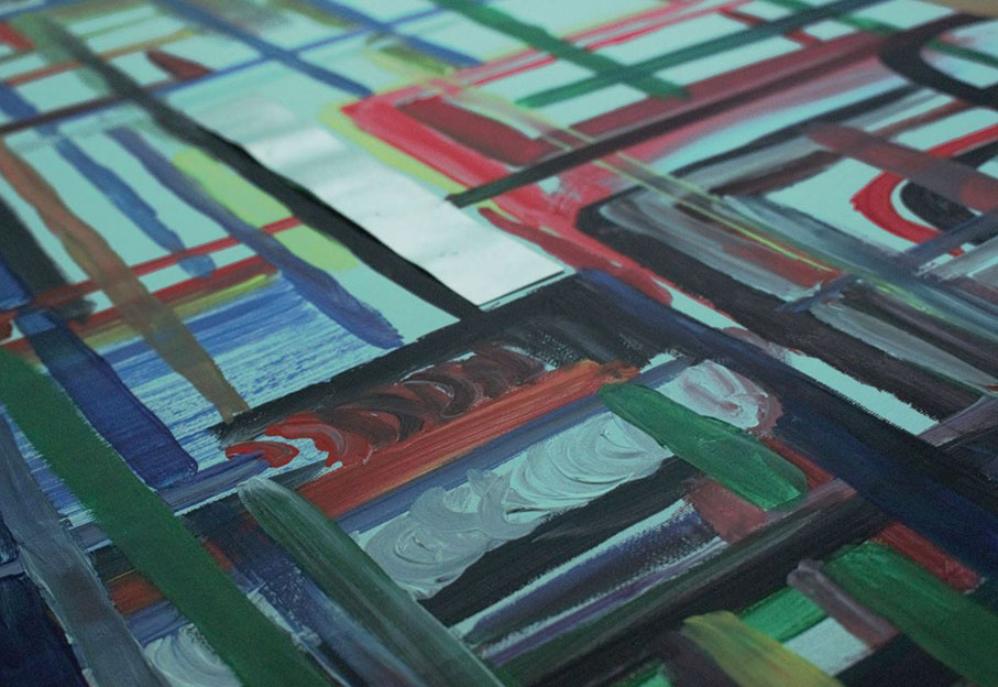
I really liked the coloured light and the many effects it had on the colours I was used to, so I wanted to do a little more on it and show what a power the light has. I had two coloured lamps change constantly while painting, so that the way I choose the colours wasn’t like usual. Thinking about it, maybe it were better if I had painted something realistic, so that the choices I made had more of a purpose. The painting then would also “make sense” in one light, but not in the other.


blue light painting green light painting

orange light paintingpink light painting

purple light paintingwhite light painting


In the end, I still feel quite confused about what I did in this assignment.
By focusing on the things that go around unconsciously in my head, I can never be sure if I have “catched” what I was chasing after.


Bringing Intuition to the World of Algorithm


Monday, May 15, 2017

IMG_1021_1100

The online realm is one that is primarily and increasingly algorithm-based. With the growing use of the internet, the integration of our physical bodies with our technical devices, our access to the internet, algorithm is starting to take over our intuition. The more we use the internet the more we depend on algorithm and the less our intuition is trained. Sometimes I reach-out to my intuition in cases where algorithm could have brought a better answer, sometimes I reach out to algorithm in a case were intuition is much more fitting.
Today, I am going to bring intuition into a virtual space in which algorithm is the standard. I am going to do a simple PPF – past, present, future- tarot reading to predict the state of the Design blog over three periods of time. After I apply my own intuitive knowledge of the reading to the post I link the relative tag words to the post to create a calculated and contained interpretation, more algorithmic, perhaps more indicative and fitting.


The first card I pulled in the past position is the EMPEROR.

Emperor

The Emperor implies a controlling and organizing expression. He follows the Empress who is pure creative energy, flowing and care free. He also embodies that creative energy but does so by managing it in a way which provides structure. Where the Empress is totally engulfed in a mess of energy, the Emperor- like the tag words- are direct and organized. I always compare the Empress to Art and the Emperor to Design. Pulling the Emperor in the Past position here, implies the Design Blog’s beginnings were introduced by someone with intensions to or with a need to establish a system in order to share creative energies.


The second card I pulled for present position is the SUN.

19 - sun copy

The Sun is about being bright and fresh. It implies a time when vague ideas become clear. For present of Design Blog, I would say this is implying a time when its intentions are clear. The connections and intentions set up by the Emperor are now thriving and totally obvious. It implies that maybe there was a time in the past when its state was in a jumble, but that time is over and the Design Blog is in its prime.


The third card I pulled for the future position is the WORLD.

21 - world : graduation copy

The World card is the last card in the tarot’s Major Arcadia. It signifies an ending, a completion. Pulling The World in the future position is a very positive sign, as it implies that the Design Blog will continue to flourish in the Sun until it is totally complete and whole, and not a second before then. The design blog will never simply die out, like would be indicative by the Death or Tower card, but it will continue strong until it is time to evolve into something more advanced. A possible future outcome could be that the Design Blog evolves into something more fitting with future technologies.


ON WORKING WITH YOUR INTUITION


Tuesday, April 1, 2014


Arthur Maduro and Nadja Henss* talking together about the subject of working with your intuition


Each project that students initiate, makes them into temporary experts on given topics. Art & Design schools then become knowledge hubs where different expertise cross fertilise. By looking at what types of research students engage in, Designreseach and UnBornLab organized a 'workshop' to investigate design matters from a students' perspective.

Through a series of short video's students from both the Foundation Year and then DesignLab department share ideas, focusing on the temporary expertise gained as part of their projects, rather than the outcome. The workshop was articulated around one of their given assignments. Students were asked to develop a specific object or context to help focus or explain content.

The format is clear: two persons, discussions, filmed from above.
the space is : two stools and a table.

* Foundation Year


”Farbenkugel ”


Monday, February 3, 2014

Schermata 2014-02-06 a 22.57.12

Colors //

Philipp Otto Runge, born the 23 july 1777, died the 2 December 1810, he was a German Romantic Painter, friend of Goethe (that wrote a ”brick” book about colors; ”Theory of Colours”) in short, they shared the same interests. Runge dedicate his life on accurate, almost ”scientific”, drawings, painting and he dedicate him self on the studies of colours and creating a colours system.

For him there are three colors (blue, yellow and red) what he wanted to do is create the complete kind of colors resulting from the mixing of them, among them self and black and white. The result is a  sphere illustration similar to planet earth with two poles of black and white and colors are mixing each others in all direction and depth. The easy way to visualize his idea I think is to imagine it as a three-dimensional sphere that you can as well dissect (like an apple) and inside discover colors mixing among each other.

527px-Runge_Farbenkugel

What I appreciate on the ”Farbenkugel” is his ambition on creating a complete illustration of the relation between colors, and the obvious benefit that you can have from it.

With the fact that he is a painter you can see that his colour studies influenced the way he is handling colours (x;x) in his paintings that make me interested on choosing some of his paintings, simplify them and select some colours with the use of pastels, than be playful and let the process lead me to create something.

illustrazione-copy Philipp_Otto_Runge_005


The process//

First of all I selected some of his paintings and then I made some abstractions based on the similar color that you can see in his works, then I cut out parts, square and lines of the abstractions. Build forms and experiment and play around with them.

An interesting point of the “Farbenkugel”, if I´m not wrong, is that in the center of the sphere, or rather the core, all the colors are mixed and give black, I decide to pick a gray because of adding some white from the upper pole of the color sphere:

1903285_10151905931406314_1697678139_n

Actually, the more I was experimenting and trying out, the more I was getting insecure and confused.
Finally I decided to focus on the square selection and zoom/ abstraction of his painting.

Prova2-15_redu A2pastel

Prova2-9_reduprovaA2_redu

So I selected some of the more or less 5 x 6 cm cut outs, scanned them and printed them in A3. But then I still didn’t know what to do with them.

I questioned myself what should I do? So i pick up the camera and start filming but….

I was getting more lost and far from the original idea.

Whit this color system I must say that I learned to not underestimate or doubt the first idea, but go for it and finish it.
So this is a video clip showing the concept of extraction of colors on the first idea that I had, and if I followed correctly maybe I had some more image exemples…

Get the Flash Player to see this content.

The shortest search


Tuesday, May 14, 2013

This search for a book was the shortest search in my life. I’ve got six tags. One of them is ‘rules’. So, I’ve set up rules for myself. I am allowed to check books only from top shelves. The third tag is ‘coincidence’. I have had no idea what kind of book I was looking for, which means it was going to be a coincidence any way. One of the first book I picked from the first top shelf from the art section is a book with a naked lady on the cover. I went thought the book. The artist was mostly working around naked human body. My search was going really well!
Inside of the book I found oily finger stamps and prints of cup of tea. Apparently some one had breakfast in front of the book and left all this marks inside by coincidence.  First book I took from the book shelf exactly fitted all the tags I had! It confirmed the rules I made for myself. The power of coincidence convinced me how important to trust your own intuition and used a bit of imagination.

Rietveld Library cat.nr: BECK 3

Not A Complete Story…..


Monday, April 9, 2012

At the Fashion&FOAM exhibition in the Vijzelstraat, the work of Emmeline de Mooij was a real eye catcher. Not because of its colors, not because of its size, not because of its position, but because it was ‘different’. In an exhibition on fashion design, she chose not to show clothing or fashion photography, but to present a canvas with a picture of a jumping naked woman and collected sand, called ‘Gravity and Domestic Dust’. A very (strange?) personal approach to what fashion design is? How does she describe herself, and what –as an ex-Rietveld student- is her connection to the Rietveld after 10 years of graduation? As a reaction on her visual work, I chose a personal formal approach by sending her a letter full of loose questions, written on pictures of the Rietveld building and on photographs of her own work. What I got back was not a complete story, not a letter either, but a bunch of answers giving a slight insight in the relation between this versatile artist and ‘our’ Rietveld.

How do you describe what you do?
Emmeline de Mooij (born in Delft, The Netherlands, 1978) investigates in her installations, photo’s and performances, the human being looking for something to hold on, confronted with the sight of a dizzying big universe. Comfort and a therapeutic effect is often found in surrounding oneself with as much objects as possible.
In her work she creates artifacts and remnants of fictional societies and scenes from apocalyptic scenario’s, removing the contradictions between the everyday and the improbable. Materials such as clothing, utensils, plastic, clay and Styrofoam, she molds together into images referring to science-fiction, archeological finds and pseudo-scientific theories.
The complex, with objects surrounded modern life and the nostalgic desire for simplicity, she captures in an ironic way. Where concepts of freedom and panic are inextricably linked to each other.

You+Rietveld: Happy marriage?
Yeah, quite a happy marriage! Although I wouldn’t describe the Rietveld at that time as a top level institute. I thrived well in the general focus at the Rietveld at giving the students a lot of freedom and responsibility, but I also think that there were a lot of not really good teachers. Teaching on a bad level, not up to date with developments within the international art world, or just not dedicated enough (absent all the time, sick, burn-out etc). I had the feeling some of those teachers where teaching there since ages, having this contract, so they were save for the next 10 years, they were friendly to the director and that seemed enough to keep their job.

In what way did you(r work) change during your Rietveld studies?
I guess, due to the fact the Rietveld being quite an international community, the same counts for Amsterdam where I moved to for my studies, my horizon was broadened. And I felt I could finally fully express myself, surrounded by like minded people, quite different from the provincial town I grew up.

What is your relationship to other (ex-)Rietveld students?
I have some friends that went to the Rietveld as well, maybe 30% of my friends? But I’m not one of those that keep hanging out with only Rietveld people, there’s quite a big community in Amsterdam that is like that.

Does it matter that they are from the Rietveld as well?
See answer above.

Do you think that someone can say that your work is “typically Rietveld -based”?
To be honest, I hope not. I hope my work is not too strongly part of just one particular tradition.
Although sometimes I have the feeling, especially compared to artists with a background in American art education, people who studied at the Rietveld have quite an elaborate/intuitive way of working, which feels to me more natural. So I wouldn’t mind if people would connect me to the Rietveld in that sense.
I can’t ignore though that my work can be typical Dutch sometimes.
Especially in photography I think there is a certain approach that a lot of Dutch artists unites, “improvised” looking still lives for example, or snap shot like photo’s with strong flash light, the use of humor in the work. And many times I think Dutch art isn’t very political, again especially compared to artists with a background in American art education (for me this is a strong reference just because I recently lived/studied in the States for 1,5 years), artists here are not extremely engaged or making political statements.

Why did you go to NYC after your studies?
Because I got offered a scholarship for the Photo Global Residency Program

When did you start making these (canvas)works? Do you consider them as fashion design?
I started making them in New York in 2010. I wouldn’t consider them as fashion design.


Do you manage to draw the school-floorplan by memory?
No.

What did you learn most in school?
Working from my intuition.

Did the school change in your eyes?
Don’t know.

Would you change something?
If there are still these teachers that aren’t dedicated and not good at teaching, I would throw them out and really try to upscale the general level. There are enough great artists and theorists living in or close to Amsterdam who could teach at the Rietveld.

Did you ever think about quitting the Rietveld?
No.

When where you there for the last time?
I think 2008, for the graduation show.

Do you feel linked to the school today?
Not so much, although coincidentally two weeks ago or so I ended up at a lecture from the Italian thinker Bifo and I heard he was going to speak at the Rietveld Studium Generale the next day. So I checked the Rietveld website and some lectures looked interesting, but I had to finish some works for a show so I couldn’t go. But maybe definitely next time.

Shield and Shelter


Thursday, July 15, 2010


enclosureflevoparkbath-etching

intuitive fear spaces


Architectorial anxiety.
Can I design a space that uses my experience of fear to design the perfect safe zone? How can I shape a space which gives one freedom and privacy but which is not enclosed?

Shields and Shelter is a design for the grounds of the public bath – Flevoparkbad [link] – in Amsterdam. For the Rietveld graduation exhibition 2010, I realized a 1:1 detail of my design on the lawn behind the Rietveld Academy.

Kristin_Mauer1

above : a 1:1 detail of my Flevoparkbad design on the lawn behind the Rietveld Academy.


In Shields and Shelter I applied step by step the guidelines that I have developed to achieve safe and comfortable zones using my own fear experiences. These guidelines involve architectural concepts like shielding and view, shadow and light, flexibility versus rigidity. The perfect safe zone to me is a flexible space which gives one freedom and privacy but which is not enclosed. As basis for the design drawings I used an aerial photo from Google Earth of Flevoparkbad. From each towel, I constructed lines of sight from 120° angle views. Through shading these 120° triangles a map emerges with different degrees of surveillance. The darker the area, the more views. At the darkest areas the view must be blocked. Therefore I developed shields, which can be slided along rails that follow the lines of sight. This allows the bathers to adjust their exposure to others according to their own wishes.

kristin_slide8

kristin_slide7kristin_slide16
IMG_4897

tracing the 'feel' zones and the emotion lines and reproducing them in a real situation.


From the jury rapport : Kristin Maurer’s installation outside is a whole new interpretation of space. Space can be created by shadows as well as materials. This is what struck our jury-members. Next to this the technical realization of the work is stunning and therefore our members of the jury wanted to celebrate this piece of work.


etchings at graduation show Kristin_Mauer3

ICE-etching

The etchings in the thesis, presented as part of the graduation show, are ground plans of remembered fear spaces. A scheme of lines of sight in train, Kristin Maurer, 2009 [etching]


Pdf-icon Download thesis: Architectural anxiety. the perfect safe zone


Log in
subscribe