Skip to Content Skip to Search Go to Top Navigation Go to Side Menu


Archive for January, 2010


El Lissitzky


Thursday, January 28, 2010

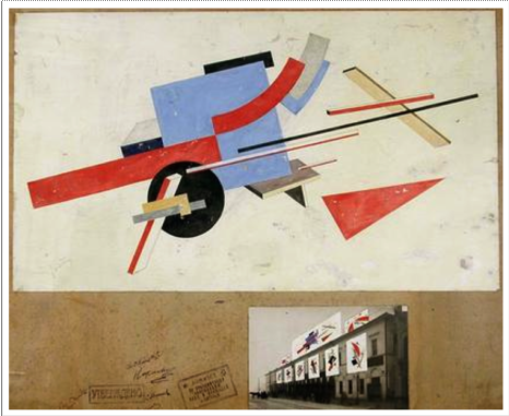
From Van Abbemuseums power point presentation I got attracted to a painting by El Lissitzky called “Proun P23, no 6”, in this presentation it has number 51. I have never really been into constructivism, suprematism or any of these kind of movements but I will try to focus on the things I actually like in El Lissitzkys painting. In general, I like the way he is able to leave empty spaces without making it comfortable. I always have to be alert so I don’t fall into the harsh abstractions of his work. The patina or aging paper makes it easier.

In this specific painting, “Proun P23 no 6”, I get the false illusion that he has done the same thing and left an empty space. But in fact the painting is packed. Trying to describe the painting, one can say that it has a fleshy colour in bottom, there are two deep red triangular forms almost meeting in the middle. Preventing them from coming together is a rectangle, a cube and two things that appear more flat, a stick and a square. The cube has a deep green coulor, the other objects are more neutral to the paintings colours. I like the colour composition and that it feels light even though it’s made in oil and on canvas. It’s a nice mix of painting and drawing. I also like the spacial aspect and the loose objects. It’s interesting the way he here presents the abstraction, I mean the space and volume is meeting some very basic shapes that seems easy to recognize and comprehend but makes an intriguing whole.

It’s hard to say anything about the texture of the painting from this point of view, but with the zoom site I attached it’s easier to get a feeling of it. From looking at other modernistic paintings, I really don’t like that dry texture from when the paint is not enough in one stroke or when the canvas is shown too much. These things create a very uncomfortable and also very physical feeling, just like some people don’t like and get chills when scratching your nails against a blackboard. This don’t seem to be a problem here with Proun 23, and I can understand that Van Abbemuseum must be very proud to have this painted Proun in it’s collection.

Applicable to all aspects of daily life


Thursday, January 28, 2010

If I would come across El Lissitzky’s street decorations today, without knowing what they were, or who they were made by, I’d be wary of calling them decorations.

They just look too much like big paintings.

And calling somebody’s painting “decorative” is usually not good for your relationship with the person.

But that’s what interests me so much about his design for street decorations from 1921: It doesn’t look like any type I have seen before.

I’m actually not sure if the decorations would be terribly effective, the street in the photo does not look particularly festive. Lissitzky’s position seems to be not so much about creating objects that fulfill a purpose in the best possible way, but more about having them embody certain (suprematist) ideals.

It seems to me, that in his street decorations, Lissitzky is not looking for the ideal street decoration, but instead applying his ideals to them.

The Suprematists of whom Lissitzky was part, strived for suprematism as “embracing all aspects of the human spirit”  and thought suprematist forms to be applicable to all aspects of daily life. And you can see this when you look at a sample of Lissitzky’s work put together. It seems he really believed that this style, this way of working, could work for anything.

But there is more to these forms than meets the eye, they follow set standards and, if you know how to “read” them, communicate a clear story. A real form-language if you will. Unfortunately I do not speak this language, or know what the paintings mean, but in Lissitsky’s vision it would be omnipresent, and understood by all.

This really interests me,

is the reason the decorations do not work for me that I do not speak Lissitzky’s language?

Or would they, even if communism had worked out and everyone would understand, still miss something of the festiveness that we associate with street decorations?

I am inclined to think the latter

Sound >< Time + Space


Tuesday, January 26, 2010

sculpture in space on figure in future


Sunday, January 24, 2010

In 1913 Victory over the sun was firstly performed in Moscow. From aesthetic perspective, it was Malevich who was responsible for the costumes and decor, we may recall upon this happening as the start of Suprematism.
In 1920, this time directed by Malevich, the opera was performed again. During this period El Lissitzky made his lithographic designs for the nine figures from the opera. Instead of costumes he designed electromechanical puppets. Puppets that would be controlled by one person. Lissitzky deliberately left this concept at the stage of the lithographies, as he had made his mind up that he wasn’t going to be the one realizing the project. “You can do this”, was his vision.

In terms of fashion, there are many ways to encounter these designs. I myself encountered three major elements that can be related with contemporary fashion: technology,expression and giving emphasis to -suprematist- shapes by utilizing them in a different context.
The use of electro mechanism could have easily inspired the work of Turkish designer Hussein Chalayan. This element comes strongly back in his 2007 spring/summer collection, used as a tool to transform. The remote control dress as an interesting outcome of the same mentality.

Dutch designer duo Viktor & Rolf greatly succeed in establishing moods and characteristics through their designs. Making these -invisible- elements visible and more importantly visual. A resemblance that goes up for every figure from the opera designs by Lissitzy.

British designer Gareth Pugh touches on these elements too, though in a more abstract way. Abstract in the sense that clothing no longer hold on to the outlines of the human body, but -form wise- is completely free to go into any directions. Great representatives of these elements are Japanese fashion designers -or rather fashion sculptors- Issey Miyake, Rei kawakubo and Yohji Yamamoto.

Laughing About Westerbork


Thursday, January 21, 2010

For a long time “The aftermath of World War 2” is going through my mind.
I especially think of the emotional effect is had on the different generations of Jewish family’s, also because of being third generation myself. In spite of the fact that I can’t acknowledge my Judaism, ’cause my mom is a catholic, I can say that it made me into the person I am right now. It is a subject that is very important for me to think about. The work of Harun Farocki, about the Dutch concentration camp Westerbork, gave me the inspiration to deepen my thoughts en emotions about this much-discussed subject.

Please click on the photo!

After doing some research on the work “Respite”, I found a YouTube film where Farocki explains how he is interested by traumatized generations. He’s not only talking about World War 2 victims, but he is talking about traumatization in general. Maybe we can see this interest as a starting point of his work. Another thing he talks about, which I think is very interesting, is this philosophy where they say that you have to experience the trauma again by smelling, feeling or hearing it, only after which you’ll be able to erase it. This is really something I want to explore for myself too. He is also talking about Alain Resnais, who was one of the founders of the Nouvelle Vague. This was a movement of young movie directors who tried to analyze Hollywood Cinema as critical as possible, and in doing so make a very radical change in cinema. Farocki tells about being inspired by this movement and especially by this kind of analysis of film. In “Respite” you can really see that this intrigues him.

Interview Harun Farocki part Ipart II

After seeing the work of Farocki I wondered what his intentions where. Did he mean to put the genocide out of his context, the downright association that everybody has: death. If yes, is that even possible? Can one see the Holocaust out of its context by only looking at photo footage? There was another thing that really caught my attention, the used photo material in the film, made by Rudolf Breslauer. These photo’s where not photo’s of stolen jewellery which was property of the Jewish inmates or remains of cut off hair, but they where photo’s of people who were laughing and doing there usual daily routines. Showing the humanity of it. The humanity that was still there, under the most horrible “scenery”. This point got me into thinking. And to put this point to my own situation; How is it possible that a damage of this kind, does not take the humanity away. And is that even true?

Once my dad told me about a moment out of his youth. It was about a conversation with his father, my granddad. After a talk about future plans and dreams, my granddad told my dad that he had no personality. The most painful thing you can imagine a father telling you. After he told me about this comment, I burst out into tears. The man was so harmed by the things he had been through. that he lost his ability to give love. Love, the thing humanity is based on.

After I stopped crying I came to the realization that not only my dad suffered from his traumatized father, but I did as well. It became clear to me that this pain was passed on from generation to generation A pain that exists out of so many layers and is therefore extremely difficult to solve. A pain that I carry with me because my father raised me up with it. Sometimes I’m scared of the thought that it will never end because of the fear to solve it, and that I will pass it true to my children or other loved once. Although I do think that it will become less, and time will solve a lot. But it will take a lot of time. In the end I can ask myself, if I once more relate my situation to the work of Farocki, is it true that people laugh their fears and sadness away. Cause I see that in my father as well, is that why our communication is only possible by laughing about everything, and talking about nothing?

from ((Gothic Hightech)) to ((Favela Chic)) and Beyond


Tuesday, January 19, 2010

Cultureflock: source, Atelier Sophie Krier

50 years after Willem Sandberg defined his vision on curating by inviting the audience to look inside the museum through the windows of his “New Wing”, the SM is in a state of comatose transition towards becoming the future’s best tourist attraction. The old adage “time flies, space stays” does not count anymore. Space moves too and a new generation of digital natives moves with it. About time to think up new directions.

The Graphic Design Museum takes the lead again with the symposium “me and you and everybody we know is a curator” about quality in an age of visual overload, after an idea by Sophie Krier and Mieke Gerritzen. How do we present and preserve quality to this new generation of “digital natives”. Sophie Krier presented this tentative diagram (above) about the main question behind the symposium  “me you…”, namely “what is quality online? – The diagram represents culture as a flock of migrating birds, always on the move, and the connected dots as our mutlifaceted attempts to make sense of that dynamic whole. In her presentation she compares it with the well know “designproces scheme” by Charles Eames in which he presents the believe of the Eames office in working from genuine interest only- in this diagram, he maps the partly overlapping interest zones of society as a whole, of the client and of his office.

The program consisted out of two stimulating culture-philosophical lectures by Bruce Sterling and Andrew Keen illustrated with case studies presented by researchers, artists, designers, critics and of course curators. Among these quality speakers the opinion surfaced that a transformation of space from physical to digital will lead to a revival of the physical quality. I would call it a reassessment of deja-vu in which the internet replaces the subconsciousness.

Designblog provides the links to a summary of the symposium by Liselotte Doeswijk (source designhistoryNL), but like to emphasize the provocative introduction speech of Bruce Sterling (Cyberpunker and blogger for Wired)  “Gothic Hightech in the Future Favela”. download a full transcription by Morgan Currie

XX- ,The Book


Saturday, January 9, 2010

XX- is based on a research-approach that focuses on the intensive examination of typography and writing in all its social, societal and aesthetic ways of application. In the 2006 ‘typography class’ at the Leipzig Academy of Visual Arts, we (Elisabeth Hinrichs, Aileen Ittner and Daniel Rother) developed our project on the visual implementation of “symbols of power” in writing systems under the conditions of a totalitarian regime. In particular, we examined the way in which the SS (Nazi SS 1925-45) presented and visually legitimated itself by means of a constructed sign . A collection of sources was created on the basis of intensive research in libraries, state archives and the Internet as well as of interviews with contemporary witnesses. This collection was the starting point and the foundation of that book XX-, The SS-Rune as a special Character on Typewriters.

In its three chapters FEMALE (FRAU), SIGN (ZEICHEN), MACHINE (MASCHINE) the book XX examines the way in which administration, communication and technology were an elementary condition of the functioning of the annihilation apparatus in the Third Reich.

The book’s content consists in visual (advertising and propaganda images, files) and textual fragments (contemporary, philosophical, sociological statements as well as statements related to cultural studies and encyclopedic entries).In it, history is interpreted, displayed and arranged. In this sophisticated way of dealing with history which makes its documents visible and discloses them for use the book XX- questions its sources and their perception. In its hybrid composition as a file as well as a book its design employs filing techniques such as a registry, catchwords, numeration and categorisation and embeds these into a book format.

The book XX- is composed as a symbiosis of a file and a book cover and thus refers to its sources: The archive and literature. Constructed solely of visual and textual fragments, it uses available literature (contemporary statements, encyclopedic entries, philosophical, sociological, political and linguistical standpoints as well as statements related to cultural studies) and images (advertising- and propaganda images of the 30s and 40s, files).

In the book, fragments are juxtaposed without them being commented in way resembling an archive. Thus, they demand an independent analysis and an autonomous evaluation of the different opinions by the reader. The selective constellation of the sources takes on the book’s structures: Their succession and compilation are fixedand thus generate a new content. The resulting hybrid presents history and questions its alleged absoluteness and unambiguousness at the same time.

The book XX- questions its sources and their perception In a sophisticated way of dealing with history that makes its documents visible and discloses them for use. Thus the closeness of the book as a medium is abrogated in favour of a new perception of historiography. History is interpreted,  displayed and arranged in a reflection of the medium.

by Elisabeth Hinrichs, Aileen Ittner, Daniel Rother

Title: XX- (The SS-Rune as a special Character on Typewriters)
Series: orange files. Studies on Grammatology # 1 [orange files. Studien zur Grammatologie]
Editors: Julia Blume, Prof. Günter Karl Bose, Institute for Book Design at the Leipzig Academy of Visual Arts [Institut für Buchkunst der Hochschule für Grafik und Buchkunst Leipzig] Leipzig 2009
324 pages, 198 images, 420 citations, hard cover, cost €49
ISBN: 978-3-932865-55-8

BibliOdyssey


Monday, January 4, 2010

Students of the Rietveld have many libraries at their service.
On top of the Public Libraries there are many specialized libraries covering many different fields of specialized interests. Designblog tried to give you some glance into Rietveld’s own small library by means of opening up it’s hidden treasures in two projects, called “The Library Project 2008″ and “Subjective Library Project 2009″.

Most frequently we continue our researches in the Library of the “Rijksakademie” especially when our search is art oriented. Their collection, dating back to the 18th century, includes approximately 33.000 volumes.
In addition to 85 magazine subscriptions and some 1400 videos and dvd’s, there is a large collection of monographies, catalogues of exhibitions and art theory books on visual arts, photography, video, applied art and architecture. Next to the regular collection it harbers a beautiful, exiting and inspiring special collection of rare and old book on a wide spectrum of subjects, including illustration, decorative art and others. Come in person and be awe-inspired.
The Rietveld itself squandered her special collection in the 1990ties due to lack of space and vision. Only a few items remained in their collection and archive. Stuff coming from collections like this can nowedays be found on many online blogs and sites too. Look at Designblog’s own links like BibliOdyssey (read more), Linedandunlined, Spacecollective and many others.

But there is no thing like the real thing.

The Stedelijk Museum Library is specialized on modern and contemporary art. This library is together with the Tate Research Centre and Bibliothèque Kandinsky/Centre Pompidou the biggest in Europe) and design subject of the 20th century).
The Dutch Institute of Media Art “Montevideo/Time Based Arts” (NIMK) mediatheque is the ultimate place for everything focused on video- and visual art. This Institute has a huge collection of video and a brought library.
Go there, take time and see for yourself.
The Bibliotheca Philosophica Hermetica is a highly unique library on manuscripts and printed works in the field of the Hermetic tradition that are mostly philosophical, theosophical, astrological, magical or alchemical in nature.
The Library of the University of Amsterdam (UBA/UvA) was founded in 1578, when the books and manuscripts of all catholic institutions and the city library were merged. Next to its main building at the Singel there are many other library collections (like Artis/Zoo Library) connected. Most interesting are their special collections (on printed matter and its history).
The International Institute of Social History (IISH) is the world’s largest documentation and research centre in the field of social history. The institute is independent and reliable, which makes it a natural depository of the frequently threatened cultural heritage of the labor movement and other emancipatory groups and currents. The IISH is an institute that comes under the Royal Netherlands Academy of Arts and Sciences.

Of course their are many more specialized libraries like the one in “Huis Marseille” on photography, the Academie van Bouwkunst and NAi (Dutch Architecture Institute in Rotterdam) on architecture and many others, never much more than a hour away by train. Most of them can be accessed on line like The Photography Library, a cooperation between FOAM (Amsterdam) and the Dutch Photo Museum (Rotterdam). For Fashion we just travel to Antwerp to visit the MoMu Library. Most students have free transport in the Netherlands.


Log in
subscribe