Skip to Content Skip to Search Go to Top Navigation Go to Side Menu


"poster" Tag


We are in this together


Tuesday, May 9, 2017

Writing for the sake of writing

Make a blog post about nothing or whatever

Here are random connections to random posts on a blog that everyone is obligated to update. Why? Just because. Do you ever read anything because you have to? When does it happen mostly?

School? Aren’t you studying what you like? Aren’t you supposed to study what you like?

Work? Yh you had to work somewhere. Those readings are probably boring but you need to eat and pay rent so here we go. Capitalism. Sigh.

Government mail. Can’t read those though, they’re all in Dutch. “We killed the tree now it’s your turn to struggle. Folded in half. Eight fold. Figure it out somehow. Or don’t. Whatever. Couldn’t care less. Careless.

I am sorry if you’re reading this because you have to. I wish you didn’t. But bear with me. We can power through this together. We will come out of this different. We will learn something.

I am not going to teach you though. You can only learn yourself. Ask yourself questions. Or don’t. Don’t ask questions if you don’t feel like it. Listen to your body. That pressure you feel on your chest? That fire you can’t put out, your back burning, pay attention to it. Relax. Use this moment to listen to yourself. It is hard, Everything could be hard. Sometimes its hard to leave your bed, I know that way too well. Sometimes working two shifts in a row is not as hard as making yourself some breakfast or picking up that paper from the floor, that has been there for a month.

Don’t be hard on yourself. Accept your weakness. You don’t have to love yourself. Its great if you do, but don’t be hard on yourself if you don’t. One day you will. You don’t have to love yourself in order for someone to love you. I love you. Just for you. For you fears and struggles. For your carefree attitude. Or absence of it. It’s ok to care. Its hard but you’re gonna be fine. You’re special. You’re unique. You’re so cute when you laugh. I don’t have anything funny to tell you right now, though. Kinda feel guilty for it, sorry. But I will learn to accept it. One day. One thing at a time. Or after ten thousand times. Lets change together. Its ok if you don’t want to. It’s ok if you did. Every thing is different. Every day is different. Every day you’re different and the same in a way.

All the bad and good is in you, you don’t have to look for it anywhere else. Just take a look inside. You also can take a look at someone else. Its fine to look up to people. You’re someone’s hero too. Somebody looks at you and realizes they could be better. Sometimes they don’t believe it because of how awesome you are. They should read this post too. But only if they want to. It is also ok if they have to. I hope they feel better after reading it. I hope it could make you feel more at ease. It’s ok If it couldn’t. Sometimes we can’t help but worry about things. This world is stressful enough. We just have to navigate through it. Do you know that just looking at you could make somebody’s day better? You look so radiant when you feel inspired! It’s contagious! Its ok if you feel shy for people looking at you. Don’t worry, they are in their own heads. It’s ok if you feel shy anyway. It’s ok if you don’t want people to look at you. I respect your desires. You’re a great person. But you don’t have to be great to be respected. You deserve love. You deserve peace.

It’s ok if you like when people look at you, you deserve to be the center of attention. You’re such a fun and outgoing person when you feel like it. Sometimes you don’t and I appreciate that. Everyone needs time for themselves. Some people probably don’t. But you do you! It’s important to recharge from time to time. For you it may mean all the time. Maybe you need to reach out for support. I hope you have your support system. It sucks if you don’t! Let’s try go through this together then. I am so glad we met like this. Through our eyes. Or ears. Maybe fingers. I hope you are having a good day. Or that it’s a little bit better now that we spent some time together. I hope you know your worth. It’s ok if you don’t yet. It could take some time to get there, especially living in the system that is thriving from you not knowing it. Remember it when you feel like you’re not enough. You’re more than enough, you have everything you need to be you. I am sorry if you don’t! Please, reach out for the support. You deserve every bit of it. Please, do. You are valid. You make this world so much better. I love you.
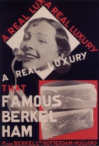
Paul Schuitema: a pioneer of photomontage in the field of food industry


Sunday, January 11, 2015

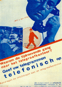
                                                                                               Berkel Ham from Berkel LTD. Rotterdam (1928) By Paul Schuitema. 

In the Stedelijk’s permanent design collection, I chose one of Paul Schuitema’s posters. Paul Schuitema (1897-1973) is a Dutch graphic designer who also designed furniture, practiced photography and typography. He constructed his advertisements on the principles of De Stijl (more mathematical, abstract and simplified, when compared to previous styles) and Constructivism (as art had to contain social means). El Lissitzky’s ideas, as well as Rodchenko’s (his way of using new angles in photography – such as from high above or down below the subject) influenced him in the design of his industrial advertisements. Those same influences can be found in the works of his colleague, Piet Zwart. Repetition, geometrical forms and the use of primary colors are used in a similar way in both their posters. Paul Schuitema lived during the time of industrialization and of mass production after World War one. These periods can be felt in his poster and the subject chosen.

Schuitema

He started to use Photomontage in 1926 and was one of the pioneers of this technique in the field of industrial design. This poster is an advertising print for food processing industries. It was situated amongst others of his in the Stedelijk’s Design collection. It was explained how photography, not yet considered as an autonomous art, was used for another medium’s finality. Photography was newly used in the 1930’s in order to bring further other types of art.

This is what first appealed to me when I encountered this poster. It felt relevant to our times and to how projects are now executed. More and more of final projects aren’t only constructed of one medium. For example photography is rarely a finality in itself, but a way to get to an other specific result. This new technique of photomontage is relevant to our time in that way. In projects and art works, the medium used is now rarely thought as a finality in itself.

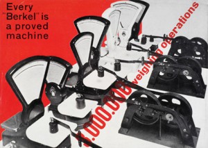
This new technique and his influences can be noticed in other posters of his:schuitema_lg

Primary colors, the use of photography, repetition and new angles as from high above or from down below are used in this second poster as well. Here is another example of his colleague’s, Piet Zwart’s, work, which is closely related to his:

pion6

After paying attention to Paul Schuitema’s poster (the first example used) – It’s design qualities and it’s historical position in the development of arts – I looked at it in it’s original function. This poster was designed in 1928 as an advertisement for the Berkel Ham industry. This subject, presented in the poster, actually takes over its technique and style. It appealed to me more when I tried to look at it in its original context.

Food nowadays is still advertised everywhere, however the energy coming out of them feels different. Therefore, I started to question the accuracy of this poster, for us today, on that matter. Food and its industry is a constant subject today – where it comes from, what is in it, how we eat it, how to eat in a balanced way, the products used for its production… The worry of how we feed ourselves could be considered as one of society’s current obsession. Seen from this point of view, this poster underlines the change of perception we have of food, from the 1930’s to nowadays.

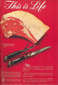
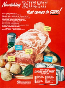
The typography, the choice of photography, and the way the whole poster is disposed, gives me a feeling of playfulness and simplicity. A feeling of innocence almost emerges out of it. As I looked through other food advertisements, of different syles, the gap seemed even more clear:


Vintage-Meat-Ads-03-634x920       50cannedmeat

These posters were used as advertisements in the 1940’s and 50’s. Sentences as :  « This is not just a piece of meat … this is something a man wants to come home to … something that helps children to grow … something that makes women proud of their meals », were used. If these posters were contemporary, they could almost only be received in a satiric way.

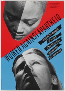
Based on the same principles of photomontage, the Dutch group of graphic designers « Wild Plakken » (1977) created posters with a specific social and political goal. They chose clients according to their ideological means. Their belief that a designer had to use his graphic designs in order to mix life to art related to Paul Schuitema and his influences of De Stijl and Constructivism. They illegally pasted posters in Amsterdam, fulfilling this idea of spreading their ideals. Women rights and racism are some examples of subjects they would portray in their posters.

CRI_7259


Some of the same principles of Paul Schuitema can be refound in the esthetic of this poster. In the same way as in the Berkel’s ham industry poster, a different feeling appeals to me. This example of  the Wild Plakken’s poster doesn’t recall innocence, but still gives me a feelling that such an image on such subjects, today, is not as easily disposed for everyone in the city. It is interesting to see how, through time and the development of one technique – such as photomontage – these posters still give a feeling that a gap has been created. Paul Schuitema’s poster and this one example, still give me the impression that this type of expression is less accessible to everyone nowadays.

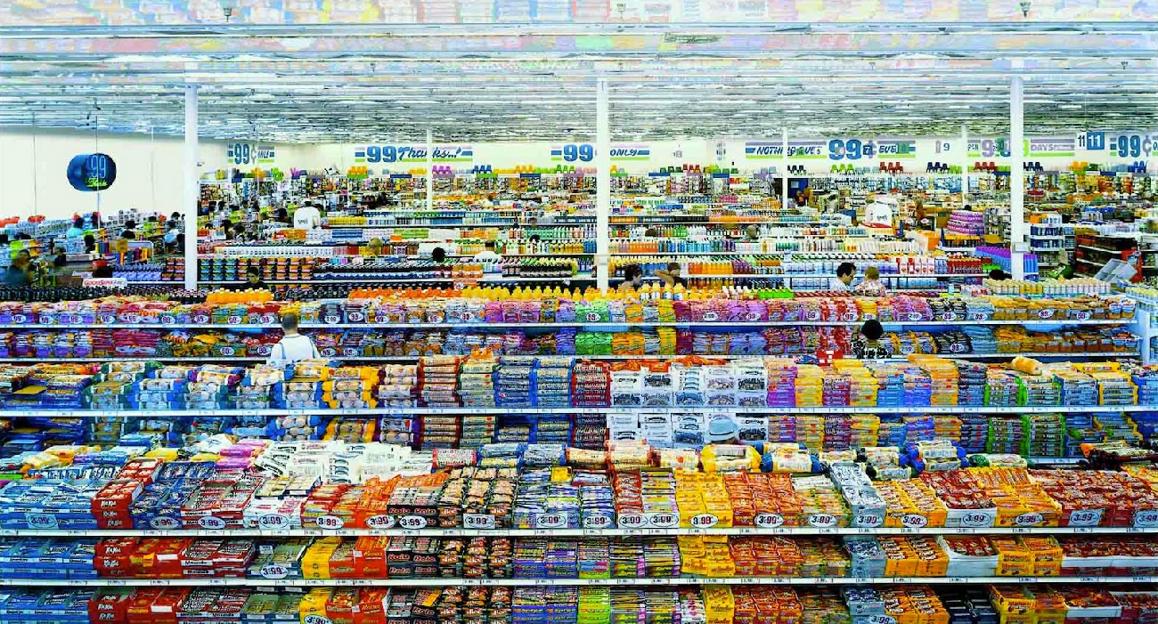
On the subject of the portrayal of food through images : Andreas Gursky’s photo « 99 cent » (1999) states a point of vue which completely contradicts with the posters above. Without giving us a direct position to take towards this subject, Andreas Gursky still pushes a feeling of being overwhelmed and crushed under the overtake of food industry. The feeling is completely contradictory to the one Paul Schuitema’s poster gives us. Both art pieces are thoughtfully structured but opposing themselves in their function.

Andreas-Gursky-4

They are however hard to compare as one is an advertisement and the other, a photography piece. I used Andreas Gursky’s photography as an example of what continuously changed our minds on the food industry. It is pieces of art as this one that put us aware and more distant from the advertisements we see. The opposition of those two examples, in the way they apply photomontage, can maybe explain the gap that I feel in the feeling those images give. As one (Paul Schuitema’s poster) shows a one sided image on how to perceive a subject, the other (« 99 cent »)  faces you to a situation, without giving a straight opinion but implying it through the image.

Art pieces (with « 99 cent » as an example), the overflow of news and a number of new scientific researches, give us a constant possibility to mistrust what is shown to us in advertisements. It is why Paul Schuitema’s poster struck me more than his others. His image underlines such a great gap of how society approached food industry at the time to now. His poster isn’t accurate for today’s society, which is what pushes its relevance in the Design Collection. It is relevant in its design – to how art works are proceeded today  – , and relevant in its subject – as it is one of today’s main concerns.


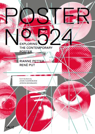
Poster No. 524 The Deconstruction of the Contemporary Poster


Sunday, November 11, 2012

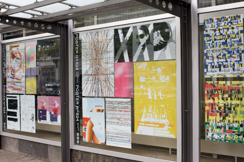
For three months, Rianne Petter and René Put (teacher at Graphic Design) collected posters hung throughout the city of Amsterdam, a total of 523 different posters. They carefully studied and deconstructed this collection according to their most important features, researched certain elements such as text, image, color and composition, isolated and then reconstructed them to create new images. Poster No.524 makes clear how a creative research process works, and is designed so that more generalized meanings about posters and visual culture are made visible. Jeroen Boomgaard and Jouke Kleerebezem’s texts both deepen and contextualize Petter and Put’s individualistic approach, while at the same time exploring the historical meaning of posters in public space (including a history of poster design since 1900) [x]

The book > Poster No. 524 < presents their researches, revealing how a creative process unfolds, how art operates in public spaces and how one goes about creating a visual identity.

Material related to the project will be on display at the Rietveld library from Monday Nov. 26th till Dec. 5th /2012. The project was developed at the Research Group Art and Public Space at the Gerrit Rietveld Academie and the book is published by Valiz. They pursued this research with the support of a grant from Fonds BKVB.

Nothing Is What It Seems


Sunday, May 10, 2009

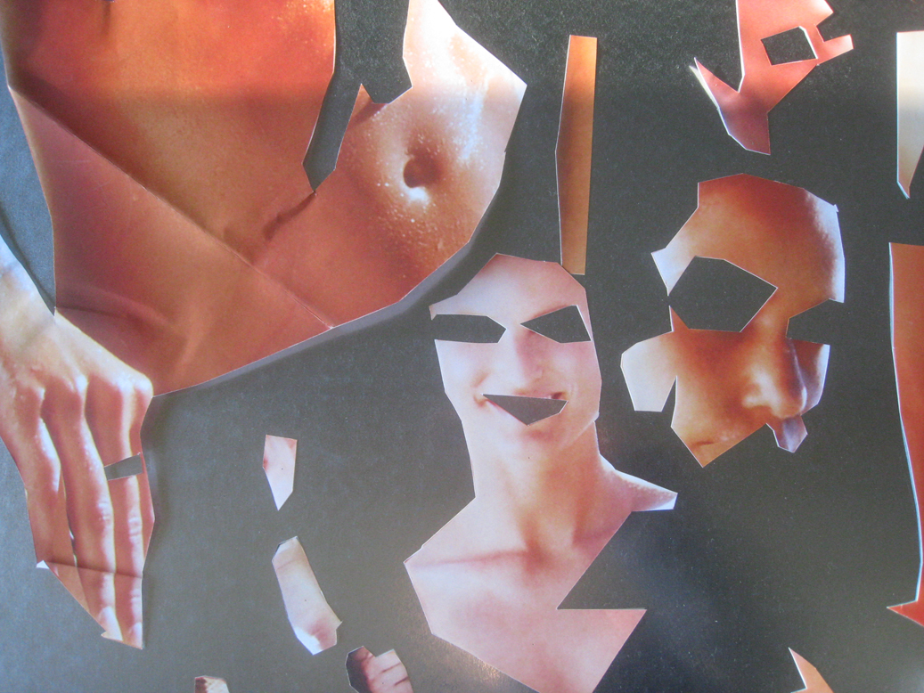
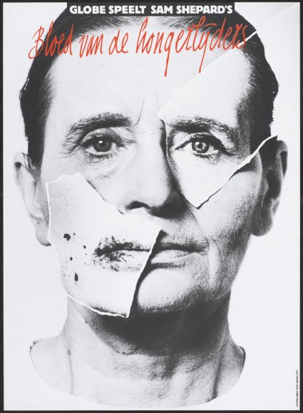
Anton Beeke’s poster for the theatrical play “Bloed van de Hongerlijders” (Blood of the starving ones) is a complex, yet at the same time striking “in your face” like work. Attempting to create an image that contains a deeper psychological meaning, Beeke executed the work while making use of different techniques. First of all there is the photograph, depicting a man in probably his early fifties. Furthermore present are yet two other photos. Where the first photo seems ordinary in the way it is presented (one recognizes a portrait that is, consistent with the convention, merely showing the face of the person depicted and partially the neck), the two other photos are peculiar. They are both cut-outs from other photos, pasted on the first picture. All the more strange it seems that also these two photos differ from each other. Although they both fit on the man’s face (from which they seem to be copies), they physically don’t match. Whereas one might assume that the right picture is a genuine copy of the original, the left photo shows spots and irregularities that could be associated with sickness. What could be going on here? Are we dealing with a Janus-like figure, perhaps a schizophrenic madman? Or was Beeke only pointing out an ambiguity with which we would be confronted with while attending the play? Presumably the answer behind these questions lies hidden within the layers of this work. Until we see it, we can only speculate. And exactly this curiosity is what a poster should revoke!

WHEN THE FACE BECOMES A MASK

What has happened to this man? Are we dealing with a Janus-like figure, perhaps a schizophrenic madman? And what could the artist’s intention be? Might Beeke have been pointing out an ambiguity with which we would be confronted with while attending the play? Presumably the answer behind these questions lies hidden within the layers of this work….read more about his poster in the linked pdf

Buckle up, and Slap me in the face..


Friday, May 8, 2009

My father once said to me that a good piece of art should slap you in the face.
Even though I disagree with him sometimes, I liked that a lot and I like to be slapped in the face.. It is not often that you are struck by something in such a manner that it stay’s in the mind and overgrows everything that mattered less.
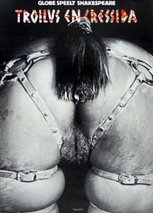
Of course the blow can come from different angles (beauty, shock, alienation, directness, physical impact) but looking at this poster from Anthon Beeke I immediately experienced the ‘slap in the face’ again.
A lot of my fellow students thought the thing horrid and filthy and I can totally understand that. This image illustrates some of the associations we make between for instance : women, horses and sexuality. I think that feeling of repulsion comes from the hidden knowledge we have about our own beastly behavior and the gender specific features that come with that. Moreover it touches upon the similarities between humans and animals.
A while ago one of my friends said she had seen two horses mate and that it had horrified her, why?, because the aggressiveness with which the stallion had moved reminded her vaguely of her ex-husband.
We can find the truth within language; do we not refer to certain men with the word ‘stud’? And do we not aim for a specific type of woman using the term broodmare?
Some displays in this exhibition made me curious, some designs were funny or even beautiful, I marveled over the poster designs from Jan Toorop and Jan Tschichold, However…; appreciating something is not the same as being hit by something. Anthon Beeke really struck, with this beautiful, raw and direct image.
This poster was made for a tragedy written by Shakespeare, I will never forget that play now, and I every time I saddle my horse for a ride I will think about Troilus and Cressida.

LUST DOES NOT MAKE ME HOT
Why is it that some works of art stay with you, and others do not?
When you go through an exhibition, an art fair or an Art book there are only very few things you remember, that stay with you, the rest ….. will be continued in this linked pdf

Salad oil


Wednesday, May 6, 2009

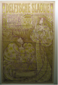
Jan Toorop was a Dutch painter and illustrator who worked between 1880 and 1928 In 1894 the Nedelandsche Slaolie Fabrieken asked him to do an advertisement poster. He came up with this: A litho in the Art Nouveau style. Very popular at the time. Made famous by Alphonse Mucha and his posters for Sarah Bernard.
If you analyze the work you can clearly see the artists hand and the customers’ wishes. This image however is published in almost every Jugendstil or Art Nouveau publication. And even became the Dutch nickname for Art Nouveau. The name’’ Slaoliestijl’’ was not only used for Graphic Design, but was also adapted in Product design.
And this is the question that troubles me most; How did a respected Symbolist painter cope with the success of his graphic work? Not acknowledged as an art form, but as a trade, at the time.
Another question that troubles me is; would it be possible nowadays, for an autonomous artist, to do advertisements without doing damage to his own work or reputation?
If you look at museums of modern art nowadays, you can see that most of them took design into their collections. This means art and design are moving towards each other. And interesting development followed with lots of discussion.

RESEARCH QUESTION: do commissions damage a autonomous artist reputation?

silent dream


Wednesday, May 6, 2009

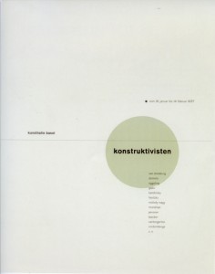
Standing in front of the works of Jan Tschichold, I felt suddenly something very familiar arising within me. An old memory dream-like of the time I studied graphics in the Academy of Fine Arts in Warsaw. As for those days, it didn’t really feel right, however now suddenly it all made sense. It occurred to me, like a missing piece of a puzzle being found, a key to connect those days to „today“. At once I could see all the rules of typography an graphic design emerge within the posters. Like hidden signs, which were not an obstacle. Rather a guideline, a common sense of beauty and harmony. I wondered, what a keen invention graphics was, to connect these powerful mediums of language and image in such an expressive way. I mostly felt attracted by his poster for „die Konstruktivisten“ (Kunsthalle Basel, 1937). I really felt for his taste of color. But mainly, for it‘s almost Zen-like minimalism and harmony. How he perfectly combined the constructivist form, the simplicity and silence. Admiring this poster I just realize how much I have to learn and how far away I am still to any perfection.


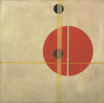
Tschichold “Konstructivisten” poster – Moholy NagyQ 1 Suprematistic painting

read more in the linked pdf “FRESH TASTE OF PEPPERMINT”

About paint and the internet


Wednesday, May 6, 2009

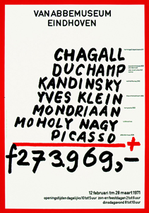
The work that Jan van Toorn made in 1971 for the van Abbemuseum in Eindhoven is a work that caught my interest from the start. It is very daring of a museum to use a political statement like this as an advertisement for an exhibition.
To me it is graphic design at its best. This work looks in a way very timeless but has a lot to do with the time it was created in. Not only because the valuta of the amount that is added up is in Gulden – which we do not use any more (unfortunately – have a peek at Renske’s posting!) – but more likely because he used paint to tell you which painters you can find at the van Abbemuseum at this exhibition. To me this feels very honest, true and logical. I think Jan van Toorn was ahead of time with this work.
I love how he throws all these big masters on a mathematical pile without actually making fun of it. Of course he is making fun of what all these paintings cost. Almost 40 years later the prices went sky high. But in a way that is not really what it is about, to me it feels like putting it out of context. He makes the master painters more human. To me this poster mocks with the art world without making fun of the painters.
It makes me feel like painting.

Jan van Toorn is a man of the first generation of graphic design. In 50 years he has seen al the revolutions and all the new more advanced options you have with the, let’s say, original or old-fashioned way of printing. Jan van Toorn: ‘The computer is the next phase and is of course an amazing development in the world of graphic design and for a designer to work with, but if I look at the results then I find it very disappointing.’

Van Toorn thinks that the Internet should be or become a medium with visual journalism that frees as well as enriches the reader/viewer. He thinks that a different, new use of language is important for that. I agree with him on this point. If you take blogs for instance, or the Internet in general, you can delete half of it because it is rubbish and has no content. To me it is about balance. People do not read long, dry texts on the Internet. It is about speed. It has to be fast. I think blogs such as ffffound.com are a good example for that. It is an only imagery, no text blog about design. You see a lot of beautiful, esthetic designs, and very often without content. Most of the design you forget instantly. Just nice pictures.

I think that Jan van Toorn despises the Internet because I read that Jan van Toorn is not interested in the beauty or esthetics of images at all. It is mainly and only about the content of the design. What is there to tell, to see or to communicate? As a designer he wants to be more than only the person in between the client and the receiver, he would like to be involved within the whole process.

A nice question I found in an interview with Jan van Toorn on the website of magazine de Groene Amsterdammer (in Dutch) is: Are you designers the mediators that show us reality in life?
Jan van Toorn: Yes.
And we simply have to believe that that is the truth in reality?
Jan van Toorn: Yes. Whether we do it or the church does. 30 Years ago it was the church. Today it is about the people ‘in between’ such as designers, journalists and people who make television.

Graphic design and product design may be present everywhere you go but I think it is art that can show you another truth. I think Jan van Toorn set the standard for graphic design back in the days. All we can do is get inspired.

NEW FREEDOM?


Wednesday, May 6, 2009

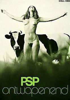
To investigate a design work, i chose the advertisement-poster „PSP ontwapenend“ designed by George Noordanus in 1971.
When i saw the poster, i liked the spirit and the freedom it shows! It has something light and joyful. At the same time it also has something humorous to me. The photograph might stand for the new freedom at that time, won from the 60‘s: the possibility to show nudity in public and even the use of it in advertisement.
Further more, the design and composition of the photograph struck me. The image shows a lot of (formal) parallels: the nudity and vulnerability of the woman and the cow and the pattern of darkness and lightness. Also the setting of the woman and the cow show parallels. And in the end, of course, the context of the slogan „PSP ontwapenend“ in connection with the image is important and interesting to find out more about it!

ANOTHER TIME-SPIRIT

The political background of the poster back then, in the seventies (it raised many controverse reactions), is already discussed so many times. So I decided to relate the poster to recent times: living today, I want to reflect on the poster in the context of today, on the combination of nudity with politics nowadays…. continues as pdf


Log in
subscribe