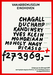
The work that Jan van Toorn made in 1971 for the van Abbemuseum in Eindhoven is a work that caught my interest from the start. It is very daring of a museum to use a political statement like this as an advertisement for an exhibition.
To me it is graphic design at its best. This work looks in a way very timeless but has a lot to do with the time it was created in. Not only because the valuta of the amount that is added up is in Gulden – which we do not use any more (unfortunately – have a peek at Renske’s posting!) – but more likely because he used paint to tell you which painters you can find at the van Abbemuseum at this exhibition. To me this feels very honest, true and logical. I think Jan van Toorn was ahead of time with this work.
I love how he throws all these big masters on a mathematical pile without actually making fun of it. Of course he is making fun of what all these paintings cost. Almost 40 years later the prices went sky high. But in a way that is not really what it is about, to me it feels like putting it out of context. He makes the master painters more human. To me this poster mocks with the art world without making fun of the painters.
It makes me feel like painting.
Jan van Toorn is a man of the first generation of graphic design. In 50 years he has seen al the revolutions and all the new more advanced options you have with the, let’s say, original or old-fashioned way of printing. Jan van Toorn: ‘The computer is the next phase and is of course an amazing development in the world of graphic design and for a designer to work with, but if I look at the results then I find it very disappointing.’
Van Toorn thinks that the Internet should be or become a medium with visual journalism that frees as well as enriches the reader/viewer. He thinks that a different, new use of language is important for that. I agree with him on this point. If you take blogs for instance, or the Internet in general, you can delete half of it because it is rubbish and has no content. To me it is about balance. People do not read long, dry texts on the Internet. It is about speed. It has to be fast. I think blogs such as ffffound.com are a good example for that. It is an only imagery, no text blog about design. You see a lot of beautiful, esthetic designs, and very often without content. Most of the design you forget instantly. Just nice pictures.
I think that Jan van Toorn despises the Internet because I read that Jan van Toorn is not interested in the beauty or esthetics of images at all. It is mainly and only about the content of the design. What is there to tell, to see or to communicate? As a designer he wants to be more than only the person in between the client and the receiver, he would like to be involved within the whole process.
A nice question I found in an interview with Jan van Toorn on the website of magazine de Groene Amsterdammer (in Dutch) is: Are you designers the mediators that show us reality in life?
Jan van Toorn: Yes.
And we simply have to believe that that is the truth in reality?
Jan van Toorn: Yes. Whether we do it or the church does. 30 Years ago it was the church. Today it is about the people ‘in between’ such as designers, journalists and people who make television.
Graphic design and product design may be present everywhere you go but I think it is art that can show you another truth. I think Jan van Toorn set the standard for graphic design back in the days. All we can do is get inspired.


May 6th, 2009 at 10:29 pm
It is a great and political poster. Look at http://www.gerritrietveldacademie.nl/designblog/?p=1285
I wished you said, it makes me feel to make posters (haha). Look in the library for Jan van Toorn. Finaly an other link.
http://www.aicanederland.org/?p=191