Skip to Content Skip to Search Go to Top Navigation Go to Side Menu


Archive for September, 2013


THE THRILL OF CONFUSION/ POINTY BEAUTY


Monday, September 30, 2013

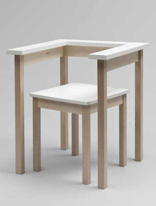
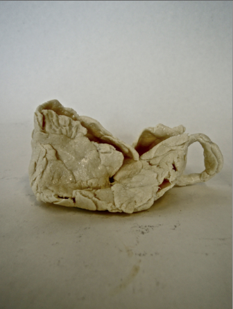
One piece of the permanent exhibition at the Stedelijk that stimulated some form of internal reaction was ‘Cow Chair’ designed by Niels van Eijk in 1997 for his graduation project at the academy in Eindhoven.

At first glance it appears to be a thick legged kiddie chair with a cow hide pinned onto it, which is nice enough – I remember thinking how well it would go with my new old cowboy boots – however, much to my astonishment, as I drag my feet past the seat to check off the next object to admire that it was obstructing I sneak a peek into the chairs insides, where to my amazement was in fact no such chair supporting the skin! I began to pace from one side to the other, pushing my face as close as I could to the void within without drawing the attention of the eagerly hovering security, reassuring myself that it was truly self-supporting.

Curious, the way that it looks so flexibly drawn around a form, with bunched creases contrasting with the tautness in the extremities yet still feels that if you were to sit on the cloth would fall beneath you like a loose rag. When considering the properties of a hide I had no reason to consider that it was it’s own shape, rather than taking the form of a structure beneath it; after all, isn’t that what skin does? My perception of the design changed completely; a hollow, anorexic skin made rigid by the last moistness of life being drained from it, locked together by savage stitches pulling at the skin as both leathers shrink in opposition.


Rather morbid, really.

As oppose to being a complex object that requires calculated thought to attempt to understand, such as an optical illusion or some form of puzzle, this intense feeling of pure confusion is induced when a seemingly mundane, daily object or situation is not how you automatically assume it to be; so automatically  that you don’t even think about it, that’s what really puts you out of whack. This sensation is one that has fascinated me (or haunted, in some cases) since I can remember. One chair related experience almost brought me to tears, it was such bedlam. On a morning no different to any other I took my usual seat at my dining room table with my tea and toast, but as I slid my chair under the table the top of my thighs brushed against the underside of the wooden table; this never happens! I was simply overwhelmed, I just didn’t know why it had happened. I called to my mother to seek an answer, ‘oh, well it must be because one of the chairs is slightly lower than the others, they must have been switched’; what a cruel trick to play so early in the morning. It was such a minute change that upon reflection such a reaction could easily seem somewhat overdramatic, but in the heat of the moment it truly felt like the world was crumbling around me and the chair.

The experience with the cow chair was less of a painful confusion and more of an intriguing, encapsulating.. confusion.  An object to eradicate all other drifts of thought.  To be noticed above all other things, even if the intention of the design is to be discreet . To create an object capable of such engrossment is surely the target of all designs? I find it so refreshingly satisfying to experience such a concentrated distraction, allowing you to grant all focus to the subject at hand, being lost in thought for something that is really real. After all, how can you think in an unclouded manner when you’re constantly mentally multitasking?

Niels and Miriam, hangin’ out.

Mr. Van Eijk and Miriam van der Lubbe have been partners in design (and in [x] their personal lives) since they graduated from the Sandburg institute, leading them to found their design studio in 1998, which lead to their own label: Usuals. Whilst managing not to come close to making the same thing twice, these two capture Dutch design by collaborating humour with vast imagination and experimental works, ranging from spacial projects to product and furniture design; this creative combination attracted numerous museums and other collaborative design companies such as Droog, and many others.

‘Poodle Chair’ 2002, another example of humorous chairs by VEVDL.

The design was of pure inspirational birth. According to ‘Subjects’, one evening whilst Niels was admiring his shoes he was captured by the way the leather formed so beautifully around the point of the toe he thought ‘if this is possible, it must be possible to make a whole chair this way’. This notion developed my opinion on the design even more so; I like a good lump of leather around my feet and can absolutely empathize with the new found pointy beauty that the chair possesses. Why, I just want to wrap myself up in a crispy point of leather.

Although I am a great enthusiast in the field of pointy-leather-beauty, I can’t help but feel a mild disappointment towards the  lack of confusion in the way the design was conceived; it all seems a little too cosy. Alas, perhaps only few are subjected to the level of intense confusion that taunts me so heavily.

A piece of (furniture)?


Sunday, September 29, 2013


CRI_157986


Table-chair is a furniture made by Richard Hutten. It’s a two-piece furniture consisting of a chair and a table with an almost shy and invisible character. The interesting thing with this piece is that it’s a illusion of a table and a chair. By closer observation I realize that it’s the relation between the two parts that create the visual expression of a table and a chair, and if you separate them, the expression changes and along with it the whole concept of the furniture. The parts are defined by each other as furniture. Presented separately, you might not even recognize it as a specific furniture. Richard Hutten’s works makes me question what actually constitutes a piece of furniture. It also makes me understand what a big role our associations play when we observe our surroundings. The Table-chair automatically lead our thoughts to a table and a chair, not only by name but also trough its execution. It’s interesting how this piece, with its simple and discreet design, can contain our ideas of what a piece of furniture is.


thedish


Perception, function and behavour
A table usually consists of a flat horizontal surface that is held up by a base of one or several supports. The fundamental purpose of the table is to support various objects in order to relate to them; for overview, work, show, storage.

The table is an ultimate tool when eating dinner. It creates conditions for you to perform the activity of eating. The flat surface of the table support the plate and consequently free your hands and makes it possible for you to use the cutlery. By placing the objects on the table, their relation becomes more clear and also their behavior related to the format of the table. A rectangular tabletop requires structure, the objects relates to the straight lines of the edges. When placing my computer on it it’s constantly relate to the lines of the surrounding. I place the laptop in front of me, push it a bit backwards to get enough space for my arms to be supported. The table support my activity with the object.

I place a sheet of paper onto the flat surface of the table, I then place a pen beside, in perfect line with the sheet, unconsciously I move the pen a bit more to the right, I continue moving it back and forth until it feels right. The right balance occurs when all element are taken into account, table, objects and body and even though my actions are based on sense it’s not a coincidence – It’s about being taught how to behave and relate to the table

At first sight the Table-chair of Richard Hutten behaves like any chair and table and therefore I know how to relate to it, but a  closer look makes me doubt. This piece of furniture requires a new approach and for that I must forget my conception of what determines a chair and a table.

OLYMPUS DIGITAL CAMERA

Within the context
I found myself at the Stedelijk, continuing to observe the Table-chair. One thing is clear; Hutten confuses me. And somehow the object makes me feel tricked. Part of Stedelijk’s design collection, the Table-chair stands on a podium among other famous design-items. Its chosen placement puts Hutten’s work within the context of modern design.

It’s clear that the work is dependent on its two phsyical parts, that together create the image of a furniture. Another important component is its ability to create confusion in the viewer. But also, I wonder if the greatness of Hutten’s furniture depends on the context in which it is shown. Perhaps it’s the context of Design that creates the confusion surrounding the object.

As a distinguished person with a recognized position and an important role within the design world, Richard Hutten can certainly play with the main principles of design. For me, it is obvious that he choose to use the design context, with its limitations as well as its possibilies, to raise issues and questions about how our perceptions and behavior are shaped by of our surroundings.

For me, the most interesting aspect of Richard Hutten’s work is the fact  that he makes them as a designer.

Bless you Hutten!

Super Nice Witteveen High Chair by Gerrit Rietveld


Sunday, September 29, 2013


images

I have chosen this object  because I didn’t realize what was his main feature at first. Which made the object very mysterious for me. It looks like a chair but I thought it could also be one made for kids (the gate would protect them from falling and the table help them eat). And their is also a hole in the middle of the seat! So I have come to the conclusion that it is a high chair toilet. I love this object because of all the colour Rietveld used. I thought  the lines present on all the file of the chair  make it look very graphic. It reminds me of the tribal art which consists in painting their bodies with lines. As you can see on the picture represented below.

images

My opinion could be a little extreme but I cannot stop thinking that this chair looks like an instrument of torture. It should be comfortable to welcome a child but it is raw wood, and there are no cushions to absorb to body. The vertical and horizontal bars also vaguely recalls the prison world.

torture wre

In fact, this chair was made for Hendrikus Johannes Witteveen Junior, the future minister of Finance who was born in 1921. It is almost identical to the original one, built in 1918.
According to museum experts the Witteveen chair is important because it is the first example of Rietveld’s use of primary colors, a key step in the development of his Red, Blue Chair, considered as an icon in Dutch art history. Even in our school, a lot of students have fun and try to make their own one. Some friends have it on their balcony! Rietveld designed it in 1918, under the influence of The Stijl movement that he has integrated in 1919. This chair is painted with the primary color palette added black, white and gray and a touch of yellow, so specific to this movement. Initially designed with a natural wood finish, Rietveld gave it these colors later, in1923, after officially joined the movement.
What’s The Stijl? It is an “avant-garde” movement, founded by Theo van Doesburg, with the active participation of Piet Mondrian. will destroy the Baroque through the use of colors and “pure” forms in dynamic equilibrium, as visually weightless.  According to Marek Wieczorek “most of its members envision a utopian environment through abstract art, universal harmony in the full integration of all the arts”.


In addition to being a designer, Rietveld was also an architect. I have chosen the Shröder house to illustrate it. I haven’t visit it yet but I already have some really good echos. It was Rietveld opinion that sleeping, eating, bathing (in short, whatever people do at home) should be conscious activities that require a certain amount of effort : letting down the table or making up the sofa bed. Rietveld also was of the opinion that the size of the room should be in agreement with the time spent there. The ideological approach of this house lead a strict view on architecture. Truus Shröder was the ideal client : after the death of her husband, she ask Rietveld to built her a new house. It was the first house of Rietveld which was an exuberant experience for him! He came to a type of design which does not strictly define a space, but instead lets it breath by means open and closed planes, varying lines, colour accent and incidents of light. In this from all sides asymmetrical composition, the transition  between inside and outside are fluently and surprisingly.

RietveldSchroderHuisPhotoErnstMorits   images (1)

Rietveld had deeply left its mark and is always present around us (I know it’s a little easy to say that because we are  studying in one of its architecture but whatever …). His manner to rethink the space make that he will be remembered !

Zig Zag Stoel


Sunday, September 29, 2013

c/o Pictoright Amsterdam/Stedelijk Museum Amsterdam

Ik zig/zag
een zig zelf
zittende
zichzelf zaggende
zig
zag ik zigzaggen.

Ziedaar de zigzagstoel van Gerrit Rietveld. Zag jij hem ook?

Zo zonder leuning, zonder pretentie zeer zeker van zichzelf?
Zig Zag
Een Zizag, ziedaar het woordenboek, is een bewegende lijn die plotseling van koers verandert.

Zo Spannend, de Z, ik zou hem om willen draaien om zo de Z van alle kanten te bekijken.


Zo, van ziehiertje zie daartje en zo en zo.

Zalig zon zigzag!
Zo zonder aarzeling aanwezig, een bazige Zigzag- Z-stoel.

Zigge zagge
zage
zigge zagge zo
zigge zagge zage zonder
zigge zagge
zoooooooooooo
ziezo
zie zo

Zigzag,
ziedaar zo in de verte
zaagt de zigzag door de lucht
gelijk een bliksemflits

O zigzag, kartonnen design klassieker, zonder ondersteuning zeer zitbaar.

Test, Test, test, test,
Ziedaar iepenhout, bout en messing,

Zigzag in zicht.

Met Zwaluwstaartverbinding verbonden, zo zigzaggend aan elkaar.
Zonder benen, zig zagt zij als een zwevende zwaluw gier!

Zij is zeer zeker zwevend aanwezig maar ruimte neemt zij niet!

Zo is Z een stoel, of is Z een tafel,of is Z een Z
Zoals je wilt!
Zig-zag-zo-zoals-
je wilt!

Stijvolle Z,
Zakelijke Z,
Zinderende Z,

Zwaluwstaart, Deuvel, Lij, Schroeven,
niet piepend iepen hout:
Een Z, een Zwiepende Zig Zaggende Zag ik nooit eerder Zig Zag stoel

Ongetooid, Ongekleurd,
Z, Zomaar Zie ik Z Overal!
Zie hier, Zie daar,
z, Z, Z, Z

Het Zigzagje, zegt Rietveld,
Ik noemde het altijd het Zigzagje,
Zegt Rietveld zachtjes zigzagggend.

Zigzagje, schotje in de ruimte,
Zag jij haar ook, zo met je blote oog?

In Z, om Z, tussen Z,
Zigzaggend zag ik Z in
en om en tussen

Zigge zagge
zage
zigge zagge zo
zigge zagge zage zonder
zigge zagge
zoooooooooooo
ziezo
zie zo

Een ruimte om op te zitten,
te zagen,
te zwoegen,
te zo evenaren,
Zo nog eentje, Zo dezelfde Z

Ijzeren Z, Fiber Z, Bandijzer Z,
Z, Z, Z, Z, Z.
Oneindige ruimtelijke Z

Zigzagje,
Zag je Zigzagje?
Gebruik je zintuigen,

Zag je zigzag je echt
Zigzaggen?
Zag je hét
Zigzagje?

Zag je een zig zelf

zittende
zichzelf zaggende
zig
zigzaggen?


De Zigzagstoel heeft in de geschiedenis van de twintigste-eeuwse vormgeving niet voor eenzelfde doorbraak gezorgd als de rood-blauwe leunstoel1

. De Zigzagstoel wordt in de geschiedenis van de twintigste-eeuwse vormgeving veelvuldig genoemd als voorbeeld van de synthese tussen vorm, functie en constructie die door Gerrit Rietveld werd nagestreefd.
De zigzagstoel omsluit de ruimte niet, maar doorsnijdt haar met vier vlakken: rug, zitting, poot en grondvlak.2

Volgens Rietveld corresponderen de beeldende kunsten, schilderkunst, beeldhouwkunst en architectuur met de drie elementen van het zien: schilderen met kleur, beeldhouwkunst met vorm, architectuur met ruimte. De beeldhouwkunst moest zich concentreren op één zintuig: het oog. Via het oog kan de mens ruimte evenaren, aldus Gerrit Rietveld.

Rietveld citeert dichter Tagore:

“Door begrenzing, van het onbegrensde wordt de waarheid werkelijkheid”.

De Zigzagstoel was voor Rietveld een oefenterrein, een middel om nieuwe ideeën, materialen en technieken uit te proberen. De Duitse meubelontwerpers en fabrikanten Heinz (1902) en Bodo Rasch (1903-1995) hadden al eerder een stoel gemaakt met een Z-vorm, de “Geiststuhl”, maar daarin speelde de ruimtelijke werking geen rol, zoals bij Rietveld zijn Zigzagstoel.

Ida van Zijl noemt in Gerrit Rietveld, de doelstelling van Rietveld consistent, “Hij wil een deel van de onbegrensde ruimte afzonderen en op menselijke schaal brengen om die ruimte als werkelijkheid te kunnen beleven. Dat is en blijft de essentie van zijn werk, los van alle experimenten met materialen en technieken en variatie in zijn stijl”.3

Gerrit Rietveld speelde met de begrenzing tussen binnen en buiten. Kleur is voor Rietveld een middel om de begrenzing van ruimte te structureren. Vorm en kleur stimuleren een actieve waarneming die mensen uitnodigt om het werk te leren kennen.

Als literatuurwetenschapper denk ik bij het aanschouwen van de Zigzagstoel direct aan de letter Z, aan poëzie en vooral aan taal. Ik schreef een gedicht. Waarom heeft Gerrit Rietveld voor deze letter gekozen? Wat betekent Zigzag eigenlijk, waar lijkt zij op? Hoe klinkt de Z, de laatste letter van het alfabet als je de Z voortdurend gebruikt. Wat voor ruimte ontstaat er als er een stemhebbende letter Z in een ruimte wordt geplaatst? Is er zo weinig nieuws over de Zigzagstoel geschreven omdat zij niet te vangen is in beeld of taal? Omdat zij zig-zagt? Beweegt? De Z wordt een kunstwerk op zich, soms ontsnapt er kunst, in Rietveld’s woorden. De Z wordt onderdeel van de ruimte, haar voeten raken de grond, maar zij blijft toch ook een object.

Peter Vöge noemt in The Complete Rietveld Furniture de Zigzagstoel conceptueel interessant en niet zozeer interessant als sculptuur. Vöge is van mening dat de Zigzag stoel zo interessant is omdat het een dynamische kwaliteit heeft door de diagonale vorm, “Like a crouching animal about to convert watchful suspense into vigorous action”.

Voor mij is de Zigzagstoel een ruimtelijk beeld dat autonoom wordt als letter, als Z, als bewegende vorm, die je van alle kanten zou willen bekijken. De Zigzagstoel als oneindige letter, want het alfabet begint na de Z weer opnieuw bij de A tot de Z en weer opnieuw. Voor mij is de Zigzagstoel een bliksemflits en een gierzwaluw zonder poten die ongrijpbaar in de lucht blijft hangen, zonder vastigheid.
De Z- Zigzag als kunstwerk, als stoel, als experiment, als overdenking, als trillend geluid, als zin, als gedachtezigzag. Oneindig veel mogelijkheden zitten er in de Z, zie ik, want na het zien van de Zigzagstoel zie ik overal Z, Z,z, z Z.

 salie zigzag stoelen

ZigZag- Salie’s tekeningen


1,2,3 page 189, Gerrit Th. Rietveld by Ida van Zijl en Marijke Küper, librairy cat. no. rie 17

Lamp Science


Saturday, September 28, 2013


Gispen’s Giso lamp (model 24)

A lamp, a simple product. A lamp only needs to give light, you have to turn on the light and after that you don’t have to touch it anymore. So a product designer is not really limited to the function of it, except the fact that it must give light. Or is this not true? Despite of all the possibilities to create a decorative lamp, Willem Hendrik Gispen made a really minimalistic lamp, the ‘Giso Lamp’ []. Only a white opal glass shade and a frosted glass above it, but that simplicity, I think, is the power of it. Willem Hendrik Gispen (1890-1981) was a dutch designer. In 1916 he began his own forge, called ‘W.H. Gispen & Co’, where he created crafted products. But in the twenties Gispen  became increasingly influenced by the design ideas of De Stijl and he switched from traditional to mechanized production. In 1926 he designed and produced the Giso lamps, it became a big success. The Giso lamp (Nr. 24) is a pendant lamp and  has a shade made of white opal glass that is 25 cm and a frosted glass disk that is 43 cm, the stem is made of nickeled metal. The opal glass ensures that the light is not really intense, but soft. The disk ensures that the light is not going up but only going down, the reason why most of all the lamps have a hood is interesting. Maybe a lamp is not only to give light, but also to give it a direction. There are a lot of Giso lamps [], but I think Nr.24 is one of the nicest, because of that disk above the shade.

This lamp is an interesting starting point to look at the vision of Gispen about de art of light. Gispen says that in the theatre the only place is where they control the light so good, that it became a real lighting art. This is because they focus on the most essential element: the light, and they are constantly occupied with the goal: lighting. If you want to make a lamp, you should be aware of the technique and also the goal: the right light on the right place. The requirements that must be set by a good lamp are  of different kind: physically, technical, economic, psychic. There are two groups that create lamps, but not with all the suspects. Architects and artist only focus on the psychic suspect, but then rarely on the main points of this suspect: colour and mood of the light. They only focus on the carrier of the light source, the lamp or ornament. The meaning of a lamp and the way to show it be interchanged. He thinks of all possibilities, an interesting way of hang up, or he creates lamps in the form of a square, instead of round, or a lamp out of wood. He thinks about everything except the fact that a lamp must be an object that light the space as good as possible. The other group is the group that only focus on the technical and economic suspect of a lamp, they want to create the best formula: the most light for the lowest costs. A lot of calculations and math, but a moderate result.

Gispen_Model24_redu

 
I will explain the different requirements.

The physic requirements: the light must be calm and not flicker, that is harmful to the eye. Also the light must not be too strong, that is also harmful for the eye. So you have to cover the light source. You can see how it is done in the Giso lamp. The shade is made of Giso-glass, the best kind of crystal glass, in minimal achievable thickness, (1mM.) covered with a layer of white glass, to a thickness of only 1/5 mM. They make the light pleasant and soft and only lose 10-15% of the light. Also the light must not be too weak. If the light is too weak it requires too much effort from the eye.

The technical requirements: the light out of a lamp can be controlled, by the use of reflectors, diffusers and light-breakers. The light can be absorbed and reflected, the way it absorbed and reflects depends on the material that is used for the reflectors, diffusers or light breakers. So you need to know about materials if you want to create a good lamp. There are also three different ways of lighting: – direct lighting. The reflector is so made that the light goes straight to one place, and is very concentrated. Examples are outdoor lighting or lights in a storefront.

-Indirect lighting: you get this light to let the light first been shined on to the ceiling. But the shadow it creates is so small that you get a surrealistic feeling, and also it is really expensive because the efficiency is only 35%.
-Half-indirect lighting: the best for general lighting. You’ll get this light if you put the lamp in a diffuser of a particular form. The light will shine in all directions . The Giso lamps are made to create this half-indirect lighting. But what you can see, the Giso lamp Nr. 24 has also a reflector above the diffuser, so the light won’t go up to the ceiling.

Economic requirements: maximum efficiency at minimum power consumption. Giso glass is perfect for this efficiency. It has a huge perseverance.

Psychic requirements: the place where a lamp hangs is of course important for how it looks like, a lamp in a living room must be different than a lamp in a party room or a storefront. As you have read there are many different requirements that a lamp must meet. They already decide what a lamp should look like, but you still can design a lamp as good as possible. For example Gispen uses soft gold bronze instead of dark bronze, so there is less contrast between the white shaves and the metal. The Giso lamp (Nr. 24) does not hang on a clumsy chain, but on a fine metal tube.

So maybe it was not true that a lamp is just a simple product. You have to be aware of all kind of different suspects if you want create a lamp, as Gispen did. But if you think it doesn’t matter at all, you can make whatever you want, without looking at all the requirements. (in my experiment I look don’t really look at the requirement, only at the atmosphere.)


Light experiment

Experiment

So now we know what Gispen thoughts were about light. I wanted to do my own light experiment. I changed my lamp into different forms, to look what will happen with the lamp and my room when I make small changes. I used my lamp in my bedroom that has a reflector above the lamp, so the light is more concentrated on the floor and less on the ceiling (like the Giso lamp number 24). I put all kind of different things under the lamp or covered it. The changes are huge, you can see it in the pictures, but it was even more in reality. If we look at the physic requirements I think Gispen would say that I made really bad lamps, because they are often too weak. Personally I like weak light, I liked the one with the white paper around the lamp, and the light concentrated on one point of my room and the rest of the room was less light. Economically it were also not really good lamps, a lot of light gets absorbed so it was not really: maximum efficiency at minimum power consumption. But my experiment was not about creating a good lamp. But about what little changes to a lamp do with the atmosphere of the room. I found out that it changes a lot to a room, but also really your mood. When found out that when the light changed, so my view at my room changed, so my mood changed. The best example was maybe the one with the color, the blue was cold and the red warm. Also the weakness of the light matters to my mood, the darker, the more I get into a mysterious almost melancholic mood. So I discovered through this whole research the impact of a lamp in a room. And that is bigger than I first thought.


Light experiment


Gesamtkunstwerk ?


Saturday, September 28, 2013

ARNE JACOBSEN (11 February 1902 – 24 march 1971) is a danish architect and designer. He was first able working as an architect, then mostly influenced by the modernist ideas. Typically, modernists reject decorative motifs, to emphasize more on materials, pure geometrical forms, function and adaptation to the industry.
Following the modernist philosophy, Jacobsen concieved buildings such as the Stelling House on Gammeltorv (left picture), or the SAS Royal Hotel (right picture), both in Copenhaguen.

old-square-gammel-torv-gammeltorv-_-6-k-c-3-b-8benhavn_700_0 OLYMPUS DIGITAL CAMERA

He went to design products because of his interest for the Gesamtkunstwerk concept. It concerned the preoccupation of building a place as a whole, every objects matter, one place (architecture, furniture’s, light…) is driven by one full concept, vision.
Jacobsen’s design products are therefore influenced by modernist ideals, but are more precisely a part of the organic modernist movement. This movement gave to Denmark and Scandinavian countries a particular place in modern design. Jacobsen played an important contribution to that.
The philosophy of organic modernism’s main concept is to emphasize on the harmony between human living and the world of nature, so that they are combined in an united, interrelated composition for a better living. Actually, it brings to modernism a humane element to its rationnalism. It’s to create clean, pure lines based on an understanding of classical furniture craftsmanship coupled with careful research into materials, proportions and the requirements of the human body.

Kokfelt House 1957 Kokfelt House

The Kokfelt House (1957) by Arne Jacobsen is a representation of what organic modernism can be in architecture.

Jacobsen uses craft and “natural” materials to build his design works. Jacobsen combines aesthetic for a better living and adaptation to industrial production (social matter); which made his works a critical and economic success in the 50’s.

The Egg

            The Egg is a chair designed in 1958 for the Radisson SAS hotel in Copenhagen. It is manufactured by Republic of Fritz Hansen.
The chair answers to the project Jacobsen was commissioned for : designing the whole hotel. He could therefore fully following his interest on the Gesamtkunstwerk concept.
The Egg is considered as a triumph concerning Jacobsen’s design : the organic form of the chair constrats with  the building’s almost exclusively vertical and horizontal surfaces. Jacobsen searched for the perfect shape by first sculpting clay in his own garage. This shape offers to the user a bit of privacy in a public space such as the hall of the hotel. It also can be used in a private place such a home to lounge. The Egg is available in a wide variety of fabric upholstery as well as leather, always combined with a star shaped base in satin polished aluminium.
By combining pure organic form, industrial adaptation, craft (strong foam inner shell underneath the upholstery technique), and conception as a part for a whole; the Egg is an excellent representation of how was design conceived in Scandinavian countries in the 50’s.


Interior of SAS Royal Hotel Interior of SAS Royal Hotel

        This piece shows a particular vision on human living. A better living combining functionnalism (research of materials), human proportions (requirements of the body) and aesthetic (part of a whole, pure forms). It allows the user to take distance from the flows going through public spaces or even in a private one; to find again a bit of intimacy. In a world where we are constantly solicitated, this chair offers with a cleaned form the possibility to manage to deal with those requests. That doesn’t mean to disconnect, but to get better relation to our environment.

         I wonder if the search for better living through the concept of Gesamtkunstwerk, which was the main preoccupation of Jacobsen, can be found in our daily lives. What happens to interior spaces when they are not conceived by professionals, but by individuals. Can we find the concept of Gesamtkunstwerk in vernacular spaces ? Do the objects, the planning of the space allow the user to enter one full vision of it ?

IS GESAMTKUNSTWERK UNCONSCIOUSLY PRESENT AROUND US ?

The Bel Air chair


Thursday, September 26, 2013

2011EN5032_jpg_l 2006AG2159_jpg_l


I think it’s pretty obvious why someone would want to write about this the iconic ‘Bel Air’ chair by Californian designer and ceramist Peter Shire. It’s simply not just another designer chair we see every day! “Quirky but sophisticated, playful but not over-the-top” was my first impression on this piece. There were also many questions that popped in my mind. The quarter circle backrest and the ball shaped “chair leg” for instance – why are they there? Why in such forms? And what about the rest of the design? It’s one of those designs that made me so curious, so now let’s get it started…
Born and raised in Los Angeles, Peter Shire’s often revealed traces of the surfing culture in his homeland through his work, always so full of colours and “cheerfulness” : I see the sharp line of the quarter circle which is in contrast with the round form of the elbow rest. The backrest is partly based on shark fins, and on the Stevens House by architect John Lautner (see below), located on the beach in Malibu.

John-Lautner-Stevens-House-78-Malibu-Colony-Rd-3_0


One thing interesting thing about Peter Shire is that, his design are very creative reinterpretations of normal forms. His work can be seen as art rather than solely functional designer objects (which he also explained in this interview). A good example would be the teapots he designed. Looking at how the teapots appear in various shapes and “movements”, I start to wonder if they are maybe 3D drawings rather than just real teapots (but can some of them really function properly as a teapot..?)


IMG_15841 7292938_1 Peter_Shire_City_Hall_Teapot_2003_630_88

Some of the teapots by Peter Shire


Now back to the Bel Air chair – of course it does function perfectly as a chair (given it has all the essential elements of a chair: seat, back, legs..), but it can also easily fall into the category of ‘art work’. Take a look at the chair again, doesn’t it look like a giant sculpture composed of geometrical shapes, or something you can find in a kids playground? 

And this is exactly the kind of playfulness and quirkiness that I like about the chair. This piece has so much to examine and look at. Everything changes when you look at it from different angles. Yet the elements come together very well, like a harmonious explosion of shapes and colours.


bel_air_peter_shire_memphisbel_air_peter_shire_memphis_facebel_air_shire_memphis_milano

AP0200_1_peter_shire_400AP0200_2_peter_shire_zoom


Now, the best part of the design has to be the bright orange plastic ball. I can totally imagine everyone looking at it twice, or more. No regular looking chair leg is found here, instead we only see this plastic ball giving a memorable twist to the piece of work, truly an uncommon but fun element to look at. It definitely brought the final result to a whole new level.

It didn’t surprise me a lot when I found out the super fun Bel Air chair was the most important contribution of Peter Shire to the Italian design group Memphis. Yes, the quite crazy and very much groundbreaking Memphis Italian group, always challenging the narrow constraints of traditional Italian furniture design. Peter Shire’s involvement in the Group came about after his ceramic work attracted the eye of Ettore Sottsass, one of the founders of Memphis. Sottsass found Shire’s ceramics “fresh, witty, and full of information for the future”. The group invited Shire to Milan to work with them.


memphis-group2011ET6775_bedin_superlamp_bulbedettoresottsasscarlton1981
The word “ordinary” just doesn’t exist in the dictionary of the Memphis…


As previously mentioned, the Memphis design held the intention to break away from the conventional and conversation sides of general retro classic Italian furniture design. So let’s recall a bit: traditional Italian furniture has been popular since renaissance periods and was used by the royalty. One can easily associate words like “classic”, “elegant”, “deluxe”, “expensive” with the style. Colours that are commonly used would be, let’s say, white, ivory, gold and brown etc.

On the contrary, the Memphis stroved to design products which were much more than just furniture—but also political statements, existential metaphors, and visual poetry. Everything. The Memphis were expert at communicating their ideas with colourful decoration and asymmetrical shapes. They have also been described as “bizarre”, “misunderstood”, “loathed”. It’s simply a collection with endless possibilities and surprise.

As for the style and works of Peter Shire, I can see that they do fit perfectly into the Memphis aesthetic.

One nice comparison with the Bel Air Chair would be the Kristall pedestal table by DE LUCCHI Michele (see below). Initially we see colourful and eye-catching components in just one table: a bright yellow top, black and white body, and four blue-gray legs. It reminds me of the first time I laid my eyes on the Bel Air chair. So unique, so eccentric, so unforgettable. Just like the Bel Air chair, the structure of table looks rather simple. Yet there are so much to look at when the graphics come as a whole: the brights colours, forms, shapes, and the very much Pop Art inspired tone…


gueridon-kristall


The Memphis just isn’t too Memphis without asymmetrical shapes. So here we see this table appears in such manner (It was in interpretation of the Apollo XI Space Mission, in case you wondered). The outwardly placed yellow top in the Kristall pedestal table gives a similar result as the bright orange plastic ball in the Bel Air Chair. They are not simply placed there to form a asymmetrical shape, I see them much more than that – the ultimate surprise and highlight of the work. Indeed, the table top and the chair leg both give a little “bizarre” and asymmetrical twist to the final look of the pieces of furniture, revolutionizing common objects, which is pretty much a very important part of the spirit and essence of the Memphis style.

Anthon Beeke plays


Thursday, September 26, 2013

This is a poster for an exhibition in the Stedelijk museum by Anthon Beeke.

Anthon Beeke-dansendemeisjes-stedelijk

It has been printed in several different colored layers which show dancing figures. Anthon Beeke designed this poster in 1995. He sought to achieve independence from the rules of typography, and from popular trends.  This unconventional move has earned him a unique place in the Dutch graphic design history.

Before I came to Gerrit Rietveld Academie I graduated in graphic design on the Media College Amsterdam. After four years I disliked graphic design so much that it made me come to Rietveld. This graphic design school is very strict and technical without much freedom. Form follows function, as they say. You learn more to become a desk top publisher. I learned about Anthon Beeke but did not really notice because it was not allowed.

But not long ago I rediscovered his work and I really started to admire the pleasure he puts in his work, Form follows fun! And I totally agree with this concept. It makes possibilities limitless. One of the reasons why I came to Rietveld is to create without boundaries, because I really felt constricted. Since he was the first to step out of these rules I decided to chose this poster. It got my attention right away, in spite of the fact that the line of sight was partly blocked by some other objects at the entrance viewpoint.

I think it is not his best poster design but I chose this object more or less because of the artists. The whole poster looks like an accidental moved photo at a party with a lot of dancing. The font that he chose adds to the dancing, it is if the letters are dancers as well. I also like the fact that it is a layered print, nowadays this look is easily Photoshopped, but he experimented with the layers and colours.

Anthonbeeke-dansendemeisjes-closeup

At the graphic design study I learned the Do’s and Dont’s which you have to obey. Of course it is good to obey these rules and if you don’t it easily becomes a bad design, but if you don’t obey and do it well it will become way more interesting then following the rules. It’s more exciting. I had to make a poster explaining typography rules this is a small part of the poster showing the Dont’s.

Don'ts typography

It’s in dutch, this is the translation:

Use more then 3 typefaces.

Align text in Block form.

Use outline on a font.

Right text alignment.

Chinese typography, line the text from top to bottom.

Obvious rules, but if you break them it could be so interesting, Anthon Beeke did this many times and he is one of the designers that could do that well.

Hollandfestival-Anthonbeeke

All the dont’s i learned are in this poster, but he did it so well that its interesting and exciting but also readable and understandable. There is a story behind this poster as well. The theme of Holland festival was avant-garde in the second world war. He used a poster of Dirk Elffers and painted it white.

Dirkelffers-weerbaredemocratie

And the Typography is copied form a letterproof of Piet Zwart. ”Pure stealing, a shame!” Anthon Beeke said. Every time he sees the poster he has to smile, because the poster says on the left side, Designgraphy: Dick Elffers, Piet Zwart, Anthon Beeke.

But what inspires me the most is that you can see in his design that he is having fun making design. In dutch graphic design it’s called grafisch vormgeven, vormgeven means form-giving, giving things form, sounds so much nicer then design. But that is really what he did, he has an assignment and looks at the possibilities (while playing) and starts giving it a form.

viewoncolour-AnthonBeeke-knitting-itsamiracle

This is for a magazine called ‘View on Colour’ which he published with his wife Lidewij Edelkoort. In this cover, about knitting, you can see something you can not think off from the start, you have to play and have fun to surprise yourself and have something to use.

James Victore says something very interesting is the book It’s a miracle about Anthon Beeke’s work.

”Anthon Beeke always kept playing. A lot of other graphic artist look more like accountants with posh watches and they don’t ask themselves what impact their design has. He plays for his own pleasure and to surprise himself. He doesn’t make work for clients, not for commissions, not for the money, its not even about the assignment or design it self – Its about him. And because its about him it’s about us. The more authentic and personal it becomes, the more impressive his designs becomes gives it more dept; it speaks to us, we can here him snigger of fun. He speaks to us because he gives himself to us. Anthon plays”(Translated from dutch version, not original quote)

I have nothing more to add or say because this quote says it all.

Bye-Anthonbeeke-nudeabc

I like Hutten


Thursday, September 26, 2013

tabel chair orange


Both parts are built by straight lines and rectangle forms. So plain and elegant it is easy to walk by. The work contains out of two separate parts that together create an object we recognize as a chair. The Table Chair is manufactured by Droog Design and can be found in different variations. The Table Chair is the exam work of  Richard Hutten when he graduated from the Design academy in Eindhoven.
It takes some time to realize how the different parts work together. My brain process what I see. What is the object and what do I think the object is? Can I try it, Please? How would a dinner party or a meeting work out when using Table Chairs? There is a feeling of being tricked. The designer  have a sharp sense of humor.

Design has always struck me as a contest in elitism, tyring-to-be-smart and commercial profit. The Table Chair’s supposed function is completely unpractical and has no intention to flirt with the viewer. Richard Hutten’s complete lack of compromise with his customers, the material and his own creative process is something I admire. I’m attracted to the Table Chair because of it’s obviousness. Still I haven’t seen anything like it before. The Table Chair is such a conceptual piece that it first makes me laugh and then gets me interested in the designers other works. It makes me see a 40 min long interview with Richard Hutten on YouTube. It makes me consider the DesignLAB program at Rietveld. It makes me visit the store that distribute Richard Hutten‘s other work. It makes me question my own sense of  value. And it makes me like his Facebook page. I like Richard Hutten.

Parkrand Building, Entrence

Parkrand building, seen from east

The Parkrand Surveillance


The ultimate Hutten experience, a journey through Amsterdam
I. Contact
I send an email to Richard Hutten Studio and ask for information about where I can find Huttens works in Amsterdam. Favorably somewhere I can experience the works in any way. While thinking about what to do next I use Huttens own method and start playing around, in Photoshop. I realize how fantastic color combinations you can find and that everybody really do look better in black and white.

II. Action
I have never been west of the Rembrandt park before. On my way to the Parkrand building I notice how the neighborhoods I pass differs to the area I live in. There is much less shops and almost no restaurants. The houses people live in have smaller windows and are not as old as the houses in the Museumkwartier. I recall a sequence in an interview with Richard Hutten where he speaks about cultural and social design. He says that is the only design that interests him. The Parkland-project is a typical example of cultural and social design to improve the reputation and well-being of the suburbs west of Amsterdam. The Parkrand building is an apartment complex where Richard Hutten designed three outdoor rooms: one room for children, one living room and one dinning room. I get to Doctor H. Colijnstraat and start looking for a way in to the outdoor rooms. I can’t get in anywhere. I try to follow a couple of construction workers but then I reach a locked door and see the surveillance cameras.

III. Capital
There is one place in Amsterdam where I know I have a chance to see Richard Hutten design products close up. The droog store near Nieuwmarkt distribute Richard Huttens design and has Richard Hutten design works on display. I recognize three. The Loo Table, a extremly small table with a stick coming up from the center, it keeps toilette paper rolls in place, 59,00 €. The Leaves, small and strong magnets put together with plastic leaves, 29,95 €. The Domoor cup, an oversized childrens cup that make passing tourists to fascinatingly mimic the drinking movement. I realize that it is a rich mans world and pay 10 €.

IV. Use
A black Domoor cup, also known as Dombo, with tea. My father laughs when he sees me. “What is that?!” I explain to him that it is my new cup. He asks me if I like it. I tell him I do.

Playing is the reason The Loo table at Droog Design

How to drink from a Dombo mug


i see, i see what you don’t see


Thursday, September 26, 2013

Walking into an environment filled up with design items is interesting and tough at the same time. It is interesting to see how the items communicate with their surroundings especially because they were never meant to stand next to each other. Of the many design pieces i liked there was only one which both attracted my attention as well as my imagination.

A piece that is part of the cubic structure collection from 1964 by Jan Slothouber and William Graatsma.

Jan Slothouber and William Graatsma - cubic structure (1964)

Because the plastic material is transparent, the colours are being mixed on the white textile. For a moment i could not recognize if the textile was dyed or not. It was a sort of visual illusion and in the meantime i asked my self why is this soft and kind material locked into a hard plastic box? Is it design or is it art?

jan slothouber

William Graatsma together with Jan Slothouber began to work for the Dutch State Mines (DSM) in the beginning of the 1950’s. Their job was to create and develop packaging, product applications, advertisements and exhibitions, thereby establishing DSM’s corporate image.

cubic constructions p139_515pxcubic constructions p205_515pxcubic constructions p203_515px

They experimented with cubic constructions, developing them for applications in exhibition design such as the 1958 World Exhibition in Brussels. They limited themselves and decided to use almost only the cube as form or starting point, thus they tried to determine the principle of cubic constructions.

cubic constructions p158-159_1000px

Jan Slothouber was opposed to individualistic movements such as the painters of Cobra, and preferred a more ‘democratic’ artistic form, whereby the cube was the universal shape that everybody could understand and use. In fact he was an architect, he believed and practiced what Louis Sullivan [x] said in an article in 1896; “form ever follows function“.

Slothouber and Graatsma went on to found the Centre for Cubic Constructions (CCC). In 1966, CCC won the Sikkens Prize (jointly with Peter Struycken [x] and Johannes Itten [x]), for their innovative contributions to art and design. Their approach to commercial exhibition design earned for Slothouber and Graatsma an exhibition in the Stedelijk Museum in 1967. Design, dimensions and experiments in colour and lettering, all in relation to the cube, were being displayed under the title ‘Four Sides: Size, Shape, Colour, Letter’ (Vierkanten: maat, vorm, kleur, letter). Three years later, they represented the Netherlands with their Cubic Constructions at the Venice Biennale in 1970 (GRA Library).

cubic constructions p408_515pxcubic constructions p409_515pxcubic constructions p407_515px

After all this success, they were known by the public as artists instead of architects or designers. This became very visible when they were asked to design the post stamps for the former PTT in 1970. The profit from selling the stamps went to a charity for children. During that time, the PTT had a lot of critique for choosing such an “avant-garde artists”. The charity was afraid that the designs were to abstract for the bigger public and the stamps would not have been sold.

ccc_postzegels_515px

After his carreer at the DSM, in 1970, Eindhoven’s Technische Hogeschool invited Jan Slothouber to set up a Faculty of Form Theory in the new architectural engineering department. Together with his students, he developed ‘new cubic constructions’ (nieuwe kubiese konstrukties).

As professor of the new faculty he gave several lectures on a regular base. In 1971 one of his public lectures was “The form of our surroundings“, where he explains that our surrounding is built up by creatures, objects and happenings, and they are visible because of their shape. Our surrounding exist, because we see, experience, think or execute it, but everybody experiences it differently, because everybody’s awareness of the surrounding is different.

Therefor we are unable to talk about it as something common, it is only an apparent similarity because we perceive these shapes the same way, but it doesn’t mean we experience them on the same way. Sensory observations like sight is measurable, but our personal emotions change the result. Our feeling can influence our perception of the surrounding and that is why our surrounding can occur differently for everybody. The emotional perception is highly underestimated in architectural design, only invisible form aspects can be experienced. But for pleasure both (visible and invisible) form aspects are important.

Furthermore he explains the importance of the usefulness in our surrounding, whereby he mentions that the architect has to distance himself from artistic ambitions. These ambitions make the livability dissimilar for every levels of society. The best thing to do is to create an understandable form language, a base for our communication with the constructed surrounding. Human perception should be the priority of design. To achieve this, we need to cooperate with science, technology and art.

The object i have chosen was a result of a series packaging whereby he experimented with different materials inside the cube. The relation between the materials and the transparent, sometimes colored, plastic cube. His research has been shown in the Stedelijk Museum and the Venice Biennale, so what is this object? Art or design? Is it important?

Slothouber has done a lot of different things in the past so it is difficult to say where this object could be categorized. His design research has been shown on art exhibitions and his designs has been criticized as too ‘avant-garde’ art. He is erasing boundaries between design, architecture and art. The object I have chosen, the object where my all research started, is not just design, architecture or an artwork. it all comes together in that piece.

Jan Slothouber was an admired teacher, although it wasn’t always clear for his students if he was totally crazy or a genius. One of his students was John Körmeling. In his work the influence of Slothouber is highly visible. They both share the similarity of outlook on the erasure of boundaries between design, architecture and art.

video of the rotating house in Tilburg by John Kormeling


everything is relative,
even cubic regularity.
many things are true
and few are certain.
form is only a means,
just like cubic construction.
important is the aim
that finds expression by it.
an idea can be made visible
by the shape of a construction.
reconstruction of the idea however
is often a difficult task.
we beg your pardon
for our cloudiness.
we hope you will discover yet
the aim of cubic constructions.

– a cubic construction compendium, 1970


A Completely New Shape


Thursday, September 26, 2013

Starting Point – Ted Noten “Chew your own Brooch”

Chew your own Brooch is a project by the Dutch designer Ted Noten, who is known for his jewellery and bag designs. It was started in the late 90‘s in the Boijmans van Beuningen Museum in Rotterdam, where visitors were asked to sculpt their own brooch with a piece of chewing gum which was afterwards cast in either gold or silver.

brooch

At first I could not see the connection between the golden shapes and the chewing gum above, still wrapped in its paper. The package was designed to resemble a regular chewing gum which seems to emphasise the close relationship between design and commerciality.

Having a concept for making own designs which is accessible to a wide range of people is a valuable thing. It enables somebody to adjust and shape a product instead of making use of a pre-designed model which may not be as suitable to an individual‘s needs but is more representing a general trend.

Even though mass-designs have their perks, people have always been striving for individuality – and they still struggle to find ways of expressing their ideas. Opportunities like Ted Noten‘s Chew your own Brooch are therefore a great enrichment to the world of design.

The beauty of this concept lies in the idea of creating completely new shapes by using everyday products. If the common purpose of an object is being put aside, new ways of applying its materiality and construction can be discovered.
To me looking at everyday objects without bias becomes more and more important since I realised that too many doors are being closed by focussing too much on what something already is instead of all the things it could be.

Taking this project as a starting point I want to investigate more on “new shapes”.


Experiment – Creating New Shapes

One way of creating a new shape is to exchange an objects material and see what it does to it‘s shape.


cup1 cup2 cup3 cup4

Ceramic to Chewinggum (aprox. 60 pieces) 

In this case what hapens is, that the reproduction does not want to stay in the original shape. The softness of the chewinggum allows the cup to collaps as time passes which leads to a unfunctional, and yet new shape.


elastic

Elastic to Polyurethanium

Something very different happens if you replace a strechy material with a solid one: the reproduction breaks into sections, creating different pieces with individual shapes. It almost seems as if by changing the material, the object has been dissected and therefore can be looked at from new angles.


plastic

Plastic to Polyurethanium

The original shape is almost not visible in the reproduction which, with its massive and clumpy look, is quite the opposite of transparency and lightness.


Another way of making new shapes it to detach the process of creation from personal intentions or standardized movements that were learned before and to use the element of chance.

This has been done by many artists and also musicians (John Cage, “Number 14” and “Indeterminacy)

Simple elements could be the use of dice or outer influences like nature or spontaneous reactions of people.


What does a new Shape bring?

Art World

There are several examples from the Art World where the replacement of an object‘s material leads to a dysfunctional reproduction. In the case of Claes Oldenburg‘s Soft Toilet creating an „anti-sculpture“ or an „anti-object“ was the aim, functionality did not play a role. Also Ted Noten changed an everyday object like a bag into something which cannot be used in the classical sense but is being used as a transmitter of a message or opinion.


Nature

Shapes constantly change in nature, everything is shifting, adapting, evolving, it is all about survival and therefore must be functional.

In colder regions of the world, animals have a different surface-to-volume ratio than animals living in a warm climate, meaning that the size of their extremities and the compactness of their body depends on external influences. Compared to a regular Fox, a Fennec has extremely big ears which enlarge his body surface in order to lose more heat. Even though both animals derive from the same family, the shapes of their bodies changed due to different needs.


New Shapes as Solutions

In the end, whether it is making a statement, forwarding a message or personal view, adapting to new circumstances or improving a present situation, it is always about a problem that requires a solution which can be found in a different shape through evolution, reflection or experimenting.


Log in
subscribe