Skip to Content Skip to Search Go to Top Navigation Go to Side Menu


"opposites" Tag


From death to Life with Baas


Wednesday, February 21, 2018

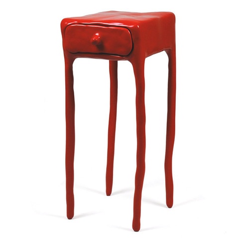
I found « Clay furniture » by Maarten Baas really interesting as a design object.

Clay furniture chairs and table

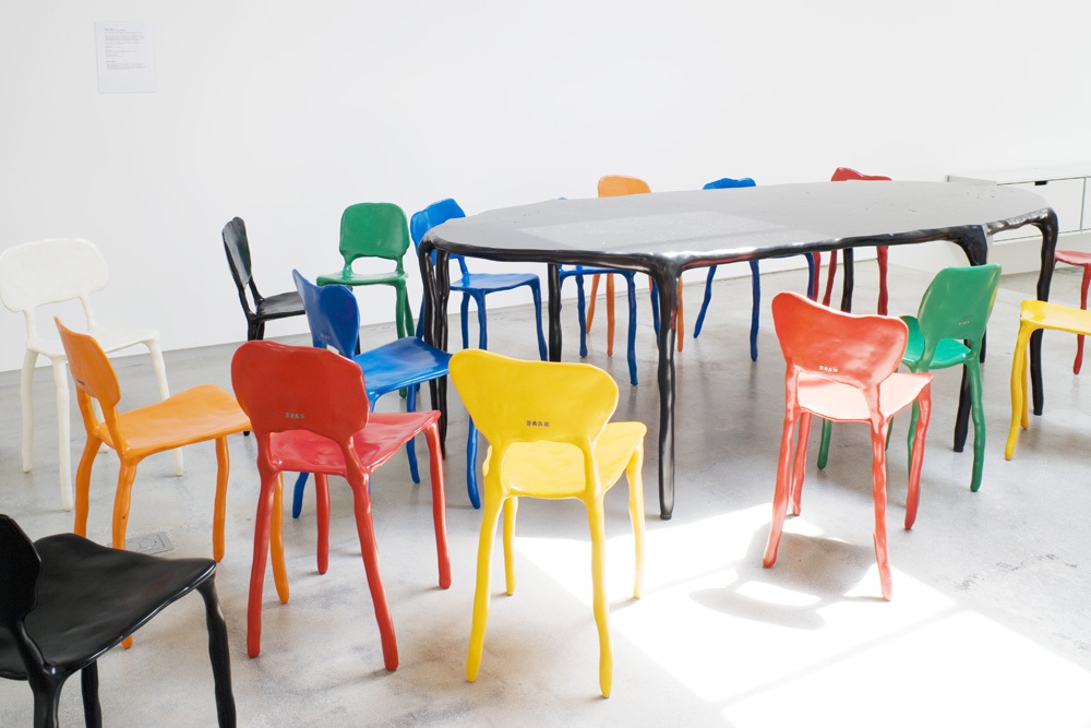
First of all, I noticed the colors. Afterwards, the shapes.

My first impression of the piece was that it was more similar to a three dimensional drawing than to an object in space. It has very clear lines and really simple shapes. I like this work because, more than just being a practical, usable furniture, its unusual nature made it seem more like a work of art. Even if this artist is first of all a designer.

Maarten Baas tried to build (handmade) objects that remind of a part of the human body, I saw that when a man sits on a chair he becomes one with this chair. He was inspired by the human body to give a unique shape to his furniture. In this way they become like extended molds of the human body.

These chairs are not so different from classic ones (which the generic shape we would expect from a chair), although his purpose was not to recreate the classic chair.  He designs it spontaneously made of industrial clay.


Clay 3 furniture


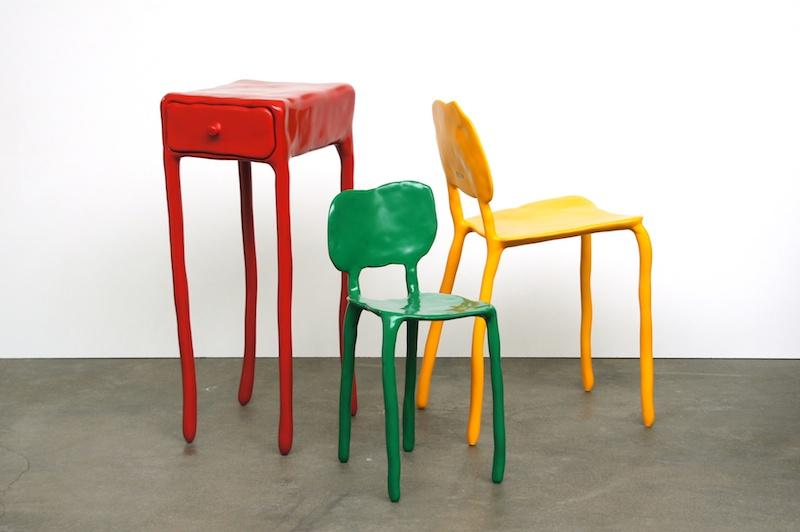
The colors used aimed to give life to these objects. Maarten Baas changed the nature of a stool and a chair. It’s not just a chair or a table, but something we are going to live with.

 Quite ironically, Baas has tried to bring life by torturing.

SMOKE

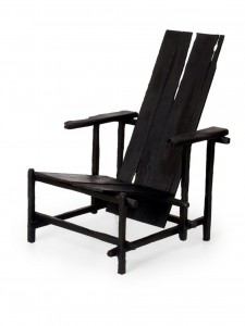
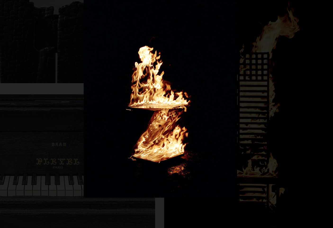
Going from decomposing a ready made to creating an artwork in its whole, with his graduation project called « Smoke » at the Design Academy, metamorphosis remains the link to his works.

First he buys ready made furniture, which he destroys to create his own. From life, he uses death to give birth. Cutting, mutilating, burning, he ends with the suffocation of the object by applying varnish, letting the object remain what it has become.


maarten-baas-smoke


This graduation collection had real success when it was presented in a personal show in 2004 at the Moss gallery in New York, two years after his graduation in Eindhoven.

How successful, he continue his collection by showing it in an exhibition called « Where There’s Smoke… » where he had the defiance to present burning classics designed chairs like the one by Rietveld, Gaudi, Sottsass and others.


Baas Rietveld SmokeBaas Rietveld Smoke in fire


Uncertain, colorful shapes, simple and childish, Baas tenderizes us with his Clay furniture. The proximity with the human body surely does give us a sympathetic effect.

By using clay as his material of choice to create his furniture, it seemed to me that the designer was expressing fragility. The shapes that the clay creates (not straight or parallel lines), adds to this idea of being fragile. Again, I think this refers back to the human body and its own fragility (bones can brake).

I got the impression that the legs were almost moving. It isn’t a very solid shape, not fixed to the floor. It’s a very fluid shape.

small table clay


Torned feet, broken back, Baas plays with this uneven symmetry to destabilise us. Will they dare to?

Although seemingly nurturing with this simplistic and joyful harmony, I wonder if these works really are as sympathetic as they may let you believe. With these harsh, cold materials, what would our bum think when sitting on a chair made of clay with a metal carcass interior? Wouldn’t the fragility of our bones be going through hard times?

Fragility of the human body, fragility of clay. Have we ever wondered if a chair would be fighting our weight? Alike human legs, the chair’s feet seem uncertain. Homemade, this furniture takes a more artistic dimension than that of the classic ones. With these fine drawn lines, as I said above, the air runs through and gives to this chair, this table or this cupboard a lightness that reminds that of a three dimensional poetry. The softness of the paint recovered of varnish gives more comfort to the mind than to the body ; however aren’t they both as important?

This furniture becomes a real nice company. A touching fragility, friendly presence, comforting colors, amusing shapes, childish naivety.


fan clay


Baas works in harmony with space, and finds a way to link his works.

Starting with very gloomy, dusty works, darkness reigns over his graduation work.

Baas has produced a real contrast between his two works « Smoke » and « Clay Furniture ».

A real meltdown of materials, processing and concepts, Baas presents us two projects which have similar use but are visually opposite.


Opposites attracts and influences


Sunday, March 31, 2013

Ettore Sottsass designed this lamp in 1981 for the Memphis Milano Collection and it got its name after the great Indian emperor Ashoka. Fascinated in ancient cultures, he travelled in 1961 to India, which profoundly affected him. However, there is nothing that precisely reminds me of Ashoka in the lamp, neither in colors, form nor material.

Portrait of the emperor Ashoka and an Ashoka temple in India.


With deeper investigation I found out that ashoka translates from Sanskrit into English as “without sorrow”. The emperor Ashoka was revered by many as a leader supporting big changes. After years of rationalism, Sottsass along with Memphis Group were rebels. The style they brought up was seen to be perfectly in tune with the early 80’s post-punk culture, without a doubt a distinction of the often-obscure theories of postmodernists. This brings me to the feeling of Sottsass as a punk, reining the future without sorrow for the past and incorporating art into design.

What further strikes me is the significant playfulness that follows his designs and thinking. A good description of his works is “a shotgun wedding between Bauhaus and Fisher Price”. It shares a common interest with toys such as testing out, trying, building as in children’s mind and color palette.


Fisher-Price advertising and Ettore Sottsass Flavia vases


Duplo lego and Ettore Sottsass Casablanca Sideboard


The name Ettore Sottsass was unknown to me, until some months ago. I was star-struck by his philosophy and work. Coming from Sweden where popular design often is characterized as being very minimal and serious, I was experiencing the complete opposite. It was playful, bold and colorful. He totally distracts me with his colors, what he calls “gas station colors”. Maybe my attention is drawn to the object thanks to the distinct primary color used; there is something pure and genuine about them. To Sottsass these colors are the ones he used as a kid, learning to draw. Freedom and rejection of prejudices is supposed to be a reason why he uses them. There is always an extra effort to be able to combine or even use color. What he expressed in 2007 becomes especially interesting since my wardrobe exclusively consists of black and different shades of gray:

“It’s a shame, but yes, color is still something unpopular. The predominant shades are white, black, beige … I think the reason is that it is just easier. If you go all dressed in black its very easy.”

Sottsass was, besides working solely colorful, well known investigating in combining different materials, from cheap materials such as laminate to richer ones – brass and marble. This creates a conflict for possible new life or at least raises questions about it.


Furthermore, from my point of view, it is important to notice that the lamp (plus almost all of his other works) seems to widen the users’ idea of function in every day life. Instead of taking the obvious and primary functionality of an object for granted, in this case, a source of light, Sottsass deliberately add another dimension into the object. By taking away the familiar he surprises and asks for participation and sensation. He gives the object an aura and hence creates a presence to which I am confronted to and that makes me feel alive. One noteworthy quote from Sottsass is when he explains his view on function:

“All the objects I have designed are ‘functional’. They can always be of use. What matters is that the one who uses them must be able to use them. (…) Everyone has different ‘function’ or necessities. (…) Maybe a young man wants to put his rolls in a container, whereas a young woman wants to put all her books there. I don’t know. There is no generic function. Function is life. I cannot foresee function. The furniture I have designed has always been functional. However, one needs to know what it is for.”

I would define my sentiment regarding Ettore Sottsass’s work as an ‘opposite attraction’. Opposite, because originally, my personality and work do not reflect at first sight his point of view. Attraction, because he has and will inspire me to break up predefined rules, experiment techniques and challenge mentalities in my personal work.


Log in
subscribe