Skip to Content Skip to Search Go to Top Navigation Go to Side Menu


"cooperation" Tag


ON FUNCTIONALITY


Tuesday, April 1, 2014


Esther Frank* and Kjersti Alm Eriksen and NicolasChuard and Salomé Roodenburg* on functionality


Each project that students initiate, makes them into temporary experts on given topics. Art & Design schools then become knowledge hubs where different expertise cross fertilize. By looking at what types of research students engage in, Designresearch and UnBornLab organized a 'workshop' to investigate design matters from a students' perspective.

Through a series of short video's students from both the Foundation Year and the DesignLab department share ideas, focusing on the temporary expertise gained as part of their projects, rather than the outcome. The workshop was articulated around one of their given assignments. Students were asked to develop a specific object or context to help focus or explain content.

The format is clear: two persons, discussions, filmed from above.
the space is : two stools and a table.

* Foundation Year


The studio of Karel Martens


Wednesday, January 8, 2014


I had my worries walking around the book shelves in the art book shop San Serriffe. I didn’t know anything about art books how to look at them and how to look at the design.
I skipped though some books but didn’t find them interesting. Then I saw a cover that caught my attention. I didn’t know the artist but I was enchanted by the simplicity of the graphic black-and-white book cover with Japanese text on the side and the title ‘Full color’. The size of the book felt a bit small in my hand, handy and easy to flick through the pages.
I turned the first page and discovered a colorful photo showing a bookshelf filled up with paper rolls and used fruit boxes properly containing more papers. The photo only shows a small part of the room but on the following pages the panorama of the room which turns out to be an art studio is shown. Page by page I was guided into the head of a graphic designer’s studio.


book coverbook-shelves2


It turned out to be the head of the Dutch graphic designer Karel Martens. He is specialized in typography, working with prints and books.

After his studies at the School of Art at Arnhem in 1961, he became a freelance graphic designer.

Since 1977 he has been teaching in graphic design at his old school in Arnhem and at the Jan van Eyck Academie in Maastricht. He is now working as a supervisor at the master-program Werkplaats Typografie [x] together with Armand Mevis. This program is based on practical assignments and self-initiated projects. It also works as a meeting place for graphic designers.


The book ‘Full color’ which is showing Martens’ studio was published on the occasion of the exhibition KM, Ginza graphic gallery in Tokyo in May 2013 [published by Roma Publications].

With the information about the artist and his work I started to look deeper into the book.

The photos by Johannes Schwartz are divided into 4 parts by the graphic designer Julie Peters together with Martens himself.


book2

The first part contains photos from the artists’ studio. They seem to form a long panorama, cut up and organized so you see some parts of a room at one photo and the second part of the room at the next photo. This way of organizing the photos gives you the impression of flashbacks and even more if you already know his work.

The next part is Martens’ archive, collected in boxes from the bookshelves. Here you look directly into the boxes which contain sketches, illustrations and prints of the artist. If you look at the prints you’ll find some of the shapes recognizable. When you flick through the book you get the impression of a system of colors and shapes which are being repeated. An example of that could be the small industrial metal pieces which shapes are to found on some of Marten’s prints. It seems like the editing of the book creates some sort of pattern – just like Marten’s prints.


book2


The third part is a close up of Martens kinetic work with clocks seeing from behind. A study about composition and color, by printing a dot pattern on two glass disks and attaching the disks to the second and minute hands of a clock. The chose of photographing the clocks from behind is again a way to show the process from his work.

The last pages in the book are writings by David Senior and Martens him self. The text is in English and Japanese describing the project around the book and the work of Martens.

One thing I was wondering about was why Martens choose to have a graphic designer on this book when he himself makes books. I asked Johannes Schwartz about that and he told me that the making of this book includes a close co-operation between all 3 artists. This book does not only work as a documentation of an artist. Not only the contents of the book tells about the artist and his work but also the editing is very important.

The result is this fascinating portrait which gives you a good insight knowledge of Martens’ visual language.
If you are curious for more please check one of his other books “Karel Martens: printed matter/drukwerk, 2nd Edition” which contains a big amount of exhibitions, art works and articles he have been taking part in. This book gives you a good insight into Martens’ environment and way of working too.

Rietveld library catalog no: marte 1

cover back

New girls and boys by Anthon Beeke


Sunday, December 8, 2013

This post is dedicated to the design approach, names, some interesting facts of project “Body Type” by Anthon Beeke.
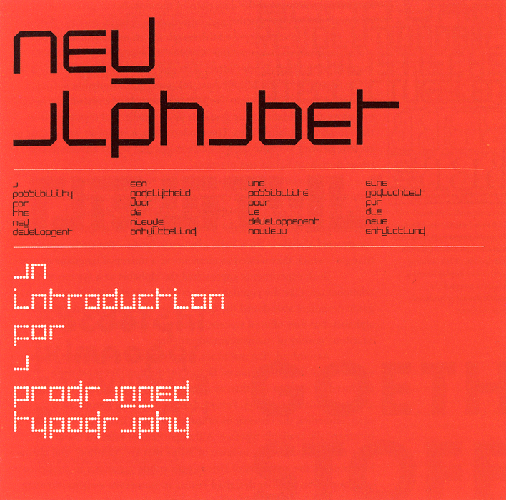
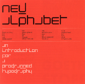
The book, which I want to consider was published in August 2011, but looking into it, it become clear that this box/book is the second time this project of this talented graphic designer is published. For me, it is important to say that these two publications are based on an idea of an alphabet made up of ‘Beautiful girls’ created originally in 1969. In past, this alphabet was based on naked female bodies, which posed (where constructed) like letters and punctuation marks. Beeke made this alphabet as ‘a tongue cheek’ response to Wim Crouwel’s famous New Alphabet published a year before in the same series “Kwadraat bladen/Quadrat Magazine”[x]

_1114605983

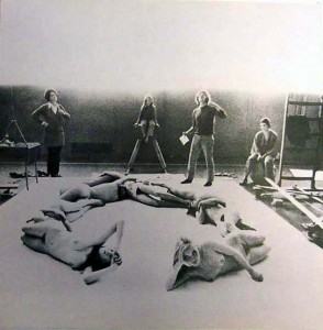
Project ‘Beautiful girls’  in process in a GYM of Gerrit Rietveld Academie

photographer: Ed van der Elsken


This alphabet as an experimentation was a sensation for late of 60’s, nobody has done something like that before.

Considering the second publication it is extremely essential that a lot of famous designers as Wim CrouwelRene Knip worked together and organised every aspect of the book.Well, I can say that this book is as a result of cooperation of several designers. That means that this project was mulled over  from different points of view and all design decisions were discussed in a professional surrounding and this fact automatically  increases its quality.

images


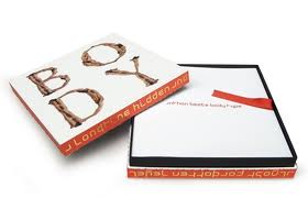
The ‘Body Type’ book was made as a box,which is a really attractive ,in my opinion, because of a size, image on a cover and, of course, colours. Despite on a fact, that book is based on a quite old idea, it looks contemporary and a cause of it is that Anthon Beeke decided to make it in colour. The whole publication saves a tendency of 3 main colours: redwhite and black. Thats is why it looks bright, new and interesting. A content of the box consists of 3 parts. In the first part you can find an introduction ,which was written by Wim Crouwel ,who also was a designer of the main font for a book.Text is provided in Dutch and in English, and following a purpose to create a fast visual difference between these two languages and to make it easier to read,separating one from another , Dutch text is in black colour, English in red.

wimcrouwel

The second part of a book is a ‘body alphabet’ itself.In this part Beeke also decided to add something new (compering with a previous publication), there are letters from not only women, but and from black men, what shows an expression of time ,which we live now. The third part consists of printed letters , so you can tear out and string up to bring this alphabet to life in words and texts that means that now a benefit from a book is not only to read it and enjoy its design ,but and use it for whatever you like.


This video shortly shows how photos for letters were made.Enjoy!


Rietveld library catalog no: 757.3 bee 1 (N.U.)


Log in
subscribe