Skip to Content Skip to Search Go to Top Navigation Go to Side Menu


"graphic design" Category


Redesign


Tuesday, May 28, 2019


Making the redesign of an already existing page.


It helped me to discover all the interesting moments in the structure of the web page and to divide the webpage into different layers.
I chose that page (https://designblog.rietveldacademie.nl/?p=77833) and started to draw the structure of it. I noticed that this page doesn’t have a lot of air between different parts of information, words, and texts and all data ranged to the center. Moreover, there are six colors, 4 fonds and two main pictures with bright and sharps form inside. All paragraphs are left-aligned and they end in a rather chaotic order. However, squares around words help to divide information between each other. The quantity of the colors attract the biggest part of our attention and we can feel a little lost.


Sketch


Modular grid


The fullness of the page


The Hierarchy of the given information


Colors


Example of a new Design


By doing a new design for the existing page I tried to pay attention to the pictures and elements on the images which always can become the part of the website.  In that case, I chose circles as the decoration of the page. Also, I wanted to divide the main text (essay) from the surrounding data. So color gave me a possibility for doing that. Plus I added a little bit more space between words and made distance between tags, title, essay. It helps us to get a breath.


Jan Toorop’s Delftsche Slaolie


Saturday, October 27, 2018

This poster is one of the first works that is exhibited at the Stedelijk when you enter the base. I spent a couple of hours at the museum looking at everything, trying to look for different options, but in the end it is the first one that I saw that made the cut.

It is a lithograph made by Jan Toorop in 1894 for the Dutch Oil Factory (Nederlandse Olie Fabriek, NOF), but it is also because graphic design (and in this case advertisement) can be forgotten; when people think about design, the first things that usually comes to mind is furniture. I then wanted to investigate how different it would be to research in this field of design.

I first started by going to the academy library and found three books about Jan Toorop, two in Dutch and one in French. In art books, Toorop’s posters are always quickly mentioned, if ever mentioned at all. Most of them focus more on his paintings and drawings and his advertising period during the 1890s is largely overlooked. But what would there be to say? It seems to be a question I cannot find an answer to this. I find it strange that this piece is considered one of the most famous works of Toorop and Dutch Art Nouveau and that there is so very few information and texts about it.


Furthermore, when I did my research on the internet, only basic information showed up, usually on museum’s websites like the Rijksmuseum or the Victoria and Albert museum in London. Both of them have a print in their collection, that’s why you can find it there: a picture, with a title date and dimensions. So no analysis or study or history or context like I expected. For instance there was only one website (the Moma) that mentioned the company this poster was made for; you can find the initials on the poster (NOF).

Another thing really intrigued me: in the first websites popping up under the research bar were both Christie’s and eBay. On the first one, original 94×64 cm prints are auctioned from 22500 euros. On the second one 53,7×12 cm prints are sold for 25 euros. The one in the Rijksmuseum is 95×62,5 cm, in the V&A it is 101×69,9 cm. I also stumbled upon Vintageposter.nl who retailed two sizes, for 50 and 70 euros. The posters always come in different sizes and prices, original print or not; they even come in different shades since Toorop made versions with slightly altered color schemes. I also came across stamps with the design printed on it.


Everything published before 1928 is automatically public domain, which is the case for the Delftsche Slaolie poster (which was created in 1894); it means that with no copyright, anybody can use it. If I wanted, I could sell postcards like this person on eBay or commercialize shirts with this image on them.
This thought also made me realize another weird thing: when I was browsing on google images, I only found pictures of the poster alone, but never in context. At first, this poster was supposed to be an advertisement, but I never encountered a photograph showing a situation where this work was actually put to its initial use. I also expected to find pictures of this poster as decoration, since it also sells like this nowadays, but absolutely nada.
After searching for a long time I only found one image with a framed poster. It was on the website of a gallery and the piece was sold for an unknown price.


I started wondering about the fact that more than a century ago, people saw this on the street like we see advertisement ourselves nowadays; we wouldn’t think about hanging this Oatly (a brand of oat milk)

poster that has been all around the streets of Amsterdam on our wall, and in the same way maybe the people back then would have laughed at the idea of putting the Delftsche Slaolie poster in their home.

I went to the Stedelijk museum again but couldn’t find a postcard of the work in the gift shop. Since I couldn’t find any picture of the poster in context, weather it be advertisement or decoration, I would do it myself, and I decided to do that with a kitchen wall because I figured that most people would hung that in their kitchen. It is food related after all.


If I print it myself at school in good quality and same size as the original it would cost me a couple a few euros, and maybe it would be even better than the eBay or Vintageposter.nl ones. I will have to do that for my grandmother so she can add it to her collection on her toilet wall.

What does all this mean for the future of our present advertising? All brands try to make beautiful or eye-catching or subversive ads in order to differentiate themselves from the rest; but what does it have to take to end up in the Moma, Christie’s or an old lady’s toilets?

Abeceda NOW


Monday, May 21, 2018


ABECEDA 1926


 In 1926, the Czech dancer Milca Mayerova choreographed the alphabet as a photo-ballet.

Each move in the dance is made to the visual counterpoint of Karel Teige’s typographic music.

Teige was a constructivist and a surrealist, a poet, collagist, photographer, typographer and architectural theorist, and his 1926 photomontage designs for the alphabet are a uniquely elegant and witty invention, and one of the enduring masterpieces of Czech modernism.


Abeceda


In the graphic design world, movement refers to the path of a viewer’s eyes as he or she looks at your work. Since movement can add such a large sense of unity in design, it plays a significant role in the ceration process. By tying the different elements of a design together in a specific way, you can control the movement of your viewer’s eyes throughout the medium. As a different media, body does the same thing in ABECEDA 1926 photo-ballet. There is the different movement which is more analog, natural and already exist but still a path of a viewer’s eyes as he or she looks at the work, using the body and an action as a method of design. Despite the fact that the terms action and surface are disconnected even opposite things.


Letters get created

by movements > Movements who

literally give the sound exhaling.

abc

In our case of the Abeced Alphabet an example

with the first letter of the alphabet, the letter ‘A’.

The body language of reaching towards the sky asking an ‘A’. 

But expressing ‘Aas confidence standing tall, putting your hands in your wrist, chin up.

So one single letter can have a wider scala of meaning.

A aa

A letter without  a sound of the voice, a movement of the hand can be like an incomplete inform. Just an ”A” on a paper.


Body language which is connected to words is a missing factor in language these days. Digitization is transforming things into less natural outcomes. Which is interesting is relating those two opposite sides; the digitized, formulized and made as a stabilized, structured letters out of the natural, smooth, changing, body movement. Even we can find some elements from both sides in all the sides, still the texting, mailing and internet talk has no presence of body and sound which is ironic because we generally attend to imitate the existing features that we know, take them as a starting point or repeat them.


We can see the first examples of this attend in the ”Cave Paintings”. Cave paintings are also known as “parietal art”. They are painted drawings on cave walls or ceilings, mainly of prehistoric origin, dated to some 40,000 years ago (around 38,000 BCE) in Eurasia. The exact purpose of the Paleolithic cave paintings is not known. Evidence suggests that they were not merely decorations of living areas since the caves in which they have been found do not have signs of ongoing habitation. They are also often located in areas of caves that are not easily accessible. The paintings are remarkably similar around the world, with animals being common subjects that give the most impressive images. Humans mainly appear as images of hands, mostly hand stencils made by blowing pigment on a hand held to the wall.

Some theories hold that cave paintings may have been a way of communicating with others.


33132479_2159603404055339_7157237393018322944_n


The body and other elements are using for communication in a way with ”movement/action of the body and also in a way with ”captured frames such as; paintings, photographs, and even typography as visuals. So we can really understand the idea of connecting body language with the captured, reflected typography together.


designtheory5


According to that point and various examples, we can tell that art may imitate life. The movement, the performance reflected and created an alphabet. But could it possibly be possible to create an alphabet without any reflections from life?


emojis


Sunday, May 13, 2018

So what it basically iS?

.                                    Symbols, that help to describe/show things/emotions.

Did it all start from the primitive period, when people drew animals on the walls of the caves, using images and signs in order to describe?

2017-01-092_1300


Or from the first ‘:)’ in the poem from 17th century?


emojis


Anyways, it became popular in the 90s when in SMS people started using emoticons. Emoticons are punctuation marks, letters, and numbers used to create pictorial icons that generally display an emotion or sentiment.
Actually, it officially started in 1982, when in Carnegie Mellon University the joke in online message board went wrong and made a huge misunderstanding. Dr. Scott E. Fahlman came with a proposal to use emoticons in order to define jokes and non-jokes.  : – )

Kao(face)moji(character)s are Japanese emoticons ¯\_(?)_/¯ .

e(picture)moji(character)
the first emoji was made by Shigetaka Kurita in 1999 for the first Japanese mobile internet platform i-mode.
(the 176 original emojis are now part of the permanent New York MOMA collection)

In 2011 Apple (of course) made them famous by adding them in iOS 5, but only for the Japanese version.                                  (2 years later Android joined 🙂
After noticing the growing popularity of emojis around the world they added them to every keyboard.
Now every user can switch from English or German to emojis’ keyboard.

With the help of Unicode Consortium    (- a non-profit group that maintain text standards across computers) (and Google’s petition to get emojis recognized  )             emojis are (almost) everywhere.                                                                                                                                                                                                    O-:

in 2010 Unicode accepted 625 new emojis proposed by Apple.

in 2013 the US Congress Library added the ‘Moby Dick’ written in emojis languages

in 2014 the gender and skin-color issues raised

in 2018 157 emojis were added.


You can propose your emoji and explain why it is necessary to add it                                                                                                 http://unicode.org/emoji/selection.html

2 times a week the Unicode meets up to discuss wether the pasta should be on a plate or in the bowl

wether it is important to add a sugar cube to emojis’ list

wether the girl’s haircut should be till shoulders or longer

You can go to https://emojipedia.org/                if you are not sure in the meaning of the emoji and do not want the misunderstanding to happen

You can go to                                                             if you want to analyze the emojis you are using

http://emojinalysis.tumblr.com/                                                                            (sometimes they can tell more than your daily horoscope from Cosmopolitan)


http://emojitracker.com/                       if you want to know what is in trend on Twitter


We are now way more reachable for any person in the world

We are now able to understand people without words


                           are emojis the new Esperanto?

                                                                                                                                                                How are they effecting us socially?

In Japan, where the emoji was born, there are declining birth rates due to people loosing interest in romantic relationships.

 Hikikimori – a group of young men who dont leave the house and only communicate through technology.

                             We are loosing the power to communicate face to face.

However, Match.com released data proving that the more emojis a singleton uses on their dating site seems to result in more dates, therefore more sex.

      Our phones have become priority.               In general, if someones phone pings they stop their real life conversation for their phone.

Emojis are  proven to help dyslexic people – they help us to sense emotions in bland messages.

                                                                                                             what is the future of emojis and our language?

CMYk printing advices:


Tuesday, February 27, 2018

CMYk is color system used for printing. To print an mage, first you have to separate it into four colors: Cyan, Magenta, Yellow and Black.
Each of this colors consists from halftone dots, when dots of different colors overlap each other you can get all colors of rainbow. By using halftones of each colour, we are able to mix various percentages of all four process colours to print a huge spectrum of colours. If you take a magnifying glass to the full colour image, you will see that it is comprised of dots of various process colour. There is a measure of density of this color dots, it is called DPI, in particular the number of individual dots that can be placed in a line within the span of 1 inch (2.54 cm). If you are printing photo, dpi should be around 300. But if you are printing big board or posters, something that people will observe from the distance dpi can be less than that.


Screen Shot 2018-02-04 at 11.02.20 PM


In theory, the mixing of C, M and Y should give a black color, but in practice gives a dirty brown. Therefore, the fourth paint is often added black. If we add one or more of the other CMY colours to Black in 4 colour process printing, we get a darker, truer Black than just using Black ink alone. It is called Rich Black. In theory, you can get the richest Black by using 100% of all four inks but in practice, you are limited by how much ink you can lay down on the paper (how wet the paper can get) and the technology used in the printing process. A typical Rich Black mixture would be 50% Cyan, 40% Magenta, 40% Yellow and 100% Black. This produces a darker Black that is neutral in colour. Some other combinations of process colours can produce other looks like “Cool Black” or “Warm Black”. Rich Black should never be used for small type, especially fonts with fine serifs.


So you like patterns?


Sunday, November 26, 2017

The book I choose to research is called ‘Biogea’ and was written by Michael Serres, and designed by Jason Wagner. Published in 2012 by Univocal Publishing, which Jason Wagner co-created with Drew Burk.
From the design of this book and from other books that Jason Wagner has designed I can see hints of his personality if not that then definitely his direction of interest. The way all the patterns are so precise and clean cut gives me the impression that he has a methodological nature and an obvious love of patterns both simple and complicated, while enjoying a subtle use of colour. As seen in another book designed by Jason Wagner ‘Variations on the Body’, which is also written by Michel Serres.

Variations -Cover

The fact that Jason Wagner is a part of the Univocal means that a critical look at the company can give an insight on the designer and ultimately the design itself.

Univocal Publishing was founded in 2011 as an independent publishing house specializing in small-scale editions and translations of texts spanning the areas of cultural theory, continental philosophy, aesthetics, anthropology and more. Univocal’s books including Biogea combine traditional printmaking techniques with the create evolutions of the digital age and feature letterpress covers designed by Jason Wagner, who demonstrates the technique in a video.

https://youtu.be/qwQSNhor1EQhttp://

Using techniques similar to this the publishing company oversaw the printing and binding of books from 2012 to May 2017, in which it ceased operations and merged with another company. This could seem to fall down to Jason Wagner who is stated to be moving on to pursue other projects.

But why did I choose this book? I decided on this book for a variety of reasons. I enjoyed its’ simple yet complex design containing a neat revolving spiral-like pattern which is placed in the middle of the book and looks pleasing to the eye. The pattern it self drew my gaze as I found it really intriguing as it resonated with my own interest in complex and unique patterns which I like to create.

The plain colours and easygoing layout of the book for me made it feel more approachable. The design it self didn’t take anything away from the content, for sometimes I feel that the cover of a book can sometimes give you false expectations of what it contains. Being misled into buying something based on its looks. This book however balances this nicely I think by not taking anything away from the content but instead relating and highlighting the themes within.

Biogea

The Typography is placed on top of the design and relates to and supports it nicely. Accentuating its colours and giving the book a clean and natural feel. The pattern initially drew my attention to the book, but as I took a closer look I found that the texture around the design on the cover felt good to the hand and gave it a thicker and more solid feel. This impacted on my decision as the pattern and texture subtly blend their delicate qualities together to create a book that i found aesthetically pleasing. While the design since imprinted on a thicker material felt noticeably different making it stand out from other designs and books.

The almost scientific complexity of the simple and delicate design also relates well to the content of the book for it’s a mixture of poetry and science. While also presenting a philosophy that merges the humanities with all creation. This has made Michel Serres “one of the most intriguing thinkers of his age”, and I believe is a reason why Univocal publishing has design and printed most of his books. Because of the authors philosophical and poetic inquiry sings praise of earth and life, and what Michel Serres names singularly as ‘Biogea’. The design relates well to the content as it mixes light fresh colours with an intricate pattern, which gives a natural clean aesthetic relating to some of the topics within the book. Some of the obvious examples being the use of blue in the typography which links with text within. “ Today we have other neighbours, constituents of the Biogea; the sea, my lover; our mother, the Earth, becomes our daughter; this beautiful breeze which inspires the spirit, a spiritual mistress; our light friends, the fresh and flowing waters.

Even though the design itself is quite precise it has a sense of movement to it and gives the book a poetic feel to it, this also relates to the content, as it’s a mixture of poetic statements revolving around natural themes. “In these times when species are disappearing, when catastrophic events such as earthquakes and tsunamis impale the earth” the author wonders if anyone “worries about the death pangs of the rivers”.

The author asks the same question of philosophy “as the humanities increasingly find themselves in need of defenders. Today, all living organisms discover themselves part of the Biogea”. Knowing the content of the book also ends up shaping my view on the design of the cover as the series of lines almost create a shield like swirl or sea creature, protected by the bold strong title Biogea.
 

Biogea, designer: Jason Wagner, Rietveld Library Cat. no: 157.3 ser 3

The spoken History of the young worker


Saturday, November 25, 2017

The magazine was on the shelf and the first thing that i picked up, I was immediately drawn to this magazine. The first thing that I noticed was the size – A3 -, demands your attention, gives importance. The cover is the picture of a young man, the eyes immediately captured my attention, eyes that tell a story. They make want to know what he has to tell.

Front

The dialogue in the magazine is mostly told in black and white photographs, what relates to the titel ‘’The spoken history of the young worker’’. The pictures are strong, dynamic, a lot of energy. There are also pages out of newspapers or other magazines from all over the world relating to the young worker. I think they this to connect the workers from all over the world as one unity.

What really spoke to me about the young worker is how relatable they are. Boy’s my age working, revolting, search for freedom. A peak into a different age but we still want the same at the core.  The story of the everyday people that is not what I typically think of when I think of design.

The Worker Photographers from the ’20s were the first amateur photographers to use the camera politically. They were pioneer in what we could call a ‘civil and collective use’ of photography. Far from having a rhetorical approach to Worker Photography, they are interested in their radical practice of photography based on self-representation, self-publishing and image critique

On page 3 you immediately get to know the spirit of the workers, what they have to say.

They are all different

temper

ambition

adaptability

team spirit

On the first page you have a collage for the youth photography programme and on the 4 and on page 4 an NEGATIV-ENTWICKLUNG. So on the first 3 pages you have the spirit of the worker and an mannual how to tell the story of the people. A manual to carry on the revolution.

Page 45/46 touched me the most, the plumber woman that dreams of going to college and the trainees that riot after the suicide of one their colleagues. Both heavy in the themes, and emphasizes by the word SCUM how we treat these human beings.

What i loved about the magazine is the IMAGE ACT, you can take it out of the magazine and made out of green paper. Image Act takes inspiration from the speech act, a concept in linguistics that explains how words can have qualities that go beyond the information they convey and materially affect our existence. These sound files are archived and accessible online at werkermagazine.org/imageact . The speeches are given in their own languages.

Werker correspondent aims to develop an autonomous and economically self-sustainable community of reporters and subscribers. the intention of this network is to function as a direct unmediated information source, communicating the everyday realities in different parts of the world.

Rogier Delfos is based in Amsterdam, The Netherlands. He studied a BA Graphic Design at the Gerrit Rietveld Academie, an MA Critical Studies at the Sandberg Institute and is currently teaching at the Gerrit Rietveld Academie. In his artistic practice he works with publishing as a communication technology that creates a multitude of social behavior. He experiments with an array of techniques of publishing to express his desires and micropolitics and spread alternative views on labour, gender, education and queer sexualities. His definition of ‘publishing’ has a wide and foremost artistic understanding; he is using various forms of printed matter, film, online platforms, installations, workshops and—as a more recent involvement—by way of writing and performative lectures.

Because this magazine is all about telling the story of the daily worker, how do tell a story. I decided to show the world of the the daily worker at the Albert Cuyp market. Young boys that work there but also men that work there for over 20 years. The pictures are taken in the night when they breaking of the market, that is when the workers have the most interactions with each other. Chatting with your neighbour from 3 stalls down, breaking off to rebuilt it all tomorrow.

welkom op de cup24085224_550761031927714_584990146_o24085217_550761231927694_427242328_o24085187_550760125261138_1554252217_o24085185_550760968594387_1853148593_o24085172_550760105261140_2083366229_o24085122_550760958594388_107620977_o24085051_550760605261090_301756406_o24008306_550761158594368_354181755_o24008292_550761201927697_199083987_o24008236_550760155261135_1797684679_o24008173_550760571927760_1725135145_o24008113_550761368594347_788304569_o24116674_550761065261044_1138337676_o24116657_550760685261082_1756487607_o24116653_550761171927700_179825527_o24116552_550761188594365_145621779_o24116532_550760598594424_1605619576_o24116488_550760578594426_1007634969_o24116415_550760648594419_1631676107_o24116355_550760208594463_436619670_o24115540_550760631927754_1712362897_o24115462_550760971927720_951828826_o24115421_550761255261025_1818772717_o24115348_550761145261036_1379700961_o24115341_550760148594469_2008611135_o24115303_550760218594462_590994169_o24115297_550760608594423_827372340_o24115289_550761238594360_511110490_o24115267_550760085261142_1629170884_o24115254_550760998594384_89609813_o24115232_550761041927713_2040479749_o24093885_550760231927794_254548344_o24093861_550761178594366_165234530_o24093831_550760595261091_395663118_o24093733_550760995261051_1647616141_o24093703_550761391927678_2092155428_o24093556_550760705261080_640813926_o
Werker Magazine #1, designer: Marc Riog Blesa & Rogier Delfos, Rietveld Library Cat. no: werk 2a/b

Judge a book by its cover


Saturday, November 25, 2017

Book Cover     Illustration 2

Sound file: ‘Front Cover’

[audio:https://designblog.rietveldacademie.nl/wp-content/uploads/2017/11/Front-Cover-Audio.mp3|titles=Front Cover Audio]
The blue colour of the spine was the first thing that attracted me to the book ‘Walls That Teach’. I reached up to grab the book and upon closer inspection I discovered a beautiful cover with an interesting layout of text and attractive illustrations. The layout of text on the back of the cover for example runs horizontally, forcing you to turn the book to the side to read the text – something that reoccurs occasionally within the book. Despite the title of the book and the topic – architecture of youth centres – being an unknown topic to me, the design of the cover intrigued me enough to give the book a chance and look within it.

Typo 'w'

I opened the book and ran my fingers through the pages to feel the paper. The book felt light and the paper felt thin. The colours of the paper were the next thing that I noticed – they vary between green, white, and black paper. The main texts appear on the green and black paper. The illustrations and images appear on the white paper. The white pages are laid out horizontally requiring the reader to turn the book to its side in order to look at it.

Sound file: ‘Chronological’

[audio:https://designblog.rietveldacademie.nl/wp-content/uploads/2017/11/Chronological-order-paper-choice-and-consequences.mp3|titles=Chronological]

Young Pioneer Palace 3

The way the font (Gil Sans, Gill Sans Infant) is used and the strokes of the letters, the layout of the paragraphs, the letter spacing, word spacing and line spacing give a feeling of space on the pages without giving the impression that the page feels empty. The letters, words and lines are spaced quite far apart. The Paragraphs are centred on the middle of the pages, leaving a space of about an inch on either side. The strokes of the letters are also light (there are specks of white on the text that is black). All of these factors contribute to the appearance of the pages not looking cluttered.

Sound file: ‘Playful Typography’

[audio:https://designblog.rietveldacademie.nl/wp-content/uploads/2017/11/Playful-Typography.mp3|titles=Playful Typography]

Illustration 4

The illustrations throughout the book are very imaginative. The first illustration is on the front cover. it is an architectural drawing of a youth centre with illustrations of people demonstrating how the space would be used – people are dancing in a disco, some people are playing table tennis, some people are sitting around and some people are working.

Sound file: ‘Illustrations’

[audio:https://designblog.rietveldacademie.nl/wp-content/uploads/2017/11/Illustrations.mp3|titles=Illustrations]
However, these illustrations change inside the book. The people depicted in the illustration on the front cover are no longer contained within the walls of the ‘youth centre’, but are left to roam freely over the pages. Sometimes at the bottom of the page you will find a couple walking hand in hand. On another page there are people playing table tennis. On another page beside a paragraph about the planning of a youth centre there are a group of people meeting around a table discussing something.

Illustration 5

The contrast between these illustrations and the more practical architectural drawings within the book is really amusing. For someone like myself who doesn’t know much about the topic of architecture, small details such as the people wandering through the pages really capture my attention and encourage me to read. The different photographs of the youth centres under construction, how they were used and exterior shots of the buildings punctuated throughout the book also adds another dimension. The combination of how the text is put together, the illustrations, drawings and photographs really brings the book to life for me.

Sound file: ‘Images’

[audio:https://designblog.rietveldacademie.nl/wp-content/uploads/2017/11/Images.mp3|titles=Images]

Book Images 2 Book Images 3

My first impression of the book was that it appeared to be playfully made. This struck me as being funny because the topic of the book is about youth centre architecture, but the topic of the book suggested that it could be heavy to read. Upon opening the book and reading it, I was pleasantly surprised to find that the playfulness of the cover continued throughout. All the different elements brought together really encouraged me to read. I think that the intention of the design element of the book is to inspire the audience to interact with the book and create discussion. All in all a very well designed book.


Walls that Teach, designer: David Bennewith & Sandra Kassenaar, Rietveld Library Cat. no: 718.5 pie 1.8 met 1

Orange


Saturday, November 25, 2017


Orange to catch the eye and then black and white.

Creating pleasure, stimulating sight.

Images contrasting, dark and light.

Clashing shadows tend to fight.

Hundreds of books, a sea of bindings.

Holding stories, facts and findings.

A linen cover caught my attention.

A decision made with no suspension.


The book AR-artistic research was conceived through a one-year collaboration between Massachusetts Institute of Technology (MIT)and the German company Siemens-Stiftung. Multiple artists contributed essays to the book about their work and how they combine art and technology. The book is designed by Novamondo (Berlin) and no individual names of designers are given which may mean that a number of people were involved in the design of the book.

AR-artistic research has 131 pages bound in a hard cover. The image on the cover, designed by Jae Rhim Lee, has an interesting circle structure in fluorescent orange. Later in the book you come across the same image and realize the circles are mushrooms. The fluorescent colour really caught my eye. The orange/red colour fills almost the whole front of the cover. The image is screen-printed onto cream coloured, linen-like material that is very pleasant to hold. The hardback cover has the quality of a painter’s canvas.


ar-artistic-research-45


Looking through the book I immediately realized this fluorescent orange plays an important role in the design of the book. The colour returns on almost every page, usually emphasizing significant images or important parts of the text. The rest of the book is printed in black and white. The futuristic fluorescent orange in combination with traditional black and white create a fascinating relationship with many surprises.

AR-artistic research has four chapters that have no images. These chapters, which are full of text, were surprisingly one of the first things to catch my eye when I first looked through the book. In these chapters the designers play with the three colours (orange, black and white). I think limiting yourself to these three colours is an interesting decision. To experience this limitation myself I decided to experiment with the colours.


boekslides3


I combined black with the fluorescent orange and afterwards I did the same thing using white. Throughout my experiment I used the same orange tone, yet the colour seemed to change. This effect is called the contrast effect. It is an effect that you see everywhere though I had never properly taken it in. Using the contrast effect within design, you can create a structure of importance in size, shape and colour. The designers of AR-artistic research make great use of this effect. The fluorescent, eye-catching orange is a good contrast to the more inconspicuous black and white. The designers also create a lot of contrast in image and font size. This gives the reader the impression some images or sentences are more important than others. It also creates interesting layouts and some very fine prints.

There are five images in the book that cover two complete pages. The images are mainly photos and in every image the light and dark juxtapose each other. My favourite image is of white mushroom roots on a black background (see GIF below). The simplicity of the image and the differences in light and dark are very impressive. I think it was a good decision of the designers to dedicate two pages for this image. If the image was smaller the reader might not give it as much attention because of its simplicity.


boekafbeeldingen2


This is the first time I have focused on the design of a book instead of content, which was an interesting experience. Not only have I learned a lot about the book’s design but I have also learned a new way of looking. I hope now not just to read the content of a book but also to read the design. I have also fallen in love with this particular colour of orange.
AR–Artistic Research, designer: unknown, Rietveld Library Cat. no: 700.8 met 1

We Have Skype


Friday, November 24, 2017

“All languages are foreign.

The best books are found, not sought.

Peace, plenty, truth, and love.”

– We Have Photoshop 2017.


12/11/2017

Dear creators/members of We Have Photoshop,

First I will introduce myself; my name is Sterre, I am a Dutch student at the Gerrit Rietveld Academy in Amsterdam.

For a design research assignment called ‘Books by Design’, I am analyzing the design of your book ‘Gilles Deleuze’s ABC primer.’ I found it at our school’s library and was immediately attracted to its playfulness. The only thing that bothers me is that there’s always a grand distance between the reader and the creator, I would love to let go of that distance by having a small talk with you, that would help me understand your way of decision making.

Does We Have Photoshop also have Skype? I would love to wake up in the middle of the night for a nice conversation with you!

Let me hear what you think about it and hopefully I’ll see you soon through my computer screen.

Kind regards,

Sterre Troquay

15/11/2017

Hi Sterre –

Nice to hear from you

and sorry about the delay in getting back to you.

I’d be happy to help with your project by having a chat on Skype.

I live in London so the time difference won’t be a big deal however,

I’m currently travelling between India and Russia

and won’t be back in London until the evening of the 19th.

I’m pretty busy during the day next week

but would be happy to chat after 7pm London-time

if that isn’t too late to be of use for your project.

Monday would work well for me

but it could be a different day if that isn’t good for you.

– Mike


17/11/2017

Hi Mike,

Thank you for responding!

Monday 7 pm London time is perfect!

My username on Skype is: Sterre…...

I’m looking forward to it!

Kind regards,

Sterre


20/11/2017

Skype video call

So, you work together with other designers within the studio called ‘We Have Photoshop, right?

Yes, that’s right.


Can you tell me a bit more about the genesis of the studio?

I started the studio together with my friends from collage.

We used to study at the Yale School of Art,

though the studio was never registered as an official company.


How do you work together? Do all of you work on each project, or ..

No, as soon as we graduated from art school,

most of us moved out of Brooklyn and the group scattered a bit.

Sebastian lives in Moscow, Rebecca in Chicago,

Andrew still lives in Brooklyn and I live in London.

The distance makes it hard to work together on projects,

that’s why the studio barely exists, most of us have other primary jobs now.

Whenever we work for a client,

one of us takes the job and we sometimes help each other completing the job.

Most of the time we consult via Skype, but I sometimes go for a visit.


You designed ‘Gilles Deleuze’s ABC Primer’. Was anyone else involved in the designing of the book and was there a client that had influence on the outcome?

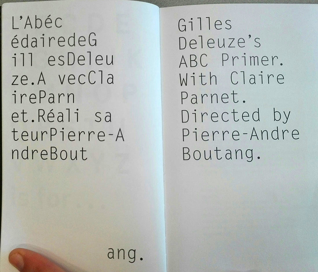
I designed almost the whole book.

Only the title page isn’t my idea, Sebastian worked on that.

I think there’s a clear contrast between his work and the rest of the book,

you can tell it’s been designed by someone else.

This project really originates from my own interests, there’s no client involved.

It started about 8 or 9 years ago when I found videos

of a series of interviews according to the letters of the alphabet.

They were broadcasted on French television after Deleuze committed suïcide,

I believe This was one of his conditions for taking part in the interview in the first place.

My girlfriend at that time, now wife, speaks French quite well and also works as an academic, so this subject was very interesting for her as well.

We thought: if this book doesn’t exist already,

we could make an English translation of it.

We sent an email to ask for permission to translate the interviews,

 but they never responded,

so we figured that we could just do it since they’ve never said no.

My wife did the translations and the content and I did the design.


Did you know that the book was in the Rietveld library?

No, when you publish a book, you never get to know who buys it.

Nowadays that’s already different, now they do tell you in which country it’s been sold.

But we also never really wanted to publish it.

We wanted to make a translation to give it to our friends

because we thought they should read it as well.

….

I don’t really give clear answers to your questions, do I?


Yes you do .. But I also wouldn’t mind if you didn’t .. I just want to hear about everything you’ve got to say and at the end I’ll try to write a research in the same conversation-like style that the text of the book is written in. So, that’s why I’m also recording this ..

So, have you read the book then?

Yes, I’ve started on it and I really want to continue.


Yes, they have a pretty amazing conversation ..

That’s one of the reasons why we were attracted to doing this,

because the text is really good. I have read it a couple of times now,

but I can imagine it’s very hard to understand for someone

who’s not a specialist in theory.

It’s very dense, it’s very particular and specific.


They talk about a lot of different subjects as well.

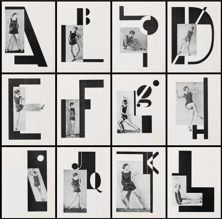
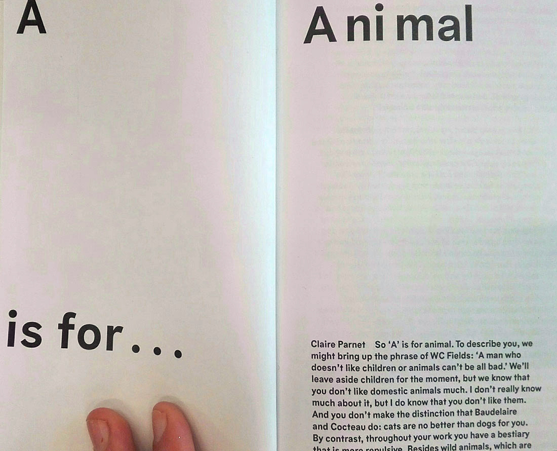
Yes. The interview is structured by the letters of the alphabet,

but throughout the interview some ideas and subjects

return in the conversation they’re having.


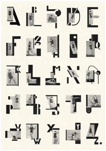
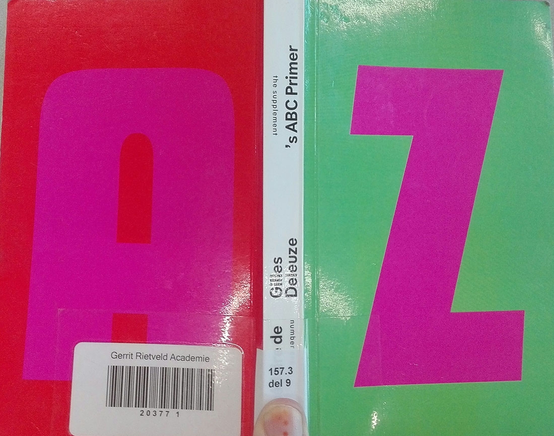
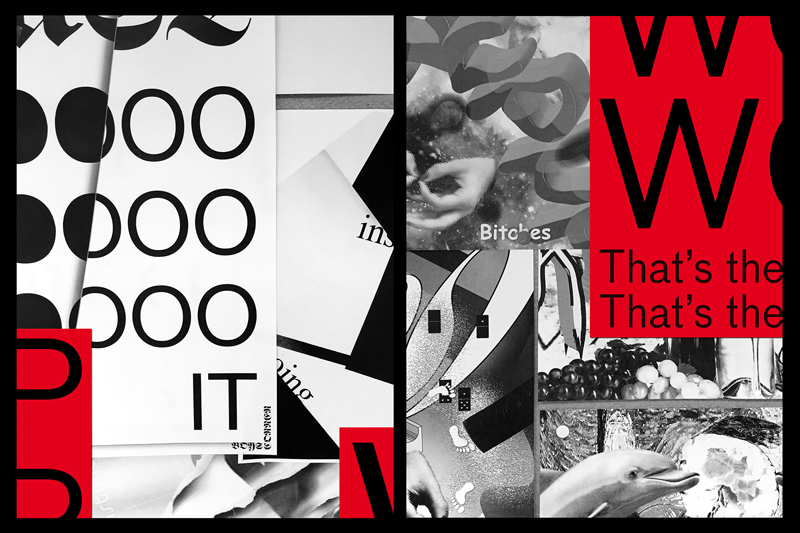
I feel like the playful design of the book is really in contrast with its logical and chronological context. The cover of the book for instance: the letter ‘Z’ is on the front and the letter ‘A’ is on the back, shouldn’t it be the other way around? Is it a joke?

cover

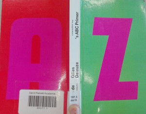
Yes, it’s definitely a joke.

But still the cover of the book makes sense: When you open it, and look at the cover,

the ‘A’ comes before the ‘Z’ and the spine serves as a space between the letters.

Can you tell me a bit more about the design of the book and the decisions you’ve made? I’m also interested in your working process.

Of course.

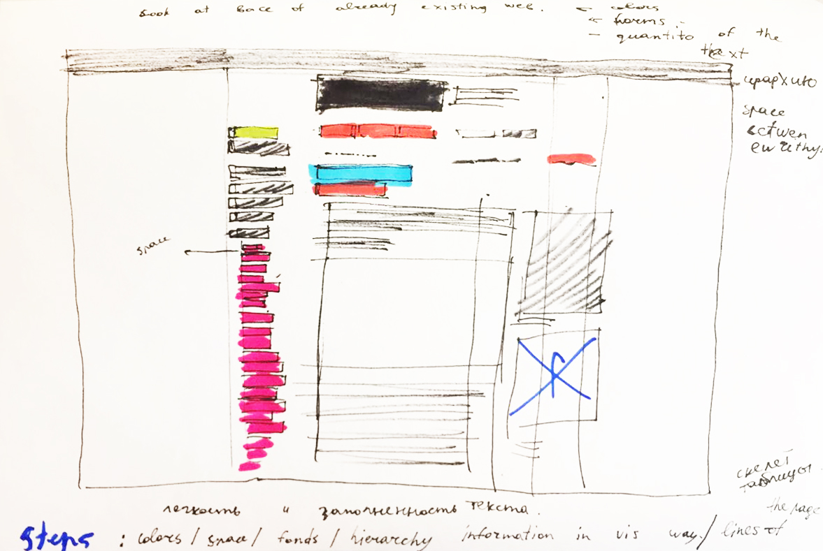
 The design of a book really depends on the content

and I always start on the structure.

But for me, it basically means: adding, adding, adding,

and afterwards scrapping things till almost nothing’s left

and then I’ve probably done enough ..

At the time I made the book I was very interested mapping one structure onto another.

The text is made the same way: by translating the French sentences into English,

 the text becomes a bit distorted at first.

The design of the book visually mirrors that.

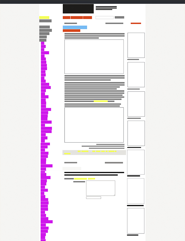
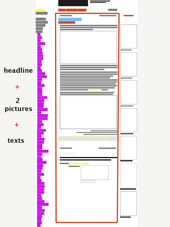
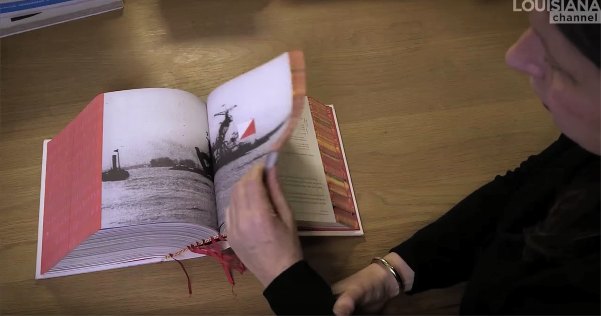
You can see that very well on this double titled page.

doubletitle_wit

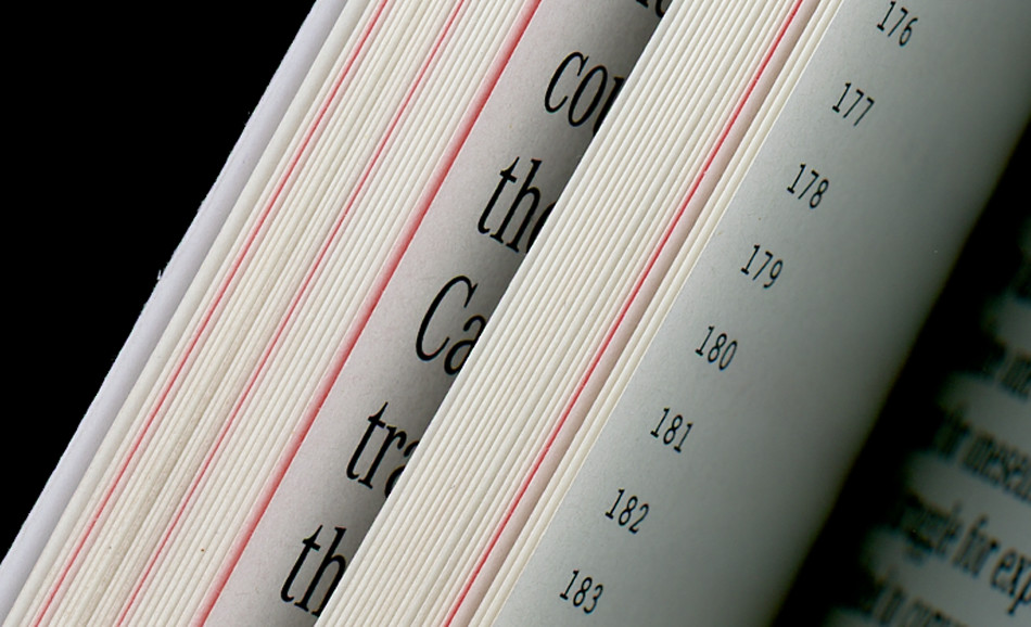
Something that was also interesting for me is the running footer

which moves from ‘A’ to ‘Z’ across the bottom which makes it look like a small film.

The same thing happens with the structure of the chapters,

which are also divided by the letters of the alphabet.

What I really like about the book is that it looks very logical, but in fact it’s completely illogical. I don’t want it to be completely understandable, I like it to be a game.

aisfor_wit

Yes, that’s exactly what attracted me so much! We’re actually doing some bookbinding at school at the moment and I feel like this is very useful for my own book design as well. So, are you satisfied with the end result? Are there things you would have done differently?

Yes, I’m actually pleased with the physical design of the book.

Of course, there will always be things that you don’t like, but can’t do anything about.

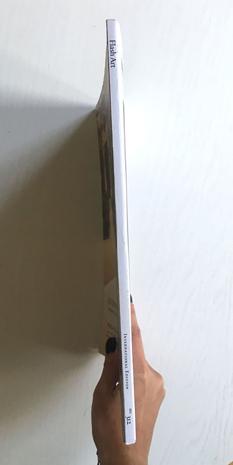
The glue binding for instance:

the first version of the book was way more flexible than the latest version.

That’s because they used a lot more glue for the latest version.

I also prefer the paper of the first version, I’m not sure why they changed it ..


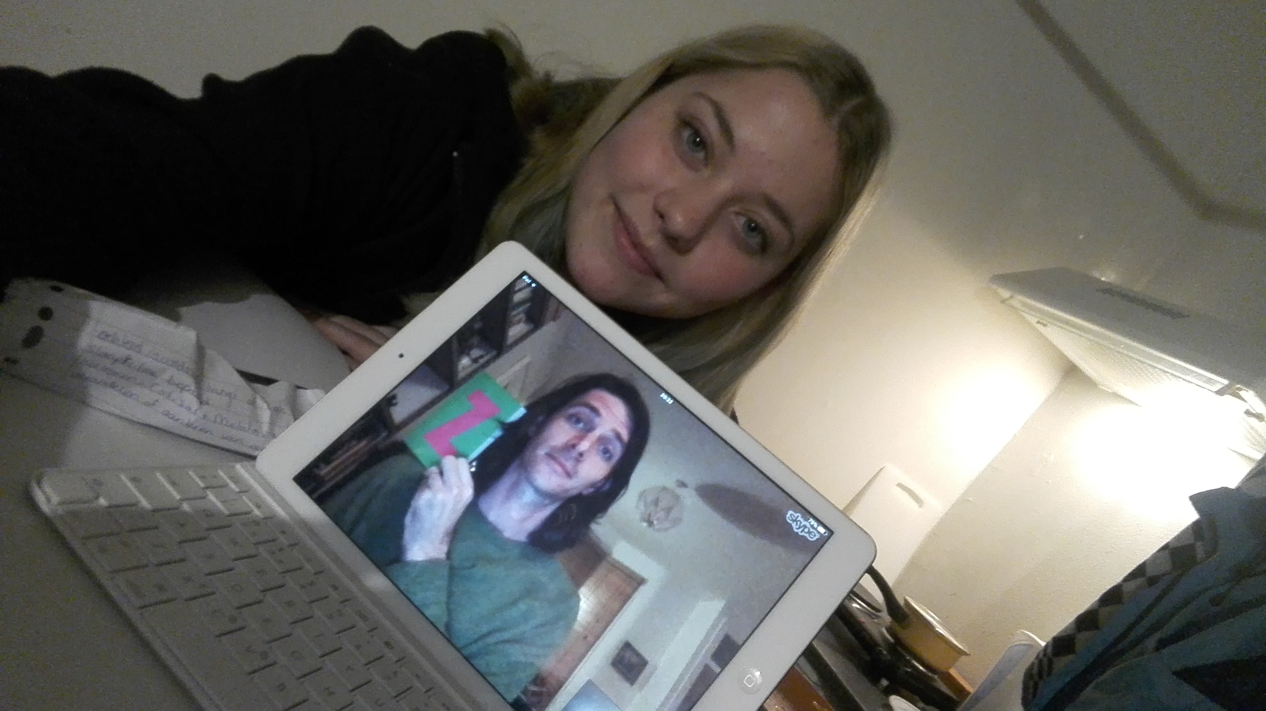
Thank you so much for your time and great help! I just have one more question: Would you like to take a selfie with me over Skype?

Selfie


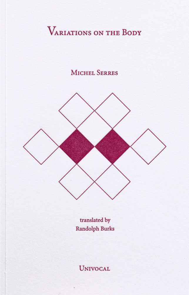
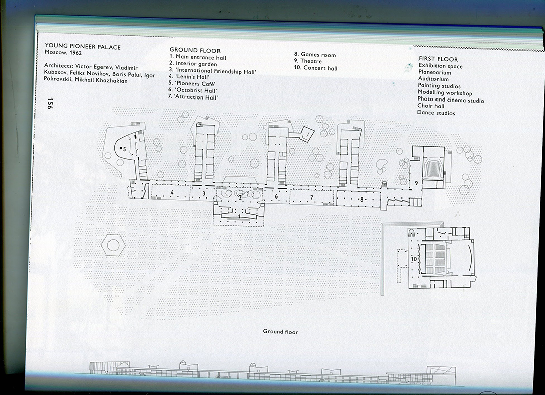
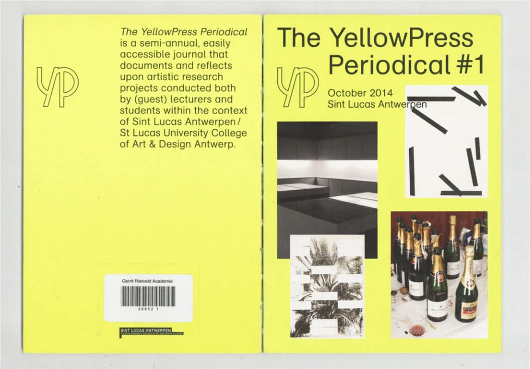
Gilles Deleuze’s ABC Primer, designer: We have Photoshop, Rietveld Library Cat. no: 157.3

Visual depiction of intimacy through design


Friday, November 24, 2017

A thick, soft bound minimal book. Deep wine red cover, blank, apart from the title- “Eva Hesse, Diaries”. From a side view, multiple black lines appear – opening the book up at one of such, the viewer discovers fully blacked out pages. Clearly a separation of some kind, and this is where the curiosity started – one of the reasons why I picked up this book to research on it.

Book cover

To some extent reminiscent of a elderly and minimalist bible caused by colour and size, opening this book immediately provokes a certain curiosity; especially the confrontation with cutting through content and context sharply through a simple, basic idea – to separate each diary with coloured pages enforces the reader or viewer to get a rough insight to the actual content of Hesse’s Diaries already.

The 20 second intimacy that occurs to a person when looking at a book for the first time has always fascinated me somehow – the endless possibilities of reactions one might digest, from a deep attraction to complete indifference, and how the slightest change in design, especially typography can make the most significant change.


According, “Eva Hesse Diaries” reveals a very appealing approach typography wise.

Every new page usually starts with the date of the entry, which truly summons the feeling of physically opening up and reading through her original diaries.

Another attention catching factor supporting the previous are the visual irregularities in which layout and state pages are left, some being nearly blank and some completely filled, but always seemingly decisive.

As an example, turning the page to find one single sentence only may leave a vibrant impression on the viewer. For further underlining of importance, paragraphing has been used with a similar effect.

paragraphing

In the optic chaos one might expect reading a diary, this design makes us stumble upon aesthetically pleasing organization due to provision of the books typographic grid in which the manuscript pages had been divided into eight columns.

For stronger visual insurance of clarity the font size is standardized whereas uppercase, underlining and crossing outs are retained. As an extra insight content wise, some of the original materials of her diaries such as notes and loose pages have been added.

sketches


The design of this newly gathered selection of Eva Hesse’s diaries was awarded the bronze medal in “best book designs from all over the world 2017” and selected one of the “most beautiful Swiss books 2017” and was planned and mainly made by Johannes Breyer during his internship at the design company “NORM” in Zurich, led by Dmitri Bruni and Manuel Krebs.

To get an insight into Breyer’s approach in and understanding of design, we might want to look a bit closer at his persona itself.

He is a half German, half Chilean graphic designer currently based in Berlin who studied in Zurich whilst being occupied at NORM before he graduated from the Gerrit Rietveld Academie.


http://www.norm.to

Nowadays he focuses mainly on printed matter such as books, and type design.

His interest in graphic design roots in a passion he found himself captured in during his youth where he claimed to have been an excessive gamer. Gaming led to him and his online friends stumbling upon web design which stuck to him as a field of interest so such an extent he decided to pursue this newly found passion – which leads us up until now.

Momentarily he runs a Swiss type design practice with the designer Fabian Harb called “DINAMO”, which produces typefaces and exclusive alphabets.

http://www.abcdinamo.com/about

Breyer is interested in creating and deducing the best system for each project and each product. From his perspective, it is better to hold personal preferences back, otherwise the content may be too easily forced into a form without relation to content or cause.

One of his beliefs include the fact that he thinks of passion and general curiosity as a more vital factor to success and progress rather than following an institutional education, although he’d rather work within a tight set of rules during the process of a project, claiming such set of rules to provide the necessary freedom to not run in circles with the same questions over and over again.


Overall, this design accurately depicts a visual insight into the artists personal life in an aesthetically pleasing format that certainly deserves the attention it has gotten. To achieve the effect of a reader entering the mind of a complete stranger could be described as a phenomena, considering the fact that in a social surrounding people interact on a mostly superficial basis – depending on the individually desired extent of social interactions. Exposing the raw content that makes up our persona, sharing every single vital thought, including angst and paranoia, socially unacceptable thoughts and processes in mind is something most people fear – but it also awakens a greater curiosity. To gather personal content together and deal with such sensible material in an appropriate manner could be considered an honorable task, anyhow this book is certainly worth giving it a look at.
Eva Hesse Diaries, designer: Johannes Breyer, Rietveld Library Cat. no: hes 9

Book or object?


Friday, November 24, 2017

I love books. Looking at books, or preferably full bookshelves, has always made me happy. It is not that I loved books because of the way they looked, but rather because of the knowledge that they represent. I’ve always seen books as a medium for information, as a source of knowledge, and because of that, I thought that the content was the most important part of a book.

When I started to make a book myself, I focused on the content, seeing the design as something ‘to worry about later’ or even, something ‘not to think about too much at all’. However, at the same time as making my own book, I did a research on a book designed by Irma Boom. Boom is a Dutch ‘bookmaker’, as she calls herself, who challenges the traditional formats of books. She doesn’t treat books as simple PdFs prints, but rather as architectonic objects. The shape, weight, and size become important aspects of the design because these aspects influence the experience of reading the book just like the content does.

To illustrate this, Boom has prove she could as much make a book that is 170 x 225 x 113mm height and weighs 3.5kg,  than a book smaller than the tip of your pinkie. The experience of handling these two ‘objects’ are completely different. While the first one is hard to hold because of the weight, the other one is hard to hold because there’s only a small surface to hold on to. The experience of these two books would have been the same if they both had been read on a computer.

Schermafbeelding-smallBook_1200

Schermafbeelding-bigBook_1200

Boom handling her smallest and biggest book. 

Another book made by Boom is Misfits. Misfits has an outstanding shape too, which spoke to me immediately. The book is bound in the simplest way, but it is an unusual way for a book so thick. It is bound by one thread that holds more than 300 pages together. Like Boom says herself, the book is essentially ‘just a pile of paper, stapled, folded and that is it’.

misfits front

The middle of the book, where the thread binds the book and the pages come together, is also used as the center of the content. The works that are showing in the book come here together and are ordered in a catalogue. This is also useful when flipping through the book, because this is the place where the book will open naturally. Here, the way of binding influences the structure.

misfits middle

I like that the book is unusual, as well in the shape of the book as in the structure. This makes the book interesting to look through. The book is simple in the mechanism that is used to bind the pages, but it isn’t so straightforward in the mechanism to organize the pages. At the same time, the simple solutions that are used in the book connect the book to the work of Hella Jongerius, the artist whose designs are shown in the book. She tries to find easy solutions in her designs as well.

Another book designed by Boom in which the physical shape fits the content is Elements. Elements is a book, or rather a collection of books, that accompanied the exhibition ‘Elements in Architecture’ at the 2014 Venice Biennale. It is a sort of frame that beholds 15 smaller books, each representing another fundamental part of architecture, such as floor, wall, ceiling, balcony, elevator and ramp. The fact that the book is a collection of different parts, different elements, strengthens the content of the book.

elements shelf

The complete collection of Elements standing in a full shelf with other books designed by Irma Boom.

Elements and Misfits both are books with an unusual physical shape. These books got my attention because of their shape, not their content. For me, they where more ‘objects’ than ‘books’. Books are of course always objects, but when does a reader become aware that it is an object? When does a book become more than content, fitted in pages?

Boom’s books are often seen as works of art. I think that one of the reasons for this is their object-quality. They are interesting to look at as object and don’t necessarily need their content to be interesting. This makes them almost like autonomous works of art.

In my own project too, I’m trying to make the design of the book interesting and fitting for the content. I let myself be inspired by Boom’s book designs and made, like Boom did with Elements, a collection of smaller books. These books are bound in the same way as Misfits is bound. In the middle of the book I placed the most important pictures, like Boom used the center for a summary. This way I hope that when someone opens the book, the most important page is immediately visible.

own collection2kopie

own middle

Researching the way Boom uses the physical elements of a book to enhance the content made me aware that a book could be more than just printed out pages, bound together. I realized that books are objects too. I have my own copy of Misfits now, which is not standing in my bookshelf, but proudly on top of it. I haven’t read a page of it yet, but I’m in love with the book already.

Misfit, designer: Irma Boom, Rietveld Library Cat. no: jonger 2

Paper Senses


Friday, November 24, 2017


What                 about

         a     paper      experience    ?


Texture      //////////////   Size///////////////////

////  Shape//////////////////////////////////Smell


w.herwegh1_800

w.herwegh4


Reading is normally the first motivation for buying a book right? But it isn’t always the case, at least not for me. There are so many different things that can bring you to this mysterious and incredible object: the book. One of them is the paper experience and since ages it is a full and really particular sensorial one.


In fact, only for this reason,  I spend hours and hours in book shops searching for something attractive. But what does it  « something attractive » mean? After spending four years studying Graphic Design in Switzerland, I have learned how to understand layouts, how to make them attractive, and how to manage different information to make them more accessible. But Furthermore I’ve learned that the base of all the work of a graphic designer is sensibility. How to play with visual and tactile senses. How to make you curious on a subject that you don’t really care about just by the shape of a book. The content of it, is for certain the most important thing but some people can look at a book in a totally different way.  For instance, when I buy books, pay attention to the layout or the paper, more than to the content.


Through the broad variety of books available in the Rietveld unique library, my eyes fell on a small and independent  magazine called « The YellowPress ». It was created by the St Lucas School of Arts of Antwerpen. This magazine’s particularity is that for each one of their periodical they gives the opportunity to all students, alumni, researchers and professors of the school to share their on-going research and/or output / results. This enables a diversity and an open-minded perspective of the magazine and creates the possibility to reinvent the layout’s atmosphere and dynamic. This explains the reason why each periodical has a completely different shape, typography and layout design.
I chose to focus my work on the first number of the periodical made by the graphic designer Ward Heirwegh who teaches graphic design at the St Lucas School of Arts.


Cover


More precisely, I’ve chosen to work on the Periodical #1 because at first sight it was the design of the cover that I noticed. Therefore, I focused only on the design of the magazine, not on the content. First of all, we can see how images are articulated with the text in a way that they interact with each other and play with the space of the page. The fact that they are using a card board for the cover but also for the Editorial and Colophon was at first something that I’ve found really playful and unusual. The cover is normally more straight than the content but in this case, they played with the same paper inside of the book and bring an other dynamic.


image4


The back cover is also interesting because they played only with text elements and the size of the text, which gives a special interest to the pages because the integral empty space. That is one of the knowledge of a good designer to know how to manage the white space and make it interesting. As many Graphic Designers, they used only text and play with the idea that it can become an image.

The color of the cover has been something really intriguing because it is a fluorescent yellow. This choice gives a certain impact to the cover because it catches the reader’s eye. Among the four pictures on the cover, only one is in color and the others are only black and white. From my perspective,  this gives a tension to the way that it is framed because of the repartition of the space.


image1.1

image1

image2.1

image2.2

image3.2

  image3.1


Moreover, the dynamic is followed by the utilization of all different kinds of paper for each edition. As I have mentioned previously the cover and the Editorial are printed on a card board and the four projects are presented on different papers. By this simple act, they created a different atmosphere for each periodical and gave another dynamic to the work. One of the first things that I usually like to look at when I’m discovering a book is the choice of paper. This simple fact allows you to give a whole sensibility to your object. Furthermore, what differentiates a printed book from a digital book is precisely the choice of the material and also the images can be really different depending on the paper and the quality of the printing. The paper is the real contact with the object and therefore a full sensorial experience. The magazine’s choice to change the paper for each project gives a different feeling to each work and invites the reader to discover/ experience something new every time . From my point of view, this is one of the most important characteristic.


image6


By conducting my research, I saw that The YellowPress is variable for each project. I liked the fact that they have found different dynamics, playing with the space and the different typographies. They have chosen to use different typographies for the different parts of the magazine and by this means, we can distinguish the different parts of the magazine: for example, the Editorial, the introduction to a work, the information of the pages, etc. The fact that they mix different kinds of typography shows that they care about each shape and dynamic of the typography and about what experience they could create on the ready. It is a subtle way to play with the content.


binding


On this periodical, one of the things that I’ve really liked was the bookbinding. They have work with a sew and stick binding and it gives something really attractive to the object. By the fact that the layoutis really clean and nice and you have this industrial binding which brings another dimension to the project, more experimental and practical.

After my analysis about the layout of this magazine, I think that in the first place I was actually more attracted by the choice of the different papers than about the layout itself. I still like how they  have constructed and organized the magazine but I’m really interested by the texture. What I’ve also really enjoyed about this magazine is that they didn’t respect the common codes that magazines usually follow. A magazine is usually based on a specific grill and respect certain typography and system for each periodical. In the YellowPress, they adapt and change every time every thing.

 
We are at a time when the value of paper is being questioned and compared to digital. It is essential to see in this medium a real quality and sensory experience that I believe, can never be equaled by the digital. People crave for something real, a physical object that is unique and that you can hold in your hand and experience it.

The YellowPress Periodical #1, designer: Ward Heirwegh, Rietveld Library Cat. no: magazine

The Continuing Story of Life on Earth


Friday, November 24, 2017

Hamburger Eyes. The Continuing Story of Life on Earth… Bizarre title aside- hamburger eyes? life on earth continues!!- what attracted me the most was the cover, more specifically its texture. The pleasant sensation of its grainy, bulky surface on my fingertips reminded me of snowy twitches of bad TV signal, or, perhaps more curiously, the thick, shiny, rough surface of the corridor walls in my primary school in Russia (a serious throwback!). A visuo-tactile experience. A tactile eye (a Hamburger Eye?)

cover-backside_1200

The object-oriented appeal of this catalogue is emphasized by the cover’s minimal design: front- one black and white image, framed simply and straightforwardly, no text; back- modest typeface (and size) of the title, another black and white shot, Kunstverein München. The Continuing Story of Life on Earth is the sixth installment in Kunstverein München’s Companion series, produced in collaboration with Roma Publications since April 2015,  and was released on the occasion of the exhibition by Hamburger Eyes at Kunstverein München. I’m still not entirely sure what Companion series is all about, other than quietly beautiful, tactile books; book-objects. They are artist/exhibition books primarily, all clad in that leathery grain and defined by simple, sharp covers and minimalist layouts; images taking up full pages, and separated completely from text, which always has its own section. I have managed to get hold of two more publications from the series, You’ve got beautiful stairs, you know (artist book for/by la Vasiljeva), and Serving Compressed Energy with Vacuum (exhibition catalogue for Anne-Mie Van Kerckhoven). Both have the same multi-sensory appeal of a well-designed object; as publications, they are direct in their materiality but somewhat elusive in their origin and intention: where did they come from? Who made them?

design-theory-1_1100

design-theory-2_1100

Companion is conceptualized and designed by Julie Peeters , a Brussels-based graphic designer, editor and educator. For the sake of this brief research we are going to conflate the series with the person behind them; she is credited under ‘identity’ as well as under graphic design. Companion is Julie Peeters.

Peeters deals primarily with exhibition-related printed matter- booklets, posters, catalogues; on her website you can find examples of ‘anthologies of installations’, exhibition designs, as well as credits for the identity of Lithuanian and Cyprus Pavilion at the 55th Venice Biennial. Peeter’s signature minimalism, as seen in Companion, is consistent throughout her design practice: simple yet bold covers without titles (if possible), text relegated to its own section in the back, simple layouts that let images unfold, breath, softly assert themselves. A prime example of this is Julia’s design of Full Colour by Karel Martens, published on the occasion of an exhibition in Tokyo. Graphic, enigmatic cover; title humbly relegated to the spine ; images taking up the whole page, on every page. Never a literal representation, a book by Peeters is an autonomous object, which augments its origin (an exhibition, an artist’s practice), yet has a character of its own.

Full Colour OUTSIDE

Full Colour INSIDE

Upon closer inspection the book’s identity unfolds; The Continuing Story of Life on Earth is not just Peeters. Hamburger Eyes began as a small xeroxed zine, turned into a magazine, and has evolved into a publisher. Publishing since 2001, they have developed their own signature vision of photography-

‘Ray selects images for their almost unexplainable impact, for their ‘epic’ qualities that exceed understanding, that SURPASS LANGUAGE…’
very Peeters?…

and a self-assured design style-

‘the current format is black and white printing on matte stock, print run of 500 copies, 6 x 9 inches, 64 pages, with PERFECT bind

carcrash_1100

catalog pages1_1100

The exhibition

which spawned this curious book (‘facsimiles of spreads from the back issues of Hamburger Eyes’) points to the mutually informative relationship between the design and the content. Each image was exhibited unframed and face up on tables, ‘as if a zine were being collated’. Hamburger Eyes promise to focus on the quality of a given image, rather than on the quality of its framing or installation ~ ~ ~ ~ The Continuing Story of Life on Earth has a very simple yet occasionally claustrophobic (two images stuck to one another on one page, with one blown up on the other) layout that recalls the intimate space of a zine. The book also houses an essay, that weaves throughout the whole book and is punctuated with tiny images- who made the choice when it comes to this punctuation? The publication is authored by Chris Fitzpatrick (editor?…), who also initiated the exhibition; one has to always consider the relationship between the designer and the author. The Continuing Story of Life on Earth is a collaborative effort shared between the two. Here content informs design, but also design informs design: from a zine to a photography magazine to an exhibition and back again trough the catalogue to our book.

Hanburger Eyes /The continuing story of life on earth, designed by Julie Peeters, Rietveld Library Catalog no: hamb 1

Chose a magazine for it first look


Friday, November 24, 2017

As a part of a research I focused on the design of a magazine. How a layout can interfere with a certain content ? and how a layout could be a good understanding of the content itself ? I started my research by choosing a magazine. A magazine which inspired me at the first look. Thought a mere book wasn’t interesting me. I chose to work on an edition magazine. I focused on the Flash art magazine issue 312.

At first, what’s Flash art magazine and why it is created ?

Flash-Art_lay-out

A little bit history about flash art magazine:
Flash Art is a bimonthly magazine focused on contemporary art. It was founded in Rome in 1967 by Italian publisher and art critic Giancarlo Politi. The magazine has been described as “the confident, international journal of European and North American contemporary art ». It is a magazine and publishing platform dedicated to thinking about contemporary art, exploring the evolving cultural landscape through the work of leading artists, writers, curators and others.

The next question following was why I chose this magazine? Why not an other one ?
—> Basic description and first look. How it’s look like ?

cover content summary

At first I chose this magazine for its cover. It attracted me by the colours of the artwork put in the middle of the page but also by the white square surrounding it. At first sight, the magazine looked minimal with a straight and regular layout. In the first pages of the magazine you have art and luxury adverts. After those pages you find a summary.

The magazine is separated in five parts : – Macro, – Features, -Time machine, -Micro and -Reviews. In those parts you have different topics, artworks and interviews presented.

In the middle of the magazine you can find different advertising and publicity about museums and artworks.
Concerning the layout, it is presented like one page of text, one image.

IMG_9656
The text are laid out in columns. Often with three columns. The font is the same in all the magazine but the size changes for titles and subtitles. They used newspaper paper for the hole magazine. The cover is smooth, with a title in front and on the top, then an image of an artwork all over the page. On the right side you have the number of the magazine, the month of it’s publication and the price in the different countries.The binding is basic, a glued square which keeps the pages together.

binding

After the description part of the design, let’s talk about the interference of it with the content:
First thing to say. I focused on the design of the magazine and not on the content.
We know the magazine is an art international magazine. The content then speaks of art and explains artworks. As I explained previously, the layout is quite simple and straight forward.That is why the design gave place to a good understanding of the content because it is clear. The texts are clear and the images printed big. Different layout for images and texts takes place in the magazine which differs depending on the content of the article. A question came to me about this straight and basic layout. Is it the same for all the number of the magazine ? Is it a choice to work with the same layout ?

By conducting my research, I saw that flash art have several designers for different number of the magazine. In one of the numbers that I chose, the designer Samuele Angellotti, has his proper label : Hansel Grotesque. A website was created since 2015 but nothing is online yet: http://www.hansel-grotesque.it/. His work is about identity and graphic design. It is really different compared to the layout in Flash art. I put the link of his personal blog:http://www.samueleanzellotti.it/ . It shows that Samuele Angellotti works with difference brands, for example Jin Jin Island. He was the art director and the graphic designer in 2015. The layout of his website is interesting and interactive for the viewer. The projects are well understood, represent by that ‘gif’ logo of the project on the black background.

Let’s see if I can say more about the layout and designers in different number of the magazine. I’ve made the choice to focus on three different numbers. In all of the three, the summary changes. They are more or less different categories, it obviously refers to the content itself. I noticed similarities in the layout.The advertising at the beginning in the magazine are the same, the font and the size of the text is the same. The review part is not changing. Indeed, in one magazine the layout change by adding different papers. In one we have scans of newspapers. A glossy paper is here to explain a project of an artist. The text has a different layout : a grey square surrounded the text.

For each artist presentation and article the design changes with colour of the square surrounding the text and the quality of the paper. In an other number, we have different colours of paper : light blue, light pink and light yellow. Two columns of text and the same font again. Sometimes the colour of the text changes to emphasize the content. The designer is again not the same than the two other. In this issue the graphic designer is Lilia Di Bella, who works as a graphic designer for the platform “Archive Books”. It is a platform for debates and cultural research located in Berlin. They are engaged on difference activities about publishing and exhibition making. http://www.archivebooks.org/. The design of the website is clear and clean. It shows artists publications. It is different compare the website of Flash art magazine:https://www.flashartonline.com/ which are more commercial and linear. In the principal page, artists projects are presented. It is possible to see the magazine of the month. Also find the previous number of the magazine and buy the current magazine.

I tried to search for an older version of flash art magazine to see if the layout was the same and if not what were the most important changes. I find one of 2006 and just on the cover we saw differences . I imagine the layout was different inside of the magazine.

flashart 2006
After investigating about the layout of this magazine, I think that it was the cover of the magazine that attracted me more than the layout itself. The flash art magazine use the same graphic rhythm to have an entity and his own identity next to other popular magazines. The layouts are clear, I think the content is the most important thing. It is a straight pattern which is repeated monthly in these magazines. They wanted to achieve a universal identity with international content for an open reader.

Flash Art, designed by Samuele Angellotti, Rietveld Library Catalog no: magazine

The YellowPress Periodical #3


Friday, November 24, 2017


The Sun and The YPP3


the sun hockney1

An issue of the Sun, or any other tabloid newspaper, is designed to grab your attention, and to stand out on shelves filled with newspapers and magazines. The tabloid newspaper uses bright colors, large bold typography, and shocking headlines next to eye-catching suggestive photos. The cover of the YellowPress periodical #3 does not share many of these features, and it does not use any of these visual tools in the same way, but the publication’s bright red cover with it’s abstract black shapes still managed to grab my attention. Sitting on the shelf in the library it was the first item that caught my eye, and it intrigued me enough to pick it up and have a further look.

book003_1

The name YellowPress refers to yellow journalism or yellow press, a term used to describe what is more commonly known as tabloid or sensationalist newspapers, publications that focus on the amount of newspapers it can sell and not on actual journalism. The type of newspapers that will annoy you when you unintentionally encounter them in a shop or on a table in the hospital waiting room. Cheap, unprofessional and frequently unethical printed content. The YellowPress periodical is by contrast a publication platform for artistic research, based in the St Lucas School of arts in Antwerp, where the designer of the book (periodical) also teaches. The name is an allusion to this trivial form of journalism, that graphic designer Ward Heirwegh also refers to in the design of the publication.

book026

When it comes to the front page, the only immediately recognizable feature shared by a tabloid newspaper and the YellowPress periodical #3 is the use of color. The use of red on the cover could be a reference to tabloid newspapers, as their titles are often surrounded by the vibrant color known to evoke emotion. The red on the dust jacket has an eye-grabbing effect, but it’s also used inside the book with one full red page introducing each of the four chapters. On the lightweight almost newspaperthin pages the color has a different effect. The reflection of the full red pages on the white paper create the illusion that some pages are pink and the back of the red printed page appear to have a light pink tint. The last chapter of the book enhances this confusion by altering between red, pink and black text. The overall effect this has on the book is a soft glow of light red and pink throughout, creating continuous variation through an indirect use of the colors.

book0201

The bright red dust jacket embracing the white cover of the book features the YellowPress Periodical logo – an outline of the letters YP – as well as four elements referencing the content of the book. A black rectangle, a line with black dots reminiscent of a map drawing, a row of three digit numbers, and a set of horizontal and vertical lines with one line covered in three black ovals make up the design of the front cover. The graphic elements are distinctively individual, but they also work together as one illustration due to their differences in form and their similarity in color. Already on the cover a play between the content and design becomes apparent, and shows that this is an unusual book with a very specific design language. Ward Heirwegh (the designer) mainly works within the cultural and creative field, and besides teaching graphic design conducts research into alternative means of distributing information (and takes photos of his work on wooden floors).

book012

The shapes are in fact abstractions of the issue’s contents. And they are all repeated continuously throughout their respective chapters. Calling the divisions in content chapters is perhaps not accurate enough as the YellowPress is a non-hierarchical publication where the contents are not arranged after importance or in the same way chapters would be arranged in a conventional publication, or how content is categorized in a tabloid newspaper. The black squares referenced on the cover are featured alongside typography pages that are an addition to first text, both by artists An Onghena and Hanne Van Dyck.

The use of graphic artworks is a major contrast to the tabloid newspapers use of offensive caricature drawings, but on a stripped down level they are in both cases illustrations supporting the written content. The black vertical line featured on the back cover under the dust jacket marks the margin for the pages, and is present throughout the book either alongside text or behind illustrations. It’s even there when it isn’t, as the text follows the same margin even when the line is not printed. In the second chapter the vertical line is replaced by a horizontal one, that separates text from illustration or other text.

book015

The layout is so far removed from the commercially driven newspaper layout that attempting to compare the two does not make a lot of sense. The same can be said of the design and the content of this magazine, so integrated that I’m hesitant to describe them as singular elements. The experimental nature of the design and the publication itself is pushing boundaries and exploring the limits of publication design. The challenge of integrating artworks, texts and illustrations from different contributors has been solved in such a way that the design becomes the content.

Elements like the vertical line are one of many elements that are played with, and this playfulness of the design is probably the most attractive element to me. The book constantly presents rules and systems that it, after establishing them,  chooses to go beyond or disregard. A sense of humor is present in the references to yellow press for instance in the use of a serious and not so modern looking typeface or in the ironic nature of the publications name, when the YellowPress’ content is so far removed from that of the yellow press. While tabloid newspapers today are a major contributor to an unstable political situation, the YellowPress is a tool for academics and artistic researchers to inform and educate their readers. The YellowPress Periodical #3 uses some of the same tools as a yellow press newspaper, but by altering their intention – using them to inform and not to sell, to educate and not to frighten – the visual language changes from noisy and disturbing to something beautiful.


The YellowPress Periodical #3, designer: Ward Heirwegh, Rietveld Library Cat. no: magazine

Words Don’t Come Easy


Thursday, November 23, 2017

A


Object

  1. A material thing that can be seen and touched. (Oxford)

2. A thing external to the thinking mind or subject.(Oxford)

3. Something mental or physical toward which thought, feeling, or action is directed.(Merriam Webster)


Conversation

  1. Exchange of sentiments, observations, opinions, or ideas (Merriam Webster)

2. Talk between two or more people in which thoughts, feelings, and ideas are expressed, questions are asked and answered, or news and information is exchanged (Cambridge, Oxford)


Recognition

  1. Knowledge or feeling that someone or something present has been encountered before.(Merriam Webster)

Identification of someone or something or person from previous encounters or knowledge.(Oxford)

The fact of knowing someone or something because you have experienced it before.

2. Acknowledgement of the existence, validity, or legality of something. (Oxford)

Agreement that something is true or legal (Cambridge)

3. Appreciation or acclaim for an achievement, service, or ability. (Oxford)

Special notice or attention (Merriam Webster)


B


F.R DAVID is a biannual journal- founded, edited and typeset by Will Holder-concerned with ‘the organization of reading and writing in contemporary art practice’. It is chunky: a rectangular block. Like a brick. Or a novel: An object. This is what drew me initially to the Autumn 2017 edition- ‘Recognition’- and is illustrative of an important aspect of Will Holder’s work. His interest in the thingness of words” is manifested physically, not only in the shape and feel of the journal (something which he plays with more explicitly in “Black my Story” an exhibition catalogue in novel disguise), but also in additional items that come with every edition- A book mark and a postcard- things that very much ask us to hold them in our hands. A specific rule defined at the founding of F.R DAVID stipulates that they are printed on the matte side of the card, the gloss side left blank (This is also true of the cover). Another, dictates that seemingly mysterious letters on the spine of each edition when placed together will eventually spell out F.R DAVID’s maxim ‘Words don’t come easy’. Of course, the 80s hit of French pop star, F.R. DAVID, whose name is appropriated hilariously as though it were the author’s on the cover of this intellectual, literary-art journal.)

This kind of inversion of commercial publishing convention is present throughout ‘Recognition’ (and the rest of Holder’s work): images are placed oddly on the page, sometimes even overlapping with the text; the typeface shifts incongruously to ‘American Typewriter’ for one text only; images of text are used at points rather than the typed words; footnotes expand uncontrollably to fill entire pages. By subverting our expectations, Holder makes us extremely aware of the materiality of every aspect of the publication- both literal/physical and linguistic. The event of publishing too becomes an object: Holder organizes performances with readings in strange, poetical formats with quite trance-like elements. Constantly he is reacting against the increasingly conventional, stream-lined nature of the graphic-design industry, a world of “branding agencies and viral strategy analysts”


fr-david-cover_950 R.F.Davis-Spread_1100


C


Will Holder told me about the role of page space and layout in his work in allowing room for multiple meanings:
“My work allows all present to have a voice, and often uses the page to score this polyphony and dissonance.”
In particular, he is concerned with the reader’s contribution to the meaning of a text; his work is conceived of as a collaborative exercise between author and audience and designer and printer and publisher and all who have played a role in producing it. The ongoing, dialogical qualities of book design become increasingly important with the modern explosion of information sharing. In an era very much preoccupied with notions like ‘fake news’ and ‘post-truth’ we need to find ways to re-legitimise published opinions.
“We could say that given today’s onslaught of information and multiple views, reading is an exercise in comparison, in order to distill one’s own position; and not regurgitate what others want you to”


F.R. DAVID being a journal, has to accommodate multiple voices more actively even than a publication with a single author. Each text is subject to the “inflection of [its] neighbours”. In catering to this and in embracing it, Holder intersperses separate texts in the ‘Recognition’ issue, using two different style sheets: While some typographical and formal limits are imposed for continuity, there is diversity within these limits, informed by the content. The original typesetting of articles has been maintained where Holder deems it relevant. And in all of these decisions he acknowledges the subjectivity of his own voice, pointing out “that relevance is dictated to me by my reading of the material”.


F.R. DAVID as well as many of Holder’s other publications uses primarily ‘The Doves type’, steeped, appropriately, in conversation and history and mystery: Its origins are in The Doves Press, founded in 1900 in London (since when it has been banished for almost a century to depths of the River Thames and then dramatically rediscovered). Its celebrated fount of metal type was designed with the intention of ensuring that it did not distract the reader from ideas within the text itself, ‘the thing intended to be conveyed’. The significance of this sentiment in relation to Will Holder’s intentions is apparent. So too is a playful irony: He is strongly conscious of the agendas of typefaces and the impossibility of one that obediently serves content, rebelling, in fact, in ‘the non-linguistic or extra-linguistic qualities of language’.


fr david preface Doves-Character-set-650x1055-July-2016


Mischievous subversion of a devise like this epitomizes Holder-style. He leaves questions- about the nature of the publication (a mysterious new magazine, ‘Staples’ with very minimal and odd content, for example, is entirely unexplained); the route we should take in reading it; and the boundaries between earnestness and farce, unanswered. We must surrender to the ambiguity of the work.

F.R.David, designed by Will Holder, Rietveld Academie library catalog no: magazine


Log in
subscribe