Skip to Content Skip to Search Go to Top Navigation Go to Side Menu


"product design" Category


The diversity of a stable object


Wednesday, April 24, 2019

     As a student of arts and design and, at the moment, about to reach the end of the first year – I found myself trying to understand my progress and development process as a student- considering all the different situations and stages I have been through this last year in relation to the school.

     Characterised by strong rhythm and diversity, the basic year forced me to be extremely versatile.

     Creativity and quick response led me to places where I had never been before and although I was very confused in the beginning, I can now understand the interconnection of all the proposals from the school and how my reaction to them should be constantly evaluated in order to keep developing as a student.

     As so, confrontation becomes incredibly important to get to know myself and, under pressure, the behavior of my body had many times to overcome the speed of thought, which means, that it was necessary to act without thinking innumerable times – which resulted in a completely different way of perception on my own work. This practice, of course, has greatly influenced my method of creation and helps when it comes to try to have an overall view on the last period of my life- which I will be doing meanwhile writing this essay.

    From this very small and summarised description of the last months as a student of an art academy I ask you to take some words that will help you to follow my thoughts throughout the essay:

  • Rhythm;
  • Diversity;
  • Versatile;
  • Creativity;
  • Interconnection;
  • Confrontation;
  • Development;
  • Behaviour of the body;
  • Method.

These words, for me, interrelate the three points I want to focus and connect: Art academies; me as a student and school furniture design. But lets start from the very beginning.

     Art as an educational practice emerged in the 16th century in Italy, and has since evolved in many directions. Artistic teaching has been constantly changing and responsible for the emergence and development of multiple movements and new artistic practices that grow from the urge of the artists and and the society. As so, methods used in art schools have been transformed side by side with the whole society and its needs. 

     Throughout all these years many academies have been important for the development of various names that have become part of world history. Thus, certainly, the school where each one of them studied, had a great impact in their own artistic practice. Aiming for the same to happen to me, when I decided to study arts, I promised myself that I would try to find a place that would truly satisfy my needs and where the thought that moves the school would meet my own way of thinking.

     The academies have become places where learning is fundamental but, over time, the way the disciplines are taught to the students is in constant transformation- what results in a huge variation of methods used in artistic teaching.

Therefore, my task of finding the place where I wanted to develop my practice as a potential artist had to be even more cautious and I had to get to know as much as I could about the schools to which I could apply without studying there.

     After much research, I ended up leaving my home country, Portugal, in search of something that seemed appropriate to me and I ended up enrolling in the Gerrit Rietveld Academie in search of a more adapted teaching to my ideas and to my way of producing.

     Surrounded by different ways of thinking and materializing ideas, I was immediately enthusiastic about the reality that surrounded me. The contemporaneity and versatility of the teaching of each one of the teachers has proven the ideas that I brought with me from Portugal. It is very important to have the school as a safe space where all ideas are respected; Where the concept is valued and experimentation has no limits. The unlimited access to the workshops gives creativity to the students and the consideration of the creation process by the teachers and colleagues makes me believe in several methodologies that open up a huge range of possibilities to each project that I develop.

     While considering all this I realized how similar the school I was studying was to one of the most important schools in the art and design history which I always had as a great example of education techniques: the Bauhaus.So there has grown an even greater interest for this fascinating school. Now, living even closer to where everything happened geographically, I have managed to get more and more acquainted with its history.

     After some research, I have come to understand that the way the Bauhaus developed and educated its students was more than a teaching method. It is perhaps a method of production and creation that is directly related to one’s own method of living.

     Honestly, I find it striking how schools like the one I attend and the Bauhaus consider the curriculum of the degrees, and as time goes on we have more and more evidences of the positive influence that this way of teaching has- somewhat minimal, where “less” is believed to enable a much interesting creation. I would like you to take into account the last sentence- “Less is believed to enable a very interesting creation”


     While researching about the schools of art education and my perception of them. I began to notice a very important element: school furniture. That both the Bauhaus and the Gerrit Rietveld Academie plays a very important role – maybe because of its relationship with design practices. Considering those academies as a space where an incredible relationship develops daily: between the building and its interior; the objects; and  the people that share this space of discovery and experimentation.

     The interaction turns out to be very relevant in the day-to-day of those who frequent this place. The distribution / organization of space among all those who occupy it is extremely relevant and certainly influences all activities that take place in the school environment, from pedagogical to playful.

     Historically, there are several objects that are part of the artistic school environment and that, thanks to its constant presence, a certain language between human being and object is developed. As I wandered through the corridors of my school, I realised that each student has its own body language, just like every person and that we all physically get involved with what surrounds us.


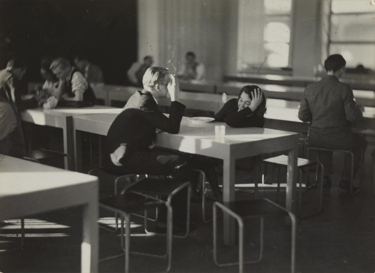
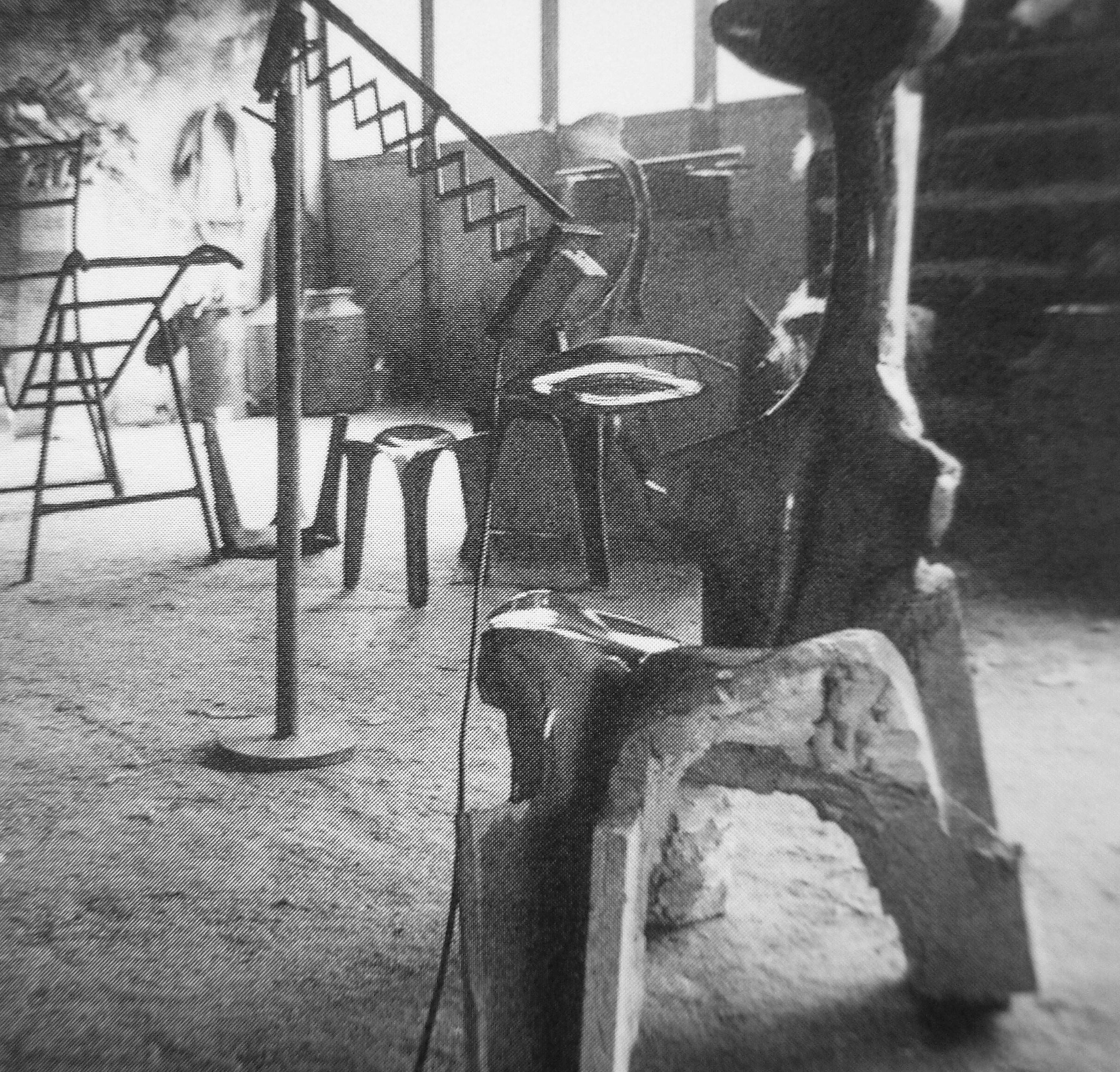
Cafeteria after lunch, Bauhaus, Dessau 1930-2, photo: Iwao Yamawaki, Tate UK

     The same happens in relation to pieces of furniture. Without realizing it, the chairs where we sit become part of our position while we are seated, or an easel can become part of our body while we paint – its triangular shape where the frame is supported, often serves as support for the painter. I myself have noticed that many times I paint I find moving in different angles thanks to the support given by the easel. And, together (me and the easel), support the fluid movements of my arm that moves the brush.

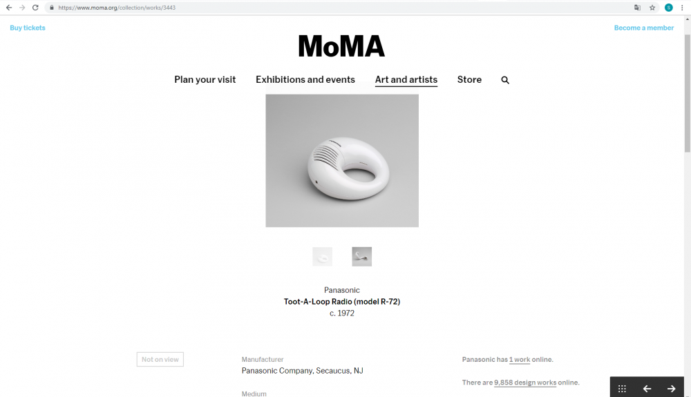
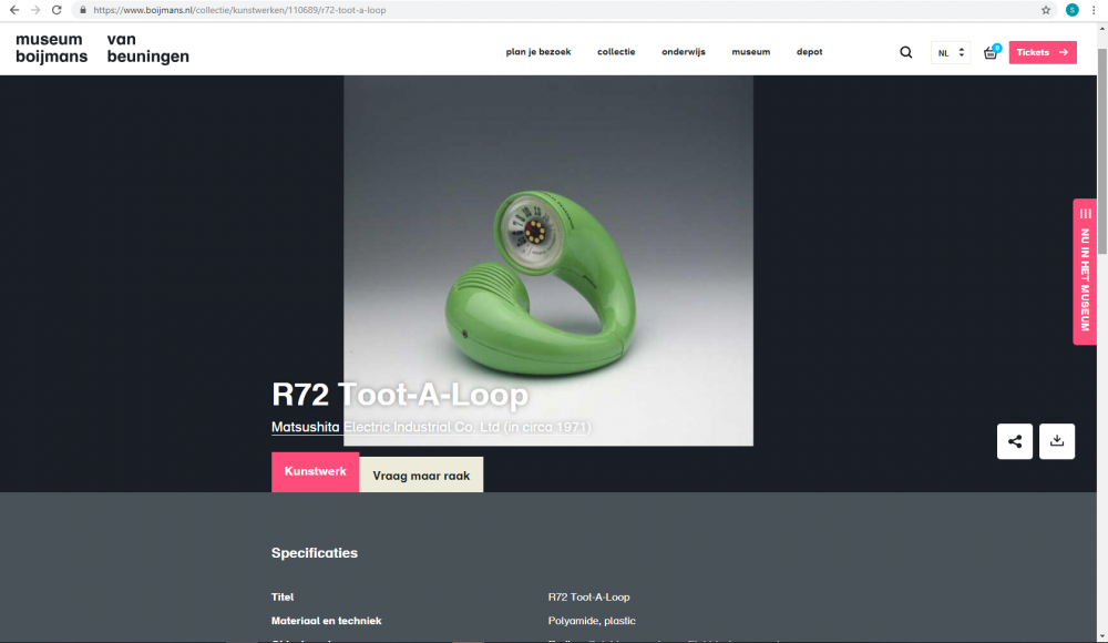
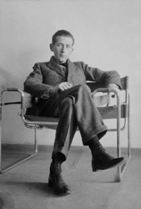
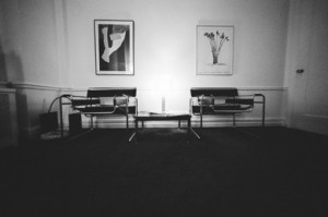
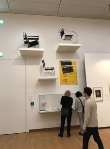
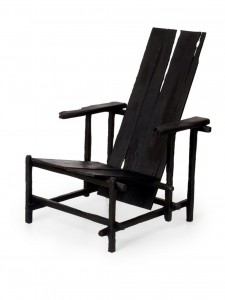
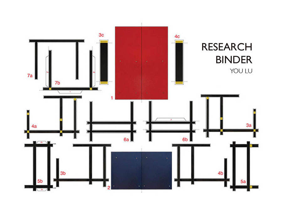
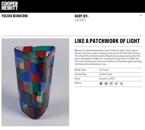
     Due to the introduction of this new theme – school furniture design. It is impossible not to go back to the Bauhaus, a school where numerous pieces of furniture were developed and included in the school itself. When I went to the exhibition “Netherlands Bauhaus – pioneers of a new world” at the Museum Boijmans Van Beuningen in Rotterdam, I found several photographs with many of the most famous pieces by Bauhaus students, such as Marcel Breuer’s stool but, and I realized how furniture captures my attention by the way it is designed and it interacts with the space. But, throughout the exhibition, there was one piece that captured my attention, the Ulm stool by Max Bill.

“Function means the relation of one thing to another. (…) When we speak about fulfilling a function, we are talking about producing something to fulfill a need. “;

“By function I therefore understand a relation, for example the relation between material and form.” – Said Max Bill.

     Having the designer’s words as a starting point I would like to take advantage of the functionality of his piece – which fascinates me – and directly compare it to my relationship with the school that I attend because, incredibly, while appreciating the stool in the museum Boijmans Van Beuningen I felt that, somehow, its structure was very close to mine, as a student of the Gerrit Rietveld Academie.

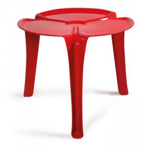
     Physical characteristics of the piece:

– The stool is made up of 4 pieces that when fitted create a volume of varied functionality. The joint of the different parts is extremely well design;

– The simplicity of the geometry allows the interconnection of all parts and a joint strong enough to handle a weight;

– The stool has 3 almost identical parts that form the seat and a tube that allows support and transport.

     In a metaphorical way, I associate this description with my goals as a student. Every day I try to find solutions for my assignments through maximum simplicity; I try to be as organised as possible so I do not get lost in my own thoughts and, to ensure that each of these thoughts results in something material. In order to develop my production process. In each of the projects that I do in school I seek the interconnection with the others projects- always trying to notice the small things where they might be similar and, therefore, I have discovered many personal characteristics – mainly in relation to the way I work and how I shape my thinking. By considering and evaluating my own works I manage to find myself a little bit more every day.


     Functionality of the piece:

  • One of the strongest features of the Ulm stool is its versatility in functionality.

The joining of four simple pieces results in a simple object that can be used as a bench, as a desk and as a shelf and can still be transported very easily.

     In relation to my own experience this versatility can be found in a lot of aspects. The Gerrit Rietveld Academie is a place where its diversity promotes an open space where a lot is possible. Even if the departments work in separate ways there are links in between that make the school work as one and everyone is free to participate and to take the best out of everything that the school offers, from people to workshops.

From such freedom I experienced a lot of different results from each student, including myself.  It is this versatility that I try to find in my posture as a student because I believe that it will certainly result in a practicality and ability to solve any problem that I will increase my creativity and for sure be one of the most important lessons I will take with me from my years as an art student.


     At this point, where I can relate the characteristics of a design piece with my own performance as a student. I consider my research finished.

After all and by becoming better acquainted with the reality of art academies and their direct relationship with what is produced in them. I believe that writing this essay resulted in a very personal development – It led me to conclusions about how I interact with the space around me and how this influences my results and it also made me pay more attention to the results themselves so that, later, perhaps, I might be able to assume that I know myself.


As Little Design as Possible


Thursday, November 15, 2018

I was startled by the fresh, sleek but subtle apparence of the SK 4 as I walked by it in the basement of the Stedelijk museum. I stopped and bent over to get a closer look. This audio system combines a turntable and a radio with two speakers in a single white metal box ornamented solely by two wooden boards on each side and an acrylic glass lid. The rest is all functional: a few plastic control knobs and an analog display for radio frequencies.

« Hans Gugelot, Dieter Rams » stated the label on the right.

Those two designers (Hans Gugelot and Dieter Rams) worked for electrical appliance company Braun which released the Phonosuper SK 4 in 1956 as one of the first products to incarnate their new design. They wanted to get rid of the superficial and fashionable to make room for efficiency, simplicity and the beauty that comes with it.

I started searching the internet for some historical context and information about the relevancy of the object today. A few scrolls were enough to realize how influential the SK 4 design is. I first stumbled on countless ads selling the product from one to three thousand euros. Then I found many blogs paying tribute to it by sharing images and information about the design philosophy of the brand. I noticed that Dieter Rams was a lot more mentioned and appreciated than his co-worker Hans Gugelot, probably because the former was involved with Braun for many years (and still is) and has worked on many other notorious products. In fact, Rams is a legend of product design, referenced by many younger designers, such as Apple’s Jony Ive, as a major influence. This is very apparent when looking at today’s electronic products like smartphones, computers, bluetooth speakers but also furnitures and architectural edifices. I found a short documentary on Vimeo yielding the floor to Mr Rams himself at the initiative of the V&A Museum in London. According to him, his willingness to bring a new world of modern design to post-war Germany began when he met the Braun brothers. The success of their new creative approach proved the importance of a well though and original design. He also developed the 10 commandments for good design (which undoubtedly still hold up) in order to teach the students and the media, as well as keep together the behavior of the brand.

I searched the library of the Rietveld Academie as well as the library of the Stedelijk museum for documents published in the 60’s when the SK 4 was commercialized but I was not able to find any. All I could find were recent books paying tributes to the design philosophy of Braun and Dieter Rams, compiling images and information on their broad collection of products. I did not learn anything new about the SK 4 except for a few drawings I found in the book ‘Less and More, the Design Ethos of Dieter Rams’ by Klaus Klemp. They were made by Rams during the conception of the audio system, which I was quite excited about. The drawings are very simple, almost innocent, and denote of the « new beginning » state of mind of their author. It only made me thirsty for more archive documents of this type, so I kept on researching the internet. I found an image from an original Braun catalog including the SK 4, as well as a diagram of the SK 4 electric circuits naming the object « schneewittchensarg » (« snow white coffin »). This nickname shows how groundbreaking the design of the SK 4 was.

Overall, I found the internet much more efficient for my researches: it brought me more information in a shorter amount of time then books did. Nonetheless, the search for material publications is much more thrilling. It leads to discovering new places (like the archives of the Stedelijk museum) and offers a tactile, more intimate experience. The books I found did not really offer more information but displayed in a more interesting, compelling and memorable way. This leads me to thinking that printed publications will continue to play a very important role along the exponential growth of virtual data. Our senses have not changed and the book is a design object which offers a cleaner and purer visual and tactile experience than computers.

SCREEN 100


Saturday, October 27, 2018

The Presentation of ‘Screen 100’

In the Stedelijk Museum Base, a screen made of pinewood can be found, next to other Scandinavian design. The description tells the beholder some basic information of when the screen was designed, by who, and when this specific one was produced.The object was designed by Alvar Aalto, who was a Finnish architect and designer who was born on the 3rd of February 1898. He could be seen as one of the most influential in Scandinavian design of his time. When looking at the representation of his works in books, his architecture is most prominent, as those were very big projects he worked on for multiple years. For every building he made he wanted the environment to be functional, so naturally he also started making furniture. In books about Alvar Aalto there is often a mention of the Pinoy vase and the Paimio chair, but it’s difficult to find the more obscure ‘Screen 100’.

aaaaaaltoScreen 100 Alvar Aalto in Stedelijk Museum Base

However, looking for it on the internet, thousands of results pop up. Even though printed matter hardly mentions the less popular objects, this does not seem to be the problem online. Instead of information about the object itself, or biographical details about Aalto (or maybe even the theory behind his design) it seems to be mostly auction sites. Various auction houses have a broad range of prices, starting from around €1800,- till approximately €8000,-. The sites claim that their ‘Screen 100’ was produced very short after the design year, but never give actual information on the piece. Often, the screen is presented in a way that Alvar Aalto would never. Next to very decorative elements full of color, or with clashing styles. The only place on the internet that seems to accurately depict the aesthetic of his designs is Artek.fi , the company founded by Alvar Aalto himself to produce his products en masse. Still though, the site remains simplistic and does not give away too much information.

auction site aaltointernet screensaalto artek

To see how this object is represented in other media, a library needs to be visited. Specifically, the library of the Stedelijk Museum itself. In this library there are many books on art and design, but there are also documents on every piece in the museum, including ‘Screen 100’ by Alvar Aalto.
Looking in their catalog, many books on Alvar Aalto mostly focus on his architecture again. However, there are some books specifically on his industrial design. Even then, the screen is not put into the spotlight. In one of the books about Aalto’s design, it only has a very small mention in the back of the book, where his designs are put in chronological order. Only a small symbol is present, no pictures of the screen are shown in the book. The depiction of this exact design item is very scarce, even in very specific books.

alvar aalto furniture bookartek design alvar aalto chronological order

Luckily, the museum library has more than just those books. A brown file storage box is brought out, containing various brochures and sale catalogs from Artek. There are folders and papers from the fifties, nineties and early two thousands that contain every object sold by Artek. These are one of the few printed documents that show ‘Screen 100’.
Besides the catalogs, the library also has the complete object description on hand, which is a file including all known details about the specific screen that they have in the museum. Details like the manufacturer, the size, the number of slats, and even how the object is transported are included. In this description it is mentioned that the screen was used in the museum, before it was put in the collection of the Stedelijk Base. Pictures show that the screen was used to block entryways while exhibitions were built. This means that the object was also represented in a very practical context.

artekartek catalogus spread alvar aalto designscreen 100 alvar aalto volledige objectbeschrijving stedelijkscreen 100 aalto stedelijk

The differences of how the media presents this object lie in the frequency and detail of information. Printed matter available in regular libraries often focus mostly on the more iconic, time consuming efforts of Alvar Aalto, as his architecture is often more prominently shown than his design. If the design does have a mention, it is mostly the more popular things that will be mentioned. This also holds true for more specific books on his design. One of the few printed matters that do mention the screen are very functional such as inventories or catalogs, where the context is about selling a product, instead of informing the reader about various movements or ideas. The price is often listed right next to the object. The same holds true for the information found on the internet, where auctioning sites give a very simple description on the object. However, the online results show a variety of pictures of the same object, in different combinations and settings, whereas the printed catalogs often go with the same pictures and symbols. While the museum library has one of the most accurate and detailed descriptions for the object, one can only understand it fully by seeing it firsthand. Even then your understanding of it can depend on the context in which you see it, as the screen can be represented among other furniture of Scandinavian designers in the context of a presentation in a museum, or seeing it functional, as an everyday item, where you are more likely to glance over it.

Yet, after a deep dive into the designs of Alvar Aalto it seems impossible to glance over it and not admire the simplistic beauty that is inherent to ‘Screen 100’.

Fulvio Bianconi Pezzato Vase


Saturday, October 27, 2018

The starting point of my research was Fulvio Bianconi’s Pezzato Vase. The Vase that displayed in the Stedelijk Base (fig. 1) was designed in 1950-1951 and acquired by the Museum in 2002 from the artist Tomas Rajlich. The Pezzati series [Pezza (it.) – patch] was designed between 1950-1954 and produced by Venini & C., a Murano glass manufacturer.

Pezzato Vase at Stedelijk Base


I started my research by looking up books about Bianconi in “WorldCat”, an Internet-based books catalog that contains combined data from thousands of libraries around the world. Most of the relevant books about the artist that I could trace in Amsterdam were either in the Stedelijk Library or the OBA (Amsterdam public library). Besides, I searched in the Stedelijk library internet database, and with the help of its librarian, I could find a few more catalogs and books that did not come up in WorldCat. I also checked in the Rietveld library search engine, but unfortunately, no result came up. Most of these searches brought up relatively focused information about Bianconi and Venini & C.

Later I started to search about Bianconi by going through the glass and crystal books collections, both at the OBA and at the Rietveld Library. Those searches brought up less specific types of books, either about design in general or glassworks.

The physical materials I found can be divided into several categories:

Exhibition Brochures

The Stedelijk library has two original Bianconi’s exhibition brochure: one from 2015 at Le Stanze del Vetro (fig.2), and the other from 1975 at Gallery Danese in Milano (fig. 3). The Danese’s brochure is the oldest physical material about Bianconi I could find in Amsterdam. It’s an envelope that contains six large postcards of the artist work and innovation to the opening in September 1975 (fig.3.a).

Exhibitions Br.

2a

Venini

The book (fig. 4) and the Brochure (fig 5.) are both directly related to Bianconi’s work at Venini. The book consists of information about Bianconi’s life, but its central part presents Bianconi’s designs throughout several decades. The designs are divided by series of production (one of them , for example, is the “Pezzati”), and the objects displayed next to their drafts and numbered as in a catalog (fig. 4.a.). The Venini Brochure function both provide information about the company and service as a poster (fig. 5.a). Although it doesn’t revolve around Bianconi’s body of work, some of his designs can be identified on the poster (such as the Fazzoletto series).

3

3a

3b

Private Collectors

I also found information about Bianconi’s designs at private collectors book. The first one is Losch collection (fig. 6), a private collection that focuses on Italian and Finish Glass. The other book presents Nancy Olnick and Giorgio Spanu Venetian glass collection. Both books are not exclusively focused on Bianconi’s works and display an assortment of his designs alongside the designs of his Italian colleagues at Venini.

4

Glass

After going through all the books found with the help of the Libraries’ database, I checked if I could find information about Bianconi in books about glass in general. I searched in the OBA collection about Glass and Krystal, that are categorized on shelf number 775.6. Three of the books (fig. 8, 9 & 10) consists of very little data about Bianconi, while one of the consists a more in-depth look into his body of work (fig. 11).

5

6

Searching online brought up other results. Searching “Fulvio Bianconi” in Google provided around 90,000 results, and adding the word “Pezzato” narrowed the results to 12,500. The internet-based results concern mainly commercial aspects regarding the designer works and present rather little data about his life and body of work.

Many websites either sell Bianconi’s designs or providing data about future auctions and previous auctions results. The site varies from e-bay to Sotheby’s and online auction houses.

7


Other websites, more “institutional” ones, deliver basic information about the designer works and his life. First, the designer’s official site contains his biography and a small picture gallery of his glass and graphic works. In Venini & C., official website this information can also be found. Modern art and design museums such as the MoMA, Stedelijk Museum, Museum Boijmans, the Cooper Hewitt and the Metropolitan provide limited information about the designer works in each of the institutions own design collection.

8

Limited data about the designer can also be found in social media. The designers have around 900 pictures that contain his name tag on Instagram. In addition, in Venini official instagram account some go his designs can be traced. The designer has a facebook fan page that is currently not active.

9

Compared to the information found in books, the one found online is not as thick and much more general. In books, we can see extensive data relating to historical contexts, manufacturing processes, and the designer’s biography and full body of work. The information that can be found online Is mainly revolving around the commercial aspects of the designer’s works, focusing on his popular and “more profitable” production series.

From Chair to Playground


Friday, October 26, 2018

While viewing all the design objects in Stedelijk Museum I came to the end of the show. I thought its hopeless to find something that satisfies my eye. I finally saw the Floris chair in it’s beautiful white form. I thought it was such an extraordinary design, so feminine, so elegant, there must be something interesting on this chair, and so I began my research on Gunter Beltzig.


Gunter Beltzig is an industrial designer that designed plastic furniture in his youth. They are now exhibited as classics in museums of modern art. He designed many various pieces of chairs and tables. As I went on checking his website, facebook profile, and all the pages that Google gave me, I found more and more of Floris Table
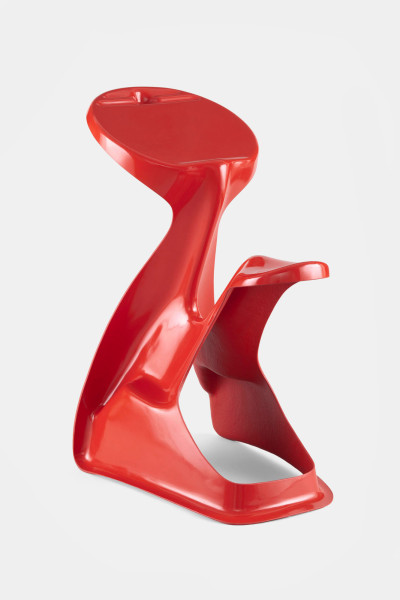
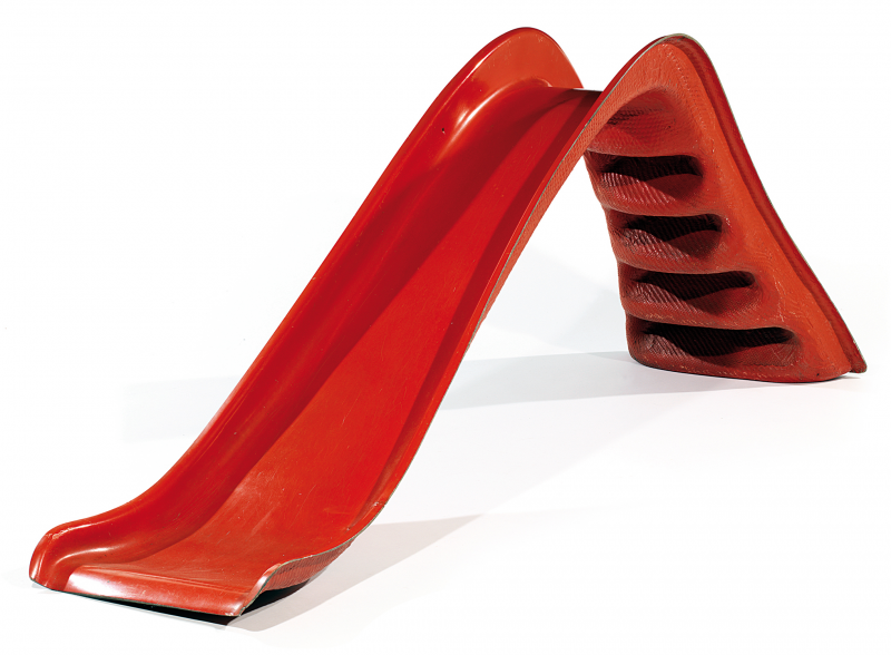
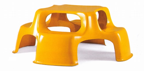
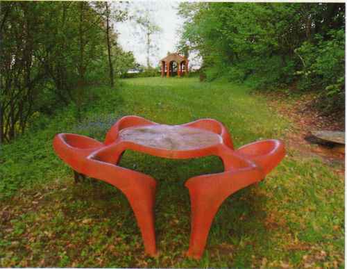
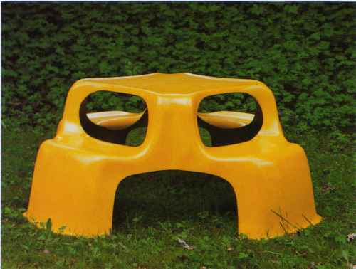
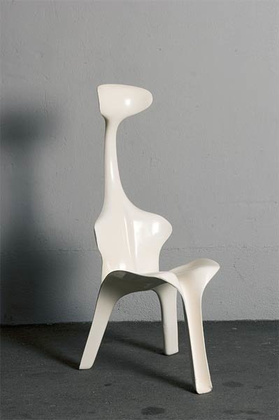
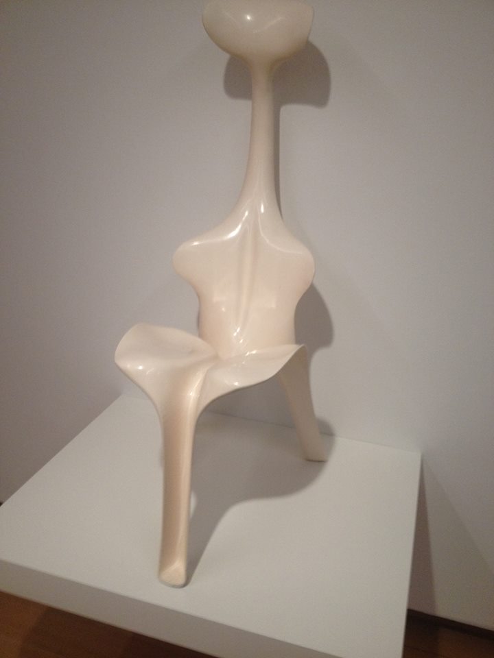
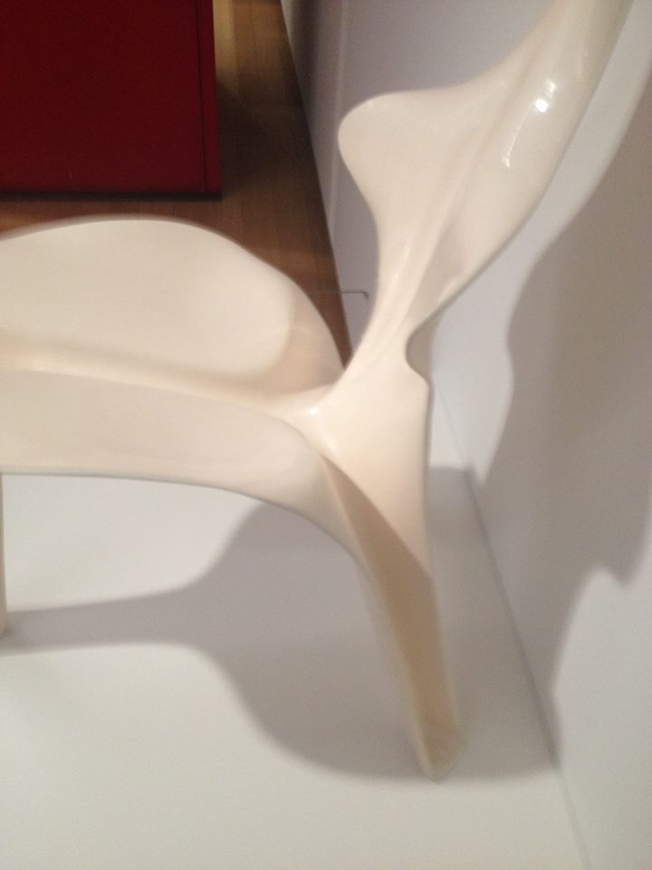
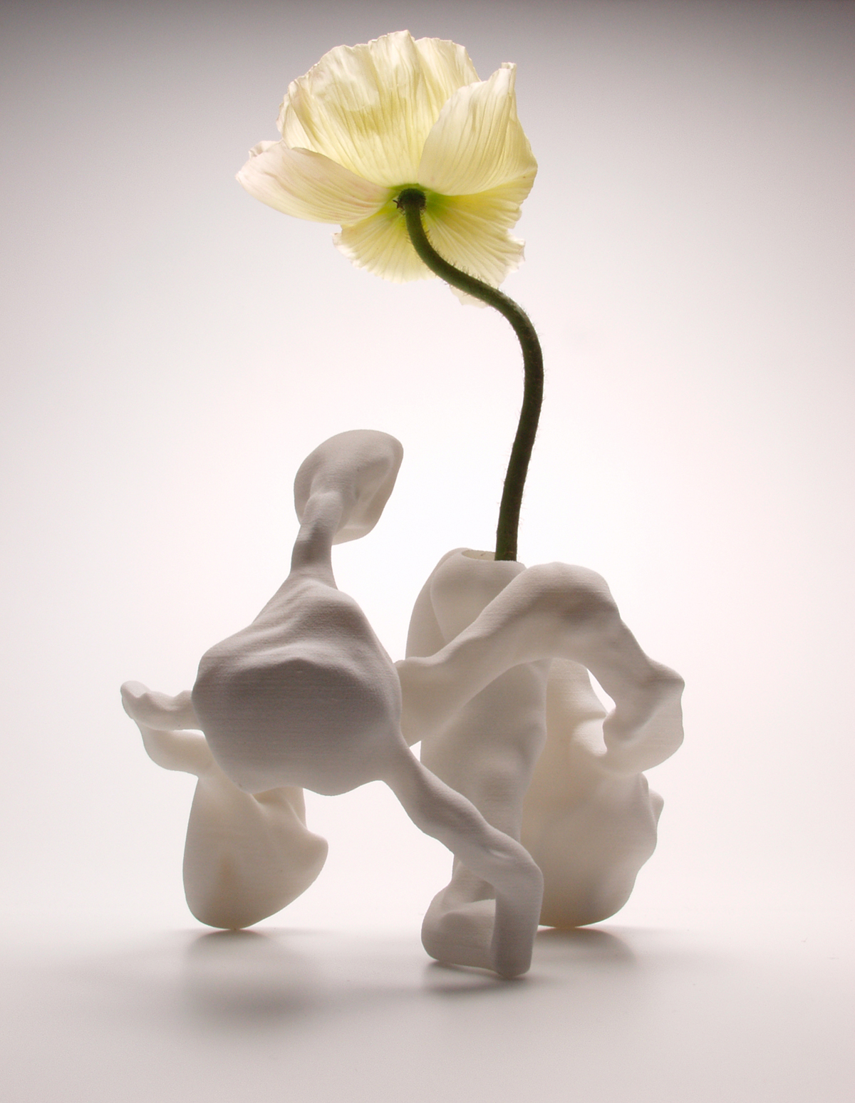
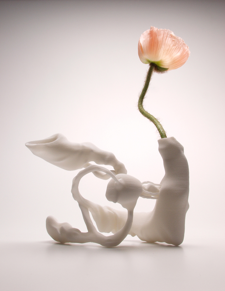
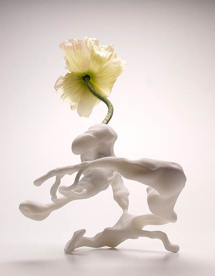
his furniture. Some were named by the same name, “Floris”, and some more playful names like Pegasus.


pegasus chair

In 1968, Beltzig created the visionary FLORIS chair, which made him known overnight. I stumbled upon Gunter’s research and ideals about life, he seemed to get be inspired by the atmosphere of the 1960s. World events, such as America sending a man to the moon or withdrawal of American troops from Vietnam, made the possibilities seem endless. To him, the world seemed full of potential and Beltzig wanted to produce a chair that matched the great future ahead.

Beltzig’s Floris chair is an ergonomic form with three legs and designed to support the three points needed for seating: the neck, rear, and back. Further the chair is light, stackable and stable. Made of fiberglass, the biomorphic form captures the spirit of the material.

272 fiberglass-wave-slide-500x500


Soon enough I started to see Gunter’s designs to represent interesting forms, something that reminded me of children’s play. I noticed that his designs were morphing into samples of playground equipment.

1392651795442320beltzig_filius_bench_vitra

Also if you put them in an outdoor environment, they represent their true shape

and use: artikel_aus_sammeln_seite_07_bild_4 artikel_aus_sammeln_seite_08_bild_3

I found information that he worked for almost five years designing electrical equipment for Siemens AG in Munich until he decided to design playground equipment and outdoor areas for children, of course we can see by his fixation on minimal, plastic, childish designs.
He has written a book on playground design, which has been translated into several languages, authored many publications on the subject of playgrounds catering for people with disabilities and children’s aesthetics and also worked collaboratively on the playground standards. He has held teaching positions at various technical universities. He has created very interesting play areas throughout Europe, also in sensitive nature and conservation areas, with high design demands, many play offers and high experience and learning effects.

  • The 6 golden rules for a perfect playground (TEXT)
    Children play! At any time! With everything! Everywhere! All over!


    Children play everywhere, at all times, with everything they can find; therefore children actually need no playgrounds. But because they are not allowed to play everywhere with everything at any time we need playgrounds to entice children away from dangers, disturbances and the wrong things.

Playing means: „activities of an individual to adjust to the environment“, with other words – playing means sampling all possibilities, go to the borders, sample experiences, search, learn – and it just does not mean children alone, but artists, researchers and many creative human beings play.

There is no defined „value of play“ but many particular play functions like climbing, balancing, coordinating, sliding, to train social conduct, to sustain oneself within the group, but also the experience of wind, rain, sun, these are only few of the possibilities in functional play.

They can overlap, can support one another; but also can block up, prevent play or lead to aggressive behavior.

Therefore it is of special importance to consciously select and search for and set in special play functions on playgrounds on special play equipment.

A playground is a highly complex sociologically functioning place.

The 6 golden rules for a perfect playground

A good playground should:
1. Offer atmosphere, impart sense of well-being, invite to abidance.
2. Have possibilities for discovery, provide only searcher with its full potentials.
3. Allow controllable risk, cognizable risk, manipulable risk.
4. Offer differing possibilities for different moods, interests, needs.
5. Supply wind-, sight- and sound-shelter.
6. Make „special“ bans dispensable.

A bad playground is:
1. A parcours for dressage.
2. A landscape decoration.
3. A use of residual areas.
4. A centralist mono-structure for only one specific user-group.
5. Not enough room, not enough choices, too uniform, not enough stability, too unkind.
6. Too safe, too similar to an enclosure, too regulated.

Gunter is a designer with a great imagination, I can almost say that he would fulfill all my dreams as a child, and give me the opportunity to enter a playground full of excitement.

skizze04 skizze01 skizze25  freizeitparks011

Some more information about projects, books, articles, text and magazine mentions:


Playconcepts and Projects of the recent past

– Playground without Play equipment, at the LAGA, Pforzheim, Germany 1992
– Apulia Robinson Club, Kinderbereich,  Italien 1993
– Expo Lissabon, Spielgelände,  Portugal 1997
– New York City Hall of Science, Play Area,  USA 1997
– Naturspielgelände,  Waging am See,  1997
– Playmobilpark,  Zirndorf  1998
– Castle Plays Cape,  Billund, Dänemark 1998
– Spielinsel, Thoiry-Park,  Frankreich 2000
– Spiel-Mal, Ornithopter,  Magdeburg 2000
– Play-Area in the Livingston Park,  Puerto Rico 2001
– Princess Diana Memorial Parc, Play Area,  Kensington, London 2001
– Spielburg, LAGA,  Oelde 2001
– Ouwehands Dieren Park, Spielhalle,  Holland 2002
– Wasserspiel im Kinderreich, Deutsches Museum, München 2002
– Fidenza Village, Play Area,  Italien 2003
– Spiel-Mal, Kiesspiel,  Dortmund 2003
– Wasserspiel LAGA, Trier 2004
– Play in the Tree Alnwick Garden,  England 2004
– Playmobil Spielen in der Halle,  Zirndorf 2004
– Blindeninstitutsstiftung,  Würzburg  2005
– Spiellabyrinth,  Wien 2005
– “Play the Wilderness” Concept,  Deimhausen since 1998


Gunter Beltzig  is mentioned in a few books and biographies mainly interested around design in the Stedelijk Museum library:

1. 

Experiment 70 : Designvisionen von Luigi Colani und Günter BeltzigGrunewald, Almut Hoffmann, Tobias (2002)

2. Sixties design: Garner, Philippe (2001)

3. Plastics : designs and materials: Katz, Sylvia (1978)

4. Van bakeliet tot composiet : design met nieuwe materialen = From bakelite to composite : design in new materialsBucquouye, Moniek E.Beukers, Adriaan (2002)


Books

„Kinderspielplätze“,  Bauverlag, 1987,  no longer available, revised as: „Das Spielplatzbuch“,  Spiel-Raum-Verlag 1998 translated into:  ukrainian 1991, polish 2001 „Ksiega Placow Zabaw“

„Spielgeräte…“,  G.Agde, G.Beltzig, J.Richter, D.Settelmeier, DIN Beuth-Verlag 2001 translated into:  french,  Verlag Afnor 2002

„Leitlinien für integrative Spielplätze“, Nürnberg 2003


Articles

“Child-like, Childish, Child-friendly: is there such a thing as children´s aesthetics?”, (Kid Size, Exhibition Catalogue, Vitra Museum 1997)

Meine „Sixties“  68 Design und Alltagskultur (Dumont, Ausst.-Katalog 1998)

Kindergarten Architecture (Gingko Press inc. Corte Madera  USA 2001)

Guarderias Diseno de Jardines de Infancia (Editorial G.Gill .S.A.,  Barcelona 2001)

Bauten für Kinder (Kohlhammer Verlag Stuttgart 2002)


Texts:

The 6 golden rules for a perfect playground 

Child-like, Childish, Child-friendly: is there such a thing as children’s aesthetics 

Play areas in schools 

Concept for A Councillor of Children needs 

Playgrounds and Playground Equipment for the Handicapped 

Checklist


 WEBSITE: http://www.beltzig-playdesign.de/indexe.html


Panasonic Toot-A-Loop R-72


Friday, October 26, 2018

z111z11
‘It’s an S it’s an O, it’s a crazy radio! Toot-A-Loop!’ that was the phrase of the famous transistor radio called the Toot-A-Loop. The Toot-A-Loop… We both got mesmerized by this yellow thing that was laying behind glass in the Stedelijk Base and we knew that this was the piece that we wanted to do research on. At first we thought it was a weird mobile device, later on we read that it was a transistor radio, a transistor radio where the designer was unknown from, something that made us even more curious.

Because of the fact we speak different languages, we decided at first to do our online research separate, Philipphine did it in french and Sena in English. We were curious about the fact if the results in the browser would be different because of the language. We soon saw that the information was almost identical so we decided to do the research in one language.

Our research began with first going on Google, we typed in Toot-A-Loop and Google gave us a lot of links and pictures of the radio, the first link that popped up was Wikipedia, of course.

wiki

This information about the Toot-A-Loop that Wikipedia gave us was comparable on almost every website, there was nothing more, nothing less.

After Wikipedia we went to the websites of different museums, almost every museum website was disappointing, because they didn’t had a lot of information about the object, they all got a picture of their own Toot-A-Loop with a short text (or no text!) about when it was made etc. but nothing more. The Metropolitan Museum of Art and the Stedelijk Museum of Amsterdam gave us some book references, something that we could definitely use later.


The many pictures on Google were linked to auction sites and even Marktplaats (the ‘Dutch Ebay’)  we saw that a lot of people were selling their old Toot-A-Loop or already sold them, so there is still a lot of interest in the radio, it hasn’t lost its popularity. The selling price of the radio was quite various,  for example on Marktplaats the radio would be sold for around 30 euros, but on the auction sites it would cost around 100 euros.

zzzzz

We also found youtube videos, videos where people were most the time trying to explain how the radio works, we noticed that the videos were quite recent and that the people who commented under the videos were most of the time talking about how they would (and still love) the radio, so a lot of people from earlier generations.

zzzzzz

After long clicking, link after link, (it must have been the last Google search page) one of us ended on this Italian radio website where we finally found some new information about the radio, they  mentioned the name of the designer, somebody called ‘J.M. Willmin’, after reading this we started to Google the name of this designer, the only information about the designer that Google gave us was linked to the Toot-A -Loop. Later on we found an antique website where they were also talking about J.M. Willmin as the designer of the Toot A Loop, we sent them an email with the question where they got there information from, this is what they answered

z1

We think that the name J.M. Willmin was made up by Panasonic so the radio would sell better abroad (in countries like the US and UK),  this is probably why we couldn’t find anything about this designer.

After our online research we went to the library of the Stedelijk Museum and the library of the Gerrit Rietveld Academy, thanks to the book references we found online we were able to find books that mentioned the Toot-A-Loop. The information we found per book was different, in the first book, Twentieth-century ornament by Jonathan Michael Woodham, the Toot-A-Loop was used as an example to show something about the Japanese design of the 1960s/1970s further then that there was no information about the Toot-A-Loop itself. In the second book we found, Radio Zeit by Isabel Brass, there was more information about the radio, but nothing we hadn’t read before.

That was something that surprised us, because books carry this magic trustworthiness with them, you should be able to find everything that you want to know in a book, at least that’s what we thought.

img020img0210001

It’s strange that there is only limited information about such a popular radio on the internet and in the books. Maybe we should use our imagination to answers the remaining questions.

With this in our minds we started to think about other purposes the Toot-A-Loop could have had, the Toot-A-Loop was designed to put around your wrist, so it could also be a kind of jewelry. We found out that Marc Jacobs probably got inspired by the Toot-A-Loop. Our imagination helped us already a bit, we are curious what you will find!

Becoming an Utopian Dream


Wednesday, February 21, 2018


stoel 1

 Picture 1: The Wassily Chair (Model B3)


Marcel Breuer

Wassily Chair (Model B3)

1927 – 1928


Medium:

Chrome-plated tubular steel and canvas

Dimensions

28 1/4 x 30 3/4 x 28″ (71.8 x 78.1 x 71.1 cm)


I still remember when I was a child the furniture of my uncle was always in the way. I couldn’t play with my toys because of the strange shimmering steel frame that was blocking my way. As I grew bigger and bigger I found out that the frame was part of a chair, but not a very comfortable one. I climbed the chair, but my legs got stuck between the spaces of the frame. The only thing that went on in my mind was, why the hell would you buy a chair that’s not comfortable at all? Later I found out that the annoying thing that was blocking my playground was a part of the chair that I now recognize as the “Wassily Chair” made by Marcel Breuer in 1927. A chair that symbolizes modernist design.

stoel 2

Picture 2: Reclameposter from the bicycle brand Adler, the brand from the bicycle on which the chair is inspired. 

 
The story goes that Breuer often rode a red bicycle and that this inspired him and led him make the most important innovation in furniture design: the use of tubular steel (Picture 3). Strong and lightweight. Perfect for mass-production. A model that is based on the traditional overstuffed club chair: but all that remains is mere the outline. In this way, an elegant composition of gleaming steel arises. The seat, back and arms seem to float in the air. An interesting tension between heavy and light is created.

stoel 3

Picture 3: The “exposed” chair

By scrolling over the internet, I found a picture that really catches my eye. On this picture (Picture 3), an “exposed” version of the chair is showed. The photo makes me curious, I want to see and touch the steel and throw it and feel how heavy it is. See what happens if you turn the frame around, would it still be a chair? It looks a little bit ridiculous. In my head, it looks like a tool for a playground, or a tool to work-out with, no wonder that I got stuck. But at the same time, it looks fragile and light, and the shiny steel creates an effect of a mirror, it reflects the surroundings. All of this creates the feeling as if the completely chair doesn’t exist. The feeling that I had as a child, by almost disappearing in the chair pops up in my head. The feeling of exposure, getting stuck between a frame that is almost invisible, in other words a human trap.

Breuer himself spoke of the chair as “My most extreme work… the least artistic, the most logical, the least ‘cosy’ and the most mechanical.” And he was probably right.

stoel 4

Picture 4: Marcel Breuer on his Wassily Chair

The chair is part of the style of Bauhaus. Which is part of the Modernism movement. Modernism is a term widely used, but rarely defined. We live in an era that still identifies itself in terms of Modernism. The buildings we inhabit, the chairs we sit on, the graphic design that surrounds us have mostly been created by the aesthetics and the ideology of Modernist design. The term refers to something that is characteristically modern, of its time. “The New”, “forward-looking”. In the designing world, it can be defined as: “Modernism is not a style, but loose collections of ideas.” It covered a range of styles, spread along different countries. But all those sites have in common that they were espousal for the new and mostly rejected history and tradition. An utopian desire to create a better world, to reinvent the world from scratch. Belief in the power and potential of the machine and industrial technology. Where there is a rejection of decoration and ornament. And a belief in the unity of all the arts. Most of the principles were frequently combined with social and political beliefs, which held that design and art could and should transform the society (Wilk, 2006), and by this raise the standards of living for all people [x].
It’s a global architecture and design movement emerged in the 1920 as a response to accelerated industrialization and social changes. By using new materials and advanced technology. It emphasized function, simplicity, rationality and created new forms of expression with a new aesthetic. Building and design can be recognized by use of clear lines, geometric shaped, cubic forms, windows, flat roofs and functional flexible spaces (Poursani, 2018).

The Bauhaus movement, started as a design school in 1919 by Walter Cropius, Mies and Marcel Breuer, Wassily Kandinsky and Paul Klee. They combined technology, crafts with industrial production to revitalize design for everyday life (Poursani, 2018). They thought that ‘new machine age’ demanded a new way of living and a new architecture with new materials as reinforced concrete, steel, and glass (Poursani, 2018). Their design principles, such as simplicity, rationality, functionality and universality, would change the world (Poursani, 2018). Their mission was to create a functional design with the principles of fine arts. Faith in new technology convenience and the promise of a better life. New materials brought new possibilities, break with the conventional forms, and use traditional and modern materials that show the possibilities of the modern industry. Functionalism is priority. Production for everybody a fact.

stoel 5

Picture 5: The Wassily chair in its “natural” habitat 

When I was able to climb the chair, I got stuck between the frame made out of steel. The space between the black leather and the frame was something where I got lost into, and my body didn’t know how to findrest in this chair.  The leather seat turned into a slide, and the chair became for me more an attraction then an object with the function of sitting. A labyrinth of body, steel and leather, or maybe a hybrid creature seen from far away. Where the object and the human became one, or where they are maybe to different.

Seeing this chair in the Stedelijk, brings questions to the mind. For example, by placing the chair in the museum, its uniqueness is accentuated. But do cheap reproductions destroy this feeling of uniqueness again? Does the space where the chair is placed have influence on how we look at it? The function of the chair is faded, by placing it really high and not as how it should be (picture 6).

stoel 6

Picture 6: The floating chair

Could you speak of design for “everybody”, when the price of a “real” Wassily chair is “almost” unaffordable. Does the contrast between functionality and comfort, make the chair a utopian idea?

stoel 7

Picture 7: The Rising Star (prize wise)

By designing an object, such as a chair, the tension between the user and the object is important. There seems to be a confusion between things that are designed and who is going to use it. There is a risk that design can be over-determined and this creates not enough space for the user to act and improvise on the object. Knowledge about people, capabilities and needs and desires is required. It seems that there is a misunderstanding in the way that the intention seems to design the user experience, but this doesn’t make the user the subject of design. By the design of the Bauhaus form became subordinate to the function. Design became not only a matter of forming objects, but increasingly a matter of how ways of use and even ways of living can be designed and in this way, it turned into designing with a social agenda. This clearly state an ambition of social transformation. But by now we know that while the social aspects of the modernist project may have been ambitious, they did not necessarily succeed. Misfits between the intended and actual use, and the user’s understanding is something that exist, but this doesn’t need to mean that they are not necessary to have. Misfits can bring new knowledge on what can be improved. Also by designing you’re in a sort of way predicting how the object will be “used”. But this doesn’t mean that it will work out in this way. Communication between the user and the designed object is based on understanding and interpretation, misunderstanding can also be seen as a point of this. It’s in important to understand that people are active parts of the system and not only a “user” because they are turned into an object. By designing it’s not possible to making people fit into systems, societies and strategies. People are fluent and flexible, such as their taste, needs and desires.And besides that, people are moving creatures, changeable, and different. Creating something that fits all of them is a beautiful utopian idea (Redstrom, 2005).

Back to the chair again, a couple years ago I found out that the chair from my uncle had disappeared from the room. The space of where the chair ones was located is filled with some new interior stuff. Something soft, more colourful and bigger. When I asked my uncle where the chair went he said that he had put it with the trash (picture 8). Not even tried to sell it, because according to him nobody would have been interested. Maybe this was something that should have happened. How my connection with the chair started as an annoying object turned into a fascination for the weird structure. But how the chair in the house of my uncle turned from something functional to something that was not interesting anymore.

stoel 10stoel 11

Picture 8: Life of the Wassily chair


Modernist had a Utopian desire to create a better world. This they frequently combined with left-leaning political and social beliefs that design and art had the power to transform society (Lodder, 2006). The word utopia is taken from the Greek and literally means both nowhere and a good place. An impractical scheme for social improvement, an imaginary and indefinitely remote place, an ideal place or state. Something that is described as perfect, but from what you know is not possible, it’s more like a beautiful dream (Collins, s.d). Nowhere and a good place is an interesting point, because in my eyes there are contradictions from each other. A good place can exist, but maybe it’s then subjective. For example, the house of my parents is a good place to me. But nowhere only seems to exist in words. It means to no place, the state of nonexistence. So actually, it’s not there, but a good place can be, can exist. The chair makes clear that the faith in new technology is a usable for creating new objects, and in this way the step to a better life is maybe made. But the chair makes also clear that the “right” object doesn’t exist. By making the chair, an idea, an ideal, a dream, (a good place), is created as an existing object. But because the chair doesn’t completely function as a chair for all the people, because of taste, price, function and discomfort, and new materials and development of technology. It makes clear that the perfect “chair” doesn’t exist (It’s nowhere). Time is a huge disturb transmitter. Technology and innovations are changeable. Besides that, humans and their needs and desires are not predictable, stable and universal, and this makes it impossible to create an object that suits all and is timeless. The chair is the symbol of modern design. Progress is the realization of Utopias, and by creating this chair at that time a little step towards a utopian dream was made. And a progress starts with a strong idea, that then is made in practice. So maybe the outwork and how it is used doesn’t need to be perfect, and we only need a Utopian dream to move forward in making new things.

It’s interesting to see how a chair can be placed in a museum, but at the same time can be sold on Marktplaats just for 100 euros (Picture 8). How easy it is to own an “extraordinary” piece. But also, how fast you don’t want to have it anymore. When I walked in the Stedelijk, the only thing that I thought was, why are those chairs so high, I want to sit in it and try them out. Untill I saw the Wassily chair, because it gave me so much memories of my childhood. Ofcourse the chair made me more curious to try out than any other, but at the same time the “special spot” in the Stedelijk is the “special spot” that the chair deserves. The untouching, unreaching of the chair, by placing it this high, reminds me of the fact that as a child I couldn’t climb the weird steel thing. And this “unreachable” value of the object as a child I now have when I walk into the museum and this is for me a beautiful annoying feeling.

A dream that started as a functional designed chair for everyone, made of new materials. Unity of all the arts, and principles combines with social and political beliefs and raise the standard of living for all people. A step to a utopian dream. Realized and made, fitted for a living room, but where slowly the function and the appreciation faded. Just as the visions that inspired the creative figures were dreams based on the technological potential and the social experiences of that time. Maybe the chair cannot be seen as a symbol of modern design, but as a symbol of the progress to realization of Utopian dreams.


References:

Collins Dictionary [Online] / aut. Collins // Definition of Utopia . – 17 02 2018. – https://www.collinsdictionary.com/dictionary/english/utopia.

Modernism in Architecture: Definiton and History [Online] / aut. Poursani Ela. – 10 02 2018. – 2018. – https://study.com/academy/lesson/modernism-in-architecture-definition-history.html.

Searching for Utopia [Sectie van boek] / aut. Lodder Christina // Modernism: designing for a new world / boekaut. Wilk Christopher. – Londen : V&A publications , 2006.

Towards user design? On the shift from object to user as the subject of design [Tijdschrift] / aut. Redstrom Johan. – Sweden : Elsevier, 2005.

What was Modernism? [Sectie van boek] / aut. Wilk Christopher // Modernism: Designing for a better world / boekaut. Wilk Christopher. – Londen : V&A publications , 2006.


From death to Life with Baas


Wednesday, February 21, 2018

I found « Clay furniture » by Maarten Baas really interesting as a design object.

Clay furniture chairs and table

First of all, I noticed the colors. Afterwards, the shapes.

My first impression of the piece was that it was more similar to a three dimensional drawing than to an object in space. It has very clear lines and really simple shapes. I like this work because, more than just being a practical, usable furniture, its unusual nature made it seem more like a work of art. Even if this artist is first of all a designer.

Maarten Baas tried to build (handmade) objects that remind of a part of the human body, I saw that when a man sits on a chair he becomes one with this chair. He was inspired by the human body to give a unique shape to his furniture. In this way they become like extended molds of the human body.

These chairs are not so different from classic ones (which the generic shape we would expect from a chair), although his purpose was not to recreate the classic chair.  He designs it spontaneously made of industrial clay.


Clay 3 furniture


The colors used aimed to give life to these objects. Maarten Baas changed the nature of a stool and a chair. It’s not just a chair or a table, but something we are going to live with.

 Quite ironically, Baas has tried to bring life by torturing.

SMOKE

Going from decomposing a ready made to creating an artwork in its whole, with his graduation project called « Smoke » at the Design Academy, metamorphosis remains the link to his works.

First he buys ready made furniture, which he destroys to create his own. From life, he uses death to give birth. Cutting, mutilating, burning, he ends with the suffocation of the object by applying varnish, letting the object remain what it has become.


maarten-baas-smoke


This graduation collection had real success when it was presented in a personal show in 2004 at the Moss gallery in New York, two years after his graduation in Eindhoven.

How successful, he continue his collection by showing it in an exhibition called « Where There’s Smoke… » where he had the defiance to present burning classics designed chairs like the one by Rietveld, Gaudi, Sottsass and others.


Baas Rietveld SmokeBaas Rietveld Smoke in fire


Uncertain, colorful shapes, simple and childish, Baas tenderizes us with his Clay furniture. The proximity with the human body surely does give us a sympathetic effect.

By using clay as his material of choice to create his furniture, it seemed to me that the designer was expressing fragility. The shapes that the clay creates (not straight or parallel lines), adds to this idea of being fragile. Again, I think this refers back to the human body and its own fragility (bones can brake).

I got the impression that the legs were almost moving. It isn’t a very solid shape, not fixed to the floor. It’s a very fluid shape.

small table clay


Torned feet, broken back, Baas plays with this uneven symmetry to destabilise us. Will they dare to?

Although seemingly nurturing with this simplistic and joyful harmony, I wonder if these works really are as sympathetic as they may let you believe. With these harsh, cold materials, what would our bum think when sitting on a chair made of clay with a metal carcass interior? Wouldn’t the fragility of our bones be going through hard times?

Fragility of the human body, fragility of clay. Have we ever wondered if a chair would be fighting our weight? Alike human legs, the chair’s feet seem uncertain. Homemade, this furniture takes a more artistic dimension than that of the classic ones. With these fine drawn lines, as I said above, the air runs through and gives to this chair, this table or this cupboard a lightness that reminds that of a three dimensional poetry. The softness of the paint recovered of varnish gives more comfort to the mind than to the body ; however aren’t they both as important?

This furniture becomes a real nice company. A touching fragility, friendly presence, comforting colors, amusing shapes, childish naivety.


fan clay


Baas works in harmony with space, and finds a way to link his works.

Starting with very gloomy, dusty works, darkness reigns over his graduation work.

Baas has produced a real contrast between his two works « Smoke » and « Clay Furniture ».

A real meltdown of materials, processing and concepts, Baas presents us two projects which have similar use but are visually opposite.


Not for Humans


Monday, January 22, 2018

TG

The white Floris chair made by Gunter Beltzig in 1968 invites you to sit down comfortably at the same time at it does not.
The material from which the strangely shaped chair is made is solid but smooth fiberglass and although the chair has different parts they can’t be separated from each other for it is a whole.
By the way it is made and shaped, your body should fit precisely when sitting in this chair, the back part being in the shape of a human back with space for your backbone to rest in and shoulders on both sides.
The seat being in the shape of a flattened butt, mirroring your seated butt, looks still too curvy for you to sit completely straight.
Its neck, which smoothly devolves from the shoulders seems way too long for your head to be able to reach the headrest and if you would place your head on the right spot, your back probably wouldn’t be anymore.

T zijkant rechts close

Because of its alienated human body features, there must be only one way to sit or else you will lose the comfort it might have.
But still, the chair gives the impression that it is not meant to be used at all.
That this chair is not meant to be used in the Stedelijk Museum, is made clear by its place on a small white platform which is attached to the wall.
The color of its surroundings is all white giving no room for any distraction and because its the only chair in the room that you have probably never seen before, it pops out and catches your eyes quickly.
While I walk on, the white alien chair waits lonely for the right person who fits.

Identity and Copy Culture.


Wednesday, November 29, 2017


  ‘This art work is designed by one American artist’ ‘ She is one Chinese designer’ ‘This is one typical Dutch design work’ ‘German style‘… No wonder, nowadays, the introduction of the modern art works is commonly and normally to be started in this way : start with identity defining. It seems like identity is something necessary when we are going to know something new. Does it mean all cultural exists have to find one sense of belonging ? Does it mean the original influence from our mother culture background always take the leadership when our brains start to work?

Globalization is like the invisible hand which is moving the modern world to keep going forward, and the mixture of cultures seems like the direct result of  the international moving and communications. Being influenced is different from Copying, but how can we define what is ‘copying‘ and what is ‘being influenced’? Do we have to take the negative attitude when we look at ‘copy’?

Tons of questions may be thought about identity and copy as they have such a close connection with each other. Here, One young artist, He Jing ??? whose art work is ‘Tulip Pyramid, introduced her own thinking and reflections

The Tulip Pyramid by DDW scouts favourite Jing He at the 2016 Graduation Show

about copy cultures. When we talk about who is she,we may say ‘One Chinese  artist’, ‘ The graduate artist from Dutch art academy’ or ‘ He Jing’. Three kinds of introductions may bring three feelings to the public audience,’oh, she is Chinese which means her works must be influenced a lot from her mother cultural background.’ ‘ oh, she was educated by Dutch art education then she may think about art in dutch ways.’ ‘ oh, who is He Jing?’.  She noticed these kinds of questions about identities and then she developed a series of research based on the cultural identities questioning( you can find in her website He Jing). As she keeps discovering about her own art identity, she noticed that there is one phenomenon among China nowadays, which is the industrial copying. For those copied products, what is their identity? Seems like those copied things live in a parallel world where is in the gap of two original identities.

When we back to the copying culture, obviously it’s not a Chinese thing only, it’s a common humanity thing. There are so many examples of ancient cultural copying behaviors, which finally created some unique and wonderful works at the end. Delft blue; The Japanese cultural origins from Ancient China and so on. (The Culture of Copy).

As she develops and researched more and more about the copying culture between China and The Netherlands, He Jing finally created these two tulip pyramid which shows the combination of Chinese copy products and Dutch copy cultures. She implies her own education situation with this tulip pyramid-mixture of two original cultures and their copy culture gaps.

As a new freshman who came to a new culture for just one and a half year, what attitude should I always cary with me when I am facing two different cultures everyday? Apparently, the open mind should always be put first place but how can I take the sprit of other cultures without the directly copying?I think the answer is to get the way and the angles of another culture about how they look at the outside world instead of the shallow images or shapes.

Keep in mind about the originals and embrace new cultural influence as much as possible, get their sprits and melt cultures in heart then turn those into new art institutions.

The Aesthetic Green


Wednesday, November 29, 2017

Facing the future access to resources and the wish to preserve today’s climate, changes need to be made.
Looking at the world of design there has always been a tendency to broaden the horizon of consumers, buyers and users. Designers found ways to deal with daily life difficulties, which weren’t considered as a problem until there was a solution, as well as they made groundbreaking discoveries. Some designers are pioneers in developing and processing innovative materials into aesthetic products and others find solutions for social and psychological conflicts by approaching them from unusual angles.
In the last years the concept of sustainable design raised and increased, showing it’s today’s presence in plenty of remarkable projects with approaches diffusing across various disciplines as fashion, architecture, product design and even fiction.

grün3 grün4 grün5 grün7  

This is to be seen at exhibitions such as ‘Change The System’ in the Museum Boijmans Van Beuningen, where many projects were dedicated to sustainability.
So Eric Klarenbeek, called the designer of the unusual, who developed a 3D printing material based on straw, water and Mycellium, the threadlike vegetative part of fungus. Printed into a thin layer of bio-plastic the material can gain stability through drying and – in Klarenbeek’s case – become a chair. He went even further and created possibilities to 3D print with only local materials as algae, potato etc.
Remarkable is the aesthetic presence of the final products. Cups, vases, bowls, which you simply want to hold in your hand but cannot as they are displayed in the showcases. This might be what makes a researcher become a designer: using the power of aesthetics to create a bridge leading from innovative development to the manifestation of the product in daily life.

Unfortunately many green designers are seen as criminals when it comes to aesthetics. Next to the pursuing of sustainability as something of moral value, aesthetics are sometimes seen as luxury and therefore a waist of energy.
People who are already familiar with sustainable values, seem to see the beauty in the ethics.
However, this understanding of beauty requires the motivation to consume with a small footprint. A motivation which wants to be spread.
Thus, the power of an object’s visual appearance shouldn’t be underestimated. It can communicate and celebrate ideals and make users value the object and what it stands for.
Experiments in interaction design even reveal that people consider objects they emotionally bond to, as more functional – and use them more likely.

In the end we conserve only what we love.”
Baba Dioum

Thus objects which don’t attract us on an emotional level, will simply not be used and kept.
If it’s not beautiful, it’s not sustainable. Aesthetic attraction is not a superficial concern – it’s an environmental imperative.” wrote Lance Horsey in his book The Shape of Green. He is the first to write and examine the relationship of sustainability and beauty. According to him “beauty could save the planet” as in the end people consume and use what they love. Horsey here uses the example of wolves and dogs to enhance his theory:

The fate of many things depends on whether they please people. Wolves might seem heartier than dogs, but there are 50 million dogs in the world and only ten thousand wolves. Which has adapted better? This view of nature may give you pause—should other species exist just to please us? But as a principle for design, it is essential. If you want something to last, make it as lovable as a Labrador.

grün7 grün4 grün5 grün3

We personalize things we use – and we use things which are personal.
Based on this theses, Jonathan Chapman helps to create an alternative consumer’s philosophy, than our present ‘throw away’ society has. He developed a new design strategy, called Emotionally Durable Design.
Through the conscious shaping and strengthening of the emotional bonding between consumer and object, one can endure the using period and thus reduce waste. According to him this can be achieved through the consideration of the following five elements:

How users share a unique personal history with the product: Narrative
How the product is perceived as autonomous and in possession of its own free will: Consciousness
Can a user be made to feel a strong emotional connection to a product? Attachment
The product inspires interactions and connections beyond just the physical relationship: Fiction
How the product ages and develops character through time and use: Surface

This results in products such as the Stain tea cup of Bethan Laura Wood – an object which gains character through being used. It builds up an individual pattern of tea stains, according to the personal ways of drinking tea.
To establish this design approach further, Lance Horsey asks the question:

What if we created a different approach to aesthetics, one based on intelligence and not intuition? Can we be as about how things look as we are about how they work?

Answers will lead to new aesthetics based on the complex connections of efficiency, sustainability, character, endurance, and the potential to develop with the users personal demand. An understanding of aesthetics which goes beyond an object’s physical presence.

How deep can we go? – The conflicts about problematic issues


Wednesday, November 29, 2017

Who are Studio Wieki Somers and Thomas Eyck? During this research I posted myself the question what the relationship is between them and why they want to make a project about the problematic issues of our world society. I also got inspired by the specific work called ‘Deepwater’ which is related to the oil problem in the world. This motivated me to question and think of how to solve this problematic issue much further.

Back in 2000, Wieki Somers (Dutch designer, born in Sprang-Capelle, 1976) graduated from the Design Academy Eindhoven. After her graduating she settled with Dylan van den Berg, with whom she studied in Eindhoven. Together they started Studio Wieki Somers in Rotterdam. Wieki Somers and Dylan van den Berg are focusing on providing an enlightened reading of the everyday movement. Focusing and making sensitivity of materials, technological ingenuity and fantasy. They make objects that you as out-stander at first have to guess what it is and what they are doing. That is the whole point of what they want, making an art piece with a functional state in it. ‘‘Basically our work is one big quest, one big process. We look at things around us, what they can be and the associations people have. We study customs everyday situations, unleashing our own imagination on them. We make the uncommon common.’’ thus Wieki Somers

‘’As a designer it’s not my attention to make the world a better place, but I’m pleased if people look at the world differently because of my products.’’

People get ideas and inspirations from the work of Wieki Somers and that’s also how Thomas Eyck got involved. Thomas Eyck is a publisher and collector and he divide characteristic and exclusive design products from this time. He stimulate designers to come up with new objects for the daily life. Together they research for different kinds of materials and making new products out of it. This is how the Deepwater work was made when Thomas Eyck asked Studio Wieki Somers to worked together.

The Deepwater work is created in collaboration between Studio Wieki Somers and Thomas Eyck in 2016. It immediately caught my attention while I was walking through the exhibition of “Change the System’’ in Museum Boijmans Van Beuningen. The work is simple, yet very impressive. It has a strong design in contrast to the other works presented in the same room. Deepwater represents a vase which is a collection of the design “Still Waters’’. Thomas Eyck commissioned Studio Wieki Somers to design a series of objects with the theme “water”. These series are five glass vases and each form a poetic interpretation of the water cycle. The vases represent a topical theme regarding the problematic relationship between humans and nature.


LTVs_WiekiSomers_05_Deepwater, Labadie


The Deepwater vase is made out of glass filled with oil floating on water. In the center of this vase a stem with leaves is represented. The oil refers to the disrupted human actions like the results of the eco-catastrophe “Deepwater Horizon’’, this was an industrial disaster that began on April 20, 2010 in the Gulf of Mexico. It was a big explosion of the drilling platform Deepwater Horizon. Studio Wieki Somers and Thomas Eyck wanted to show how conflicting the values are that ascribe our resources.


deepwaterhorizon


How can you stimulate more people when you think about this collection? And in my case about the oil problem. Because using oil is something we should take very seriously if we think about our precious world. Our nature is capable of breaking down oil itself, but this is going very slowly. The quantities of oil that enter the environment through human intervention are so great that nature has difficulties with it. Of course the place plays a role, normally it is safely stored under the ground but when it comes into the water or on land it is just a strange substance. Just what happened to the Deep Water Horizon catastrophe. How can we clean up this mess if we constantly spill so much oil?

Thankfully there are many ways to clean the oil out of the water. I found materials and information and tried these out:


REMOVE IT

oilimage

In this video I'll show you an impression about removing oil out of the water.
For this experiment I used a glass jar, water, oil, cotton balls and a sponge. First I used cotton balls to remove the oil.
The cotton ball soaks the oil out of the water each time you use one. Then I wanted to see if it also works by using a sponge.
The water will get more clear once you do this repeatedly and it works perfect.


Of course this is not enough for an entire ocean, but it’s clearly that we could discover more with materials just like Wieki Somer and Thomas Eyck are presenting. We have to dig deeper and come up with much bigger ideas to solve the oil problem. There are machines or boats with different kinds of techniques by getting out the oil out of the ocean, but still there will be leftovers and we discover that years later by accident. Of course we think of other different ways to solve this for the future, for example; using electricity. The using of oil are mostly for machines and vehicles and these will run in the future with electricity.

So yes, just like Wieki Somers I would feel the same way by not making attention to make the world a better place, but to encourage and to let people think about these kinds of topics. I think we discovered already so much about materials, technologies and objects to improve our environment. Who knows what further will be discovered in the future.


Mondrian, Rietveld, Theosophy.. wait, what???


Wednesday, October 18, 2017

Have you ever heard about theosophy?

We didn’t either, but check out this article because then you’ll know how it influenced Mondrian and Rietveld’s work.


Theosophy– what does this even mean?


theosophy


It is a unity of Religion, Science, and Philosophy that combines a variety of belief systems in its search for an underlying universal harmony. Basically, it is everything, therefore you have to be very focused to understand what specific ideas it defends and how is this shown or practiced in art and life in general.
It is also a doctrine of religious philosophy and mysticism (so it isn’t a religion itself), but holds that all religions contain elements of truth.
Theosophical writers hold that there is a deeper spiritual reality and that direct contact with that reality can be established through intuition,  meditation, revelation, or some other state transcending normal human consciousness.
Theosophy has influenced many artists among whom were Wassily Kandinsky, Piet Mondrian, Gauguin, Malevich, Gerrit Rietveld (and some others from De Stijl movement) and Pollock too. This beliefs played a crucial role in the work of this artists, whose works were seemed to search for the understanding of spirituality.
All in all, theosophy seeks to integrate perception and thought, the natural world and the spiritual work, science and religion.


How did theosophy influence De Stijl


De Stijl magazine was publishing the group’s design work combined with theoretical writings which also contained mysticism. Members were deeply influenced by theosophy which was also an important part of Bauhaus. You can see that in the way they rejected any form of naturalism in favour of a formal abstraction that connected the movement with Russian Constructivism.

De Stijl group wanted to create a new kind of art, architecture and design in order to raise a disillusioned humanity from the horrors caused by World War 1 and as many artists throughout Europe, they attempted to liberate the arts from tradition. They wanted to change art from individual to ultimate, universal. Their vision was based on deconstructivism – reducing the universe to fundamental elements and forms – the vertical and horizontal lines became the symbols of universal harmony, to which were added primary colours red, blue and yellow along with black, white and gray (considered non-colours). Even if you don’t understand the deeper meaning of theosophy, these are the things you can recognize in artworks of De Stijl movement.
Anyways, members were aiming towards geometrical and technical art which would be an experience as a whole. They were trying to give art a spirit of forms and mystification.
What was important for them was purity in architecture, the absence of organic and personal forms. Like theosophists, members of De Stijl believed in the presence of deeper spiritual reality, whereas a direct contact is established through a state transcending normal human consciousness. They brought a sense of material, intellectual and spiritual unity to art, architecture and design.
 

theo-van-doesburg-neoplasticism-composition-vii-the-three-graces1917 eb3bc17f85aec4c6a9be84a677c1bcdd--geometric-art-abstract-shapes

Theo van Doesburg’s work related to Neoplasticism – a work from Vilmos Huszar

Mondrian as a member of De Stijl


His path to Neoplasticism


Mondrian intensified gradually his expressive manner of painting and began to have a more and more intensive use of colours, that eventually lead him to the need to depict the visible aspects of reality.
From 1908, Mondrian began to work in search for a truly form of painting. The artist came to the conclusion that the pure, intense, inner colours (the primary colours) and a simple manifestation of the line (horizontal and vertical) could help reach an abstract form of art that would be suitable to the spirit of the new modern age.
In 1917, Mondrian and Theo van Doesburg founded the group De Stijl. Mondrian used this magazine as a vehicle for his ideas on art, and it was actually in the magazine where he defined his aims and the term Neoplasticism. Though Mondrian established his only visual manifestation/painting style: Neoplasticism, based on philosophical and moral considerations associated with theosophy, this name was also applied not only for his work, but also for the art that the De Stijl circle practised in the different areas.
The intention would be to use the form and line to reduce the visible reality to its essence. So, in Neoplasticism, all the abstraction is connected with the reality. The elements are displaced from their visible form, but reflected in an abstract dimension.
As Mondrian himself considered:

”As a pure representation of the human mind, art will express itself in an aesthetically purified, that is to say, abstract form. The new plastic idea cannot therefore, take the form of a natural or concrete representation – this new plastic idea will ignore the particulars of appearance, that is to say, natural form and colour. On the contrary it should find its expression in the abstraction of form and colour, that is to say, in the straight line and the clearly defined primary colour.”

Mondrian uses the basic elements of painting: line, form and colour in their purest, most fundamental state, creating compositions with different lines and planes, verticals and horizontals, neutral and primary colours in a universal visual language that everyone could understand intuitively.
Two years later, the architect- designer Gerrit Rietveld joined De Stijl, which had a significant impact on the Neo-plasticists’ ideas and production.
Influenced by theosophy’s ideas, Mondrian reduces all elements to straight lines that cross and form various sized squares and rectangles and restricts the palette to pure neutral primary colors and black, white and grey. This was his proposal to represent the universal order, rather than the physical meaningless world.

Mondriaan in Stijl 1         Mondriaan in de Stijl_950

Modrian’s texts on Neoplasticism

How is Neoplasticism connected with theosophy?


Piet Mondrian was raised in the protestant church and later on, in 1909, joined the Dutch Theosophical Society, which was one of the main spiritual movements in the Western society at the end of the 19th century. This Society was founded in the United States but quickly spread throughout Europe and had an immediate influence on art, particularly in the Netherlands. In fact this influence was so visible that forty Dutch artists participated in the exposition organized in 1904 in Amsterdam for the Theosophical Society’s International Convention.
From this time on, theosophy was to be a major influence in life and work of Mondrian.
In the journal De Stijl [x], Mondrian published some articles about the influence of Theosophy. In this articles, the artist analyzes the role of traditional art that he considers as a consequence of the lack of harmony inside of man (conflict between matter and spirit) and the imbalance between man and nature. For Mondrian, theosophy was the answer to this imbalance. Theosophy principles could, in his ideas, bring consciousness of the self, and as a result, bring the harmony in this relations.
For him, when the consciousness of individuality or, in other words, the concept of spirit emerges, two conflicts emerge with it. The first one would be the conflict between this individual spirit and his physical body. The second one, as a consequence of the first one, is a confrontation between man and nature, generating a ‘disharmony between man and his surrounding,’ or simply ‘the tragic in life’ as the artist considered.
In this way, we can consider that Neoplastic art arises from the same principal as traditional art does- from the perception of an imbalance inside of man. However, Neoplastic art tries to represent an absolute truth directly: the idea that if the artist represents it, is because he knows it, and not just some partial and accidental truth as traditional art seems to do it.
The aim of Neoplastic art is the representation of the absolute, almost like religion. By reaching this goal, he would be able to help the common man finding his inner balance. How? Modifying the external world to another one capable of bringing some inward balance: by transforming the surrounding environment, he would transform the man itself, and consequentially the society.


“Art –although and end in itself, like religion– is the means through which we can know the universal and contemplate it in plastic form.” (Mondrian, 1918)


Neoplastic art’s objective is to restore in man a balance with his environment, lost when man gains consciousness of his own individuality. Neoplastic art should be dissolved and fused into and with life.
For the artist himself, neoplastic art shouldn’t be limited to painting but rather extends to architecture and urbanism, and in this way make a real change in the environments. Mondrian considered that each artistic disciplines should perform a specific role, and together they should reflect the common harmony of the universe.
Therefore, for Mondrian, painting’s task would be to act as the guide for the rest of the other disciplines and eventually be dissolved, if the task is successful, into architecture, urbanism, life.
We can consider that theosophical beliefs are expressed in Mondrian’s neoplastic work, both, theoretically and concretely, in a constant demand for a true theosophical art.
Art is, in this way, a reflection of the absolute, “the Radiating Center” (as Theosophy calls it), which is the original force, creator of everything (idea that nature and spirit are manifestations of the same original whole: universal/cosmic order).
The artist, thereby, is the “translator” of a higher reality, and his works must repeat the representation of this “Radiating Center”.
Art should reproduce the conflict between opposing elements and the solution for that same conflict. The image of harmony cannot be static, but represented by multiple dialectics: two levels of elements, among which, simultaneous oppositions are produced (line/plane, vertical/horizontal, female/male, color/colorless…) The universal force/cosmic order/ the harmony, is so expressed in the duality between this contrasts.
While searching fot the harmony between opposites, Mondrian aims to help common man access his own inner harmony. By transforming the entire natural environment, the artist would establish the balance and reflect the image of the common origin of all creation: of the absolute. In this balanced environment, the common man can reach his inner equilibrium.


mondrian2

 Composition A, Piet Mondrian (1920)


Gerrit Rietveld as another member of De Stijl


He was born in Utrecht in 1888. His father was a cabinet maker and when just a little child, Rietveld joined the family workshop. His apprenticeship was steeped in the traditions of the Arts and Crafts movement which can be seen in his early work (first attempts of furniture design).
In 1911 he opened his first shop in Utrecht and started studying architecture. As many others, he was influenced by Frank Lloyd Wright’s architecture. By 1919 he became a member of De Stijl and became friends with its members Huszar, Theo van Doesburg, Robert van t’Hoff and others.


What influenced Rietveld’s work?


Theosophy played a major role in Mondrian’s art, but since Rietveld was a member of De Stijl too (although he never actually met Mondrian), we can also see the influences of the proclaimed philosophical ideas in his work.
In De Stijl architecture and design, Cubism was again influential but so also were Frank Lloyd Wright’s Prairie House designs, with their asymmetric free-flow of interior and exterior spaces. Despite all that, Rietveld’s ideas were more down to earth and less philosophical that the ones of Mondrian and Doesburg. He didn’t speak frequently about his work. Therefore the interpretation of it is based on the more philosophical tenets of the other De Stijl artists (members were very different considering a way of thinking) and it sometimes seems as if the designer’s voice may have been overshadowed.
Rietveld’s painted Red/Blue chair became the archetype of the movement, it was also the first time that the De Stijl colours, usually used 2D, (on Mondrian and van Doesburg’s paintings) were applied to a three-dimensional object. It was the first major piece of furniture to accord with the movement’s principles – conceived as a spatial composition, conspicuously disregarding comfort, traditional construction techniques and concepts of decoration (built on a series of horizontal and vertical planes, provides a clear expression of the group’s ideas).

rietveld1
Gerrit Rietveld: Red and blue chair


With the Schroder’s house Rietveld created a totally original vocabulary in building construction and in the treatment of interior living space. The complex, asymmetric cubic construction of horizontal and vertical planes and lines encloses and releases space in a three-dimensional equivalent of a Mondrian painting. Linear elements are red, blue, yellow or black; surfaces white or grey.


 schroder housecover-schroder-house-rietveld-utrecht
Gerrit Rietveld: Schroder house


A major effect on Rietveld was also Frank Lloyd Wright’s work who was a functionalist and a part of an International style. The most influential details from his work were the flow he produced between interior and exterior and also the use of verticals and horizontals. You can also see that in Rietveld’s last work, Gerrit Rietveld Academie where glass surfaces are made in a way you can see through the building, therefore it merges with surrounding nature.


Fallingwater

robie-house-02-2

Frank Lloyd Wright: Fallingwater Frank Lloyd Wright: Robie house


While quickly recognized as a major contributor to the development of Modernist architecture, interior and furniture design, Rietveld’s later work was largely confined to furniture design. Most known examples are his tubular steel and wood Beugelstoel chair, wooden Zig-Zag chair and wooden Crate chair. Among his other design work was the Netherlands pavilion for the 1954 Venice Biennale and a sculpture pavilion in Arnhem, Holland, built in 1955.
His furniture was designed for a mass production to be available to a large audience, even though at the end is wasn’t mass produced nor standardized – no two versions had the same dimensions.
It’s funny how when you see buildings, you mostly don’t think about the theoretical background of their form. Until we started making this research, we were more focused on functionalist features of buildings and which movement or era they belong too, but now we find ourselves thinking: ” Do this shapes represent some philosophical ideas?”


To conclude …


It’s interesting how the abstraction of Mondrian and Rietveld’s work seems to be so far from theosophical ideas – when you see the chair or a painting you don’t make an instant connection.
Mondrian and Rietveld both seems to try to make art that could reach the majority of people –a painting that would have an universal meaning (Mondrian) and a furniture that would be available for masses (Rietveld) – Art for everyone, art that would make life better. In a way, one can consider it an utopian idea, since the majority of people does not really understand the theosophical thinking … So the question remains: How educated should someone be when experience their art? Or in other words, to what point do you have to be aware of the purpose of the work to have the full experience of it? [x]

Get the Flash Player to see this content.

Now you know. Awesome, isn’t it?

a cooperative research by Neza Kokol and Carlota Bóia Teixeira Neto

Composing Chaos


Wednesday, April 5, 2017

Composing the chaotic mind

  meeting Hendrik Kerstens


TKW-Crack1540WEB


Sound file: music: Dimitri Shostakovich Piano Concerto no.2, Andante

[audio:https://designblog.rietveldacademie.nl/wp-content/uploads/2017/04/Konzert-Schostakowitsch.mp3|titles=Dimitri Shostakovich Piano Concerto no.2, Andante]

Meeting people in an age of the internet and social media seems not romantic at all, which I can assure you it isn’t. When we got the assignment to meet a person we admired and make out of this experience a design object, I made a list of artists I considered as being interesting and admirable. Starting with the first name, I did not get any response and waited for a week. I tried another artist but also he gave me a radio silence. Choosing another artist seemed just as interesting and I send another email.
But having to present my progress in the project and having no responses yet, made me feel a little isolated from the world. ‘The inner monologue’ took its place in my mind.
Thinking about this brought me to the feeling that I wanted to make an isolated space which resulted in a mock-up of a room, made out of four wooden walls isolated with foam. The idea was  that a person would be able to stand inside of the isolated space and was able to listen to my spoken inner monologue without the outside world being able to hear it. Of course for me this was not the best idea and I was far from content…


TKW-IsolatedSpace1552WEBTKW-IsolatedSpaceInside1547WEB

inside my box I got a vision….

Then something great happened. In my inbox appeared an email from the management of Hendrik Kerstens. I have been intrigued by Hendriks work from quite a young age. Interested by the pure combination of modern vision and classic interpretation of the composition of the portrets he has made.

He wanted to meet me. I got into a back and forth communication with his assistant by mail, which resulted after rescheduling and answering questions into a date. Hendrik invited me to his photo studio in Amsterdam.
When I came there at an afternoon he let me in. I was struck by his big black glasses with the kind eyes and the clean and sharp looking white studio with black furniture and equipment.
The room was filled with the sound of classical music which comforted me and everything was organized and clean. We started talking, I asked him questions and he told me a lot of inspiring things. When I asked him about his clean, organized studio, he told me that this was necessary for his chaotic mind to run free. So his surroundings would not interfere with the creative processes in his mind. He said that the process of making a picture was as composing a piece of music. This process he also addressed as sometimes hard to let go when it’s finished and ready to leave the studio. He quoted:

“Art is never finished, but only abandoned.” -Leonardo da Vinci

Hendrik Kerstens surprised me with his enormous power of persistence in his new ideas and projects. He spoke of his desire to bring sculpture and photography together, which he is currently experimenting with. And a future project where he wants to create a close connection between painting and photography. In his vision, one I would want to live by, everything you can imagine is possible.
Hendrik gave me advice in the end and I gave him a print of a pinhole picture that I had made which he accepted with a smile. When he let me out, I felt light and encouraged.

My conclusion after this meeting was that I had to rethink my idea of the isolated space in total, I had been to quick to give in and this good experience deserved a good outcome.
Thinking about my experience the subjects of ‘composing’ and the ‘chaotic mind’ kept running in my mind. Letting this be, I started developing an interest in the material epoxy and especially in its clearness after molding. I made several try outs by molding the epoxy in different plastic, glass or porcelain cups and Tupperwares. The idea was to take the chaotic aspect and function away from the object and create by molding a simplification of the shape.
After drying the objects, some were easy to come out and some I had to break out, some had air bubbles or even cracks which for me became interesting aspect in the idea of a ‘crack in the mind’.


image1kleinTKW-Shape1537WEB


Interested by the molds of the epoxy as well I made molds of clay, to create a connection between the mold and the epoxy. The epoxy in the clay mold gave a watery effect, even after drying it seemed liquid and shiny but would not come out of the clay mold. I disposed two epoxy objects from their clay molds and this created a look which reminded me of the glass smoothened by the sea.


TKW-Above1525WEBkl

TKW-Mallen1535WEB


For my last experiment with my epoxy objects, my interest was captured by making an epoxy mold for an epoxy object. My expectations were by filling a bigger Tupperware with epoxy and hanging the already dried epoxy object in it, that after drying I was able to take the object out again and this would leave me with an epoxy mold. But it didn’t, the epoxy object and the fresh epoxy
into the Tupperware had melted together in one totally new object. The ‘melting together of ones thoughts’ created its own existence.


TKW-ShapeinForm1530WEB


Looking at my experiments resulting in a collection of epoxy objects, a simplification of chaotic objects, the thought arose that I wanted to recompose or rearrange the different objects, creating ‘the recomposing of the chaotic mind’. Therefore creating a grid in which every space had the same measurements (except a special one) so the objects could be recomposed in any position.
My doubt was with the material of the grid: metal or plastic sheets. But fate took this decision from me when I was not able to work in the metal workshop for it was closed and so it became plastic.
The plastic sheets I glued together, creating a clear construction. In retrospect I was satisfied with my decision to use plastic, because of the subtlety, clearness and connection with the epoxy objects itself.


TKW-Above1525WEB


In the end, recomposing a chaotic mind is creating something clarifying. I’m not sure if I would address my final outcome of the design project as ‘clarifying’ rather than ‘clear’. In my opinion I made a composition, in which every object is a ‘clearer’ form of itself.


TKW-Upfront1504WEB

PINK GHERPE


Wednesday, March 1, 2017

gherpe-lamp-by-superstudio-for-poltronova-1968

Walking through the design collection of The Stedelijk Museum, this weird pink object in a glass vitrine caught my eye. A lamp designed by the Italian design studio ‘Superstudio’. The lamp was designed in 1967 and went in production under the name of GHERPE. This lamp is one of the examples of the ‘antidesign’ movement. This was a movement against the commercial and functional design of Italy in that time. To get a better idea of this movement,  the text by Elena Martinique gives a good view on ‘antidesign’. It made an ironic reference to the mass production. Considering the exhibition ‘Designing the Surface’ at ‘Het Nieuwe Instituut’, you could connect this lamp to the chapter: ‘In which nothing is as it seems’.

Nowadays, and probably back then, the lamp gives a cheap feeling, the feeling that is easily connected to Kitsch, also a feeling ‘Superstudio’ wanted to evoke.  A lot of futuristic aesthetics all combined in one object. The aspects of this object are screaming to the audience. The color wants to jump in your face and the material wants to fall down to show that it is not breaking. So the surface of this object is there to raise questions and false assumptions.

images-2

The shape fools your mind as well. It wants to tell you I am everything but a functional object. But of course this pink unit has a function. It gives you light in the dark and most of all a subject to talk about when you have nothing to say anymore. ‘I would never say this is a lamp’, is the sentence you hear the most when you show this object. In this case ‘Superstudio’ did a great job in their mission to create antidesign and a reference to kitsch and mass production. You do not know what it is, you do not know if it is cheap or expensive and you do not know if you like it or not, because your eye keeps caught by it, but you certainly have an opinion about it.

You could connect this object to a previous text I wrote for the Supplementary Surface Show [x]. A text with the subject ‘surface that changes‘, it changes by light. This is of course also happening in the case of Gherpe. First, Gherpe is an object without a functional look, but as lamp (light source) it changes to an object with function. In the previous text it is about Albedo 100, a reflective spray. It is completely not functional without light, so impossible to see a function. When it hits light, the function starts in a split second. Two different objects, with a lot of similar characteristics.

Faux Mucus Vases


Monday, February 27, 2017

 
Wanders Wonders Wanders Wonders Screen shot 2017-04-29 at 12.43.46 PM

'Ozaena, Sinusitis and an other vase from the Airborne Snotty series

 
This collection of vases is an example of the creative possibilities of digital production methods, such as 3D scanning and printing.
This series is a materialization of human sneeze, and they’re all called after nasal cavity diseases. The products are made out of enlarged three-dimensional mucus particles emitted during a sneeze. They’re constructed from layers of polyamide powder.
The holes to hold the flowers were made during the process of fabrication to give utility to the object and make it functional.

Trying to relate this with the subject of ‘surface – Act III – faux’, nothing is what it seems. Nobody would ever expect these vases to appropriate the form of mucus and human sneeze, and nor either to be a vase, that holds flowers.
The surface in this case is important due to the fact that it would have been impossible to create such form with another material, like clay, wood or metal.
The fact that is microscopically scanned and printed after it makes it precise, an exact copy or big reproduction of a molecular substance.
 
The Airborne Snotty Vases names and where they come from.

Ozaena: A discharge of fetid matter from the nostril, particularly if associated with ulceration of the soft parts and disease of the bones of the nose.

Coryza: A runny nose. The word coryza came from the Greek koryza thought to have been compounded from kara, head + zeein, to boil=boiling over from the head.

Pollinosis: An inflammatory response in the nasal passages to an allergic stimulus. Often includes: nasal congestion, sneezing, runny or itchy nose. Also known as Hay fever.

Sinusitis: Inflammation of a sinus. The condition may be purulent or non purulent, acute or chronic. Depending on the site of involvement it is known as ethmoid, frontal, maxillary or sphenoid sinusitis.

Influenza: An acute viral infection involving the respiratory tract. It is marked by inflammation  of the nasal mucosa, the pharynx and conjuctive and by headache and severe myalgia. Fever, chills and prostration are common.
 

The making off : Airborne Snotty Vases : Marcel Wanders Studio 2001


To sum up, both of the text I wrote relate somehow to light. Light that tries to imitate the original. You can also read it in my first text here [x].


Extravagant kettle


Monday, February 27, 2017

bollitoredesignblog


This kettle has been designed by Richard Sapper, a well known german designer. Richar Sapper started as a designer at Daimler-Benz, then, as he wanted more freedom in creation, he moved to Milan and started working for Alberto Alessi  in 1958. He had an obvious proximity with the Italian editor. Alberto Alessi is one of the most influent designers, he especially worked on “emotional kitchenware“. (see more of his works: Alessi index)

The first Bollitore 9090 was released in 1980 and was the first to be exposed at the Moma in 1983. The Same year, the Bollitore 9091 with melodic whistle came out [x].

Alberto Alessi's presentation of the Bollitore 9091.

The Bollitore 9091 has the same design as the 9090, with a very reflective silver surface, a golden spout and a black handle.

By placing a golden chorister whistle (little tubes meant to tune wind instruments) on top of the spout, Richard Sapper is adding a poetic aspect of a melody to the very materialist function of boiling water.

In both editions, the design of the kettle is not the most influent element but the surface is the most important. The materials completely transform the kettle, the meet of silver gold and black makes it extravagantly popping out, and seducing.

Using the minimalistic aesthetic, he is making the viewers wonder about the object itself, its design, its function.

« For him, the form follows the function but his notion of function is going far beyond pure material aspect. In his projects, he is always aiming for a sort of «  spirit function, he loves when his objects have a soul » Alberto Alessi.

Richard Sapper is here seeking for a poly-sensorial object, that appeals more senses than a regular kettle.

Sapper’s Bollitore is also making us reflect about the function of our everyday items.

The kettle has been completely transformed by the material covering the surface of the object, the match of shiny silver and gold has a very attractive effect which directly disturbs the perception of the object behind.

The luster of the Bollitore is perfectly inappropriate to a regular kettle situation. A surprising feeling I also felt with the Fordite, when I realized it was just paint layers component of a precious stone look.
Both of the Fordite lustre and the Bollitore lustre are disturbing because it’s making the perception of the object more ambiguous.


Log in
subscribe