An overwhelming neutrality swept over me as I entered the Library that dry early winter afternoon.
My brow, void of perspiration and still furrowed from the hours of tedious busy-work that preceded my breaching the threshold of the Athenaeum.
I looked around at the people sitting and noticed that most of them were not reading, but rather working on their computers. One girl was reading but I knew that she went to a different school, so I will relieve her of any narrative relevancy. Having been given the task of retrieving a book related to the subjects of historical or contemporary typography, I searched through the many rows of graphic design and typographical content; stopping only to dispose of excess mucous secretion that had been accumulating in my upper respiratory tract.
My digits were cold, having remained nearly motionless during the previous class but were slowly regaining their warmth and supple qualities.
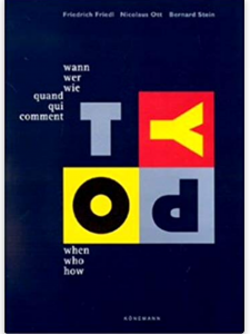
My eye caught a black book, titled in small, unassuming characters: Typography : Quand Qui Comment / Typography : When Who How / Typography : Wann Wer Wie.
Upon further inspection, I noticed that the cover was in fact dark blue, which stood in contrast to the playful colors used as backdrops for the letters of the word TYPO. A cathartic feeling was induced by the inherent beauty of the cover alone and I was excited to see its content.
A wide array of depictions of book designs and graphic posters presented themselves upon my opening the cover. Some dated back to ancient times, while some represented the collected works of contemporary designers. I closed the book after inspecting it for about five minutes and walked to the checkout desk to acquire permission of appropriation from the librarian.
"dark blue" Tag
More fear and loathing in the library
Monday, December 3, 2018

