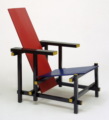
In February 2015 I visited, together with some fellow students from the Rieteveld Arts & Design Academy, the exhibition Possessed by chairs at the Gocrums Museum. The intention of the exhibition was to celebrate the history of design through picking out around 90 iconic chairs from the 100 past years. 90 chairs exhibited, a rather broad selection concerning to a western perspective– all from Scandinavian classics like Eero Aarnios famous Balls Chair, Hans J Wegners Papa Bear arm chair , chairs by Alvar Alto to international classics such as the MR 20, And off course – a couple of chairs made by the Dutch famous architect and chair designer himself – Gerrit Rietveld.
During my visit at this exhibition, experiencing all those chairs, some questions came to my mind. A collection of 90 chairs and every single one made by a male designer I made me wonder: if all this chairs were made by men, who were they then made for? When observing the chairs I got a feeling that many of them where carrying an expression of power and that one had to have a bit of courage to actually sit in them. Maybe this is what happens when chairs get exhibited on a museum instead of being in use but still I got a feeling of them not welcoming me.
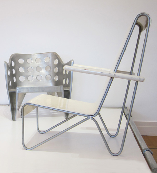
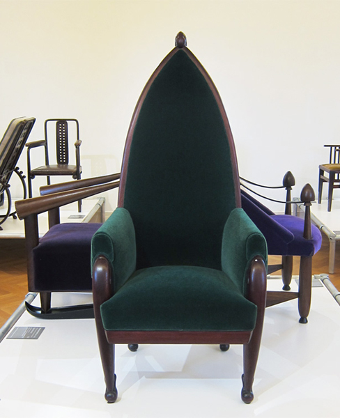
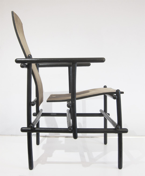
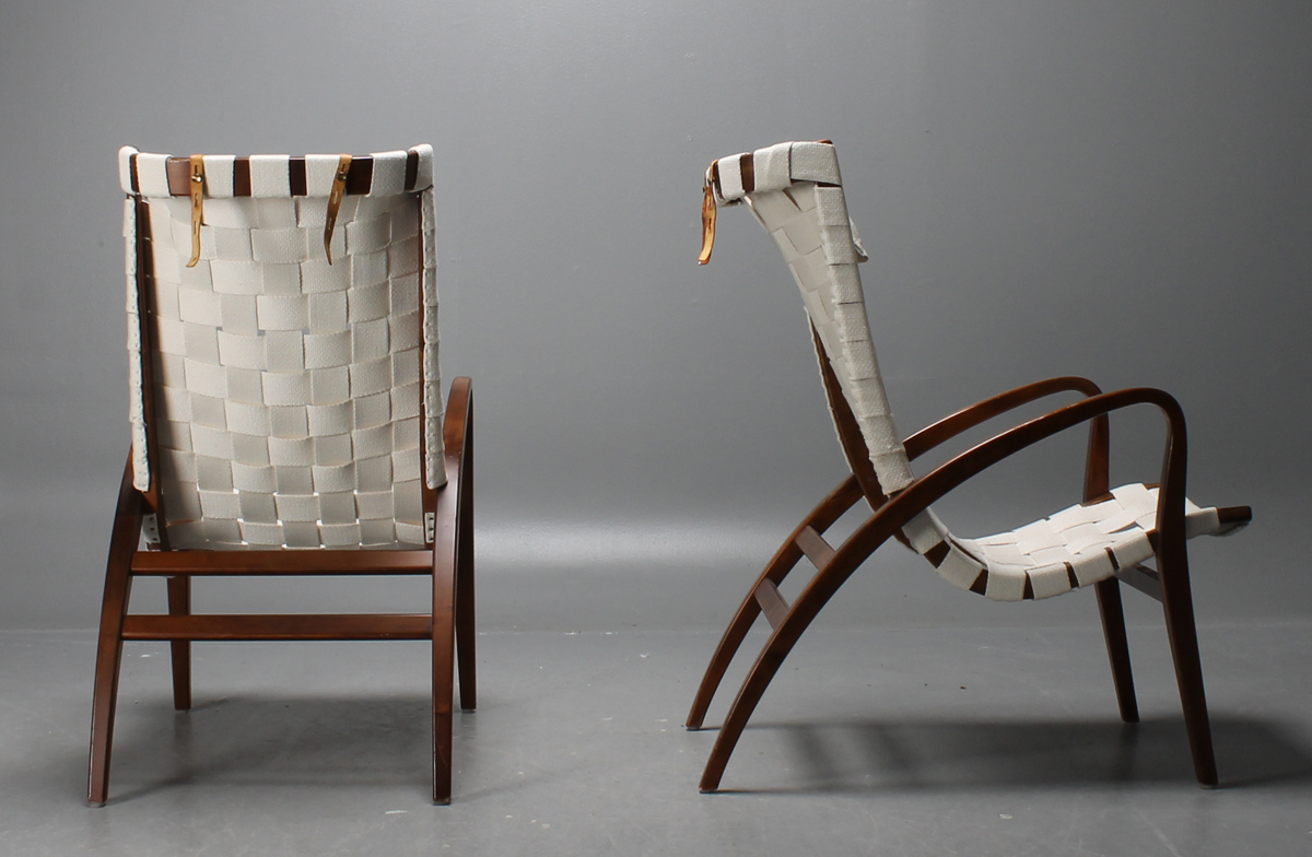
some unwelcome examples from Possessed By Chairs
Chairs often supplied with a high and straight back gave me more a feeling of how to position you than place for resting. How do we position our self by sitting and what is the difference between sitting and standing trough history according to gender, social class, culture background and so on. Who can sit and who don’t? Who sit today and who have been sitting the past 100 years? I think every chair have plenty to tell, not just from the technical aspect in how we been building our furniture’s and which material we been using; I think they as well have great stories to tell about our social history.
Anyhow, while walking thorough this selection of chairs there was one that caught my eyes and that I felt spoke with another tune. It was a leaned back chair that almost reminded me about a sun-lounger.
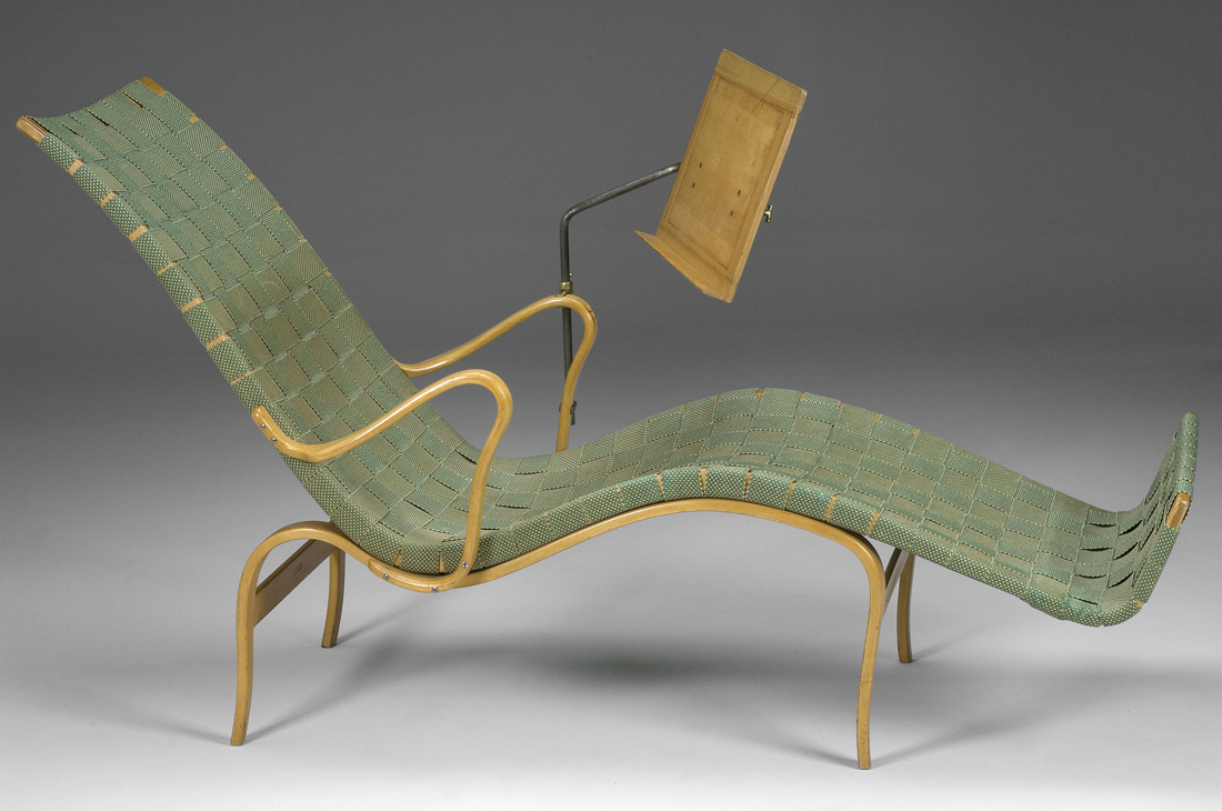
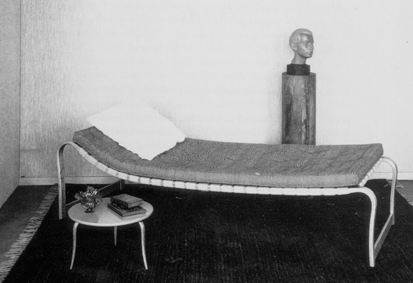
With a green cover in woven textile in a kind of plating technique this chair were for me manifesting everything else then hierarchy, rather a feeling of joy. I immediately got very touched by it. The color of the chair, which was a light green color, close to a light green Verona were expressing something very inviting and then along with the size of the chair, which felt more than enough to take one person gave a atmosphere of generosity.
When the title of the chair later became clear to me it got even more exciting as the chair actually had a woman’s name – “Pernilla”. A chair made for a woman? To put a human name to a chair apparently works well though all of a sudden I felt a personal relation to the chair and I wanted to know more. To know more about her. Who was this Bruno Mathsson and who was Pernilla?
WHERE IT ALL BEGAN
Bruno Mathsson was born in a small city in the south of Sweden called Värnamo. Since Bruno was the fifth generation in a family of master cabinetmakers Bruno was learned early how to do carpeting by his father. To live in Värnamo which is a small and quite isolated city wasn’t something that stopped Bruno from having big visions. He early learned how to get input from his surrounding world and keep up with the contemporary arts and design. After a visit to the Roohska Art and Crafts Museum in Gothenburg in his early years, he got in contact with the manager of the museum and through him he started to borrow the literature of the museum – which they send back and fro with the trains between Värnamo and Gothenburg. The Rooshka Art and Crafts Museum, which is one of the biggest museums in Sweden specialists on art combined with craft, would later make strong connections with Bruno and his design and still today they every year support and exhibit work by one designer with a scholarship through the “Foundation of Bruno Mathsson”
In 1930, at the age of 23 years the Bruno got the opportunity for the first time to put all his study and theories into real practice since he was commissioned to design a new chair for the Varnamo Hospital. Bruno took the chance to create something that he found less traditional and decided to make a chair without the old conventional and quite shabby sprung upholstery that the chairs in the hospitals of Sweden at that time used to have.
The quality and comfort combined with a new and fresh design finally brought Bruno to an unusual solution. He covered the frame with a sort of
plaiting webbing technique 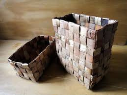 .
.
The arms and legs were made in sold birch. Bruno liked to keep the light in his design and I think you can se this in his relation to the birch as material. The chair was not of a big success by the staff of the hospital though and they nicknamed the chair “The Grasshopper”.
The Grasshopper hasn’t been in use for long before it sadly had to move up the attic of the hospital. Even if the mission with the chair to the hospital didn’t led to an immediate prosperity Bruno continued his work and carefully studied the ”mechanics of sitting”. He wanted to find the perfect sitting line, or curve and this he approached in different ways. One way of finding it he got through sitting in snow and then study the imprint his body just made. Once again the comfort was one of his biggest aims. He further on kept on experimenting with techniques of bent laminating wood to gaining skills and found out compotes of great strength but still with a gracefully and restrain look. Bruno held his visual language minimalistic and did never use more elements than necessary.
In 1936 Bruno launched three new chairs in one series that he called “Working”, “Easy” and “Lounge chair” model 36. These chairs were all designed using one piece of frame covered with plated webbing supported by separate bent laminated legs. Different but same. Bruno was reaching for a concept of a chair that could work for different settings. As well as working is something we do we equally need a chair for resting. I find it funny that Bruno made the chair “Lounge chair” so much reminding about a sun-lounger though I somehow think it says a lot about the Swedish mentality. As the winters are long and heavy in this northern country people appreciate the summers and specially the sun almost in an absurd way and because of this Swedish people often make jokes about how we to the very extend try to catch every minute of sun.
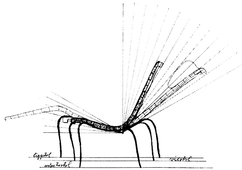
The sketch of the three chairs in one serie.
Liggstol = Lounge chair
Arbetsstol = Working Chair
Vilstol =Easy
THE BREAKTHROUGH
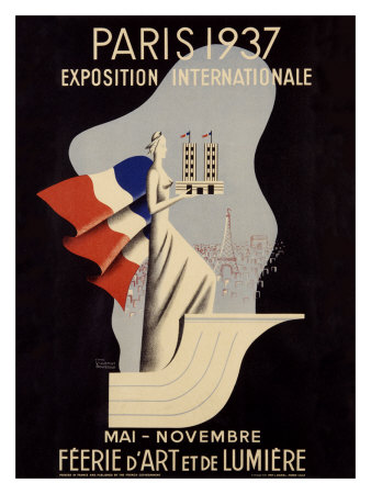
The three basic chairs can more or less be seen as a breakthrough in the career for Bruno. The same year Bruno got the opportunity to have an own exhibition in the Roohska Arts and Craft Museum where he now could show his work for a much bigger audience. Brunos chairs did apparently made a bigger accomplishment in the space of a museum than in the Swedish hospitals and soon Mathsson could be seen as one of the leaders in the design of Sweden. One year after the exhibition Bruno was asked to participate in his first international exhibition in Paris, “The Paris 1937 Expo”,
where he won the Grand Prix for his bed “Paris” that he showed. His furniture was received with a great appreciation and admiration and he got a lot of interested from all over the world. The same year his furniture also got represented at other exhibitions such as the world exhibition in New York and the Golden Gate-exhibition San Fransisco.
Swedish Pavilion Golden Gate International Exposition 1939
WORKING IN AND OUTSIDE OF SWEDEN
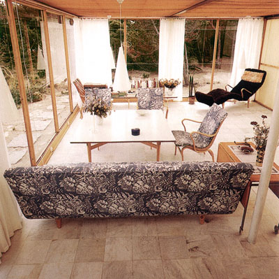
Even if Bruno never gave up his small hometown Varnamo he made a lot of journeys abroad to stay update. In the 1940s Bruno made a visit to the US with his fiancé Karin that resulted in lots of new inspiration, which led to among others, an architectural work that would become very famous as built houses in glass. Houses you today can visit in Kosta, called the Mathsson Glasshouses.
The light was of great value for Bruno, which you already could notice in his furniture’s and I think you can see a link here to his way of using of the glass as a material. Bruno wanted to get as close to nature as possible and investigating in how close the design could get to nature, and this was something he was developing through his work with the glasshouses. Later during the winter times Bruno used to leave Sweden for some months for going abroad and spend some time in Portugal where he could work in one of his own glasshouses that was established there.
PERNILLA
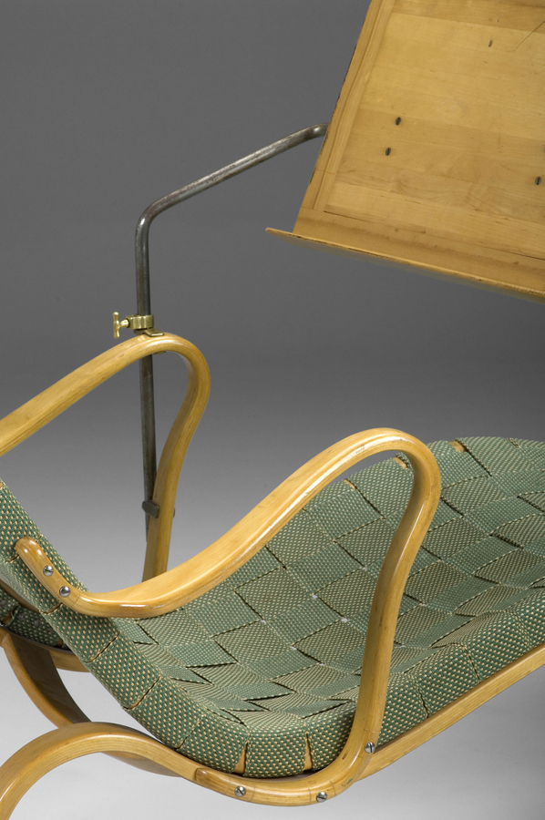
In the late 30s and beginning of the 40s Bruno’s international work somehow slowed down a bit, partly as a result of the The Second World War. By reason of this he however slowed down the tempo of the business and instead got more time to be able to develop his own design. In 1944 he launched the classic chair for resting “Pernilla 2” and then one year later the deck chair “Pernilla”. Pernilla was a chair in the already recognizable and typical style of Mathsson in which he used the technique of bending the laminating wood to get the curve he wanted and then used the plaiting technique for the cover. This time he let the whole chair be covered with the light natural green textile. The only part of the chair that wasn’t covered was the armrests. “Pernilla” was also resourced with something similar to a Canterbury, which could be used for reading without the need of using hands.
But why the name Pernilla? In further research I found out that in 1943 Bruno got interviewed by a journalist from the Swedish daily newspaper “Dagens Nyheter” by a journalist called Pernilla.
Pernilla 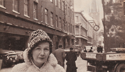 , or Pernilla Tunberger as her correct name were was a prosperous and important journalist that were beside writing about Bruno’s work an involved food columnist. She wrote critical about the food processing industry and she lifted questions around food and transport; something that was not that common in this days. She often created heads in the newspaper and somehow she must have made big impact also to Bruno as he after their meeting decided to dedicate the chair to her.
To give his chairs and furniture’s name were later to become significant for Bruno. And nearly all of them he gave female names. Eva, Mina and Miranda were besides “Pernilla” three of the most famous furniture he made and they were all named after women he met. Was he a man with mainly woman surrounding him or why did he want to give his furniture’s female names? In this I’m leaved to speculations.
As I said earlier the name of the chair worked as an intriguer to me and gave the chair a certain personality. I like to think of the furniture’s of our homes as nearly creatures and as objects that we care about. Furthermore I think it also contributes to a philosophy of the importance of quality. When our furniture’s get personal to us, we put more effort to take care of them and then we have them for longer. By this the quality will play a stronger role and quality together with functionality was together with the ergonomic quality and beauty the main things in Bruno’s concept of design.
Bruno continued his work for many years and and the fact that he turned older was nothing that constrained his passion. In the 1970?s Bruno for example had a project going on way outside of Europe, where he were being part of a panel discussing design with a several hundred interior architects in Tokyo. In 1981, at seventy-four years of age, he designed a workstation for computer users that was equipped with a “wing” that supported the shoulders. The last piece of furniture Bruno Mathssons did he made at the age of 90, the easychair “Minister” in 1986.
Bruno Mathsson died in 1988 leaving behind a rich cultural heritage.
