I CAN’T
WORK
LIKE
THIS
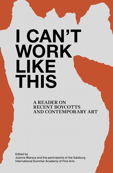
I have chosen an orange book, about the size of a big holiday novel. But with a cover much more animated than a novel.
The title in bold immediately intrigued me: I CAN NOT WORK LIKE THIS. The title is a point of view, an affirmation, rather mysterious, in any case attractive, which challenges us, and that we want to understand by opening the book. Who is it? What work? What prevents who to work? And what does this negation mean? Is it an edgy, or paranoid character?
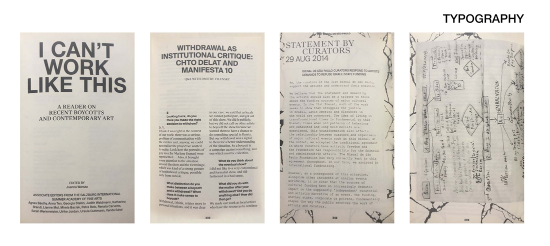
The typography of the title and the first pages, is impersonal, an imposing typo: Helvetica. But page after page, we discover a set of typography that become more and more specific and personal. First a novel writing: The Times New Roman; then the typographic style of a typewriter: ADLER; and finally, handwritten characters.
The paragraphs are changing too. At the beginning, they are inserted seriously and strictly to the right of the pages. Then the paragraphs come to life, and bend in every direction; some follow the form of images; others are divided in the same way as on the pages of an agenda. Each time the titles are put forward, they are imposing, and have an important line before the beginning of the paragraph.
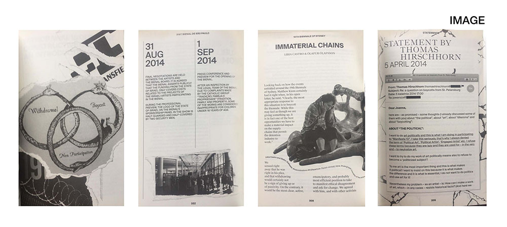
Unlike typography and paragraph, images retain their homogeneity and conductive line throughout the book. These are the torn paper effects that surround the images, and organize the book as a collage. Some images are not limited to pages, and may overflow and continue on the next page. All images are in black and white. Only the cover has color (orange). These images mix a little all times, and all media. These are both old letters, drawings and photos, but also screen shots of Facebook conversations or emails. This kaleidoscope of images and times makes us lose ourselves in time. There are also many scans of manuscripts, with arrows in all directions, words over-lined or surrounded to follow the reasoning of the creator.
The spine of the book also deserves a comment, because the drawing on the borders of pages overflows and bleeds from the pages. These are black lines that remind of tearing of the book. This creates a dotted pattern when looking at the book from the side which is also convenient for finding your way in the book, since they indicate a beginning of chapters.
Everything looks like a patchwork. Looking at the graphic designer’s chart, Krysztof Pyda, you immediately recognize the spirit that has imagined the book. The instagram of the designer is indeed a collection of images, and it is exactly this same idea, this same visual ensemble that one finds in his book. It is a multitude of documents, more or less connected at first sight, but which are connected by arrows, handwritten indications, which gradually make us enter into the intimacy of the creator. That’s why I chose this book: it intrigued me like an intimate diary. Each page is a surprise, each time more personal than the previous one.
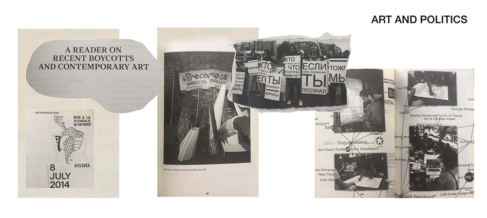
In deepening a little more, I realized that it was a book whose subject was about art and politics. First, the subtitle clearly tells us: A READER ON RECENT BOYCOTTS AND CONTEMPORARY ART. Then, the purpose is clarified with images mixing political slogans, caricatures, works of art, photos of events, maps of the world. These images are connected to each other by arrows; some parts of the documents are broken. We enter into the imagination of the creator, having the impression of following the path of her research and her thought. The reader does not read a book whose purpose is purely political, but is drawn to the point of view and the vision of the creator. These are not speeches with dates and facts, as we could see in an history book. They are pieces of image, texts, full of documents, where each page expresses, strengthens and defends the general idea and the point of view of its creator.
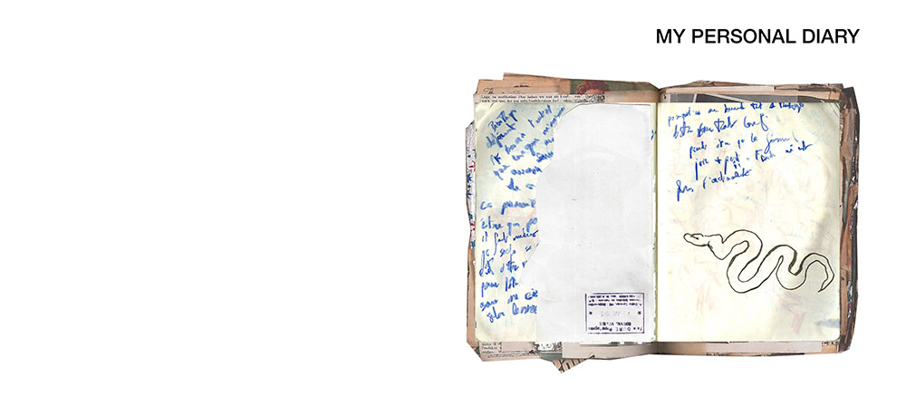
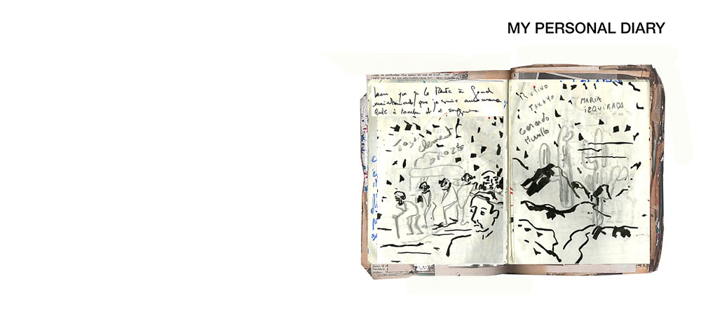
This book immediately reminded me of my sketchbooks and research books. I work a lot with collages, snippets of images, and my notebooks are also disparate collections of papers, covered with drawings and handwriting. All the papers I keep in this notebook have for me a story, show something of our generation, even if they are as everyday and innocuous as for example cash receipts or or transport tickets. All in any case are related to the places I cross, to people I met, all remind me of a particular moment. On each page, I play with the composition, an image in the foreground completes that from below.
I CAN NOT WORK LIKE THIS, is a book that I loved to turn the pages, flip, flip, stop, first for visual pleasure, but also to try to understand how it is organized, graphically. The creator really plunges the reader into his most personal research, his thoughts and his points of view, like an intimate diary.
Joanna Warsza : I Can't Work Like This a reader on recent boycots and contemporary art. designer: Krysztof Pyda, Rietveld Library Cat. no: 700.7 war 1
