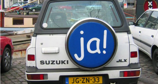
Annual design awards is an event which is announced almost by every design magazine/ company/ institution, whether it is the influential “Wallpaper” or just a blog of a random fashion lover. The best is picked out of everything, “from beds to breakfasts through jeans to genes”. However, when all the winners are praised, the time comes to remember those who weren’t lucky enough to fit on the pedestal. Being nominated as the worst is rather a dishonor for every designer or design company no matter if it’s a car or a pair of shoes.
Nevertheless, sometimes ‘bad’ is not enough to describe public opinion about a design piece. ‘The worst of the worst’ may sound dramatic, but this is a title used talking about… typography.
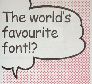
It is difficult to find a font or, frankly speaking, any piece of design which would be accepted more controversially than Comic Sans MS. Its naive, innocent and childlike appearance makes it so attractive for primary teachers and prayer groups of local churches. Yet it is also immature, juvenile and silly as if written by a 6-year-old, yelling ‘bad taste’ at everything where it pops out.
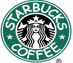
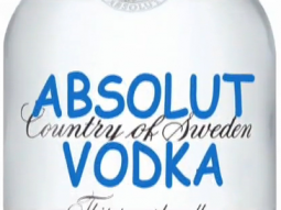
If some well-known logos were replaced with Comic Sans, it would look rather homely, warm, inoffensive and simply unsuitable. But when it comes to real examples, a restaurant menu presented in this font looks more like a kindergarden canteen while a warning sign loses its all respect immediately and seems to be rather an April Fool’s joke…
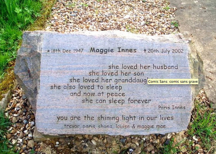
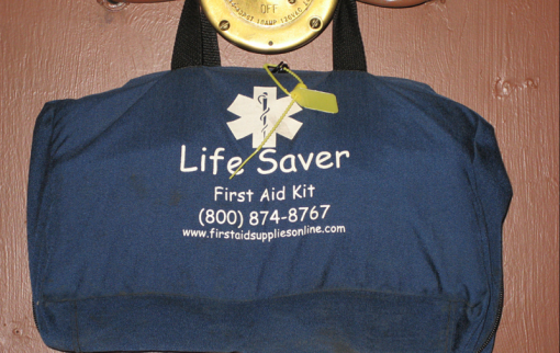
As if it was not enough, this font proves to be contagious. Ever since it’s first appearance in 1995, Comic Sans is now everywhere, even on the sides of ambulances or gravestones.
No wonder that such a vast misuse of a font has caused a big anti-Comic Sans campaign: various websites offers hilarious photostreams of Comic Sans spotted everywhere in the world; one can also email a comical educational pamphlet for a friend who is suspected to be a comic sans criminal. As if it was not enough, the hate campaign has it’s own website where special Ban Comic Sans T-shirts or coffee mugs can be purchased. Even more, visitors can donate for creating a documentary called Comic Sans Or The Most Hated Font In The World. The greatest haters can also download a special Safari extension which changes Comic Sans websites into Helvetica!
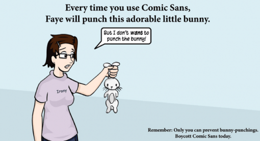
‘Every time you use Comic Sans, Faye will punch this adorable little bunny’, is written on a picture with a worried girl, holding a small white rabbit, crying ‘but I don’t want to punch the bunny’. The scale of hate sometimes seems to be taken to extreme or even absurd: “Misuse of the font is analogous to showing up for a black tie event in a clown costume”, claims the creators of the hate campaign.
It is interesting to know that originally Comic Sans wasn’t designed for wide use. It was actually created for Microsoft Bob, a software program included in Windows 95. A little dog which was used as a help character ‘talked’ in Times New Roman, a font which was a bit boring, not warm and helpful-looking at all. That’s when Vincent Connare, a typographer who worked for Microsoft, was asked to create a special font for the program.
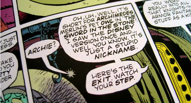
Apparently Connare was a big fan of comics. Inspired by “Watchmen”, a popular graphic novel, trying mimic its handwritten letters in speech bubbles, he ended up with now inglorious Comic Sans.
What was the secret of it’s enormous popularity? When Microsoft included the font in Word of Windows 95, Comic Sans suddenly bursted like a virus. It was something new, unseen and fun-looking. Connare explains it simply: “because it is sometimes better than Times New Roman”.
