The Type Cruiser / Ebay Auction is spearheaded by Simone Vollenweider & Anna Sartorius.
Within the last month they designed a new typeface which is available on Ebay till July 29th. Ebay (Typeface Cruiser HGB)
Part of the concept is that the font is meant to undergo changes throughout the auction: With each new tenderer a new special character will be introduced into the existing font such as a comma, question mark etc. Designers – that are not part of project yet – are encouraged to contribute to the exciting pool of characters by designing such a special character. The design of each new character is not subject to the existing typeface and is free of any rules or limitations.
The designers who are participating: Angelo Benedetto, Anna Lena von Helldorf, Anthony Burrill, Carolin Kurz, Daniel Gaffner, Daniel Peter, Dino dos Santos, Fanette Mellier, Jennie Winhall and Kathe Burn, Kerstin Finger, Hudson-Powell , Markus Dreßen, Martin Aleith (Pfandfinderei Berlin), Martin Sperling, Mathis Pfäffli, Node Berlin Oslo , Oliver Klimpel, Radim Pesko, René Siegfried, Silke Klinnert, Stephan Fiedler, Stephan Müller (Lineto), Thomas Ulrik Madsen, Yoann Betrandy, Mind Design & students of the Academy of Visual Arts in Leipzig.
More InformationsBoth, Simone and Anna, are enrolled at the Academy of Visual Arts in Leipzig/Germany and study "Systemdesign" with professor Oliver Klimpel.
Project based on a story told by American artist Ed Ruscha in an interview in NY Times 1972. Experiments inspired by this story were conducted and filmed. Project by Christopher West and Alban Schelbert [click image for movie]
Quoting graphic designer Julia Born from ‘Capsule over Kunst boeken’… ”
The information Man is an interesting story of artist Ed Ruscha, who tries to imagine what happens or has happend with his books. It deals with the live of a book. How it is used (or not), the book as an object etc…… This is what I always find interesting. The book as mass product, which starts to lead an individual life due to its distribution, changing its appearance too. I used this story for an assignment once and later it became the theme of the book ‘Beauty and the Book‘ resulting in a visual essay in coöperation with photographer Johannes Schwartz
Architectorial anxiety.
Can I design a space that uses my experience of fear to design the perfect safe zone? How can I shape a space which gives one freedom and privacy but which is not enclosed?
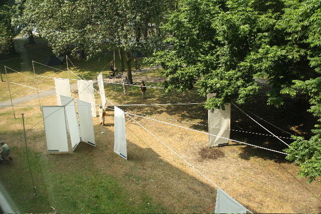
Shields and Shelter is a design for the grounds of the public bath – Flevoparkbad [link] – in Amsterdam. For the Rietveld graduation exhibition 2010, I realized a 1:1 detail of my design on the lawn behind the Rietveld Academy.
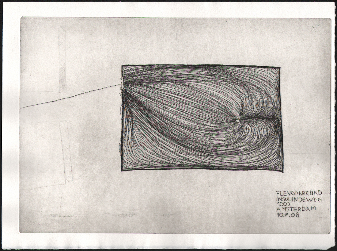
above : a 1:1 detail of my Flevoparkbad design on the lawn behind the Rietveld Academy.
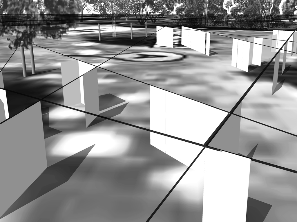
In Shields and Shelter I applied step by step the guidelines that I have developed to achieve safe and comfortable zones using my own fear experiences. These guidelines involve architectural concepts like shielding and view, shadow and light, flexibility versus rigidity. The perfect safe zone to me is a flexible space which gives one freedom and privacy but which is not enclosed. As basis for the design drawings I used an aerial photo from Google Earth of Flevoparkbad. From each towel, I constructed lines of sight from 120° angle views. Through shading these 120° triangles a map emerges with different degrees of surveillance. The darker the area, the more views. At the darkest areas the view must be blocked. Therefore I developed shields, which can be slided along rails that follow the lines of sight. This allows the bathers to adjust their exposure to others according to their own wishes.
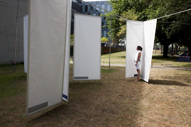
tracing the 'feel' zones and the emotion lines and reproducing them in a real situation.
From the jury rapport : Kristin Maurer’s installation outside is a whole new interpretation of space. Space can be created by shadows as well as materials. This is what struck our jury-members. Next to this the technical realization of the work is stunning and therefore our members of the jury wanted to celebrate this piece of work.
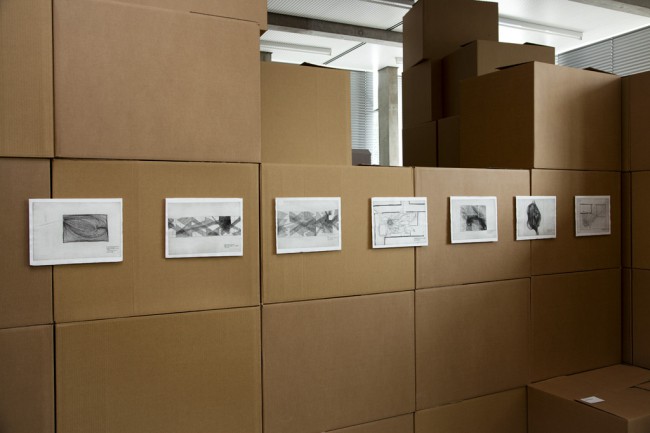
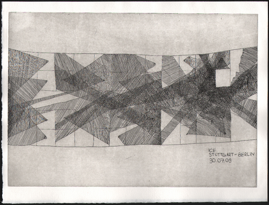
etchings at graduation show
The etchings in the thesis, presented as part of the graduation show, are ground plans of remembered fear spaces. A scheme of lines of sight in train, Kristin Maurer, 2009 [etching]
Download thesis:Architectural anxiety. the perfect safe zone
This graduation essay by Mrova Zub covers research on open-ended forms of participatory interaction and tactical involvement of individuals / groups that do not solely operate within one discipline, but by overlapping disciplines and by constantly rethinking employed tactics, manage to transgress the presets, even if its only for a short moment. In preset regimes of coding and decoding (subjectivation), mutation is a crucial tactic in avoiding interpellation. Upheaval can be stimulated in an act of flight, a drift – a deliberate betrayal of rules and orders. Through constant actualization of connections, new energies are being released that help creative and tactical evolvement. Inter passivity as the result of a constant call for recognition from institutional and governmental systems is a tactical mutation that transgresses the limits (constitutes de-subjectivation).
The essay was presented in the context of the banner archive / workshop presented at the 2010 graduation show of Interaction Design-Unstable media)
download this thesis: Towards Tactical Interpassivity, from submission to subversion
I find, first of all, that I pass from state to state. I am warm or cold, I am merry or sad, I work or I do nothing, I look at what is around me or I think of something else. Sensations, feelings, volitions, ideas – such are the changes into which my existence is divided and which color it in turns. I change, then, without ceasing.Henry Bergson
Being Motion is a graduation thesis by Charlotte ten Raa, and won the 2010 Rietveld Thesis Award. It consists out of different texts. They circulate around the subject, the self; as a movement with the possibility to reflect. I wanted to bring the subject motion close to yourself, so close as to our consciousness. How we see the movement of a train passing by as well as how we can see our consciousness as one constant motion. How the self makes up stories from what it sees and how we form an image of yourself, seeing yourself as a subject and as an object. How there are different perspectives on time and space, looking from the starting point: the self.
Our way of being in the world is very much about predicting what’s going to happen, taking tiny fragments and putting them together.William Kentridge
The jury was unanimous in its decision: Because it is a thesis that involves the reader in an interplay between form and content in an amazing way. Because it is very well written, keeping a careful balance between the personal and the objective, between anecdotal and philosophical, between thinking and doing. Because it shows that it is possible to deal with a very complex theoretical problem in a very light way.

It might be called a special coincidence that this thesis and its excellent understanding of the philosophy of Henri Bergson has been written in the spirit of our theory teacher Raoul Teulings [†2010] who we all miss very much, and in whose memory this first Prize for Best Thesis is given.