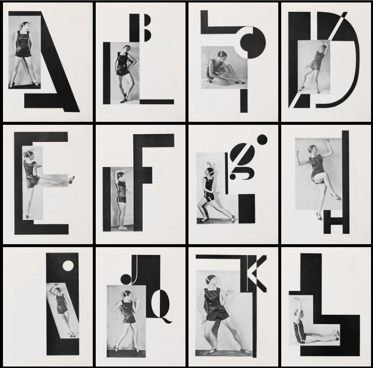
Skip to Content Skip to Search Go to Top Navigation Go to Side Menu


"digital" Tag


Abeceda NOW


Monday, May 21, 2018


ABECEDA 1926


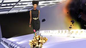
 In 1926, the Czech dancer Milca Mayerova choreographed the alphabet as a photo-ballet.

Each move in the dance is made to the visual counterpoint of Karel Teige’s typographic music.

Teige was a constructivist and a surrealist, a poet, collagist, photographer, typographer and architectural theorist, and his 1926 photomontage designs for the alphabet are a uniquely elegant and witty invention, and one of the enduring masterpieces of Czech modernism.


Abeceda


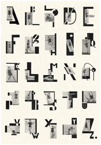
In the graphic design world, movement refers to the path of a viewer’s eyes as he or she looks at your work. Since movement can add such a large sense of unity in design, it plays a significant role in the ceration process. By tying the different elements of a design together in a specific way, you can control the movement of your viewer’s eyes throughout the medium. As a different media, body does the same thing in ABECEDA 1926 photo-ballet. There is the different movement which is more analog, natural and already exist but still a path of a viewer’s eyes as he or she looks at the work, using the body and an action as a method of design. Despite the fact that the terms action and surface are disconnected even opposite things.


Letters get created

by movements > Movements who

literally give the sound exhaling.

abc

In our case of the Abeced Alphabet an example

with the first letter of the alphabet, the letter ‘A’.

The body language of reaching towards the sky asking an ‘A’. 

But expressing ‘Aas confidence standing tall, putting your hands in your wrist, chin up.

So one single letter can have a wider scala of meaning.

A aa

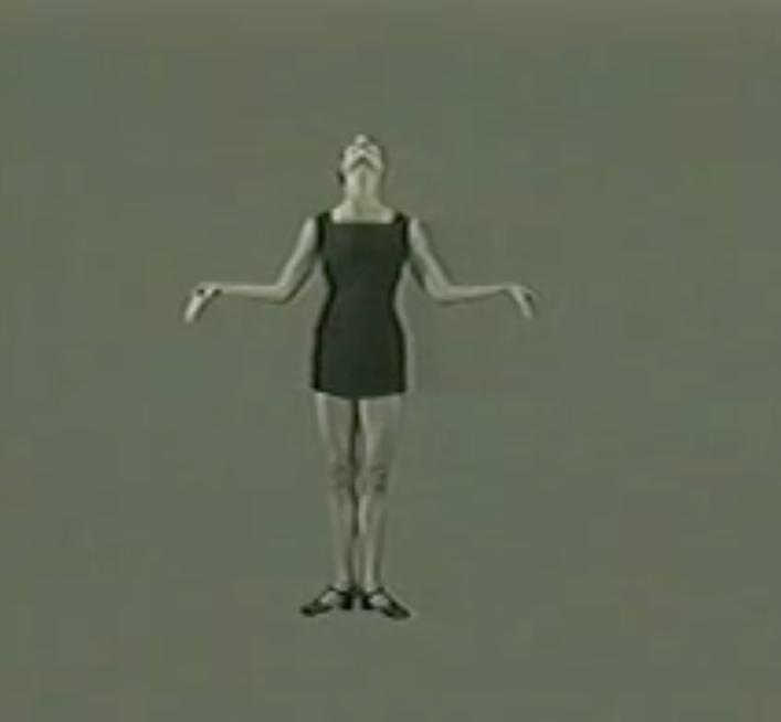
A letter without  a sound of the voice, a movement of the hand can be like an incomplete inform. Just an ”A” on a paper.


Body language which is connected to words is a missing factor in language these days. Digitization is transforming things into less natural outcomes. Which is interesting is relating those two opposite sides; the digitized, formulized and made as a stabilized, structured letters out of the natural, smooth, changing, body movement. Even we can find some elements from both sides in all the sides, still the texting, mailing and internet talk has no presence of body and sound which is ironic because we generally attend to imitate the existing features that we know, take them as a starting point or repeat them.


We can see the first examples of this attend in the ”Cave Paintings”. Cave paintings are also known as “parietal art”. They are painted drawings on cave walls or ceilings, mainly of prehistoric origin, dated to some 40,000 years ago (around 38,000 BCE) in Eurasia. The exact purpose of the Paleolithic cave paintings is not known. Evidence suggests that they were not merely decorations of living areas since the caves in which they have been found do not have signs of ongoing habitation. They are also often located in areas of caves that are not easily accessible. The paintings are remarkably similar around the world, with animals being common subjects that give the most impressive images. Humans mainly appear as images of hands, mostly hand stencils made by blowing pigment on a hand held to the wall.

Some theories hold that cave paintings may have been a way of communicating with others.


33132479_2159603404055339_7157237393018322944_n


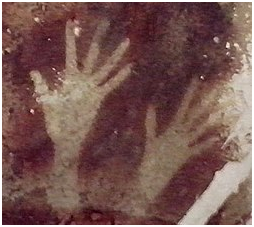
The body and other elements are using for communication in a way with ”movement/action of the body and also in a way with ”captured frames such as; paintings, photographs, and even typography as visuals. So we can really understand the idea of connecting body language with the captured, reflected typography together.


designtheory5


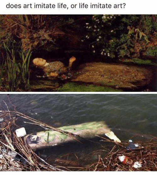
According to that point and various examples, we can tell that art may imitate life. The movement, the performance reflected and created an alphabet. But could it possibly be possible to create an alphabet without any reflections from life?


RedGreenBlue


Monday, February 26, 2018

RGB is an additive colour model, meaning that lights are added together in different frequencies to create colours. For example, when red and green lights are added together they create a yellow colour. This is different to a subtractive colour model where colours are created by mixing dyes, pigment paints etc. which then absorb parts of the full spectrum of colour frequencies available in white light and reflect other frequencies which then give the surface it’s colour.

additive-vs-subractive1x

  RGB is used in digital colour sensors and digital colour displays and projectors. Each pixel on a screen has three tiny light sources, red, green and blue in colour. These emit different brightnesses which in the combined effect create the specified colour of the pixel. The sum of all the pixels on the screen will create an image.

LCD_RGB

  These three colours, Red, Green and Blue, are chosen because they correspond to the way the human eye sees colour. We have photo-receptor cells in our eyes called rods and there are three types of rods. One which detects long-wave frequencies of light, another for middle-wave and another for short-wave. Specifically, these correspond to the frequencies of blue, green and red.

eye


The first experiments with RGB were with colour photography in the 19th century. The same photo would be taken with a red, green and blue filter on black and white film and then composited together in printing. Here is an example of the Russian photographer, Sergey Prokudin-Gorsky who used this technique in the early 20th century:


Sergey-Prokudin-Gorsky-Composite


The World in the Computer


Thursday, November 27, 2014


‘By presenting my designs not only physically but also digitally, new dimensions are created to strengthen the experience of fashion.’ (Jacob Kok)


The reason I chose Jacob Koks 3D work – evolution, (animated movie by himself and the software developer Autodesk), was because of the way it was presented  as a video made in a computer program. The use of media and what it allows you to do with gravity and form in this animated short film is for me very interesting and relevant for the art and design as it develops today.

I think the title of the exhibition “ The Future for Fashion is now” indicates that; we should use all our technologies and experiences we made so far, in the work of art and design today.  For me the technology that is created is not so far mentally reachable, as it may be for my grandmother, but still it has gone to a level of complexity that can be hard to follow for everybody.  I grew up in a generation where computers still was a “new” thing. but at the same time still very much existing. I grew up with laptops mobile phones , as an everyday- kind of object. It is therefore extremely relevant, to also include these kinds of objects in our art today.

In Jacob Koks – Evolution, he is working in this “second world“ where space limits and rules of gravity does not exist. He can play with shapes and fabric, as he likes. In the video shapes of clothing and body parts have it’s own rhythm, in the sense that it does not follow the natural movement pattern of what that kind of object, is supposed to do. The pictures is overlapping each other, making one shape or one figurative person floating over to another shape or person, creating a new walking, and idea about what clothing is and can be.
He started out with catwalk videos, mainly because he did not have the money to create collections and also to get them in production; he used his budget on the catwalk sample and didn’t have money to make more. He “crowed founded” his first collection, but he brought up a subject, for him and the rest of the fashion industry to work at.

That’s where he “reinvented himself as a designer” put in his own words, but he also questioned the very materialized fashion world, which I find very interesting. Making the fashion virtual he was not only manipulating with body shapes and fabric, but also he dematerializing clothing in fashion, by doing so. He was able to, in a very experimenting way, to expand himself as a designer in a digitally media, but also making himself able to save some money to make his art/fashion real.

A lot of catwalk clothings is only made for inspiration, which gives the designer a lot of money to spend, without selling /earning anything. I think in the use of digitally media in the fashion industry like Jacob Kok does it, is a big inspiration for other upcoming artist in this field.

Later on he cooperated with the Sims 3 Game, which also gives a whole other perspective to his work.

The Sims game is a virtual game where you create a world of your own. You simply make the figures by selecting their looks, from everything to eye colour, hairstyle, clothing, to personality interest and goals in life.

the-sims3-screens-05_656x369
Create_A_Sim-sims-2

When you made your characters, you can buy a property and then you start building. There are limits for your house building, as it is in real life, so you have to be patient.  Your characters have to go to work to earn money; they have to be stimulated mentally with having friends, hobbies love life and carrier.

You have to fulfill these desires to collect points. In this way the game can go on and on. It does not end. This game has sold over ten million copies worldwide since 2009 release, making it one of the best selling games of all time.

I believe the game is so popular because it works with the simplicity of life, it is like a recipe for how a “normal” life can look like, and you are the controller. In a world where young people are so confused about all the choices they have to make. The Sims game actually makes the player successful, almost no matter what, and if not, just start over.

It’s a game for both girls and boys maybe even some adults, because it is reflecting our own way of living. Maybe even questioning, our way of living.

When Jacob Kok is using these references in his work,[x] it could associate with a feeling, for those who knows the game, that their have control over their looks and behaving and in the end, control over their life. The game is creating a feeling of being more successful as a person, in a world that can be very confusing to live in.

Of course other artist/designers has explored this area of what the digitally media can give us.

Wade Guyton is a post conceptual American artist [x] who makes digital paintings on canvas using scanners and digital technology, but there is also artist who specialize in digitally artworks, that also plays with this virtual external world which computer games is presenting.

David O’Reilly is an artist working in the field of 3D animation movies, he is known for the distinctive absurdity of his work. In his work “External world” He kind of gives an example of how the absurd the world is. The theme of the whole film could be how people are scared of things that are new and maybe more specific about how things are rejected, if others do not understand it. The film is criticizing a lot of things, also the fact that animation movie is allowed to present violence  without being taken serious.

The relation between the two artist, is both the media but also how they reach their audience, by creating a space with no rules, a space that have no end and a place where we can create and do whatever we want.

O’Reilly is seen as one of the leading 3D animation artist, which has like Jacob Kok, is dealing with the human role in the world, by using 3D animation.

Jacob Kok works both inside and outside the media, by using The Sims, and catwalk animation movies as (Paradise) he is not only interested in fashion, but also have a background an interest in animation. His start point was not to only work in one media he once thought he would make music videos, because he felt that he in his work was embracing more visuals and music together, than separate (you can easily see this affection in his work; official trailer for his spring/summer collection) He is uniting several of his own interests in fashion/animation/ music, to make a new perspective to fashion and his artworks.

O’Reilly is working as an artist in digital form, Jacob Kok works with fashion and design and needs real time to exist, were O’Reilly only works in the virtual world. He doesn’t claim his works, but put them on the Internet for everybody to enjoy. Which I think also is an interesting point. Jacob Kok is also using this method to expand his works, but not as absolute and clear as O’reilly does it.

images

Something that I also find really interesting, is when artist use more than one skill, the combination of interest and competence is inspirational, personal and very true as an artist.  I think both of these artists are connecting very convincing and beautifully, a personal and new, perspective in the fields of art/fashion/animation.

FC11ToekomstVanFashion_MediaMatic

Wendingen as Layout and Form


Wednesday, April 2, 2014

[X]

One of the most immediate impressions one has of a Wendingen publication is of the format. It is ironically a very stout and conventional square shape, while not being a standard Din format. This is obviously a considered format, one which was chosen so as to fulfill a specific requirement. Similarly, once the publication is opened, the considerations of lay-outing the page as well as the type, is as immediate. The shortening of the printed area of the page reverts the visual shape of the page back to a more common rectangular format. The lay-outing of the type too is interesting as it plays along a similar functionality. With colour fields being constructed from smaller sets of shapes aligned together. This back and forth in format and form is something that may be interesting to play with on a digital platform such as a a basic webpage, where format differs from screen to screen, and browser to browser. Although this is fairly standardized, there is some variation. The lay-outing of individual elements in HTML then allows for a chance to reformat the page as desired by the user. While this is in no means a finished or particularly useful webpage, a more playful and relevant investigation into these issues is at least a potentially good starting point.


Log in
subscribe