Skip to Content Skip to Search Go to Top Navigation Go to Side Menu


"decoration" Tag


Birthday-Chair


Tuesday, March 31, 2015

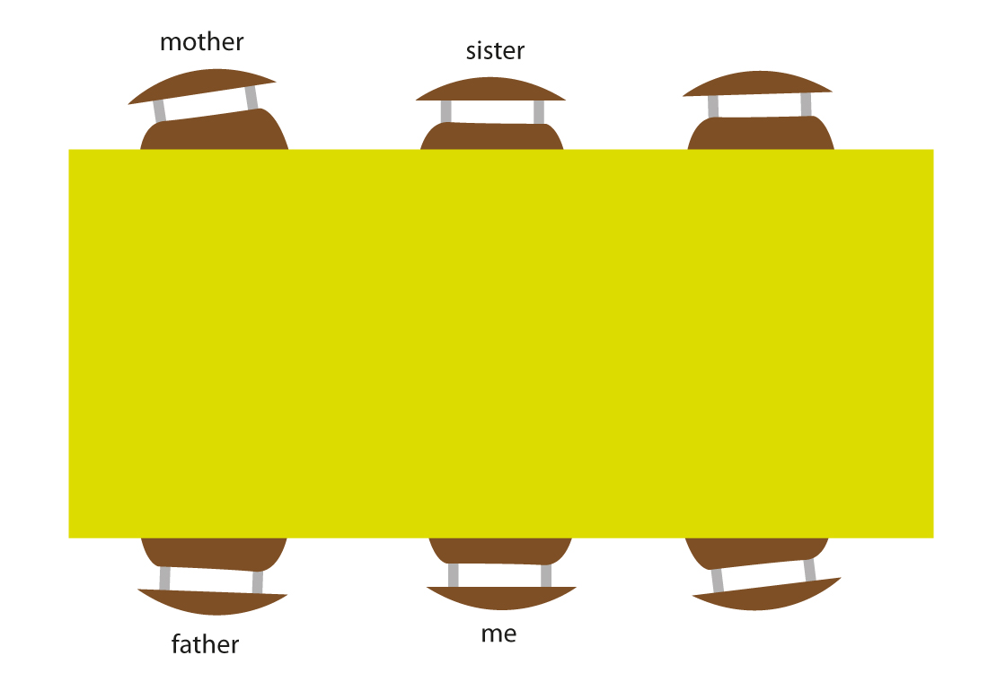
Before my sister and I left the house of my parents there used to be a clear structure in chair-composition during the breakfasts and dinners.
A rectangular formed table surrounded by 6 chairs at the 2 long sides of the table. My parents sat in front of each other, and my sister in front of me in the middle of the table.


CHAIR HIERARCHY


Everyday this composition was the same (although we tried a few times to change), except of 4 days a year, the birthdays.


CHAIR COMPOSITION


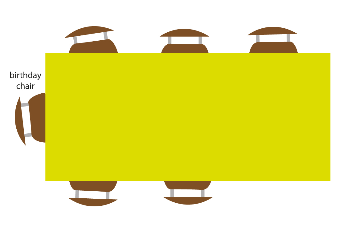
The ritual of a birthday was that the lucky birthday person stayed in bed while the rest was preparing breakfast and the living room with as finishing touch the ‘birthday-chair’.
The ‘birthday-chair’ means that one of the chairs was covered in garlands and, very important, the chair was moved to the head of the table.
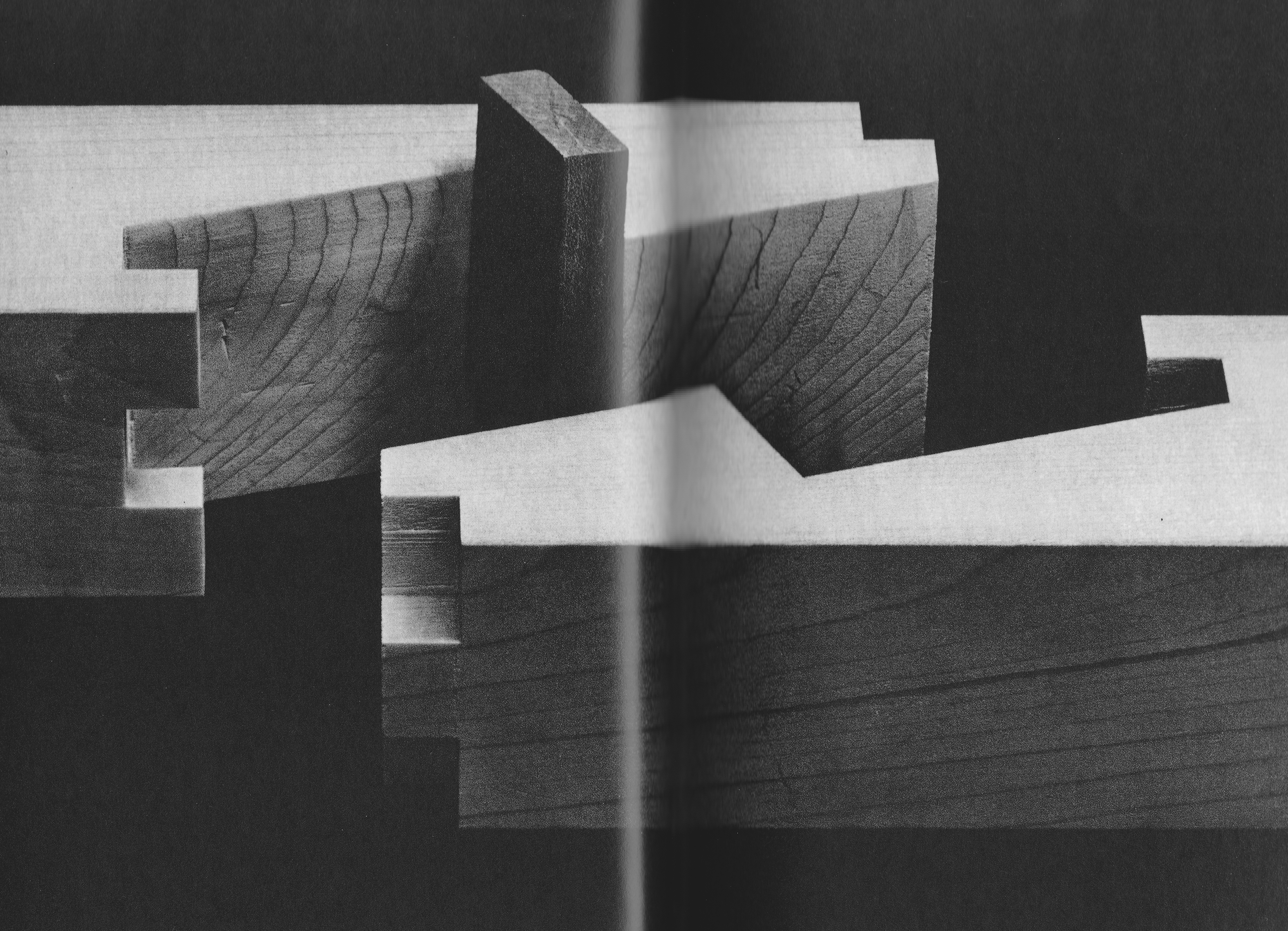
The chair, a simple and comfortable design by Gispen, inspired by the tube-construction of Marcel Breuer, used in a school, than sold to my parents for 5 guilders a piece, is quite hard to decorate because of the simplicity. 3 days a year it felt like my responsibility to decorate the chair in an artistic and surprising way.
The goal was of course to make the one who’s birthday it was feel important. It was his/her special day. By placing the chair at the head of the table he or she was the boss of the day. By making the chair look special I tried to make the person feel happy and loved.


BIRTHDAYCHAIR


What I realise now is that chairs can say a lot about hierarchy (throne). What I also think is very interesting is the contradiction between the super functional chair and the colourful (ugly) decoration what change the feeling of sitting totally. Can we consider this as a new ‘design’ chair?

History repeats itself.


Wednesday, May 22, 2013

Does this mean you make the same mistakes twice?

Do we re-live our past but in a different atmosphere?

Can we see our future in the history of time?

It is surprising how the sum of the past and the future can result in the present. As well as in the last book I’ve chosen, I have the feeling that two different time spirits come together.

The layout and especially the letters used on the cover of this book are very old fashioned; the use of soft orange dyes in a round shaped fond combined with a black and white frame. A frame which reminds me of origami class where at least six women with the age of forty-five and higher are sweating over a piece of paper trying to construct a whooping crane. But the picture of the cover doesn’t correspond to my slightly ironical conclusion at all. It is a picture of two wooden beams with beautiful shapes on the end of each beam. The shapes are perfectly opposite so that they can fit together as two pieces of a very complicated puzzle. It looks very modern, like something they use in high tech vehicles or space ships.


At present, the title began to dawn on me. It said: ‘The art of Japanese Joinery’, made in 1977


After a small peek into the content of this book, it occurred to me that it was filled only with old Japanese ways to attach two or more pieces of wood together. Not in the prefab-style we attach stuff these days, but on the most exquisite, caring and futuristic way possible. I felt for a moment so angry at our IKEA society where everything has to be cheap so you can buy a new sofa every four years, not caring about old handicrafts and their gift to make the most refined details. Details of such beauty that you have to suppress the urge to dismantle your closet only to see how it has been made.
The tender approach of something so simple as to attach two pieces of wood together reminds me of the first book I had chosen, where Nabokov describes individual letters of the alphabet in the way he experienced them.

Affection, or at least attention, for stuff we work with everyday, like the feeling of a specific letter, a symbol or a construction, is very rare these days. We don’t seem to have time to notice these small ‘gifts’ in the rush of everyday life. So next time you go to the library, go with an open mind and grab the very fist book that draws your attention. You’ll be surprised what comes out.

Rietveld Library cat.nr: 694.1

The X-Factor: Interior Edition


Sunday, May 12, 2013

Even though the title of the book that I will discuss here sounds like a cheap television-show, I am forced to be objective today. Therefore I would like to mention that the title of the book is, in fact, both good and bad. I’m totally neutral about it, really.

Xtreme Interiors – Courtenay Smith + Annette Ferrara;
is what the cover screams (the ‘X’ in ‘Xtreme’ covers most of the cover, printed in pink).
You might wonder why I am discussing the book with this particular cover at all. Well, dearest reader, with the three old keywords from a previous article (the keywords being: Bauhaus, contemporary, decoration) I have written for this site, I had to choose a book from the Art section in the Rietveld Library. As you may expect, the Art section in the Rietveld Library covers more than just one shelf. I even am under the impression that the Rietveld Library is an art-minded library rather than a usual library. Anyway, the three keywords in combination with the Art section of the Rietveld Library brought me to this book; since it’s full with contemporary architecture that does use decorations a lot.

The cover turns out to be very straightforward about its content: it’s a simple book filled with pictures of extreme interiors. Unlike the previous book, this book does look a lot like an art book: every two-pager has at least one image; every image is supported by some text. The book supports a wide range of architectural interests: it shows images from renowned architects to companies like IKEA, it shows interiors from all over the world and from many different movements/years – although it does not show any interiors from before the 20th century.
I think this book is more a fun-to-have, a visual page-turner to inspire your architectural designs once you found out that your designs are just as boring as the ones of most modern architects.

Rietveld Library cat.nr: 14564

Self-expression, constructed in mathematics


Friday, May 3, 2013

With three keywords in the back of my head, I had to search for another book in the Rietveldian Library.
I had chosen a book I new that I would hate – a book about modern architecture.

The keywords ‘Bauhaus’, ‘Contemporary’ and ‘Decoration’ had to give me a clue what to choose. Yet this time, I had to be objective. Ah well, when I saw the book entitled ‘Postmodern Urbanism (Revised Edition)’ it was easy to choose without judging. It was clearly the best book to choose for me, since Postmodern Urbanism is extremely contemporary, Bauhaus-influenced and therefore a-decorative (relating to ‘decoration’ as a keyword).

The first thing one could notice about the book, is that it feels a lot like a modern building itself. The book is solid, practical, safe, strong, linear in design, no decorations (except for the cover, however, the decoration is rather mathematical than baroque-like) and unpersonal. I estimate there are about 15 pictures in the book that counts almost 400 pages. This is definitely remarkable for a book about art, where the visual aspect is usually so important. It feels like a book written by a philosopher rather than an artist; rather focused on the inside visuals of one’s mind than the outside visuals of the physical world, in which all contemporary postmodern buildings are standing after all (if we forget about the people that say that what is in their brains is reality too, which of course is debatable).

Upon studying the book a little bit longer, one could notice it’s full of footnotes. The book really looks a lot like a scientific paper, it does not look like an art book at all. I feel the urge to complain about modern architecture again, how it is so different, so ancient, so non evolved compared to other forms of modern art, but let’s keep it objective here, hey!

Rietveld Library cat.nr: 14749

The personal problem of contemporary architecture


Thursday, April 11, 2013

This building is one out of a million examples of problematic contemporary architecture. A grey building in a grey country, no exciting materials used, no decoration, not any different from the next building, no ambiance created, no emotion left behind, no warmth expressed, no nothing.

When I took a glance at the design books, my choice was clear rather soon; ‘Contemporary Architecture’. Admittedly, the contemporary architecture shown in in this particular book, which has an incredibly creative title for a book about contemporary architecture, is much better than the regular architecture you can see around you. Yet it will never change my opinion that Bauhaus has stopped any evolution in the artistic field of architecture.

How is it possible that in all fields of art, the artistic styles change so rapidly, while architecture looks almost the same for several decades?
You can’t compare films from the sixties with contemporary movies.
You can’t compare early photography with contemporary photography.
You can easily compare architecture of the 1920s with contemporary architecture.

Why oh why with our modern tools do we still worship the rules of Bauhaus?
Why do we fear decoration? Why do we need to make our homes so practical that we forget its real use: to feel home. Let’s face it; we are not living in a country where it’s a luxury to have a home at all, the use of homes in ‘our world’ is to feel at home. But no, we have to keep it gray, un personal, zero decoration.

Do I have such an untrained eye or do all products of architects look the same indeed?
Is it just what I see or are architects really so conservative? I’d just love to see architecture that acknowledges that a home is more than a frame. Let’s just make our homes our homes again, let’s stop those grey ‘machines for living’, those brick houses with their built-in BBQs, those average-man gardens with one tree surrounded by high anti-neighbour fences.

Ah well, I could probably have approached this subject in a more sensible way, with better arguments and all that, but hey, I am here to write a subjective article about the book that caught my eye – I can’t make it any more subjective than this.

It’s time for a revolution though. Dear architects, grow some balls and be creative, not practical.

Rietveld Library cat.nr: 13053

Embellishing my knowledge in Ornaments


Saturday, October 27, 2012

ornament

noun |?ôrn?m?nt|

a thing used to adorn something but usually having no practical purpose, esp. a small object such as a figurine.

• a quality or person adding grace, beauty, or honor to something : the design would be a great ornament to the metropolis.

• decoration added to embellish something, esp. a building : it served more for ornament than for protection.

adorn; beautify : the men and women in the Stone Age ornamented their caves.

Apart from an ornament being a quality or having to do with religion and music or being the popular Christmas Ornaments, it’s all about adorning, and beautifying. And this is no different with Ornaments in the type world, from old to new, it’s the same bull. (pardon my english)
There are many great book to dive into like this famous publication “Ornament and Crime” (1908) by Adolf Loos, produced in the name of ornaments, at the birth of modernism.

The forms used in the type ornament or indeed in any kind of ornament, may be based upon, but should not be imitations of nature. All ornamental units are derived from one of two sources. they are obtained either from natural forms, such as plants, animals, fish, etc., or from forms not directly traceable to nature, such as the elemental geometric forms– straight and curved lines, triangle, square, circle, etc., and their combinations.

Well searching for these buggers is the thing, you type in on your computer [ornaments], you’ll find some ornaments because crafting is so in and do it yourself, and among these you find some of the type ornaments or sites that you can buy a certain font that is ornament based that’s great, but that is not the point. (kind of.)

And for my search I typed these, typeface ornaments, printers ornaments, dingbats, Ornaments. I thank the search of printers’ ornaments”, gave me this following site that is gold. (click image)

(more…)

Applicable to all aspects of daily life


Thursday, January 28, 2010

If I would come across El Lissitzky’s street decorations today, without knowing what they were, or who they were made by, I’d be wary of calling them decorations.

They just look too much like big paintings.

And calling somebody’s painting “decorative” is usually not good for your relationship with the person.

But that’s what interests me so much about his design for street decorations from 1921: It doesn’t look like any type I have seen before.

I’m actually not sure if the decorations would be terribly effective, the street in the photo does not look particularly festive. Lissitzky’s position seems to be not so much about creating objects that fulfill a purpose in the best possible way, but more about having them embody certain (suprematist) ideals.

It seems to me, that in his street decorations, Lissitzky is not looking for the ideal street decoration, but instead applying his ideals to them.

The Suprematists of whom Lissitzky was part, strived for suprematism as “embracing all aspects of the human spirit”  and thought suprematist forms to be applicable to all aspects of daily life. And you can see this when you look at a sample of Lissitzky’s work put together. It seems he really believed that this style, this way of working, could work for anything.

But there is more to these forms than meets the eye, they follow set standards and, if you know how to “read” them, communicate a clear story. A real form-language if you will. Unfortunately I do not speak this language, or know what the paintings mean, but in Lissitsky’s vision it would be omnipresent, and understood by all.

This really interests me,

is the reason the decorations do not work for me that I do not speak Lissitzky’s language?

Or would they, even if communism had worked out and everyone would understand, still miss something of the festiveness that we associate with street decorations?

I am inclined to think the latter


Log in
subscribe