ornament
noun |?ôrn?m?nt|
a thing used to adorn something but usually having no practical purpose, esp. a small object such as a figurine.
• a quality or person adding grace, beauty, or honor to something : the design would be a great ornament to the metropolis.
• decoration added to embellish something, esp. a building : it served more for ornament than for protection.
adorn; beautify : the men and women in the Stone Age ornamented their caves.
Apart from an ornament being a quality or having to do with religion and music or being the popular Christmas Ornaments, it’s all about adorning, and beautifying. And this is no different with Ornaments in the type world, from old to new, it’s the same bull. (pardon my english)
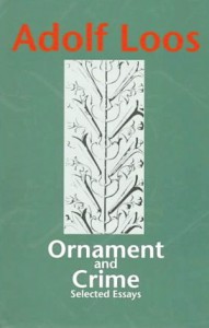
There are many great book to dive into like this famous publication “Ornament and Crime” (1908) by Adolf Loos, produced in the name of ornaments, at the birth of modernism.
The forms used in the type ornament or indeed in any kind of ornament, may be based upon, but should not be imitations of nature. All ornamental units are derived from one of two sources. they are obtained either from natural forms, such as plants, animals, fish, etc., or from forms not directly traceable to nature, such as the elemental geometric forms– straight and curved lines, triangle, square, circle, etc., and their combinations.
Well searching for these buggers is the thing, you type in on your computer [ornaments], you’ll find some ornaments because crafting is so in and do it yourself, and among these you find some of the type ornaments or sites that you can buy a certain font that is ornament based that’s great, but that is not the point. (kind of.)
And for my search I typed these, typeface ornaments, printers ornaments, dingbats, Ornaments. I thank the search of “printers’ ornaments”, gave me this following site that is gold. (click image)
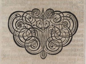
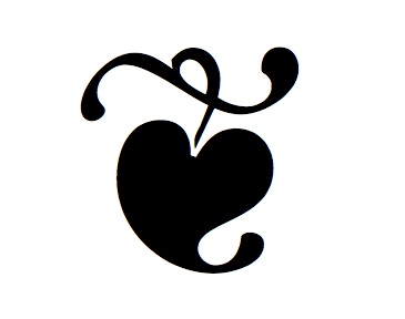
Cause it has various names associated to it, printers’ ornaments ‘cause it is a group of printed design elements — include typographic fleurons [x], dingbats, headpieces, tailpieces, scrolls, trophies, lunettes, calligraphic and heraldic devices, cupids and wreathes. So your search can be broadened.
The Printers’ ornaments have been around since moveable type printing starting from the 15th century. And they were used to decorate and fill in page space, give the end of a chapter or of the book. The given site goes deeper in the sense of printers and the woodcut motives and such.
We know that the ornaments give importance to the texts that surrounded it, when you look at it, it can even be an illustration to the text, or have nothing to do with the text, which is in most cases.
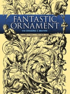
The Old Ornaments or earlier ornaments are majestic and powerful, you must love the detail check out this book:
Fantastic Ornament: 110 Designs and Motifs (Dover Pictorial Archive) [Paperback]
Michel Liénard (Author) Surprise!
As you can see the earlier ornaments are very fancy in a way and quite detailed, but the newer ornaments that are very well known are quite the opposite. Being very simple and catching your eye with there boldness.
Zapf dingbats, Webdings, Wingdings Poppi Font, Fella Parts there are more I’m sure…
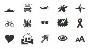
In the preparatory course we had to make our own dingbats, we had to take pictures of what objects, places or things, that make your country knowable I believe… in my case it was Aruba, and from those pictures you had to make your simplified dingbats, the more simple the better. If you can still see it from afar it’s there. One example:
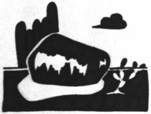
And the simplicity cleanness of these ornaments make them what they are, though different to the earlier days you don’t see them being used as there predecessors where, because a clean letter is more presentable. And all these fall in the category of a font, you can download them free or with a fee, like these Bodoni ornaments & Soupirs and you can just search the web and find them like many others. The Soupirs; (This ornamental font family is the result of a long collect through the streets of Bordeaux. From 1489 motifs collected, 310 were chosen to compose Soupirs.) these fonts are in the ornament style and can be bought for $100 for the collection of 5 fonts.
In some books you still find the closing of a book with one of these typeface ornaments.
These ornaments change the letters of the alphabet to symbols, and symbols want your attention. It’s almost like a secret code.
But what are the dingbats used for?
Well the meaning of the word might give an answer to that:
dingbat |?di ng ?bat| informal
noun
1 a stupid or eccentric person.
2 a typographical device other than a letter or numeral (such as an asterisk), used to signal divisions in text or to replace letters in a euphemistically presented vulgar word.
ORIGIN mid 19th cent. (in early use applied to various vaguely specified objects): origin uncertain; perhaps based on obsolete ding [to beat, deal heavy blows.] Sense 1 dates from the early 20th cent.
The shapes and images found in dingbat fonts make them especially useful in logo design or as icons or symbols in newsletters, books, brochures, or other types of publications.
Some symbols work fine as is needing nothing more than resizing to fit your layout. You can access many of the dingbats by going to the Symbols (Word) or Special Characters (Pages) in your writhing software.
Here is a link to: 5 Favorite Fonts with Hidden Type Ornaments – Minion Pro, Adobe Caslon Pro, Warnock Pro, Zapfino and Chaparral Pro. Between my searches on the PC I found a book, but to my luck couldn’t find it by searching again but I did save it in my favorites/bookmarks. Here is the link, this book is all about and the title says it all:
“Modern type display and the use of type ornaments”
Coming back to the question Why use dingbats or ornaments? This book gives a pretty good answer, I chose the Chapter 7: The Design & Combinations of type ornaments (page 94)
- Well for the answer to my previous question is this page: 96, line 9 or 16. You can read the short or the long version.
- Starting from Chapter 7 thus the first part gives you the purpose of type display & ornaments, what it’s based upon and you could say tips for creating your own ornaments. (Pages 94- 95)
- Second section of page 96, starting with “The principles which…” is about Construction of ornaments,
- part of it reminds me of the Kaba Ornament by Bram de Does
- continuing to page 97 and the construction of the ornaments, on this page the new section is about the printing method and various ways of placing the unit of an ornament for example:
- Inicials
- Single Ornamental Unit
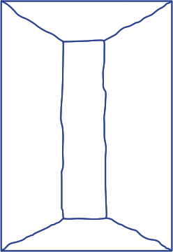
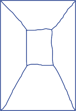
- Border (click images)
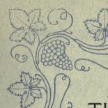
- Diaper or all over patterns
(again with the case of Bram de Does and the Kaba Ornaments)
With the subject ornaments the possibilities are endless and the information as well. I hope with my research I covers some part of it.
