*Latent Stare* exhibition guide cover by Saul Steinberg
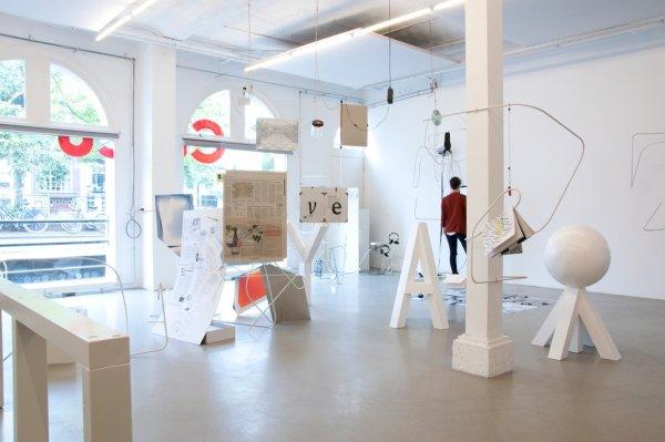
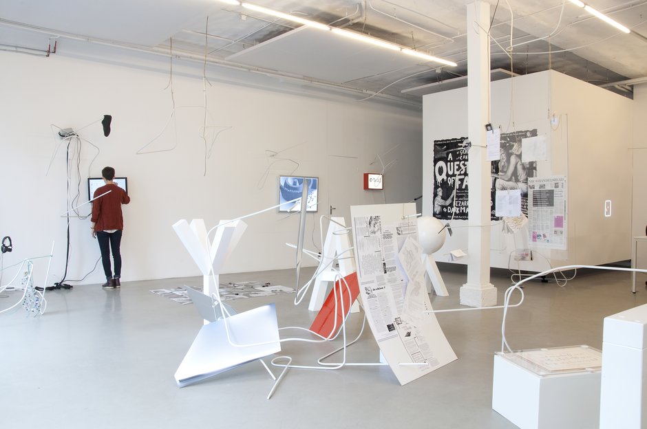
David Bennewith (who is born in 1977) is a graphic designer from New Zealand living in the Netherlands. He has a small design studio named Colophon (since 2007) which focuses on graphic and type design. He works on both commission-based and non-commission-based projects as well as research-orientated. He has been working as an advising researcher at the Jan van Eyck Academie design department (since 2010) and is currently teaching in the graphic design department in the Gerrit Rietveld Academie. David Bennewith doesn’t want to call himself the curator of the *Latent Stare* exhibition, but the organizer. The exhibition is a project that explores the practice, methods and messages of type design. The exhibition was open from 8 July – 30 September 2012 in Casco, Utrecht, but had also been set up in the design department at the Jan van Eyck Academie, Maastricht (in 2010).
To begin with I had to research the title because I didn’t know what Latent Stare meant.
*Latent Stare*, definition:
la·tent /?l?tnt/ :
1. Present or potential but not evident or active: latent talent.
2. Pathology In a dormant or hidden stage: a latent infection.
3. Biology Undeveloped but capable of normal growth under the proper conditions: a latent bud.
4. Psychology Present and accessible in the unconscious mind but not consciously expressed.
stare /ste(?)r/ :
So I guess a *Hidden Gaze* would be close to a synonym.
I visited Casco with my class and teacher to see the exhibition and listened to David Bennewith, the organizer-not-the-curator of the exhibition, explain some of the works. Unfortunately I couldn’t really follow what he said due to the strict programme that day which didn’t include any breaks to refill the students’ brain energy and empty stomachs. So all I could think about was food. Type design hasn’t got much in common with food. What did happen though was I paid a lot of attention to David Bennewith’s New Zealand accent. *Latent Steeeer*. I started thinking about how interesting it would have been if the exhibition were about his accent and not only the letters of the English alphabet. How boring is it that even if you speak with this amazing accent you still have to write the same way as all the other accents.
As I started searching for research material about the exhibition I remembered his accent and discovered that his nationality does matter. David Bennewith wrote a guide for the *Latent Stare* exhibition. And while reading it I discovered what interested me the most about himself and his exhibition: That I don’t understand it. He writes very complicated texts!
I started thinking more and more about why David Bennewith tries to explain his exhibition in such a complicated manner. He uses a massive amount of long descriptive sentences with brackets, parentheses, commas, dashes, etc. Furthermore, his writing includes a lot of big empty words which the reader cannot connect with. An example from the Foreword of the exhibition guide:
I’m not saying that I don’t understand what he writes at all, but it takes me four times to read every sentence. 4 times! I found it very interesting how a person who’s so interested in written communications (which type design is) can make it so difficult for us to understand such a simple topic. Did he do it on purpose?
The exhibition guide is written in a typeface called HelveticaBothersMe v2 and is by Roman Gornitsky, the man behind the exhibition guide’s design and layout. It’s simple to understand. No complications. Therefore it’s easy to read the typeface, but in the case of the exhibition guide, difficult to read the text.
And then I discovered that some of the exhibition itself includes the exact opposite of what I have just explained. That is: a typeface which is difficult to read but the text can be as simple as anything.
|
Typefaces are all about communicating through words with a certain look which affects the way the message of the words is communicated. An example: the sentence “I just went shopping” written with blood gives us a completely different message than the same sentence, “I just went shopping” written with flowers. So the appearance of the text affects the message. David Bennewith puts it in a similar way in the Foreword of the exhibition guide (but less comprehensive in my opinion):
“The motivating concept behind this *Latent Stare* exhibition is the suggestion, exploration and illustration of the idea that a typeface, as a systematic device and as a (digital) product, is something that carries or projects a meaning (into civil society) beyond commercial – antecedent and subsequent aesthetic – imperatives and derivatives.”
So there are two aspects to the message: the words and their visual appearance. This sometimes leads to the appearance being more important than the words in communicating the message. I can’t be the only one who notices that when a typeface becomes so… lets say “interesting/artistic” it becomes harder to read. A good example is Ji Lee’s Univers Revolved (2003). (Psst, click the link, it’s very interesting!) He takes Adrian Frutiger’s typeface Univers (1953) and makes it 3D. And it’s almost impossible to read the letters. Almost.

READING IS FUN!

WAKE UP!
Can you read it? It’s not so easy – yet the text is so simple! If you couldn’t read it, Ji Lee explains the logic behind the typeface through pictures on his website (same link as above). When you understand the logic it becomes much clearer to read.
Here’s another example where the text and the appearance are intertwined. Together they make the message a lot stronger. It’s not a work in the *Latent Stare* exhibition, but describes very well what I mean. It’s a poster by Simon Hipgrave:

We are Water
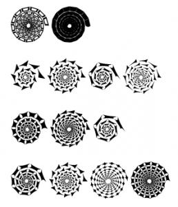
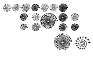
Sometimes the typeface is even so complicated that the words are impossible to read. Luc Devroye designed a typeface that includes only spiral forms, or shell-forms: Les Escargots de Suzi. It’s completely incomprehensible.
My toes are cold
Of course it still gives us some kind of a message, but not anymore in words. It’s entirely the visual aspect that projects the message. Then why do type designers stick to the very strict medium of words? Why don’t they just draw what ever they want that gives us the same message? Would it make any difference if there were no letters behind the shells? If it just randomly looked like this:
aldkjdsooiefjkdlijpe
Those are my thoughts about how you can communicate through the medium of words. Do you understand the message by looking at its visual appearance, or do you simply read the words? The interaction between the two affects the outcome and makes us think what message it carries.