Skip to Content Skip to Search Go to Top Navigation Go to Side Menu


"tools" Tag


Subordination to the tool


Friday, February 19, 2016

« Biff » is a typeface, created in 1999 by Swedish designer Jonas Williamsson for the Lineto type foundry. Jonas Williamsson is part of the art and design collective REALA.

“Biff” is a font based on the aesthetic of the early (80’s-90’s) NYC graffiti, the description of the font on the Lineto website mentions in a direct way the throw-up graffiti style as main reference.

typo-biff.jpg
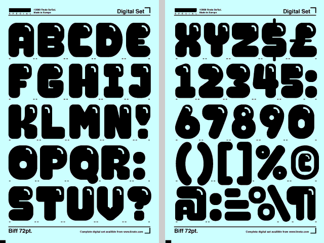
BIFF - by Jonas Williamsson

Big, simple and round letters were very common at that time, when the material available and the circumstances it took place in did not allow graffiti writers to do complex and precise pieces. Before it became the well documented worldwide culture it now is, graffiti started as a way for young uneducated urban populations to leave a trace of their existence or for gangs to mark their territory. Subways became the main vector of this « street signalization » because they travelled the city, passing from a neighborhood to another, going from the projects of the Bronx, to the wealthy streets of the Upper West Side.


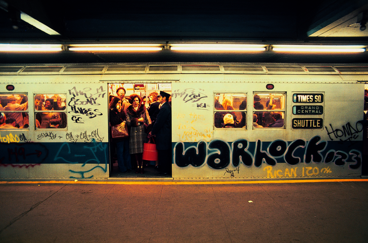
80's graffiti on NYC's subway

This local phenomenon has been well documented at the time (1983) in the famous movie “Style Wars

In this context, the visibility and the ability to be easily read and recognized while using basic high-pressure spray-cans and painting fast in order to avoid getting arrested was more important than a proper styling of the letters, giving birth to the « bubble » style, also called « throw-ups ».

8
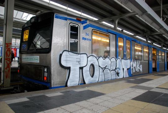
Throw-up style nowadays

Hand writing and drawing symbols are very ancient and codified practices, present for thousands or more years in the Western countries as well as in Asia or in the Arabic world. In Europe calligraphic handwriting based on the ancient Greek and cursive Roman scripts developed in the Middle-Age (around 600 AD) by Monks, using tools such as brushes or calligraphic pens on parchment, which allowed the writer to give a lot of contrast to his letters (switching between more thin or thick lines within the same letter). These tools and the calligraphic use that was made of them gave birth to Gothic typefaces, that can be recognized by their large amount of angles and ligatures. The first bible Gutenberg printed was made using Textura characters (also called “Blackletter”). Although cut from wood the letters still resemble hand writing. Gutenberg even enhanced that feeling by cutting the letters with small variations.


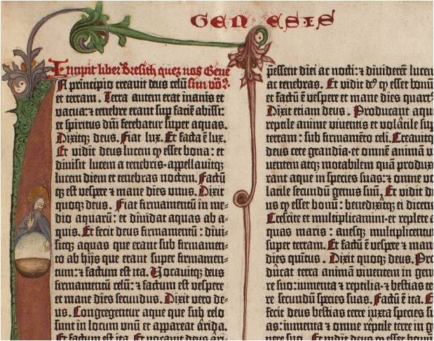
Detail of Gutenberg's bible
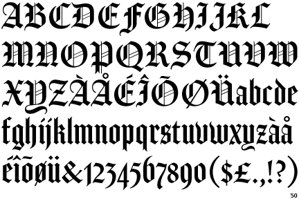
Amador
Textura Gothic Font

At the end of the Twentieth century, while New-York’s graffiti scene was getting a lot of attention from the medias and artistic world, influencing the arrival of similar movements (in style and in attitude) all around the world (especially in European capitals such as Paris, London or Copenhagen), writers in Sao-Paulo started developing a singular approach of this practice. Influenced by the artworks of heavy-metal bands coming from the West, they reinterpretate these Gothic typefaces (which are less and less used all around the world, exception made for these confidential subcultures) by using a mono-linear tool (spray paint) that does not allow any variation in the thickness of the line. Even their approach of graffiti writing and tagging is different than in New-York where it was all about the signature.
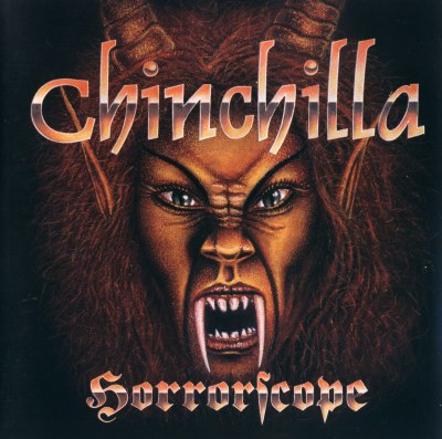
11879
Heavy metal artwork

Sao-Paulo writers (also called « Pixadores ») are closer to a classical writing logic, rather than a signing logic, copying an ancient font and paying a lot of attention to the space between letters and lines. The surfaces they choose to write on are also quite peculiar. By climbing and risking their lives, the Picadores draw their letters in a systematic and performative way on the faces of the tall buildings and towers of the city, creating impressive compositions, each group or individuals passing one after the other on a same spot.

In the same way “Style Wars” documented New-York graffiti scene, a movie like “Pixadores”  is a historically significant trace of Sao-Paulo’s writing phenomenon.

285382878_4fea6c7180_b
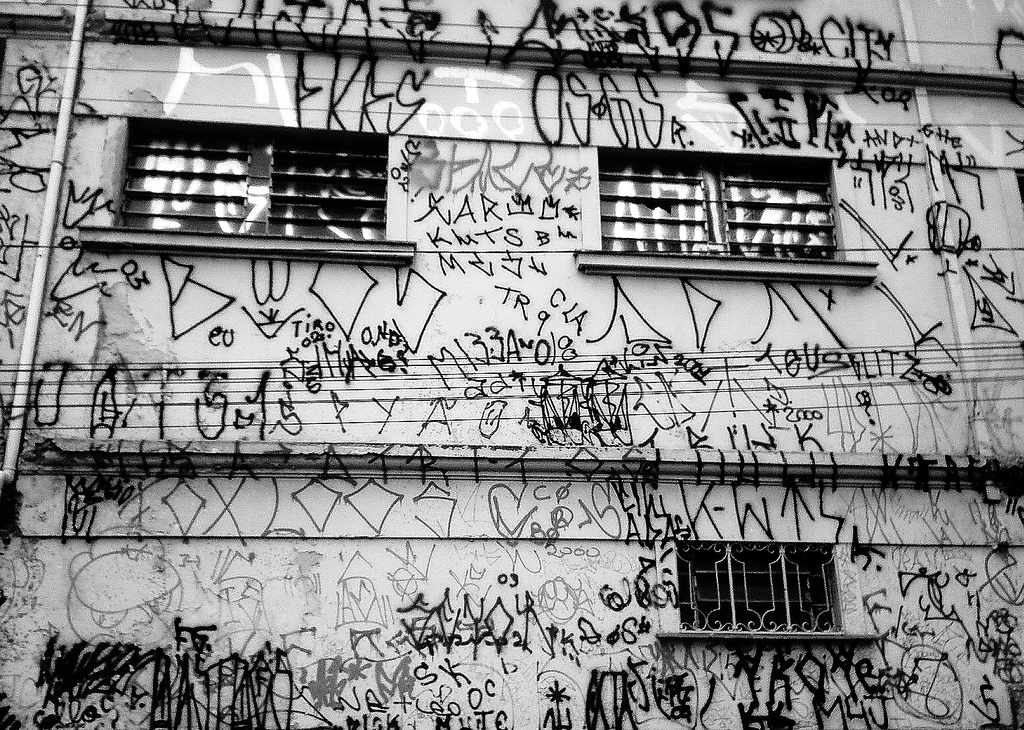
Tagged wall in Sao Paulo

Nowadays, typography is still developed based on classical calligraphy and Latin capitals, using the shape and contrast of regular calligraphic pens, while the worldwide writing practice is mainly made using mono-linear tools like BIC pens or round-tip markers. This gap between a common contemporary behavior and the survival of this old way of dealing with typography is very real.

A typeface like Gerard Unger’s « Flora » however, is an attempt to approach typography in a more contemporary way (the letters are based on his own hand writing). The website myfonts.com also released an interview with Gerard Unger, a dutch designer who studied and taught for a long time at the Gerrit Rietveld Academy. More famous typefaces are designed based on this more contemporary technique of writing like Din Mittelschrift [x] or even Helvetica rounded [x]

handmade-bic-textura

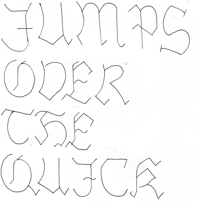
The above handmade transformation of a classic fractur and a textura letter type with my Bic pen illustrates clearly what happens when old calligraphic letterforms are re-written with modern writing tool [x]

BREAD


Wednesday, May 13, 2015

I spent approximately 3 months doing intermittent research and experiments related to bread making. I looked a lot at the process of making bread, the associations and relationship that we have with bread and tried to think about bread making in a different way from what has become such a stable and set way of working with and interpreting bread. This all sounds a bit silly, and in a lot of ways it was – one of the conclusions I came to was that because bread has been such a common practice for such a long time that the way that it is done has been refined so much that it does not need a design student to come along and ‘re-invent’ it. When I came to this realization in many ways it opened me up to experiment more and in different ways without worrying about the experiments having any particular meaning or significance.

Punch

I started my project by getting up at 4 in the morning and spending a few hours watching a professional baker work and talking with him about bread and baking. I was amazed at how he seemed to always know exactly what needed doing next, he almost never paused to think about what the next thing to do was. A good moment was when I had just arrived, he was pouring out some walnuts from a large bag into a bowl and one dropped on the floor; thinking to be helpful I picked it up and after a pause of not knowing where to put it I set it down on the corner of the metal work surface. Issa instantly picked it up and put it in a small bowl lower down and gave me a bit of a smiley but ‘what an idiot’ look which was fair, I hadn’t considered the hygiene level in a professional food environment!

P1110728

One thing that I particularly liked about watching the baker work was the scoring of the bread before it goes into the oven. I originally thought it was just an aesthetic thing but it is an important element as it allows the bread to rise properly and cook more evenly, by scoring in a controlled way it also means the bread does not just split in random places. As a result of these thoughts I decided to do a small workshop with 4 of my class mates where I provided them with a piece of dough each and a razor blade and encouraged them to form their dough in whatever way they wanted and to try avoid the conventional way that bread looks. It was a fun experiment and brought a diverse range of results which I think pose an interesting question to how we all have a very set way of what we expect bread to look like and how it can be altered.

P1110754 P1110761 P1110784

As a continuation from that workshop I thought again about the lack of experience and in particular tactile experience that we have with bread even though most of us are so familiar with it as the finished product. For my next experiment I decided to teach a friend of mine who has very little interest in cooking/baking and virtually no experience in bread making but eats bread almost every day how to make bread.

Having watched a professional at work and been inspired to go and experiment with baking myself I wanted to pass on the experience that I had had onto someone who was unlikely to have experienced it before. I guided my friend through the simplest bread making and talked to him about his connection, or lack of it, with bread. As I am just learning myself it was enjoyable to guide him though it in an amateur way and work certain things out together at points and the discussion was entertaining. I was not looking to inspire him to become a regular baker but just to share the experience of making bread and hope that it would change his relationship with the thing he eats so often.

I also enjoyed the extreme amateur situation that we were doing it in, we did it in my tiny student accommodation kitchen and improvised a lot of parts where we didn’t have the space/equipment that a professional would use. This extension of the amateur level that we were baking at was something I enjoyed particularly because it shows just how simple bread making can be.

These are just a few examples of experiments that i tried out during my process, the project is ongoing and now I bake my own sourdough bread once a week and continue to experiment with the shape and ways that we look at and use bread.

Scan 23-cropNeckSandwich

Scan 25

Jonathan Puckey en (de grafische) Tool


Monday, November 5, 2012


Links, foto bewerkt met Q*bertify. Rechts, originele foto van de band “Tool”.


Jonathan Puckey is een vormgever gevestigd in Amsterdam. Jonathan maakt deel uit van Studio Moniker, en draagt bij aan Conditional Design. Conditional Design is een samenwerking als ook een manifest waarin zij onder andere stellen: “We search for unexpected but correlative, emergent patterns”. Veel van het werk dat zij produceren is hiertoe te herleiden, het laten ontstaan van patronen uit gestelde regels. De systemen die zij creëren gaan uit van procesmatige ontwikkelingen zonder gefixeerde eindresultaten. Vanuit een gecreëerde setting kan een patroon oneindig doorgaan en veranderen. De regels die zij opstellen zoeken naar de mogelijkheden om informatie te visualiseren en het oog te behagen. Een voorbeeld hiervan is de site van het SNS Reaal Fonds, waarbij zij de uitgaven van dit fonds omzette in metaballs.

Een terrein waarin Jonathan werkt en onderzoek doet zijn tools. Dit zijn tools in de brede zin, van computersoftware om foto’s te bewerken tot gereedschappen om lettertypes te ontwerpen. Naast dat Jonathan deze tools gebruikt in zijn werk heeft Jonathan samen met Jürg Lehni het platform Scriptographer.org opgericht. Dit project, dat tegenwoordig verder gaat op Paperjs.org, probeert als een platform voor het ontwikkelen van nieuwe tools te fungeren. Over het ontwikkelen en gebruiken van tools nam ik van Jonathan het onderstaande interview af.


Zijn (type) tools een recent fenomeen, hoe ben jij begonnen met creëren van tools?

Ik weet zelf niet hoe lang het al gebruikt wordt. Zelf programmeerde ik eerst generatief, waarbij na op de knop gedrukt te hebben ik als maker geen invloed meer had. ik Als ontwerper schrijf je de code die vervolgens volgens een bepaald patroon een vorm of de vormtaal genereert. Op de Rietveld Academie ben ik het programmeren als de basis voor het vormen van gereedschap gaan zien, waar je mee aan het werk kan gaan. Hierdoor ontstaat een tweeledig maakproces waarbij je eerst de tool ontwerpt, waarna je met de tool verder kan ontwerpen. Je hebt hierdoor twee momenten van invloed.

Als jij zelf een tool maakt en deze vervolgens gebruikt, waar ligt dan het zwaartepunt van de creativiteit?

Dit is een combinatie, meestal ben ik tijdens het programmeren ook aan het gebruiken. Door tijdens het programmeren features te maken kan ik vervolgens de tool verbeteren.

In hoeverre heeft de gebruiker werkelijk invloed op het functioneren van de tool, als de voorwaarde al gegeven zijn?

Dat is per tool zeer verschillend, sommige tools zijn al helemaal af als je ze hebt gemaakt. Het werk wat je ermee doet uit nog wel wat je wil uiten, maar de tool wel de overhand heeft in het vormen van de uitkomst. Bij sommige tools is dit echter nog erg open, de gene die werkt met de tool heeft dan een sterkere invloed op het eindresultaat, zelfs sterker dan de ontwikkelaar van de tool. Dit is altijd een balans, de gereedschappen waar niets aan toe te voegen is door de gebruiker zijn dan ook de gereedschappen die ik niet weg geef, als de gebruiker weinig invloed heeft is het delen minder van belang.

Wat is voor jou het criterium waar een goede tool aan moet voldoen?

Dit is erg afhankelijk van de gebruiker waarvoor de tool bedoeld is. Persoonlijk test ik de tool altijd uit door me af te vragen: hoe lang kan ik er mee werken, kan ik hier nog weken mee vooruit? Als dit het geval is, dan is het een goede tool, want dan heb ik het blijkbaar niet meteen door. Een goed gereedschap is ook iets waar je heel lelijke dingen mee kan maken. Waar het aan jou is om de juiste input te leveren, zodat het er toe doet hoe jij de tool gebruikt.
De tool moet sprekend zijn, op het moment dat de tool niet spreekt betekent dit dat het idee nog te vaag is. Dat het idee nog niet genoeg gereduceerd is tot zijn essentie.

Heb je voorbeelden van tools welke je als mislukt ziet?

Een tool waar ik veel tijd in heb gestopt maar nog nooit iets mee heb gemaakt is Ribbon Folder. Ik was gefascineerd door het idee dingen te kunnen vouwen. Meer specifiek; hoe je als je iets vouwt, vervolgens die gevouwen hoek kan uitrekenen? Als je een lijn maakt door punten te plaatsten met de hand, zit in de vorm van de hoeken die ontstaan een bepaalde logica. Door op een lijn te drukken kan je op verschillende punten meerder vouwen creëren. Dit heeft me veel tijd gekost, maar toen ik klaar was deed het me eigenlijk niks. Het eindresultaat nodigde me echter niet meer uit er iets mee te gaan doen.

Ribbon Folder

Worden jou tools ook door anderen bewerkt, heb je hiervan voorbeelden?

Wat was de motivatie om de tools gratis aan te bieden op Scriptographer.org en paperjs.org?

Voor Jürg Lehni was de rede om Scriptographer.org te starten om de discussie over gereedschappen te beginnen. Hij wilde hiermee de vraag stellen waarom we allemaal dezelfde software gebruiken, bijna iedereen gebruikt Adobe software. Scriptographer.org confronteert de gesloten mentaliteit van Adobe met een ander perspectief. Daarnaast was er de pragmatische reden dat Jürg deze tools al bedacht voor zijn werk.

Zijn er zaken die als inspiratie fungeren voor het vormen van tools?

Van nature hebben wij (Studio Moniker) een natuurlijke fascinatie voor techniek, waar we allemaal mee bezig zijn. Als ontwerpers zijn we dan ook nooit bezig om afgewerkte eindproducten te ontwerpen. Bij het ontwerpen van bijvoorbeeld een poster heeft het onze interesse om een systeem te ontwikkelen waardoor de poster uit zichzelf gaat groeien, hierdoor ontstaan organische processen die niet volledig te controleren zijn. Met een gereedschap controleer je in zekere zin nog meer. Maar door te beginnen met limiteren door het stellen van een omgeving, kan je vervolgens binnen deze omgeving volledig vrij ontwerpen. Hierdoor voorkom je dat je gaat emuleren, je doet nooit alsof je principes hebt hebt bedacht die je moet vasthouden of imiteren, de ontwikkelde software werkt als het goed is uit zichzelf.

Door regels te stellen is in het eindproduct voor iedereen het spoor te herkennen in het eindproduct.

Het meest optimaal is als die zoektocht zicht in het eindproduct zichtbaar aanwezig is. Zoals bijvoorbeeld in het Delauney Raster. Het Delauney Raster vormt beelden om tot backtographics, waarbij het gebruik maakt van het Delauney Triangulatie (http://nl.wikipedia.org/wiki/Delaunay-triangulatie). Er is al veel gedaan met Delauney Triangulatie in wiskundige software etc. Normaal word de punten-set waaruit de driehoeken ontstaan gegenereerd, ik heb uitgeprobeerd of ik dit handmatig kan controleren. Ik vroeg me of; of ik kan doorhebben hoe de driehoeken zich vormen? Dit bleek te werken, waaruit het idee ontstond om hier inzichtelijke software voor te programmeren.
Ik had het gevoel dat hierin iets zat, door eerst te doen en achter te rationaliseren ontstaan interessant vormen.

Delauney Raster

Heeft het maken van tools een belangrijke plek gekregen?

Met name webdesigners zitten dicht bij de sourcecode, dichter dan andere ontwerpers. De overgang naar digitaal heeft veel veranderd, met name webdesigners blijven vaak binnen het domein van de machinale software. Veel van de programma’s simuleren dan ook wat daarvoor kwam. Het is raar om te blijven steken bij dezelfde programma’s. Vroeger konden fysieke gereedschappen makkelijk worden aangepast. De schroevendraaier die mensen vroeger hadden, ontbreekt nu af en toe. Door platforms te vormen kan meer richting gegeven worden.
Ik vind daarnaast dat de mens een belangrijke plek in het proces moet behouden. Veel programmeurs vinden echter dat de computer zelf creatief is. Deze creativiteit is echt alsof, de ‘randomness’ van een computer zorgt ervoor dat de posters die een computer genereert alle zo random zijn waardoor de verschillen generiek worden. Wij zijn echter op zoek naar waardevolle verschillen, die betekenis uitdrukken. De input van de ontwerper zorgt uiteindelijk voor de betekenisvolle uitkomsten.

Karl Nawrot, fascination for the In-Between


Monday, March 7, 2011

Typefaces always seem to be facing the wind, two feet on the sheet of paper, unmovable. Like a silent army, arranged according to there ranking, there are ready to take a new formation. This traditional and almost absolute arrangement tends to make us forget how those typefaces got there, what is there personal journey, what and even who shaped them like that.

Karl Nawrot seems to be privileging this particular journey i am talking about. So to say, his typefaces carriers are far from being all traced beforehand. Moreover, he seems to be having even more fun in creating devices and means to form those letters than in the final presentation.

By using tools he creates himself, he lets the door ajar to imagination, not exhibiting the letter as a final assertion but as a possibility. Stamps, enigmatic stencil disks, collages celebrate as much the process as the result.

Thereby the designer does not hesitate to present those tools, such as the stencils disks, also through a series of posters, respecting somehow the presentation of typefaces. By creating a parallel in the presentation, he builds up a clear bridge between the making and the result, putting them on the same level of importance.
Through this interstice he offers us, one can let his imagination grow about what could be the final arrangement.

But is it not the definition of children games ?Making use of the possibility of the material and playing around it more than gathering all the forces to the final result. Indeed he does not only create his own tool, he also documents the process by making use of stop-motion movies.
Once again the use of this device to present his work makes it really fun. The videos or clip-arts that can be found on his website, www.voidwreck.com , are, according to me, by no means instructions for the proper use of those tools but once again a celebration of its inner-possibilities.
Thereby, in a interview he gave to the blog Manystuff.com in January 2011, he gives his definition of what a good design is. He declares : ’’A good design gives you the feeling of a piece stuck between past & future.’’

Playfulness is definitely the word I would use to describe the work of Karl Nawrot. However focusing on this aspect would maybe undermine the importance of geometry in his creations. Indeed if there is space for game and ‘’abruptness’’ in the realization, there is a clear rigor in the fabrication of the tool. On the one hand the Stamps Box conceived in 2005 and 2006 has a clear connection to childhood but on the other hand the rubber stamps consist of drawn geometrical patterns of the same size. Even if Nawrot limits himself to four simple geometrical shapes (rectangle, line, triangle and circle), he succeeds in generating 150 different stamps : the result of an intense research in exhausting the possibilities and combinations of shapes.

Still Karl Nawrot is not only experiencing with typography, he is also an illustrator but those two interests tend to meet again through the approach he uses.

Indeed the letters he draws seem to peel themselves off, falling into pieces. But the movement could also be interpreted in a reverse manner : the letter getting slowly their final shape under our eyes. Once again Karl Nawrot creates the ambiguity, describing physically this in-between he invokes below, ‘’between past and future’’.

Background :

Karl Nawrot attended the graphic design school Emil Cohl in Lyon, France. He was accepted at the Werkplaats Typographie in 2006. He is now established as a graphic designer and typographer in Amsterdam where he lives.

Research David Keshavjee & Julien Tavelli


Sunday, March 6, 2011

David Keshavjee (born 1985) and Julien Tavelli (born 1984) are two Swiss graphic designers/typographers, they both studied at Ecole Cantonale d’Art de Lausanne (ECAL) They where one of the winners of the Swiss Federal Design Award with their graduating project, ‘Using Tool,’ in 2009. They just made a pedagogic booklet at the Federal Office of Culture in New York, Acid Test. In collaboration with Körner Union and Tatiana Rihs they made offset cmyk experiments. Later they printed a reproduction of that handmade booklet, “Les impressions magiques“. They are part of Maximage Société Suisse, an exploration in the field of emotion and technology.

Their Using Tool project is, I think, the most interesting thing to discover about them, it explains a lot about how they work and how their poster series for music concerts where build up. The posters where published in Wallpaper and in the book ‘Typeface as Program,’ witch was published by Ecole Cantonale d’Art de Lausanne (ECAL) Especially the last one is very related to their process and what they are designing. They also explain in this book how Keshavjee and Tavelli approached their works by using half digital half manual tools during the process.

They started in their design process of the posters by first programming a script, inspired by a workshop of Frederik Berlaen on ECAL, that could automatically create a system of characters by using the already by Keshavjee and Tavelli designed ‘o’ and ‘n.’ Those two are the essence of the typeface, so with this characters the script is able to create the other characters of the alphabet. Keshavjee and Tavelli like to keep the random and uncertain factor in this system and in their font by giving the computer the control of the typeface. I think the script also helps them to design the first layer of the poster, the digital printed part, the black thin lines. When their computer created the characters they use a machine next to the computer that cut the letters out of a 2mm thin wooden plate what is still very raw then, but they do the final touch by hand. After they manufactured the wooden characters they cut pieces wood all the same size to glue the 2mm thin wooden characters on it. After they did this crucial step, they can think and work with the spacing of the letters, and build up the composition. The last step for them is to combine the background layer and the composition of the typography, the wooden characters into the final poster.

I think with the combination of manual and digital processes that are repeated at each step, from the production and application of the typography until in the composition and final print, Keshavjee and Tavelli create a refreshing and inspiring result of the raw woodcut with the smooth digital print. They work according to the principle that the means influence the form and that new forms of expression in graphic design can be created by combining different tools. These ideas are applied to the poster series as well, it’s the essence of their project. The posters are also published together with the thoughts about this series and an interview where they explain more in the book, ‘Typeface as Program.‘ There is also an interesting article on boston.com about the swiss designer thoughts of typography by Cate McQuaid.

For me they work a bit like typographic engineers I would say. They really are working with developing scripts and systems to help them approach typography in another way, not very usual and practical way, but an interesting one. You could think if you read about how controlled they work in a way, that they are probably to much controlling their work. But their prints are very open for unexpected accidents within its system, there is a lot that can go wrong, all trough this process the accidents are creating new opportunities in the creative process of their typographic experiments, that’s a good value of their work I think. They also always start projects by experiments. It could be interesting to learn and see more of the projects of David Keshavjee and Julian Tavelli, and see how they treat their project during the process of designing typography.


Log in
subscribe