Skip to Content Skip to Search Go to Top Navigation Go to Side Menu


"sound" Tag


Herman von Helmholtz colour theory


Saturday, February 24, 2018

Hermann von Helmholtz was a German physician and physicist. He was born in 1821 in Potsdam, Germany and died in 1894. Hermann von Helmholtz was a pioneer in several scientitv fields, and made significant contributions. In the field of physiology and psychology he is specially known for his studies of the mathematics of the eye, ideas on visual perception of space and colour vision research. In 1851, Helmholtz became world famous, after his invention of the ophthalmoscope – an instrument that could examine the inside of the human eye. Together with Thomas Young, an English physician, he developed a theory of trichromatic colour vision. The theory assumed that the eyes retina consist of three different kinds of light receptors for red, green and blue. The trichromatic theory was quickly accepted, so Hermann von Helmholtz continued to study colour.

The colour diagram appeared for the first time between 1856 and 18867 in his famous manual of psychological optics. here, Helmholtz introduces three variables; hue, saturation and brightness, all which we are still using to characterize colour. These variables were chosen to correspond to the three parameters of sound, amplification, pitch and timbre. Helmholtz discovered that the only difference between sound and the perception of colour is that the eye cannot differentiate between the components of a mixed colour, while the ear can easily identify separate elements of sound.

Helmholtz was the first to demonstrate that the colours which Newton has seen in his spectrum are different from colours applied to a white base using pigments. He discovered how spectral colours shine more intensely and possess greater saturation(1). In the manual he also submits that James Clerk

Maxwell’s triangle Screen Shot 2018-02-05 at 09.56.41 
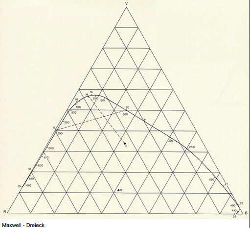
is too small to accommodate the saturated spectral colours, and that Newton’s colour spectrum neither did explicitly refer to trichromatic theory. In the colour diagram, the spectral

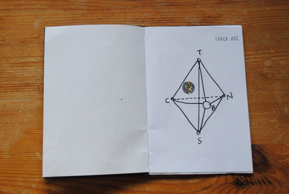
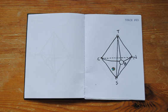
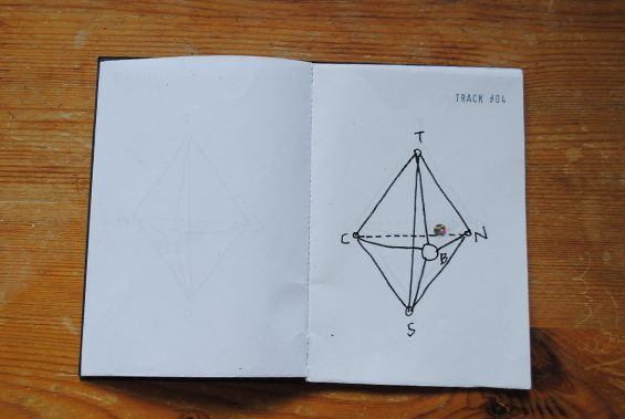
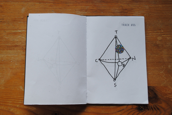
colours is arranged on a curved line Screen Shot 2018-02-05 at 09.43.54
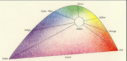
, to achieve a better understanding of their mixtures. In order to attain white, Helmholtz discovered that it did not require equal quantities of violet-blue and yellow for example. The diagram is instead arranged so that the complementary colours that required a bigger amount to obtain white, were given a greater authority. Helmholtz then did a modified version of Maxwell’s construction of the triangle, and arranges the colour diagram inside the triangle, with the spectral colours having varying distances to white, which lies in the center of the triangle.


Hardly readable – A graphic translation, the sound as a last abstraction


Sunday, February 21, 2016


A translation of roman letters into graphics and a translation of these graphics into sound. What happens if a language is changed into a system that we all have to learn new? A system that defines roman letters in new ways. Therefore a first abstraction into graphics and a last abstraction from the graphics into sound. Both, the individual graphics as well as the sounds can be connected and therefore they can create words in the level of language. To what extent is that still readable? Is our visual dialect able to understand that? And if we are able to read the graphics as new letters, can we associate them with new sound that is creating a virtual language that is not spoken?


AZART


AZ-art is about the art from A to Z by belgian Guy Rombouts. It is an alphabet translated into graphics. Each letter gets a fixed graphic. If the letters create one word the graphics create one cloud. That means that there are certain combinations between the graphics that are approximately working in the same way as certain combinations between letters in a font (space, connection etc.). Instead of one-dimensional strings the alphabet combines words as two-dimensional objects. With the use of different colours for each graphic the combination appears much stronger than a written text. If there appears a space that separates two words in the graphic translation it appears a second layer and therefore it becomes a third dimension when words create a sentence. The words are translated into new associations.


Writing Down And Reading Aloud


Questioning the system of a new graphic language means to make a connection to our understanding. How do we perceive things? How do we actually start learning to understand what we perceive? Being alive with the knowledge of speaking and listening, we learn our visual dialect as a second language. This second language is learnt by translation: writing down what is spoken and reading aloud what is written. Our roman letters are carrying petrified leftovers of a long historical development – connected to pre-alphabetic times. Therefore many people are questioning them for an efficient design. Also Chinese politicians and teachers were trying to simplify the logographic of the Chinese alphabet. What is a graphic translation about? In “Phonographic Translation” by W Haas it is explained that a worker in Tientsin needed half a year for learning the Chinese characters and he still could not remember them. These three characters represented just three works that he had to use every day. Chinese pupils have to learn the first One-Thousand Characters in primary school. Basically a contemporary graphic translation of a language is about the simplification of a language.


The AZ-art is about the transformation in two directions: X axis and Y axis


Every graphic is defined by an individual shape and colour. My description of the colours of the graphic alphabet is based on Goethe’s colour theory. I used the definition of red, blue, green and yellow and brought them in connection with the RGB-Values of each graphic.


blog blog2


blog3 blog4


blog5 blog6


blog7


Goethe’s colour theory


|||||||||| Because of its high dignity is is sometimes called crimson (even if this is actually drawn into the blue). By increasing the two poles (yellow and blue) to red an association, tranquilizers or gratification takes place. It gives an impression of seriousness and dignity and also of kindness and grace. Through a crimson glass one sees a well-lit landscape in a terrible light.

|||||||||| It is the color of the dark. It is a color energy and the highest purity a lovely Nothing. It seems to recede (the distant mountains can be seen in blue). It is pleasant to look at, there is a feeling of cold and reminiscent of a shadow. Although Blue rooms seem far, but cold and empty. Blue light is changing your mood into sadness. If blue is touched on its plus side it is pleasant.

|||||||||| It is the colour that is nearest to light. It has a serene, cheerful, gentle property. As gold it has a splendid and noble effect. It makes a warm and comfortable impression and in Painting it is used to illuminate. Howerver yellow is very sensitive and gets an unpleasant effect when it is dirtied or pulled into minus. Then it becomes the colour of shame, disgust and displeasure.


The sound as a last abstraction


As an outgoing sound I decided for the Wobble Bass with a 25% Filter Reso. Each graphic is based on this sound and is transformed in its visual appearance. That means that e.g. letter X is not transformed because it is a linear graphic. In its tone middle e.g. the filter frequency of letter N is transformed (30-90 Hz). The filter frequency of letter C is transformed (30-155 Hz) from the beginning to the end of the tone. Letter B is showing the strongest hearable difference. Because of its graphic the transformation of the outgoing bass has 4 high distances and 4 low distances. That means that the Filter Reso is 4 times transformed to 70% and 4 times to 0%. The filter frequency is 30.

Next to these 4 letters I also translated the 3 AZART- Options of a black, grey and white environment into sound. My research is ending with a playlist that I uploaded on SoundCloud. There you can find the sound of 4 single letters, the 3 environments and the combination of the 4 letter with each environment. These sounds are produced in a collaboration with Alexander Köppel (Exchange Student GRA – Inter-Architecture).


ON MATERIALIZING EXPERIENCE


Tuesday, April 1, 2014


Pierre Niviere and Lisa van der Breggen* talking together on the subject of materializing experience

'Think Inside My Box' movie


Each project that students initiate, makes them into temporary experts on given topics. Art & Design schools then become knowledge hubs where different expertise cross fertilize. By looking at what types of research students engage in, Designresearch and UnBornLab organized a 'workshop' to investigate design matters from a students' perspective.

Through a series of short video's students from both the Foundation Year and the DesignLab department share ideas, focusing on the temporary expertise gained as part of their projects, rather than the outcome. The workshop was articulated around one of their given assignments. Students were asked to develop a specific object or context to help focus or explain content.

The format is clear: two persons, discussions, filmed from above.
the space is : two stools and a table.

* Foundation Year


The London Supplementary Design Show


Friday, November 1, 2013


< LONDON DESIGN >


< CAREFULLY SELECTED FOR YOU >


17 Rietveld Foundation Year students visited London in the first week of October 2013 where they composed their own London collection of design highlights.

Items were selected from the collections of many renown institutes like the British museum, Victoria & Albert, The Design museum, Off-site ICA or galleries (The White Chapel, Ravenrow etc…..). What is interesting for us? What do we like and why.

Previous to this trip we did visit the permanent design presentation in the Amsterdam Stedelijkmuseum. Compared to the items we selected and researched there [project: Design in the Stedelijk-3], this show presents a personal comparison between that and those of the London institutes.

If you click on them a caption will appear –just as a in a real museum– presenting information and a personal reflection on why that item was selected.
Researching contemporary design we present this “The London Supplementary Design Show” as a mirror of our own selection motives, an imaginary online exhibition space with items carefully selected for you.

click on images to visit the exhibit


Spira-Ribb Westwood_T-shirt

no_angle_no_poise_tiagodafonseca_2 ChloeMeineck_music-memory-box GatewayRouter_redu

8_snow_white_wrist_redubrave-new-world-lamp_1helmet_cropped

Samoerai-armor Sottsas_London_Item_LeftSottsas_London_Item_Right RavenRow_poster_tadanori-yokoo

MarjorieSchick material 3d printer

selected by Wiebe Bouwsema WillyBrown_redu TrojanColumn_VAA G_Force_Cyclonic_James_Dyson


Why Not?


Wednesday, May 22, 2013


Choice, Cover, Sound. What can I find? Books, Visual, Design Why should I choose this one? Well. It wasn’t easy at all. But it was at the same time. operating 6 different words, which are never combining on the same title but can be easily associated with one single cover.
That was the idea. That was the choice. That was the start and finish point at the same time.
“Why not?” – that is the title for the third book I took from the library. The name that matches all of three chosen tags. If you start to Google it with "why not.." you will immediately have few options
Why not design,
Why not associates?
Why not" and "why not both".
You will also find website called WhyNot which propose "How to Use Everyday Ingenuity to Solve Problems Big and Small" or
Why Not Eat Insects? Or
Why not build more Schools Without Walls?”
Why not take up knitting again?

Sex and intimacy after 60: Why not both?
Why not kill two birds with one stone and send IRS to Gitmo?
Dogs on trains? Well, why not?
Why not be a naive?
Why not to swipe your girlfriend's skincare?
SO when I was googling in the library by hand, touching, looking for something special, taking, putting back to the shelf, searching and exploring and when I saw the perfect book for that
I had no more doubts – that was the right one.
That is funny, you don’t care actually what you will read about. Just simple choice of a book, as a subject, as a thing, as a piece.
Ask “Why?”, think “Why Not”? And take it!

Rietveld Library cat.nr: ?


Synesthesia As a Reason For Subjective Choice


Saturday, May 18, 2013

There is a Synesthesia exist.

As for information from the Wiki difficulties have been recognized in finding an adequate definition of synesthesia, as many different phenomena have been covered by this term and in many cases the term synesthesia (“union of senses”) seems to be a misnomer. A more accurate term for the phenomenon may be ideasthesia.

According to Richard Cytowic, sound ? color synesthesia, or chromesthesia is “something like fireworks”: voice, music, and assorted environmental sounds such as clattering dishes or dog barks trigger color and firework shapes that arise, move around, and then fade when the sound ends.  For some, the stimulus type is limited (e.g., music only, or even just a specific musical key); for others, a wide variety of sounds triggers synesthesia. I’d like to have it. How is it to feel the sound with the color, or drawing with the sound?

Sound often changes the perceived hue, brightness, scintillation, and directional movement. Someone can see music on a “screen” in front of his face. Deni Simon, for whom music produces waving lines “like oscilloscope configurations – lines moving in color, often metallic with height, width and, most importantly, depth. My favorite music has lines that extend horizontally beyond the ‘screen’ area.”

I pretended being an synesthet while I was touching hundreds of books on the library’s shelves. I would like to see in all of this pictures a sound. To feel that the title of the book I chose is not a trick, and design made by machines is truly loud and 3-dimensional. Is it?


Touchable sound


Thursday, April 11, 2013

Are you dying to get your hands on a book? How you can choose the only one from thousands titles on the bookshop shelves? To search books by authors you’ve enjoyed in the past? Isn’t it boring? Look for a “Keyword”. Does it really work like that? Imagine that you are in the restaurant ordering a dish you’ve never tasted. What’s then? You can explore the ingredients, take a look at the picture. But still you can’t smell it or  touch it. With the book – it’s not the same, actually. Real book has it’s own aroma, touching feeling and the sound. That makes it almost a dish you can try before you order and pay.

Narrow down your stack. If you would rather have book 1 over book 2, put book 2 back. Keep doing this. If you would rather have book 3 then book 1, put book 1 back, etc. Try to feel the quality of paper, the smell of typography, touch it as you choosing a fruit or music instrument. Fall in love with it’s cover, play on it, feel it’s life. Deep sound from book’s cover will make you want to take this book to your hands again and again and again. And it will not be quietly collecting dust in your house.

Touchable Sound [audio:https://designblog.rietveldacademie.nl/wp-content/uploads/2013/04/MZ000006.mp3|titles=MZ000006]

Rietveld Library cat.nr: 775.2 vri 1

From colour to sound


Wednesday, December 12, 2012

The CMN colour system was created in 1986 in Italy. It shows how colours change. How they can get brighter and eventually become white (bianco) or darker, thus resulting in black (nero). They can also become transparent (trasparente) or reflective (speculare). The CMN-86 colour system is about how colours appear, change and disappear. Going from dark to bright and from reflective to transparent, a specific colour can become very different, this system takes that fact into consideration, as the only one!

This system takes the shape of a tetrahedron, originally met in Plato’s geometrical ideas of colours. It can be combined with other systems in order to not only express the origins of the colours but also reflect the intentions of the observer. C is for “colori” an etymologically interesting word that means “something disguised and revealed”. In other words, something is taken away from white light (original essence) so that the object is revealed.

Synesthesia is a condition in which one sense (for example, hearing) is simultaneously perceived as if by one or more additional senses such as sight. Another form of synesthesia joins objects such as letters, shapes, numbers or people’s names with a sensory perception such as smell, color or flavor. The word synesthesia comes from two Greek words, syn (together) and aisthesis (perception). After some research I found out that synesthesia is divided in different types according to what senses are involved. The specific one concerning sound and color  is called Chromesthesia. I wanted to use that as a base for my work and try to find a way to combine this scientific fact with the colour system I’m working on.

Instead of imagining a color moving and evolving into the tetrahedron, let’s imagine a sound.

thus:
Color = sound
Bianco = high pitch
Nero = low pitch
Transparente = puissance
Speculare = delay

I first decided to work with sounds of everyday-life like opening the fridge, cooking, turning the light on. I wanted so see what could happen to this typical sounds within this new system.
These sounds were finally too complex and couldn’t really make the system clear and understandable, I preferred to use a really simple and pure sound and make it move in the system to reveal its logic. I made a book so, while you are listening, you can see where the sound is located on the tetrahedron and, therefore, grasp the system.

[audio:https://designblog.rietveldacademie.nl/wp-content/uploads/2012/12/1-track-011.mp3|titles=1-track-01]

[audio:https://designblog.rietveldacademie.nl/wp-content/uploads/2012/12/2-track-02.mp3|titles=2 track 02]

[audio:https://designblog.rietveldacademie.nl/wp-content/uploads/2012/12/3-track-03.mp3|titles=3 track 03]

[audio:https://designblog.rietveldacademie.nl/wp-content/uploads/2012/12/4-track-04.mp3|titles=track 04]

[audio:https://designblog.rietveldacademie.nl/wp-content/uploads/2012/12/5-track-05.mp3|titles=track 05]

[audio:https://designblog.rietveldacademie.nl/wp-content/uploads/2012/12/6-track-06.mp3|titles=track 06]

[audio:https://designblog.rietveldacademie.nl/wp-content/uploads/2012/12/7-track-07.mp3|titles=track 07]

[audio:https://designblog.rietveldacademie.nl/wp-content/uploads/2012/12/8-track-08.mp3|titles=track #08]

[audio:https://designblog.rietveldacademie.nl/wp-content/uploads/2012/12/9-track-09.mp3|titles=track #09]

[audio:https://designblog.rietveldacademie.nl/wp-content/uploads/2012/12/10-track-10.mp3|titles=track #10]

[audio:https://designblog.rietveldacademie.nl/wp-content/uploads/2012/12/11-track-11.mp3|titles=track #11]

[audio:https://designblog.rietveldacademie.nl/wp-content/uploads/2012/12/12-track-12.mp3|titles=track #12]

My project consists of the translation of a visual system regarding colour to a visual system regarding sound. The original CMN system shows how colour appears, changes and disappears,  from black to white, across reflection and transparency. This system is a way to apprehend a colour and its nature within a defined scientific tetrahedron-shaped space. Applying it to sound give us a way to approach sounds in a different angle, sounds can become autonomous elements of our environment.
Then, we could imagine to use this system on other matters like smell, touch, feelings, … and give a tangible and reachable reality to the unspeakable.

Signs and sounds – The way to communicate


Friday, October 26, 2012

If you talk about communication, you can not avoid Paul Elliman.

Paul Elliman is born in 1961 in the UK. He is a London based artist and designer, with works primarily focusing on communication and different ways of communication through language, sound and typefaces.

He is dealing with new looks and ways to use the written language. He has made a human alphabet, with people acting letters in a photo booth machine.


The original poster as Paul Elliman made it.

His work often involves collections of things. The largest project is his own font, “Found Font”, which is based on things from his everyday live. It is an ongoing project that already has been going for over 23 years.

(more…)

Multimediakunst


Thursday, January 19, 2012


Kunst, muziek en technologie smelten samen in installaties waarbij de interactie met andere elementen centraal staat.
Het geluid reageert op beweging en beeld reageert op geluid. Het begon allemaal in 1958 met de videopresentatie Poème Electronique van LeCorbusier, ook wel het eerste ‘multimedia-kunstwerk’ genoemd, met als doel te laten zien wat technologische vooruitgang de mensheid oplevert. Een klankgedicht waarin architectuur, geluid en beeld samen vloeien tot een geheel.
Vanaf dat moment ontwikkelen technieken zich verder en daarmee de mogelijkheden voor deze installaties.
Dit boek bevat een overzicht van een aantal kunstenaars die zich vanaf dat moment zijn gaan specificeren in deze ‘multimedia-kunstwerken’.


this post is part of he subjective library project "Unopened Book"
the book can be found at the Rietveld library : catalog no :

Italian Music for Movies


Tuesday, June 1, 2010

- click on image to download this research pdf -


- also read 'There are rules behind complex and organic circumstances [x] -


Maxell 90 Gold


Thursday, March 4, 2010

For me sound is something mysterious, because I’m deaf. during my childhood I was fascinated by music cassettes (casette-bandjes). People love these things. For me it was hard to imagine.
Something coming out of the cassette that I couldn’t see.
some more interesting elements:
– gold/black – variety volume of lines – symmetrical holes – two hole with teeth – rectangle with round corners – easy to put in pocket – parallel lines–

scale drawing “make invisible visible”

final presentation

Exploring the possibilities for translating the idea into a product brought me to a new space for viewing the designwork. I fell in love with the PET-foamboard material and thin woods. I could change the shape and lines (movement).
During the translating I solved the technical problems/errors that I couldn’t see in my scale drawing. I had to wear the showmodel glasses in order to solve these problems and find the right shape (nose-holding, hinge and degree angles).
I’m happy with my first design product translation from the (inaudible) cassette-band and I don’t mind wearing it.

Sound in simplicity.


Tuesday, March 2, 2010

Sound.

Heads turn.

What arrives?

What passes by?

Research.

Male tango shoes.

Makes sense.

Quite feminine, though.

Androgynous.

Turkish shoemaker fixed them.

20 euro’s.

Cheap.

“Beautiful, around thirty years old.”

Leather, black, a hint of wood.

Ten little holes.

Thin black laces.

Simplicity.


Simplicity.

Starting point.

Sound transformed into visuals.

Black.

Second hand leather.

Ten small holes.

Covering skin.

New necklace.

New scarf.


Sound >< Time + Space


Tuesday, January 26, 2010

Ambient


Monday, May 4, 2009

Brian Eno’s repetitive music. He is known as the creator of the so called ambient music which is a low volume music designed to modify one’s perception of a surrounding environment. That sentence is true in the fact that I stop being annoyed by all the people around me and I turn inwards. I notice my own heartbeat, the way I move through the crowd; all the little details around me seem beautiful and unique. Even the fat lady eating Febo is strangely hypnotizing.
That’s the thing about ambient music, as Brian Eno termed, it can be either “actively listened to with attention or as easily ignored, depending on the choice of the listener”. If you listen to it in your headphones then you are alone in your own world but if it’s in the background ,for instance in a restaurant, it turns into elevator music. Eno used the word “ambient” to describe music that creates an atmosphere that puts the listener into a different state of mind; having chosen the word based on the Latin term “ambire”, “to surround”.

The importance of living in the right now, in the moment, seems to increase every day. Like Brian Eno talked about in his essay for The Long Now Foundation

“Now’ is never just a moment. The Long Now is the recognition that the precise moment you’re in grows out of the past and is a seed for the future. The longer your sense of Now, the more past and future it includes.”

I think what he means is that we should all live in the moment because who knows what will happen in the next 5, 10, 20 years. The glaciers might have melted and we could all be living in boats. Well, I certainly don’t want to be that pessimistic and I usually think about the future in a positive way. But when I start to think about this type of stuff I prefer to live myself in the moment. The dinner I’m going to eat in a few minutes, I need to clean the table first and then I might go to the bathroom. I love the fact that I don’t know what is going to happen so I tend not to plan too long ahead, although I have a plane ticket back and forth Amsterdam and Reykjavík months in advance. I know that I will spend my summer in Reykjavík with my friends and family and I will probably get a work in my mothers business. I think I know those things, but they are still 3 months away. A lot of things can happen in 3 months. Making a plan gives you a false sense of security that if everything is going according to the plan then you are safe. A plan gives you also something to look forward to, then you know that you won’t be stuck doing the same thing months ahead. Living in the right now while making plans is the perfect solution, to always have something to look forward to and still enjoy what you are doing in that specific moment.

link to Big Here and Long Now
link to Brian Eno
links to Ambient Music: Music for Airports interview on this subject

Ambient is a posting by Thordis Zoega

Repeat.


Saturday, February 14, 2009

listen to William Fitzsimmons while reading X

Voice of The Gerrit Rietveld Academy


Thursday, January 29, 2009

Echo,

v. reverberate; repeat a sound; transmit immediately each character received by a computer back to the course as to serve as a confirmation of receipt (Computers)

n. repetition of a sound produced by the reflection of sound waves from a solid surface; (Computers) user input printed to the screen so the user can read it; (Slang) person who reflects on another person; person who imitates another

As I walked trough the hallways of the Rietveld I see everything developing,
objects, drawings, performances, everything is moving and growing.

although the strange thing is that everything looks a bit a like,
exchanged words, moves, thoughts connected, reflected and formed,
into one echo that belongs to the voice of the Rietveld academy


Log in
subscribe