A translation of roman letters into graphics and a translation of these graphics into sound. What happens if a language is changed into a system that we all have to learn new? A system that defines roman letters in new ways. Therefore a first abstraction into graphics and a last abstraction from the graphics into sound. Both, the individual graphics as well as the sounds can be connected and therefore they can create words in the level of language. To what extent is that still readable? Is our visual dialect able to understand that? And if we are able to read the graphics as new letters, can we associate them with new sound that is creating a virtual language that is not spoken?

AZ-art is about the art from A to Z by belgian Guy Rombouts. It is an alphabet translated into graphics. Each letter gets a fixed graphic. If the letters create one word the graphics create one cloud. That means that there are certain combinations between the graphics that are approximately working in the same way as certain combinations between letters in a font (space, connection etc.). Instead of one-dimensional strings the alphabet combines words as two-dimensional objects. With the use of different colours for each graphic the combination appears much stronger than a written text. If there appears a space that separates two words in the graphic translation it appears a second layer and therefore it becomes a third dimension when words create a sentence. The words are translated into new associations.
Writing Down And Reading Aloud
Questioning the system of a new graphic language means to make a connection to our understanding. How do we perceive things? How do we actually start learning to understand what we perceive? Being alive with the knowledge of speaking and listening, we learn our visual dialect as a second language. This second language is learnt by translation: writing down what is spoken and reading aloud what is written. Our roman letters are carrying petrified leftovers of a long historical development – connected to pre-alphabetic times. Therefore many people are questioning them for an efficient design. Also Chinese politicians and teachers were trying to simplify the logographic of the Chinese alphabet. What is a graphic translation about? In “Phonographic Translation” by W Haas it is explained that a worker in Tientsin needed half a year for learning the Chinese characters and he still could not remember them. These three characters represented just three works that he had to use every day. Chinese pupils have to learn the first One-Thousand Characters in primary school. Basically a contemporary graphic translation of a language is about the simplification of a language.
The AZ-art is about the transformation in two directions: X axis and Y axis
Every graphic is defined by an individual shape and colour. My description of the colours of the graphic alphabet is based on Goethe’s colour theory. I used the definition of red, blue, green and yellow and brought them in connection with the RGB-Values of each graphic.
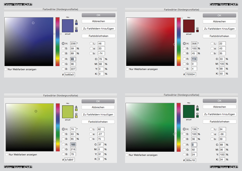
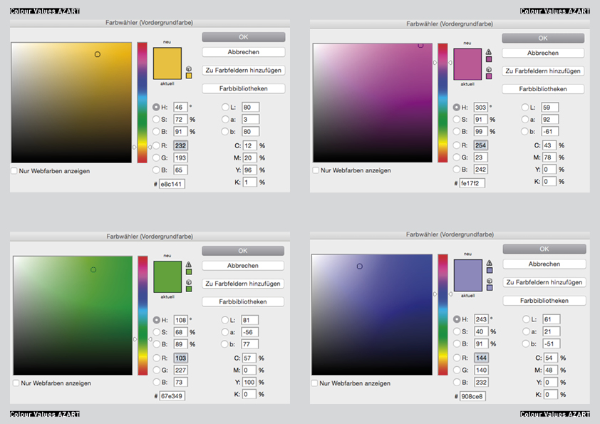
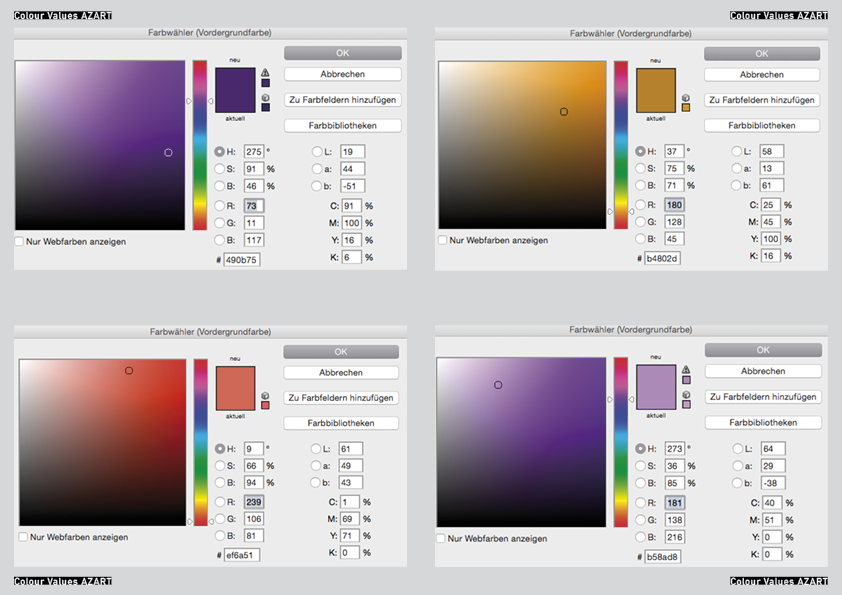
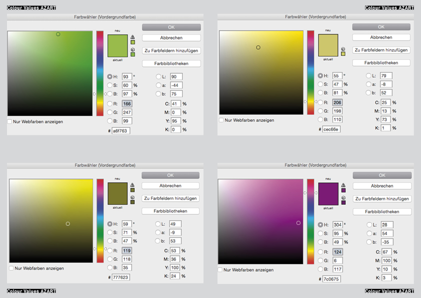
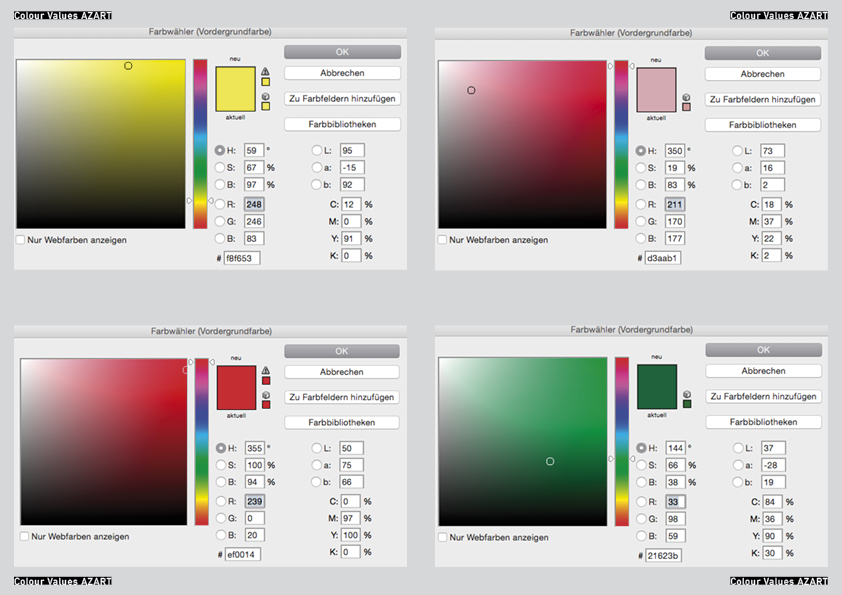
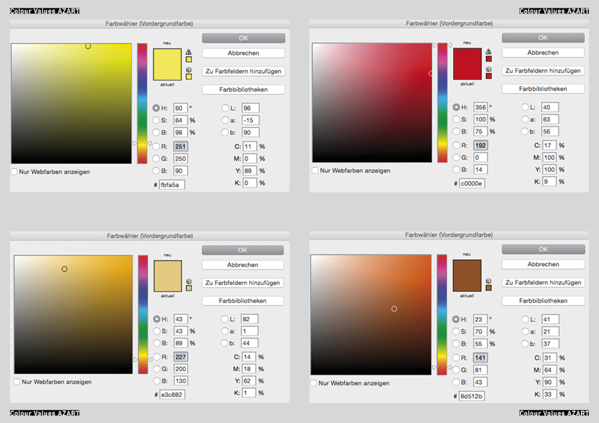
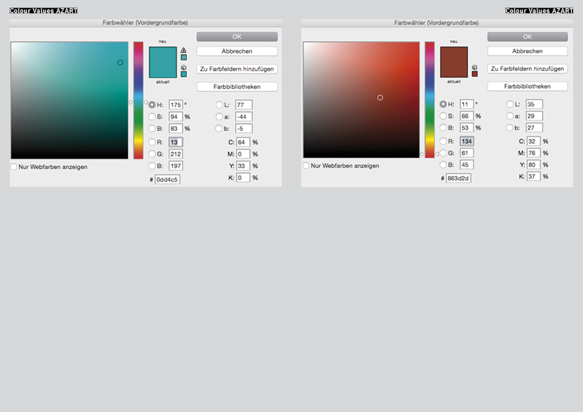
Goethe’s colour theory
|||||||||| Because of its high dignity is is sometimes called crimson (even if this is actually drawn into the blue). By increasing the two poles (yellow and blue) to red an association, tranquilizers or gratification takes place. It gives an impression of seriousness and dignity and also of kindness and grace. Through a crimson glass one sees a well-lit landscape in a terrible light.
|||||||||| It is the color of the dark. It is a color energy and the highest purity a lovely Nothing. It seems to recede (the distant mountains can be seen in blue). It is pleasant to look at, there is a feeling of cold and reminiscent of a shadow. Although Blue rooms seem far, but cold and empty. Blue light is changing your mood into sadness. If blue is touched on its plus side it is pleasant.
|||||||||| It is the colour that is nearest to light. It has a serene, cheerful, gentle property. As gold it has a splendid and noble effect. It makes a warm and comfortable impression and in Painting it is used to illuminate. Howerver yellow is very sensitive and gets an unpleasant effect when it is dirtied or pulled into minus. Then it becomes the colour of shame, disgust and displeasure.
The sound as a last abstraction
As an outgoing sound I decided for the Wobble Bass with a 25% Filter Reso. Each graphic is based on this sound and is transformed in its visual appearance. That means that e.g. letter X is not transformed because it is a linear graphic. In its tone middle e.g. the filter frequency of letter N is transformed (30-90 Hz). The filter frequency of letter C is transformed (30-155 Hz) from the beginning to the end of the tone. Letter B is showing the strongest hearable difference. Because of its graphic the transformation of the outgoing bass has 4 high distances and 4 low distances. That means that the Filter Reso is 4 times transformed to 70% and 4 times to 0%. The filter frequency is 30.
Next to these 4 letters I also translated the 3 AZART- Options of a black, grey and white environment into sound. My research is ending with a playlist that I uploaded on SoundCloud. There you can find the sound of 4 single letters, the 3 environments and the combination of the 4 letter with each environment. These sounds are produced in a collaboration with Alexander Köppel (Exchange Student GRA – Inter-Architecture).