Within a era where design industry has been mostly focusing on how-to-reach at quickest the largest market possible by basically allowing marketing and communication departments to take the lead and most companies are sales-increasing-oriented, there’s a figure I’ve been admiring a lot for a certain capability to break this kind of mechanisms. Dutch designer Hella Jongerius has been an attentive observer of the industrial production process and its weaknesses and I could think of her as a designer capable to give the design industry a remarkable, somehow playful response.


Chicle Project, material experiment for The Nature Conservancy, 2009
By having a broad look here and there to her work, I could figure out that the strength of her designs lies in their between-state for both caring about details and imperfections and still being able to fit into an industrial production rhythm. In her work I see some sort of generosity which looks up back to the past (not just to appropriate herself – as most designers nowadays would do – of principles such as authenticity and sustainability) by giving it a further value as a result of her never-ending research around life and ”afterlife” of objects. What strikes me about Jongerius’ design approach is that she pushes design to an almost imperceptible limit which oscillates towards an artistic process. Hers seems to me closer to an art-related way of processing research, brain storming, sketching ideas and projects themselves starting as sketches, always caring about some imperfection which can emerge through unexpectedly magic come outs. This is at least what it means dealing with handicrafts. Something that she has discovered already in the 90s when giving the design industry imperfection as an answer. Concerning to Jongerius, design should firstly be communicative. This is what design is about. Its function lies mainly in its communicative power which can be measured at different levels of meaning. Even ugliness can be very a strong means of communication. Since handicrafts primarily deal with the impossibility to produce perfect finished products, she has considered it as her own vehicle to face the anonymous perfection that industry has been producing for more than a century. In most of her works, she is been playing with the imagination of the user, by creating fore ex. a ”frog table” which is basically a frog seating at the table itself and a question which comes along with that is: why do we need imagination for (a specific) utility? isn’t use already enough?

Frog Table [Natura Design Magistra] 2009
According to the Dutch designer, there is a persistent prejudice concerning the essential difference, drastic separation between designs that are made to be purely functional and expressive designs which are able to tell stories which go beyond themselves as objects.
Once again the function of design has assumed new meanings and contents. It cannot be formulated strictly depending on terms of use or comfort.
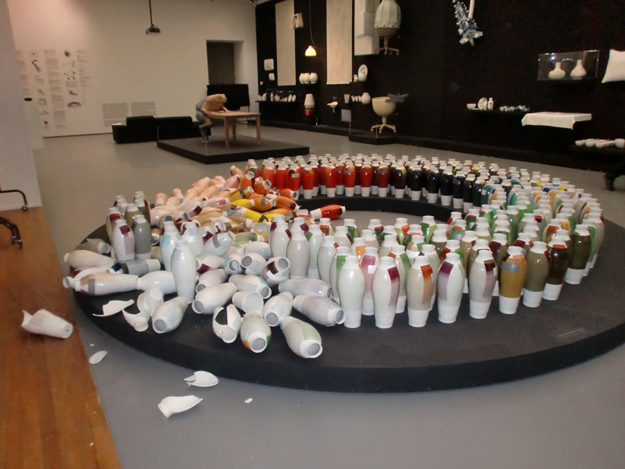
Sometimes the core signifier of design can actually be its paradoxical non-functionality > animal bowls < a project started in 2004 for which Jongerius is been selecting different pieces ouf of the Porcelain Manufacturer Collection of Nymphenburg – as a celebration of age-old crafts and treasures found within the Nymphenburg archive, in Germany.


Bowl with hare / Bowl with fawn / Bowl with hippopotamus
Some other aspects that I really appreciate about Hella Jongerius’ work are the experimentation with the more diverse materials and her deep passion for colours I feel somehow very close to.
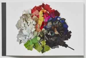
In 2009 she’s been leading a project for The Nature Conservancy [x]. In this particular project Jongerius is been experimenting with the natural material of chicle, derived from the rain forests of Mexico. The project itself consisted of a group of internationally renowned designers who have been participating, initiated by the American Nature Conservancy, an organization which strives to protect sustainable materials for use in contemporary art, design and architecture. The results of the project were shown for the first time at the Cooper-Hewitt National Design Museum in New York.


Chicle project [x]
Argali Rugs, 2015
For this project Jongerius has created – within a palette of six colours typical of Nepalese yarns – Kilim rugs which have been hand woven from special Tibetan wool from Argali – a wild sheep breed that resides in the Himalayan mountains. The yarns themselves have been hand spun by local weavers, and their naturally faded colours and irregular character lend each rug a truly individual appeal. Each rug incorporates several design details, including a hand-embroidered area with silk yarn – a reference to an old tradition of repairing the rugs. The fringes are braided, a practice that also refers to an old custom in Nepal – this for its decorative appeal.

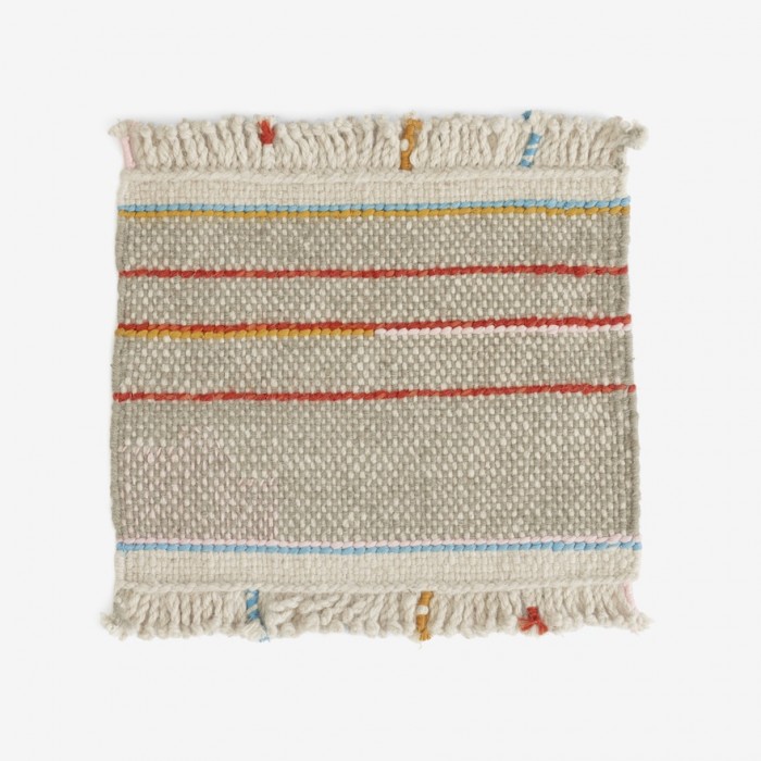
Argali for Danskina [x]
There are some many things which should be told about Hella Jongerius, that comes almost difficult to make a choice ouf of the huge amount of her research. Jongerius has been the Art Director for colours and materials at Vitra for many years, during which she has developed Vitra Colour & Material Library together with a quite recent book ‘I don’t have a favourite colour’ which basically refers to the establishment and +further development of an intelligent system of colours’, materials and textiles that make it easy to create inspiring environments in offices, homes and public spaces. It is definitely an interesting book since the Dutch designer has been illustrating her method of research and the application of its results to the Vitra product portfolio.

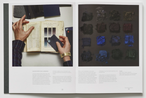
'I don't have a favourite colour' [x]
Jongerius way of dealing with the design experience is very fascinating for me since I’ve always felt quite far away from the design process, very related to super appealing – almost perfectly finished products.
Her installation/selection within the textile archive of KLM company for Dream Out Loud exhibition at the Stedelijk has been so inspiring for me. It confirmed me further my pre-existing love for textile matter. It immediately brought me to a sort of aesthetics that I personally feel pretty much related to. By reading part of her book Misfit and her .Manifesto. Beyond The New written together with Louise Schouwenberg so many exciting questions came up – concerning the contemporary era – where are we going to? design/art? this over exploited back to the roots feeling and the over flooded quantity of emerging designers. What can design add to the world of plenty? and What is functionality in the here and now?
