Multiplicity of forms and emptiness (pure form) always gives me the same feeling of infinity.
Somehow I would like to say that 0 = ?.
The choice between horror vacui and amor vacui seems to be a rhetoric question. Is there any difference between a clump of grass and a smooth white stone?
Everything around us is organized in some kind of rhythmic replication. Lives on a three, hairs, names and numbers in the telephone book. Each of the chemical elements is a pattern integrity. Each individual is a pattern integrity.
Replications and emptiness seem to have the same quality to me.
But what is more natural (neutral) for human beings?
Probably emptiness.

Many people believes that simple-form, cheap mass products can make the working class happy. Designers and craftsman tried to realize that dream. One of them was nineteenth-century wallpaper designer, painter, poet and writer William Morris. But what has he to do with the hero of ours essays El Lissitytzky?
I discover a lot of links… They both believe that art is a way to change human reality. They want to change society and they were both left wing oriented.

Now we know, their ideals failed. William Morris was not radical enough and El Lissitzky was too much. First of all, they didn’t think about the economical aspect of design and basic human needs. Secondly they didn’t take into consideration that avant-garde design can be too hermetic for most members of the society.

I appreciate the work of the russian costructivist, but I can not realy imagine that I would try to do something so simple and uncompromising like they did. If I would combine architectonical clearness of Lissitzky with birds, flowers and colors I could find some new solution for common people?
For me, patterns are the essence of beauty. Maybe the next revolution should be a revolution of patterns. Although ideals never come true they can stay forever – good design.

What fascinated me in the exposition is how El Lissitzky redesigned Malevich’s opera, Victory over the Sun.
Victory over the Sun was a futurist opera premiered in 1913. The costume and set design was done by the Russian artist Kazimir Malevich. The futurist opera couldn’t succeed as the suprematist techniques were pretty new. The audience reacted negatively and violently to the performance.
What happened afterwards is that following the Russian revolution, El Lissitzky worked with Malevitch for a new version of the opera as an electro-mechanical show. Lissitzky transformed Malevich’s black and red squares into figures constructed of transparent prisms and metallic rods, bending and receding in space. He created a typography specially for the libretto. Most importantly, he transformed the old costumes into new robotic figurines/figures.
The new version of Victory over the Sun was closer to El Lissitzky’s Proun principles, where his work was more focused on the interaction of his architectural, graphic and typographic experiments, transforming sounds to architecture, words to costumes, or drawings to characters. This made me realize that he is not only a painter, but a graphic artist and an architectural designer, and a designer of furniture’s, books and posters.
This is the proof that architecture and design are not just about constructing buildings or visuals, but also about how to create a coherent whole with a story, connecting different elements like the space, decors, visuals or texts.
Then maybe design is an activity one can apply to any kind of system. Architecture is a principle for making relational systems that can improve the totality of an artwork.


[cover] "Two Squares" / Dedication page / [page.4], from Lissitzky's "Two Squares"
Dit verhaal (1920) behoort tot de proun-serie van lissitzky.
Ik vind het een van zijn beste werken. Simpel en toch heel sterk.
 In eerste instantie wist ik helemaal niet dat dit een kaft van een boek was. Een kinderboek nog wel. Over een rood en een zwart vierkant die de wereld gaan redden met behulp van een cirkel. Ze bundelen hun krachten samen om zo de chaos te vernietigen en een nieuwe orde te vestigen.

[page.4] Don’t read, get paper, rods, blocks, set them out, paint them, build.
De tekst op pagina 4 maakt duidelijk dat Lissitzky met zijn verhaal kinderen en volwassenen lezers aanspoorde tot activiteit. Zijn intentie was het verhaal tot leven te laten komen in een schouwspel. Je zou het dan ook niet alleen op een (typo)grafisch twee dimensionele kunnen zien, maar ook op een architecturale drie dimensionele manier kunnen bekijken.


[page.5] Here are the two squares / [page.6] They fly on to the Earth from far away and / [page.7] And see a black storm.


[page.8] Crash – and everything flies apart / [page.9] And on the black was established Red Clearly / [page.10] This is the end – let’s go on.
‘The words move within the fields of force of the figures as they act: these are squares’, zoals hij zelf zegt. De plaatsing van de woorden en het gebruik van de letters vertegenwoordigde een totaal nieuwe benadering. Het verhaal wordt dan ook over het algemeen aanvaard als een van de eerste voorbeelden van de Nieuwe Typografie.
Het werk werd voor het eerst gepubliceerd in 1922 en bestaat uit 10 pagina’s. Lissitzky maakte zelfs een speciale editie voor ons beroemde vaderlandse tijdschrift De Stijl ( in “De Stijl” 5e Jaargang 10/11). Enkele uitgaven hiervan zijn nog op te vragen bij het magazijn van de openbare bibliotheek (De Stijl : [maandblad voor de beeldende vakken], maar de editie waar ik het over heb is daar helaas niet meer in de collectie. Wel de volledige facsimile herdruk met het gehele in het Nederlands vertaalde “van tWee kWAdrAten in 6 konstrukties” in deel II. Ook kun je de volledige originele versie nog vinden in het boek “El Lissitzky”, wat door zijn vrouw Sophie Lissitzky-Küppers is geschreven.
De Stijl facsimile (red. Theo van Doesburg ; ed. by Ad Petersen1968) [page 5,6,7,8,9, 10+page 4]
El Lissitzky by Sophie Lissitzky-Küppers [top 3 pages, original print 22 x 28 cm]
![]()

Rodchenko is een constructivist, behoort tot de Russische avant garde. Zij hebben ontzag voor machines en architectuur.
Rodchenko begon zijn carrière als kunstenaar met abstracte schilderijen, daarna ontwikkelde zich dit tot grafische vormgeving en vervolgens fotografie. Door dat hij dit allemaal gedaan heb zie je zijn kennis en talent. Deze bijzondere veranderingen in zijn vakgebied zijn te verklaren aan de hand van zijn werk. Zo is er in zijn constructivistische schilderijen als in zijn grafische collages en fotografie een duidelijk oog voor ruimte en communicatie tussen vlak en lijn zichtbaar.
Door dat hij dit allemaal gedaan heeft zie je zijn kennis en talent. Dankzij zijn veelzijdigheid en het feit dat hij zowel autonoom en vrij toegepast kan werken. En bovendien gebruikt hij zijn talent.
Rodchenko heeft fantasie en een persoonlijk fotografisch oog. In de tentoonstelling in het foam komt dat vooral naar buiten bij de atletiek serie. Door de hoeken die hij kiest word het een beetje surrealistisch en tegelijkertijd is het een prachtig momentopname. Je begrijpt misschien wat ik bedoel als je de foto hier boven ziet. Kale Russische mannen op gymschoenen met heel korte broekjes, en een geweer.
Als hij dit recht van voor had gefotografeerd, werd dit veel serieuzer genomen.
Hij is in dienst van de Sovjet Unie, maar toch heeft hij nog steeds oog voor de absurde taferelen. Hij verpakt deze absurditeit in een voor de Sovjet Unie acceptabele vorm.
Rodchenko heeft fantasie en gevoel voor compositie.
Wat ik echt heel fijn vind aan de voorstelling is, is dat je het plezier in zijn werk kan terug zien. Iets wat ik trouwens miste bij van Doesburg in Leiden en Lissitsky in Eindhoven.
Omdat ik vorig jaar fotografie heb gestudeerd weet ik dat er een soort regels in de fotografie zijn, waar je rekening mee moet houden. Rodchenko heeft dat niet gedaan. Ik vind dat erg fijn, want dat zorgt voor meer vrijheid en meer mogelijkheden.
Mensen hun voeten zijn van de foto afgesneden en sommige gebouwen worden uit hoeken gefotografeerd als of iemand de foto heeft gemaakt die net een beetje bezig is met de fotografie en is wat anders wil doen, zogenaamd iets orgineels wilt proberen.
Ik heb opgezocht dat hij de gebouwen zo fotografeert, omdat hij ze wilt laten zien van alle kanten, op een meer ruimtelijke manier.
Toch hoop ik dat hij de voeten er onderbewust er af heeft gelaten. Want dat betekend dat er minder denken aan te pas is gekomen, het is dan natuurlijker het komt uit het gevoel en het gaat dan meer op de actie zelf.
Dan moet ik gelijk aan zijn collages denken, ze zijn soms heel simpel, maar ze werken heel goed op de een of andere manier.
Ik merkte aan zijn foto’s ook maar weer hoe belangrijk het wel niet is om je eigen foto’s af te drukken. Het contrast of de lichtheid, maakt soms echt zijn foto. Zonder dat waren ze misschien wel te normaal geweest.

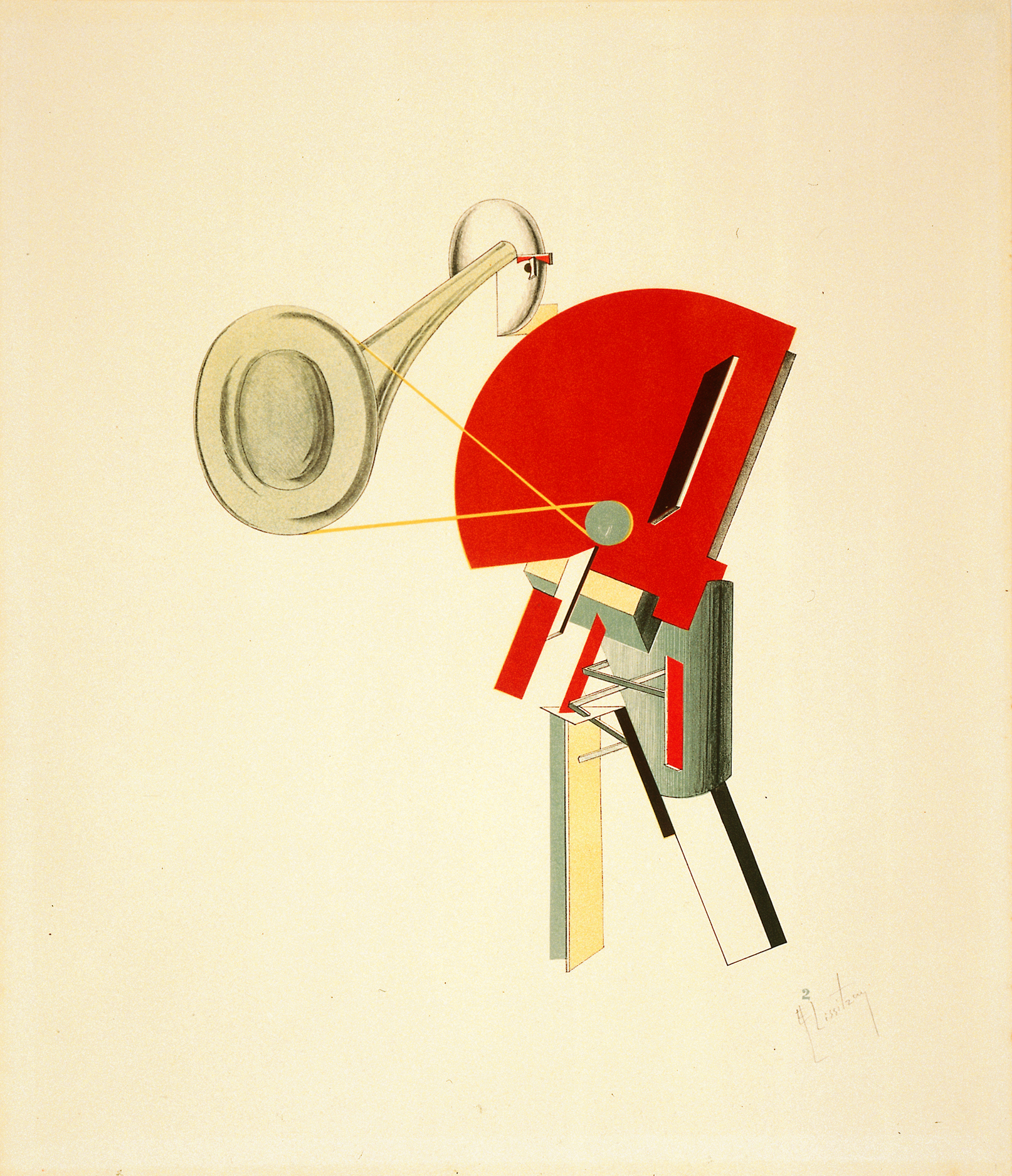
In this work you see influences of Design, Fine arts, Architecture and Graphic design.
A nice thing of this work is that the upper drawing can stand on his own, and therefore can be divided in Fine arts. What Lissitzky is doing in the painted photo below, can be compared with design. Almost all his work contains influences of Design, Fine arts, Architecture and Graphic design. For myself I see it back the most in this one.
I really like the composition and colour distribution and how Lissitzky combines the 2D/3D perspective, which makes the drawing much more architectural.
I think the later work of Kandinsky is in some way comparable. I’m talking about elements of composition, colour distribution wise and form contrasts.
What’s fascinating actually is that for example in these paintings ( K1, L1, K2, L2 ) the triangles, (half) circles, stripes and composition have so much in common. While the ideas of their work are so different. Kandinsky combines painting with music, which Lissitzky does with architecture.
What I appreciate is the modern way of exposing his work. I like the way he puts his drawing and his street-exhibition in one frame on the cardboard. And the fact that he paints on the photo. The street celebration design reminds me a bit of graffiti in legal manners. In Graffiti you have multiple meanings of doing it. Some do it for the adrenaline-kick, some for the group or competition feeling, some to show their design skills and others for political statements or propaganda. This last example is what I see in a part of Lissitzky’s work.
I think it’s interesting to see how he uses his propaganda work in other work but then he integrates his in his autonomous work (proun. street celebration design).
All in all I think it’s a great work and a unique style. I really admire that Lissitzky makes so many different things, and still keeps it in one theme


Designing a book is not something that requires a lot more than just putting together some pieces of paper and binding them in a book cover. But in order to design a book that immediately attracts ones attention, a book that makes you look, it is necessary to re-think it to make people wonder and speculate. Something that surprises them, make them think, or reminds them of something else that they are familiar with.
Stefan Sagmeisters book “Made you look” from 2001 is a great example of a book that has been re-thought. Already by removing the plastic cover of the book you get surprised and fascinated by the simple transformation that takes place in front of your eyes. What seemed to be a sweet family dog appears to be a ferocious wolf, just by using red foil on top of a separated red and green color print. The technology is simple, the result overwhelming.
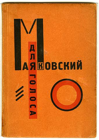 Already in 1923 El Lissitzky was thinking further than just a bunch of papers in a hard cover, when he published an interesting little book with poems of Vladimir Mayakovsky accompanied by graphics by him self, under the title “For the voice”.

To make it easy to locate a specific poem Lissitzky made the kind of index we find in phonebooks at the edge of the pages. But where in the phonebooks you look up a name by the first letter, Lissitzky made small abstract symbols or thumbnails of the graphic that accompanied the specific poem in the book.
This way Lissitzky moves the form of the book away from the formal form and at the same time he plays with an already known design, that doesn’t make people confused but rather triggers a desire to explore. I really think that this is a great way to stimulate peoples curiosity to look in the book, which is the whole point of making one. It’s very inspiring.