Designing a book is not something that requires a lot more than just putting together some pieces of paper and binding them in a book cover. But in order to design a book that immediately attracts ones attention, a book that makes you look, it is necessary to re-think it to make people wonder and speculate. Something that surprises them, make them think, or reminds them of something else that they are familiar with.
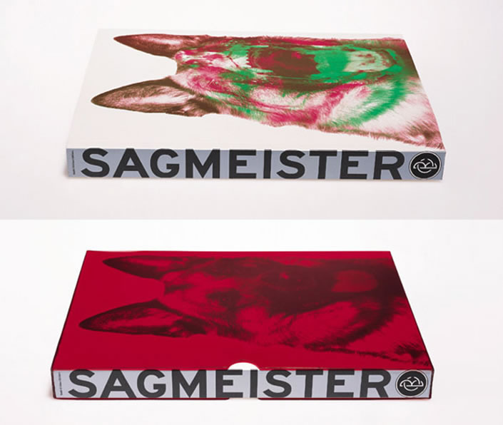
Stefan Sagmeisters book “Made you look” from 2001 is a great example of a book that has been re-thought. Already by removing the plastic cover of the book you get surprised and fascinated by the simple transformation that takes place in front of your eyes. What seemed to be a sweet family dog appears to be a ferocious wolf, just by using red foil on top of a separated red and green color print. The technology is simple, the result overwhelming.
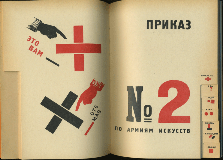
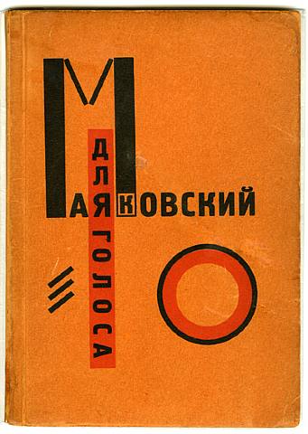 Already in 1923 El Lissitzky was thinking further than just a bunch of papers in a hard cover, when he published an interesting little book with poems of Vladimir Mayakovsky accompanied by graphics by him self, under the title “For the voice”.
To make it easy to locate a specific poem Lissitzky made the kind of index we find in phonebooks at the edge of the pages. But where in the phonebooks you look up a name by the first letter, Lissitzky made small abstract symbols or thumbnails of the graphic that accompanied the specific poem in the book.
This way Lissitzky moves the form of the book away from the formal form and at the same time he plays with an already known design, that doesn’t make people confused but rather triggers a desire to explore. I really think that this is a great way to stimulate peoples curiosity to look in the book, which is the whole point of making one. It’s very inspiring.
