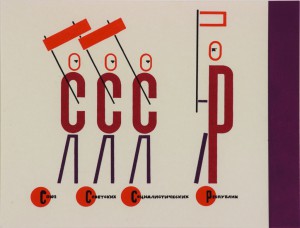
As a student who already was aware of which direction to choose before applying to the Rietveld my trip to the Van Abbe Museum was no eye opener on that point. Being raised by artist parents and Bauhaus principles in the country side of Denmark I found huge inspiration in the El Lissitzky exhibition well knowing that I want to become a Graphic Designer.
Most of the works of Lissitzky seemed to be constructed out of different objects and colors. Two or three dimensional there was a huge understanding of aesthetics with great influences from the Bauhaus generation. Unlike most of my fellow students who thought Lissitszky was too Russian, constructed, cold and straight eyed I saw great playfullness, movement and joy (experiments) in the works. Me having a little knowledge in the field of printing I could see that the artist had explored what was possible at that time. I immidiately identified my self with the way I use basic html like color boxes, strokes and helvetica when working with web design. The lack of knowledge or technology is not always a limitation but can also be a huge gift which removes superfluous decoration and focuses on the main idea behind the work. The way he constructs with distinctive geometric forms in layers and makes it look quite simple, even though everything is put in the best way possible, was very impressing. I kept seeing references to cubism and futurism in his sketches which I also seem to have in my drawing. The picture underneath sums up what I have said, with a very simplified illustration that is constructed like both informative text and illustration this silkscreened illustration has references to the beginning where Lissitzky designed children books.

