‘Voices’
Designed by former UNA-Designers (Hans Bockting + Mark Diaper)
As a start of my ‘guiding’ through my research I will write down a few sentences about the designers/design agency of the book. Just a few sentences because the designers doesn’t seem to have the need of sharing a lot of personal background information on the internet, I don’t feel the need of sharing their personal information as well.
Mark Diaper who was part of the UNA design agency at the time of creating the book, founded his own design agency “Eggers + Diaper” (1999, Berlin) together with Birgit Eggers.
The former UNA design agency existed from 1987 untill 2007, founded by Hans Bockting, Will de L’Ecluse and Henk Hoebé, who all went seperate ways by 2008.
quote; “Kenmerkend voor het werk van UNA is de grote aandacht voor het evenwicht tussen vorm en inhoud, oog voor het detail, respect voor traditie en een zekere vorm van speelsheid.(playfullness, !imporant! to translate!, as I found this interesting for my research, looking at the work of Hans Bockting) Eveneens tekenend voor het bureau is de lange relatie met zijn opdrachtgevers. Voor de stad Amsterdam is UNA een belangrijk bureau geweest omdat de meeste opdrachtgevers hier gesitueerd waren.”
“UNA-Designers” is now going on as “Bockting Ontwerpers” (from 2009) runed by Hans Bockting and his wife Sabine Bockting. Hans Bockting is also co-founder of “Traffic Design” and “Concepts”.
.
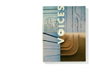
The book I chose for this project is titled “Voices”. It is a book named after an exhibition that once took place, which had the same name as the title.
“Voices is an exhibition that brings together works by nine contemporary artists of different origins and generations, discovering the domain of the visual and the material of sound contributed by the human voice”
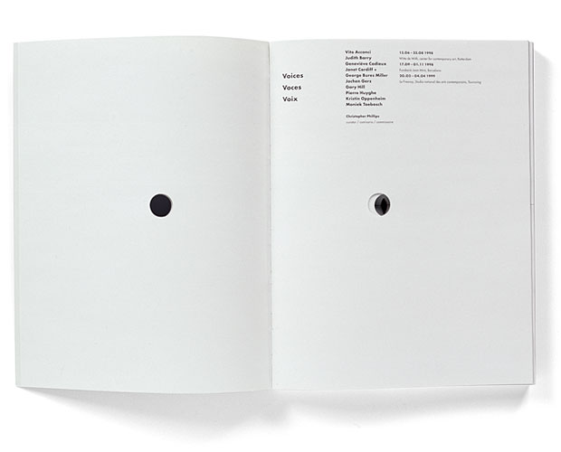
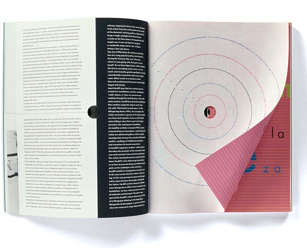
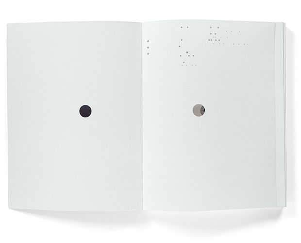
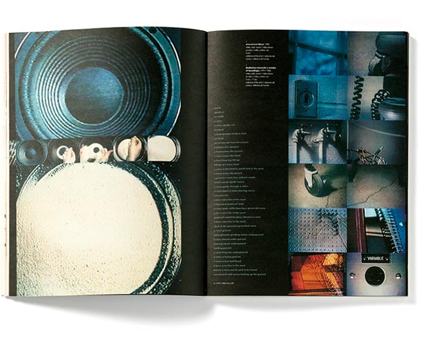
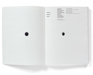
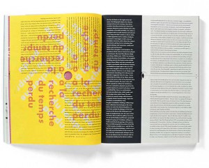
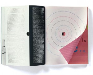
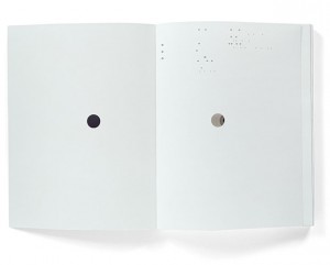
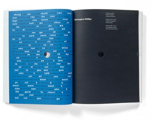
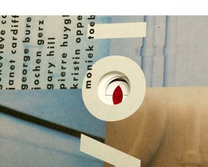
The choice I made for this book was quite selective. As I scanned through the given booklist, what caught my attention most were titles with the word ‘voice’ in it. Probably because of last years Studium Generale that took place with the subject of ‘voice’, but turns out a subject that I have an interest for. I noticed this strong attraction for this word and decided to find a book related to this subject. Immediately my eye fell on this book with on its front cover the word ‘voices’ with big letters centered between 4 images that are filling up/being part of the front cover. The backside is divided in 2 images. On the front cover there is a hole in the letter “O” of the word ‘voices’. You can not see through the hole because the following page is covering the hole with its white. But when you flip the second page you will see (through) the continuing hole till page 33.
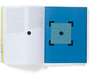
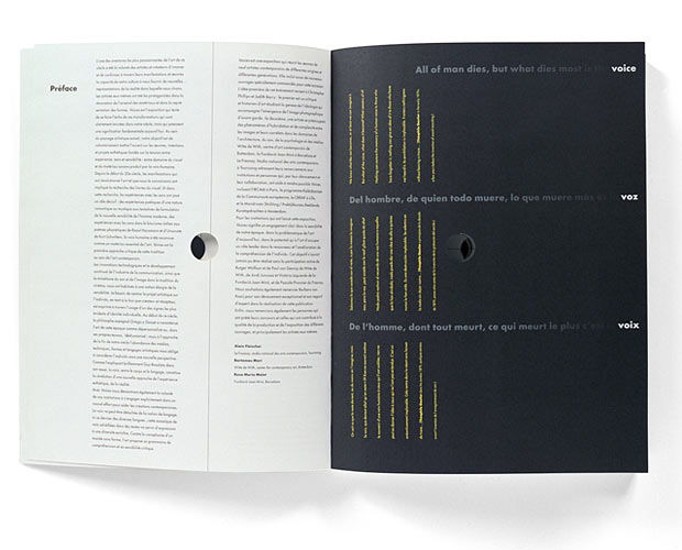
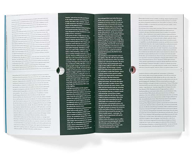
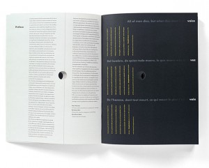
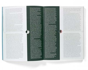
And there is more which caught my attention inside the design, the ‘dividing’. A thin black line through the center of the pages (horizontally/vertically) is attracting my eye. It’s seems like a strange element in the whole of the design. I want to know about this line. Why do I experience this line as unfitting, and why is it at some pages not reaching the opposite side it should do/ and does in other pages. 3 Languages who are divided by those attention-seekers of lines in many different ways, so many notations within the book, within the design, resulting to a bit of my frustration of not be able to ‘read’ this musical score.
While looking at other work of Hans Bockting, and getting introduced to a calendar from Hans Bockting (Traffic Design,1980), which I played with for a while, every month/page a different surprise in it’s full meaning, small attachments, opening/closing/lifting-up/changing material/sizes/colours, TACTILE SENSATION & FEEDING FOR THE EYE, again the sheet music work which I can hardly handle following from start until the end, but knowing it works perfectly as a whole. Let’s play it again.
After some plays I questioned myself why for godsake I am always attracted to such a full-filled mixture of information/ images/elements/things going on in, as now researched ,a book,design. Translated into my experience of observation “CHAOS”!
It is for my personal perspective exciting to see as much as possible, as many possible variations of information on a surface , in design, images etc. ! MASS !
I like to see mass and take time to discover every quality within that mass, but at the same time it is in general the case that I get stuck in the beginning of the discovery, losing track of what I am actually seeing while zooming in on a particular element/part, raising questions, no answers, no guide-through,raising frustration,loosing interest in zooming in on the following element, and taking it as a whole, but not really understanding.
Looking at my personal way of living, way of working, WORK, I consider myself as a possible face of the word ‘chaos’. I am attracted to chaos, but I would be happy if the chaos could be read in the way of the music sheets. In my personal way of working, I have taken steps back from mass into simple and clear, to understand the way of quality of less and the non-questionable/for itself-speaking element, in order to get to combining variables into a creation not-longer experienced as chaos as ‘?’,. My so called chaos who creates the heart/ the melody in the music sheets.
I decided to send a letter to Hans Bockting with the question, how Hans Bockting can permit himself the freedom to create such a playful diversity of work.
I did not get any response ……………………………………………………………………………………………………………………..
…………
…..
.
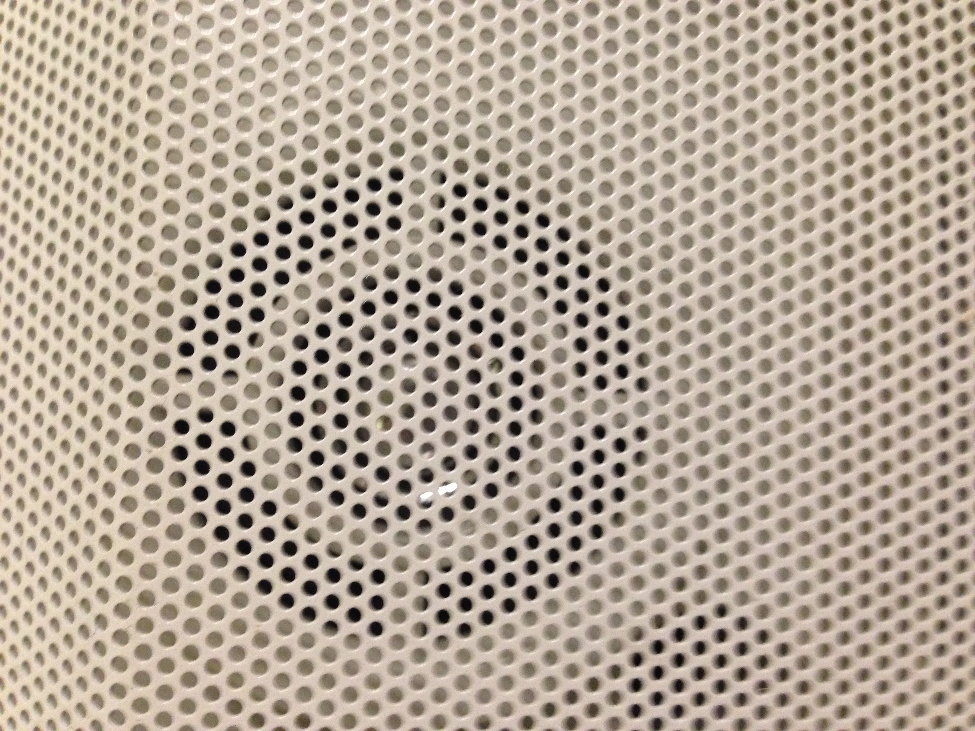
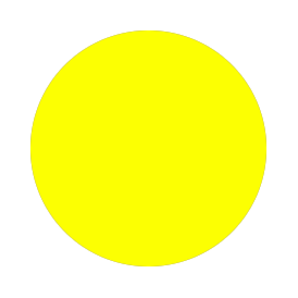
Then at one moment in thought, I looked up in my room, seeing my lamp.
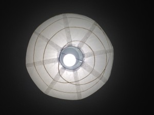
The circle. my escape out of the chaos.

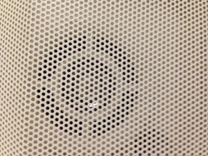
I had returned to the holes-element in my chosen book. My melody maker within my daily-life chaos. I saw dots in everything. The very clear round shaped element just made me understand.
circles.
dots/points/holes.
the simplest element of visual design.
The defining characteristic of a dot is that it’s a point of focused attention. Dots settle themselves in space and provide a reference point relative to the other forms and space around it.
Dots are the focal points in our compositions. Dominance.
Dots create a relationship with the space around it. The two most important relationships formed are the proportion of the dot and the space around it and the position of the dot within that space.
As dots increase in size we start to see them as shapes, but they still retain their dot-like qualities and characteristics. A square placed in the white space of a page is still a dot. It still attracts visual attention to it, which again is the dot’s defining characteristic.
Dots centrally placed within a composition create symmetry and are neutral and static, though they tend to dominate the space around them. Dots placed off center create asymmetry. They are dynamic and actively influence the space around them.
Serenity is my outcome of the research. I look through the holes of the book again, but now only focussing on what I see through the circle-out-cut on the following page. I will find the rhythm, I will find the voice.
Rietveld library catalog no : 708.5-cat-50