Simplicity, clarity, structure – to me, these words represent the core of Wim Crouwel’ style. In his works I find the intention of combining human emotionality with the precision of the machines. It is a systematic approach, a development towards digital forms
One of the design pieces in the exposition that I liked the most was the concert poster for the Zurich Tonhallen. It is made in a definitive and geometric, yet abstract style. It looks like Crouwel incorporated a mathematical method in organizing the spirals into a graphic work. It is the visual equivalent of music.
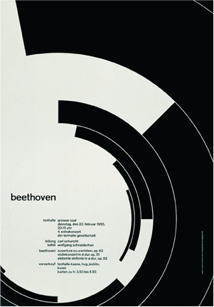
The poster portrays music through series of concentric curves. These incomplete closures focus our attention to the information on the poster, with no unnecessary ornamentation to distract us. There’s a certain strength in the simplicity and elegance of the forms, that makes it easy for the eye and brain to process the image in a single glance. Wim Crouwel also escapes the well-known combination of black-and-white by using beige instead. And he is bold, just like the music of the composer, but without the trick of eye-catching colors. Simply with the movement and structure of the lines.
What makes this poster memorable for me is the fact, that the first thing I thought when I looked at it was…..”This reminds me of sound-waves.” Only to find out afterwards it was really a poster for a concert.