Hamburger Eyes. The Continuing Story of Life on Earth… Bizarre title aside- hamburger eyes? life on earth continues!!- what attracted me the most was the cover, more specifically its texture. The pleasant sensation of its grainy, bulky surface on my fingertips reminded me of snowy twitches of bad TV signal, or, perhaps more curiously, the thick, shiny, rough surface of the corridor walls in my primary school in Russia (a serious throwback!). A visuo-tactile experience. A tactile eye (a Hamburger Eye?)
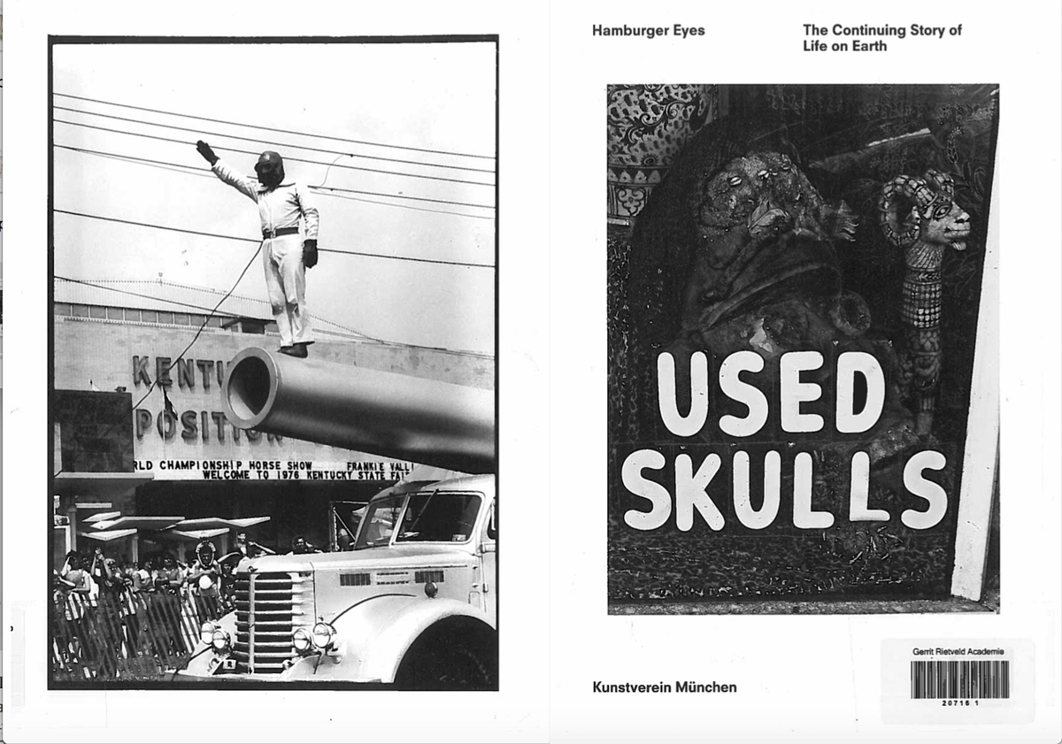
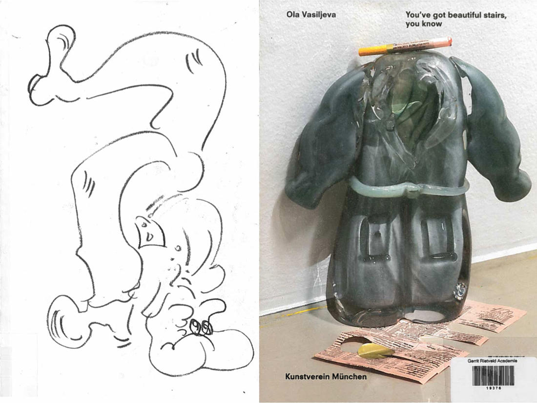
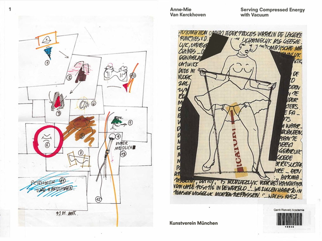
The object-oriented appeal of this catalogue is emphasized by the cover’s minimal design: front- one black and white image, framed simply and straightforwardly, no text; back- modest typeface (and size) of the title, another black and white shot, Kunstverein München. The Continuing Story of Life on Earth is the sixth installment in Kunstverein München’s Companion series, produced in collaboration with Roma Publications since April 2015, and was released on the occasion of the exhibition by Hamburger Eyes at Kunstverein München. I’m still not entirely sure what Companion series is all about, other than quietly beautiful, tactile books; book-objects. They are artist/exhibition books primarily, all clad in that leathery grain and defined by simple, sharp covers and minimalist layouts; images taking up full pages, and separated completely from text, which always has its own section. I have managed to get hold of two more publications from the series, You’ve got beautiful stairs, you know (artist book for/by la Vasiljeva), and Serving Compressed Energy with Vacuum (exhibition catalogue for Anne-Mie Van Kerckhoven). Both have the same multi-sensory appeal of a well-designed object; as publications, they are direct in their materiality but somewhat elusive in their origin and intention: where did they come from? Who made them?
Companion is conceptualized and designed by Julie Peeters , a Brussels-based graphic designer, editor and educator. For the sake of this brief research we are going to conflate the series with the person behind them; she is credited under ‘identity’ as well as under graphic design. Companion is Julie Peeters.
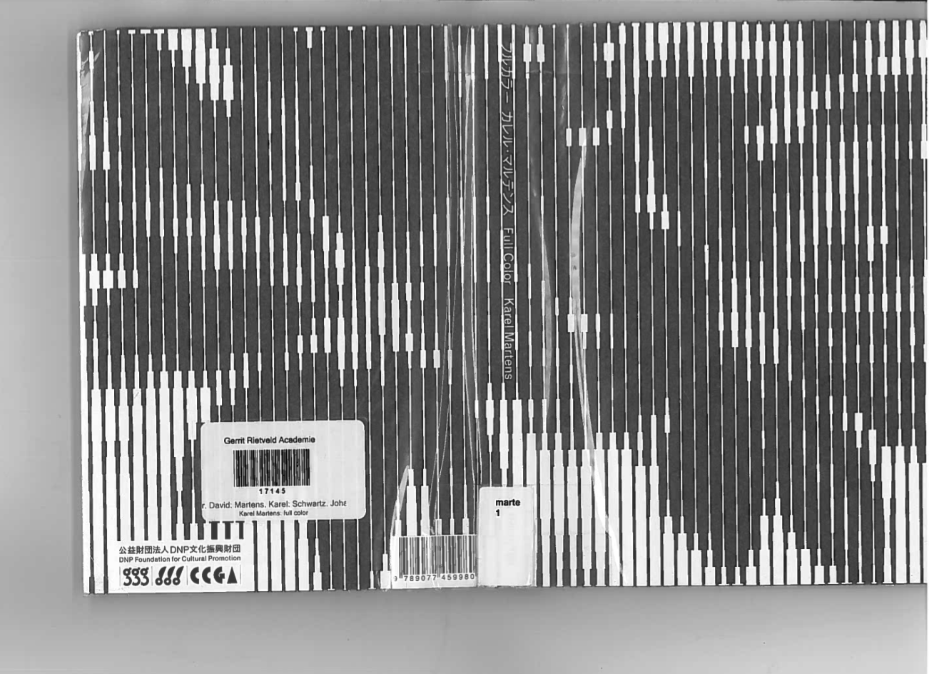
Peeters deals primarily with exhibition-related printed matter- booklets, posters, catalogues; on her website you can find examples of ‘anthologies of installations’, exhibition designs, as well as credits for the identity of Lithuanian and Cyprus Pavilion at the 55th Venice Biennial. Peeter’s signature minimalism, as seen in Companion, is consistent throughout her design practice: simple yet bold covers without titles (if possible), text relegated to its own section in the back, simple layouts that let images unfold, breath, softly assert themselves. A prime example of this is Julia’s design of Full Colour by Karel Martens, published on the occasion of an exhibition in Tokyo. Graphic, enigmatic cover; title humbly relegated to the spine ; images taking up the whole page, on every page. Never a literal representation, a book by Peeters is an autonomous object, which augments its origin (an exhibition, an artist’s practice), yet has a character of its own.
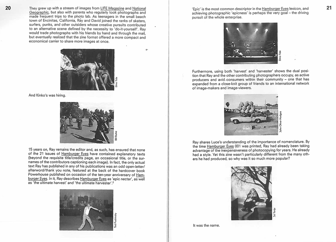
Upon closer inspection the book’s identity unfolds; The Continuing Story of Life on Earth is not just Peeters. Hamburger Eyes began as a small xeroxed zine, turned into a magazine, and has evolved into a publisher. Publishing since 2001, they have developed their own signature vision of photography-
‘Ray selects images for their almost unexplainable impact, for their ‘epic’ qualities that exceed understanding, that SURPASS LANGUAGE…’
very Peeters?…
and a self-assured design style-
‘the current format is black and white printing on matte stock, print run of 500 copies, 6 x 9 inches, 64 pages, with PERFECT bind’
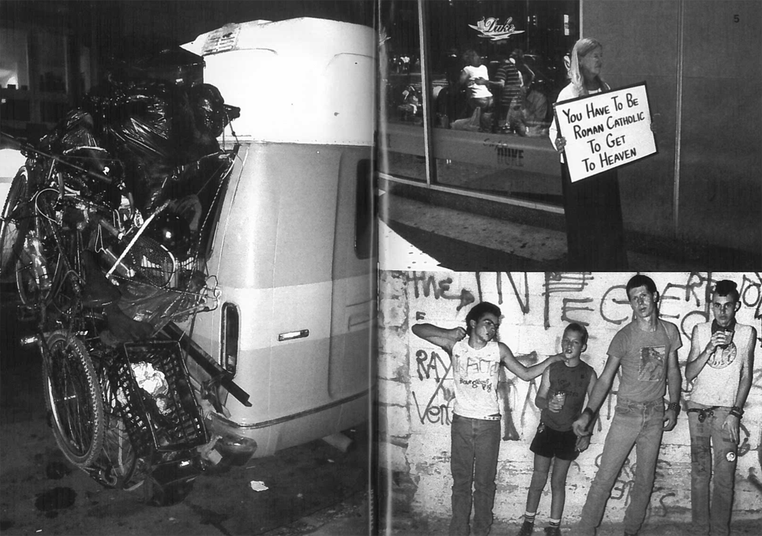
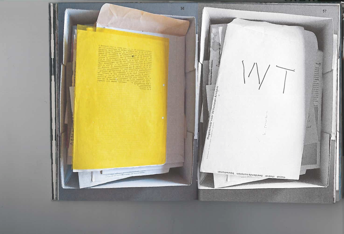
which spawned this curious book (‘facsimiles of spreads from the back issues of Hamburger Eyes’) points to the mutually informative relationship between the design and the content. Each image was exhibited unframed and face up on tables, ‘as if a zine were being collated’. Hamburger Eyes promise to focus on the quality of a given image, rather than on the quality of its framing or installation ~ ~ ~ ~ The Continuing Story of Life on Earth has a very simple yet occasionally claustrophobic (two images stuck to one another on one page, with one blown up on the other) layout that recalls the intimate space of a zine. The book also houses an essay, that weaves throughout the whole book and is punctuated with tiny images- who made the choice when it comes to this punctuation? The publication is authored by Chris Fitzpatrick (editor?…), who also initiated the exhibition; one has to always consider the relationship between the designer and the author. The Continuing Story of Life on Earth is a collaborative effort shared between the two. Here content informs design, but also design informs design: from a zine to a photography magazine to an exhibition and back again trough the catalogue to our book.
Hanburger Eyes /The continuing story of life on earth, designed by Julie Peeters, Rietveld Library Catalog no: hamb 1