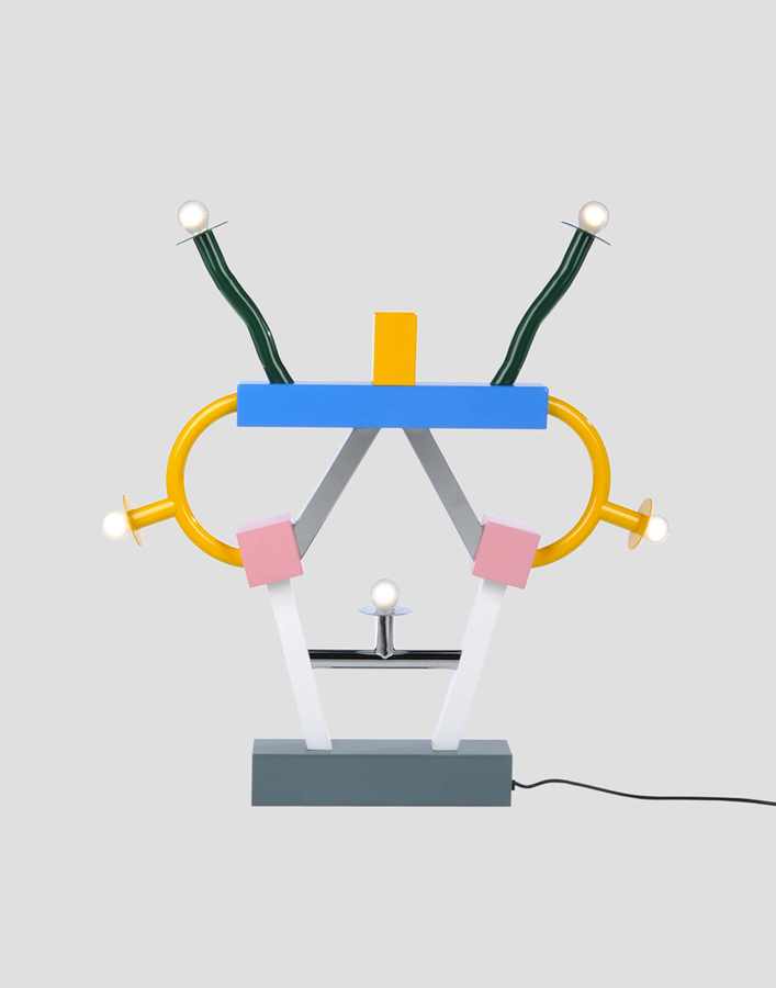
Ettore Sottsass designed this lamp in 1981 for the Memphis Milano Collection and it got its name after the great Indian emperor Ashoka. Fascinated in ancient cultures, he travelled in 1961 to India, which profoundly affected him. However, there is nothing that precisely reminds me of Ashoka in the lamp, neither in colors, form nor material.
Portrait of the emperor Ashoka and an Ashoka temple in India.
With deeper investigation I found out that ashoka translates from Sanskrit into English as “without sorrow”. The emperor Ashoka was revered by many as a leader supporting big changes. After years of rationalism, Sottsass along with Memphis Group were rebels. The style they brought up was seen to be perfectly in tune with the early 80’s post-punk culture, without a doubt a distinction of the often-obscure theories of postmodernists. This brings me to the feeling of Sottsass as a punk, reining the future without sorrow for the past and incorporating art into design.
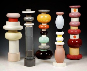
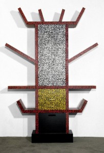
What further strikes me is the significant playfulness that follows his designs and thinking. A good description of his works is “a shotgun wedding between Bauhaus and Fisher Price”. It shares a common interest with toys such as testing out, trying, building as in children’s mind and color palette.
Fisher-Price advertising and Ettore Sottsass Flavia vases
Duplo lego and Ettore Sottsass Casablanca Sideboard
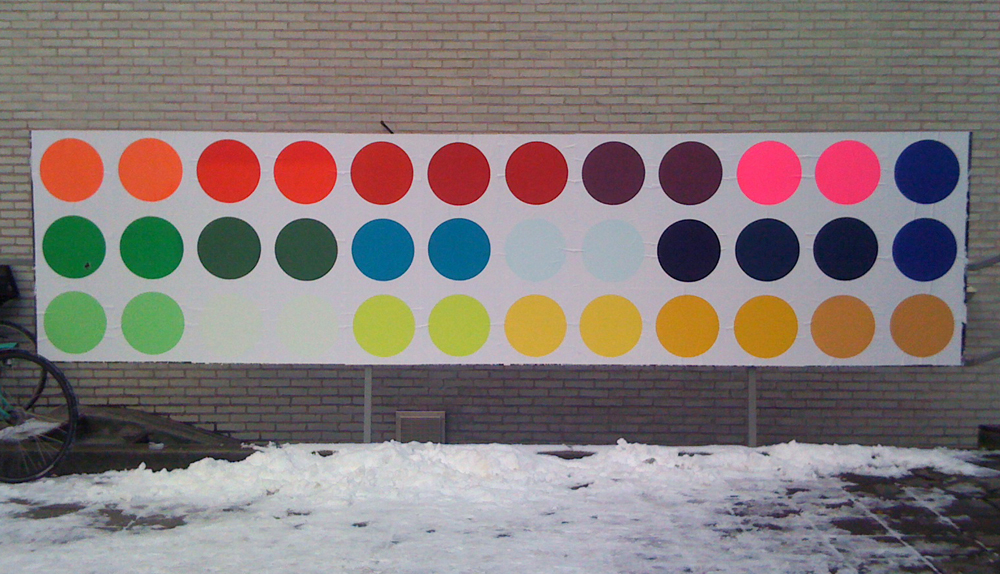
The name Ettore Sottsass was unknown to me, until some months ago. I was star-struck by his philosophy and work. Coming from Sweden where popular design often is characterized as being very minimal and serious, I was experiencing the complete opposite. It was playful, bold and colorful. He totally distracts me with his colors, what he calls “gas station colors”. Maybe my attention is drawn to the object thanks to the distinct primary color used; there is something pure and genuine about them. To Sottsass these colors are the ones he used as a kid, learning to draw. Freedom and rejection of prejudices is supposed to be a reason why he uses them. There is always an extra effort to be able to combine or even use color. What he expressed in 2007 becomes especially interesting since my wardrobe exclusively consists of black and different shades of gray:
“It’s a shame, but yes, color is still something unpopular. The predominant shades are white, black, beige … I think the reason is that it is just easier. If you go all dressed in black its very easy.”
Sottsass was, besides working solely colorful, well known investigating in combining different materials, from cheap materials such as laminate to richer ones – brass and marble. This creates a conflict for possible new life or at least raises questions about it.
Furthermore, from my point of view, it is important to notice that the lamp (plus almost all of his other works) seems to widen the users’ idea of function in every day life. Instead of taking the obvious and primary functionality of an object for granted, in this case, a source of light, Sottsass deliberately add another dimension into the object. By taking away the familiar he surprises and asks for participation and sensation. He gives the object an aura and hence creates a presence to which I am confronted to and that makes me feel alive. One noteworthy quote from Sottsass is when he explains his view on function:
“All the objects I have designed are ‘functional’. They can always be of use. What matters is that the one who uses them must be able to use them. (…) Everyone has different ‘function’ or necessities. (…) Maybe a young man wants to put his rolls in a container, whereas a young woman wants to put all her books there. I don’t know. There is no generic function. Function is life. I cannot foresee function. The furniture I have designed has always been functional. However, one needs to know what it is for.”
I would define my sentiment regarding Ettore Sottsass’s work as an ‘opposite attraction’. Opposite, because originally, my personality and work do not reflect at first sight his point of view. Attraction, because he has and will inspire me to break up predefined rules, experiment techniques and challenge mentalities in my personal work.
