I was browsing through the list of books acquired this year at the Rietveld Library and I came across the title “Khhhhhhh” by Slavs and Tatars.
Interesting title that made no sense to me and therefore made me curios and furthermore choose the book for my exploration and design research.
Now I know that Slavs and Tatars (S&L) is an artist group and this book is a combination of research and study alongside giving a written lecture and investigation through the book which was published in connection with their exhibition on the topic which the book investigates [X].
Before starting the exploration of the book, to be clear about who S&L is, this gives a pretty good hint: “Slavs and Tatars is a faction of polemics and intimacies devoted to an area east of the former Berlin Wall and west of the Great Wall of China known as Eurasia. The collective’s work spans several media, disciplines, and a broad spectrum of cultural registers (high and low) focusing on an oft-forgotten sphere of influence between Slavs, Caucasians and Central Asians”.
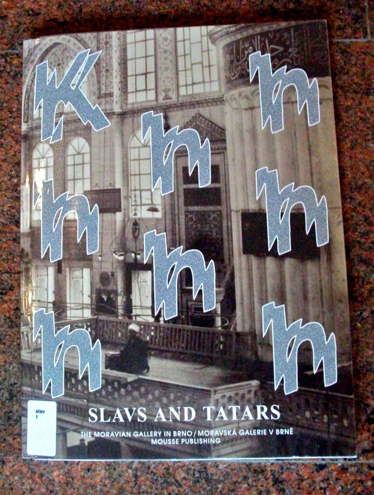
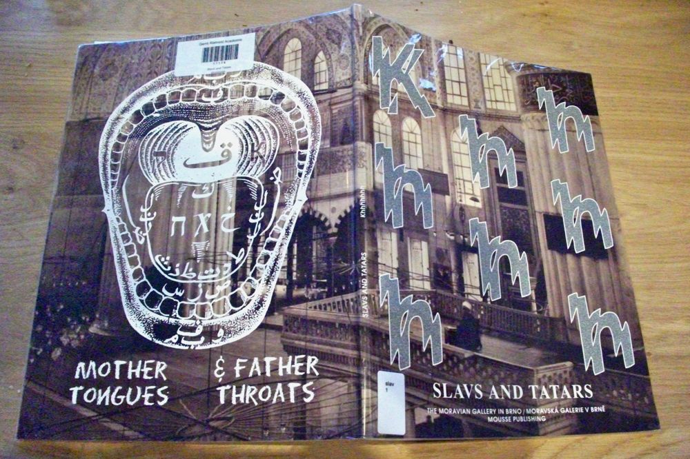
Looking at the book the first thing one notice is of course the cover – afterwards turning the book around, feeling the weight in your hands and looking at the back.
The cover consists of the K and the H’s from “Khhhhhhh” scattered over a picture of a room that looks like a mosque. The letters are in a sort of bad computer game-like font with a thick white border and a filling of grey/silver’ish screen noise. Strange combination which immediately intrigued me and invited me to open the book and look at the inside.The way the letters are scattered is of course a choice which have been made, like everything else in the book, and the way these letters are scattered is no different. They move up and down in a rhythm that divides the cover into sections. Also the effect of the font adds to the feeling of them moving.
The book is slightly bigger than A4, half a centimeter on each side and has a thicker cover but still not hard, which gives it the feeling of a catalog more than a book-book.
The back of the book is a continuation of the mosque room with a big white print on it of an open mouth with the two sentences:”Mothers Tongues” and “Father Tongues” written under it.
By looking at the cover and the back you already get a feeling of what the book might be about. Something with letters and a strange pronunciation of /sound from this “Khhhhhhh” + the mosque, the strange print of the open mouth which almost goes “AAAAAAHHHHH” at you, the inside of the mouth with foreign alphabet symbols and finally the Mother Tongues and Father Tongues indicating, again, language and inheritance of tongues/pronunciation.
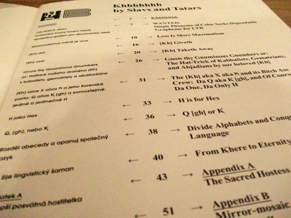
Opening the book there is no first page with information about the publisher, designer, year or anything, but on the opposite page there is the table of content written in Russian and English opposite of each other as if there was in a way some kind of comparison between the two languages. Maybe the book is about language? The paper is thicker (115 grams), a bit yellowish and has a really nice smell.
As you can see on the picture, the book has chapters and sub chapters.
The following page is a Russian text in fat black lettering and two translations of the same text in English and I think Czech. The text says:” Genghis Khan, me you midnight plantation! Dark blue birch trees, sound in my ear! Zarathuse me, you twilight horizons! Mozarticulate me, dark blue sky!” – by Velimir Khlebnikov. I found it interesting that the two first letters in Velimirs second name are Kh. Also Genghis Khan was the leader of the Khan clan in Mongolia from 1175.
Before moving on to the rest of the book I would like to add a quote to give a shorter and probably more precise introduction to the book that might make more sense than what I’m able to explain: ” the book is; A reconsideration of pedagogy, progress, and the sacred role of language via the perspective of a single pesky phoneme, [kh].Khhhhhhh explores the thorny issues of knowledge versus wisdom and the immediacy of the oral versus the remoteness of the written word thru a fireside chat around sacred hospitality, Velimir Khlebnikov, and numerology.”
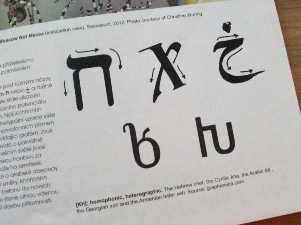
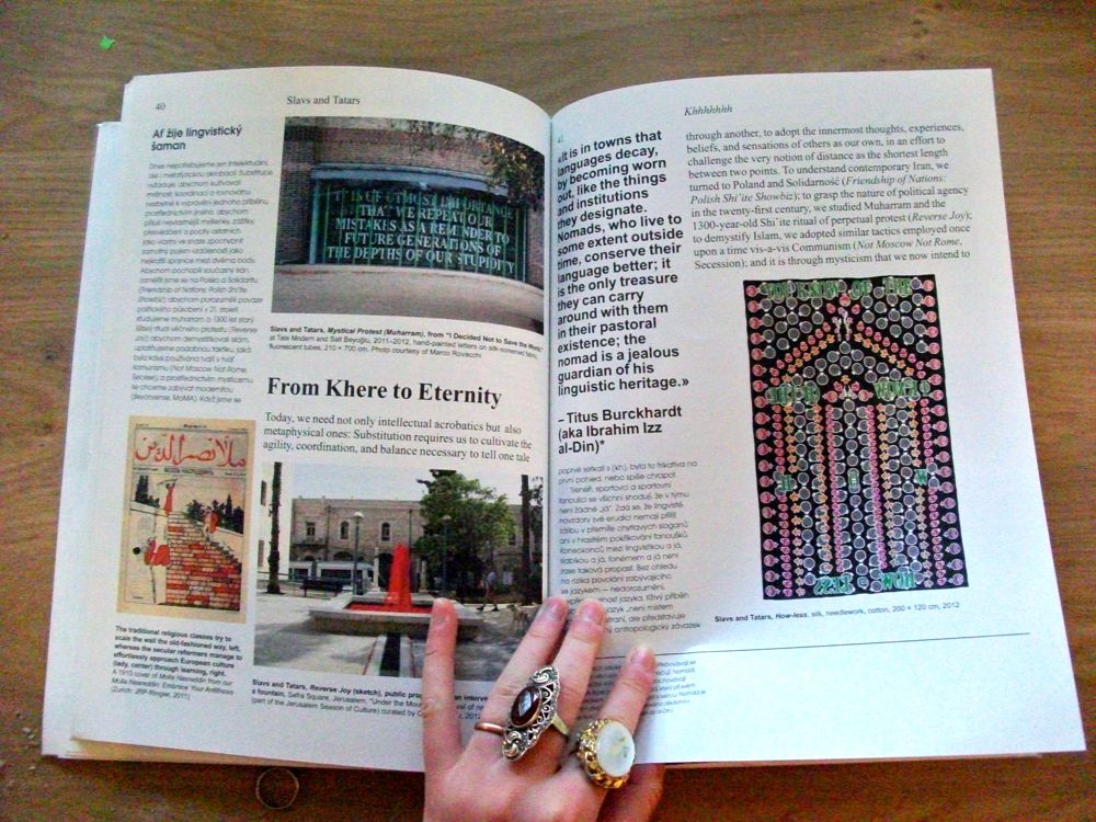
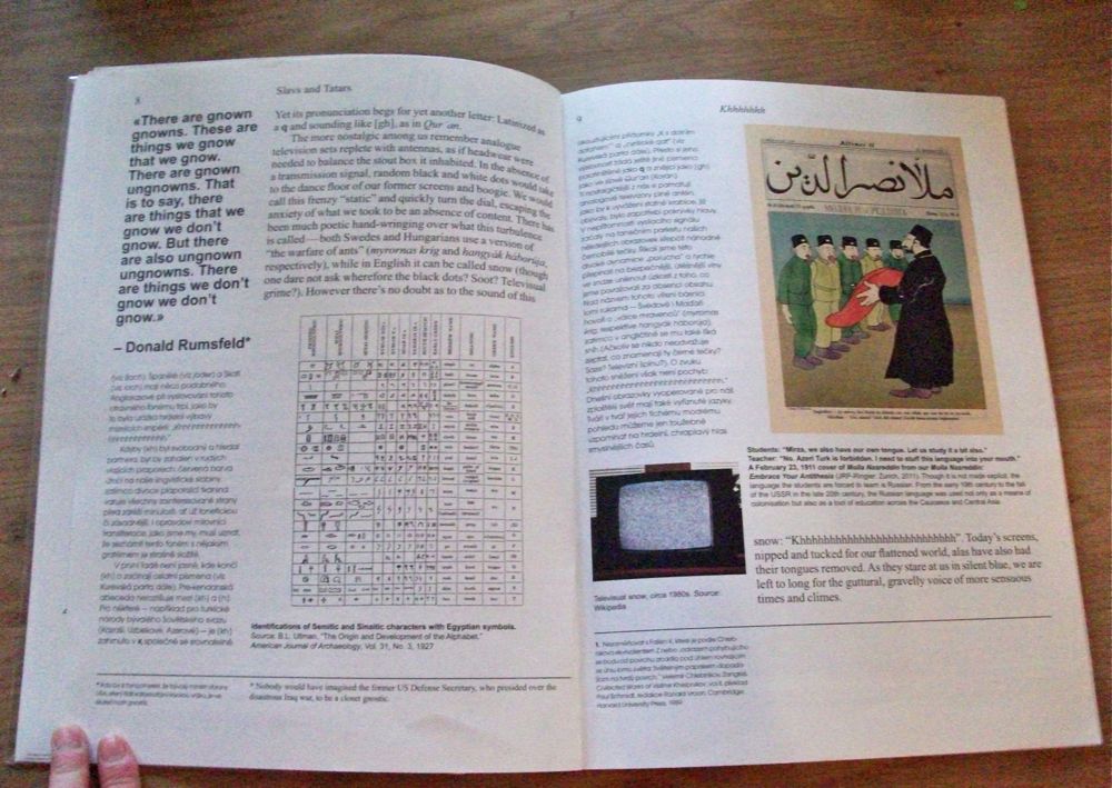
After this starts a long investigation of the phenomenon Kh which I, before reading this book, had no idea was a phenomenon in language and how it undergoes different names and symbols in Semitic, Cyrillic, Turkic and Arabic alphabets. Because of the different languages each page consists of an English text, the translation in Russian, pictures from Slavs and Tatars exhibitions and beautiful drawings of the Kh in different languages and in which direction these symbols are to be drawn.
The choices which S&T has made for this book helps to pass on the investigation/research feeling and works almost like having a wall with a lot of sticky notes and pictures on it. They make this work without being confusing, which very easily could happen, by dividing the pages into sections. As in the table of content, the pages inside the book are divided so the left, slim column is for the Russian translation, most of the rest of the page has the English text and then you have pictures, illustrations and alphabets/symbols scattered over the rest of the page, with descriptions of each picture under each picture + footnotes. Busy, busy pages! The graphic of the lettering becomes more like a picture on the page than a text. Still everything is framed and kept inside a border of approximately 1,5 cm.
There is a lot of information on each page and the drawings, the texts, the translations and images are placed differently on each page so when you turn the page you have no idea what will come at you. As mentioned before this could give a very confusing experience with the book, but instead of being confusing it just keeps you really interested and curious.
S&L them self says in an interview that with their publications they: “Attempt to resuscitate the sacred character of language, from the devotional act of reading to the ritual of the printed word”, – which might be why the book design is how it is, jumping up and down and moving on the pages as if it was the spoken language with it’s rhythm, different heights and lows and not the printed word.
It is almost impossible to describe the book with words, especially written words, which funny enough makes so much sense considering what the book is about.
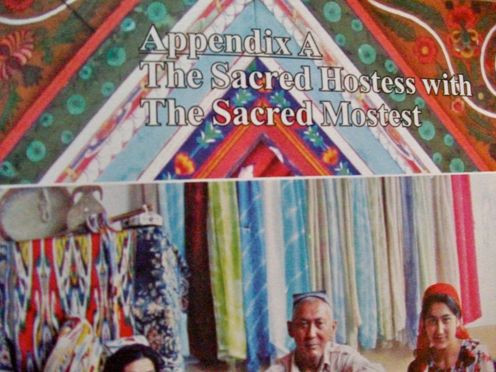
To indicate that the book moves into a different area in Appendix A, the pages changes completely and the background is a big photo.
And the same goes for Appendix B, which is the last chapter.
I would really recommend you to have a look at this book and Hey! ….
It’s super easy because they even have a free pdf version uploaded online and on all their other publications www.slavsandtatars.com
Rietveld library catalog no: slav 1
