Skip to Content Skip to Search Go to Top Navigation Go to Side Menu


"subjectivity" Tag


Turn the shelf, turn the page


Tuesday, April 19, 2016


When I walk through bookshelves comparing labels and the code I found in computer system, I feel that it is too right to do so. It is like a treasure hunt with a map showing exactly where the treasure is. The code efficiently directs me to the book I need but in a completely closed way. There can not be everything in a book itself. The thing I really want to get from books is more often in somewhere                 between                 books than in a single page. So the whole point is matching a book with a good pair, or a good group, or a good pile of books. This is a collective activity, which is not necessarily precise but friendly.


_____

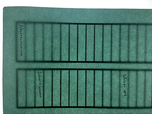
1) Every spine of books you can see in front of the shelf is under a certain theme. They are like a quick index you can highlight. They follow the an alphabetical order, so you should go to the first shelf if you are looking for ‘Abstractionism’.
front

 *The ‘theme books’ do not have to be really representative to be there, as long as they can stand autonomously with a clear keyword in their title and not duplicate the other theme.


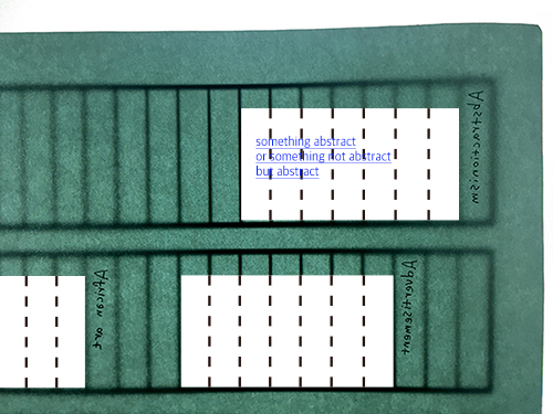
2) If you feel like diving into the subject and seeing more things about it, you should go the other way around the shelf. Other books which are considered to be part of same category would be placed next to it in the opposite way. Just as you click the blue hyperlink in Wikipedia for extra information.

front_2 copy


Photo references, books which are written by the same author or in the same series could be obviously related. But there also could be hidden connections which you would never understand the relevance of if you have not read them. Unexpected encounters from this        l      o          o     s        e              c     o     n     n      e     c    t    i   o  n       could offer a key to the totally different world, or an advanced step in a research, or maybe a clue in a maze that made you interested but confused. It opens up and widens the space between each little subjects and makes a playground to think and read.


3)Every reader can be a participant of the organization, so it is always welcome to replace or move books. There are no definite criteria to locate them-it is not random but super subjective. If you feel like that is not a right place for it or there is a better spouse for it, go for it. Maybe you could have a hard time to find the same book next time if someone disagreed with your choice and moved it, but that also enables you to track another adventure that the same book went through.


All the choices reflect personal moments and thoughts that people have really experienced and are willing to share them. The subjective reaction on books can find and activate the potential connection between them. With this, the identity of a book gets defined over and over again by its surrounding which continuously changes. Where is it? What is on the left side of it? What is on the right side of it? Where was it? Where is it going to be? This is a collective activity with unlimited possibilities, which is not necessarily precise but friendly.


In & Out of Amsterdam


Sunday, December 8, 2013

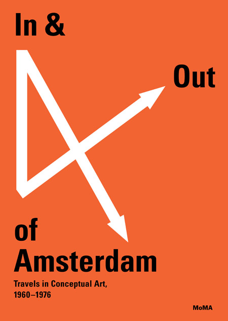
This sparkling red cover with white arrows  caught my eye in the library.  There won`t be more colors in the book (except for photographs). I don’t mention it as a regretful. The retraint use of colours in the book emphasize both the cover and the inside.
cover

The cover is giving informations on the topic (conceptual art), the location (Amsterdam  and further links) and the period (1960-1976).As an object the book is pretty thick especially because of the choice of the paper. The cardboard of the cover is like wrapping the book which is bound separately with a black textile.
The book is dealing with conceptual art.
This field is generally using a lot of words to translates the works. In that case, graphic designer´s purpose is to communicate the ideas in the most efficient way. To reach this point they have to find a visual language to lead the reader in the way they consider as the most interesting. Here the structure is pretty clear. The book is comfortable as an object (as mentioned above) and comfortable to read.

This is first due to the black bold letters and central texts. Then the colors of the photos are softened and finally the white paper is not too bright.
Now we´re sure the reader is not confronted to practical difficulties the designers still have to focus on how to relay the information and find the balance between text and image.
Divided in chapters, the book first talk about the raise of the conceptual art especially linked with artist who have been working in Amsterdam. Then the book become more visual presenting artists through their works (mostly photos).  So when the book comes closer to the artists and conceptual artworks it becomes visual when you probably expect more text and informations.
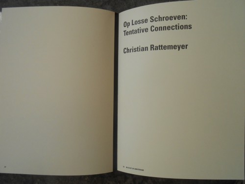
The reader can easily spot the chapters because of the blank left page facing the title written in bigger letters on the right page. The first part of the book is about conceptual art and does not focus on artists so much. To illustrate the ideas developed in the texts and make them understandable images are included.

DSCN1661
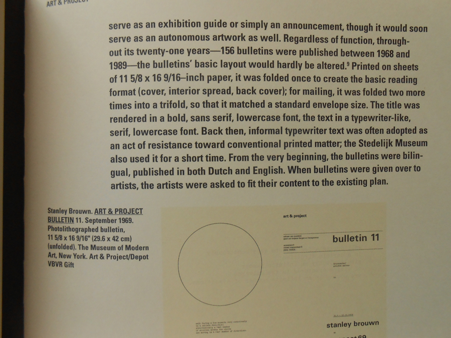
The text placed in the middle leaves a lot of white space next to it. This is used to add  details that are not directly part of the text like information concerning a photo or references. There is only one single typeface used. The only difference is the size of the letters making the text more or less big according to its importance. So this book is really trying to explain the content in an organized and comprehensive way.

DSCN1658 copie


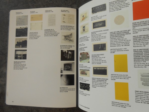
In the end of each chapter is an index and everything is gathered together in the end of the book in a bigger and complete index. This index also contains pictures to be in harmony with the rest of the books logic and design.


Index
Then we come to the second part of the book based on specific artists. Here the text gets smaller and is present on the first left page of each artist´s chapter only. This because after using a lot of text the reader should be able to have a sensitive and personal approach to the artworks. The presence of the text is only to provide informations that can not be translated through images (biography…). So that we can focus only on the works themselves.

At this point we only have pictures to understand. But still we are not facing the real artworks so the photographs and the graphic design can decide how to introduce them.
First because of the angles and the distance, then by the size of the printed picture in the book and the choice to select colors or not, finally by the order of the presentation and the links created between the chosen images due to their positions towards each other. That’s all the explanations the reader has.
With this system the graphic design leads to a certain way of looking at the artworks while they still give a lot of freedom to the reader.


Point of view

In my opinion the visual communication of this book makes its topic clear and understood but still asks a bit of interest and subjectivity from the reader who has to experience the book (exactly like in an empirical process)  to get  knowledge from it.

Rietveld library catalog no: 706.8 che 1


Log in
subscribe