Skip to Content Skip to Search Go to Top Navigation Go to Side Menu


"perspective" Tag


Distance makes perspective


Thursday, November 24, 2016


Design Methodology, Logic, Mathematics, Geometry, Counting, Systems, Translation, Meaning, Value, Obsession, Graphic Design.
For this Design research project I have tried to relate myself or the way that I work to the work of Pavel van Houten. In a way I will temporally adopt Pavel van Houten’s way of working maybe or the way that I interpret it to research his work (or maybe more my own work ?)
 

PVH-behand2-D.acton
 

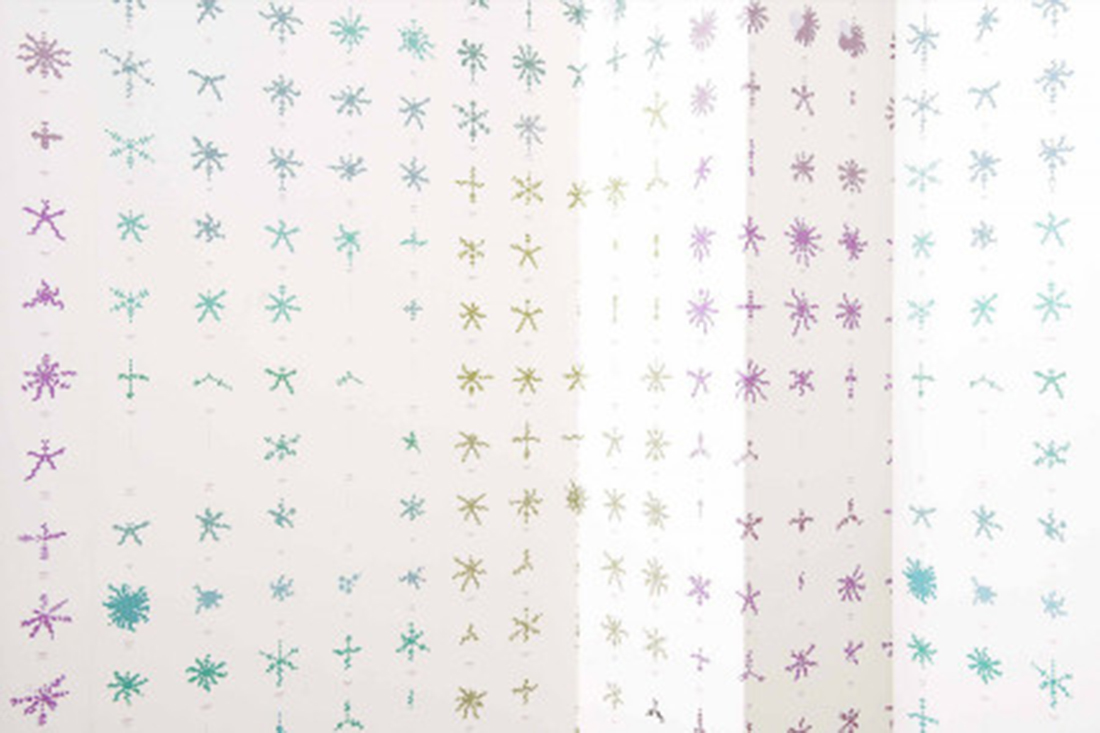
After our museum visit to Dream out loud I thought I recognized in his work something which I use in my work: a strange system that generates a certain visual language. He used the database of the project Treeful to create new wallpaper for artis. Because of this I thought out of all of the people that are present in the exhibition Dream out loud his work spoke to me the most. I started looking in to all his work and I also visited him to talk to him about his work. After I talked to him I understood what his work is about. Also he seems to be very aware of his position as an artist and uses this in a very clever way to help people understand things that he wants them to understand or look at in a different way.

When does something become valuable?

So now the focus of my research has shifted for now I have the desire to understand myself in that way. What do I want to say what do I have to say is necessary? How do I distance myself far enough so that I can see what it means. How do I find my way of working? Perhaps these questions are to big and will take a lifetime to answer.
Can I find anything about this topic? Yes I remember this:

Since books can’t fly, lets angle them instead


Saturday, April 16, 2016

Since books can’t fly, lets angle them instead

I’m usually a patient and thorough person. My apartment is always in an acceptable order, I iron my clothes, I bike at an average pace, I don’t lose my patience when I stand in the slowest line at the grocery store. If I start reading a book, I always finish it sooner or later.

But; whenever I visit a bookstore or a library, and I get confronted by thousands of books, I completely lose my patience.

I know that there is a very clever and simple system to find what you are searching for, and that someone carefully placed every book in alphabetic order, neatly lined up on the bookshelves. But when I stand before the books, I get the same anxious stomach ache as when someone asks me a simple mathematical question that I usually can answer in one second, but in the stressed situation I turn red and stutter that I don’t know.

So how could I avoid this brain-freeze related paralyzation in the context of books?

Solution:

So lets start with the order of the books. The order is usually determined by the alphabetic order of the authors name or the title, which makes sense since it’s both practical and logical, which I’m a big fan of.

Now imagine that you stand before the alphabetically organized bookshelf, turning the pages in Hendrikje Koersen’s poetry collection De witte boot. You are now amazed over the treasure you found, and start to eye the bookshelf after more poetry.

Here is the interesting part:

Imagine every book containing poetry, magically hoovering in front of the bookshelf, making it easy as a piece of cake for you to find.

Sounds good right? Unfortunately I’m not a wizard and therefore not in a position to change the laws of nature, but I can however physically highlight a category of books, by tilting the short-side of them, so they hang over the bookshelves end, pointing out in the room, without actually falling down.

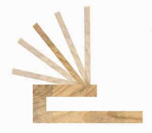
To angle these books, you could use a very simple wooden tool as in the illustration below.

angler

Left picture: Angler, viewed from the side

Right picture: Angler, viewed from above

How:

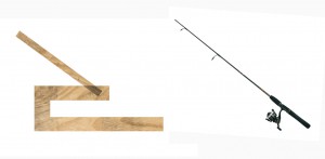
I have chosen to call this tool an angler, since it is used to literally angle books. (Angler is also the word used to describe a person who is doing angling, a kind of sport fishing, which is fitting since you hold your fishing rod in a angle similar to my wooden tool.)

angler and fishingrod

Left picture: The Angler

Right picture: Fishing rod 

The angler-tool is made of a very simple construction of wood. It can both be used in singles or in groups, but in the context of bookshelves, I will describe the usage of multiple angler-tools.

To use it you first have to fasten it to a bookshelf, and then put it in the angle that is needed. You can choose from five different angles, each representing a different category.

I have chosen to represent poetry, architecture, design, photography and fine art in this scenario, since I study at an art school where these subjects are the most presented in the school-library. In theory, you could add even more angles to the tools design, but I believe that that would affect the clarity of the category’s in a negative way.

anglers angles

Picture: The five different angles that can be used

The tool has five angles, each representing on of the category’s above.

The angles are:

90

110

130

150

170

The angle 170 will be most far out from the bookshelf, and thus also highlight the book. I want to use it as a category for Poetry, because I believe that poetry it is an underrepresented subject that is read the least in art schools in comparison to other subjects. Having this subject highlighted could direct more attention to poetry and maybe influence someone to take a look in the book, even if this person usually does not read poetry.

Angle 90 would be used for books about Fine Art, since I believe that Fine Art is the subject with the highest quantity of books, which therefore makes it important for them to stay further back so they don’t block the view of the angled books, hanging out a bit from the bookshelf.

It is also a category of books that are often used for research in an art university, so it is important for their title to be visible to make them easy to find.

Angle 110 would be used for the Design-category, for the same reason as Fine Art.

The 130 angle would be used for Architecture, and angle 150 for Photography.


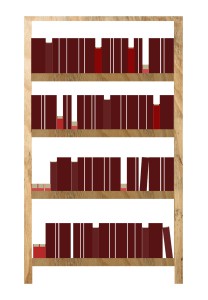
visualisation

Picture: Illustration of how a book-shelf using the angler could look.

Result:

By using this angler tool system a modified bookshelf will look like a relief due to the books protruding in different angles. If you are looking at the bookshelf from a distance, you should have an easy time recognizing the different categories by the angle of the books. Looking at the bookshelf from a closer distance, you would be able to find your book by using the alphabetic order.

By making the bookshelf look like a relief instead of a plain overview, it will invite the viewer for a more tactile experience of the books, because you are not only able to touch and see the spine of the book, but also the front and back side, the material of the cover and the colors of the pages.

The tool may only be a small object, but it would affect not only the angle of the books physically, but also the viewers visual perception of the bookshelf, both from  far and close distances.


A performance in n dimensions


Monday, June 16, 2014

In spring 2014 Designblog was invited by the 26th International Biennial of Graphic Design Brno (subtitled Education and Schools) to prepare a presentation for their Open OFF Program.
I decided to involve a group of BasicYear students in a research focussed on browsing the blog. The goal was to look for a personal objective and to visualize the browsing behavior it generated.
In an effort to regain more insight in the position of Designblog, we invited Klaas Kuitenbrouwer to lecture on the position of blogs as part of the wide interwoven internet space. A space that turned out to look much flatter than our imagination could have ascribed it.
The lecture later developed into this text supporting "WORDPLAY", our final presentation at the Biennial. No better place than to publish that text as part of the student research project "Browsing Designblog" on the Designblog itself.

Henk Groenendijk : moderator Designblog


While the screen of the device you are using shows that Designblog has a relevant two-dimensionality to it, this text will take you along perspectives on Designblog from single dimensions to two-and-a-half, three, four and even the ever flexible ndimensions in which Designblog simultaneously exists.


Address

http://designblog,rietveldacademie.nl
is an address, a pointer to a location. An address refers to a particular spot, a one-dimensional unit that is typically part of a thing with more dimensions.

An address like this has two kinds of capacities:  one is understood and used by machines, and the other is for humans. In its machinic capacity, designblog.rietveldacademie.nl points to a specific series of states of tiny logical gates, that are part of a memory disk in a server owned by some provider. That’s where Designblog resides in what you could call its latent, purely informational state. In this state Designblog is inaccessible for humans.

The human-facing capacity of the address points to a location on the WorldWideWeb. This address holds particular information on what it points to. In terms of content, it suggests its visitors to relate to what is behind the address as a time-stamped list of musings (a weblog) contextualized in the particular world of meanings known as design. But the address also ties the web location to a place on the physical globe, mobilizing some spatial –geographical- reference frame. It shows the blog is affiliated with an art academy: the Rietveld Academie in The Netherlands.

When a human calls upon that address – when it is clicked by you in this text, for instance – a command is sent to copy a section of that series of logical states from the server through fiber optic cables, through a couple of routers to the computer or phone where the click was performed. The browser on that computer (yours, that would be) than has the specific task and ability to allow that series or logical states to inform the screen of its computer to display what we have come to think of as the front page of Designblog.


Page

The ‘page’ is home turf for the graphically oriented. A two dimensional surface, that can passively hold various two-dimensional artifacts in a fixed relation to one another. The page was a helpful metaphor to be able to relate to the strangeness of networked information, as it was performed by snippets of code – a rewarding, but also frustrating metaphor for the graphically oriented: neither is there a real surface, nor is there a fixed two-dimensional relation between any artifact and any other. Still, although the page doesn’t exist anywhere but in your lazy perception, it doesn’t really hurt to think of Designblog as a collection of pages.
But there’s more…

The latent, machinic state is now activated. The address opened its front door, and revealed what performs not only as a page, but also like a place. An online, publicly accessible part of the Rietveld Academy, that indeed has some characteristics of a classroom.


Place

A place is an appropriated space. A location with layers of stories, traces of events. A place offers corners, furniture, a means to sit down and be there. A place ties to identity, to individual identities, or group identities. At places, relations become entangled. Anything can talk to who- or whatever also happens to be there. A place is somewhere you can be with your experience, somewhere to orient from. This possibility of being there, (which is different from ‘looking at’) this possible sensation of presence, subtly mobilizes a notion of partiality.

Over its years of existence Designblog has become a place with a deep accreted inside, a vast archive of contributions by Rietveld students: worded observations, found media-items, responses to assignments, to each others contributions, linked to each other, to other addresses on the web, clustered and flagged by tags.

Unlike a classroom, the inside of Designblog is at the same time its outside: the stuff inside is crawled and indexed by the bots of Google, that provide the endless amount of entry points for the querying audience. In this sense Designblog is like a Klein Bottle, an object with two-and-a-half dimensions, of which the outside and the inside are one unbroken surface.

Every corner of Designblog either links to some item in the vast non-dimensionality of the web, or is accessible from it. Things inside Designblog are not even closer to one another than to things accessible through other addresses. Everything  on the web exists at more or less the same distance from everything else. If this is a classroom, it is an extremely open classroom.


Space

Designblog has a lot of placeness, but clearly also still has endless space. To call it space pulls the attention to its not yet actualized potential. It brings to the front that whatever it is, it could house a great many future developments, without ever loosing that quality of potential. In the sense that any member of the blog can always open up a new empty page (a sub-address) to fill, Designblog performs as space. But this spaceness, because it is part of the web, has no particular kind of dimensionality to it.


Nest

Designblog is a collective, open archive, an accessible history of students’ online work. But to say (like you would say of an archive) that informational artifacts are ‘stored’ there would be misleading. The artifacts are not stored in its structure, they are its structure, as well as its decoration.

Like a birds nest is made of twigs, threads, leaves, wires, found things that are sufficiently twinable, Designblog is made of its twines. Also a nest is a place where one can land and fly off from. A nest is a place that holds up who dwell there, but that does not cover them. A nest offers place, but has no real inside. All that seems to hold for Designblog: as a groups’ nest it offers a place to land, to contribute informational twines to, and to fly off from.


Body language

When language deals with space and location, it stubbornly uses the body as implicit reference. The language of spatiality is about here or there, behind or in front, up or down and in or out. The web captured the human imagination through the metaphor of cyberspace. This spatial approach offered important and helpful familiarity, and has made the internet inhabitable, so to speak.

Spatial concepts have played and still play a crucial part in helping people to relate to networked computing. But insisting on spatial notions also fixes the relation between people and the online as a spatial one.


Time

And it is through the time-perspective – the fourth dimension– that other Designblog realities reveal themselves. Because the most essential aspects of Designblog are processes.

The emergence of Designblog, (as of all blogs) follows a time line, that would be one-dimensional if it didn’t fold in on itself, and looped to earlier contributions. Twining may be an apt practice by which to perceive the development of Designblog: both making and responding to what’s there, simultaneously creative and reactive.

Time is also the room in which learning takes place – the process of one thing informing another thing, the process of information, the raison d’être of a school.


Performing

All agents related to Designblog are engaged in some act of distinctly time-based performance. A performance of a for a particular audience – you.  Some of those acts come down to straightforward, unambiguous execution of tasks, others are more elaborate and creative.

Your computer or phone performs its web browser, for you. The web browser in turn performs the latent code of Designblog to make it active and accessible, again to you.

Designblog performs its fuzzily structured content, never showing more than a glimpse of its vastly twined labyrinthine body. It responds to your clicks by turning a differently dressed little facade, by offering a new shadowy inroad, or by suddenly pointing a spotlight in your eyes.

Members perform the mysterious part of author – transforming found things into new source material. They create independent, informative agents of text or (moving) image, that in their turn perform the act of information on your sense organs.

And the members add tags to their agents, to suggest similarities or difference between their agents to you. These tags perform as frames through which to move with your mind, frames that you put on to shape your perception. Every one of those tags performs like one of n dimensions along which the content of Designblog can be morphed, when you travel along it. Although it is not so much you who travels through Designblog, it is more that Designblog travels through your screen – you stay put, Designblog performs the moves.

But you are not undergoing this passively. You are the last performer, performing the score of Designblog, following the by-roads and sideways. By your clicking you act upon your pseudo-conscious choices about what material is allowed to inform your perception. Your clicks and non-clicks manifest your own perspective in the material of Designblog.


Klaas Kuitenbrouwer augustus – september 2014

(written for the occasion of "WORDPLAY", the presentation of the online artefact Designblog at the Graphic Design Biennial in Brno, Czech Republic.)
 

sorry


Thursday, April 3, 2014


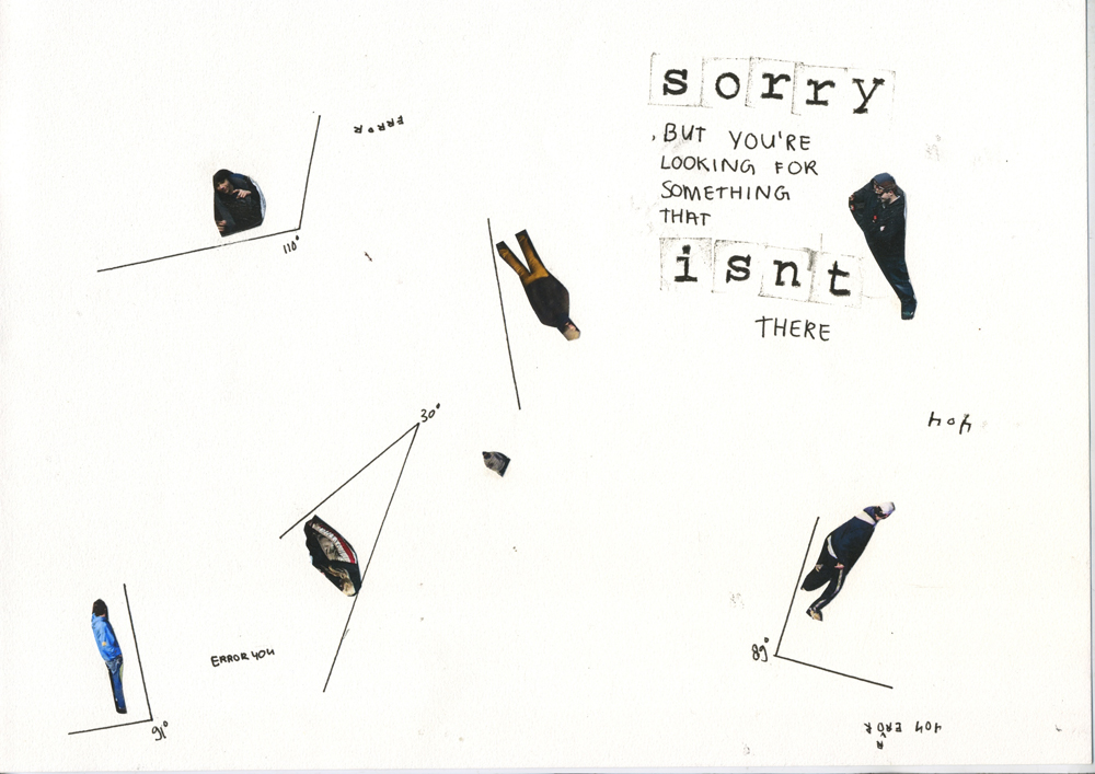
error404_redu


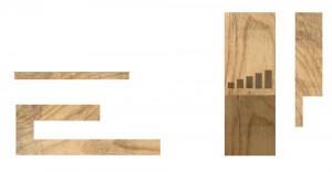
I was scrolling my way through the DesignBlog, when I stumbled upon a tag I wanted to click on. “90º” it said. Just under the tag of “80’s”, but above “a priori”. Almost poetic those three together. You can imagine my curiosity.

But then, something unexpected happened. Clicking on the tag led me to the page  “Error 404 – Nothing Found” [x].  “Sorry, but you are looking for something that isn’t here” it told me. I’m looking for something? It isn’t there? Of course, these kind of bugs happen more often on websites or blogs, but it kept my already triggered fascination going. I imagined a world without 90º. The blog told me I was looking for right angles, but apparently they aren’t there. They do not exist.

I think a world without 90 degrees will change everything. Don’t know if it will make the world a better place though. Don’t know if it will be an advancement for design either.

ON EXPERIENCING LANDSCAPE


Tuesday, April 1, 2014


Darius Blokker and Dimitra Chrysovergi* talking together on experiencing landscape


Each project that students initiate, makes them into temporary experts on given topics. Art & Design schools then become knowledge hubs where different expertise cross fertilize. By looking at what types of research students engage in, Designresearch and UnBornLab organized a 'workshop' to investigate design matters from a students' perspective.

Through a series of short video's students from both the Foundation Year and the DesignLab department share ideas, focusing on the temporary expertise gained as part of their projects, rather than the outcome. The workshop was articulated around one of their given assignments. Students were asked to develop a specific object or context to help focus or explain content.

The format is clear: two persons, discussions, filmed from above.
the space is : two stools and a table.

* Foundation Year


Looking at learning / Learning to look


Wednesday, April 20, 2011

We relate to an image in context with the place where we see it. Showing scientific images in an art space can be confusing if you don’t know what you’re in for.

It’s a worthwhile contemporary experiment in the sense that science has become an omnipresent part of our reality, and it’s interesting to explore the limits of the meaning and purpose of scientific images.

I can recognize the blown-up images of molecules because I have seen similar ones before or by reading the description. In a place of science, this might not have happened: I stood back and let them sink in, taking a closer look at the abstract forms, realizing: This could be anything. Not knowing how big this thing is in reality, I can imagine it to be anything. Something small zoomed in or a city from a distance. A couple of times, I saw something I would have liked to copy or use, say, as an animation. There’s a fun thing about those images, beckoning me to play. A thing I found funny was how some images could have passed as modern art, had they been painted on canvas.

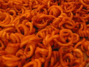
worms or curly fries?

A different aspect I thought about was the visual properties of nature. Some of these colors were very nice. I wondered if this was an actual attribute of the object or if a pigment had been added by the scientist to make a certain membrane better visible.

In the end, I do believe that scientific images can be put in an art space to enhance the viewer’s flexibility when it comes to the subject. Personally, I found these images very romantic. The devotion of human kind to find their origin developed with them into being and will never fade. Now that’s love!

Being Motion


Wednesday, July 14, 2010

Get the Flash Player to see this content.

I find, first of all, that I pass from state to state. I am warm or cold, I am merry or sad, I work or I do nothing, I look at what is around me or I think of something else. Sensations, feelings, volitions, ideas – such are the changes into which my existence is divided and which color it in turns. I change, then, without ceasing. Henry Bergson

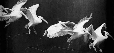
Being Motion is a graduation thesis by Charlotte ten Raa, and won the 2010 Rietveld Thesis Award. It consists  out of different texts. They circulate around the subject, the self; as a movement with the possibility to reflect. I wanted to bring the subject motion close to yourself, so close as to our consciousness. How we see the movement of a train passing by as well as how we can see our consciousness as one constant motion. How the self makes up stories from what it sees and how we form an image of yourself, seeing yourself as a subject  and as an object.  How there are different perspectives on time and space, looking from the starting point:  the self.

Our way of being in the world is very much about predicting what’s going to happen, taking tiny fragments and putting them together. William Kentridge

http://charlottetenraa.blogspot.com/

download this thesis: Being Motion

image: Etienne Jules-Marey

The jury was unanimous in its decision: Because it is a thesis that involves the reader in an interplay between form and content in an amazing way. Because it is very well written, keeping a careful balance between the personal and the objective, between anecdotal and philosophical, between thinking and doing. Because it shows that it is possible to deal with a very complex theoretical problem in a very light way.
It might be called a special coincidence that this thesis and its excellent understanding of the philosophy of Henri Bergson has been written in the spirit of our theory teacher Raoul Teulings [†2010] who we all miss very much, and in whose memory this first Prize for Best Thesis is given.


The final Choice


Tuesday, December 8, 2009

In my quest of finding books to write about I finally choose a book that I really want to read. In the former postings where I wonder why and trying to answer that question I now finally finish this path. I finish it by picking a book by M.C Escher. As a child this Dutch Graphic Designer fascinated me. His so-called impossible structures blew my mind away. You can look for hours to his drawings where he plays with perspective and impossible spaces. When I look at his work I don’t know what reality or fantasy is. And maybe that is what attracts me so much. The mathematical influence in his work is really important and that also raises questions again. Is his work art, math or graphic design? And is Design Art?

Esch. 6


Log in
subscribe