The Presentation of ‘Screen 100’
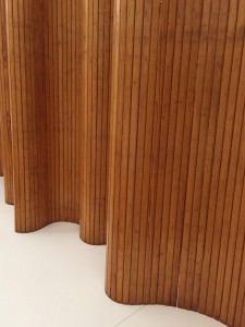
In the Stedelijk Museum Base, a screen made of pinewood can be found, next to other Scandinavian design. The description tells the beholder some basic information of when the screen was designed, by who, and when this specific one was produced.The object was designed by Alvar Aalto, who was a Finnish architect and designer who was born on the 3rd of February 1898. He could be seen as one of the most influential in Scandinavian design of his time. When looking at the representation of his works in books, his architecture is most prominent, as those were very big projects he worked on for multiple years. For every building he made he wanted the environment to be functional, so naturally he also started making furniture. In books about Alvar Aalto there is often a mention of the Pinoy vase and the Paimio chair, but it’s difficult to find the more obscure ‘Screen 100’.
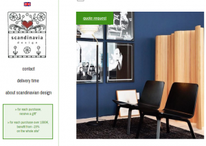
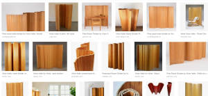
However, looking for it on the internet, thousands of results pop up. Even though printed matter hardly mentions the less popular objects, this does not seem to be the problem online. Instead of information about the object itself, or biographical details about Aalto (or maybe even the theory behind his design) it seems to be mostly auction sites. Various auction houses have a broad range of prices, starting from around €1800,- till approximately €8000,-. The sites claim that their ‘Screen 100’ was produced very short after the design year, but never give actual information on the piece. Often, the screen is presented in a way that Alvar Aalto would never. Next to very decorative elements full of color, or with clashing styles. The only place on the internet that seems to accurately depict the aesthetic of his designs is Artek.fi , the company founded by Alvar Aalto himself to produce his products en masse. Still though, the site remains simplistic and does not give away too much information.
To see how this object is represented in other media, a library needs to be visited. Specifically, the library of the Stedelijk Museum itself. In this library there are many books on art and design, but there are also documents on every piece in the museum, including ‘Screen 100’ by Alvar Aalto.
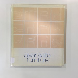
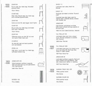
Looking in their catalog, many books on Alvar Aalto mostly focus on his architecture again. However, there are some books specifically on his industrial design. Even then, the screen is not put into the spotlight. In one of the books about Aalto’s design, it only has a very small mention in the back of the book, where his designs are put in chronological order. Only a small symbol is present, no pictures of the screen are shown in the book. The depiction of this exact design item is very scarce, even in very specific books.
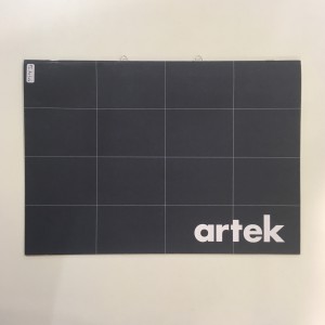
Luckily, the museum library has more than just those books. A brown file storage box is brought out, containing various brochures and sale catalogs from Artek. There are folders and papers from the fifties, nineties and early two thousands that contain every object sold by Artek. These are one of the few printed documents that show ‘Screen 100’.
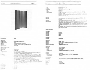
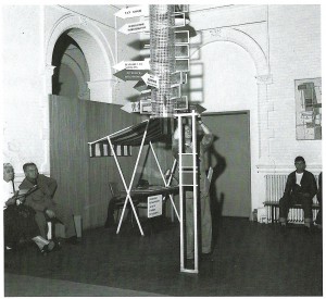
Besides the catalogs, the library also has the complete object description on hand, which is a file including all known details about the specific screen that they have in the museum. Details like the manufacturer, the size, the number of slats, and even how the object is transported are included. In this description it is mentioned that the screen was used in the museum, before it was put in the collection of the Stedelijk Base. Pictures show that the screen was used to block entryways while exhibitions were built. This means that the object was also represented in a very practical context.
The differences of how the media presents this object lie in the frequency and detail of information. Printed matter available in regular libraries often focus mostly on the more iconic, time consuming efforts of Alvar Aalto, as his architecture is often more prominently shown than his design. If the design does have a mention, it is mostly the more popular things that will be mentioned. This also holds true for more specific books on his design. One of the few printed matters that do mention the screen are very functional such as inventories or catalogs, where the context is about selling a product, instead of informing the reader about various movements or ideas. The price is often listed right next to the object. The same holds true for the information found on the internet, where auctioning sites give a very simple description on the object. However, the online results show a variety of pictures of the same object, in different combinations and settings, whereas the printed catalogs often go with the same pictures and symbols. While the museum library has one of the most accurate and detailed descriptions for the object, one can only understand it fully by seeing it firsthand. Even then your understanding of it can depend on the context in which you see it, as the screen can be represented among other furniture of Scandinavian designers in the context of a presentation in a museum, or seeing it functional, as an everyday item, where you are more likely to glance over it.
Yet, after a deep dive into the designs of Alvar Aalto it seems impossible to glance over it and not admire the simplistic beauty that is inherent to ‘Screen 100’.
