The first time I saw his book was at a gallery, which let’s agree it’s not the most intriguing place for displaying books since we didn’t have the chance to go through the pages, but the positive side of it was that it made me even more curious about the content of the book and helped me to analyze my primary choice I had to choose among an array of books from different ages, designers, concepts and styles.
Why did I chose this one? Sagmeister’s book was one of few books lacking any text on the cover meaning that for it’s representation
it relies only on its visual qualities. But not only that, it lacks any hint of subject on it as well so it triggered me to step closer.
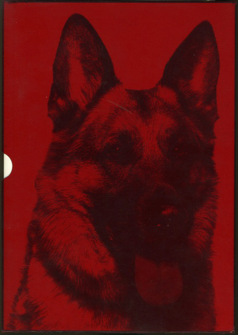
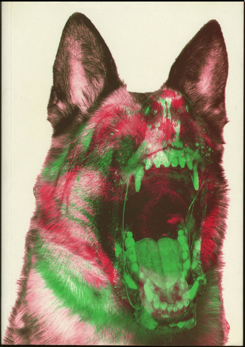
At first look I saw a book with a portrait of an animal referring to a wolf, but the closer I went to the image the more information started “appearing” on it by different layers.That combination of overlaying made me curious even more. When it is in it’s red plastic cover a perfect, friendly and appealing portrait of a German shepherd is displayed on the surface, but once you remove it, the mood of the dog changes by an added green layer and it doesn’t even look like dog anymore. It adopts a dualistic grotesque-creature shape which fascinated me instantly.
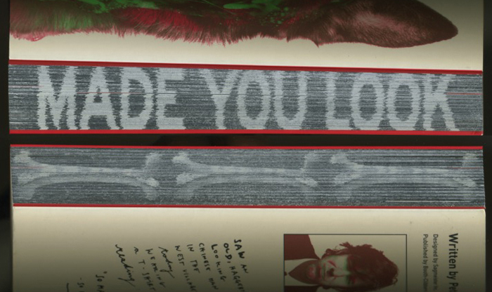
I found this interaction between all the elements very intriguing. Further in my investigation I figured out that it’s a book covering 20 years of graphic designs by Sagmeister, INCLUDING THE BAD ONES.
‘Made You Look’ by Sagmeister 2001
Cover and content, the duality of our showing on the surface what people want to see, but giving them the chance to look on the other side as well.
post by Jenela Kostova
