Skip to Content Skip to Search Go to Top Navigation Go to Side Menu


"inspiration" Tag


“I HEARD THEY RIPPED IT OFF”


Wednesday, November 21, 2018

The first thing that caught my eye was the title together with the typo; “I HEARD THEY RIPPED IT OFF”. The typo looked like the way I write by hand; With bold letters and a melancholic undertone. The book gave me a homemade impression, and right now I really want to make a book based on what I write and draw in my journal, like one of those books that more look like a public notebook( Had bookbinding workshop for the first time the same morning). The aesthetics of the book worked as inspiration for me, which was one of the reasons I chose it. Generally I like books that look like weird notebooks you have stumbled across somehow. When I go thrift shopping I always look for old journals, like peeking into lives of strangers I probably never will meet.

The title had my kind of humor, for me humor is key; Seeing something which applies to your own sense of humour is kind of like seeing something written in your own language when you are traveling. Furthermore the title intrigued me and I wanted to know more about the title and the person who came up with that quote. I don’t like when things are too obvious, I want to feel as if I have stumbled across something  secret.

The cover was very minimalist with only a stripe of black “spray paint, a bit mysterious in a way, and very graphic ( Black and white). I like when things are a bit mysterious yet graphic at the same time, I suppose you can see that in the artworks i make. The book was small and simple and the pages “raw” in a way, again working as an inspiration for my eventual future book. I always prefer books that are small and simple, too big and too fancy books takes up too much space and attention. Also that day I had a small bag which might have affected my choice of a small book in order to fit.  When I peered through the pages there where different small texts written in straggly handwriting together with a few drawings, which gave me the impression of looking into someone’s journal. Exactly the inspiration I’m currently looking for. I wanted to know more of the content, it felt very personal and humorist yet serious in a way.

1-2-3-:^)


Saturday, April 5, 2014

ppp1


Jumping around through these images in Designblog,

back to essay this title ‘1-2-3 Jewel’ caught my eyes.

An essay about jewelry? Cool, lets check out.

Not only its pretty graphic design and pinky pinky makes you happy, the content is really good.

For me hand made jewelry is unique, you can feel so much more than mass manufactured accessories.

And it’s always a great gift option for special occasions.

It’s so nice to read about the graduates, after spending so much time in Rietveld and staying in the Jewelry department.

What is their understandings or maybe personal relationships and reflection on jewelry.

To see how they find their own way through different approaches, experiments and observations,

finally to see where they are standing now.


ppp2


Are you an artist or a craftsman?

Are you making wearable jewelry or object for contemplation?

Does it matter? Does it not matter?

Sometimes I pass their department several times a day when I have to go to workshops,

then I start to guess how many people are working there on their table now:

Glue, hammer, burn, bang bang.

Pretty in color and form. Another jewelry is born.


ffff


The X-Factor: Interior Edition


Sunday, May 12, 2013

Even though the title of the book that I will discuss here sounds like a cheap television-show, I am forced to be objective today. Therefore I would like to mention that the title of the book is, in fact, both good and bad. I’m totally neutral about it, really.

Xtreme Interiors – Courtenay Smith + Annette Ferrara;
is what the cover screams (the ‘X’ in ‘Xtreme’ covers most of the cover, printed in pink).
You might wonder why I am discussing the book with this particular cover at all. Well, dearest reader, with the three old keywords from a previous article (the keywords being: Bauhaus, contemporary, decoration) I have written for this site, I had to choose a book from the Art section in the Rietveld Library. As you may expect, the Art section in the Rietveld Library covers more than just one shelf. I even am under the impression that the Rietveld Library is an art-minded library rather than a usual library. Anyway, the three keywords in combination with the Art section of the Rietveld Library brought me to this book; since it’s full with contemporary architecture that does use decorations a lot.

The cover turns out to be very straightforward about its content: it’s a simple book filled with pictures of extreme interiors. Unlike the previous book, this book does look a lot like an art book: every two-pager has at least one image; every image is supported by some text. The book supports a wide range of architectural interests: it shows images from renowned architects to companies like IKEA, it shows interiors from all over the world and from many different movements/years – although it does not show any interiors from before the 20th century.
I think this book is more a fun-to-have, a visual page-turner to inspire your architectural designs once you found out that your designs are just as boring as the ones of most modern architects.

Rietveld Library cat.nr: 14564

“1-2-3 Jewel”


Monday, March 5, 2012

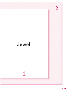
As part of the final exams and graduation show 2011, the Jewelry department of the Gerrit Rietveld Academie “Het Sieraad” published a wonderful triptych.
A successful effort to put the work of the 8 graduating students in broader perspective.

This triptych consists out of 3 layers in which the students present
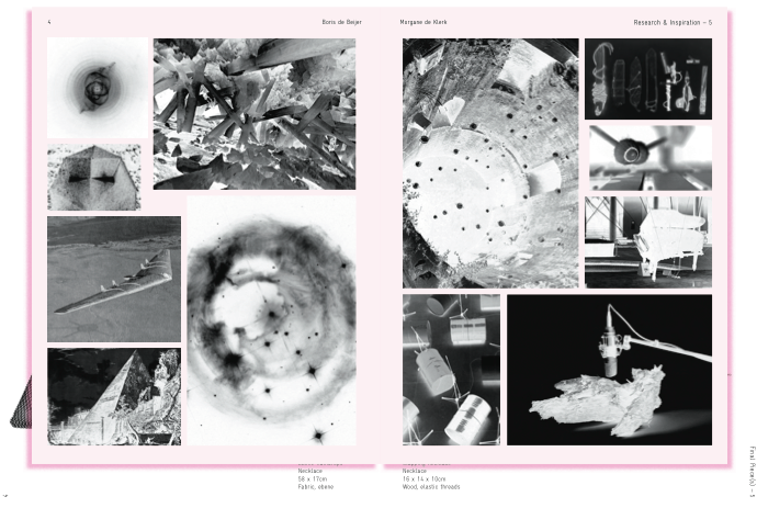
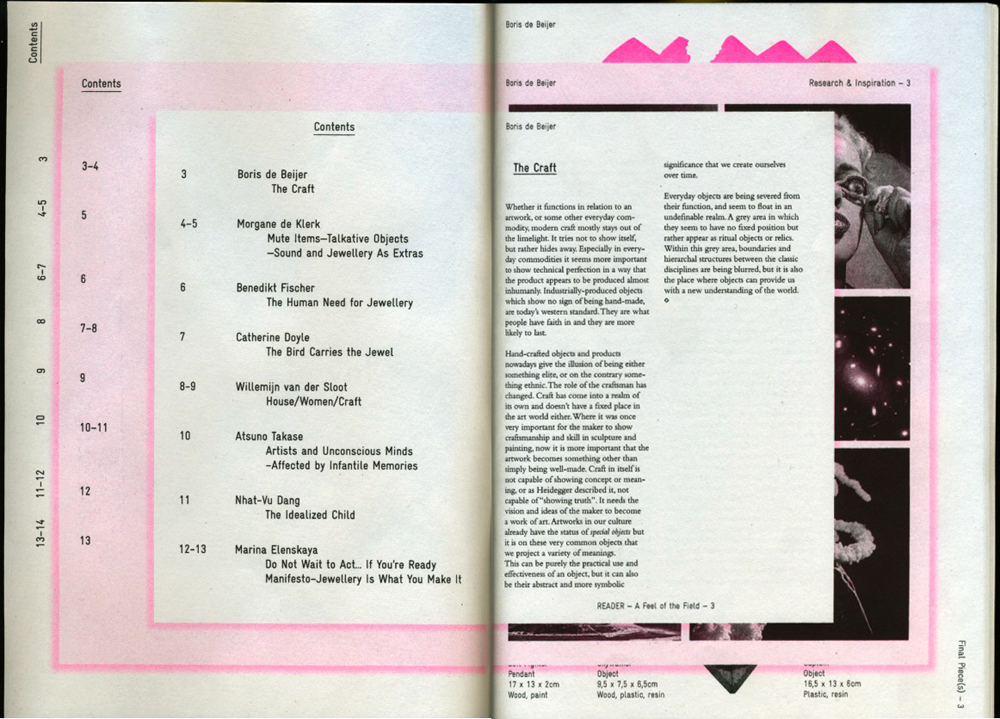
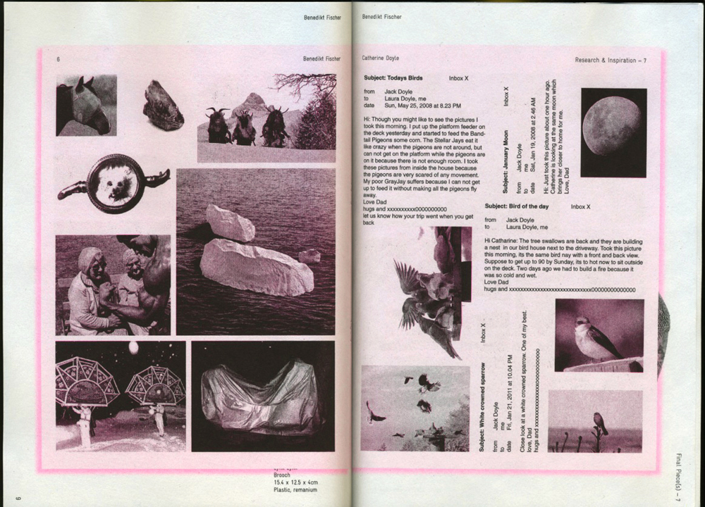
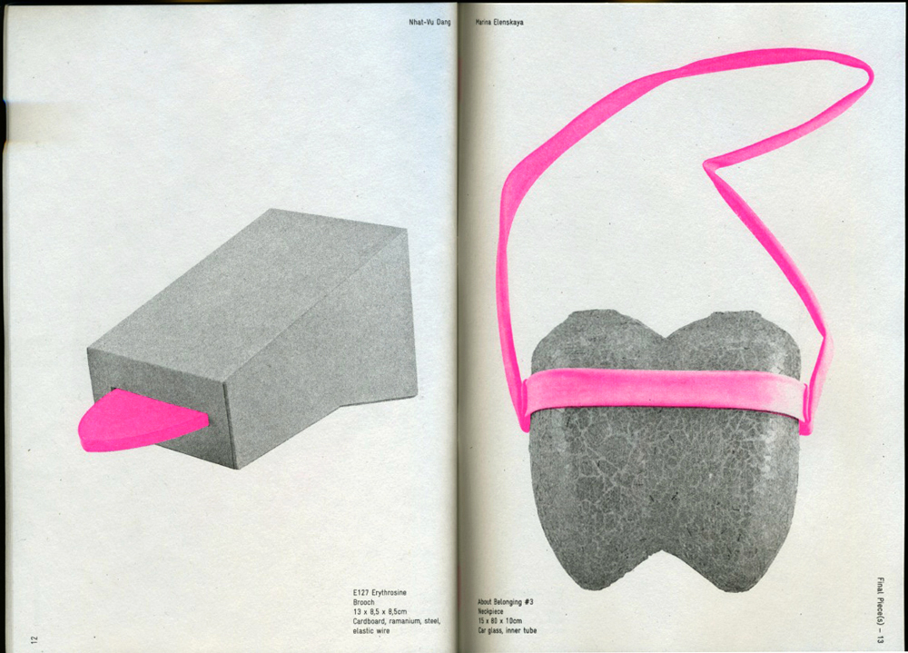
1] their visual inspiration material, 2] parts of their theses in relation to the works, 3] the works itself.

The whole publication is beautifully designed by Anna Hennerdal a graduation student of Graphic Design herself. She managed in a very effective way to visualize these layers and their interrelationships. Most intriguing in this publication is the transformation of all the material through the miraculous technique of cyclo-style printing causing an unique visual interpretation.


“1-2-3 Jewel”
a feel of the field / research & inspiration / final pieces

page 2 - 3 : chapter 1 / a feel of the field / index - Boris de Beijer

page 8 - 9 : chapter 2 / research & inspiration / Benedikt Fischer - Catherine Doyle

page 12 - 13 : chapter 3 / final pieces / Nhat-Vu Dang - Marina Elenskaya

The 40 page publiation “1-2-3 Jewel” of which 200 copies were printed can be bought for € 25 at the Jewelry department or can be downloaded as pdf below.

  download thesis: 1-2-3 Jewel” [english language]


Like clothing to fashion – an architectural research


Wednesday, November 30, 2011

The initial starting point of my research is rooted in the interest around the De Stijl movement and its outspoken elements regarding architecture. From 1917 until 1931 while being in The Netherlands and bordering countries, one was able to find a great body of work containing certain remarkable aesthetics. An underlying common intend was to create spiritual harmony and order by reducing the use of forms and color. Stylistically that lead to the conclusion of implementing primary colors, black, white, vertical and horizontal lines as basic elements. Abstraction was the thing.

Anyway my idea of what my research topic should be all about shifted shape numerous times during the process of finding a spark. The reason for that can certainly be found in my personal approach towards architecture which I will involve a little more later on. Questions concerning the different stages in the process of designing architecture reoccurred. The importance of De Stijl for works of upcoming future architects was another aspect I chose to lie my focus on. While hunting down valuable pieces of information with consideration towards De Stijl’s influence nowadays, I found myself in the lucky position of gaining insight into architecture students’ minds while wrenching out new ideas. I went and asked.

(more…)

Behind the Poster


Sunday, November 13, 2011

Since I have grown up I have been exposed to more and more designs and designers. During my research of Wim Crouwel, I was introduced to Swiss Graphic Design and Joshep Müller-Brockman in particular, as this designer was a big inspiration for him. Müller-Brockman was one of the great pioneers in the New Graphic Design movement, (also known as Swiss Graphic Design), educator and writer who helped define the movement within the 50’s. It represented what designers would consider cleanliness, readability, objectivity and structure. For me, the simplistic color schemes and structure within the design really speaks to me.

Müller-Brockmann began his career as an illustrator, but it was not until his turn to graphic design that he found his true calling. He is perhaps best-known for creating mathematical grid style to provide an overall orderly and unified structure.[x]

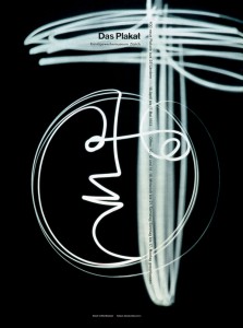
Müller Brockmann’s wide-range passions, interests, and commitments enable one to approach his work from several points of view, and his influence in graphic design extends well beyond his familiar poster work. He also was an accomplished photographer, often integrating experimental photography, photomontages, and light paintings into his design work. He loved music and over the course on many years made the now famous poster designs for the Zurich Tonhalle (Concert Hall), which were highly influenced by the “feeling” aroused by music. Josef Müller-Brockmann’s ideas are mostly related to abstract concepts, seen in many of his Zurich Tonhalle Concert posters. He argued that music is an abstract art therefore should be “interpreted abstractly,” and based strictly upon the established rules of typography and a grid.[x]

Nevertheless, all his works were built upon a grid system and in Müller-Brockmann’s book Grid Systems in Graphic Design he describes his process of using the grid and specifically reinforces the purpose and importance of its use and simplicity. Labeling it “constructive design,” Brockmann describes the Swiss style as economic and rational, and it is interesting that even those designs that appeared free of structure were rigidly organized beneath the surface.

What I like about the series of posters for the Zürich Ton Hallen, designed in 1960, is the angular look on structure and alignment within the text and within the shapes and space. The two tone color scheme also helps it to visually stand out. These posters were one of the revolutionary turning points in contemporary graphics. And it was not just another transitory style- it defined a contemporary graphic environment worldwide.

(more…)


Log in
subscribe