Since I have grown up I have been exposed to more and more designs and designers. During my research of Wim Crouwel, I was introduced to Swiss Graphic Design and Joshep Müller-Brockman in particular, as this designer was a big inspiration for him. Müller-Brockman was one of the great pioneers in the New Graphic Design movement, (also known as Swiss Graphic Design), educator and writer who helped define the movement within the 50’s. It represented what designers would consider cleanliness, readability, objectivity and structure. For me, the simplistic color schemes and structure within the design really speaks to me.
Müller-Brockmann began his career as an illustrator, but it was not until his turn to graphic design that he found his true calling. He is perhaps best-known for creating mathematical grid style to provide an overall orderly and unified structure.[x]
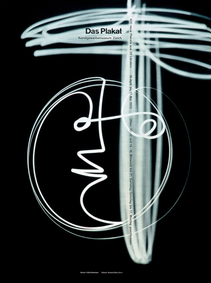
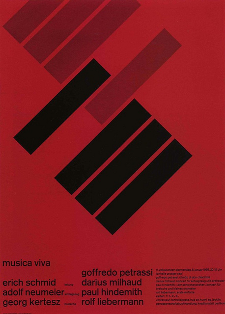
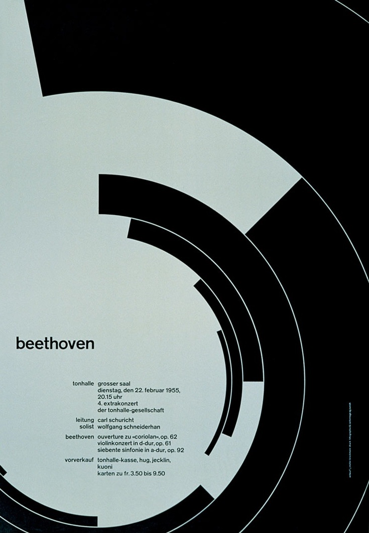
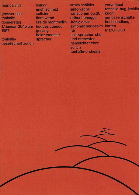
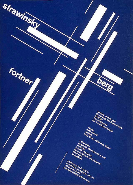
Müller Brockmann’s wide-range passions, interests, and commitments enable one to approach his work from several points of view, and his influence in graphic design extends well beyond his familiar poster work. He also was an accomplished photographer, often integrating experimental photography, photomontages, and light paintings into his design work. He loved music and over the course on many years made the now famous poster designs for the Zurich Tonhalle (Concert Hall), which were highly influenced by the “feeling” aroused by music. Josef Müller-Brockmann’s ideas are mostly related to abstract concepts, seen in many of his Zurich Tonhalle Concert posters. He argued that music is an abstract art therefore should be “interpreted abstractly,” and based strictly upon the established rules of typography and a grid.[x]
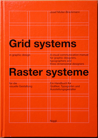
Nevertheless, all his works were built upon a grid system and in Müller-Brockmann’s book Grid Systems in Graphic Design he describes his process of using the grid and specifically reinforces the purpose and importance of its use and simplicity. Labeling it “constructive design,” Brockmann describes the Swiss style as economic and rational, and it is interesting that even those designs that appeared free of structure were rigidly organized beneath the surface.
What I like about the series of posters for the Zürich Ton Hallen, designed in 1960, is the angular look on structure and alignment within the text and within the shapes and space. The two tone color scheme also helps it to visually stand out. These posters were one of the revolutionary turning points in contemporary graphics. And it was not just another transitory style- it defined a contemporary graphic environment worldwide.
In a more personal light, some of Müller-Brockmann’s inspirations were his early interest in Carl Jung, his special affinity for Japan and Graphology (the study of hand writing and personality). Brockmann claims he stopped pursuing Graphology, only to later regret it because it might have been a useful tool in foreseeing a good or bad business partnership. He also had a very humble nature and sly sense of humor. For example, when asked what his best work is, Brockmann humorously replies, “The white reverse side of my posters!” Again, when the asked “What does order mean to you?” Brockmann’s responds humbly “wishful thinking” then ultimately states that it is the “knowledge of the rules that govern legibility.” This statement seems to illustrate the power of his convictions.

The ethical context for Josef Müller-Brockmann’s life is mentioned in a lot of sources. Specifically, his ethics governed his work from the 1950s on, as he declined work for liquor, tobacco, war games, military, real estate and politics. Similarly, Brockmann makes a conscious decision to no longer design for Turmac, a cigarette manufacturer, after learning that nicotine causes cancer. Hence, due to the ethical message he was advocating in the New Graphic Design, Brockmann no longer included “harmful commodities” in his professional work. Brockmann claims that the designer should have a sense of responsibility for the contributions they make to society. In his own words, he states that professional ethos is work that maintains the “intelligible, objective, functional, and aesthetic quality of mathematical thinking.”
As I researched beyond, I began to discover some interesting facets to Brockmann’s personality. On one hand he seemed to adhere to such a strict belief system and design process that I wonder if this sternness and rigidity was reflected in his personality. Several of his partnerships broke off, including his resignation as Director of the Department of Graphic Design at the Zurich School of Arts and Crafts in 1960 due to internal conflicts and politics. In addition, the original partners at Brockmann’s design agency, MB & Co., left the business in 1976 due to conflicting visions, and Brockmann even ended up running his gallery”Seestrasse” alone. Perhaps a little stubbornness does come through when his friend mentions how he had to repeatedly persuade him to return to Switzerland to look after his declining health. I never found out if he was difficult to work for, but instead the memorial tributes described him as “charming and open, always ready to learn.”
By searching for the inspiration and the man behind the work, I believe I understand how Josef Müller-Brockmann established himself as one of the most important voices of twentieth century graphic design, acted as a harbinger for what was to come and serves as a gauge for the study of design history.
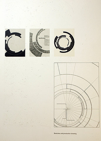
an exhibition on Josef Müller-Brockmann / Chaumont, France, 2008.
Young graphic designers inspired by Brockmann