What is happiness to you? How does it smell, taste and feel?
Jeppe Hein is a Danish artist based in Copenhagen and Berlin. His work attempts to be inclusive and tactile, whilst at the same provides a stimulus for contemplation.
The book tries to depict the artist’s representations of three dimensional work within the context of a two dimensional medium.
First of course I was attracted to the front cover. My eyes followed the confusion of coloured dots, like spatter from an ink-jet printer. Until they found the centre; a blister free of colour where the title nestled and seemed to lift, like the title suggested: “A Smile For You”. And then, off-centre; top left following the curve, the artist’s name. Tinier, but somehow less intimate. Different font. Lighter in colour, perhaps, but a statement nonetheless. Ownership.
I browsed through the book and saw that these elements were replicated throughout; the lack of margins, the differing fonts and point sizes, sometimes with serif, sometimes without as if each page was a different room of the exhibition. I became a visitor among the others. And there are many others. I am one of those looking at them, trying to look within.
I realised that the depiction of the artwork was an attempt to reflect the conceit of happiness. The expression of such is difficult; emotions are subjective; happiness is maybe the hardest one to express in a creative medium. I therefore found it interesting how you could try to express happiness in design and in the content of a book.
Books are neither happy nor sad. It is what is contained within and the ability of the author, the designer, and the illustrator; the bookbinder and most importantly the consumer who decides that.
I feel like I have an intimate relationship with this book, it’s precious nevertheless I’m not afraid to use it, look at it, smell it, crease it, read it and ignore it. As long as it’s on the bookshelf it will always be there. A small happiness in my head.
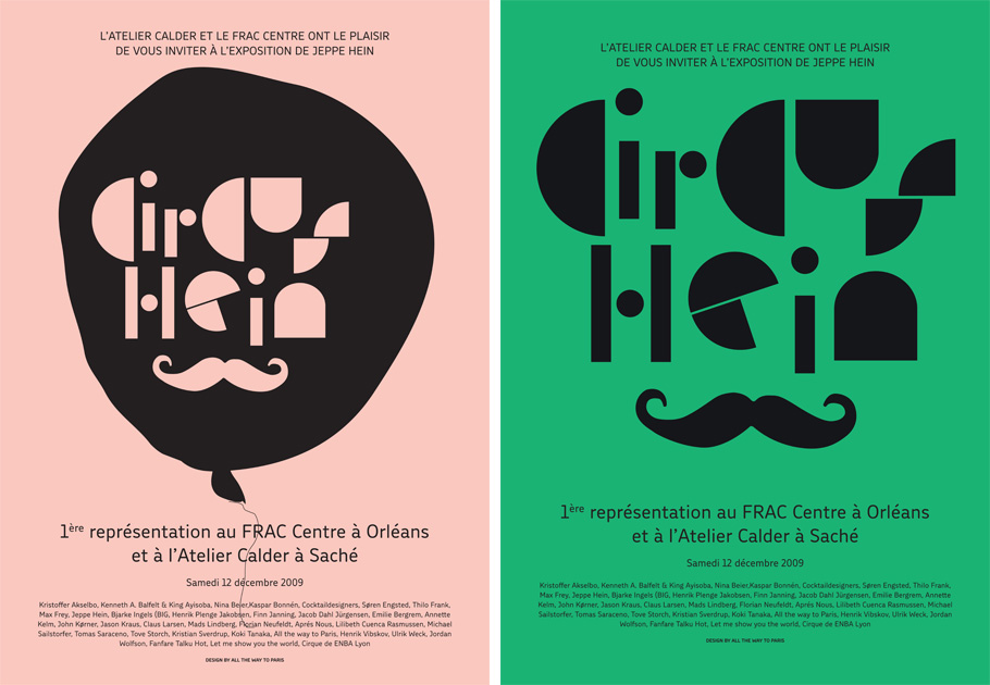
The book was designed by All the Way to Paris a Danish-Swedish graphic design studio based in Copenhagen. Founded in 2004 by Tanja Vibe and Petra Olsson Gendt. ATWTP and Jeppe Hein have a personal relationship together. They have been working as a team for the past six years. In 2008, the designers produce the graphic identity for “Karriere” a restaurant ran by Jeppe Hein and his sister. Also, in 2009/2010, they created a logo for “Circus Hein,” a circus show held in Orléans, France. The designers touch can easily be recognized. The colours and typeface are echoed throughout their work.
The catalogue’s design is a close collaboration between Jeppe Hein, his studio and the graphic designer. The artist decided on the selection of images and came up with the idea to include the postcards, engaging the reader to participate by sharing his thoughts on happiness.
The photographs of the artist’s installations and drawings are inviting; the reader can easily travel through them. The choice of mat photo paper is important. The depiction of these works attempts to be as truthful as possible. Many of the photographs enable the reader to see the audience’s reactions to the installations and how by using everyday materials Jeppe Hein tries to reflect the serenity of introspection through voyeuristic engagement.
The designers were able to incorporate a collection of intriguing dividers into the catalogue. Each introduced by an element on the previous page that relates to it somehow. Their content is different from the rest, they’re special. Every divider consists of a short reflection on happiness. These small and grainy pages are significant. They allow rhythm within the book.
At the end, you can find the index of the work featured in the catalogue. The information is printed in landscape format, more convenient to gain space, but also to radically separate the exhibition content and the index. Though I find it uncomfortable to read a hefty book in this way.
I thought I could use this research for personal reasons in addition to the design aspect. Expressing and understanding what makes me (feel) happy is complex. I can identify when I am intensively happy or deeply sad. But never what’s in between?
And I still can’t.
Rietveld library catalog no : Hein 1

