Skip to Content Skip to Search Go to Top Navigation Go to Side Menu


"Experimental Jetset" Tag


Words used as objects


Wednesday, November 11, 2015

 
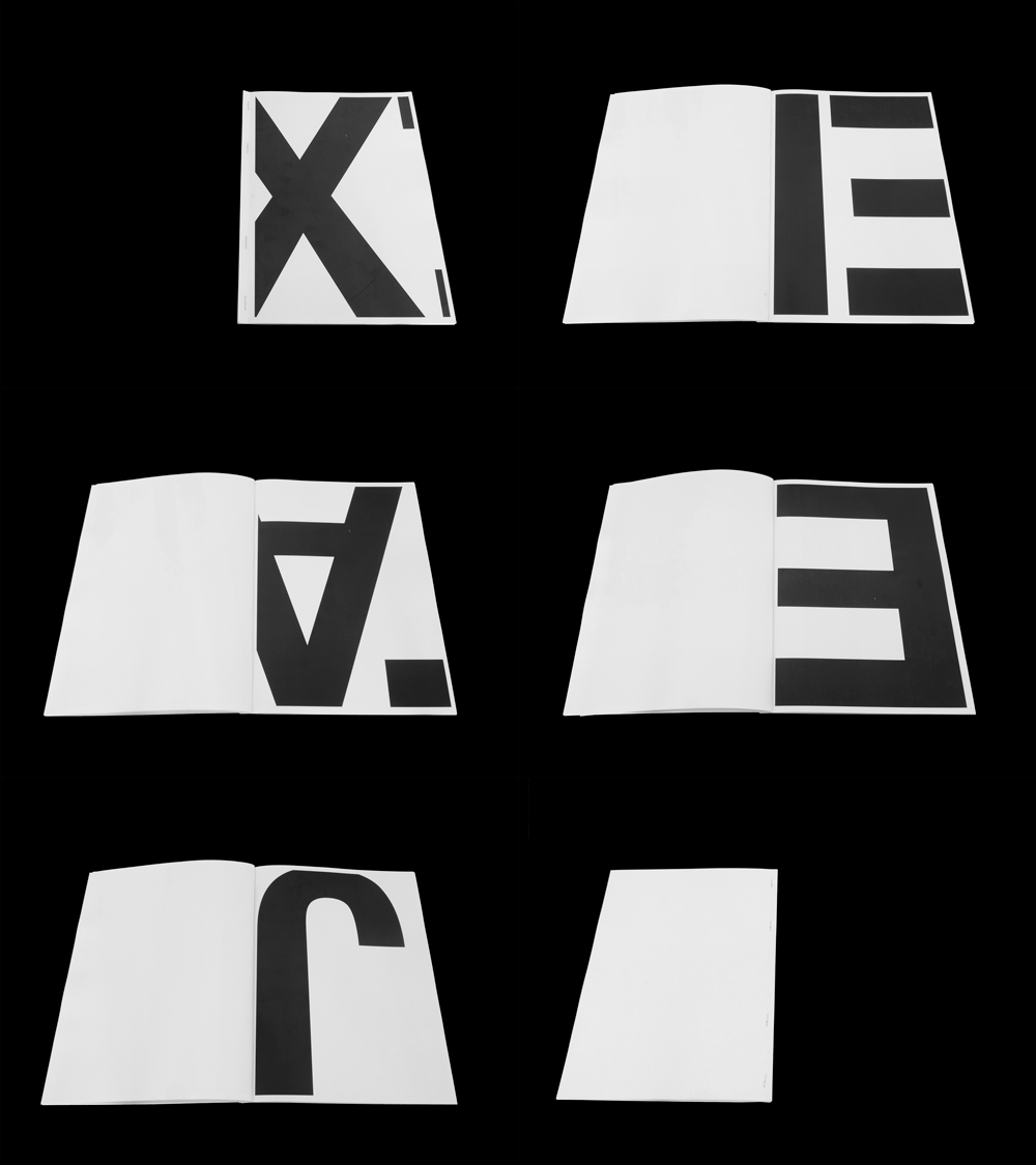
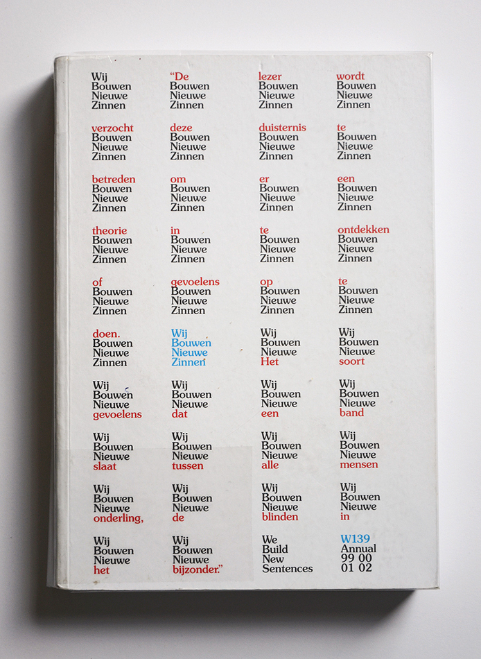
The front page of the book is plain white, with nothing but text – that’s not so special, you would think. But the designer of this book, Experimental Jetset, describes their methodology as ‘turning language into objects.’ And so it is possible that a plane white cover with nothing but the title and a few words could catch my eye.

DSC_0145_cover

Experimental Jetset is a small Amsterdam based design studio, founded by and still consisting of 3 designers: Marieke Stolk, Erwin Brinkers and Danny van den Dungen. They all studied at Rietveld academy and formed Experimental Jetset together in 1997, after their graduation.


DSC_0148_1 DSC_0146_2

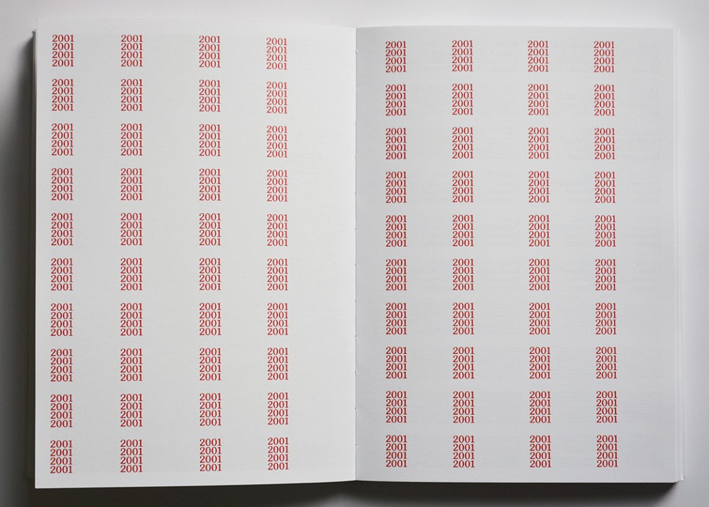
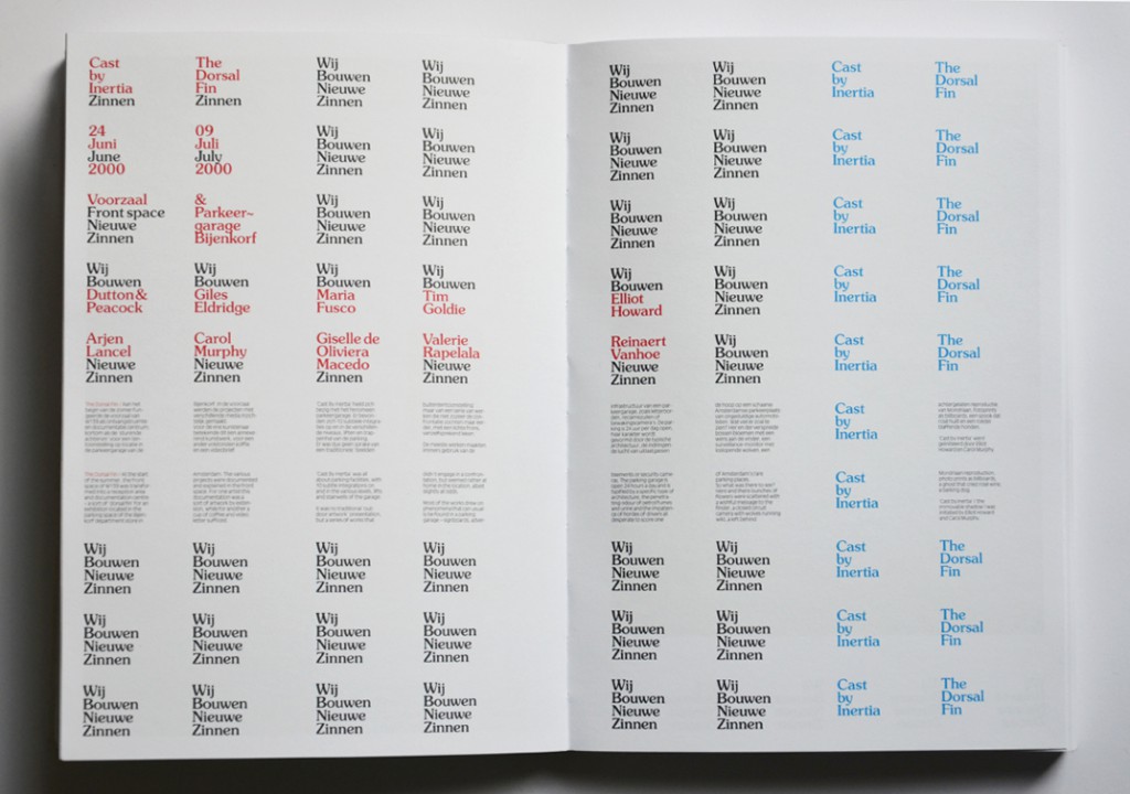
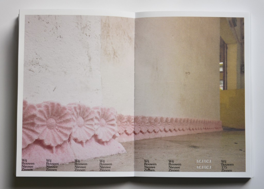
Not only on the cover of “Wij Bouwen Nieuwe Zinnen” (building new sentences) are words turned into objects – through the whole book, this theme comes back. “Wij Bouwen Nieuwe Zinnen” is an art catalog, presenting an overview of the exhibitions, and their contributing artist, that took place in W139 gallery between 1999 and 2002. Every exhibition that is described (in words and in pictures) starts with a blank page, like the cover of the book, with in the same block wise shaped sentences describing which exhibition it was, when it took place and which artist contributed to the exhibition. The space that doesn’t have to be used for this information, is filled with word-objects saying constantly one thing: We Build New Sentences. In the pages that follow, pictures and texts are showed, a bit like you would expect it to be in a catalog, except the fact that the bottom of the pages is always reserved for the word-objects. Always you can find in the bottom of the page the name of the exhibition that is further described on the page, but the rest of the space in the bottom of every page contains more word-objects, which continue saying through the whole book: We Build New Sentences

DSC_0147

DSC_0149

At designboom.com Experimental Jetset gives a very clear explanation of how they work with words as if it were drawings or ‘objects’. ‘Originally, the word ‘graphic’ is derived from the proto-indo-european base-word ‘grebh’, which simply means ‘to carve’ or ‘to scratch’; but in greek times, the word ‘graphikos’ referred both to the act of drawing and writing. In a sense, we do believe that the current practice of graphic design still refers to this classic notion – the idea that writing is a form of drawing, and drawing is a form of writing.’

The way Experimental Jetset uses words in a certain shape and the repetition of this shape, I had never seen before. Because I am no designer, I am unable to see direct influences in the work of Experimental Jetset, but according to themselves they are influenced by all kinds of things, from punk to what they call ‘the late-modernist landscape’ in which they grew up. This is one of the reasons for their frequent use of the typeface Helvetica. ‘It’s only logical that this late-modernist dialect can be detected all throughout our work. we’re simply not the kind of people who feel it’s necessary to suppress one’s own dialect.’

‘We feel strongly connected to the Dutch graphic design tradition, much more than we feel connected to contemporary Dutch Design. Contemporary Dutch Design is often perceived as very ironic, and overly personal; something we have absolutely no affinity with. At the same time we do realise that our humourless and rather dogmatic way of designing is sometimes interpreted as ironic or even deadpan. We have learned to embrace this awkward friction.’

So though they invented a very original style, they did this in the ‘language’ they grew up with, and they often use nothing more than words and letters itself. I would call their work honest, and I think that is one of the things that I find so interesting and pleasant about their work.

Experimantal Jetset claims to have no affinity with ‘overly personal’ contemporary Dutch Design, but when I started my research on Experimental Jetset, it stroke me how many interesting comments the designers of Experimental Jetset make about themselves – in interviews, but also in the book the designers made about their own work: Statement and Counter-Statement. Notes on Experimental Jetset. These comments show a different image of the group: a very open group, eager to talk about how they work, how they come to certain designs, and even make personal notes on their own work. This is, according to themselves, to reflect on their work. In an interview they mention their way of using these texts: ‘Around 2005, we decided to make our first proper website, we thought it would be interesting to include texts like these. Mainly because we don’t necessarily see our website as a portfolio, attracting possible clients – we see it more as a diary, or a personal archive.’ So in this sense, and maybe that is different from the ‘contemporary Dutch Designers’ they are talking about, they are very open about their way of working and about their work-proces, rather than putting personal issues in the works.

The good thing about the many comments Experimental Jetset makes about their work and their way of working, is that it is easyer to put the work in a perspective. The fact that the designers point out their influences themselves, that they describe their own method, is a parallel to their work itselve – works that are always very open. The designers of Experimental jetset are not these artistic magicians who do magic tricks – they use means that are recognisable for everyone, they explain what they do and why they do it and this brings the honesty and clarity in the design and the concepts of the designers.


Rietveld library catalog no : 705.9
STARSTRUCK


Wednesday, May 13, 2015

01_animation_EX_book

Hello Experimental jetset

My name is Claes and I’m a student at the rietveld academic, and my design teacher has given us an unusual assignment to contact people that influence our work and see if we can spend a short period of time with them. I had the chance to talk with one of you at the San Serriffe bookstore a while back and it was a really nice conversation. Your group is a huge inspiration to me and contacting you was the first thought i had! I hope that we could work something out at your convenience.

I look forward to hearing from you!

Best regards,

Claes

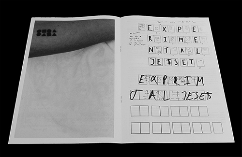
This is the first mail I sent to EJ and the starting point for a really nice project which resulted in a book that you can see as the gif above.

The research publication can be found in the attached PDF at the bottom. The research publication is about the work before and after the meeting with EJ. This meeting lead me to the conclusion that “less is more”. Enjoy.


IMG_0730_2_500px

“The tattoo I got is the worst and best…. But I would never show it to them, they would think I’m a freak”

research publication


A Printed Book History X : A Visual History Of The Printed Book


Wednesday, May 30, 2012


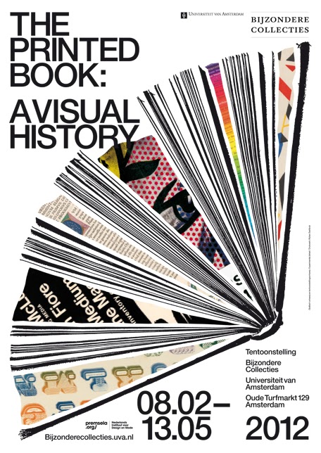
The Rietveld Library acquired a copy of the book [x] “The Printed Book : A Visual History”. The book of “The Printed Book” is compiled by Mathieu Lommen, and designed by Cees W. de Jong. It gives an impressive overview of 500 years western bookdesign [x]. Read this article in the New York Times for some background [x]
So for all who missed that exceptionally beautiful and well designed exhibit at the Special Collections of the UvA (University of Amsterdam) can still dream away online at home because students from the Foundation Years D_Group went there for you and selected their favorites, . Scroll down and enjoy…..

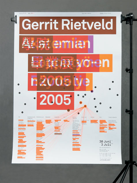
poster, catalogue and exhibition design by Experimental Jetset


Experimental interview


Thursday, October 15, 2009

What is the connection between Experimental Jetset, Johannes Schwartz and Herman Verkerk?
Besides the fact that they are all based in Amsterdam, that they can speak Dutch, they all like to create beautiful and witty designs or images, they like to question their practice, they like to experiment and they actually teamed up together several times, another crucial connection appeared recently: the three of them are going to participate to a collective interview project…

After discovering more about their work, it became obvious that there was something interesting to investigate about their collaboration. What make several people or entities meet and work together? Are they alike or on the contrary, are they so different that they complement each other…?

For that reason, we interviewed them using the same process:

>> AN INTERVIEW IN A SUITCASE
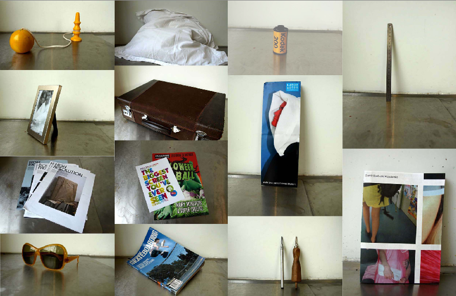
We visited Johannes Schwartz, Experimental Jetset and Herman Verkerk, carrying with us this suitcase. Inside the suitcase, many different objects. Each interviewee was invited to open the suitcase, to browse through it and to freely react to the objects they found in it.

The results were surprising, exciting and very interesting. But when it comes to decide what brought the three of them together and where they meet… you are left free to listen to the interviews and to make up your own mind!

Experimental Jetset, Johannes Schwartz or Herman Verkerk

Why Helvetica?


Wednesday, October 14, 2009


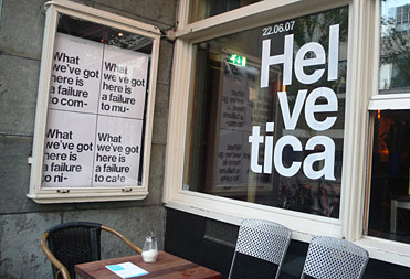
The work of graphic designers unit Experimental Jetset is often associated with the use of a very limited amount of typefaces, mostly Helvetica. Is it an easy way out, typographically? Or is using Helvetica a tribute to modernism? Now, after using Helvetica intensively for over ten years, Experimental Jetset still finds it an intriguing typeface.

This video was embedded using the YouTuber plugin by Roy Tanck. Adobe Flash Player is required to view the video.

However, why Helvetica?…… Why_Helvetica

Rietveld & Beatles, Identities with a content


Wednesday, May 13, 2009
Building & Identity became subject of plans to move Amsterdam’s Art & Design Academy (The Gerrit Rietveld Academie) to an other location.
Academy and building named after the same conceptual visionair Gerrit Rietveld cause an interesting concourse, in which the identity of our renown academy building is suddenly confronted with an evenly famous and internationally renown educational identity. (link to student research)

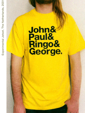
As part of a teachers and students protest against the “ad hoc” plans, celebrating the 42nd birtday of the Rietveld building, a T-shirt was designed after the famous “Beatles” T-shirt by Experimental Jetset, to emphasize this realation between content and identity. Rietveld is building and students and teachers as the Beatles still are John&Paul&Ringo&George. link

Rietveld for Rietveld
www.rietveldforrietveld.org
The goal of this website is to open the discussion on the preservation of the historical Rietveld building for the Gerrit Rietveld Academy, Amsterdam.

Read more about this and all ongoing facts and publicity  ¿GRA becomes GAK?

Objectiefied Bits


Friday, January 30, 2009

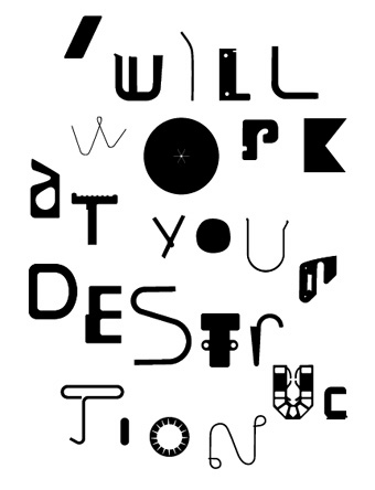
Maybe you find it puzzling that this posting about Helvetica and Wim Crouwel starts with an image of Paul Elliman’s “Bits” Alphabet.

Extremes can sometimes meet when you least expect it, and this fascinates me. It became apparent again during the investigation by the FoundationYear C group, into Gary Hustwitt’s Movie “Helvetica” and our consequently visit to the Wim Crouwel exhibit last month at the “van Abbemuseum”.

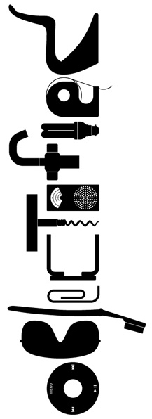
left: Bits by Paul Elliman, right: Objectified by Build (click images for blog info)

“Bits” was developed by Paul Elliman in the mid 90ties and published in the 15th (Cities) issue of Fuse’s conceptual Font Box. quote: “Language moves between us and the world on patterns of repetition and variation, and a mimetic example of this might be something like an alphabet”
Later, in 2004, it was included in the Cooper-Hewitt Design Triennial N.Y. which made “concept type” part of the established design world.

Gary Hustwitt’s new documentary “Objectified” takes design, and as a matter of fact “Bits” too, one step further by making it popular in the same way as he did with “Helvetica”.

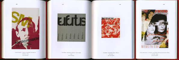
Modernist thinking, or even constructivist-, lays at the base of the “Helvetica” concept and the work of Wim Crouwel, as this first movie on typography has him stated. As a true Dutch graphic design icon Wim Crouwel illustrated this through work, presented at the library exhibition of the van Abbemuseum, celebrating his 70th birthday. A small but beautiful display of catalogues and posters made for both this and the Stedelijk Museum in Amsterdam.


pages by Crouwel versus pages by Jan van Toorn from publication “Het Debat”

Extremes met in person when Crouwel and Jan van Toorn celebrated their life long controversy with a recurrence of their famous 1970 debate. Functionalism versus engagement. Jan van Toorn succeeded Crouwel as a designer at this museum under the directorate of Jean Leering to manifest in an inspiring cooperation what that leads to in terms of exhibition concepts and graphic design (“Museum in Motion” at the library). Jean Leering also closely work together with Jan Slothouber (read part 1 of C group’s research) at the TU-Delft where the published several internal essay’s on the philosophical and social consequences of design.


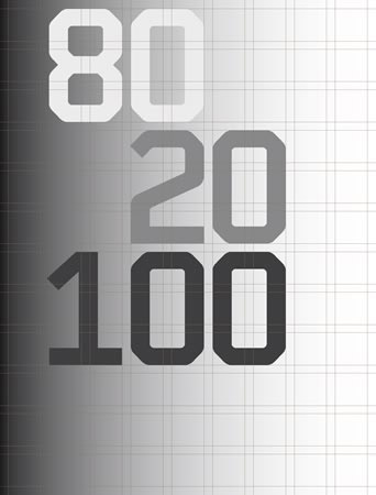
80/20/100 © Nijhof&Lee booksellers – Laurenz Brunner, final exam poster

More research was conducted to explore related content or work approach of other designers like, Laurenz Brunner’s “Akkurat”, his successful contemporary remake of Helvetica, Experimental Jetset convicted users of Helvetica, the cooperation “8020100” between Vivid Gallery in Rotterdam and Nijhof&Lee Bookstore in Amsterdam. Context was created by turning the focus on Adriaan Frutiger, designer of Helvetica’s conscientious alternative “Univers”. To further explore the relation to language and image we further focused our investigating efforts on the visual legacy of Charles & Ray Eames, the “El Hema” exhibition/store and Massin‘s timeless publication “Letter and Image“.

With the inclusion of Belgian artist Guy Rombouts the full circle of our focus on type design was completed. The investigation into his visual language concept “AZart” will be presented soon in a separated part 3 C_group posting. This was part II of the C_group research
All researches linked in this posting can be downloaded in A4 format and are also available as hard copy research prints at the ResearchFolders available at the academy library

D group /Type Design, from Experimental to Corporate


Tuesday, April 22, 2008

Helvetica is a feature-length independent film by Gary Hewitt, about typography, graphic design and global visual culture. It looks at the proliferation of one typeface (which is celebrating its 50th birthday this year) as part of a larger conversation about the way type affects our lives. (http://www.helveticafilm.com/) Helvetica introduces type as more than common. A specialized design discipline.

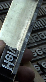
helvetica movie image1helvetica movie image2

A lecture by Henk Groenendijk on experiments in type design, related to ‘developping cultural and economical progress in the 1950-’70, gave more insight in the context that proved so fertile for Helvetica’s rise to stardom.

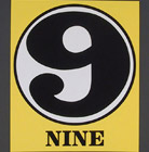
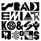
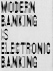
Indiana Number-paintingLogo’s from fiftiesSandberg Experimenta TypograficaModern Banking

Time and space is a given phenomenon in education at the Rietveld Academie, where things constantly present themselves in past and contemporary creative projects. As an almost casual gesture, some 2nd year students from the graphic design department dropped by to present their recent type designs in progress.

Student type design

Finally research material was edited down to A4 sized guided tours into selected subjects. All subjects presented in this list are also available as hard copy research prints at the ResearchFolders available at the Rietveld library.

As usual we selected subjects with a direct connection to the context of the presented material in this classbloc. In this case Helvetica the Movie” and its content, was researched through subjects like the Corporate Alphabet, Wim Crouwel, Laurenz Brunner, Experimental Jetset, Norm type design and their publication “TheThing” or Letterpress.

The lecture gave a much broader perspective from which researches like de Stijl fonts, Buro Destruct, Zaph Dingbats, the Univers Font, Systemfonts, Swiss Style/Modernisme, Guy Rombout‘s AZart and Edward Fella were initiated. Widening the discussion towards the Helvetica subject by adding links to the actuality, some more subjects were added, Jonathan Barnbrook. Richard Niessen, Type Radio, Emigre‘s Zuzana Licko, Jonathan Puckey‘s Type Tool, the mysterious typebased posters of Michel Schuurman and ultimately the concept of Dead Type by Hansjakob Fehr


Log in
subscribe